


It’s so great to live in a time when virtually any information or answer we seek is at our fingertips, wherever and whenever we need it. Websites like Houzz, Pinterest, and the like have become vital resources for homeowners planning to renovate or decorate their homes (renters, too!) – as well as design professionals looking for inspiration, sourcing furnishings for projects, and collaborating with clients. I’m actually a big proponent of utilizing these tools – they are wonderful, and I don’t know what I’d do without them!
What I think they should definitely not be used for is researching and selecting paint colors. OK, fine if you want to reference examples of a paint color you like “in real life”…only you have to remember…it’s not real life. Of course, not surprisingly, paint color questions are among the most common types of questions submitted on Houzz and similar sites.
Before I get into all the reasons why this is not a good idea, I thought I would just show you a series of photographs, found on a simple search on Houzz, that all labeled with the same paint color. It’s a very popular one – Benjamin Moore November Rain.
I happen to like this color very much, and have used it in at least two or three color consultations, and am even considering using it in my home when we renovate it in the new year. Just humor me and take a look (and please note that I have embedded all images directly from Houzz, and they are all linked to the profiles from which they came)…

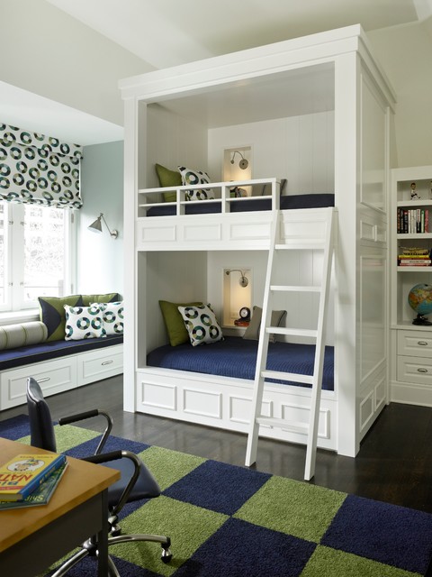

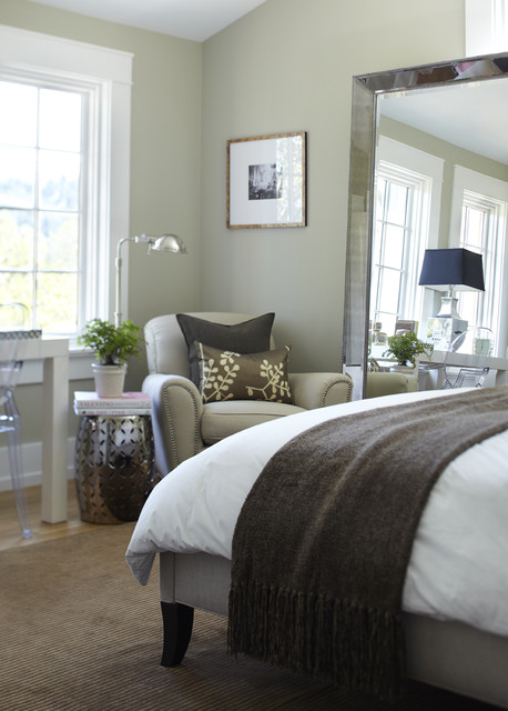

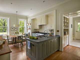

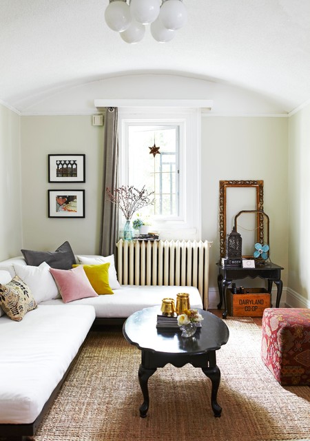

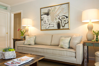
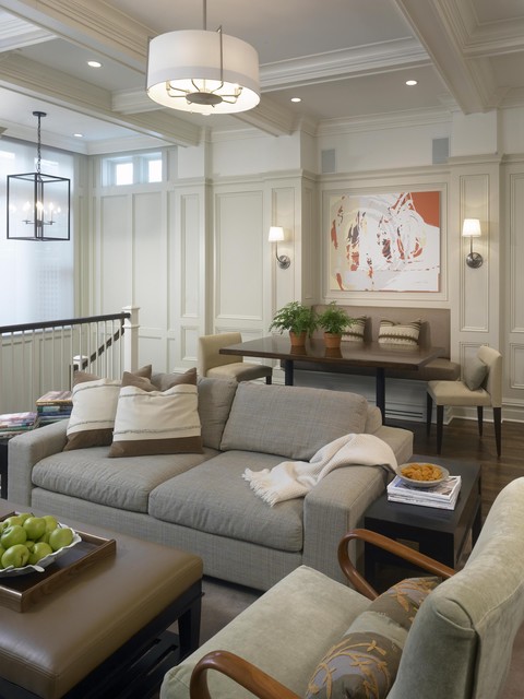

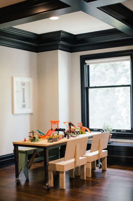
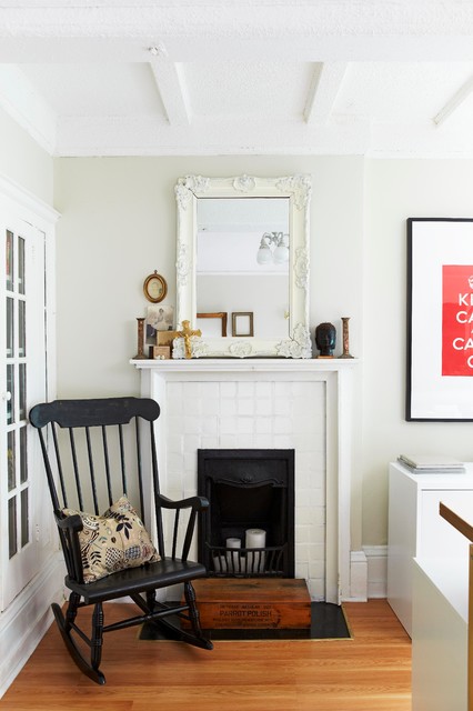

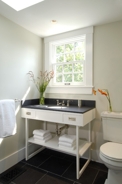
There are some very pretty spaces here! But see how different they are?? What’s going on here?
A few things, in particular…
1.) Lighting. Paint colors will behave differently in varied lighting conditions. The amount of natural light, the direction from which it comes, the time of year, and geographic location can all have a major impact on the appearance of a color on the walls. I have seen November Rain look very green, very beige, and nearly white. This kind of behavior is not unique to this color. A paint color really needs to be evaluated within the context of the lighting in that particular space.
2.) Sheen. No one ever talks about sheen when asking about a paint color. Flat vs. Eggshell or Satin reflect light differently, and thus affect the way we perceive color.
3.) Context. In the case of November Rain, it is a pretty light and subtle color. It will, however, look a little darker when paired with furnishings that are lighter than it, by comparison. Conversely, it can appear lighter with highly-contrasting dark elements (like the black countertop and floor in the last example…for example).
4.) Photo Editing. Most of the photos you see here have been modified and enhanced in Photoshop. Sometimes this type of editing is to correct the exposure, and an attempt to make the photograph reflect what the color looks like in situ. More often, I think, color correction is simply trying to make the image more beautiful – and what that means depends upon who is commissioning the photographs, and what their intent is. For example, photographs taken for editorial use will be tweaked to suit the look and style of that magazine.
5.) Misinformation. If it’s online it must be true, right? Ha. You have to at least consider the possibility that the color someone says was used in a room may not actually be that color. It could be a color match mixed in another manufacturer’s paint base, or it could just be plain mislabeled, maybe because a user commented and thought they knew what it was, or because the designer forgot and made an assumption. I’m pretty sure at least one of these above is not November Rain.
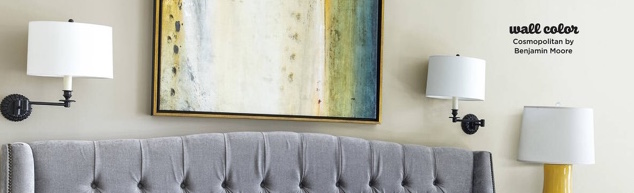
As some bonus evidence, especially because I was going to share a ‘behind the scenes’ post detailing my holiday photo shoot with HGTV Magazine (which I’ve postponed until after Thanksgiving), I wanted to show you a picture from my own home, which ran as part of the magazine feature.
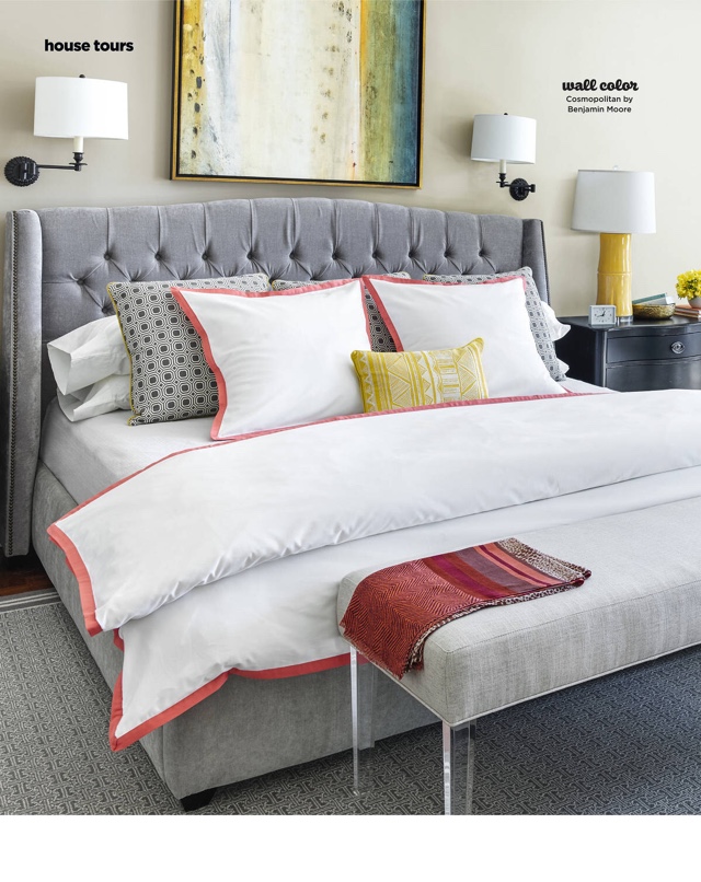
Photographed by Annie Schlechter and styled by Matthew Gleason for HGTV Magazine.
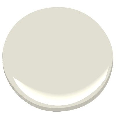
The wall color, as the photo indicates, is Benjamin Moore Cosmopolitan.
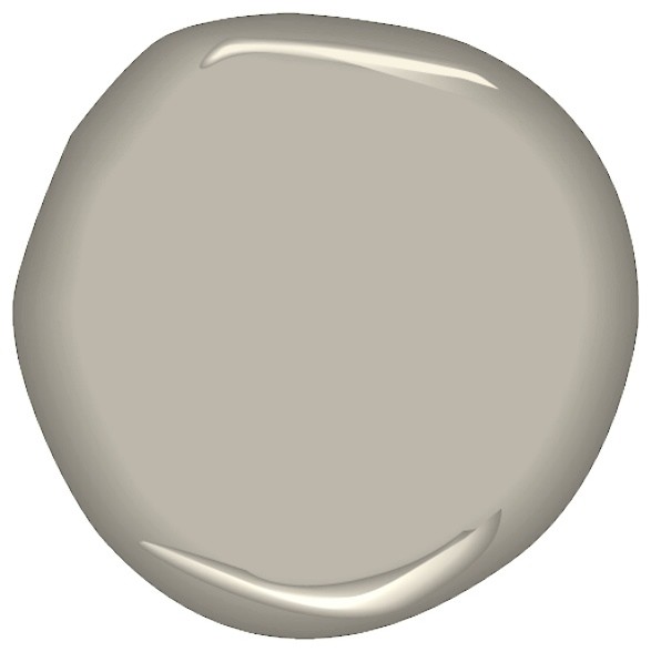
Ironically, neither the photo nor the paint blob look anything like the actual paint color (at least on my monitor – yet another variable – reputedly there are even differences in color rendering between Macs and PCs!). But it is certainly closer to the blob – a nearly mid-tone gray with a slight red undertone. And it’s totally washed out in this part of the photo of my master bedroom. Believe it or not, my bed almost matches the wall behind it! (And believe me, that was on purpose 🙂 ).
I’ll be back on Black Friday with a new Friday Family-Friendly Find…until then, Happy Thanksgiving!