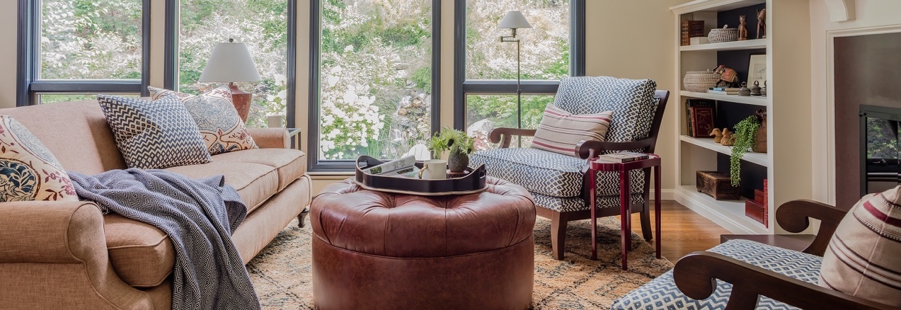
Today I am sharing a *surprise* reveal of a project we completed earlier this year, and recently photographed. In many ways, this was not our ‘typical’ client – no children, no dogs, just a husband, wife and their bashful cat living together quite happily in a 70s-era colonial in Sudbury, Massachusetts.
They found us, as many clients do, on Houzz. Both husband and wife independently made their own lists of designers’ work they liked and then put them together. (Reminds me of the time I brought my 10 names to my husband for consideration for our first son’s name…I was not informed of the requirement that the name be Irish, and thus 9 of my 10 names were immediately disqualified. But I digress…). Anyway, as it turns out, my name was the only one that appeared on both lists. So they called me and we got to it!
Our focus was on updating the most ‘public’ spaces in their home – redecorating the dining room, foyer, and living room, as well as a pretty significant surgical procedure on the fireplace wall of the latter. The before and after is compelling, if I don’t say so myself.
Well, without further ado, here are the BEFOREs:
And AFTER!
At our first meeting, I spotted a fox trotting across my client’s beautiful wooded backyard. Can you tell that inspired the living room’s color scheme? We loaded up the space with texture and cozy seating, and played up the views by painting out the dated and worn stained window trim in Benjamin Moore Hale Navy. Just like picture frames. No window treatments required.
Remember that awkward brick fireplace and wood mantel shelf? We designed a wall of built-ins integrated into the fireplace mantel, updated the surround to a unique wine slate, and converted the woodburning fireplace to user-friendly gas (built and installed by JM Construction). The wife loves to decorate for each holiday, and requested a mantel shelf that would accommodate a lot of seasonal decor. I’d say we accomplished that goal! And I love how the painting suggests another window where no window exists.
The tapestries and artwork hung at random intervals in an effort to fill a two-story wall space were replaced by these great sculptural pieces from Global Views, which appear to climb up the wall. The game table is used for entertaining guests with games and cards, as well as for coffee for two on quiet weekend mornings. I found the iron-framed chairs on Wayfair, and had them reupholstered in two fabrics.
Every time I put a chaise in a client’s home I’m like, why don’t I have one of these? I want one! Well, I still don’t have one, but this is pretty much everything. Chaises are seriously perfect for turning a dead corner into the coziest, cuddliest spot in the house. We wanted to keep this one natural and casual, but I couldn’t resist embellishing the skirt of this blue washed linen beauty with one of my favorite trims (from Samuel & Sons). I worked with Framebridge to create this custom art installation with fish prints from an antique book. It was trickier than it looks, as some of them were in ‘portrait’ (vertical) orientation, and others were ‘landscape’ (horizontal). We love how it turned out!
The foyer needed to be freshened up, big time. In contrast with the living room, the foyer lacks natural light and suffers from a low ceiling height (about 7 1/2′). To combat that, we injected some much needed color in the way of a new Persian rug, and a welcoming settee (which is totally cush and nappable, by the way) in a bold floral. This was also the only room where we didn’t do a neutral wall – well, I sort of consider green a neutral. Whatever you call it, it’s Benjamin Moore Sagebrush. The mahogany console table received custom paint from the apron on down; it’s a real space-saver in a major thoroughfare between the foyer and the living room.
I wanted the dining room to feel like a proper English high tea in the garden, under a verdant trellis. We combined traditional antique and reproduction furniture with fresh blues and greens, and a neutral grasscloth wallcovering toward this end. Thank goodness for clients who trust you enough to go for the painted grass-green faux bamboo dining chairs (from Thibaut, dressed up in Crypton fabric from JF Fabrics)! Architectural detail was lacking, so we added some simple picture mouldings below the existing chair rail and painted it all white to create a paneled wainscot. And finally, some draperies! In a Nina Campbell / Osborne & Little stylized floral print I can’t seem to get enough of.
I hope you enjoyed seeing this project as much as I enjoyed bringing it to life. This home was beautifully photographed by Michael J. Lee.

