


Those of you who follow me on Instagram may have seen my Stories yesterday, and some issues that have creeped up over the past several days. I don’t want to dwell on that right now, though. Instead, I’m going to talk about an area that’s actually, thus far (knock on a 2×4, I’ve got lots…) seemingly coming along nicely and as-expected – my mudroom.
After four years of planning, scheming, changing my mind, circling back to my original plans, then reworking them all over again…it’s decision o’clock, and the bell is tolling quite loudly. Time to lock it in, folks!
Back in the fall, I thought I had a pretty good idea of what I wanted, and put together this mood board:
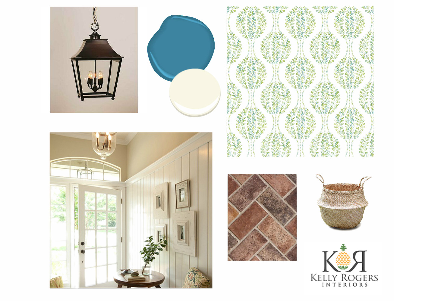
Preliminary mood board from fall 2016
Over the past several months, a lot has changed, but some things have remained the same. The first is that I knew I wanted to use tongue-and-groove vertical paneling, painted white, on the walls, under a very high chair rail (like, around 8′ or so).
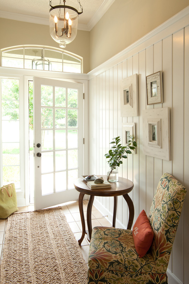
You see, the ceiling is about 13-and-a-half feet tall, and the room really needs some interesting interior architecture beyond a basic paint or wallcovering head-to-toe. (A wall of eight windows – four on the bottom, and four arched windows on top – doesn’t hurt either!).
Which means there will be about 5 1/2 feet left for…wallpaper, obviously! I love that I won’t have to worry about it getting banged up at this height. I used this trick in Eamon’s room, too.
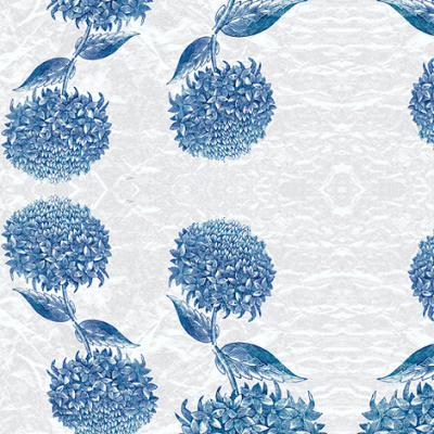
I tired of the paper in my original inspiration board – still like it, actually, but I want something a little more bold and unique, a little less sweet for my house full of boys (even our dog). I knew I wanted something that looked a bit like it was climbing up the wall, and something with a larger scale to suit the room, and to be legible from the floor.
Root Cellar Designs “Hydrangea Topiary”
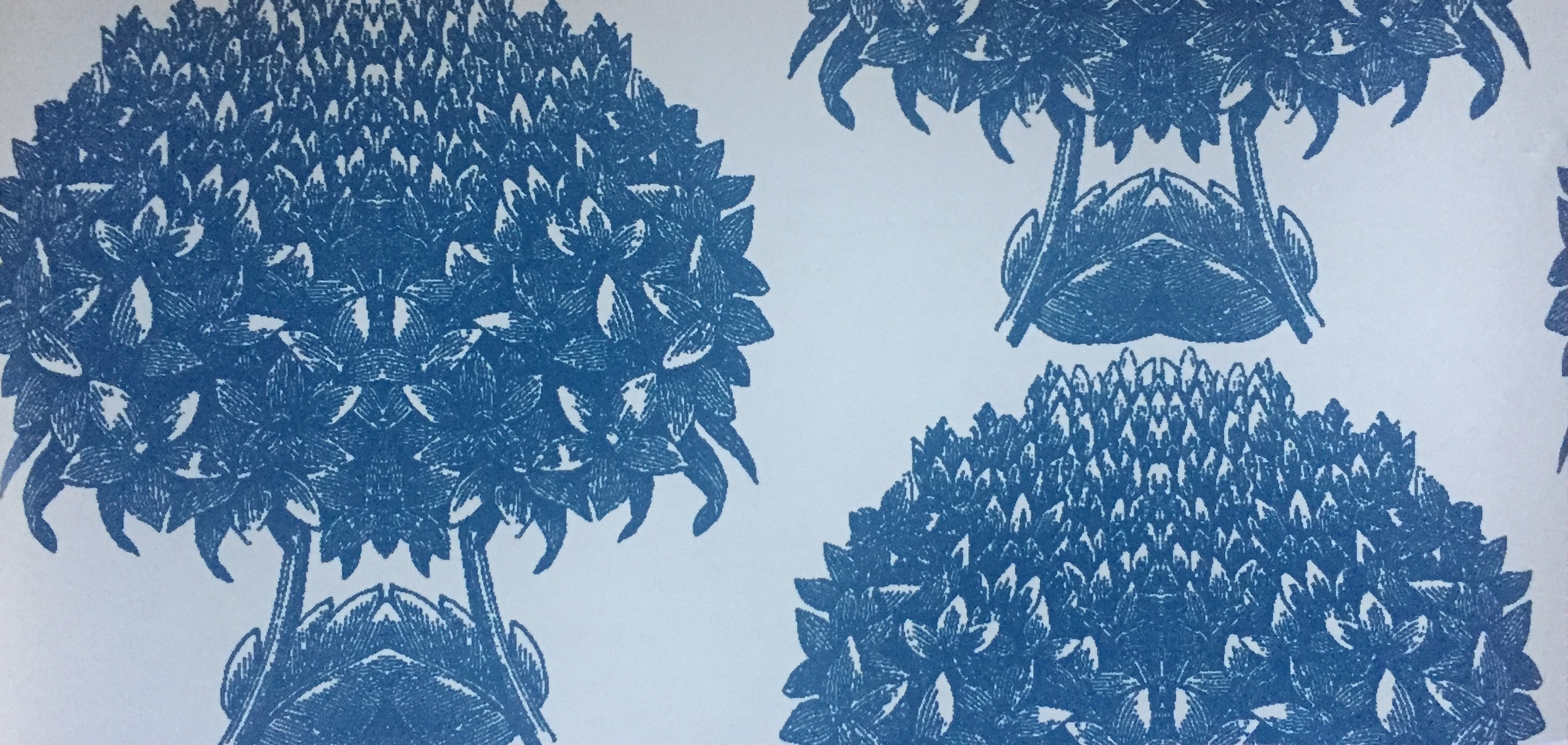
Then I found this from Root Cellar Designs – it was exactly the type of pattern I had envisioned, and was my favorite flower (hydrangea) besides! There were only two problems: The color wasn’t quite right, nor was the scale. The topiaries here are only about 4″ wide! Thankfully, Root Cellar offers custom capabilities, so I started working with Tamara Stephenson, one of the co-founders and owners, to configure my ideal paper.
After tweaking the scale a little bit (to make the topiaries between 10 and 12″ wide – shazam!), we honed in on the color. I loved this color scheme in one of their other patterns, also depicting hydrangea, and asked if they could match it.
Root Cellar Designs – “Hydrangea Dancing”
After a little back and forth over email, Tamara sent me five different strike-offs for approval, including one that matched my original vision exactly, and another I didn’t expect and completely caught me by surprise…in a good way.
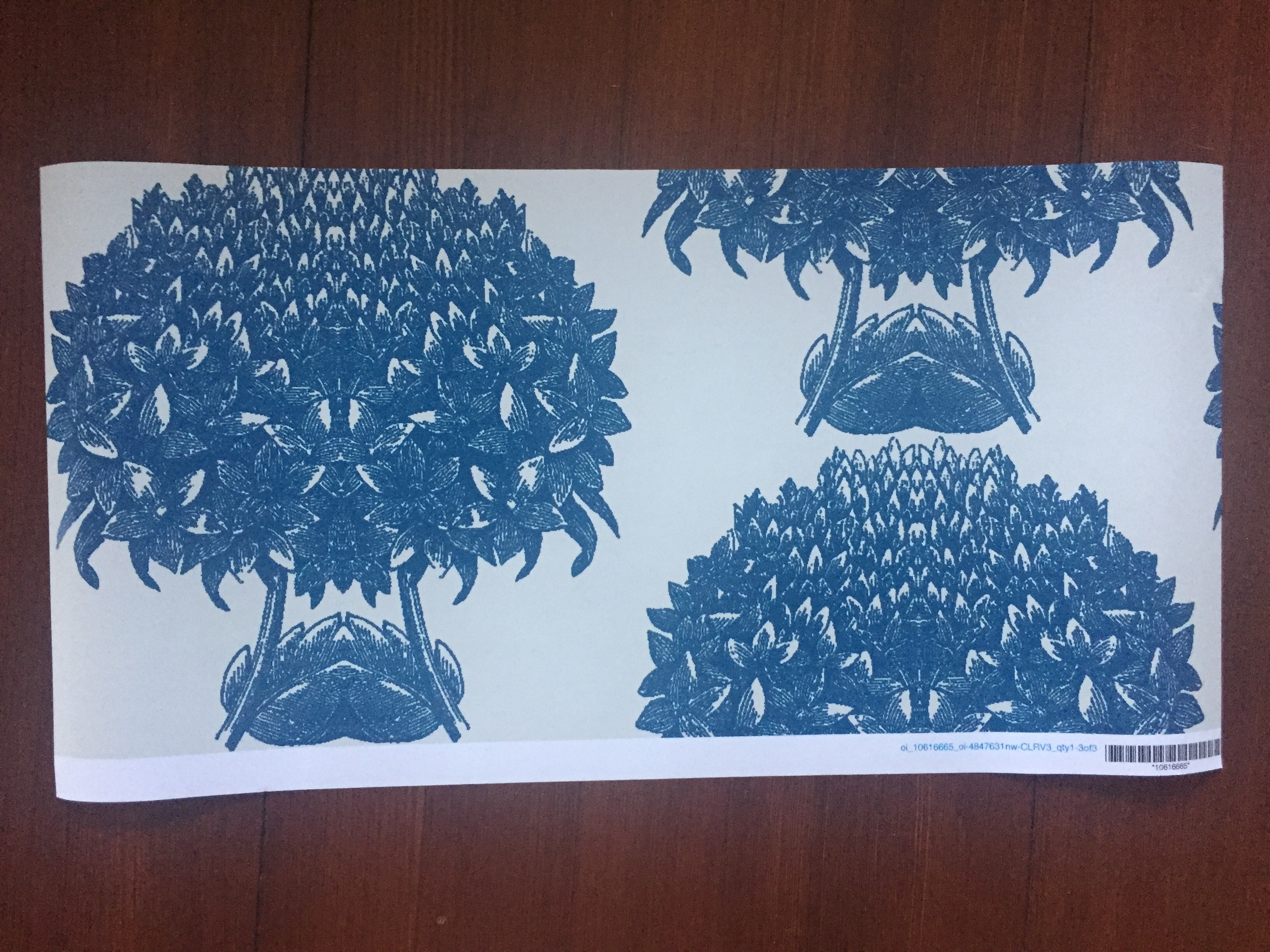
Here’s the first one.
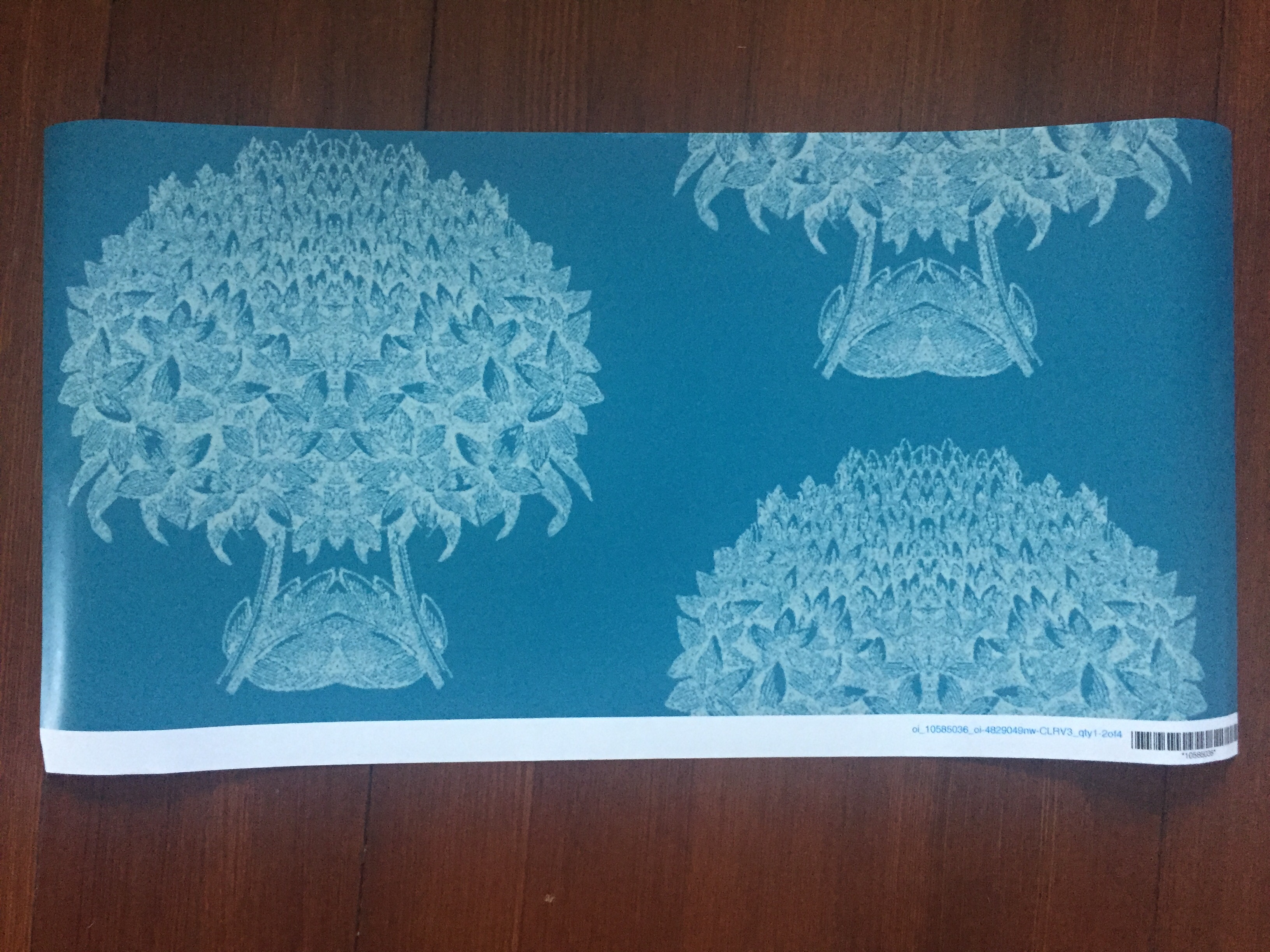
And the second. I know I definitely want the scale and spacing of the first option, but I can’t stop thinking about the second!
OK, let me show you what else I’m using in the room…I think I’m going to need some help making a decision here so hang with me…
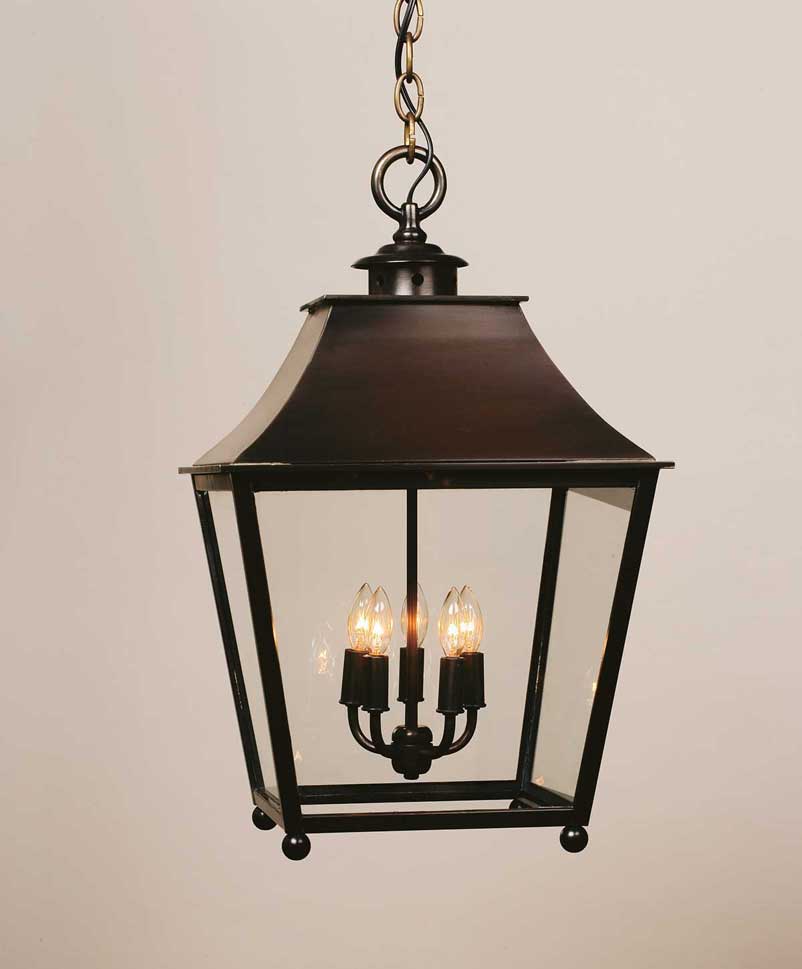
I keep coming back to this lantern from Urban Electric Co, which was my original pick. Initially, I thought I would need two in a larger, custom size (yikes, pricey!), but as I started working through the electrical plan, in relation to the windows, I realized it would be better to have three lanterns. This way I could use the standard size, and center two of them in windows in that top row.
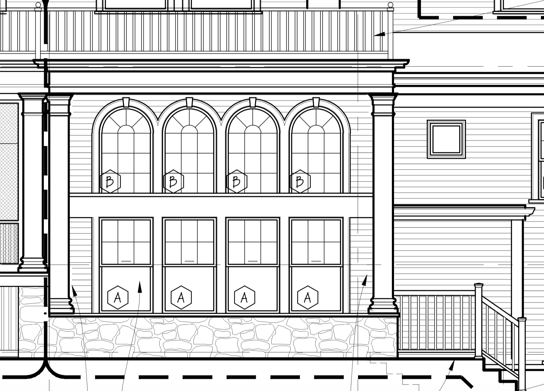
Exterior elevation of mudroom (Peter Sachs, Architect)
And there will be one lantern right in the middle.
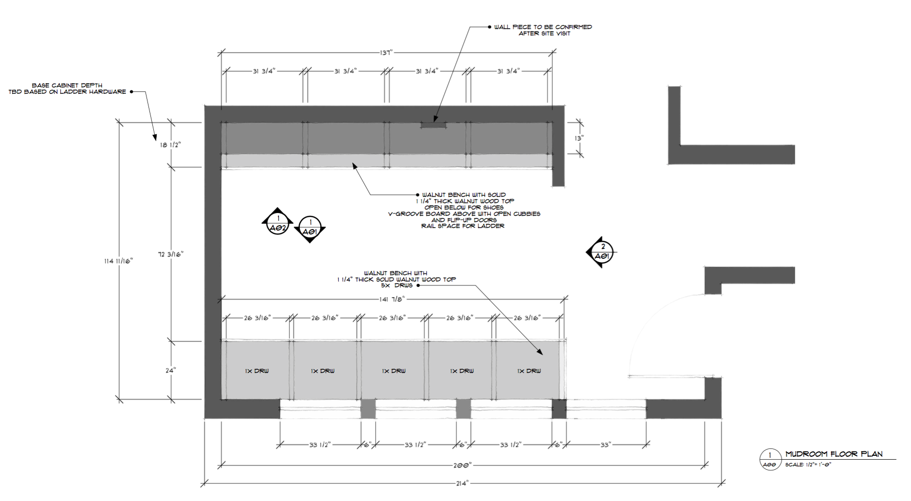
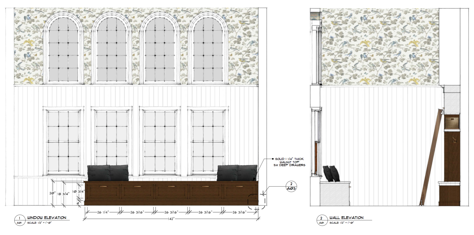
Mudroom floor plan
I worked with Jewett Farms on the cabinetry (also on my kitchen!), based on my design plan. I wanted to keep it pretty simple, so as not to interfere with the architecture of the room, and to maintain the symmetry on the wall of windows (so, an L-shaped plan was out of the question). We are a family of four, plus a dog, so the four humans each will get a generous open cubby, as well as a drawer underneath a long bench (plus one for our pup’s accoutrements).
I wanted to do them in nearly-natural walnut, as I love the beautiful grain of this species, and it was an opportunity to do something a little different and more earthy and dramatic. Also, I needed to have a library ladder somewhere in my house and this was the perfect opportunity!
JF uses SketchUp for their design software, so I have a 3D rendering, though keep in mind that the wallpaper is NOT what I am using (or the floor tile – more to come on that…and the lighting is also not depicted).
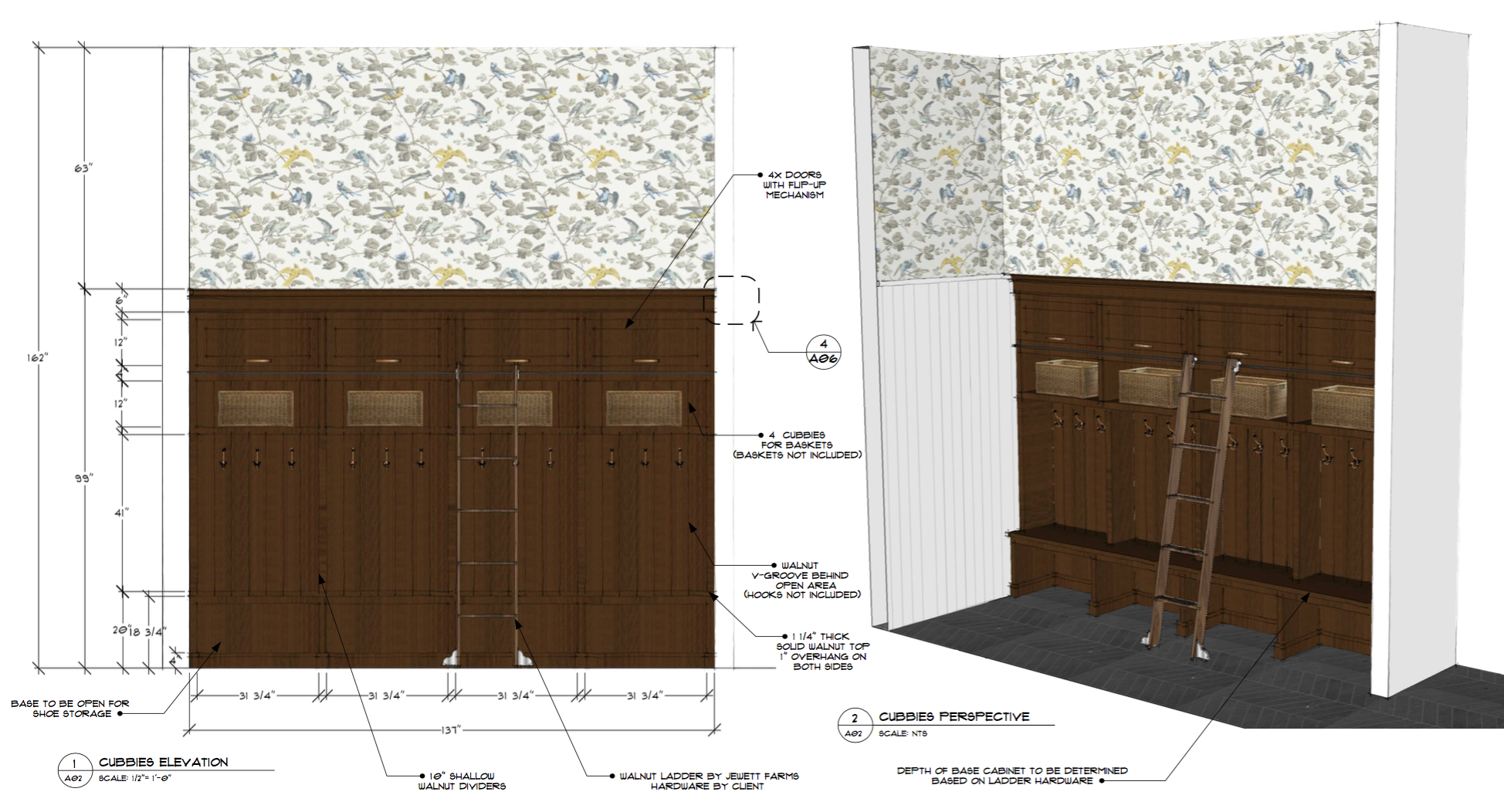
The top row of flip-up doors is for storing all of the extra stuff – mostly, shoes. As we know and have learned about ourselves, generally when outerwear and footwear come into this room, they don’t leave or get ‘put away’ anywhere else.
Once we looked at the elevation to the right, I knew I’d have to figure out something interesting to do with that wall. I’m considering creating a gallery wall, putting one horizontal piece over a row of additional hooks, or maybe creating a big magnetic board to post the kids’ artwork, cards at the holidays, etc. Also, rest assured, my throw pillows will not be solid black. 🙂
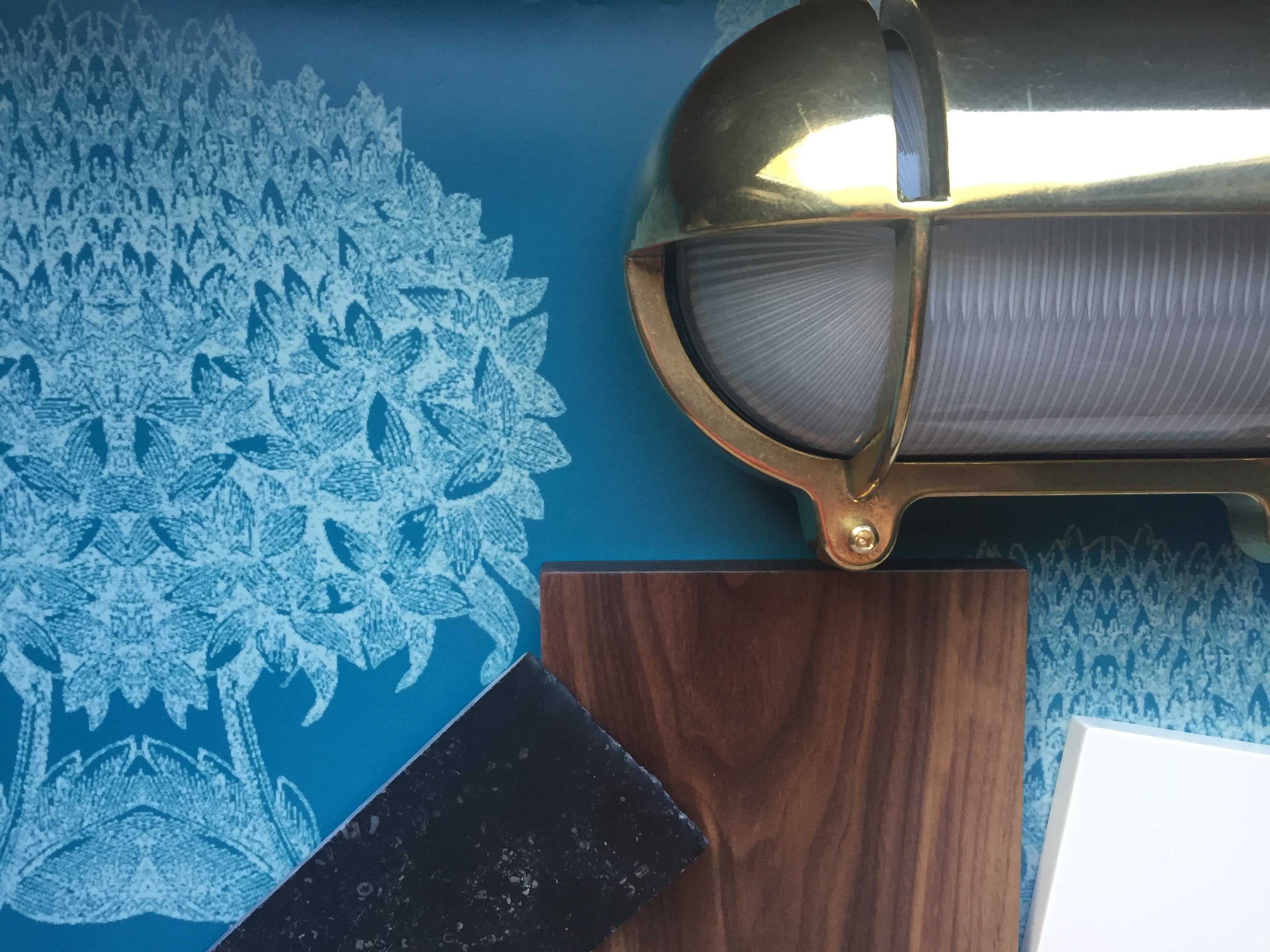
Rather than add recessed lighting, I opted instead, as I often do, for decorative, yet functional fixtures where we will need them most – directly over the cubbies.
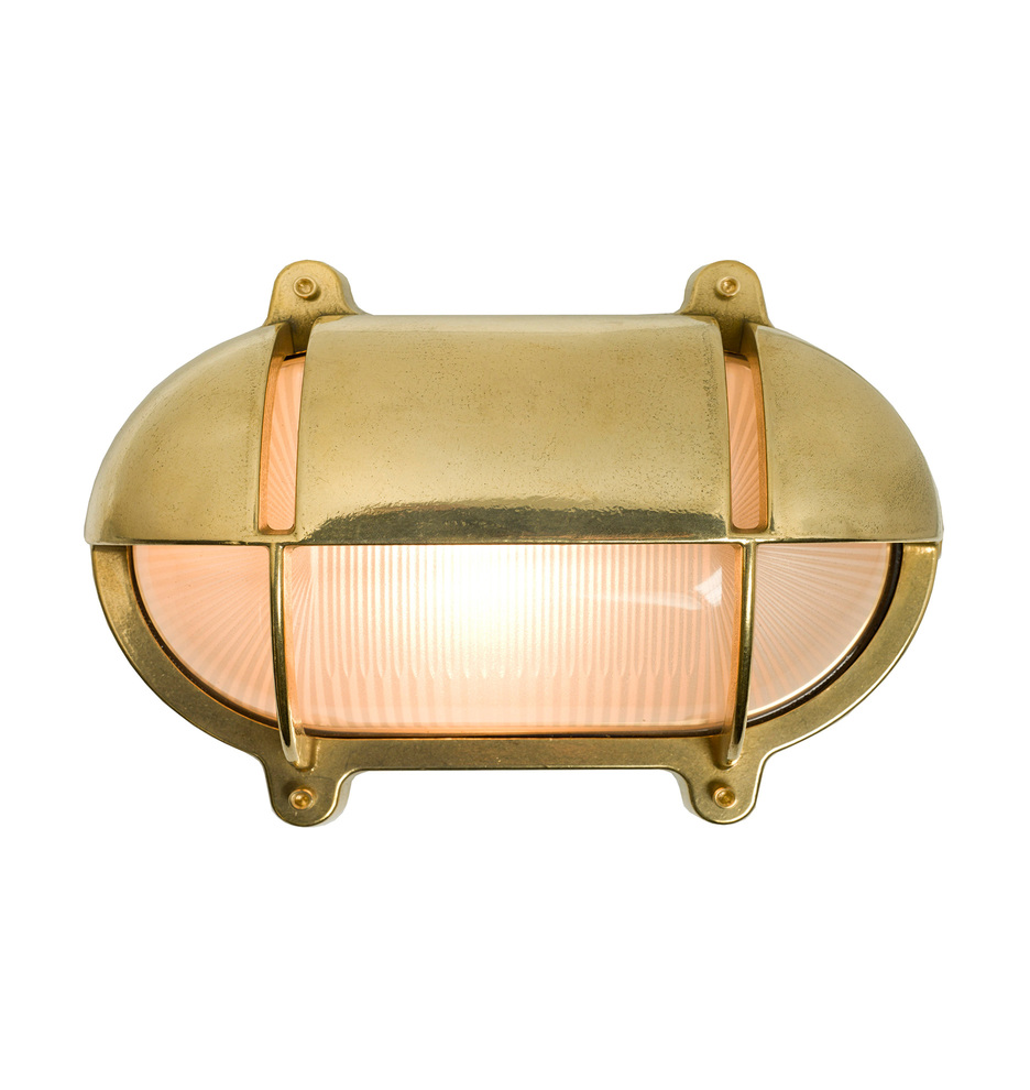
And I already ordered these beauties from Rejuvenation (so I could see the finish in person, mostly)! One above each cubby.
My original plan for flooring was to use either brick pavers or a brick-looking porcelain tile. Though I still like these options very much, I was worried there would not be enough contrast with the walnut for the unique graining of the wood to pop.
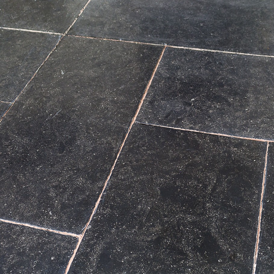
Then I discovered Belgian Bluestone. YES! I love the somewhat indoor/outdoor, rough-and-tumble quality of the tile, and that the more patina it gains, the better! It has areas that look gently polished – as if worn that way over time – and I love that. Very European, and will look like maybe it was always there (another trick I am trying in a few places…)?? Bring on the dirty, wet feet!
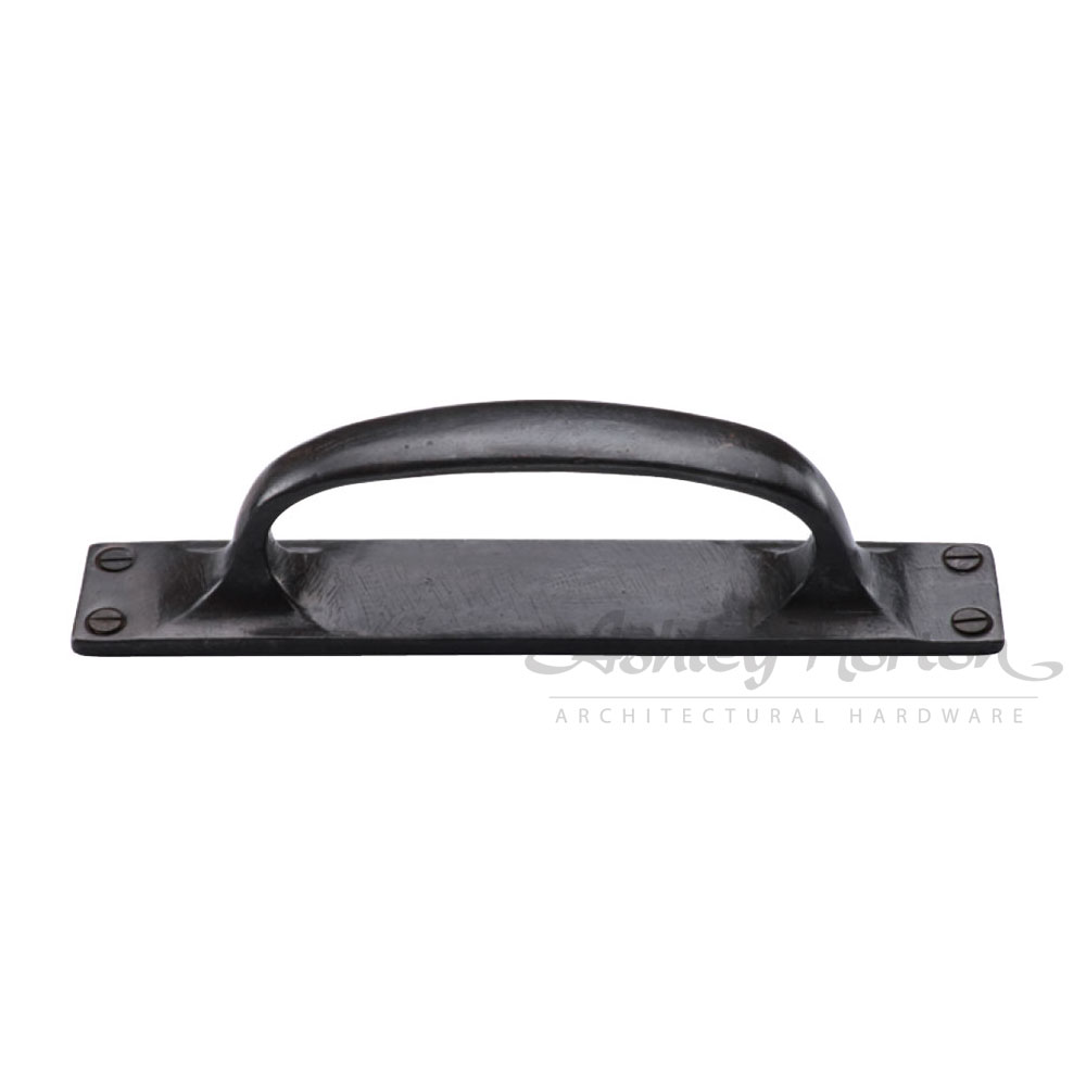
I am not 100% on this style (I always reserve the right to change my mind…because I often do 🙂 ), but I love the exposed screws and backplate of this solid bronze pull from Ashley Norton. It’s a solid MAYBE!
SO…here is where I really need some help – I feel like the wallpaper decision is really critical to the way this room will look and feel. I am questioning my original instinct to do the navy on gray, and being tempted by the fruit of another!

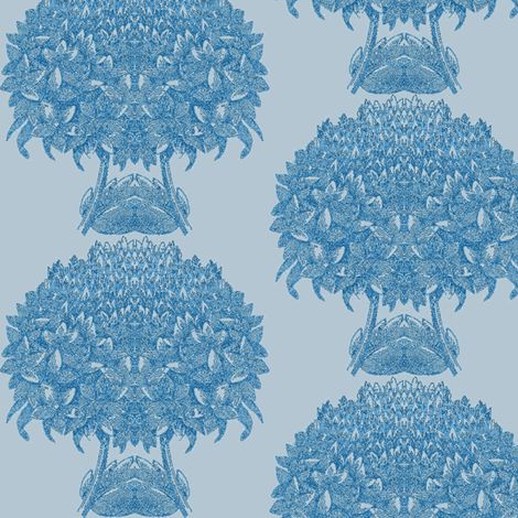
Mudroom scheme with navy-on-gray wallpaper
Mudroom scheme with gray-on-blue wallpaper
Note that the original, navy-on-gray scheme also incorporates window trim painted bottle green. I thought it made sense to keep it white, or possibly color match it to the blue ground color in the case of gray-on-blue.
Or should I even consider a super-sized version of this ‘standard’ colorway? Ay dios mio.
It’s all hard a little to think about when the current situation looks like this, and I just learned my kitchen is nearly a foot shorter than I thought it was going to be. Hmph….
Any and all opinions and feedback are very much needed – please share your comments!!