

As a color-oriented decorator, I tend to see color first and other details like line, scale, proportion, etc. after that initial impression of hue. Since color is an important element in retail and showroom design, it was a pretty good bet we’d see some great combinations and palettes at High Point Market. And we did.
My very first stop was a show-stopper – the Currey & Company showroom. This was what greeted me at the door.
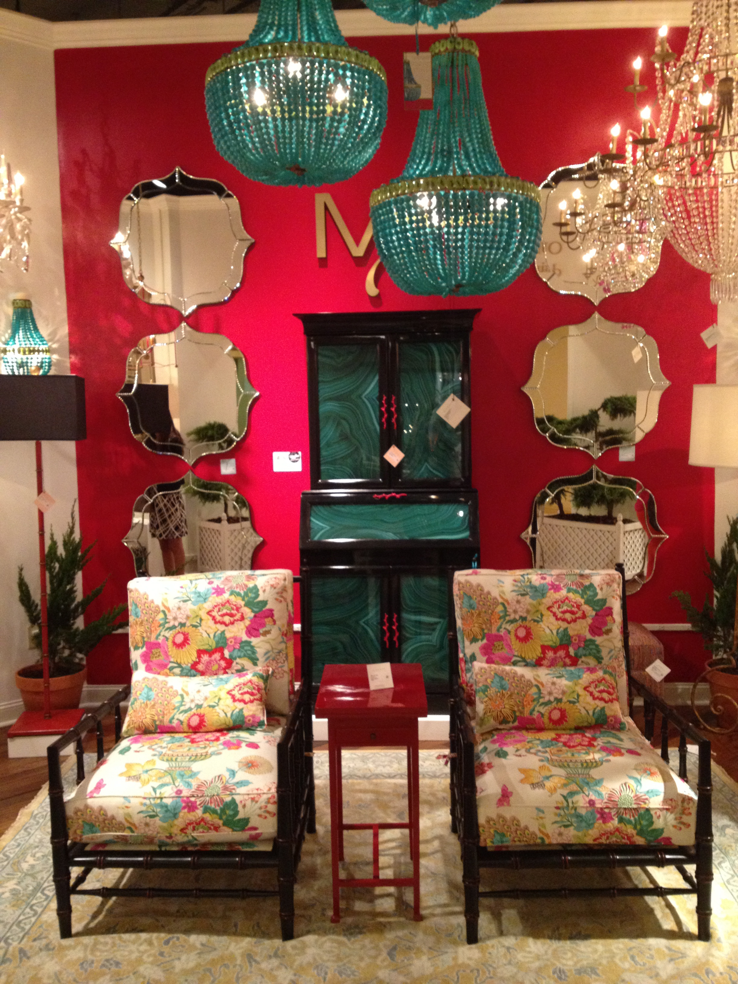
Let’s see, we’ve got lacquer, malachite, lacquered malachite, a bevy of their eponymous beaded chandeliers (I especially liked a version with cloudy white beads, not shown). Pantone color of the year Emerald green was an important color in this showroom, and others, but we didn’t see too many walls painted Emerald. Green is my favorite color, so I was very happy to see it pop up again and again at Currey & Co.
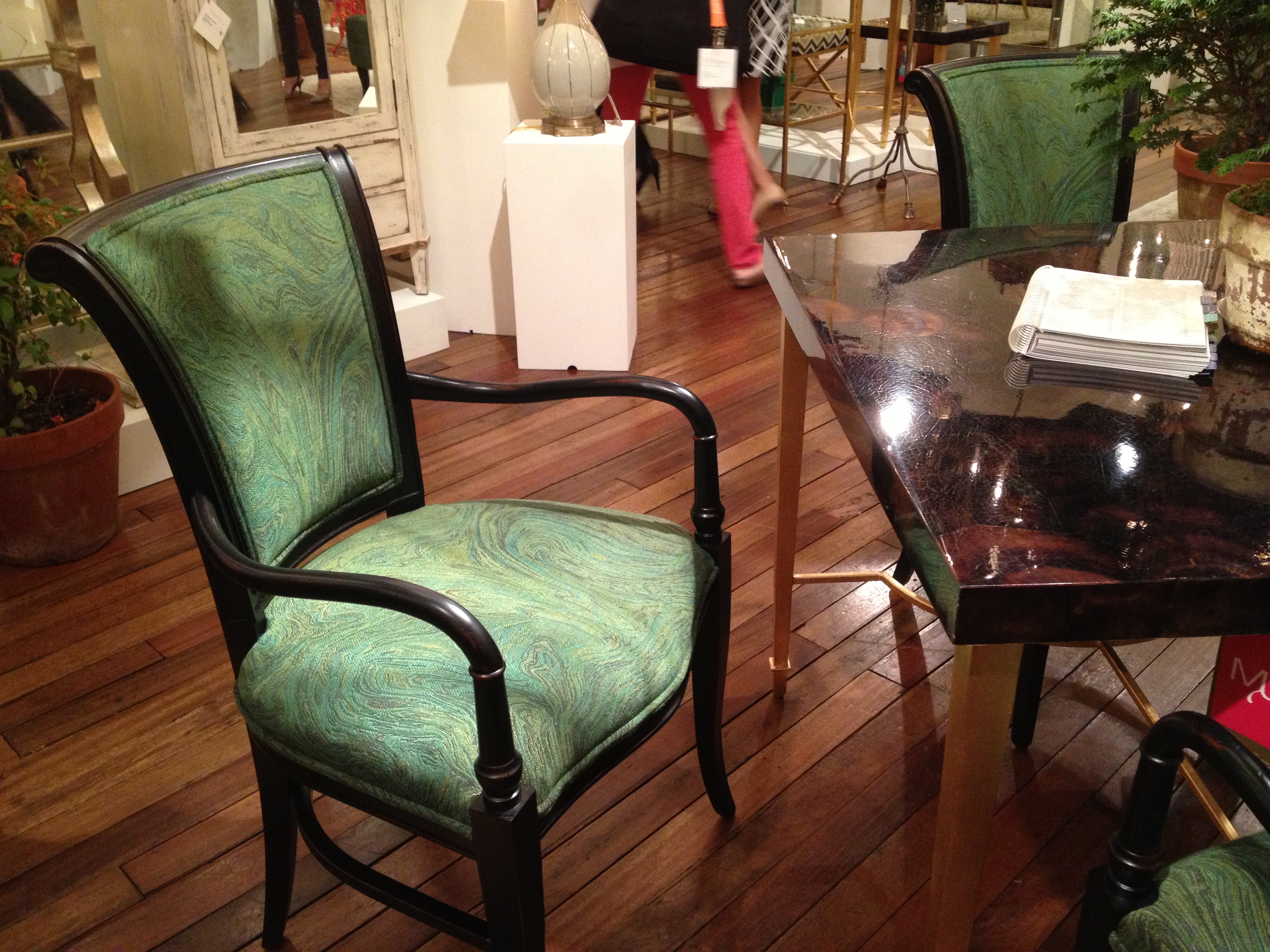
Like this swirly, twirly green upholstery on a fabulous modern interpretation of a Regency dining chair. This was a popular fabric at market this spring, making an appearance in many showrooms in a variety of colorways.
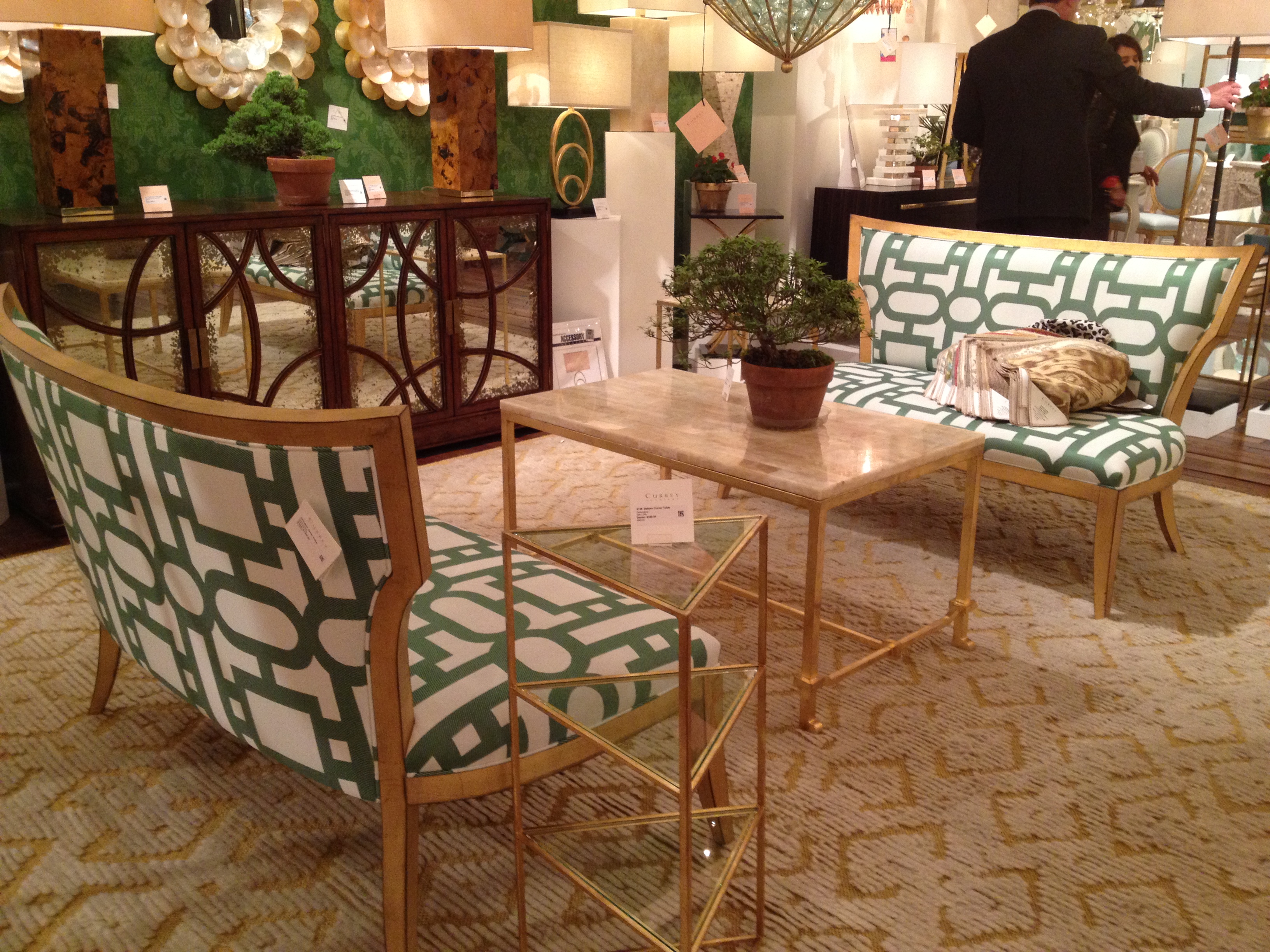
Here was one of the rare green walls, accompanied by klismos style settees in a very fun large scale, contemporary trellis pattern in emerald and white. White + Green + Gold = YES. Thank you, Currey & Company for representing Team Green so well!
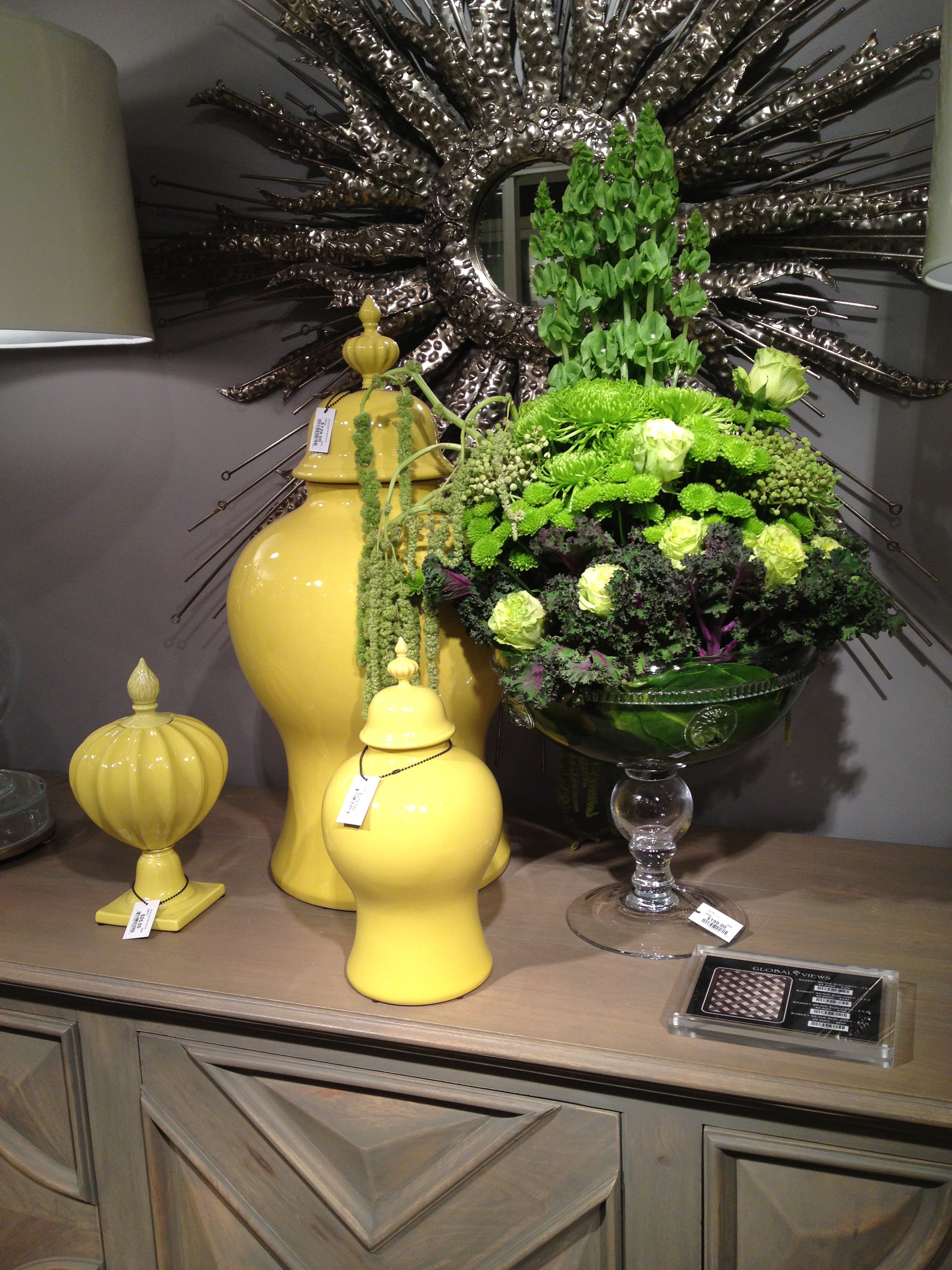
Global Views was also feeling the green (not to mention just about every other color in their ginormous showroom)…
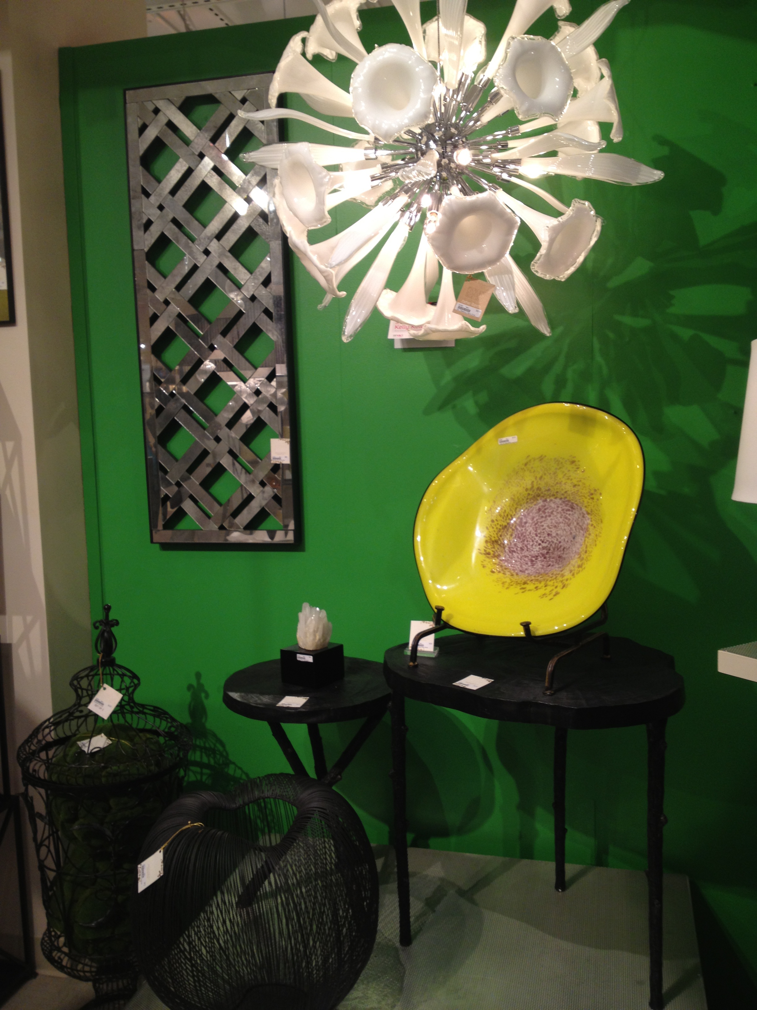
Cyan Design used green as a rich, saturated backdrop for its stunning gleaming white trumpet flower chandelier.
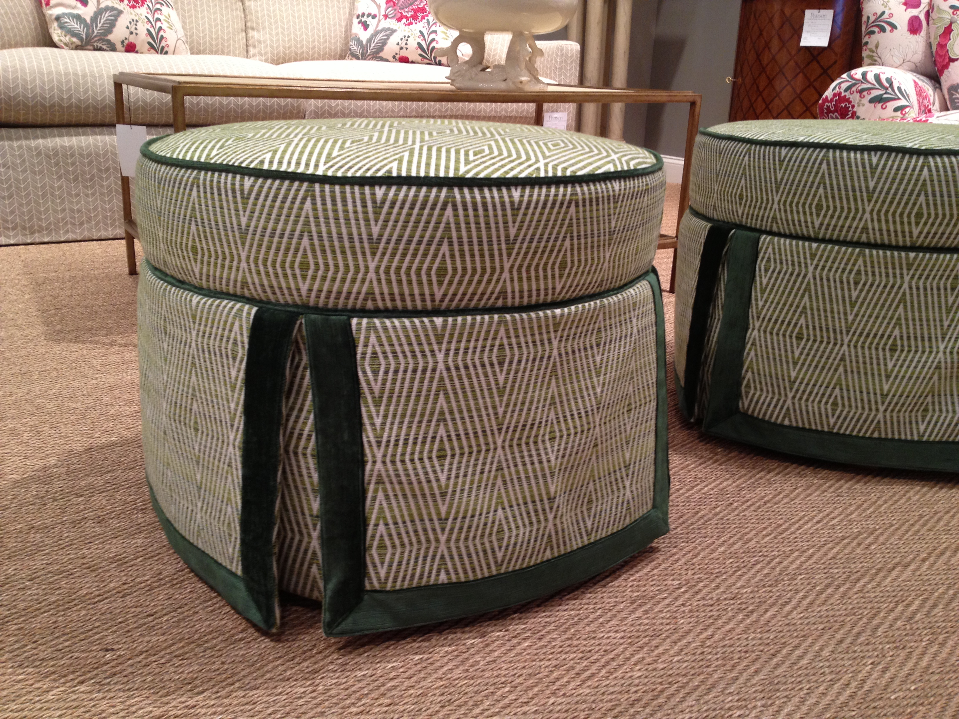
Pearson featured this lovely round ottoman with dark emerald velvet welt and border. I could see this as a fabulous accent piece in both traditional and transitional interiors – they’re especially lovely as a pair.
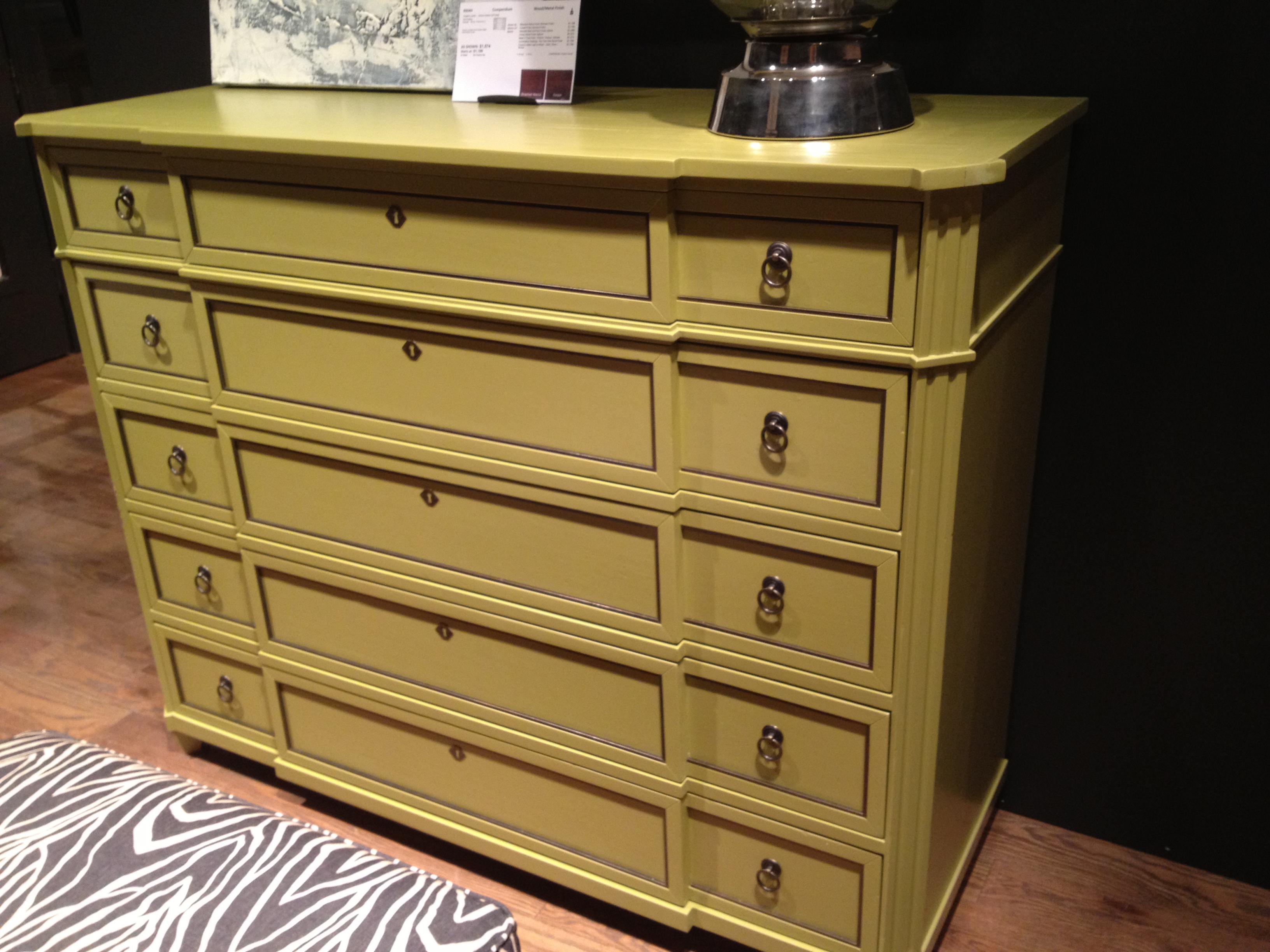
I spotted two wonderful green case pieces at Vanguard Furniture. The first is a contemporary breakfront chest with a sort of Mountain Dew-esque painted finish. I love both the color and the proportions of this piece.
And this small Kelly green chest would make a great color statement in a foyer or as a bedside chest with preppy hotel stripe bed linens. Sometimes you just want to keep it simple and let the color do the talking…

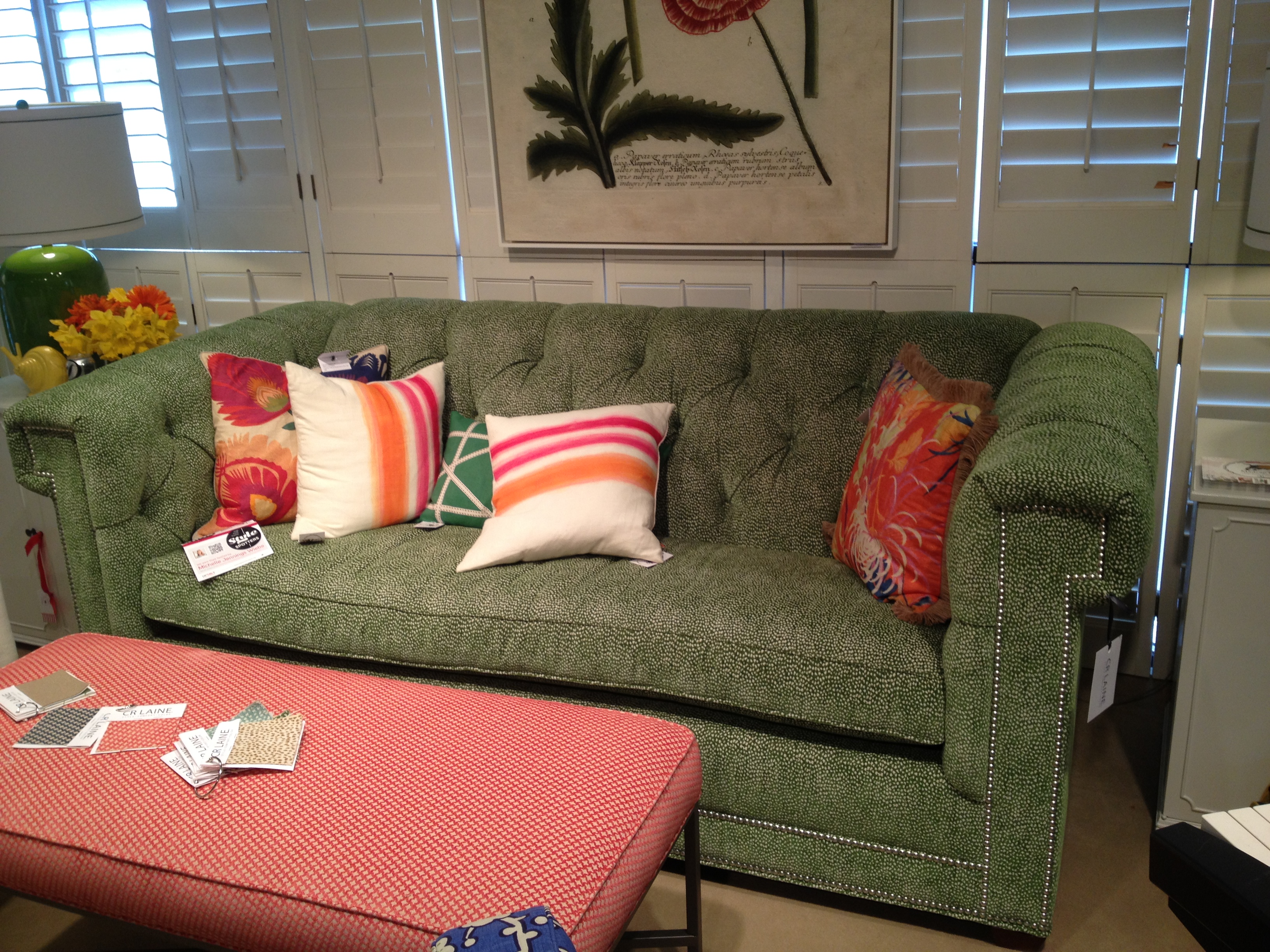
CR Laine was on board with the green trend, as well. Their Chesterfield style sofa is shown here after a long day of pillow rearrangement and “sit tests,” still looking spectacular in a wonderful mini leopard dot velvet – which I think is a great way to incorporate a ‘fun’ pattern and color (in super small scale, but a big dose of it).
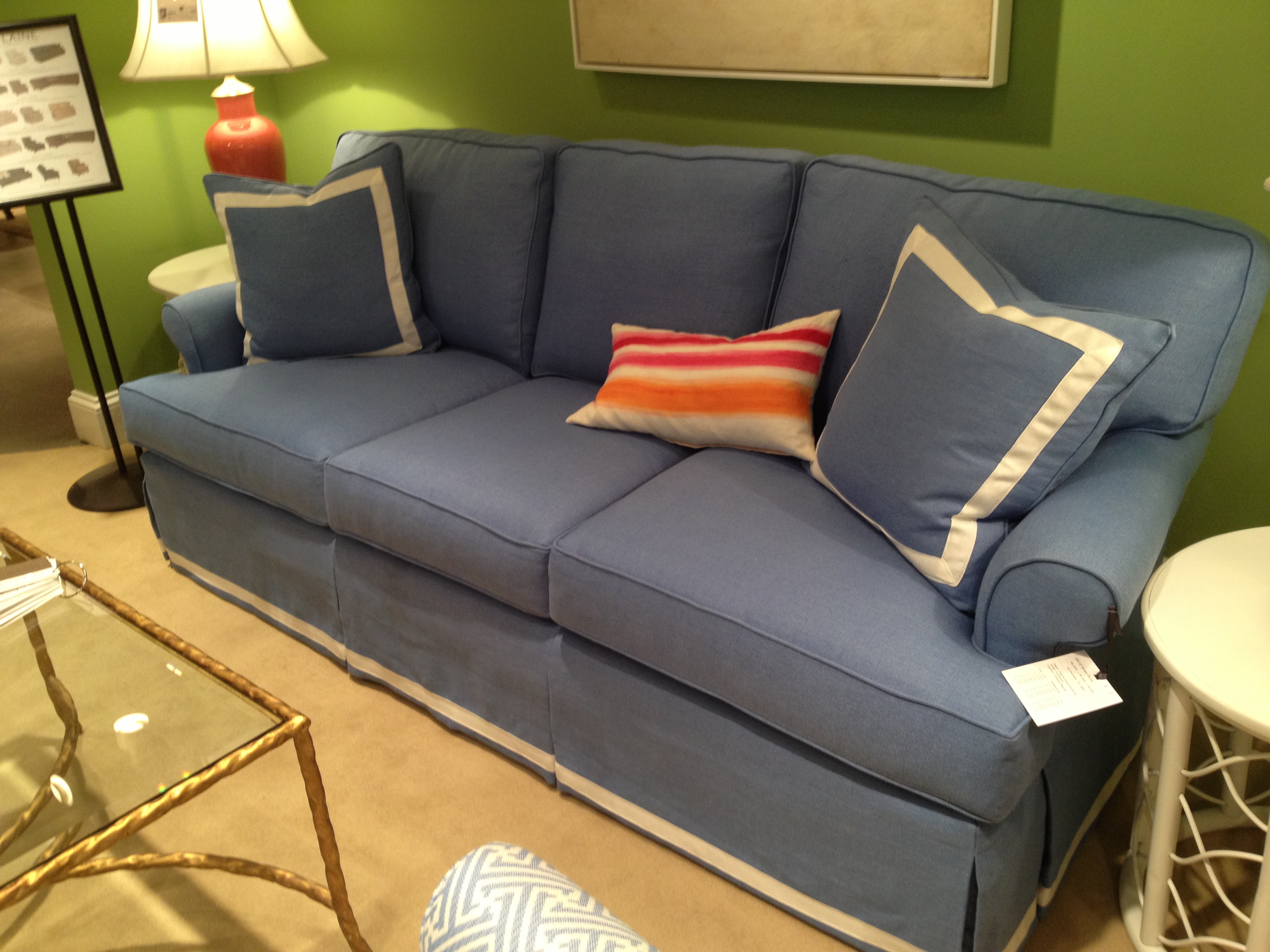
Saturated, limey green walls provided a bright and cheerful background for blue furniture in the CR Laine showroom, as well. This classic color combination of blue and green will never go out of style, and you can put together virtually any green and any blue and it just works.

I know I’m probably not supposed to have a favorite color, but I can’t help professing my love for green. It’s the color most of us see when we look out our windows (at least, in the spring and summer!), and it seems only natural to me to bring it indoors. How do you feel about the GREEN? And how do you use it in your home?
Related articles:
Family-Friendly Finds at High Point Spring 2013 Market
Quinlan’s Yellow Submarine Nursery