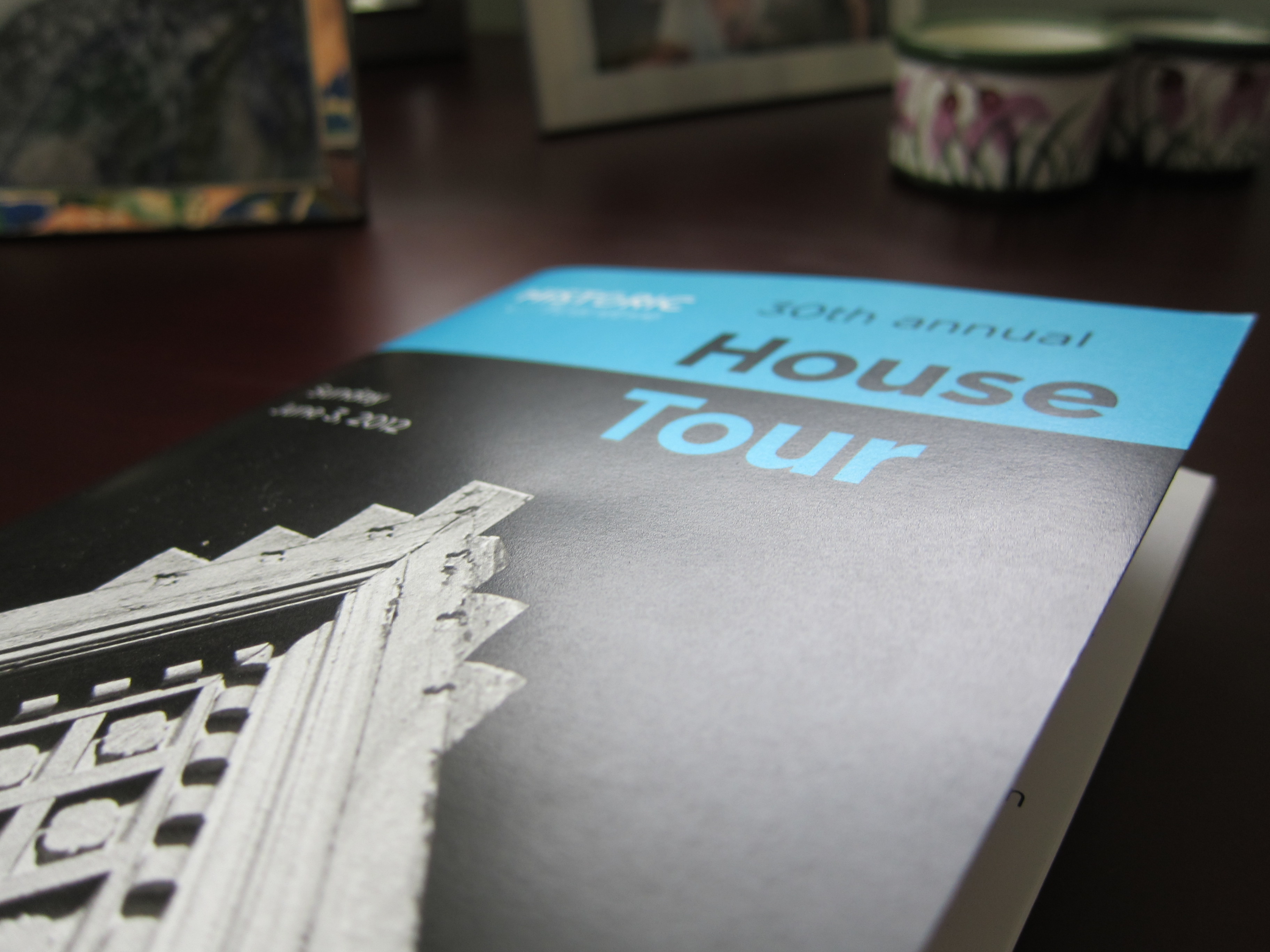
This past Sunday, I attended my first Newton House Tour – the ultimate in real estate voyeurism, right here in my adopted hometown in Massachusetts. This year’s tour, the 30th annual put on by Historic Newton, featured eight distinctive homes, some new, some old, and some somewhere in-between.
Since the tour featured private homes not on the market for sale, interior pictures were prohibited, but I wanted to share a few snapshots of the exteriors of the homes I visited, as well as some overall lessons and realizations from the day. I should also now mention that I wimped out and only went to four of the eight houses. I guess that’s what happens when you have a baby (who was a perfect angel while touring the houses in daddy’s arms).
An expanded and updated Newton Corner vernacular farmhouse was our first stop (the addition of the wraparound porch gives it a Victorian feel, I think). Needless to say, there is not a lot of farming happening in Newton right now…this lot is now approximately the size of a postage stamp, like most others in the area.
This gut renovation and expansion of a craftsman colonial revival in Newton Corner was the highlight of our abbreviated tour. I just love the burgundy-painted windows – a clever way to introduce a bit of color in lieu of the expected way (painting the trim).
One of many handsome and enviable renovated Victorians on West Newton Hill. Please excuse the wonky camera angle! I am no one-shot wonder…
My final stop on the tour was also on West Newton Hill, this regal Tudor perched on a hill and nestled into a rock outcropping. The wrought iron lantern and scrollwork made for a grand entrance to this home, owned by an interior designer and her family.
Without referencing specific houses, and in no particular order, here’s what I took away from the day:
- Harmony of architecture and interior design is paramount. Since my introductory classes in architecture 15+ years ago, I have believed that a house’s interior should honor its exterior. Which is not to say that if you have a craftsman style bungalow, you must fill the place with Stickley furnishings. But I do feel that the most successful interiors demonstrated a connection with the architectural style of the home. On the other end of the spectrum, homes that have period-specific interior design that differs from its architecture, no matter how lovely in itself, make me uneasy. Just a personal “pet peeve.”
- Hire an architect for a major renovation of an historic home. It really makes a huge difference. The results can be spectacular. And do your own homework too. The homeowner was present at this particular house, and it was clear he had done his own research into architecture and interior design in the style of his home, and was likely able to guide the renovation in more expert fashion in partnership with the architect.
- Some of the best ‘art’ can come from outside. In one home’s kitchen, walls in the kitchen between the upper cabinets and countertop were punched through with two long picture windows, revealing a an intimate view of a tranquil and verdant rock garden outside (we’re talking a just few feet away). Who needs a tile backsplash when you can look at this, and bring in all that natural light? I wish I had a picture – it was stunning.
- Pay attention to the details. When a homeowner (/architect, /designer) was mindful of finishes like door hardware, views from one room to the next, taking advantage of unique features of the home, finding perfect light fixtures, etc., it really showed. Some of these details don’t have to cost a lot money, but they do require time and thoughtful planning.
- Beige can be beautiful. Some people really like beige. Or taupe, in this case. Many designers would shy away from a rigidly monochromatic color scheme, but one home that was professionally designed and decorated was particularly successful in making it work. The visual interest in this particular room was created through incorporating a variety of textures and subtle patterns, and a thoughtful eye toward natural and artificial lighting of the space. “Pops” of color in the space in question would have spoiled the formal, yet cozy effect.

