I have to admit – when it comes to color, I am a bit of a dummy myself. After all, I am but a student of design, with my required color theory class still ahead of me (this summer – can’t wait!). I’ve certainly been guilty of timidity when it comes to using color, and combining complementary colors from different parts of the color wheel.
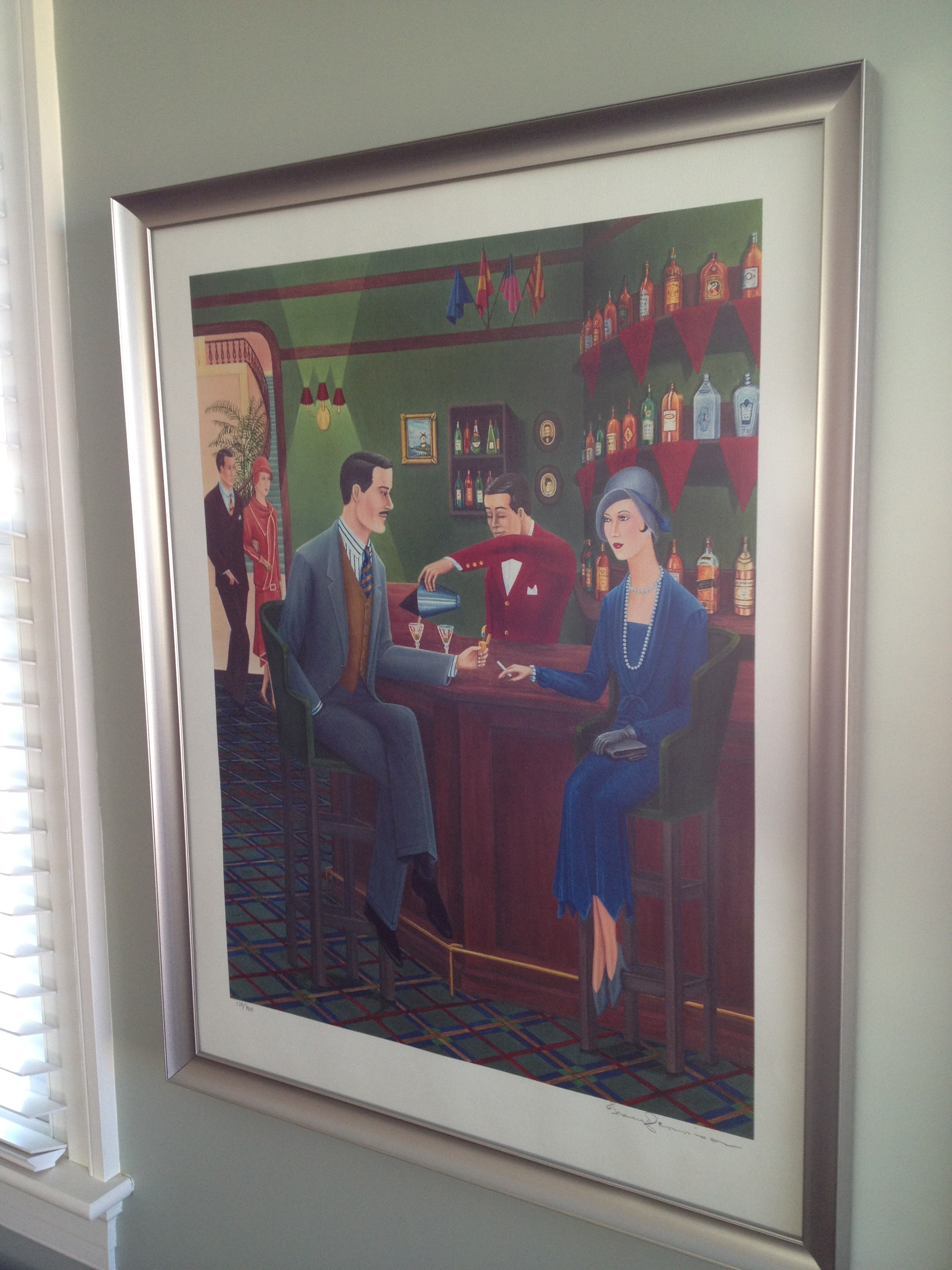
What I’ve had success with in my own home is creating color palettes based on a single object – often a prominent feature or focal point in a room, but most importantly, something that I absolutely adore. For example, in my family room I have a deco-style framed print that I love – a gift from my father-in-law. It’s not a valuable piece, but I love the elongated lines, and of course the colors – especially the brooding green on the walls. Yes, it bugs me that the woman is smoking, but I this is a scene from the 20s when most people didn’t know better :).
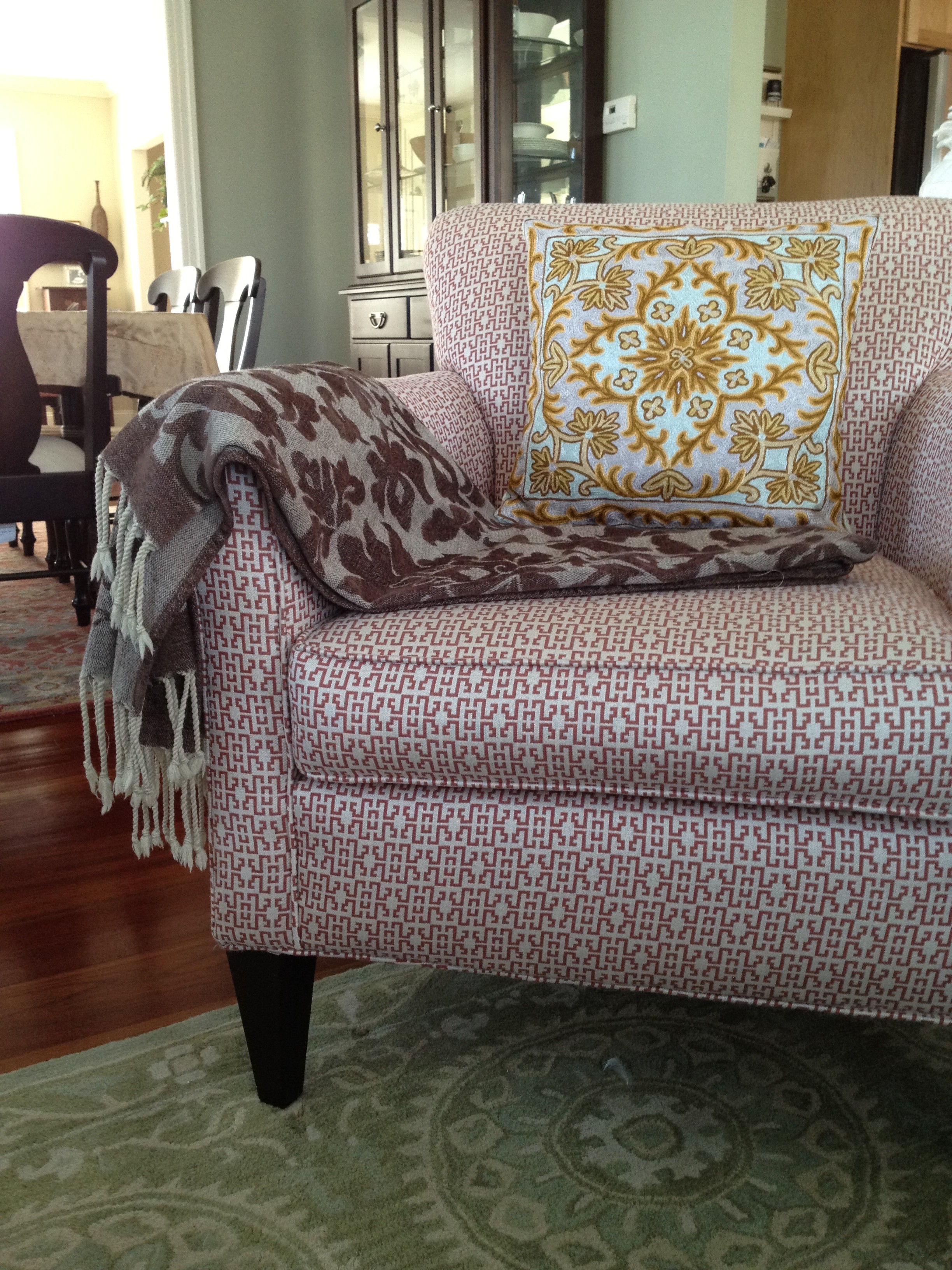
I’m not going to post pictures of the entire family room, as I’ve fallen out of love with my worn cocoa microfiber sofa, but here is an example of how the color palette translated into furnishings I don’t hate – all derived from the print.
Note that I’ve taken liberties with shades, but it is working, in my opinion. I also tried to bring in some strong (but not crazy) patterns that would both echo (armchair), and contrast with (rug, pillow, throw) the angular, linear feeling of the print.
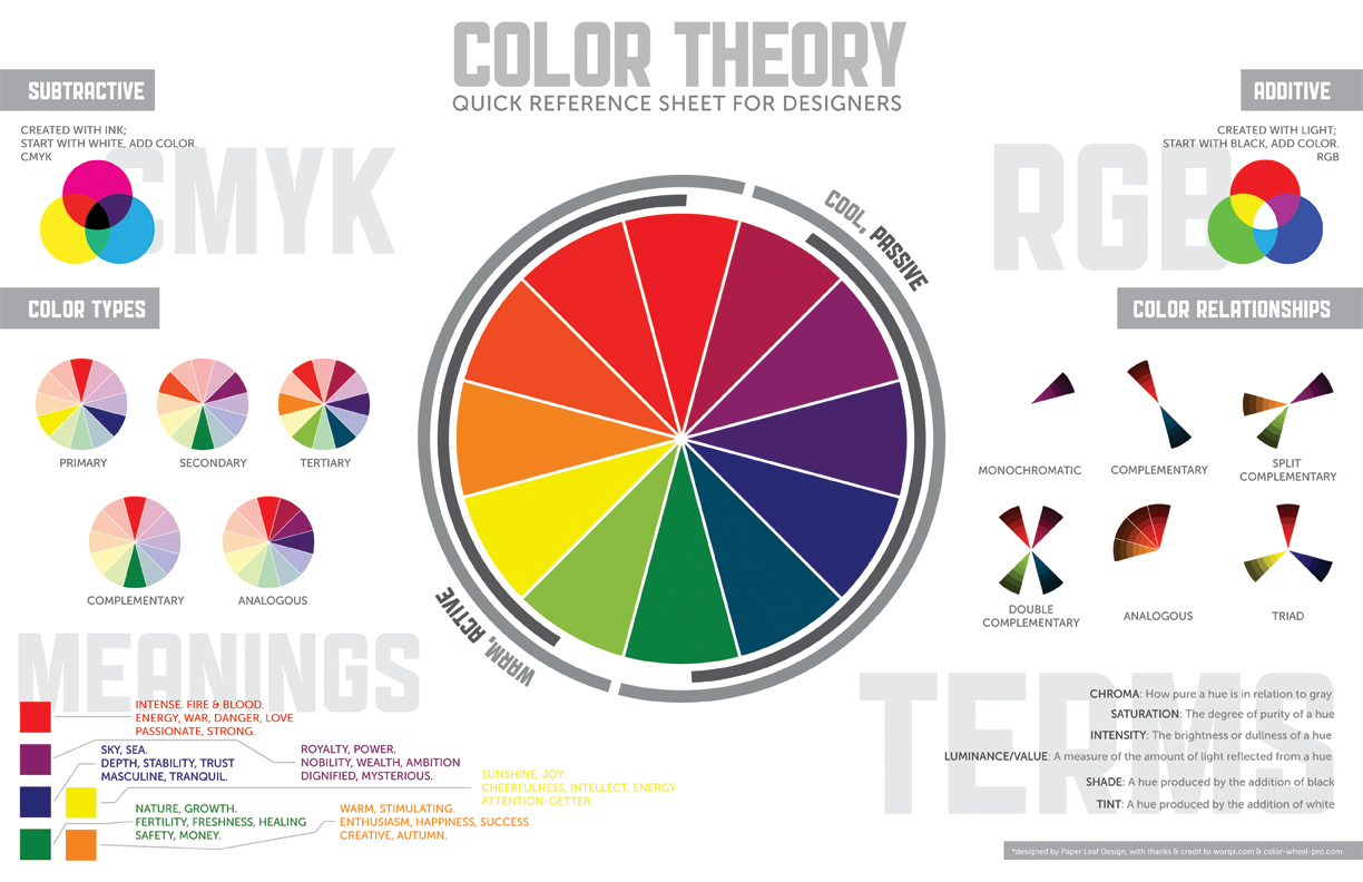
Apartment Therapy has a great piece on the language of color, which I highly recommend if you’re a “dummy” like me and want to experiment a bit in your own home. It includes this great quick reference chart for designer, from Paper Leaf, available on paper (duh) or as a screen wallpaper for your computer.


