Yesterday, I finalized the paint colors for our entire house (the new one under construction), after weeks of agonizing over fan decks, large color chips, fabric swatches, and actual paint on the walls. I won’t bore you with the laundry list of all thirteen colors (fifteen if you count trim and ceiling), all Benjamin Moore, but I will tell a cautionary tale about picking a gray paint color for your home. It is not as easy as it sounds. I may have picked up a gray hair or two along the way, too!
 For our master bedroom, I had a very specific type of gray in mind for this room – a warm-ish medium gray to make this large-ish space feel a bit cozier. After much research, hemming and hawing, I landed on Castle Gate CSP-75. However, just to be safe, we tested a couple of other colors too – one with a bit more green, and one that was a little more taupe-y (more yellow).
Castle Gate went up first – looked pretty good. Then, Cromwell Gray HC-103, the one with more yellow pigment, right next to Castle Gate. Suddenly, my beloved color had turned PURPLE! When I held up my yellow fabric swatch (the accent color I’m planning to use in our bedroom), there was no doubt about it – that color was going to look purple purple purple, which is definitely not what I’m looking for in a room I will share with my husband. Cromwell Gray was not gray enough, though – too brown and too dark. Next came Storm Cloud Gray 2140-40. Great, moody color, but just a bit too green – I was worried my bedroom would be reminiscent of an army barracks. So, I reluctantly went back to the drawing board.
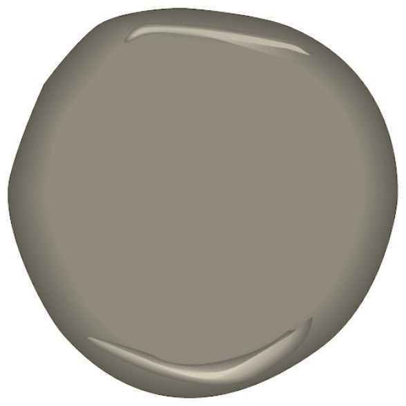
 I pulled a few more grays, and tried to err on the side of taupe, if that makes sense. You see, in the presence of yellow, the human eye wants to see its complementary hue (violet), and will essentially generate an afterimage of that hue that further alters the other colors present in the room. In other words, color is a very unstable beast, and grays are especially prone to this phenomenon. I needed to compensate for that instability by finding an even warmer gray with more of a yellow tone, so that the addition of a violet afterimage will essentially neutralize the gray (rather than make it take on a violet appearance). Ultimately, I landed on Smoked Truffle CSP-145. Funnily enough, the description of the color is “A complex green that brings flavor to any palette.” However, in combination with yellow, Smoked Truffle was the gray I was actually looking for.
To summarize, here are my real-world tips for picking the “right” gray – or any other paint color, for that matter, which may just help prevent an expensive mistake (one I came very close to making myself):
- Go to a paint store and get color chips – definitely don’t make a final decision based on something you’ve seen online (note how Castle Gray and Smoked Truffle look nearly identical on screen?). Get the biggest ones they have for colors you are considering
- Context is everything. Don’t select paint colors until you’ve thought through your overall color scheme, as well as color flow from room to room (especially if you’re repainting more than one room)
- Pull together your colors, fabric swatches, etc. and see how everything looks with a paint color you’re considering. This will help refine your shortlist
- Test test test! Ideally, you will have at least three colors to compare. Put them up on your walls, and live with them for awhile (if you can – I didn’t have this luxury, unfortunately!). Look at them in different lights (natural, artificial, and both), at different times of day. Hold up those fabric swatches and accent colors. Note any changes in their appearance as you do so. Lighting quality and quantity can drastically alter the appearance of a paint color
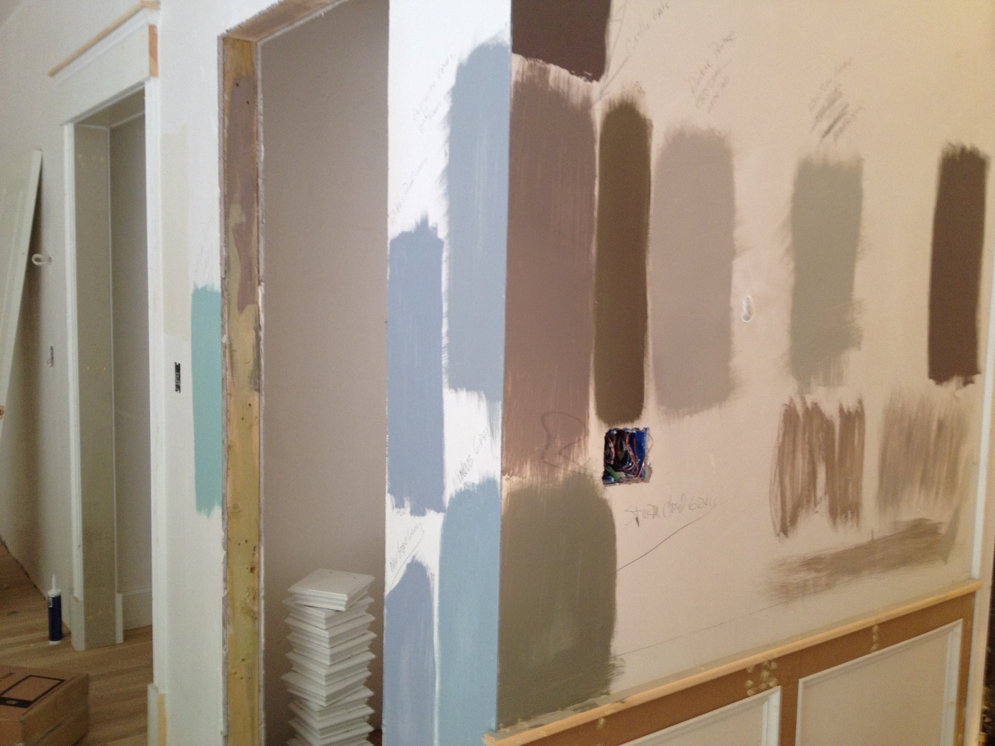
One final tip – whatever you do, if you’re working with pros, don’t tell a painter, decorator or designer you want a certain color (e.g. gray) and expect that you are envisioning the same color. Case in point – the photo below shows some of our test swatches, all of which are gray colors (with the exception of renegade Tiffany Blue strip on the far left, which I’m not using, by the way).


Who would think that trying to pick gray could be so complicated? Fun to test them out isn’t it? Gray-t post 🙂
Thanks, Donna – har har! I didn’t even mention the (different) grays in our master bath, my son’s room, basement bathroom, and our 3rd floor guest suite. Why do I torture myself so?
Pret Hotel Bucuresti
Hi there! I just wanted to ask if you ever have any problems with
hackers? My last blog (wordpress) was hacked and I ended up losing many months of hard
work due to no back up. Do you have any solutions to protect against hackers?
Can i see your finished pucture of the Smoked Truffle I’m in the same boat trying to find the right grey for our bedroom. Thanks so much