This past summer, a new client and her husband hired me to redecorate their family room and the adjacent eat-in kitchen. Their home is gorgeous – set back on a hill surrounded by mature trees, and renovated and expanded a few years ago. One of the big changes was the addition of a gracious family room, which opened up to the kitchen. Like many homeowners who undertake a large renovation project, they lost a bit of steam when it came to decorating and finishing the interiors. I was delighted when they called me to help them create spaces reflective of their taste and style, while also making them comfortable and practical for them, their three sons, and their adorable dog.
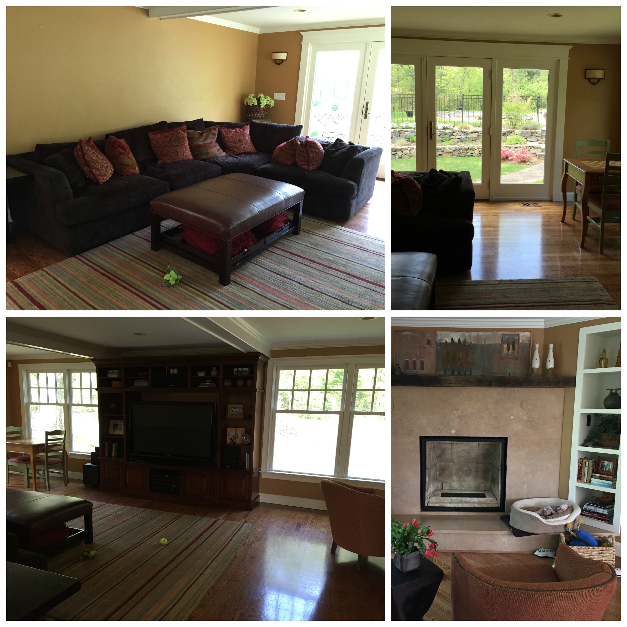
My client’s biggest complaint was how dark and small the family room felt – and how she never wanted to spend any time in there. At about 32′ x 15′, this should definitely not have been the case!
BEFORE:
It reminded me a little of a mancave – which is not too far-fetched, considering the male-to-female ratio in this house!
My mandate was to improve the quality and quantity of seating for both family time and entertaining occasions, to incorporate her preferred palette of warm, earthy hues in a much lighter way, and to make the room generally more interesting and stylish.
The AAAAHHFTERS…
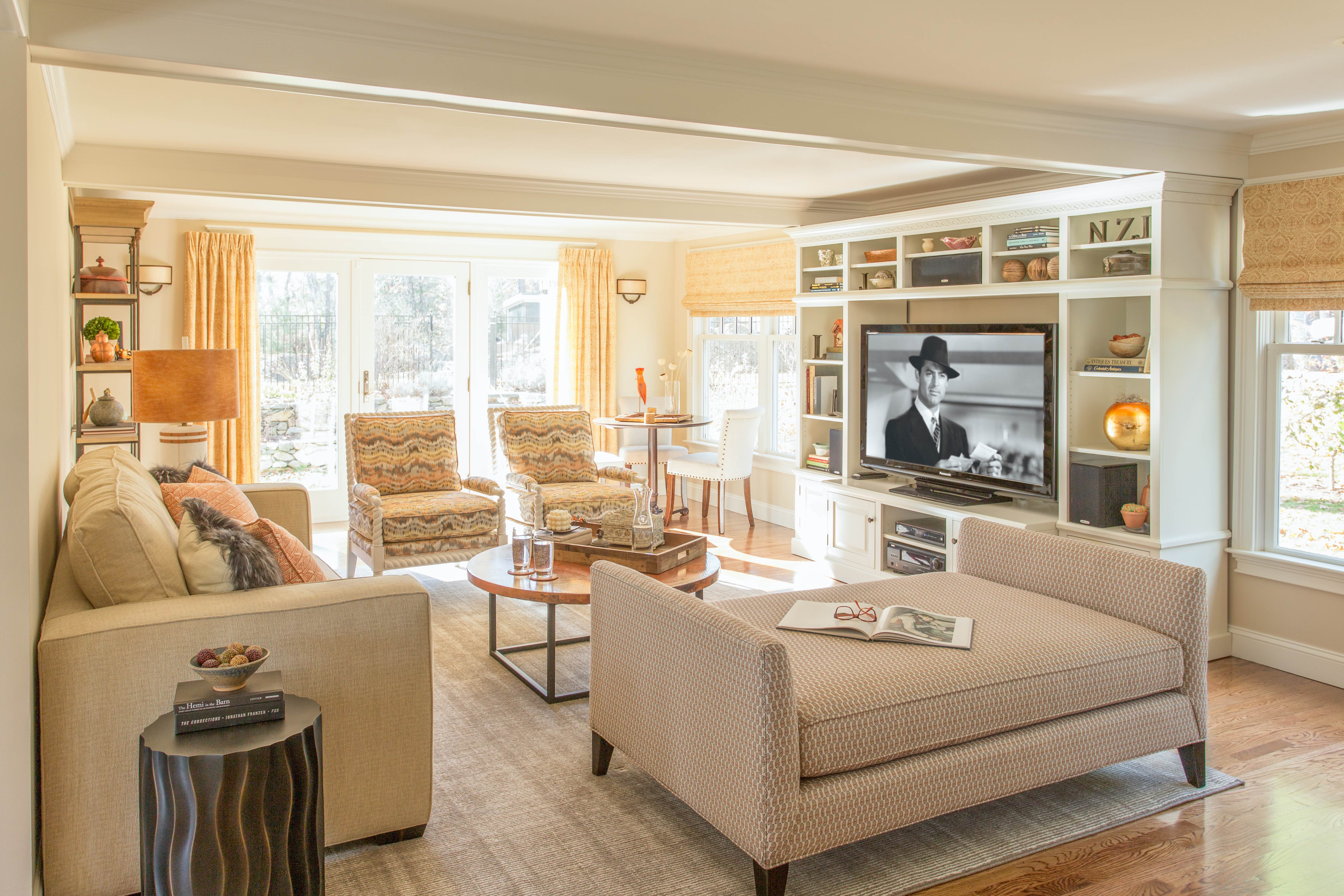
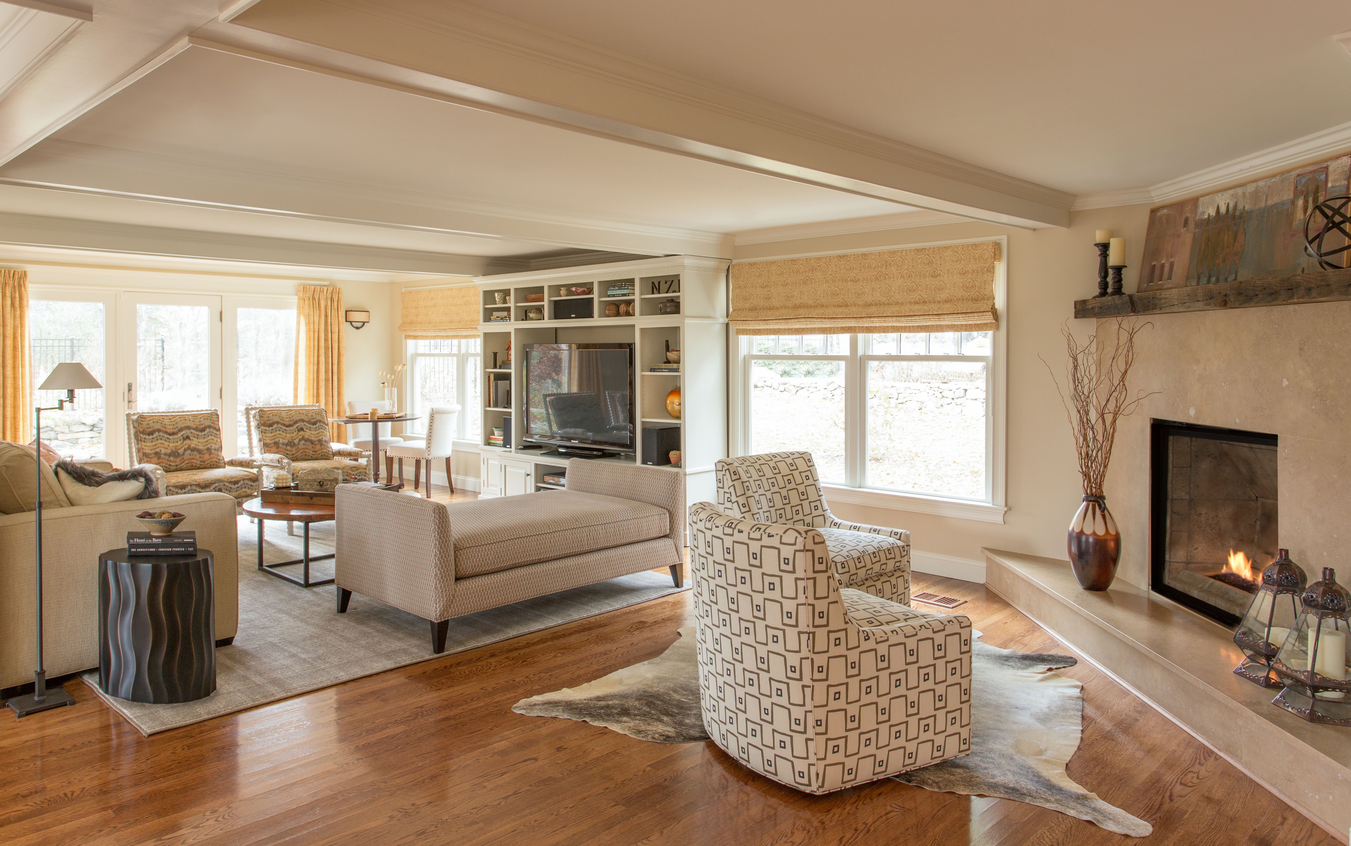
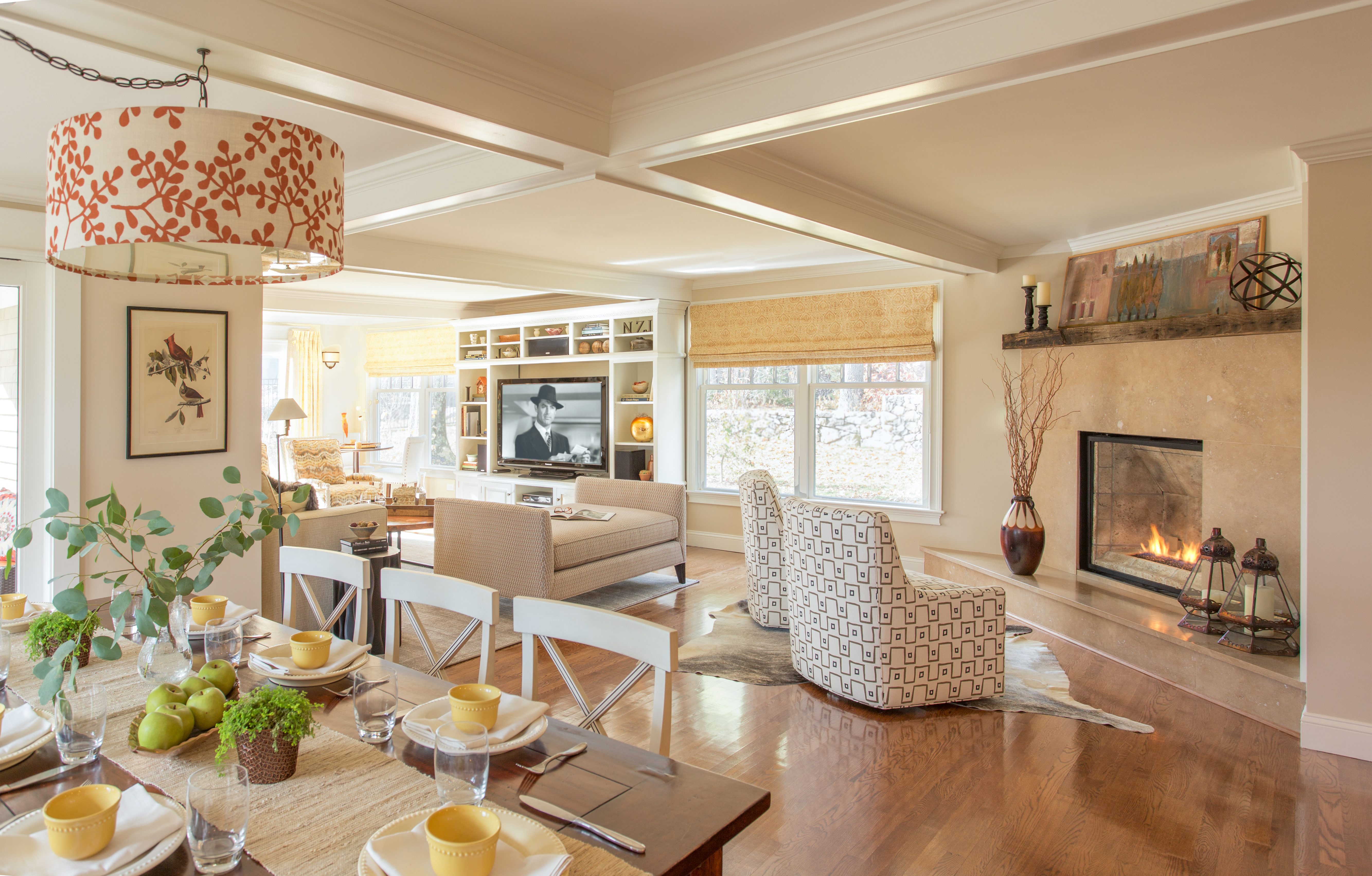
The addition of window treatments, lighter upholstery and, most definitely, fresh, light paint on the walls are a huge collective breath of fresh air. Orange, my client’s favorite color, is the star, but a heavy dose of light neutrals keeps it from overwhelming. And can you even believe that is the same media cabinet?? A big paint job, but so worth it – looks like built-in furniture, no?
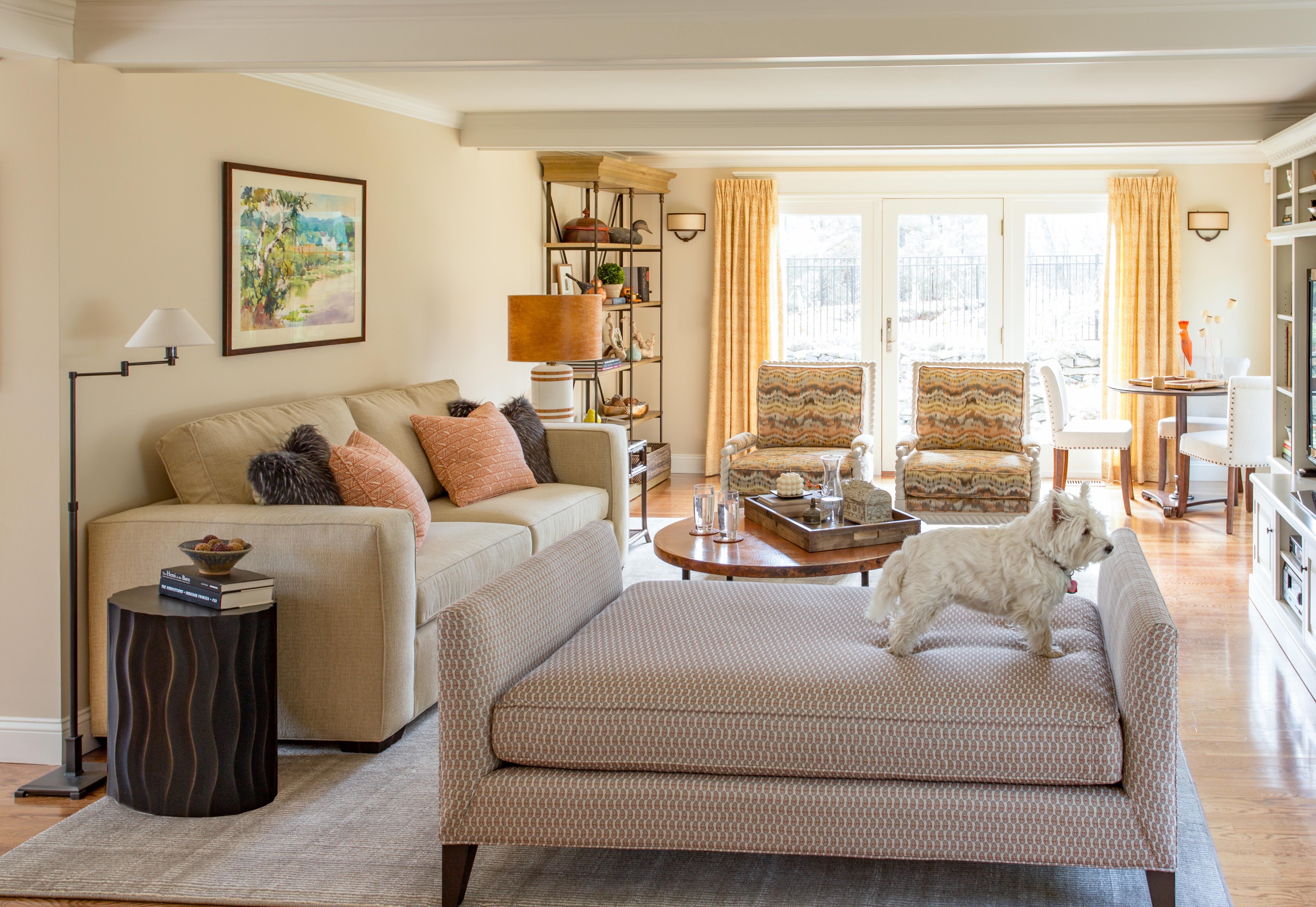
The CR Laine daybed in a custom length is a favorite hangout for the boys, the husband, and, of course, their Westie! By the way, the new paint color is Benjamin Moore Dulce de Leche.
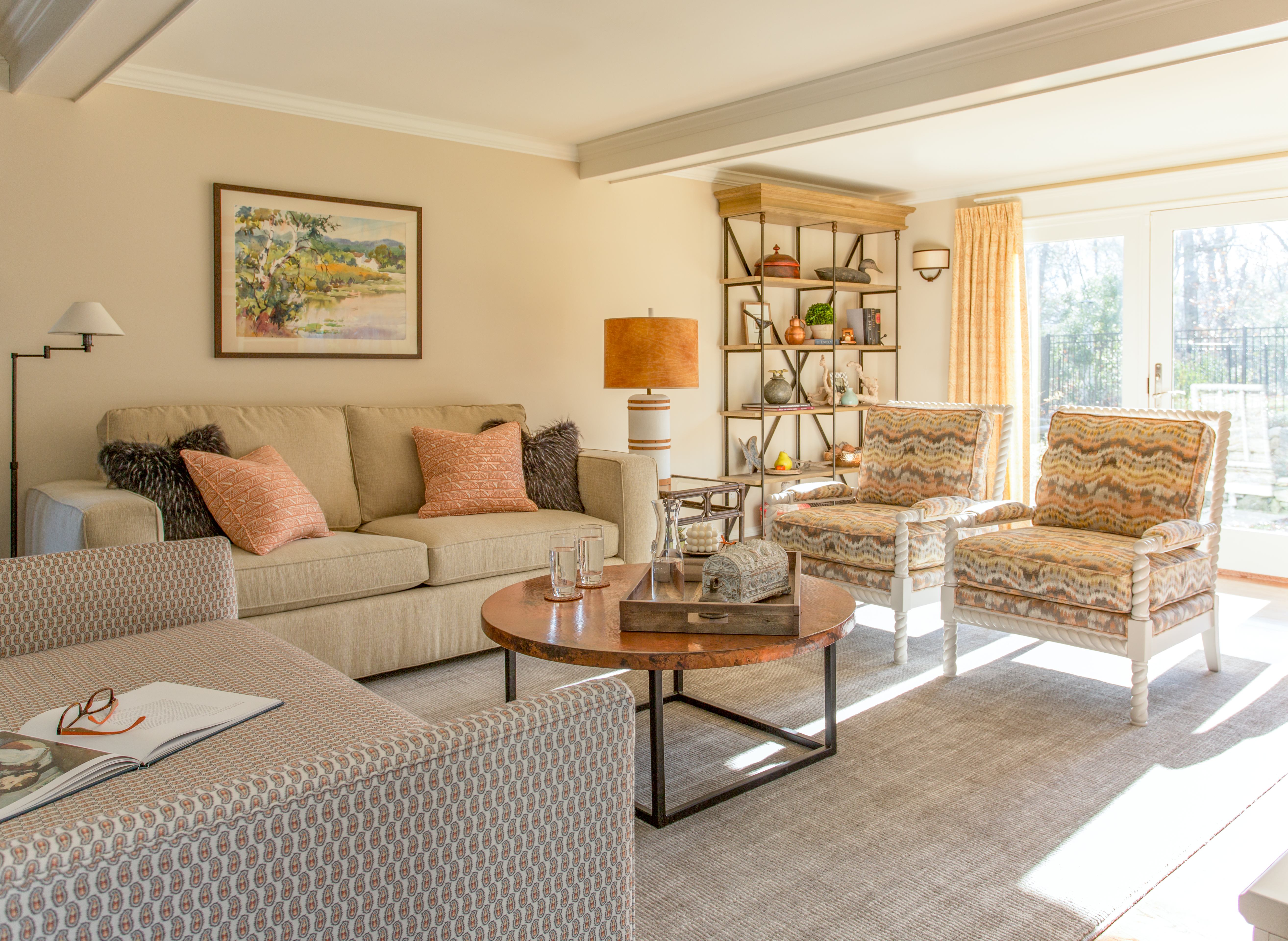
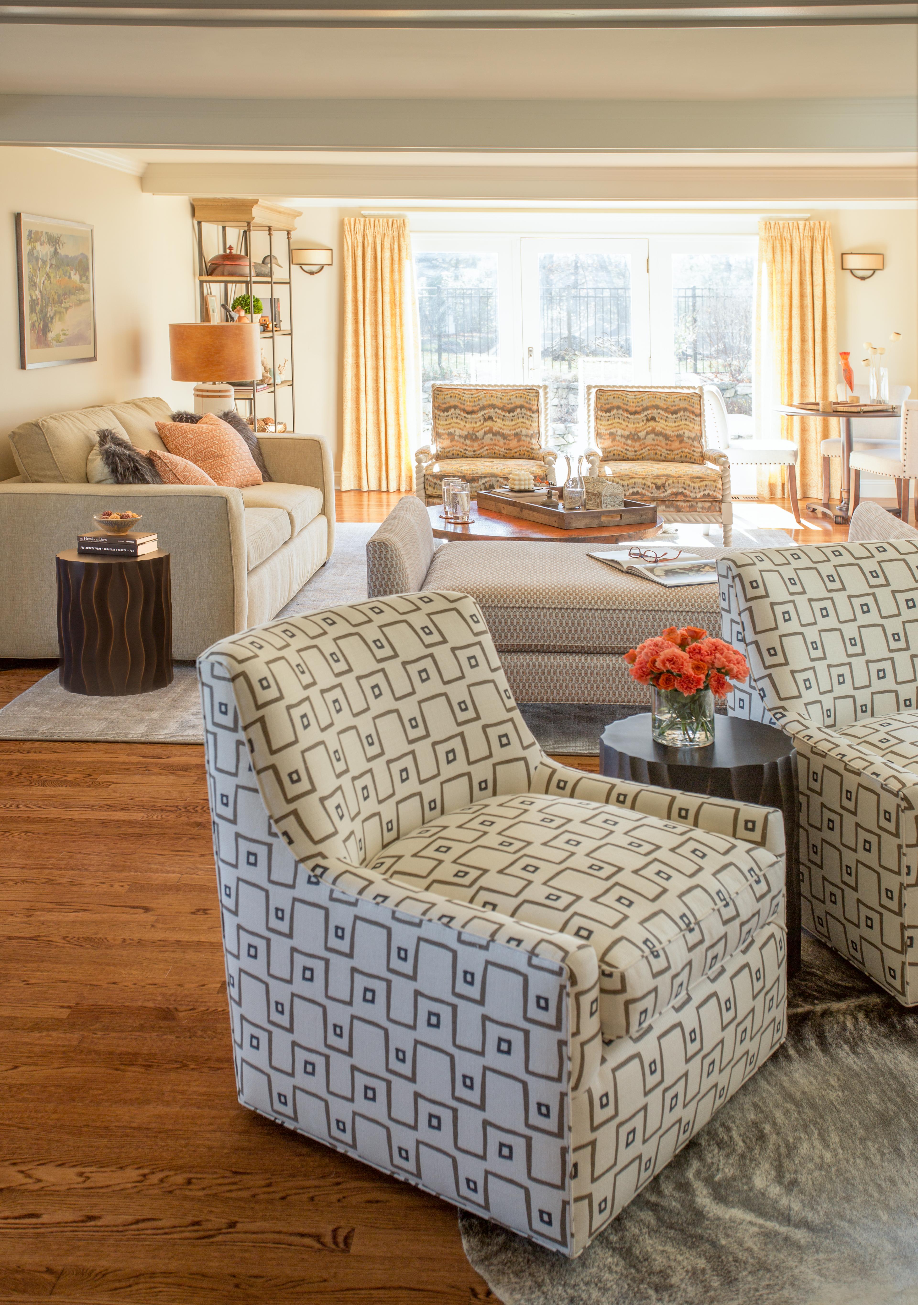
The addition of a variety of textures – the natural variegated plush wool rug, faux fur throw pillows, a leather lampshade, and a show-stopping copper top coffee table from Woodland Creek – add to the cozy, comfortable feeling. And the sofa fabric has already survived a red wine spill and an indigo dye stain from dark jeans. It’s from Duralee‘s Crypton Home collection, and it looks as good as the day it was unwrapped and moved in.
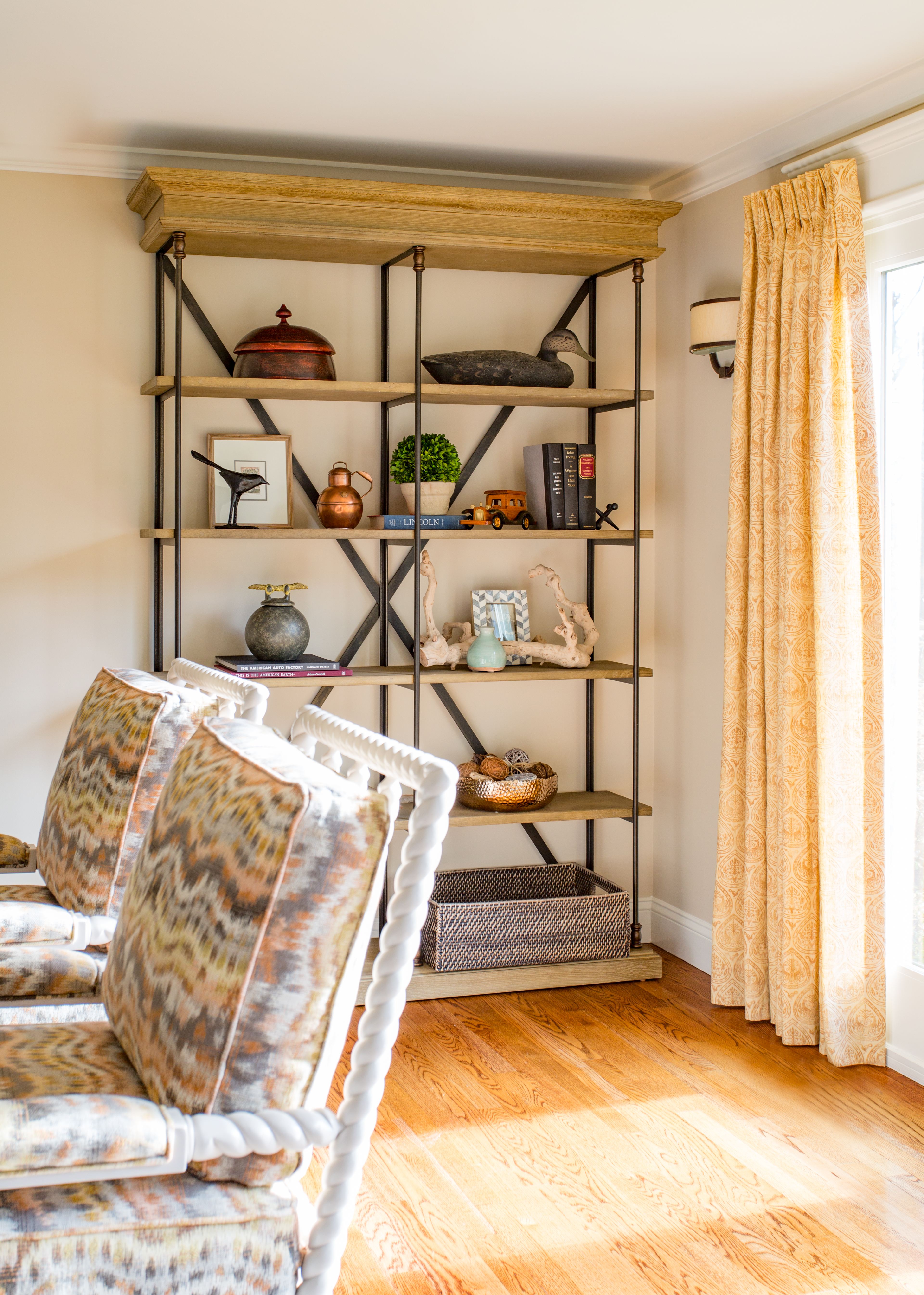
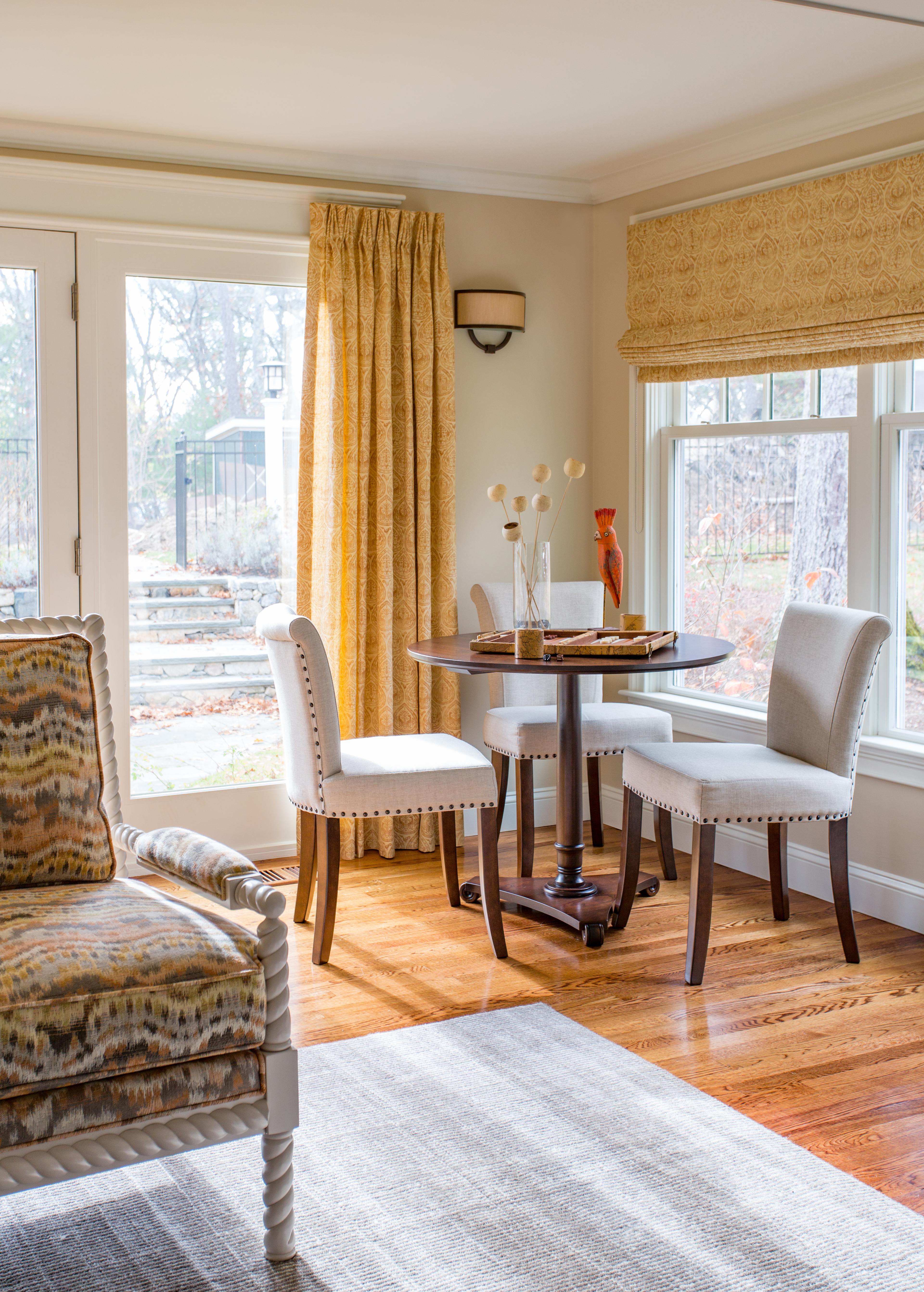
I absolutely love these rope twist chairs (a nice variation on the spool chair, I think!) from the Dana Gibson Collection at The MT Company, upholstered in a funky autumnal ikat from Robert Allen. We added a tall bookcase to help visually balance the media unit on the opposite wall, and to provide an additional opportunity for creative styling, and a bit of storage for the adjacent game table.
The boys love to play chess, backgammon and Othello in this cozy corner. I really love how the window treatments turned out; they soften the edges of this long, boxy space, and the Rose Tarlow print is heavenly!
This view gives you a better sense of the scale of the room. And a peek into my favorite part…
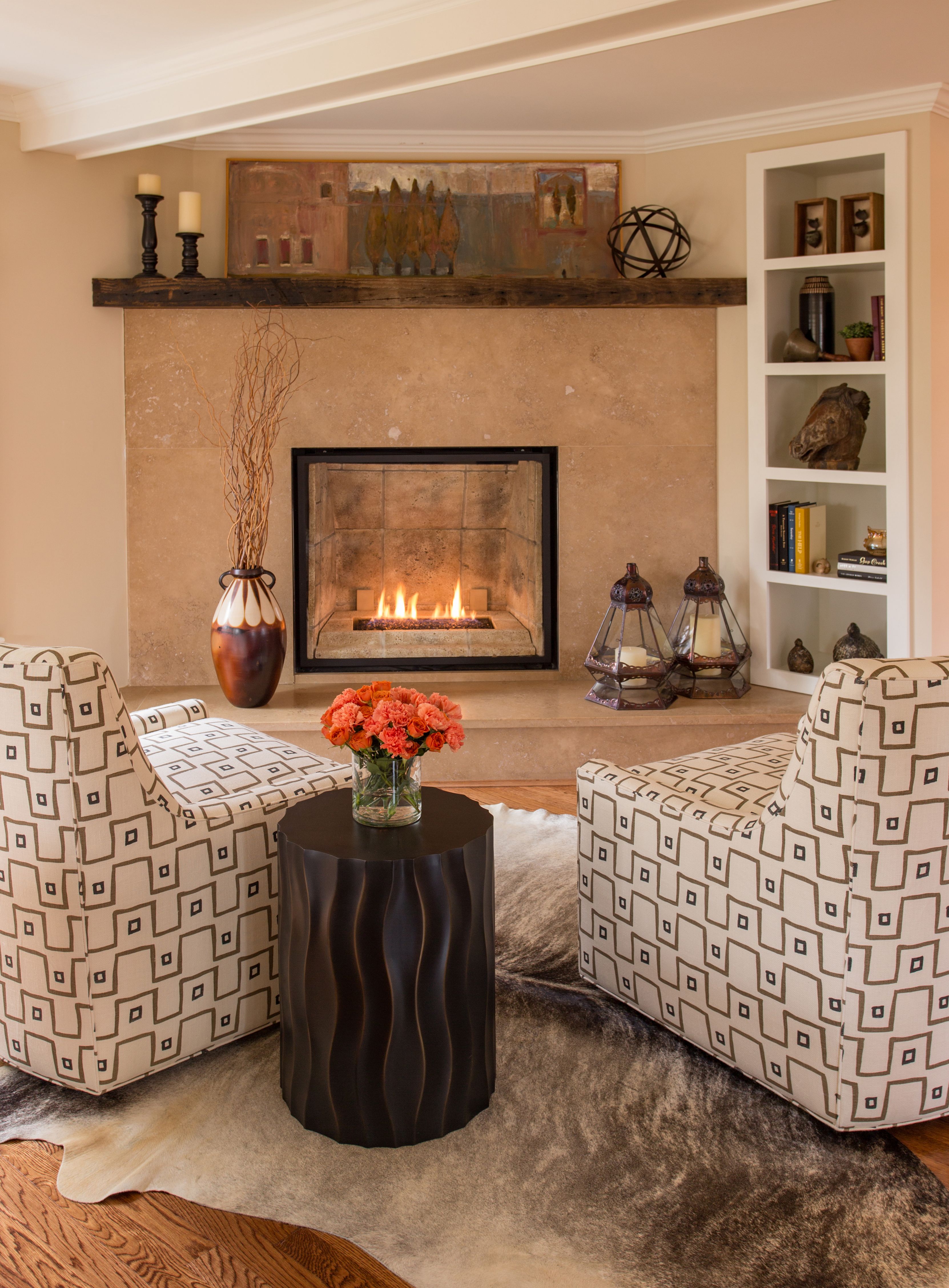
These custom swivel chairs are covered in Mally Skok‘s Kuba Cloth print, which adds a tribal flair to the room. Swivel chairs are really the ultimate in comfortable multi-tasking, and I’m using them in virtually every living or family room project these days. Here, they provide fireside seating that can easily spin around to face the daybed in the main seating area when the action is happening there – or the TV when the big game is on. Incidentally, that daybed can seat 4-6 people when both sides are used – an entertaining workhorse!
This is a favorite father-son hangout! I restyled the built-in bookshelves, mantel and hearth, but used many of the client’s existing pieces.
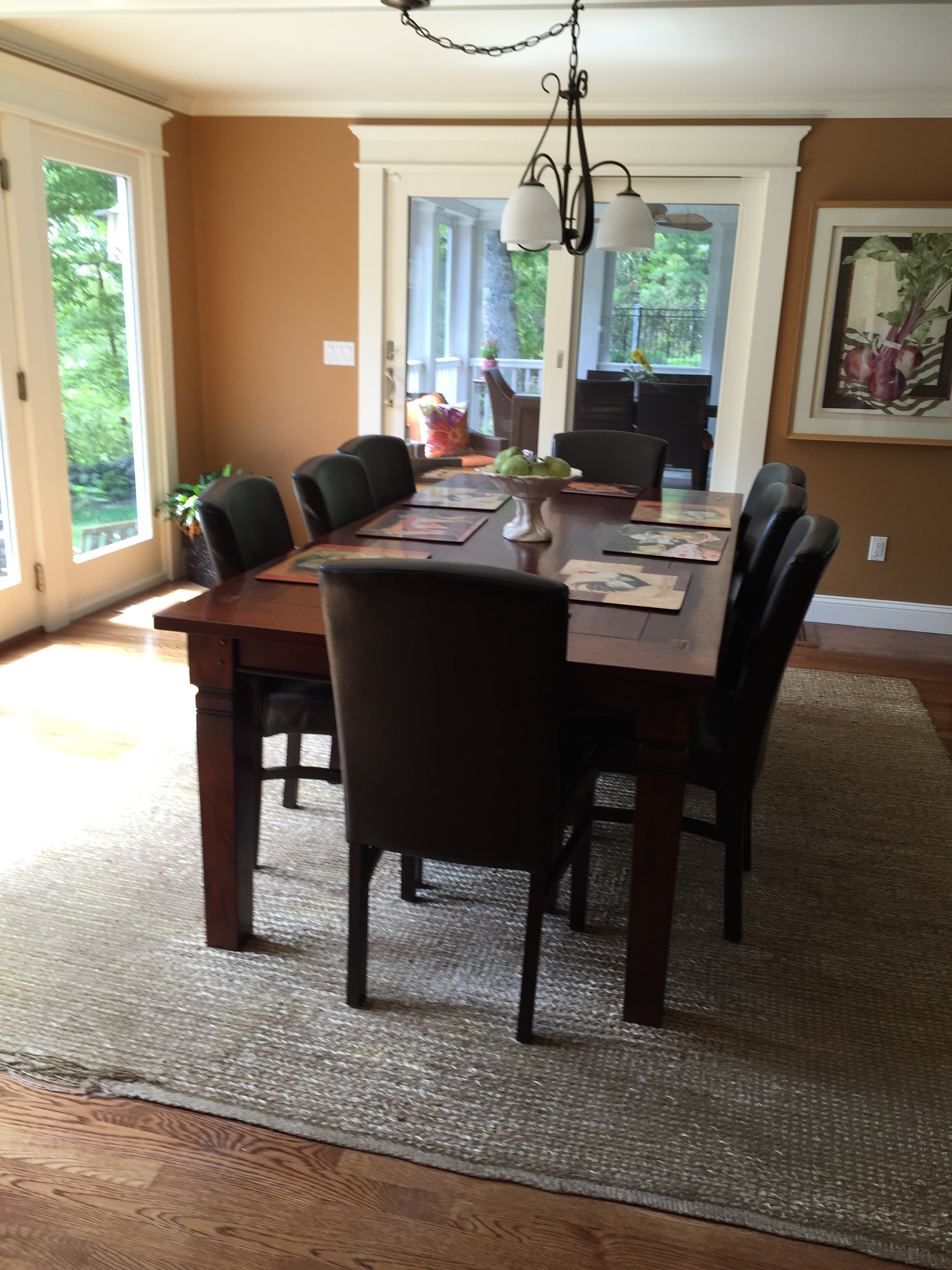
In the kitchen, they loved their existing dining table, but wanted to freshen up (and lighten up) the space. Oh yeah, and a little less brown!
BEFORE:
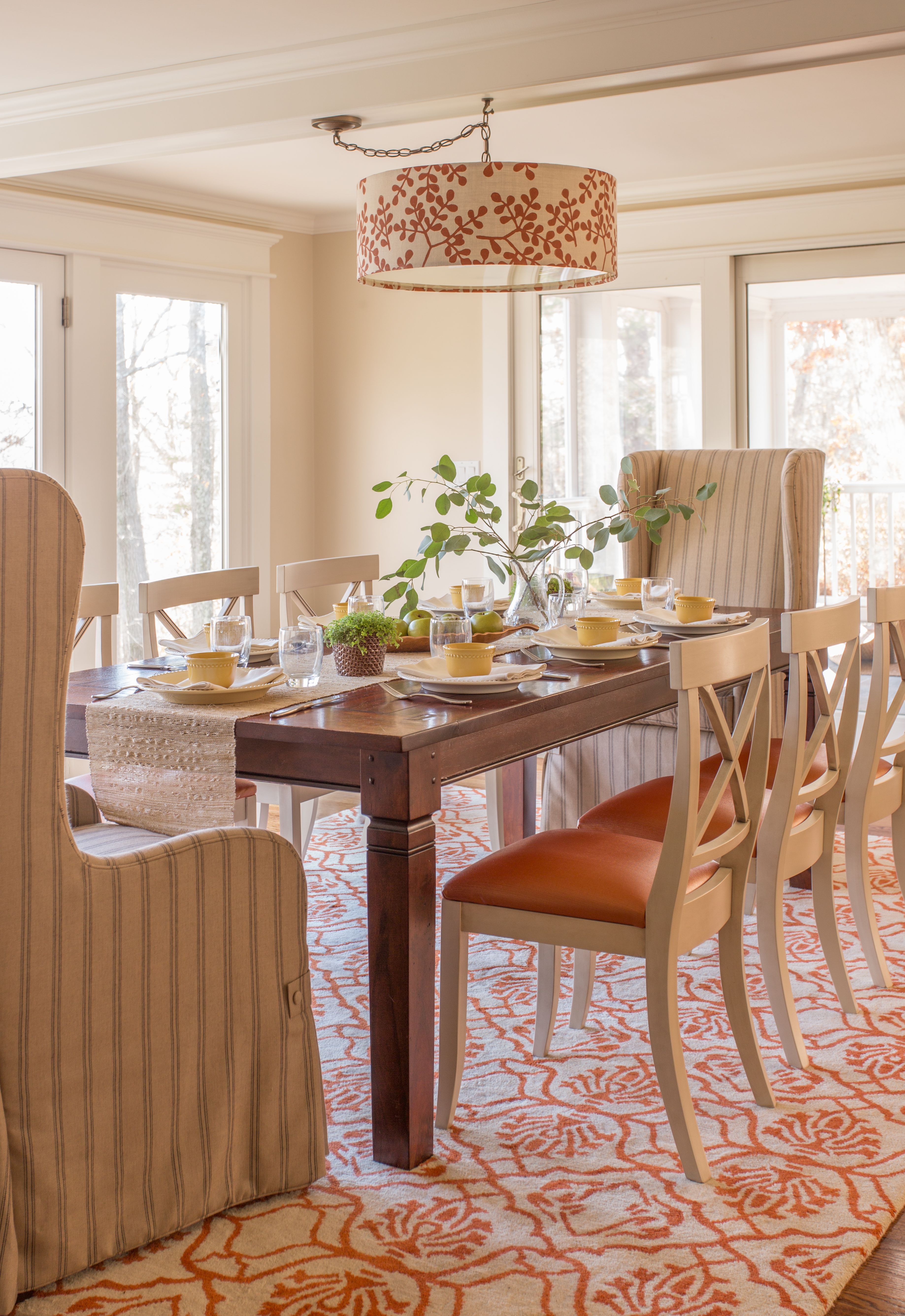
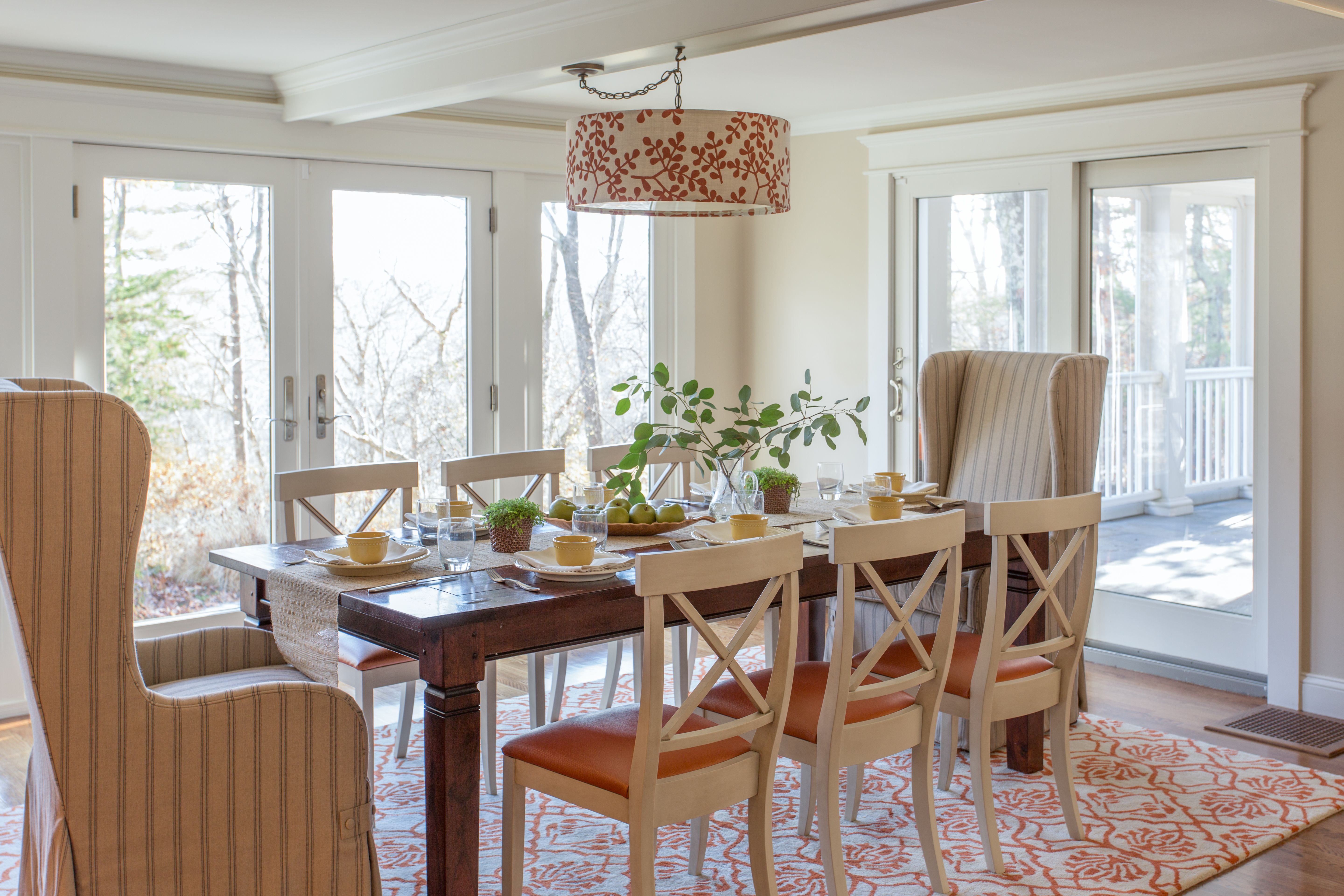
AFTER:
What a difference the right lighting makes! The scale and color of this drum pendant from Galbraith and Paul for Room & Board are just perfect for the space (the ceiling height is actually quite low).
The French-inspired chairs sport seats upholstered in a metallic orange vinyl, and the tall-back host chairs are covered in an easy-care Joe Ruggiero Sunbrella fabric masquerading as a casual grain sack linen stripe.
In addition to spending tons of time hanging out in the family room, my client has hosted a number of events since everything was installed. I’m so happy that she’s proud to have people at her home. In fact, one evening she said she had over 50 people in the family room and kitchen and it didn’t even feel crowded! Mission accomplished.
So what happened to all of that brown, anyway?? Well, it found its rightful home – in the new basement mancave. I’m telling you, that brown corduroy sectional looks like it was custom made for that room. It really looks great. So don’t worry – no sectionals were harmed in the redecoration of this room – it was simply moved downstairs as part of the Furniture Relocation Program :).
“After” photography by Eric Roth.

Beautifully done Kelly!! It is soooo refreshing and relaxing!
Thanks so much, Kim! ?
Beautiful work ! Thanks for sharing!
Sent from my iPhone
>
Thank you, Joe! I used your fabric on MT’s Somerset Bay Home host chairs and I think it is a beautiful marriage!
So cool Kelly – I am going to share some pics on my FB page if you don’t mind?? Great photo’s by Eric – his light is magnificent. M
Mally Skok mally@skok.com http://www.mallyskokdesign.com Office 1781 259 4090 Cel 1 781 2490080
>
Of course, Mally! The chairs are so unbelievably gorgeous – I feel fortunate to have been able to use your fabric in this way!
simply fabulous Kelly! Nothing like a good before and after and this one is like a breath of fresh air.
Thanks so much, Linda! It feels the same way in person – I kind of wish it were mine!
Nice work Kelly! Can you name the source for the dining chairs? Thanks!
Thanks, Melissa! The side chairs are from Gat Creek; vinyl upholstery is from Kravet.
Excellent! So light, bright and airy! Well done, Kelly!!!