I am currently in Newport, Rhode Island on a quasi “stay-cation” – I call it that because my husband is still commuting to Boston for work this week, and I have to drive up to the city a few times next week for various commitments. I don’t think it can be a true vacation if you have the ability to go home several times while you’re “there” ! While I’m still not sure how I feel about that, we’re really enjoying our time here in Newport. We are renting a lovely home in a neat residential neighborhood (Kay-Catherine) that has a local feel, and features some really unique and colorful architecture.
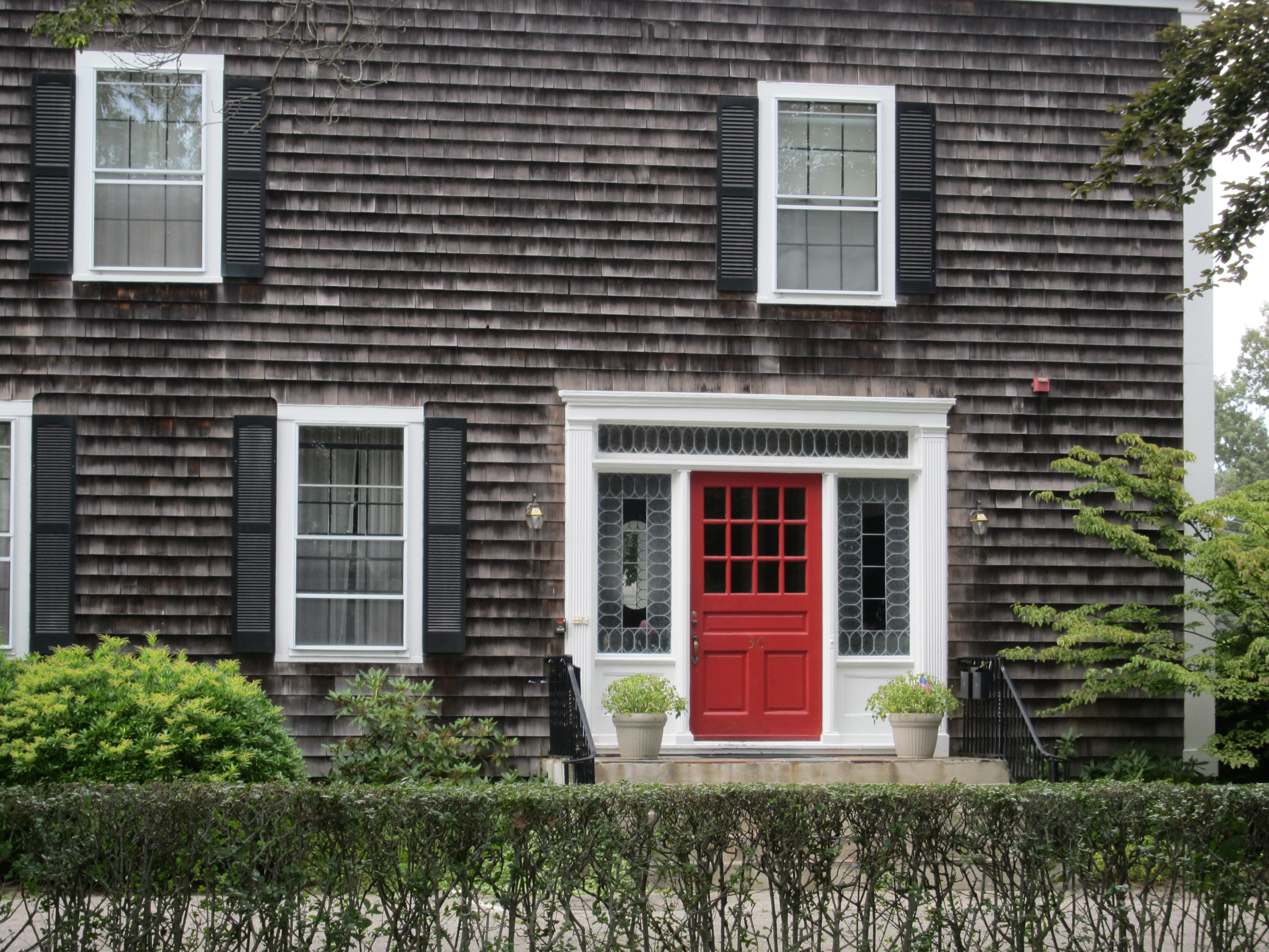
This red door really caught my eye. Simple, yet striking on the shingled facade with white trim and black shutters. The leaded glass side lights and transom have a traditional feel, but the geometric pattern is thoroughly modern.
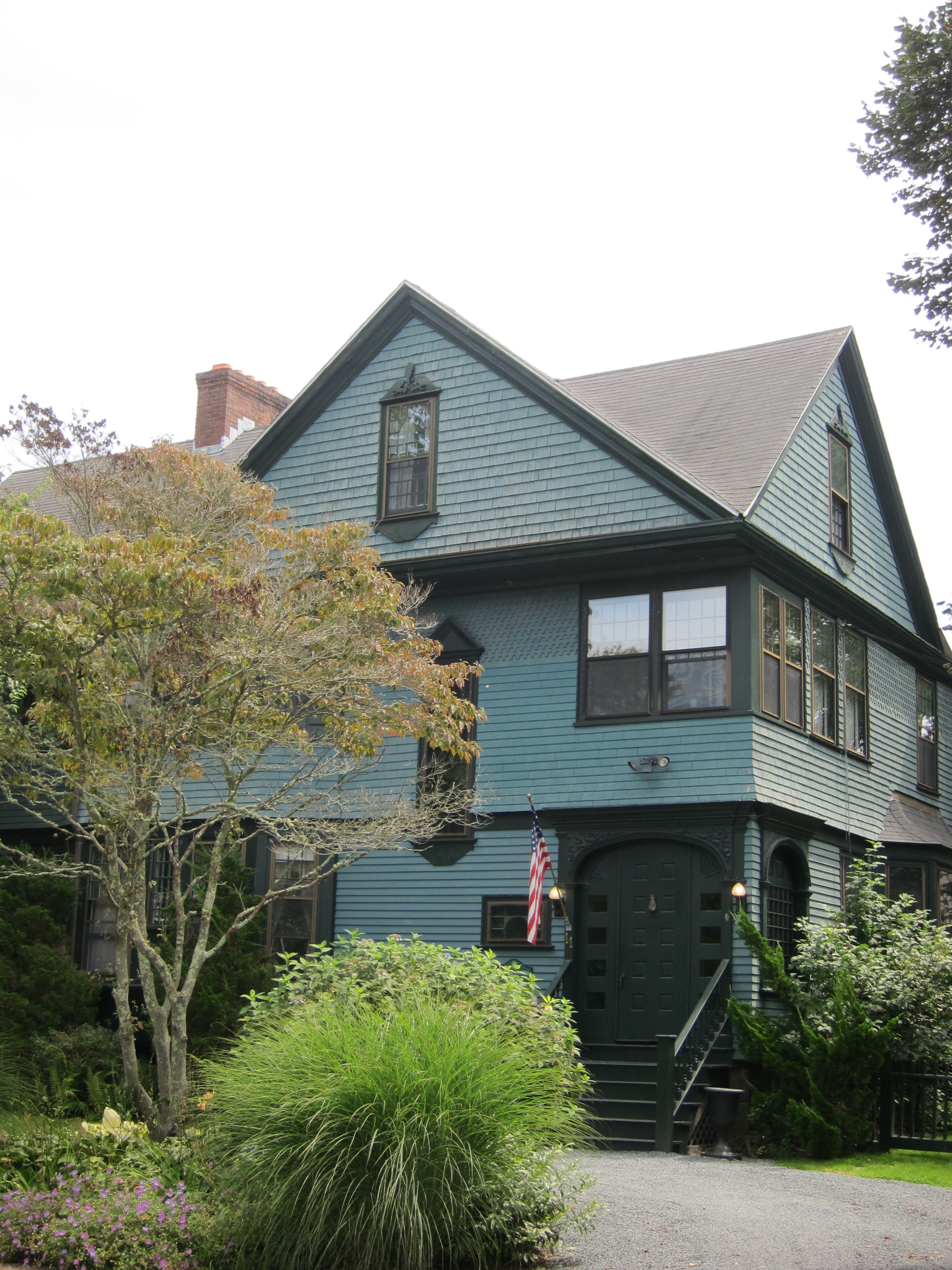 I loved the muted turquoise and dark forest green (trim) color palette of this Victorian. I kind of wish the door popped a bit more with a more vibrant color, because it is gorgeous.
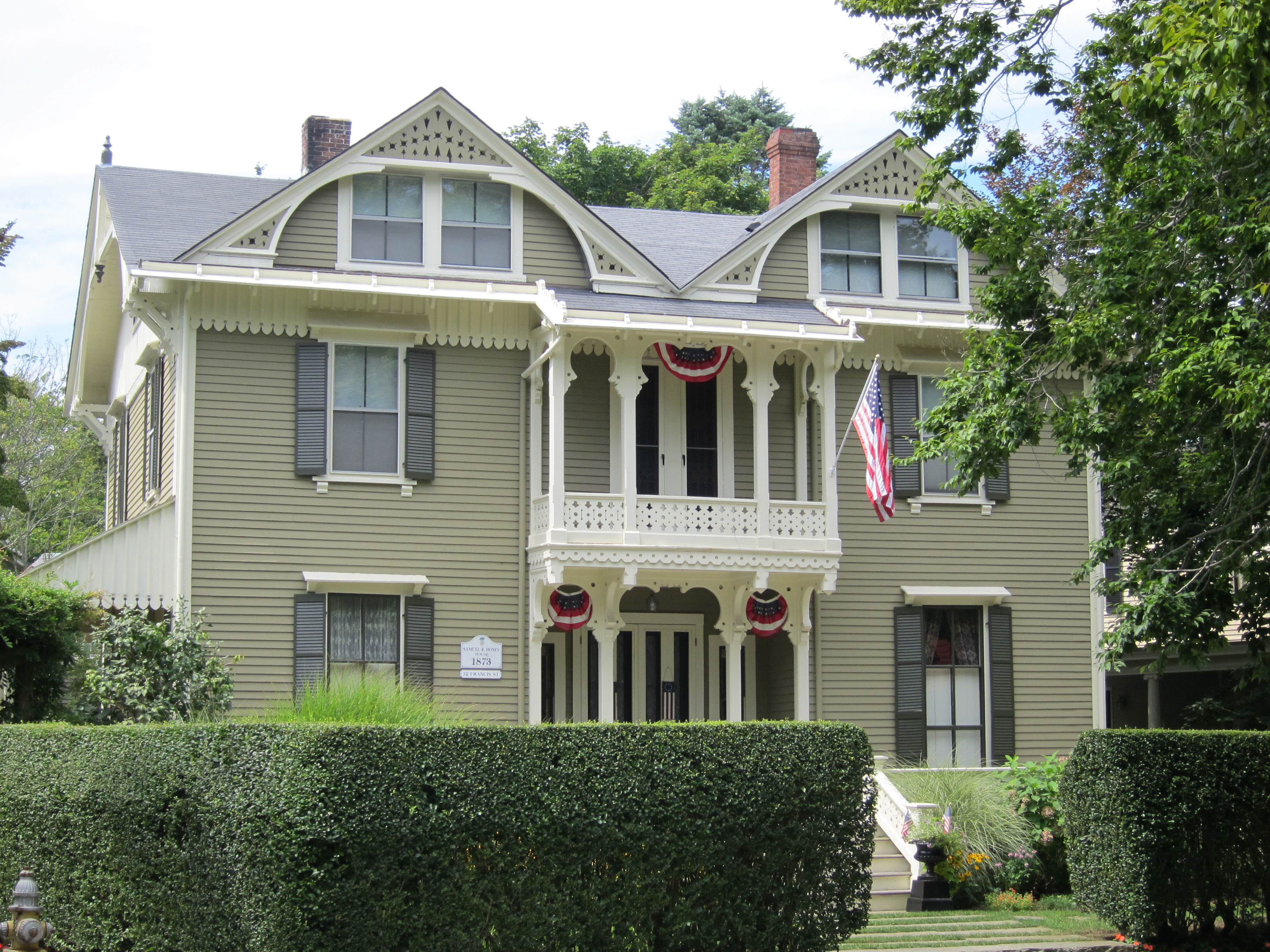 Check out the ornate creamy-white ornament on this pristine Queen Anne. Doesn’t it look like there should be someone presidential giving a speech from the second floor balcony?
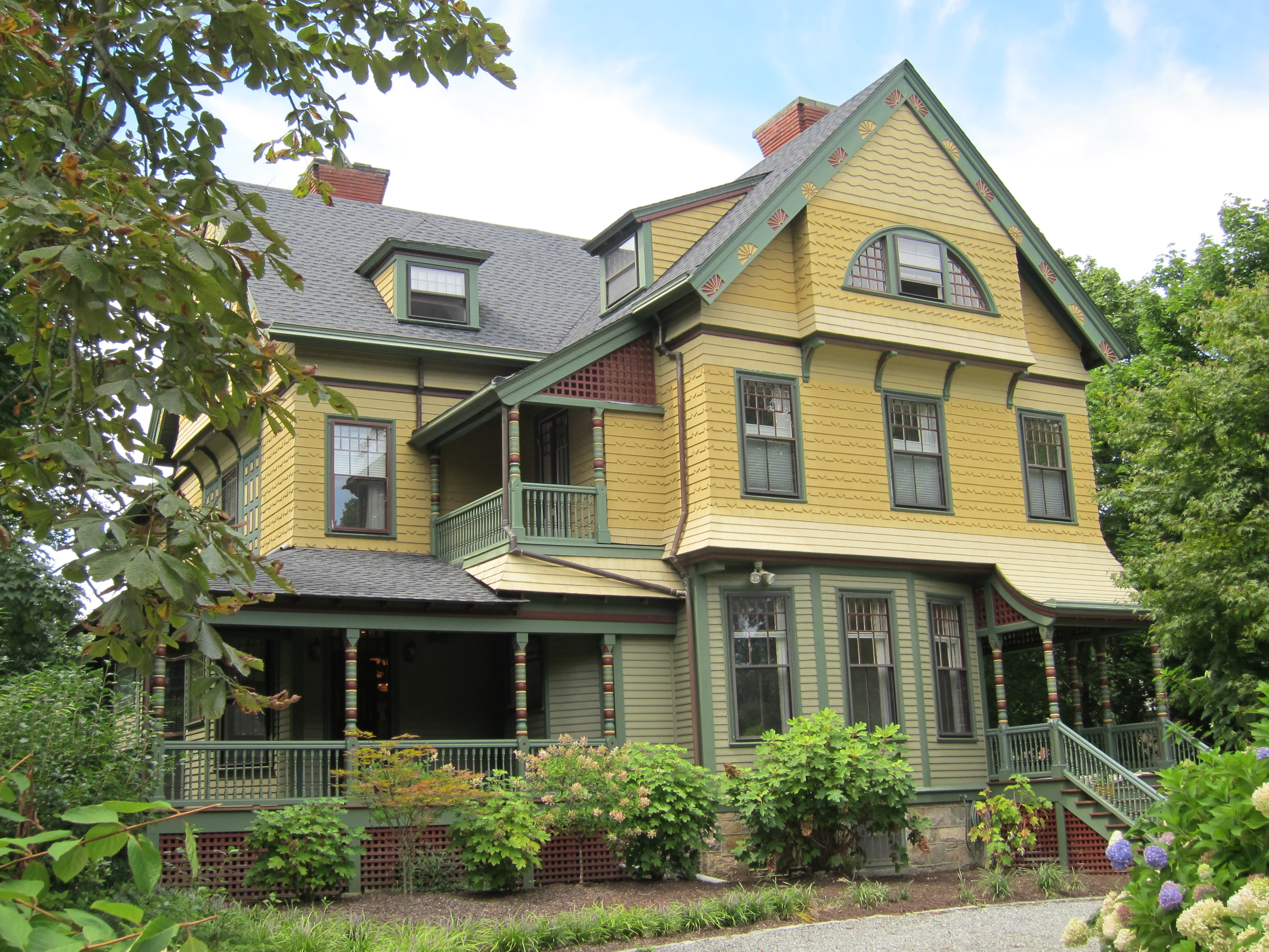 They just don’t build them like this any more – or paint them like this, either. The gold, moss green, and brick red color scheme is historically accurate for a Victorian exterior, and it is one I have seen time and again in this neighborhood. But the attention to detail on this home is just stunning. Note the two-toned shingles to make the design pop, and the multi-colored spool posts on the porch.
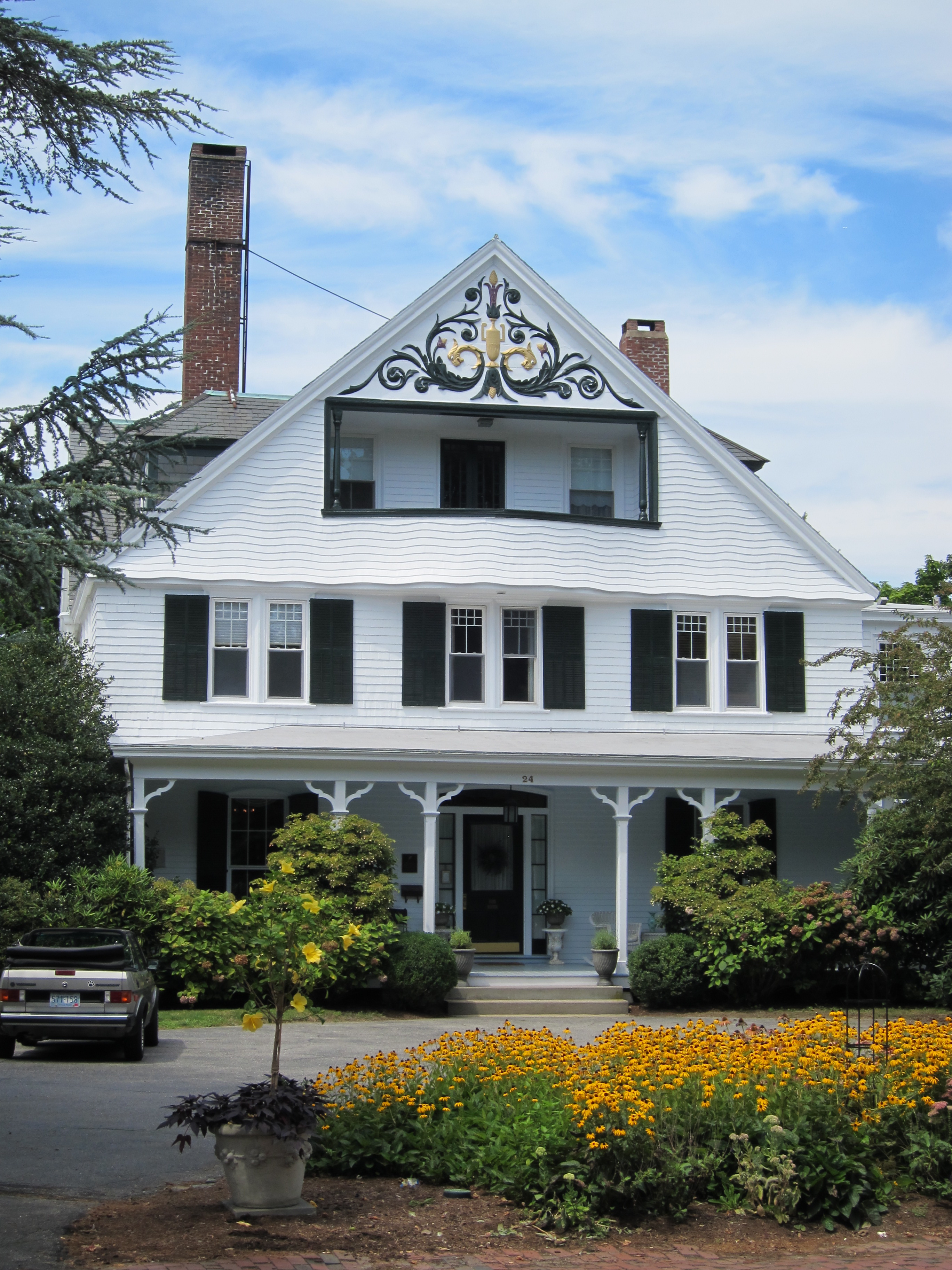 Although this home isn’t quite as interesting from a color standpoint, everything above the second floor was just too interesting not to share. Check out the wavy shingled overhang, which seems to evoke the nearby Atlantic Ocean. I loved the inset balcony, as well as the monumental pediment frieze, thankfully painted properly so we can enjoy it from street level.
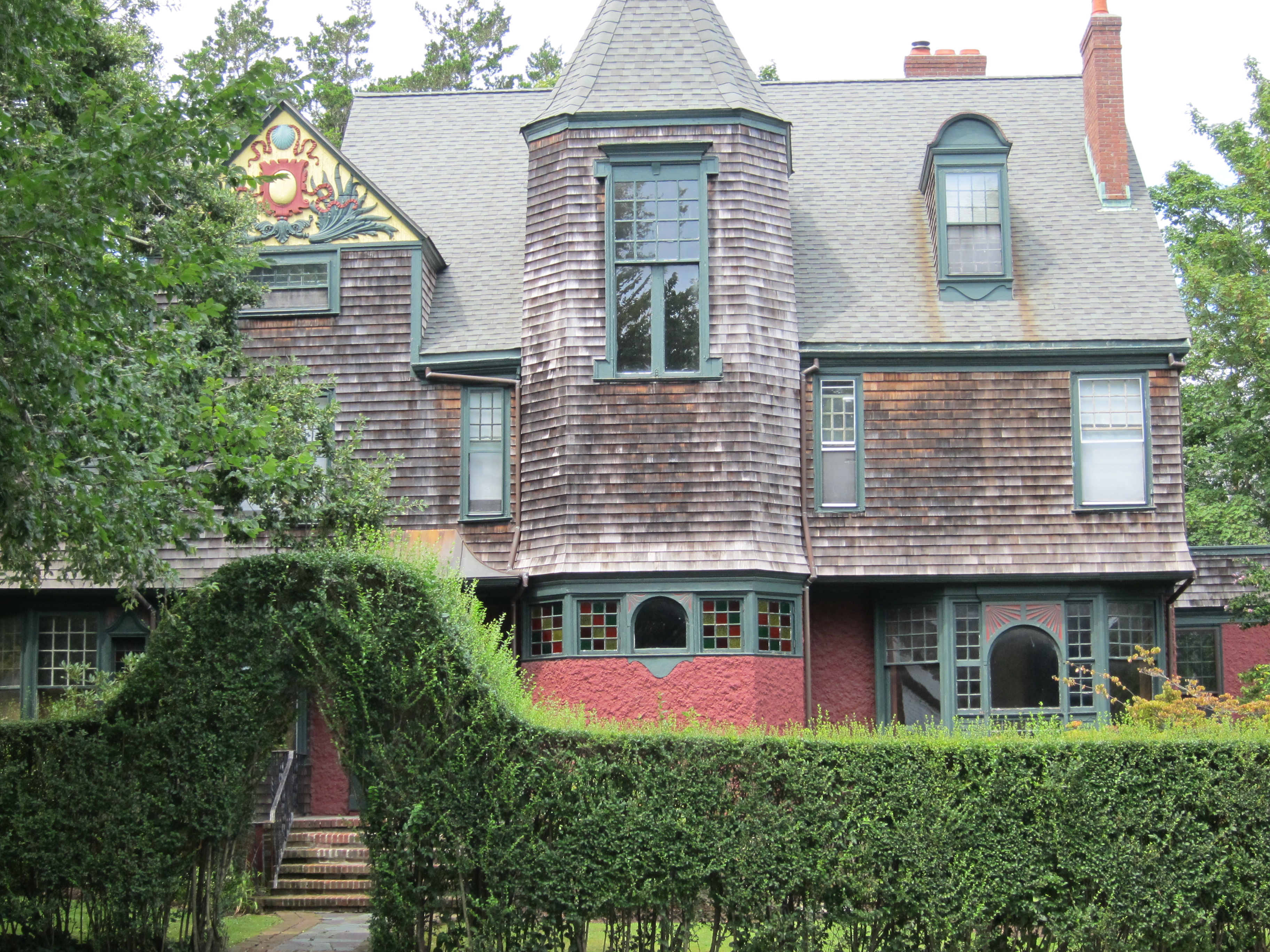 Another gold, green and red beauty, as well as another well-preserved and beautifully painted sculptural pediment. This one is a shingle style Victorian (are you detecting a pattern here?). Don’t miss the beautiful multi-colored lead glass windows on the first floor of the tower.
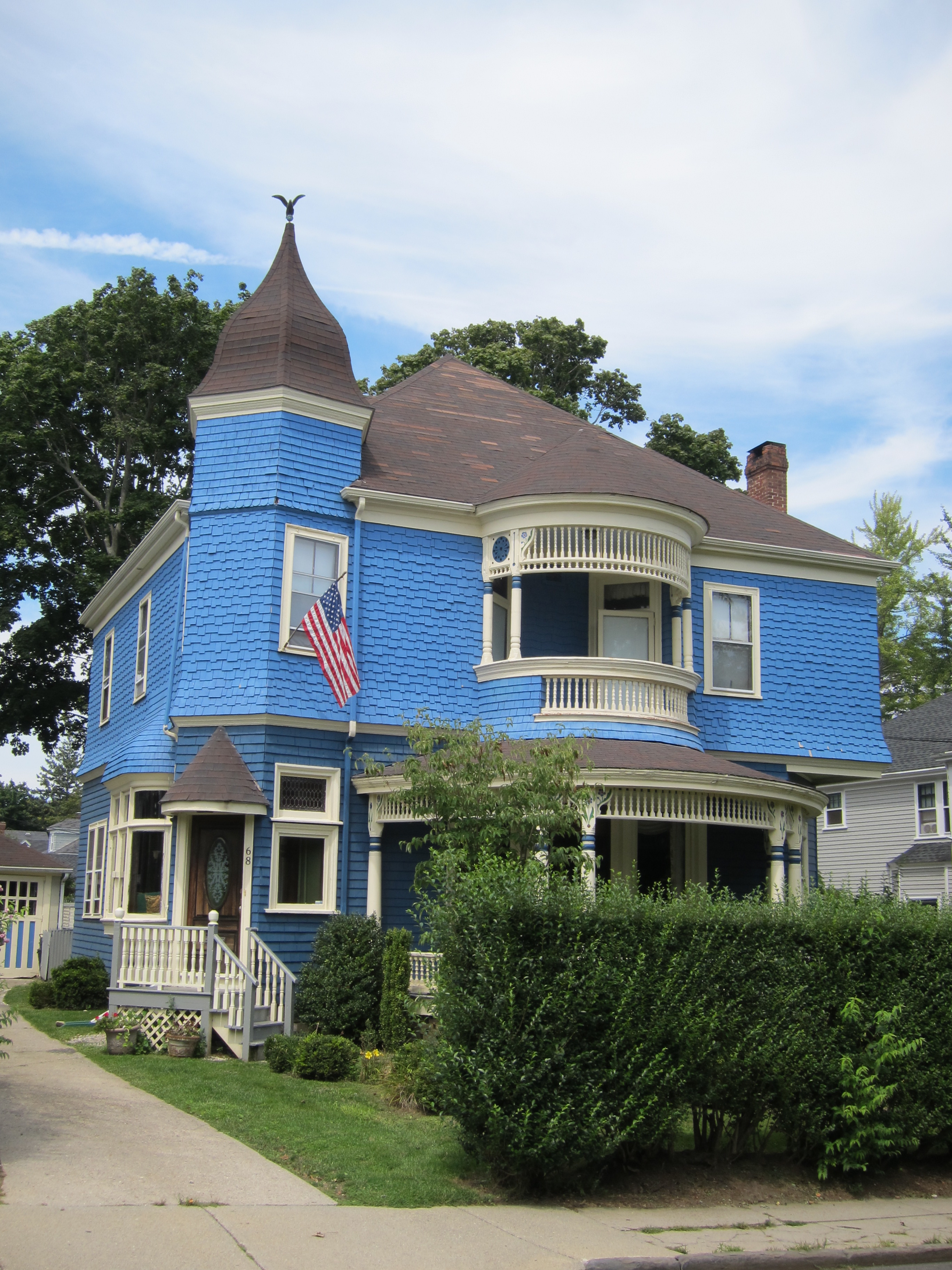 I like that the homeowner chose a brighter color for the main color of this house. The cerulean blue stands out among the white houses that surround it, but it totally would not have worked with white trim. The light yellow color helps to calm down the saturated blue and maintain the home’s Victorian elegance, whereas white trim would have made it look cheap.
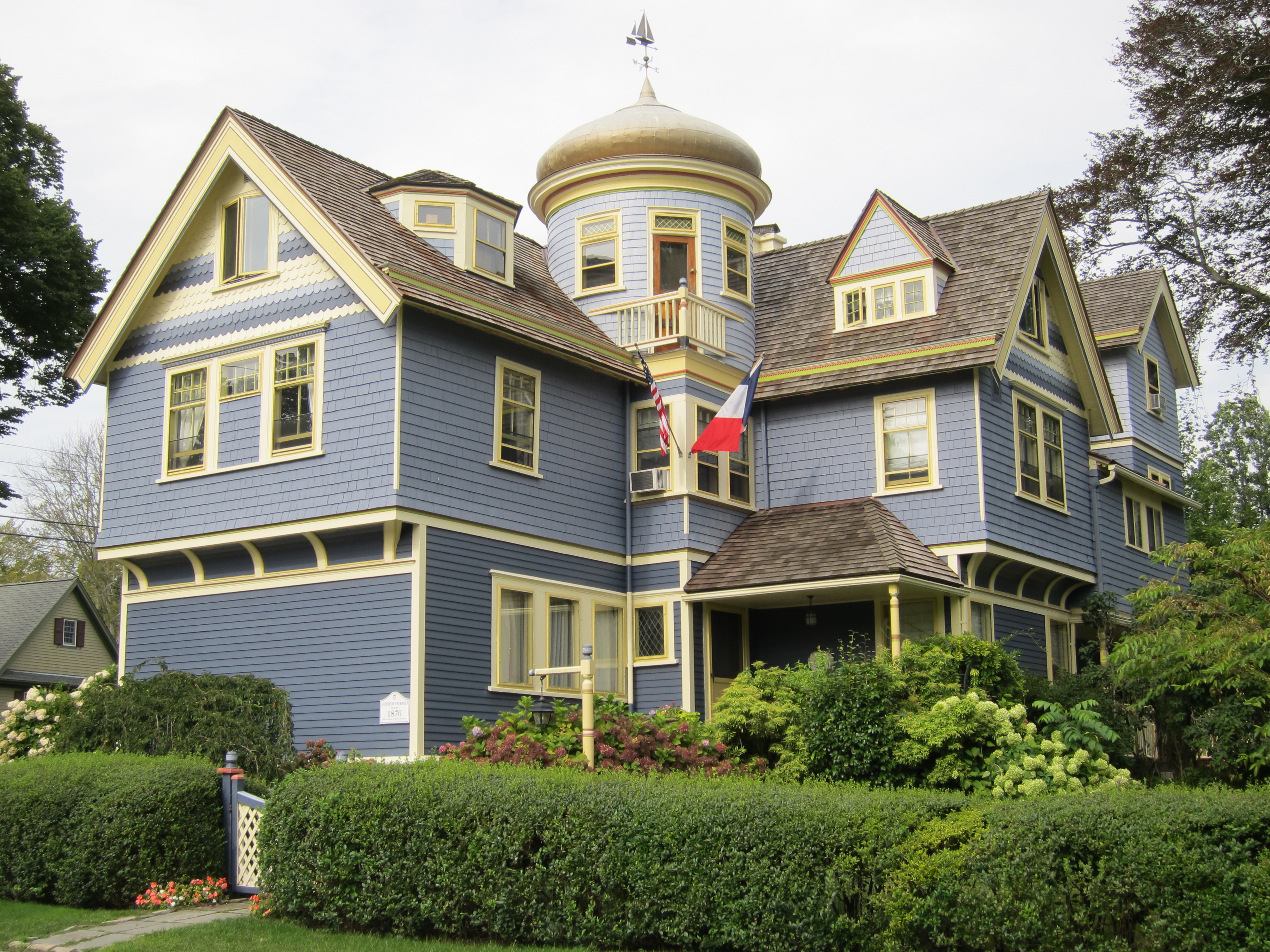 Like many other homes in the neighborhood, this is an historic home that has the marker to prove it – the Katherine P. Wormeley House. Upon closer inspection, I learned that this house is the product of the famed architectural firm McKim, Mead & White. While they are better known for their more monumental commissions in the Beaux-Arts fashion (like the Boston Public Library and the old Penn Station in NY), the firm was prolific in the residential sector, as well. What first captured my attention was the lovely slate blue and lemon yellow color palette, as well as the thoughtful treatment of the fishscale shingles. Then I looked up and saw the Eastern-influenced gilded gold dome topped by a nautical weathervane! When I looked up this home online, I didn’t find much information, other than that the locals here apparently call this house the “Turkish Delight.” 🙂 The current owners appear to have an affinity for the French, judging by the flags now flying on the tower.
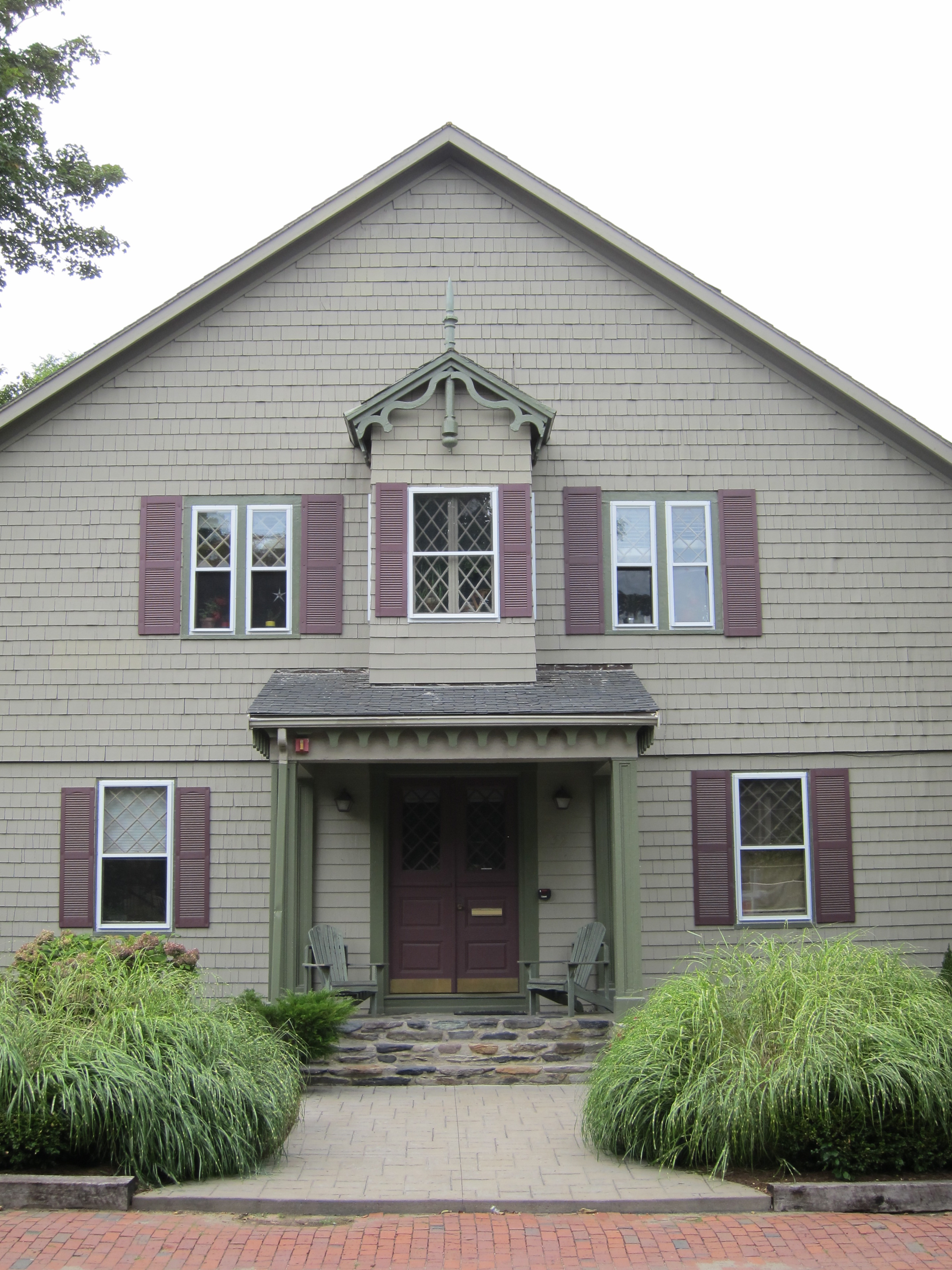 This home is sited on a corner lot, and essentially has two front entrances. I liked the flawless symmetry of this one, as well as the earthy green and aubergine color palette.
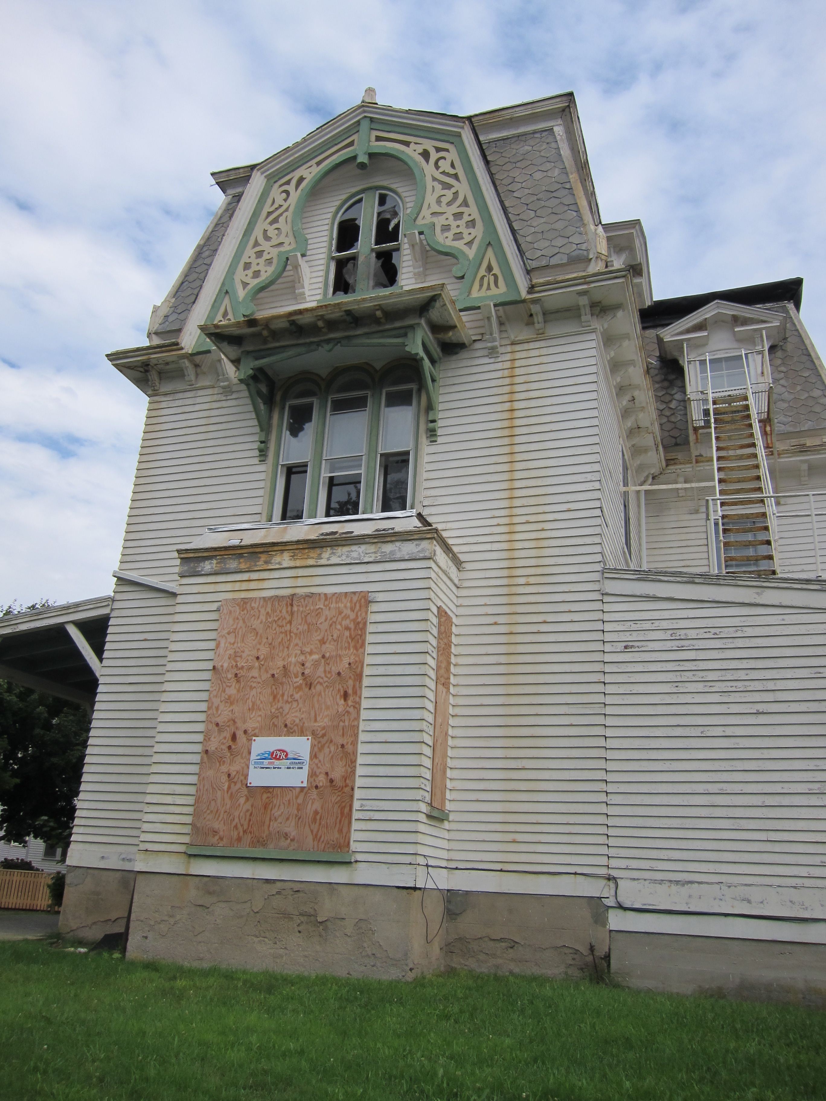 This one broke my heart. Look up the definition of potential in the dictionary, and there should be a picture of this house. As we turned the corner, it looked as though this home may have been the victim of a fire, though it is unclear if the fire occurred before or after the home fell into disrepair and was abandoned. I hope it is salvageable – I didn’t see the tell-tale big red “X” anywhere, so I’m hopeful someone will come and rescue this fallen Queen Anne.
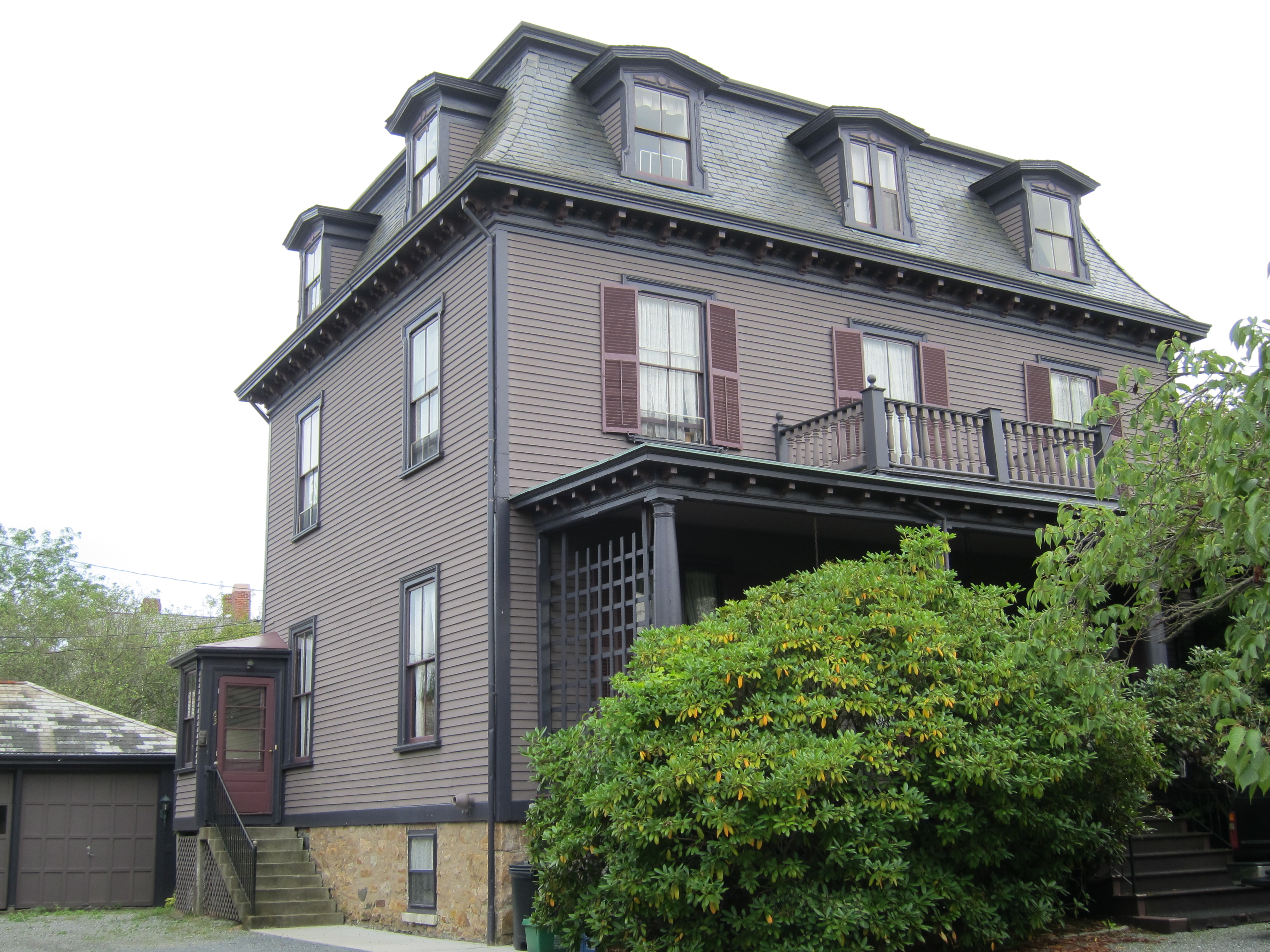 What a lovely monochromatic scheme in violets on this well-maintained Second Empire house…
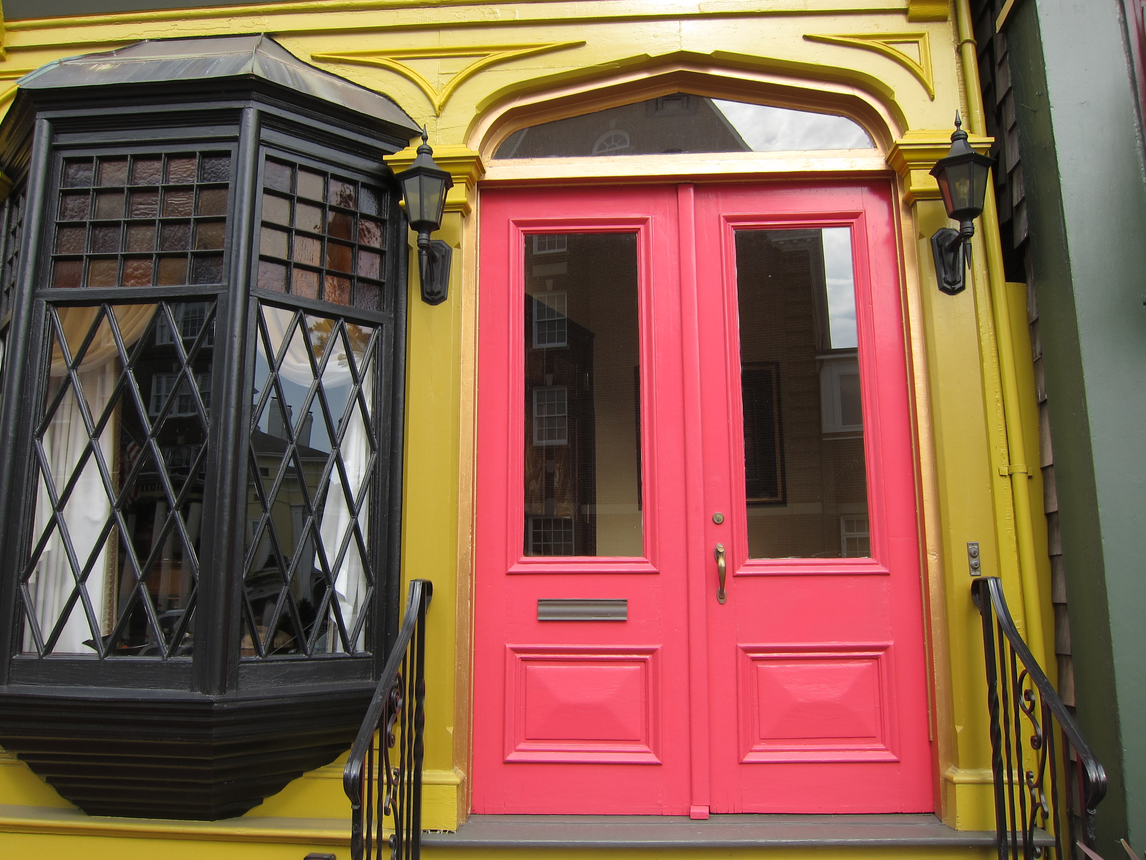 Though I can’t be 100% sure this is a private row-house residence, it looked to be, so I tried not to linger too long as I snapped this quick picture. WOW – what a bold statement that really works, in mustard, coral and dark green. I wish I was on the other side of the street so I could have included the second story. The bay window glass appears to be original, as well, and is gorgeous. I wonder if this place is for rent next summer…

The mustard and coral home is my favorite. I winced when I saw the home destroyed by a fire. That really is a horrible waste of potential. I hope someone gives it some TLC soon. A historic, Queen Anne deserves to shine!
Thanks for your comment, Iris. I don’t know the story there, but it is always sad to see an historic home in a state of disrepair. Here’s hoping someone swoops in to save it!
I love it! The first shingle style might be my favorite. Looks like a great place to stay-cation!
Thanks, Patricia! Yeah, that first one just screams “New England,” doesn’t it? We’re having a great time, and I’m glad we decided to stay in this fun neighborhood, instead of in a beach condo or the like.