A beautiful public entry – more specifically, your front door, is really the first impression your home makes on visitors, passers-by, and of course the nosy Nellies who like to scope out everyone else’s digs (but I wouldn’t know anything about that…). All apologies to apartment dwellers and other renters! Now that I’ve got that out of the way…
One of the next decisions I have to make on our new home is what to do with the front door. Let me first say that the door itself, which is made of synthetic material, is kind of visually (and tactile-ly) underwhelming. It has very good insulating qualities, is sturdy and may even outlast Cher on this Earth, in the end, but it’s not what I would have chosen, if I had my choice. Long story. So I’ve decided to use the situation as an opportunity to paint our front door a bold color (I had originally planned to have it stained, but I’ve become a bit leery of the whole staining a non-wood, wood-looking material thing). If we hate it, or it simply isn’t enough “lipstick on a pig” to make the door work for us, we’ll switch it out for another style.
I thought I’d share some welcoming front doors I’ve come across in my search for inspiration. I think I have a pretty clear vision of what I’m looking for color-wise, but I’ll leave that for another post (after I’ve made a final decision!).
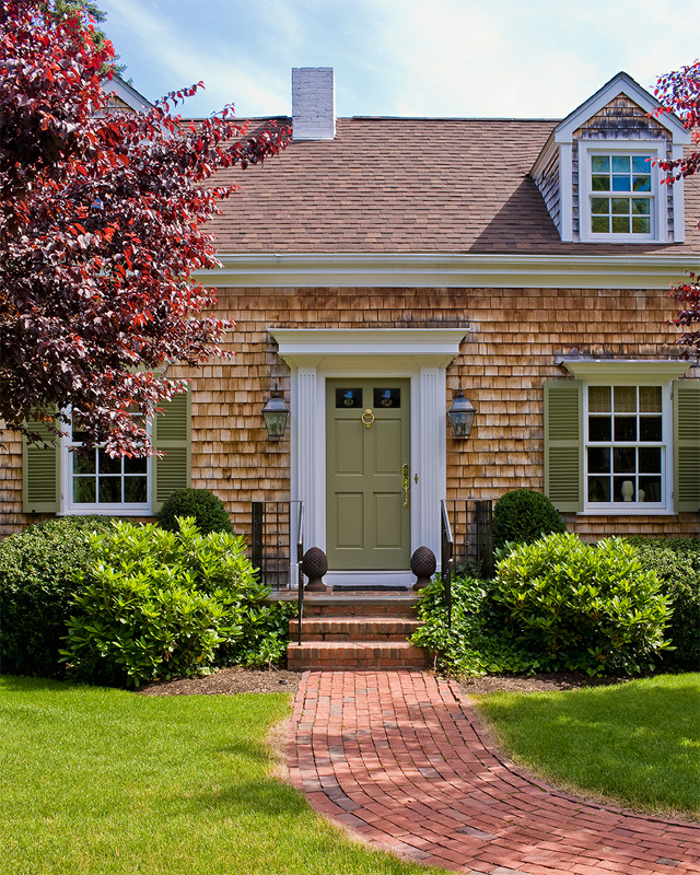
Photo source: Katie Rosenfeld (Photograph by Michael J. Lee)
This is Weston, MA based designer Katie Rosenfeld’s own home, bedecked in cedar shake shingles, off-white trim and olive green front door and shutters. It’s an example of a low-contrast front door I can get behind – the color makes the house look like a product of nature, and its New England environs.
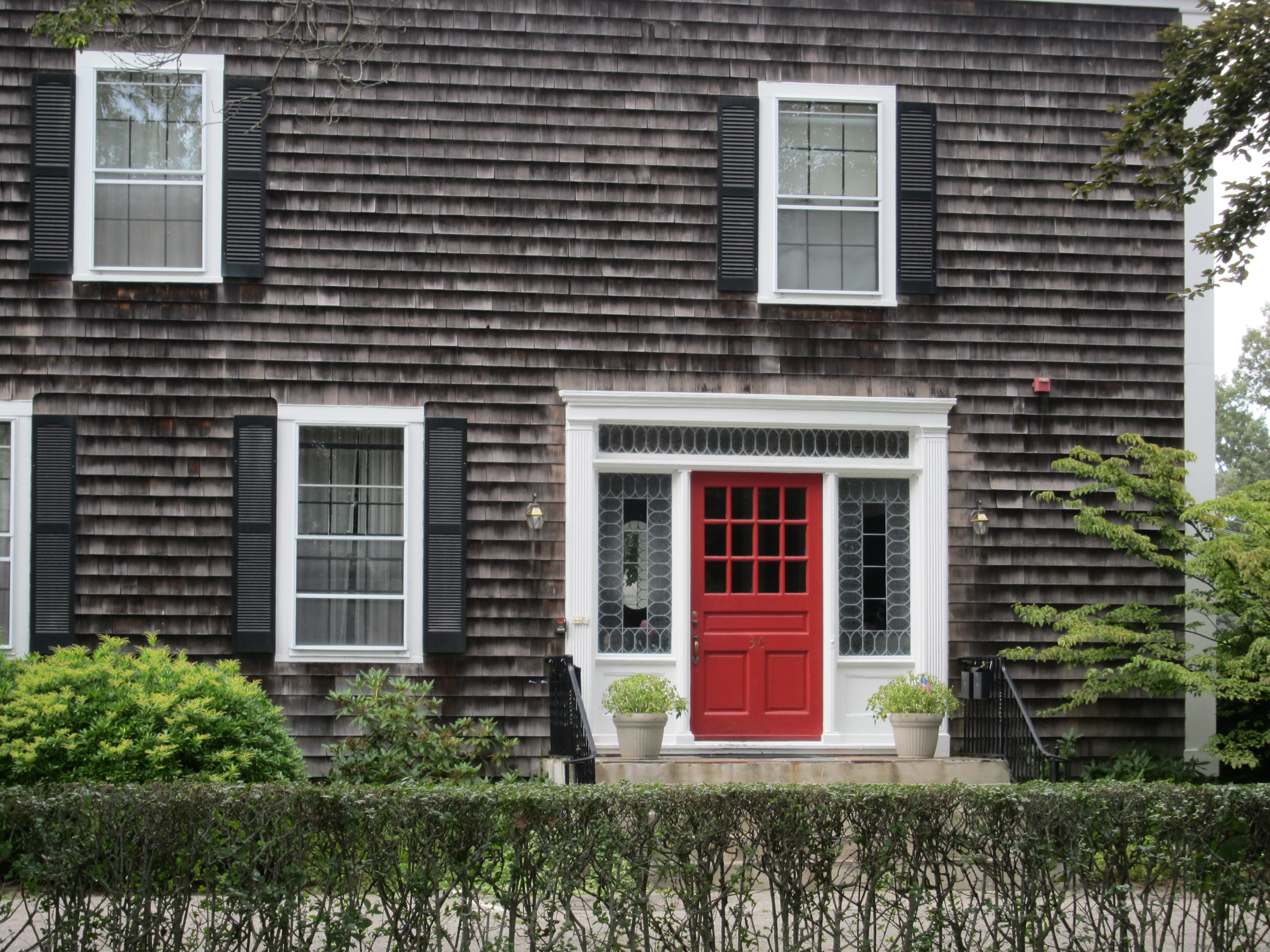 Speaking of New England, this home in Newport, RI piqued my interest this past week while strolling through the neighborhood where we’re renting a home (for vacation). Everything about this entry is classic and symmetrical. A red front door is a common, very good choice for many of us – and here’s why. As a warm color, it advances toward you (it “pops” – vs. receding like cool colors), which helps it stand out and guide your visitors to your home’s entrance. It’s also a color that works well as a contrasting accent with many typical main exterior colors, like gray, khaki, olive and white.
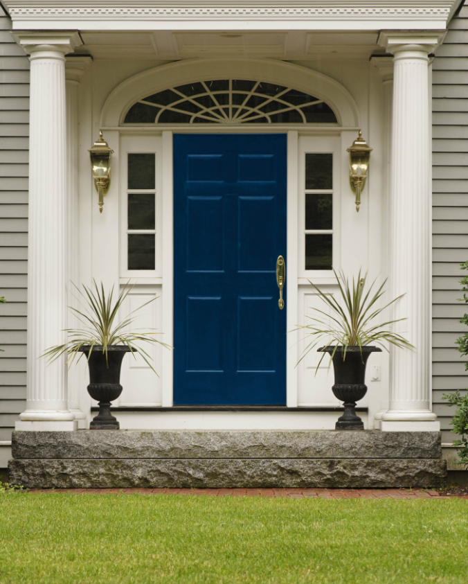
Photo source: Colour Me Happy
Conversely, the use of a low value shade of blue-violet creates drama and depth. The creamy trim and brass hardware and sconces are a warm counterpoint to a cool-hued front door that appears to recede behind the neo-classical portico. The front door is appropriately painted Sherwin-Willams Dignified 6538.
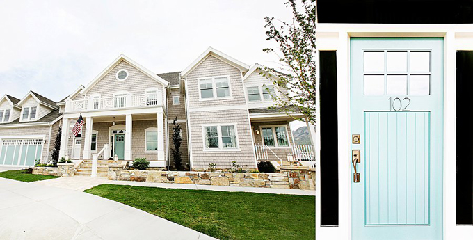
Photo source: House of Turquoise
Lets linger awhile on the cool side of the color wheel, and check out this turquoise front door, which was featured on House of Turquoise a few months ago. This light, warmed up blue says “coastal” – exactly the feeling the homeowner was seeking. The paint color used here is Benjamin Moore’s 2012 Color of the Year, Wythe Blue HC-143.
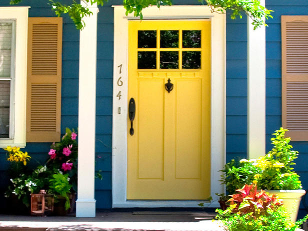
Photo source: HGTV
Being the color of sunshine and all, I can’t think of a more cheerful way to welcome one’s guests than with a yellow front door. Yellow can be very tricky, though, for a couple of reasons, which have nothing to do with color coordination. One is that yellow paints fade the most quickly – more than any other color (amp up the sheen to help counter this effect). Another is that yellow paints tend to look the most different from color chip to a painted surface, so remember to test to avoid unpleasant surprises!
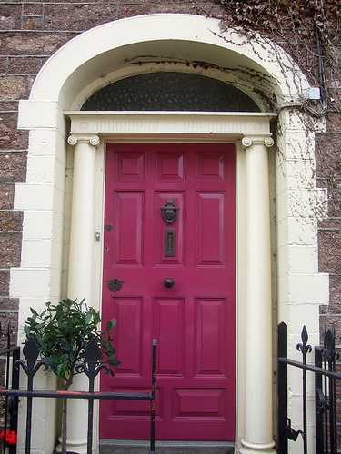
Photo source: via Pinterest
If red is a bit too traditional for you, why not consider fuschia? This shade has just enough black to avoid giving the impression that Barbie lives here. It is polished and sophisticated, yet young and modern. Not that any of those should be mutually exclusive.
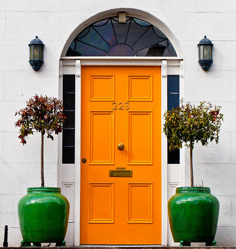
Photo source: Habitually Chic
How bold does this orange door look on the white limestone (?) of this home? It really transforms the facade from staid to striking, and gives the home a hit of contemporary saturated color. The green planters make it pop even more. By the way, orange is the warmest hue (blue is coolest) on the color wheel.
Which door is your favorite?

Wow! I really like many of them, even though they are all so different. I do like the first one a lot, for the reasons you point out– it really helps the house reflect its environment.
I know, on the right home, I can imagine using them all!