I am really excited to share with you a project very near and dear to my heart. It is so special to me because it gets to the heart of why I became a decorator in the first place. In fact, it’s the home of the person who inspired me to pursue interior design.
Several years ago, she and her family moved to a wonderful new house, a classic Tudor, but they never really got around to feathering their nest. With busy careers, three kids, and a dog, she always felt it wasn’t the right time to decorate – that maybe it would be better to hold off on investing in the interior of their home, at least until the children were a little older, and a little more careful. When you actually do the math on this, if you have a few kids that are spaced a couple of years apart from one another, we’re talking 10-15 years until they are all “a little older.” That’s an awfully long time to live in a home with “temporary” furnishings you don’t necessarily love (which reminds me of the old adage, “there is nothing more permanent than a temporary solution”). I knew there had to be a better way for young families like this one…
This couple has an appreciation for modern design and favored a light, clean, uncluttered aesthetic, which wasn’t reflected in their furnishings. Nor did the distinctive architectural style of the house shine through on the inside. And beyond having furniture from their last apartment in place, and applying some creamy neutral paint to the walls, they hadn’t really done any decorating to speak of – no artwork, window treatments, nothing.
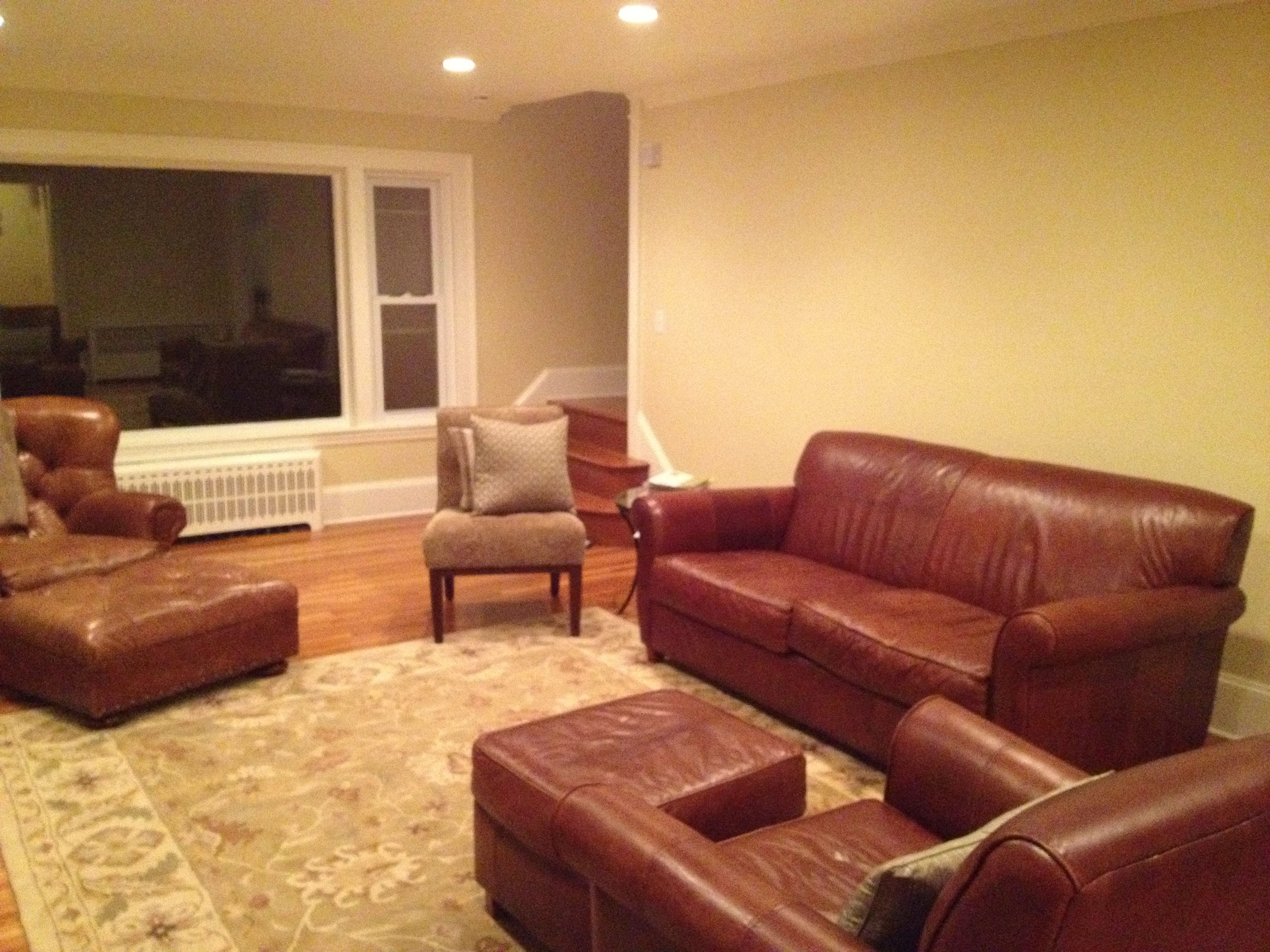
The living room, BEFORE:
And AFTER:
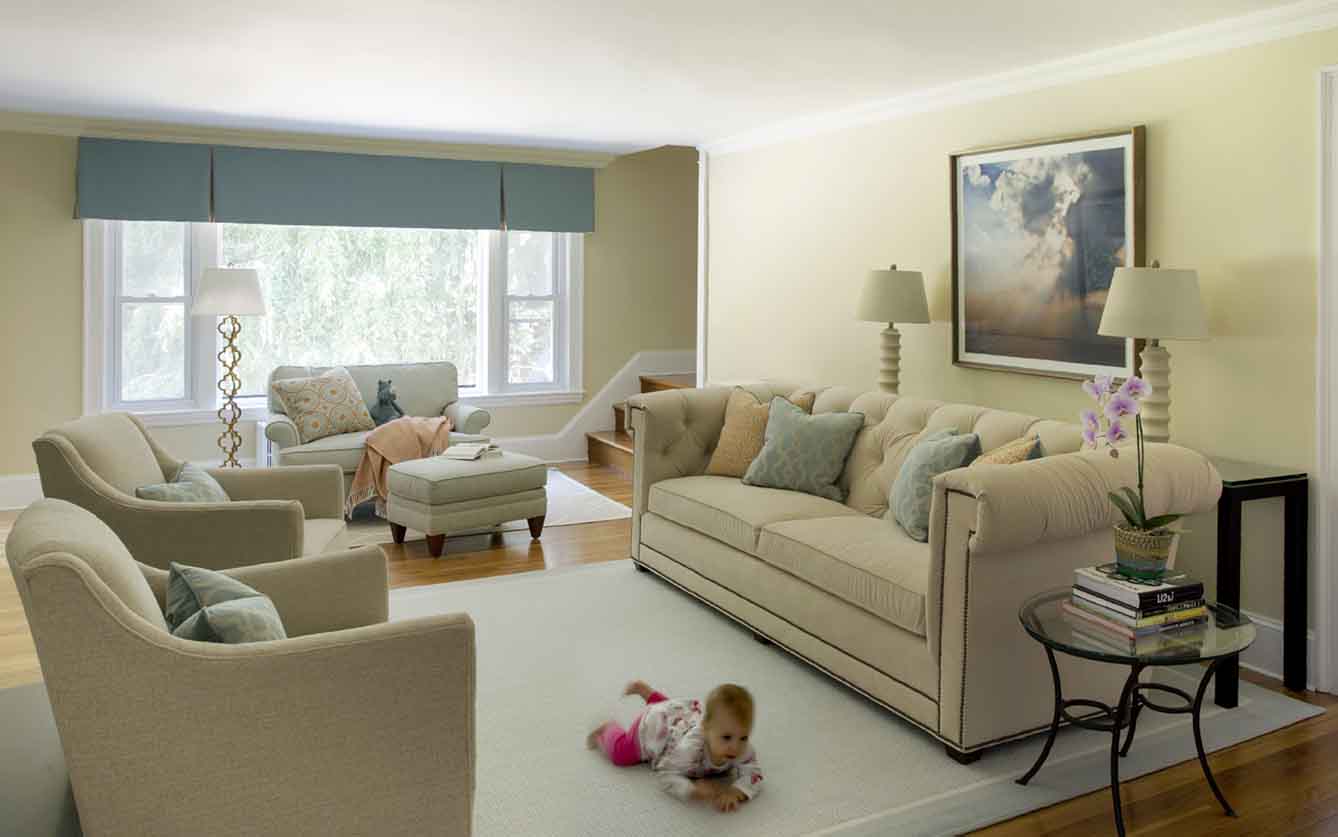
Bye bye incorrectly scaled brown leather furniture, hello light and lovely living room. The room has been divided into two separate zones: a main seating/conversation/TV watching area (TV is behind the pair of chairs on the left), and a family reading space by the large picture window (now softened and jazzed up with a custom valance). The client wanted to keep an open area between the sofa and chairs for kids to play (or scooch!) on the floor, so we added console tables behind the sofa to provide a place for a drink, and add some lighting. We used very light upholstery on the furniture – how, you ask, could that possibly be a smart choice for a family with three kids and a dog? It’s all about the fabric – the CR Laine Chesterfield-style sofa is covered with Ultrasuede, which is one of the most durable, stain-resistant and easy-to-clean choices available today. As an added bonus, it’s super soft and luxurious looking. The other upholstered pieces, and the custom Stark area rug, have been treated with MWI Fibershield green stain protectant. So don’t let the airy, creamy feel of this room fool you – it is a sturdy, family-friendly space that gets a ton of use, and has already survived a myriad of “oops” over the past year and a half.
Reading area BEFORE:
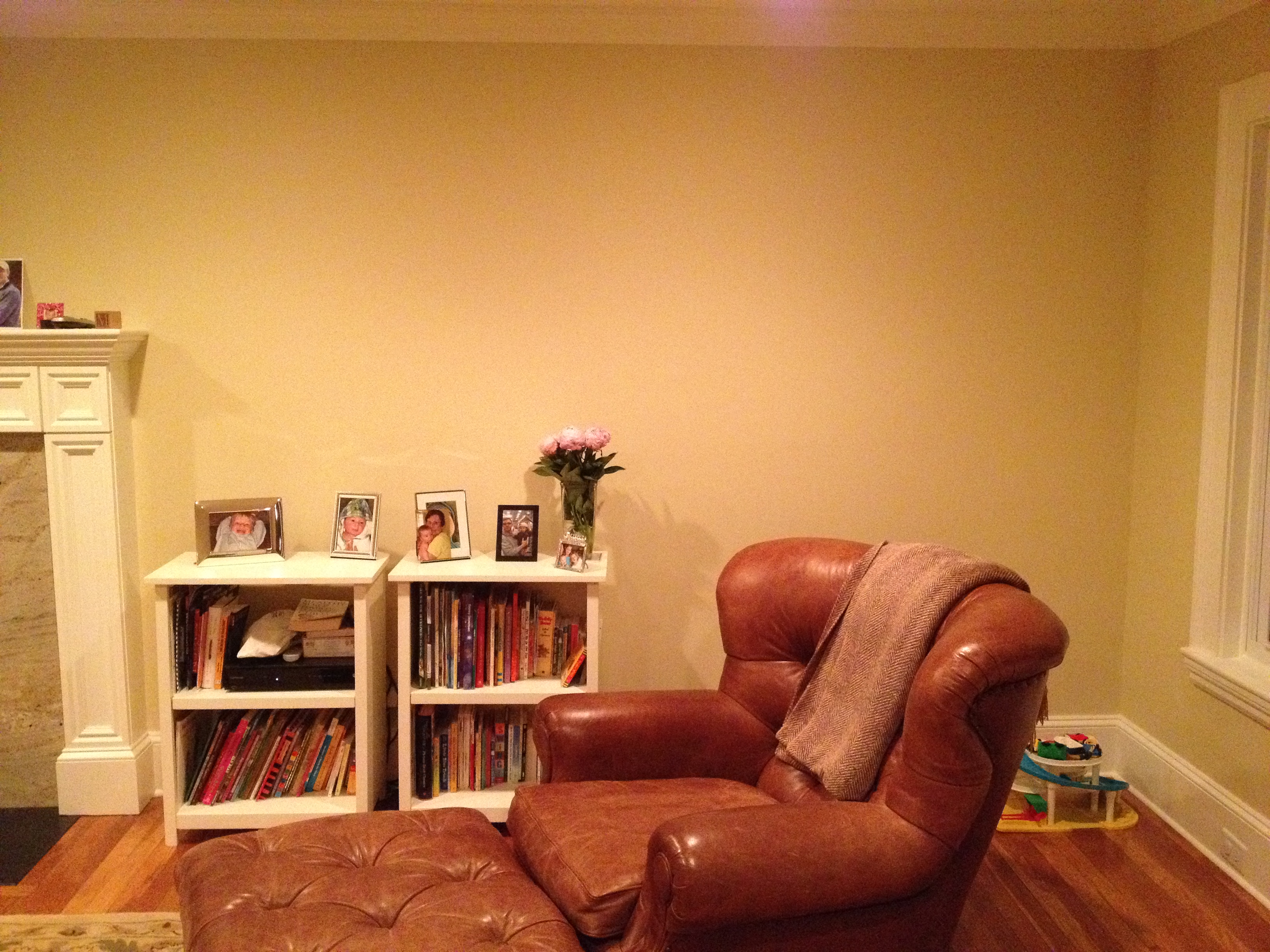
Basically a dead corner (don’t worry, we didn’t eliminate the book storage, just moved it!)
Reading area AFTER:
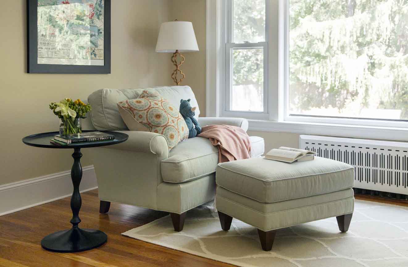
Decorator secret #87: Sometimes things get moved around a little bit during photo shoots :). This one shows you how the room is really set up – with the CR Laine chair-and-a-half, perfect for snuggling with the little ones and a good picture book, angled slightly to take advantage of a lovely view into the backyard. (Also not a bad perch from which to keep an eye on the kids playing on the swing set!)
Foyer BEFORE:
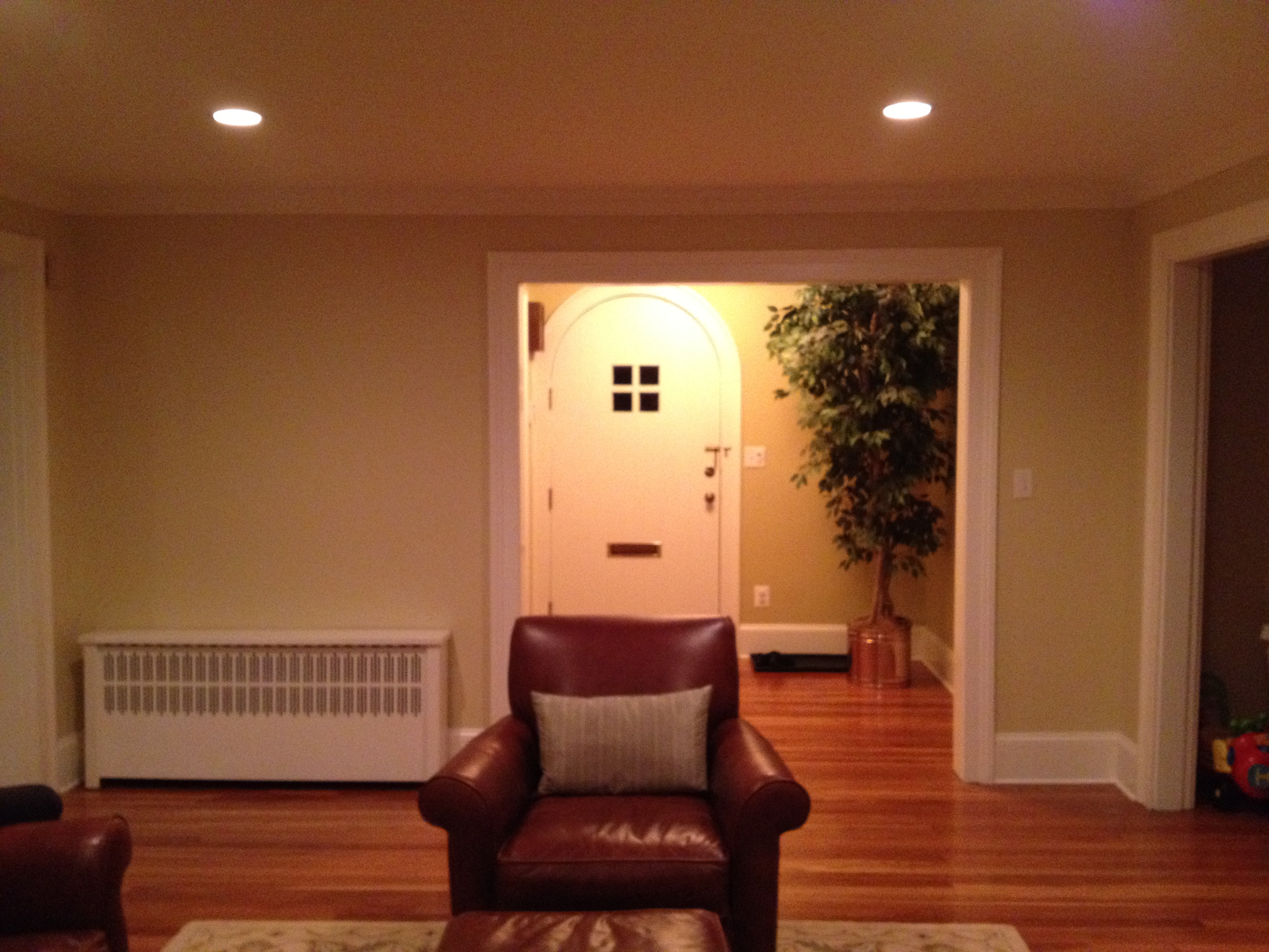
The entry lacked both function and definition. It was a cozy little space, though, with lots of potential – and a pretty cool front door, too.
Foyer AFTER:
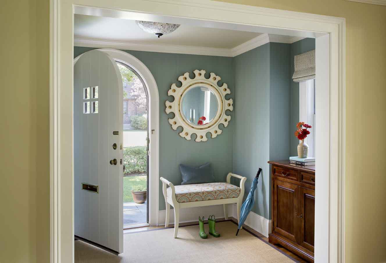
We added a blue strie wallpaper from Farrow & Ball, and a custom sisal rug to help differentiate the entryway, and to create a more welcoming vibe (versus feeling as if you have walked directly into the living room). The foyer is quite small, and very much open to the living room, so it was also important to visually connect the distinct spaces. This was achieved largely through color – the main color here (blue, on the walls) is the same as the accent color in the adjacent living room. I think the blue walls really help accentuate the door, as well. We also painted the foyer ceiling the same color as the walls in the living room. Very subtle change, but it actually makes a huge impact. Functionally, this tiny space is now incredibly hard-working – accommodating a bench for taking off and putting on shoes, a gorgeous mirror to check yourself before heading out the door, and a Ballard Designs console (which is just nine inches in depth!) with drawers and doors – actual useful storage space – that nestles in snugly below the window.
Powder Room BEFORE:
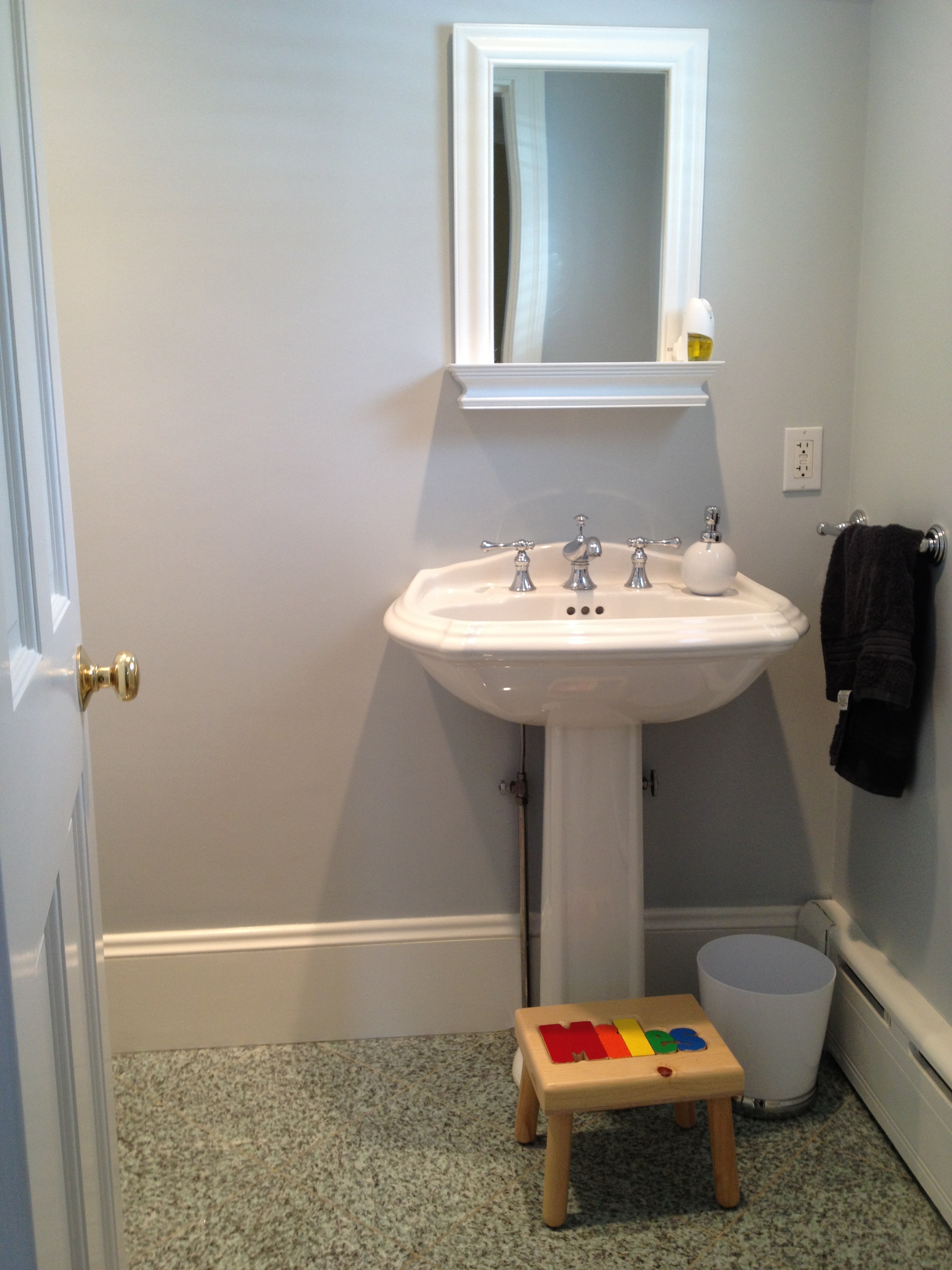
I’ve blogged about this before – a powder room with some “bossy” sea foam green granite floor tile that wasn’t my client’s favorite thing, but also wasn’t a huge priority to change. I knew we could make a couple of really simple, really inexpensive updates to put this floor in its place.
Powder Room AFTER:
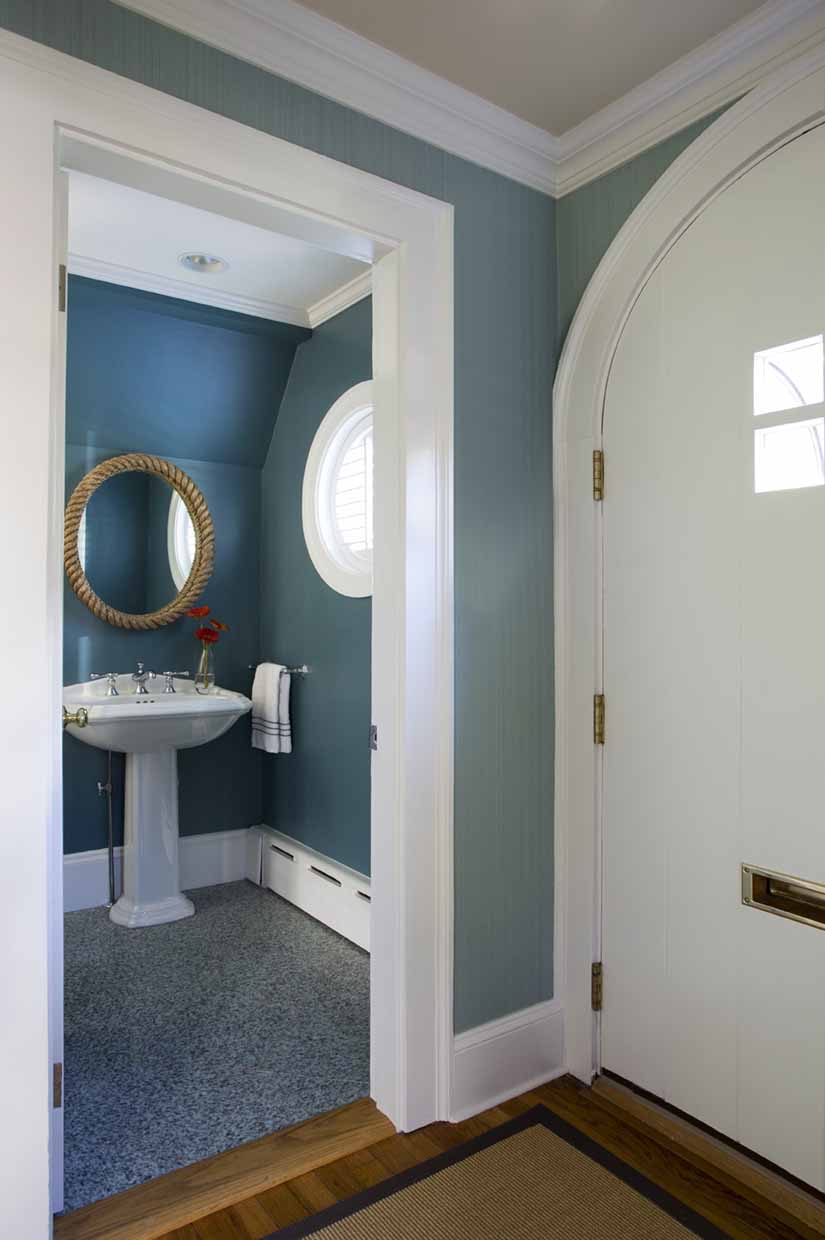
Those two changes – can you see them? – paint and a mirror. That’s it. I chose a deeper blue-green paint color to balance out the floor, which also relates to the blue wallpaper in the foyer. The right color makes all the difference – I also love how it instantly made the pedestal sink, with its curved backsplash, look more shapely and elegant. The oval rope-bordered mirror from Anthropologie plays up a nautical vibe (originating from the round, porthole-esque window), and also picks up the natural texture of the foyer’s sisal rug, and the shape of that nifty front door.
When my clients prepared to welcome their third child, a girl, they asked for my help in converting their eldest son’s room into a shared bedroom with his brother.
Boys Bedroom BEFORE:
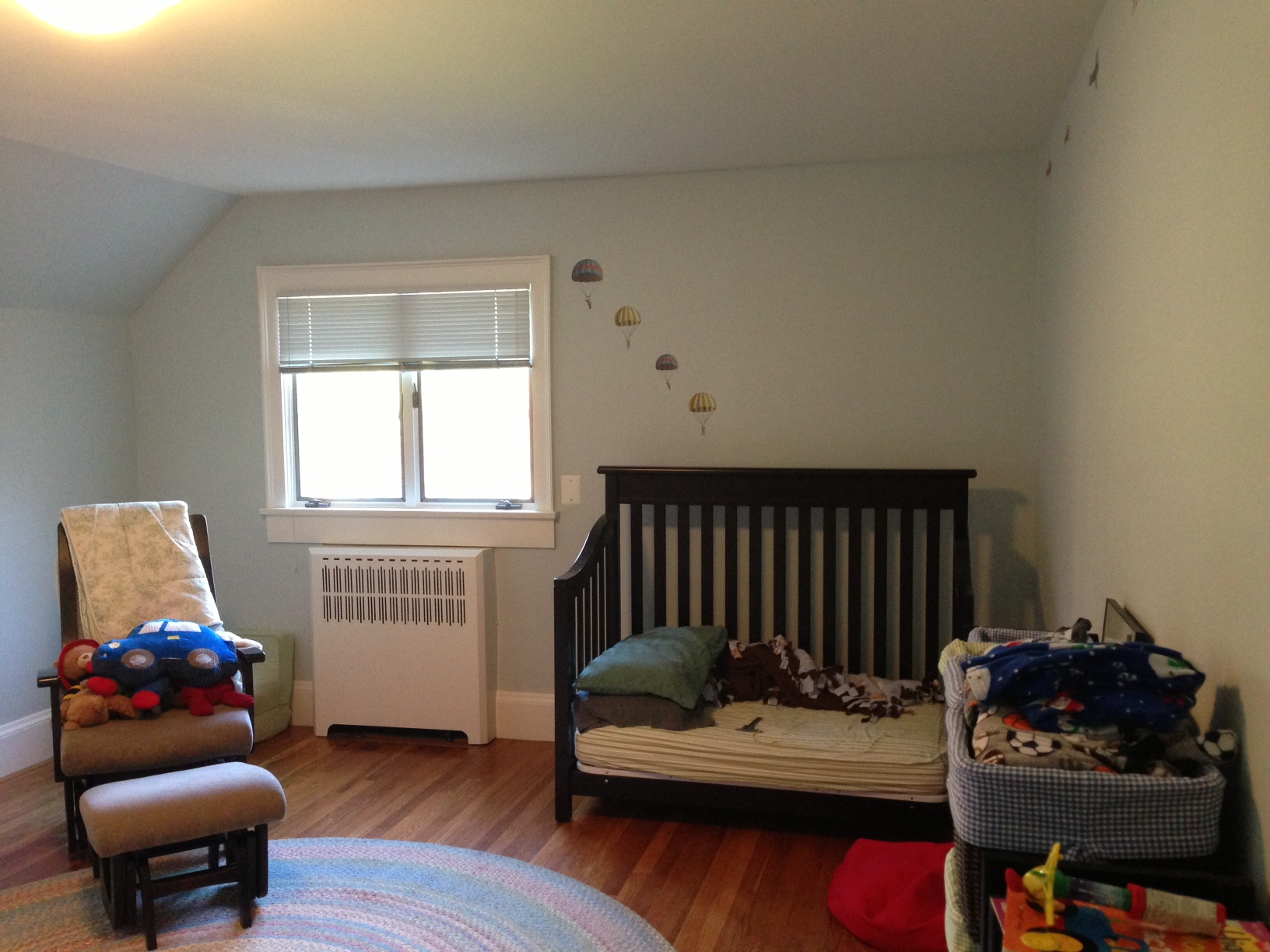
This bedroom (which by the way, is HUGE), was suffering from an odd layout, lack of personality, and was also stuck in “baby mode,” even though its current resident was most definitely a “big boy.”
Boys Bedroom AFTER:
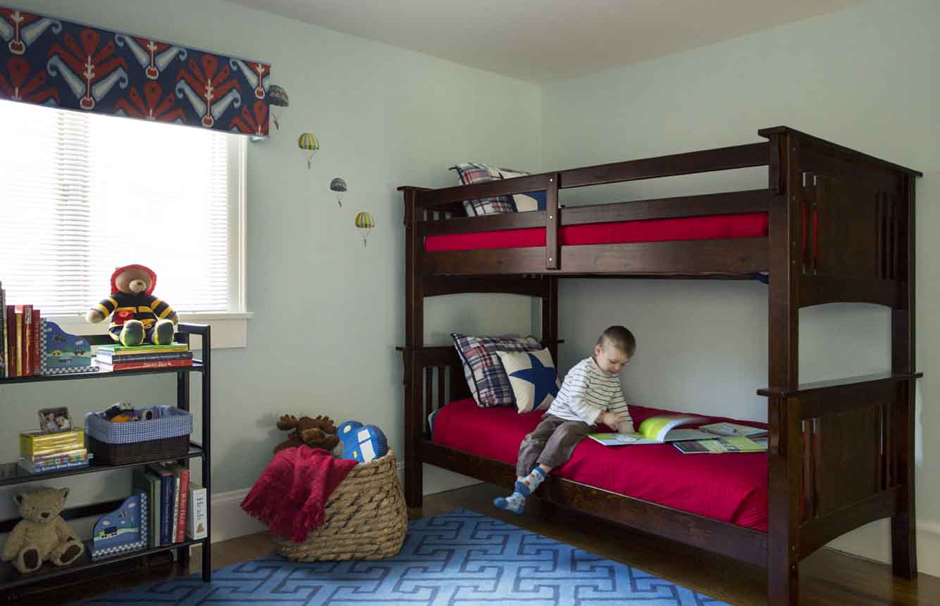
Have I ever told you how much I LOVE doing kids’ spaces? (Or how much I love a classic red, white and blue color scheme?). This was no exception. We didn’t have a huge budget for this room, so we used existing pieces, like the folding bookshelves, where possible, and found great deals on bedding from Pottery Barn Kids, and a great graphic flat weave rug from Land of Nod. Even the paint color stayed. Our little splurge was the custom upholstered cornices in a favorite John Robshaw ikat print from Duralee, which provide a purely decorative top treatment that is layered on top of the existing, functional blinds. The other side of the room is a work in progress, and will feature a daybed (ideal for sleepovers with cousins!), a cushy 8×10 rug and toy storage. I told you it was big!
When the time comes for those cousin sleepovers, I am sure my sons will have a blast. Yep, the adorable children in these photographs are my niece and nephew, and the client is my sister-in-law. I’m so happy I’ve had the opportunity to help her transform their home into a beautiful, functional and kid-friendly space – especially since she’s the one who (unwittingly) set me on my present course and inspired me to pursue a new passion for family-centered design. And I love that I can visit whenever I want!
BEFORE photos: Kelly Rogers
AFTER photos: Eric Roth Photography
Really beautiful!
Thank you, Gloria! I really appreciate the compliment :).
So special, k! The updates look fantastic – it must be so rewarding to make such a big difference to your loved ones! So excited for all your lovely work and can’t wait to see more.
Thanks a bunch, Papri! You have beautiful taste, so your comments certainly mean a lot!
I love this! Could you advise me on where/ how to find the MWI Fibershield? Thanks for such a beautiful, yet doable inspiration.
Thank you, Dorothy! MWI Fibershield is based in the Boston Design Center. I believe they only work on a designer referral basis, but I could be wrong. Greenshield is a similar product. Good luck!
This is all-around perfect. Would you mind sharing the PR and LR paint colors? Thanks for the inspiration!
Thanks for the kind compliment! I did not select the living room color, but I know that it is Cosentino Chardonnay. The powder room is Fair Isle Blue. Both Benjamin Moore.