If you’ve read some of my older posts, you know I (with my husband) am knee deep in building a new house. I’ve spent so much time picking all of the fixtures, materials and finishes to ensure that our home will have “good bones.” I’m only now starting to eke out into the world of true decoration – paint and wallcoverings, furnishings, accessories (good golly, not yet!), etc. I wanted to share some the tentative paint colors and wallpapers I have selected for the first floor of our house.
But first, I need to orient you a bit. This is a center-entrance colonial, with a pretty logical floor plan. Off the foyer, you have stairs and a hall in front of you, the living room to your left, and dining room to your right. Straight ahead, the hall continues to the back of the house, where the informal dining area is (along with French doors leading to the deck outside). Turn right, and you’re in the kitchen. Turn left, the dining room. The back of the house is very much open concept, while the more formal spaces in the front have more definition.
1. FOYER
Benjamin Moore Citrine AF-370
I was looking for a subtly mustard-y yellow to provide a warm welcome to visitors in our home’s main entrance. Citrine seems to fit that bill, and provides the right jumping-off point for the other adjacent rooms (all of them!).
2. LIVING ROOM
Benjamin Moore Mystic Lake CSP-745
What do you do when you can’t decide between blue and green? Pick a paint color that will look blue at times, and green at others. Mystic Lake is an aptly named moody hue I am so excited to see on my living room walls. It’s part of Benjamin Moore’s Color Stories, one of many in this full spectrum collection I’m planning to use in our home.
3. DINING ROOM
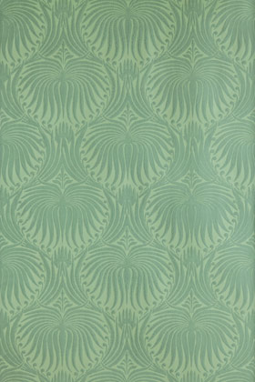
Farrow & Ball Lotus BP-2046
We’ve been living in a condo for the past five years, and although we own it, we decided not to make any significant changes or customizations in our space (with resale in mind), including the walls. That’s why I am SO thrilled for my first foray into the wonderful world of wallpaper! The Lotus Papers from Farrow & Ball have a great rhythm, and a hint of art nouveau curviness that I love.
4. KITCHEN, INFORMAL DINING, FAMILY ROOM
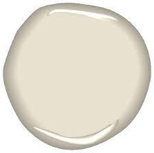
Benjamin Moore Cake Batter CSP-215
As I mentioned this is a huge, open space running the entire length of the back of our house. I picked the color based on our kitchen, which has a lot of green (surprise surprise) that I wanted to lighten and warm up, and some lighting “challenges” for which I need to compensate. I may need to lower the value just a bit if this ends up looking whiter than I would like, but the general idea is airy and creamy with a hint of yellow.
5. POWDER ROOM
Farrow & Ball Renaissance BP-2810
The powder room is TINY, but it’s going to have loads of personality. Although the background color of this wallpaper is blue, it takes on more of a purple appearance in combination with the black damask lovebird print. I think the white pedestal sink and toilet, and the polished nickel fixtures will pop and shine against it.
In the next week or so I’ll have an opportunity to look at some paint samples on the walls, to ensure that the color is what I think it will be, and that the flow is working well from one room to the next. There can be big surprises during this stage, which is exactly why we test. Wallpaper has already been ordered, so I’m very much committed in those rooms :).
Of course, I also am thinking about colors of window treatments, furniture, rugs and other major items in each room, but since that is relatively fluid right now, I think I’ll wait to reveal that later, one room at a time. Stay tuned, and let me know what you think about the walls!




I was wondering how ‘cake batter’ came out? I’m thinking of using it for my kitchen and adjacent two story family room.
Hi Elana – I actually ended up switching to Butter Cookie (also from the Color Stories collection) during the testing process. I wanted a bit more yellow. Cake Batter was lovely, just not quite the right color for my space. I do think it is a good choice for an open floor plan. The full spectrum neutrals with more subtle undertones (like Cake Batter) really are very versatile.