Oops, I did it again. It’s kind of ironic that I sat down to write a post in part about color and that big blue ‘publish’ button did me in again. It somehow wooed me into sending my post live before I had typed a word. My apologies to email subscribers who received a blank message this morning!
I was up early this morning to write partly because it’s nearly impossible for me to stay awake at night. Our only TV in the house while we renovate is in my bedroom, and that’s where we ‘retire to’ after dinner. It’s almost impossible for me to stay awake in there – it’s just so easy to lay down and close my eyes!
Anyway, some of my renovation-related posts have been more thematic, but this one is a bit scattered. I have a lot to share from the past week in terms of construction progress, and a lot I’m nervous about in terms of locking in finishes (which is sort of a theme in itself…).
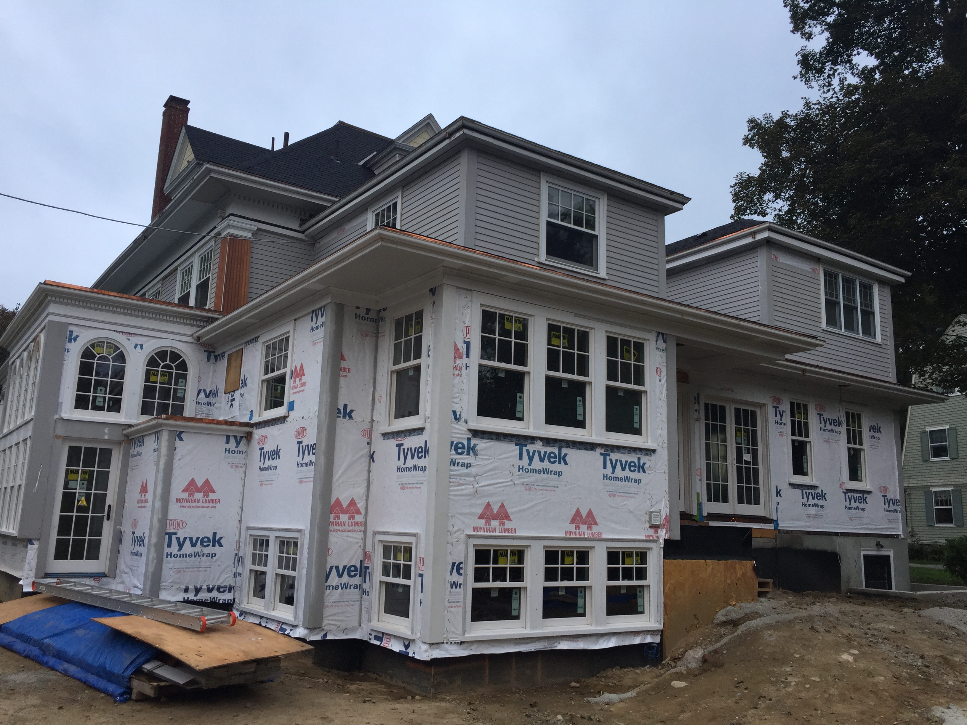
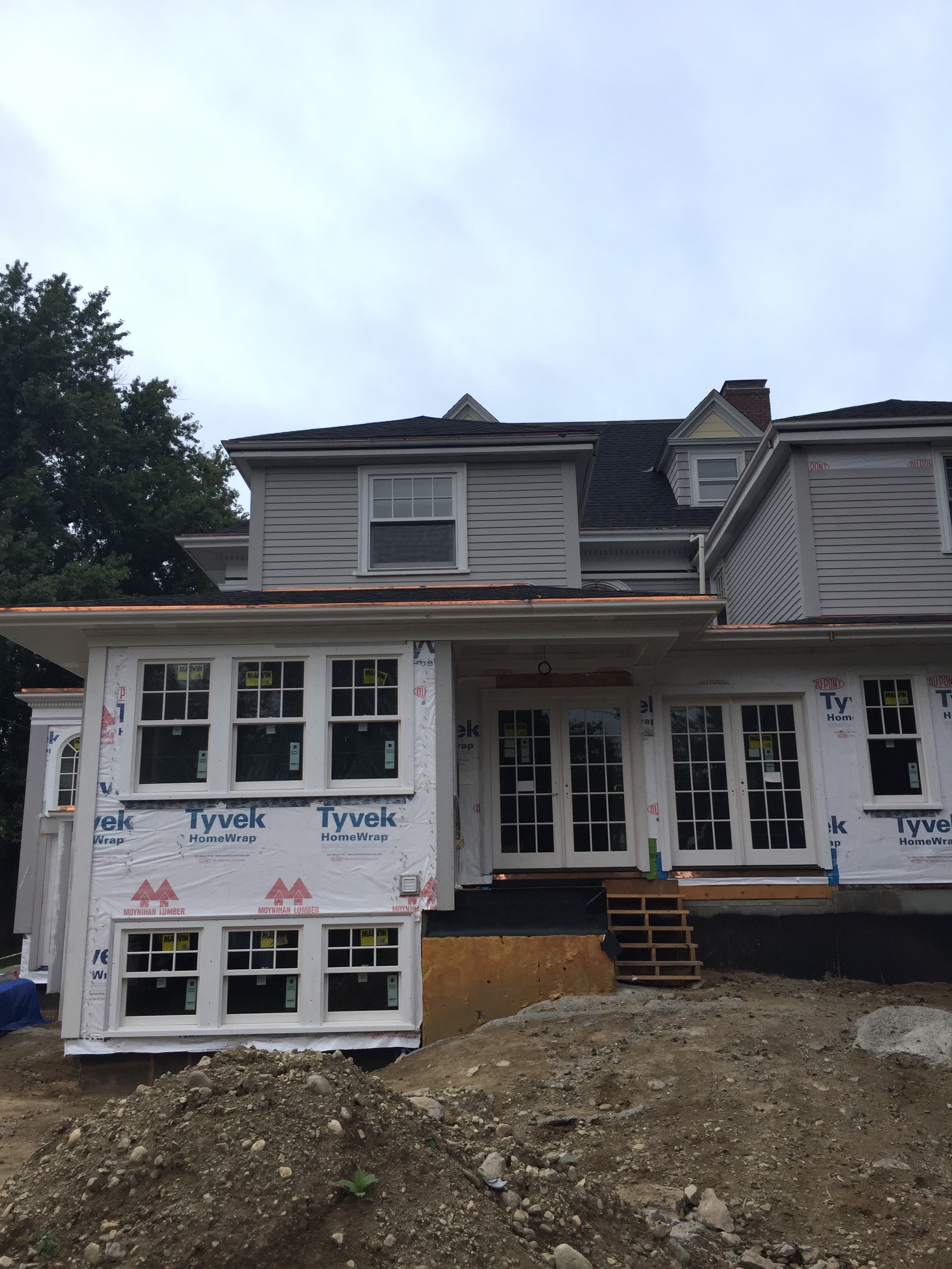
The re-siding of the entire house is underway. I can’t wait until it is painted – she doesn’t like being gray! 🙂
Speaking of which, I did test some exterior colors over the weekend. My husband is having a hard time envisioning the finished product and thinks I am changing the house from yellow to beige, when I am just ‘tweaking’ to a different yellow. I don’t use these words with clients, but I may have uttered them to him: “Just trust me.”
The next couple of days will likely be spent inside, while we deal with heavy rains. Thankfully the carpentry team has prepared for this – they’re on it!
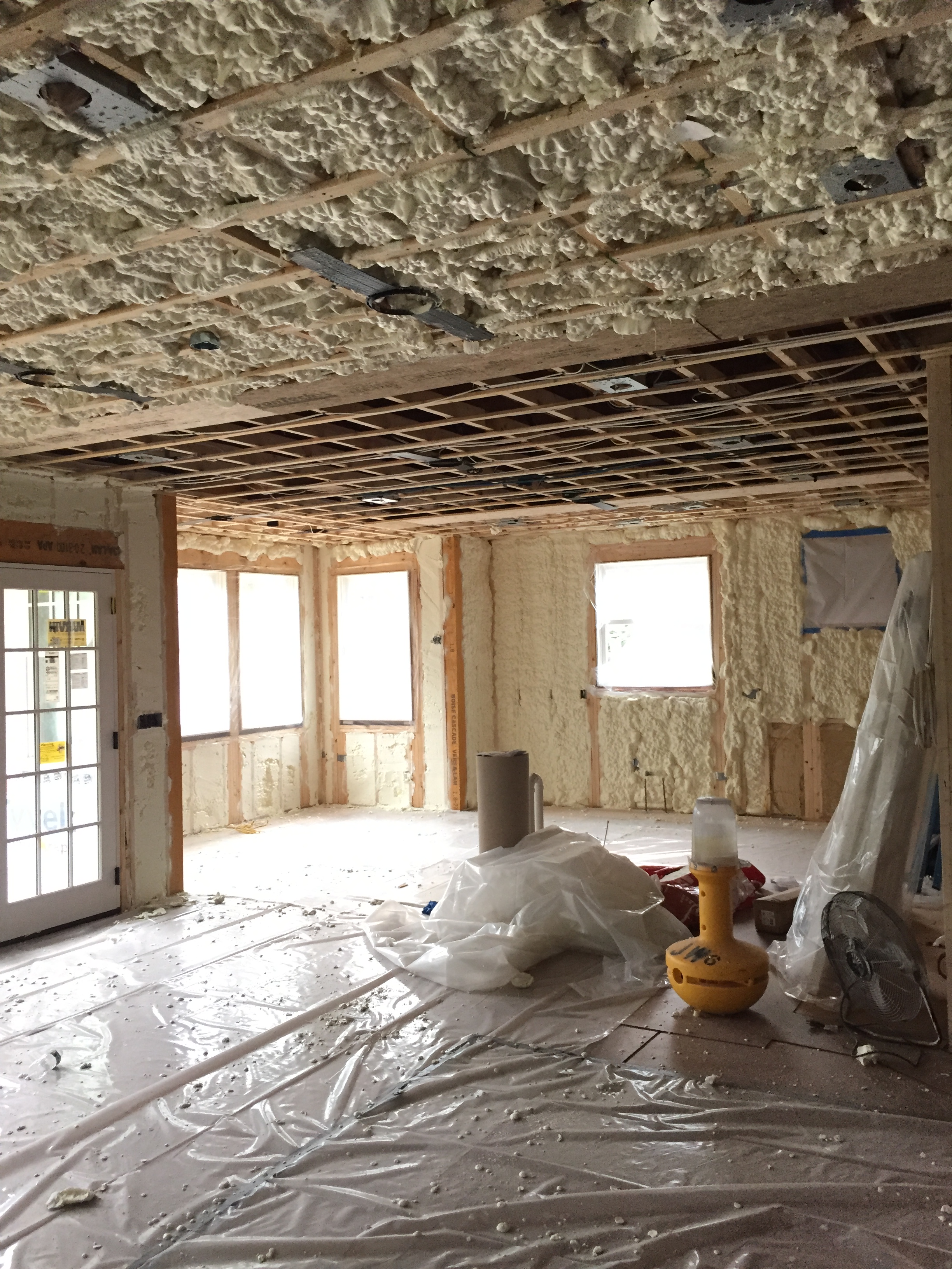
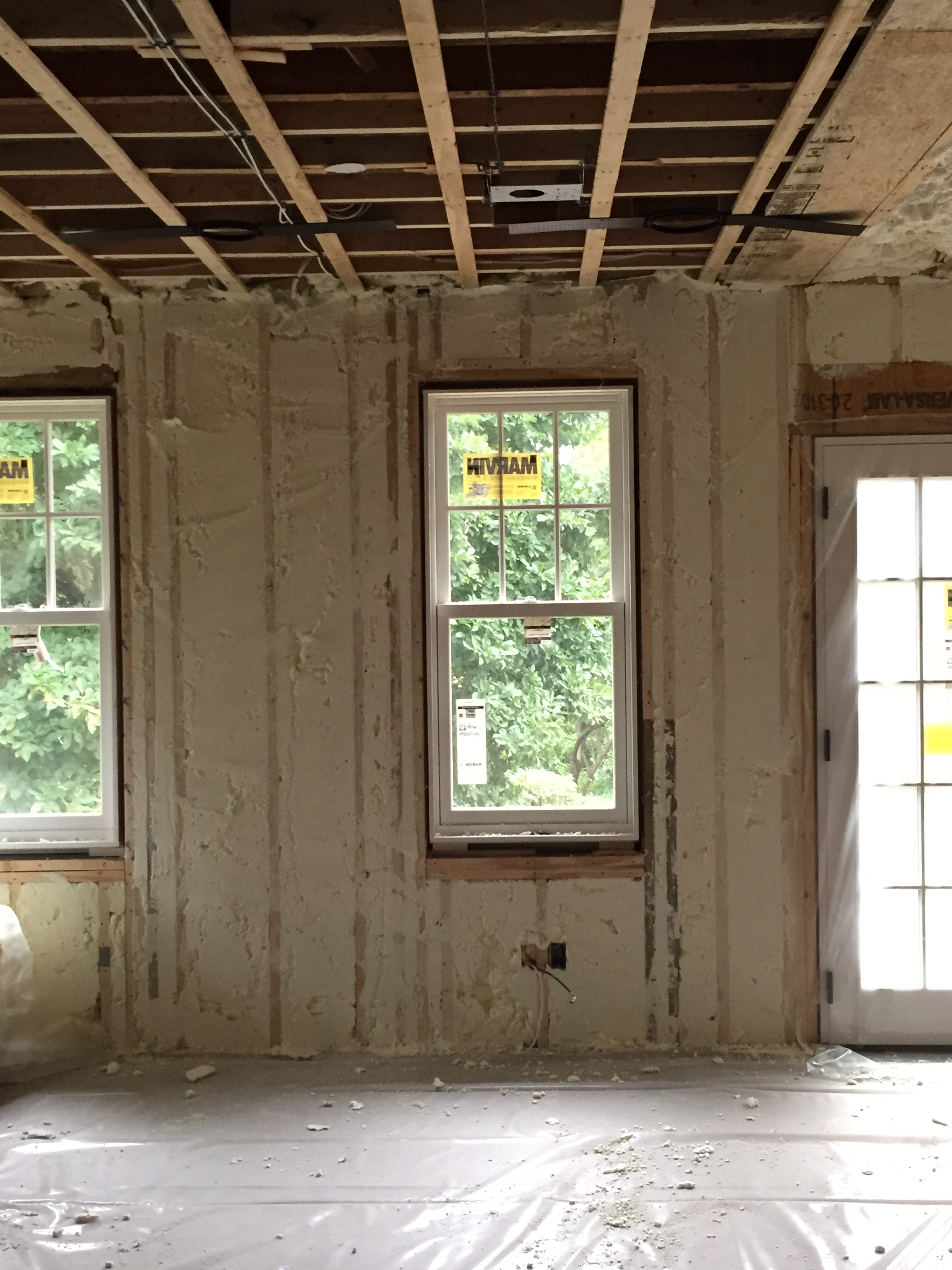
The insulators were also here yesterday. They swooped in right after we passed our final rough inspection. I believe they’re coming back today to finish up, but it’s amazing how quickly this gets blown in. I think I would like the job of ‘scraping’ the excess foam off between the studs, like making the frosting on a cake flat and smooth. That would be oddly satisfying. I would not, however, like to be on the clean-up crew.
Next up, blueboard and plaster – but, even the insulation gives more of an impression of solid walls. It’s happening!
Another thing that is happening is, surprise surprise, me questioning all of my choices. And at this phase, there aren’t too many more choices to make that haven’t already been locked and loaded. Even though I haven’t ordered all of my lighting yet (but will this week), or my tile (same), time has basically run out for me to rework those. Paint colors and some furnishings, however, are more or less still on the table.
As I sat down to finalize my paint schedule this past weekend, I spent some time walking around in the space with my fan decks and color chips, visualizing every nook and cranny. This is the ‘cranny’ I honed in on…
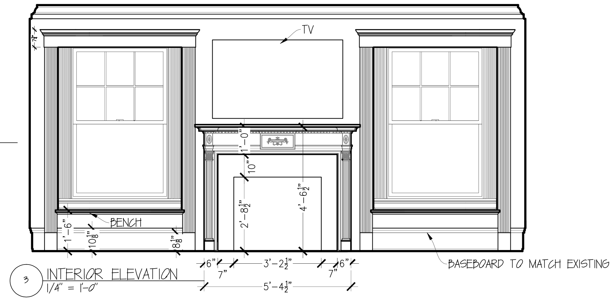
I sourced a mantel design that looked like it belonged in the house (disregard the fireplace mantel height – it is coming down a bit to give the TV a little more breathing room). I decided not to go the custom route, because that’s generally what the Victorians did – it was the dawn of the era of picking things for your home out of a catalog. Our living room, what was once the main parlor mantel may have been custom built/carved, but the others are definitely ‘bought.’ Now, granted, this is a pretty nice ‘catalog’ mantel, but I just wanted to keep it in the spirit of the others (we have four more) in the house. I am toying with painting it a bold color! Stay with me…
When I really looked at this elevation in real life, I kind of panicked that it was going to be too boring. Not only that, but at the end of a very long and not terribly wide space, I worried that this wall, which I want to be focal, was kind of going to recede into the distance (thus also enhancing the potential ‘bowling alley’ feeling). Bolder colors can have the effect of ‘advancing’ and helping to visually correct that long and skinny impression. But where to put them!? Painting an accent wall didn’t make any sense (not much exposed wall to speak of), and I definitely want to keep the cased openings white to have a consistent rhythm with the windows and door openings throughout the rest of the space.
The window seat niches seemed like an interesting opportunity to make a bolder statement. They are recessed and enclosed, which could make them feel even cozier once inside. And I think they would look intriguing against the white opening trim and light neutral wall color I have planned. I was thinking to also paint the mantel the same color. Now, I just have to choose a color! The finalists from my family room palette are muted teal or deep purple.
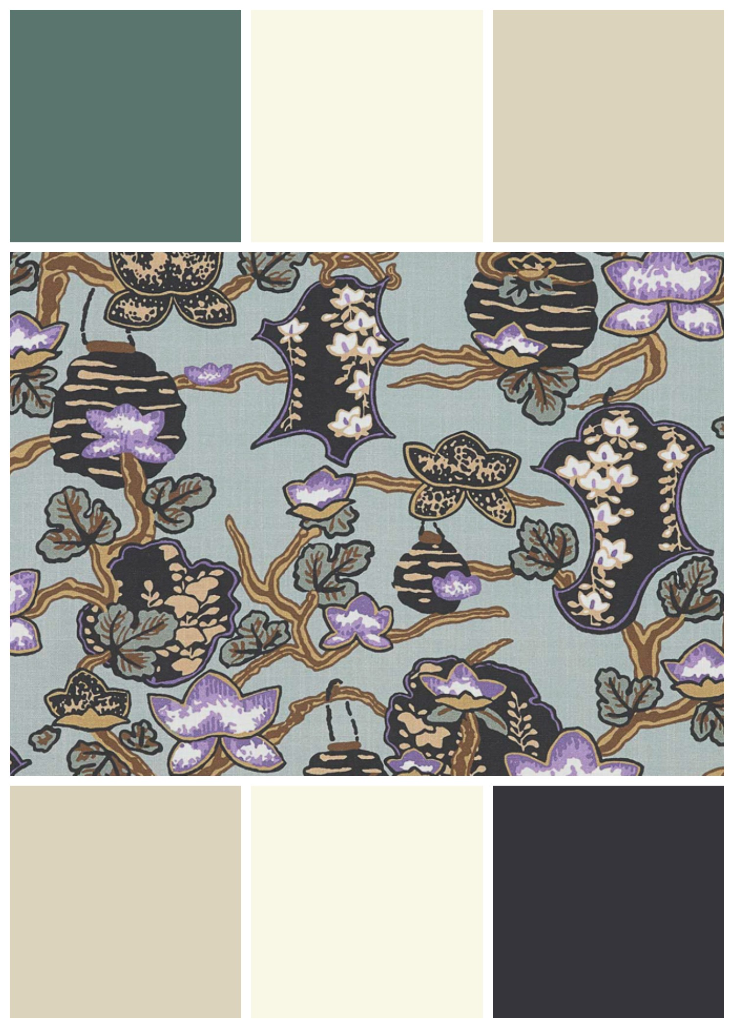
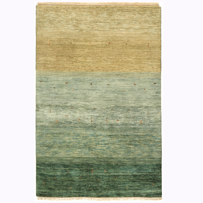
The graphic I created shows the fabric that inspired the color palette, with the trim and wall colors plus the teal and purple. [Also note that the ‘beige’ color is much more yellow than the online image appears! The wall color throughout this entire area is going to be C2 Tusk, which is a light yellow-based neutral.] I am actually leaning toward the purple for the inside of the niches – C2 Voodoo – not just because the name is amazing, but because we may already have enough teal in the room, especially in the rug.
The teal paint color is drop dead gorgeous, though – C2 Topiary. I know we would never tire of it. I’m trying to figure out the right balance and placement of colors. Voodoo or Topiary. Why is this so hard? I literally do this every day for other people. They pay me for it. It’s incredible, really.
OK, I want to shift gears to an area, right across the way, that I feel I do have under control color-wise – at least, I hope I do because there is no turning back now on any of it, with the exception of window treatment and bench cushion/pillow fabrics!
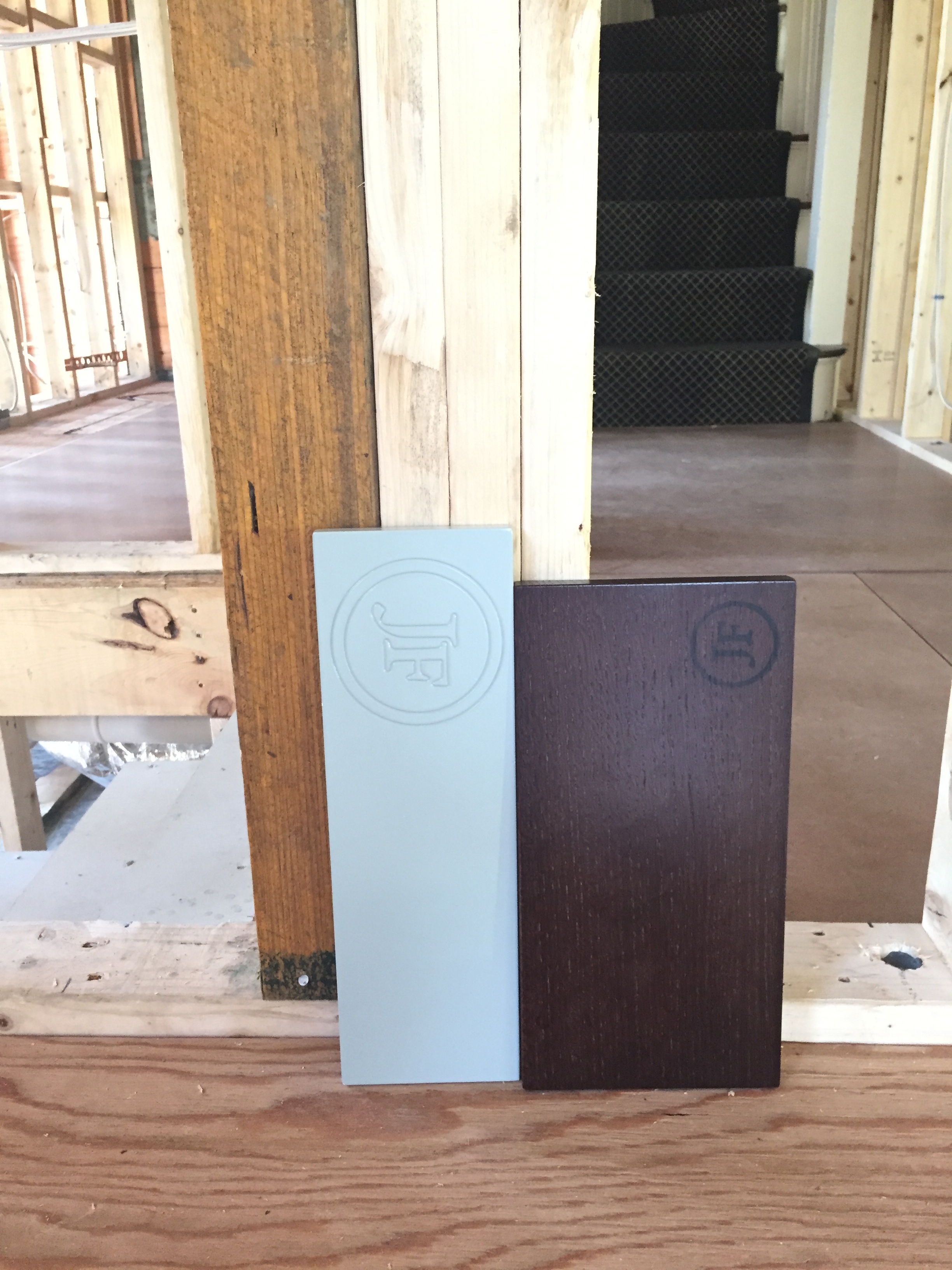
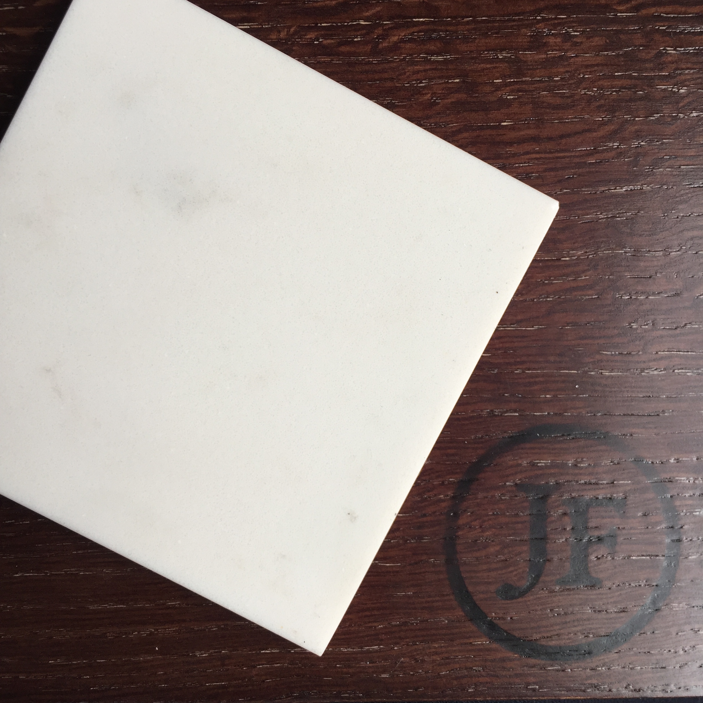
I finally approved my island/bar/range hood wood finish sample, after three rounds. I still think it is a bit red, but at this point, I’m going to make the floor stain work with it, vs. the other way around.
I do think it will look more ‘furniture-y’ this way, and will create a gorgeous backdrop for the brass cabinet hardware I have on order! Looks great with the island countertop, too (as in the above image). Wait till you see what I’ve got cooking with the range hood. More furniture-y goodness will be revealed later!
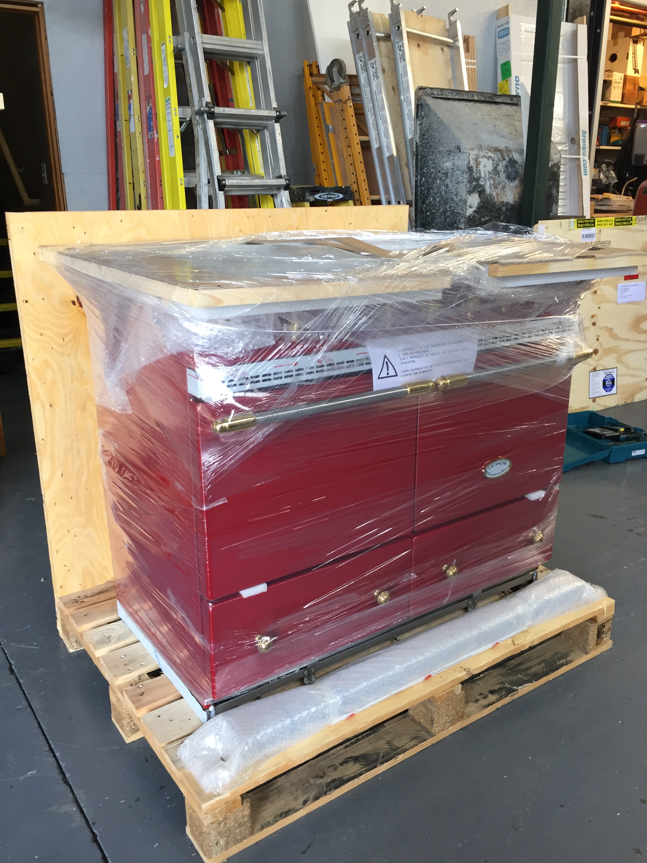
Speaking of the range, an exciting and nerve-wracking moment happened yesterday when I drove up to my contractor’s warehouse to inspect our range, which finally arrived. They uncrated it before my eyes so I could see any damage right away. Any major problems, and we’d be guaranteed to miss our ‘Christmas or bust’ deadline by a whole lot – these babies have a 6+ month lead time.
A big sigh of relief – no damage was observed, and everything seems to check out. This is the range I ordered and it has arrived unscathed! And, as you can see, it is indeed RED. Feel free to call me crazy, but I think this appliance is going to be the belle of the ball. Or, my kitchen. Now, back in the crate to get ready for your big December debut, mon cheri.
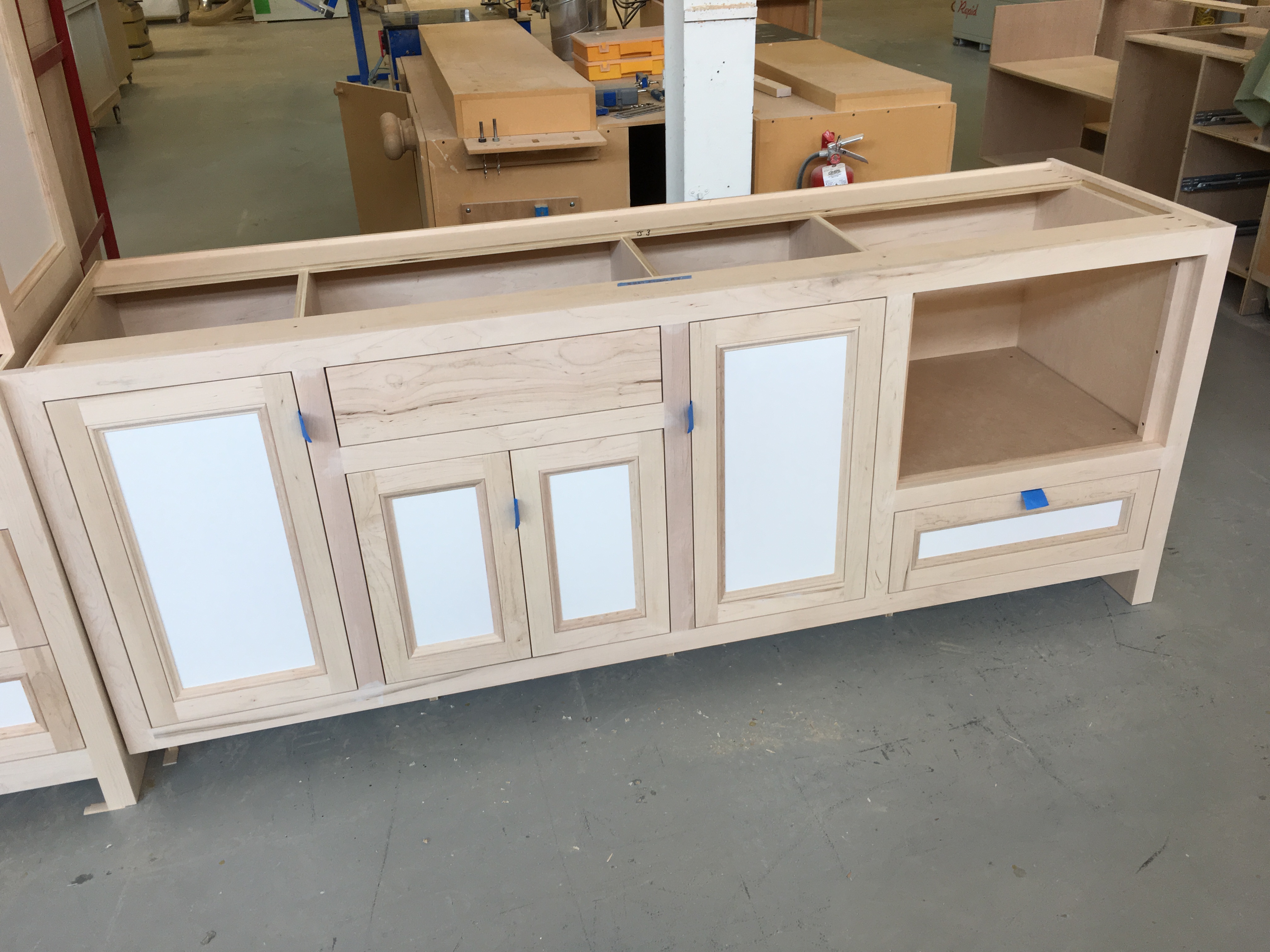
I’m headed up to Jewett Farms’ headquarters in Dover, NH on Thursday to check in on my cabinets, and hopefully select soapstone slabs for my perimeter and bar countertops. There is still time if I don’t find the perfect ones, but I’d rather not have to make the 1.5-hour drive twice if I don’t have to.
Stay tuned on Instagram Stories as I document the day-to-day progress – things are accelerating by the day around here!

I’m going to follow your blog with interest as we are in the process of renovating our house!