I’m pretty much still floored that my work was featured in the Boston Globe today (check out the online version here). I’ve been working hard to develop my portfolio, and of course hoped (dreamed!) to be published sometime in the distant future, but I honestly had no idea it would happen now. I’m so grateful. Especially to one Mr. Eric Roth, for always capturing the best of my work through his lens, and for encouraging me to strive for goals I didn’t believe were within reach for me.
Anyway…
Since you can only see a little of Eamon’s nursery in the article, I thought I’d put together a full nickel – heck, even dime – tour of the room. Finally!
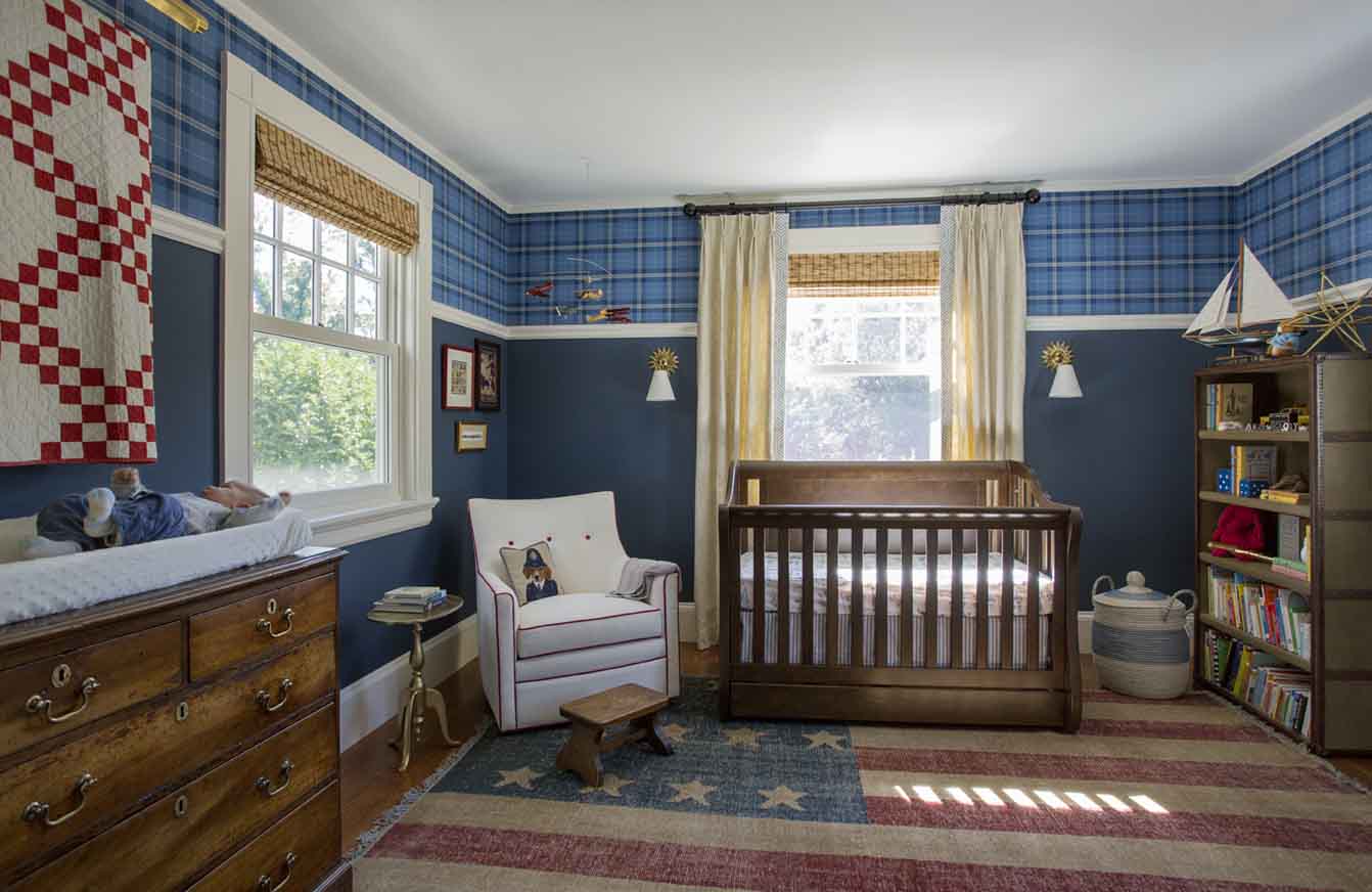
I set out with a vague vision for a masculine, Ralph Lauren-esque space steeped in tradition, but with modern touches to prevent it from looking like a period room (or too mature for a baby). Previously, I had a whole separate scheme developed for a girl’s room involving butterflies, trellis patterns, and lots of Kelly green, but when we found out we were having another boy, frankly, I was a little stumped. I found some wallpaper I liked, and bought a crib, but I just couldn’t bring myself to pull the trigger on anything. Then BOOM. This amazing recycled American flag hand-knotted rug appears (on Amazon, no less!), the smoke clears, and everything else falls into place (and is purchased immediately thereafter).
This is Eamon’s Vintage Americana Nursery – a room inspired by the past, but designed with the future in mind.
The antique quilt above the changing table is one of my favorite elements. It’s a focal piece of art, hanging on the wall now (even tastefully illuminated by the picture light above), that’s not going to create a safety hazard for a squirmy, kicking, grabby baby or toddler. And when the time comes to convert the crib into a full size bed, the quilt will move to its ultimate destination: the foot of the bed.
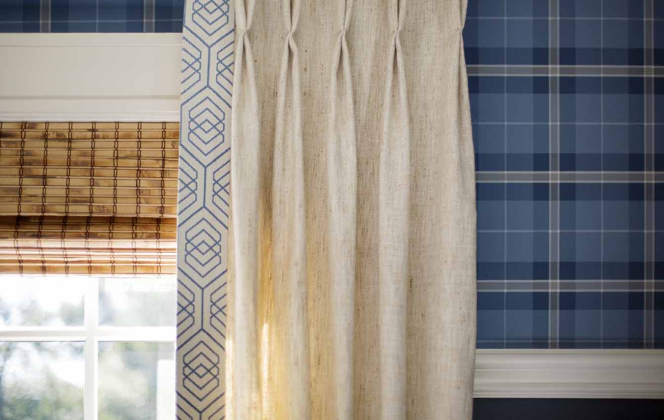
I love wallpaper, and I knew I wanted it in the nursery. But I was nervous about hanging it floor to ceiling, for fear of “scratch and dent” activity. I had a chair rail installed at a height that kept the wallpaper safely out of reach, and added some architectural interest. It also allowed me to have the paper, an all-boy plaid from Thibaut’s Menswear collection, hung “railroaded” (rolling it out horizontally vs. vertically), which saved money on both the installation and materials. This was possible because the pattern is exactly the same vertical as it is horizontal. Another cost-saving measure (that allowed me to splurge on the Jessica Charles glider – SO worth it) was keeping the window treatments held over from the guest room, and just adding a little embellishment – a custom trim on the drapery leading edges made of a Thom Filicia fabric (for Kravet) that reminded me of an abstracted/exploded plaid.
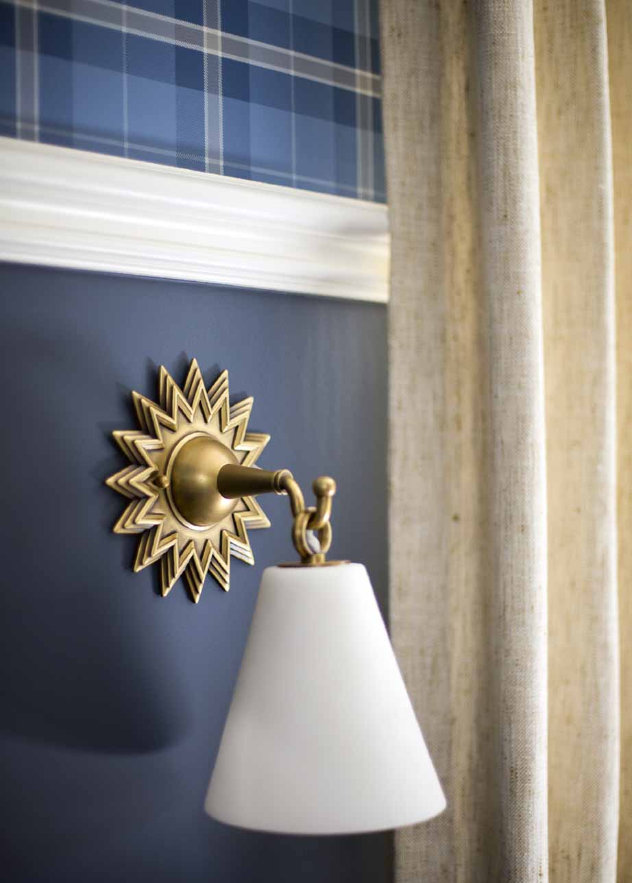
Like many Victorian-era homes, mine is sorely lacking in the hardwired lighting department. I think my electrician just booked a trip to Cabo on the money he’s made here over the past year and a half, alone. While this room had been a guest bedroom with just a couple of (awesome) lamps on the nightstands, that wasn’t going to cut it in a nursery – I did not want table lamps (nor tables!). I added these Robert Abbey sconces, which I’d admired for a very long time, on either side of the draperies and crib, as well as a picture light to illuminate the changing table (a 19th century walnut chest). Both are on dimmers – this is so important for a baby’s room! When I go in for a late night feeding or diaper change, I can turn on the lights just enough to see, but not so much to jolt my little guy wide awake. I mean, I love this room and everything, but I’m not interested in an all-night party here anytime soon. Thank you, Lutron. Down the line, the sconces will work perfectly as bedside reading lights.
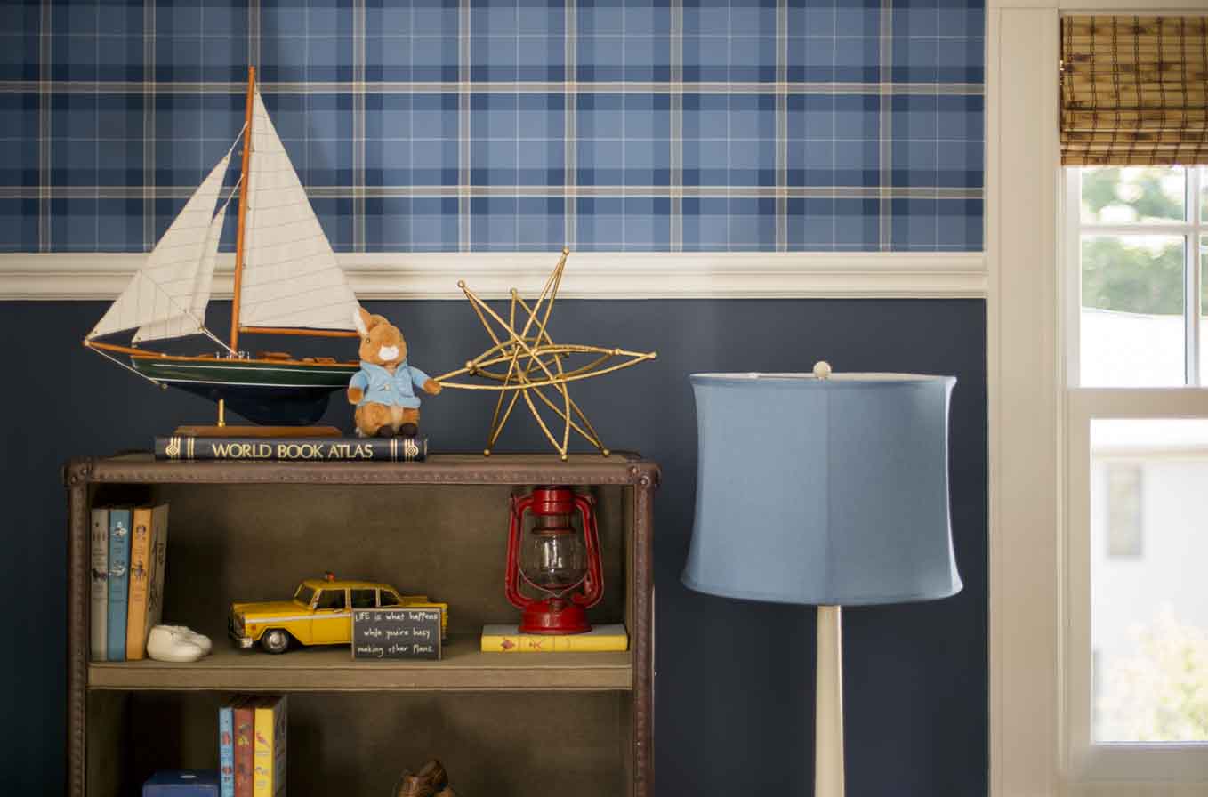
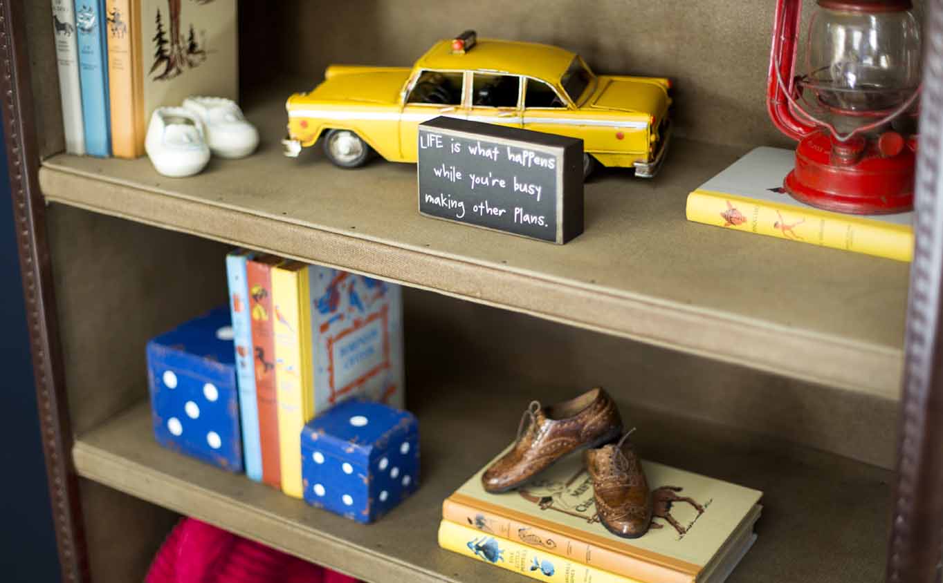
It was so much fun styling the bookcase, which is from RH Baby & Child. I found the cool vintage books on eBay for a song. Books have to be my number one go-to for kid-friendly accessories. Not only can they be really decorative and pretty, but you and your child can also read them (hello!). The white ‘bookend’ on the top shelf is my husband’s ceramic baby shoes. As Eamon gets older and more vertical, I’ll obviously rework this accordingly. There are books on the bottom two shelves so he can help himself, once he’s mobile. And not to fear, the bookcase is anchored securely to the wall :). But it’s also totally appropriate for a big-boy room for many years to come.
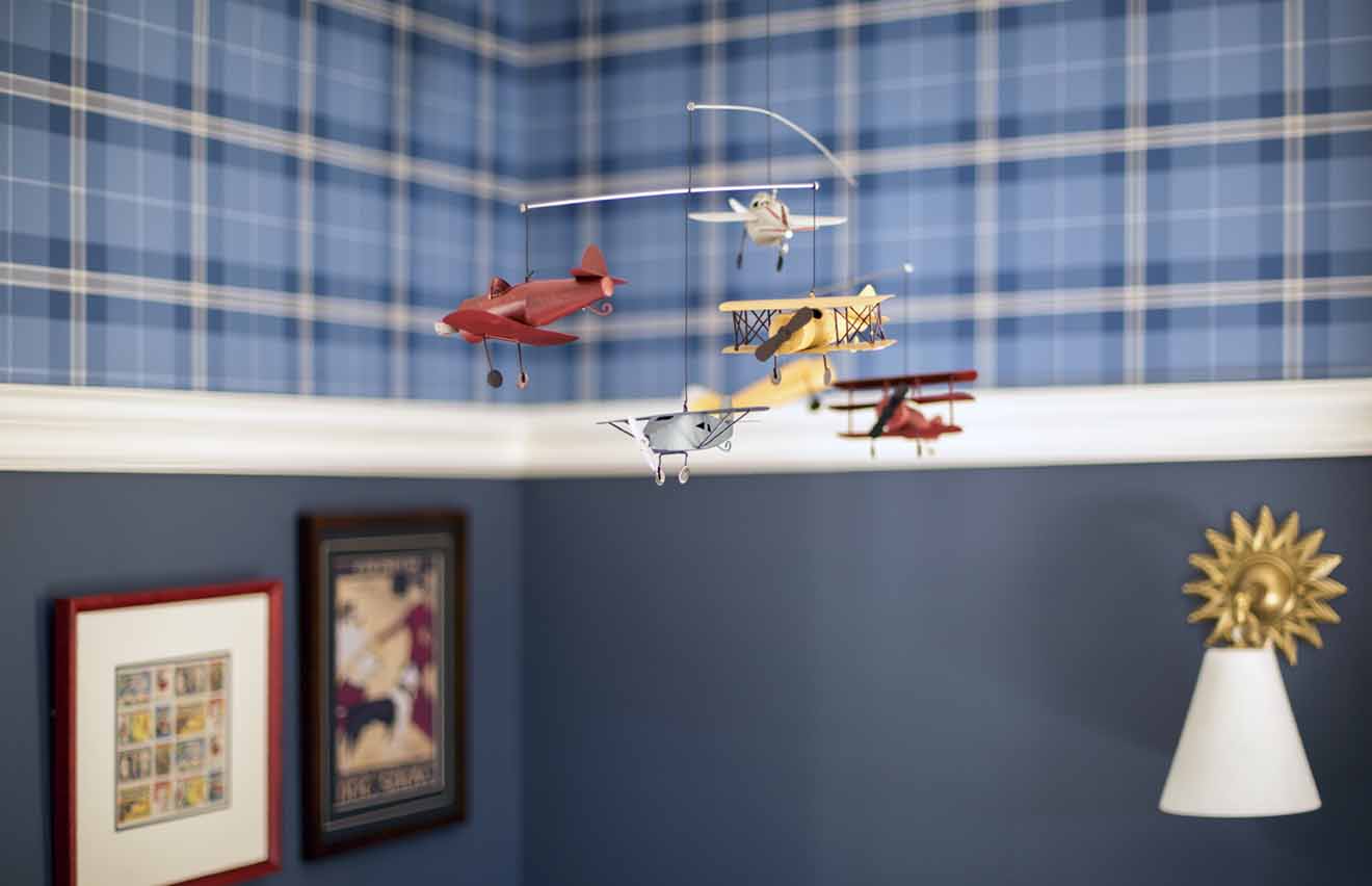
I hung a mobile of vintage airplanes, also from RH Baby & Child, above the glider, instead of over the crib. This way, I don’t lie awake at night wondering if the baby has been impaled by a miniature propeller. He can still see it there from the crib, and also likes to look at it while we’re rocking him (good for soothing!).
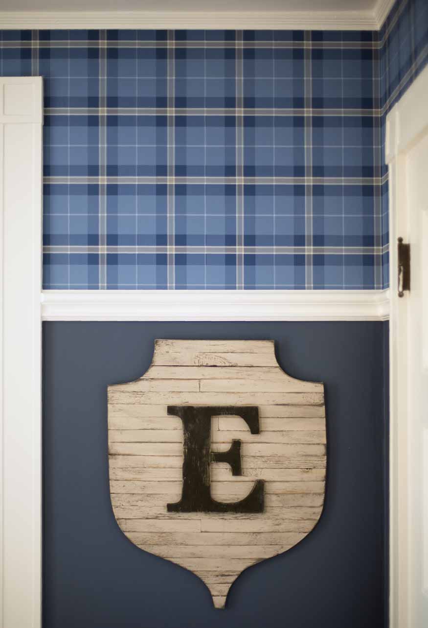
I wanted to personalize the room in some way, and found this cool weathered plaque on One Kings Lane. I hung it on the wall before we told anyone the baby’s name, so family members who had seen the room in progress were speculating (Emmet was apparently a leading contender, who knew). I think it adds a preppy, dignified air to the nursery. Oh, the wall color is Benjamin Moore Newburyport Blue. It’s a great navy that’s not too dark/black, not too “royal.”
Thanks for taking the tour of Eamon’s Vintage Americana Nursery! Can you tell how much I love designing kids’ spaces yet?? If you would like help decorating a special room for your little one(s), or other spaces in your home, please contact me; let’s talk!
Photography by Eric Roth

Kelly, this is just amazing! Every little detail is just prefect. You have an amazing gift of design. It’s a nursery that’s playful, sophisticated and cozy but best of all it will easily transition as your little one grow! Kudos
Teresa – thank you so much for your kind and encouraging words! I still often have feelings that I’m just ‘pretending’ to do this for a living, so it is especially nice to have some (generous) validation from such an expert in the area of color design. I learned so much from you; I owe you a huge debt!
Gorgeous does not begin to describe what is going on in this room. It is just so perfectly boy and New England all at once. Well done! And congrats on the Globe feature!! I lol’d at your electrician going to Cabo comment. I swear mine summers on Nantucket just on my dime. Old houses! Love…hate…repeat. Congrats again!
Thank you so much, Dina! I have been following your blog for awhile and I love seeing all of your great finds and project updates. Hope to meet you IRL sometime! I also have a 3-year-old – perhaps a design playdate is in order? 😉