I had the great pleasure of visiting the Junior League of Boston Show House yesterday (thank goodness for babysitters!), on the day it opened to the public. I have way too much to share for just one post, so I’ll be breaking it down into somewhat logical topics over the course of the next week or so.
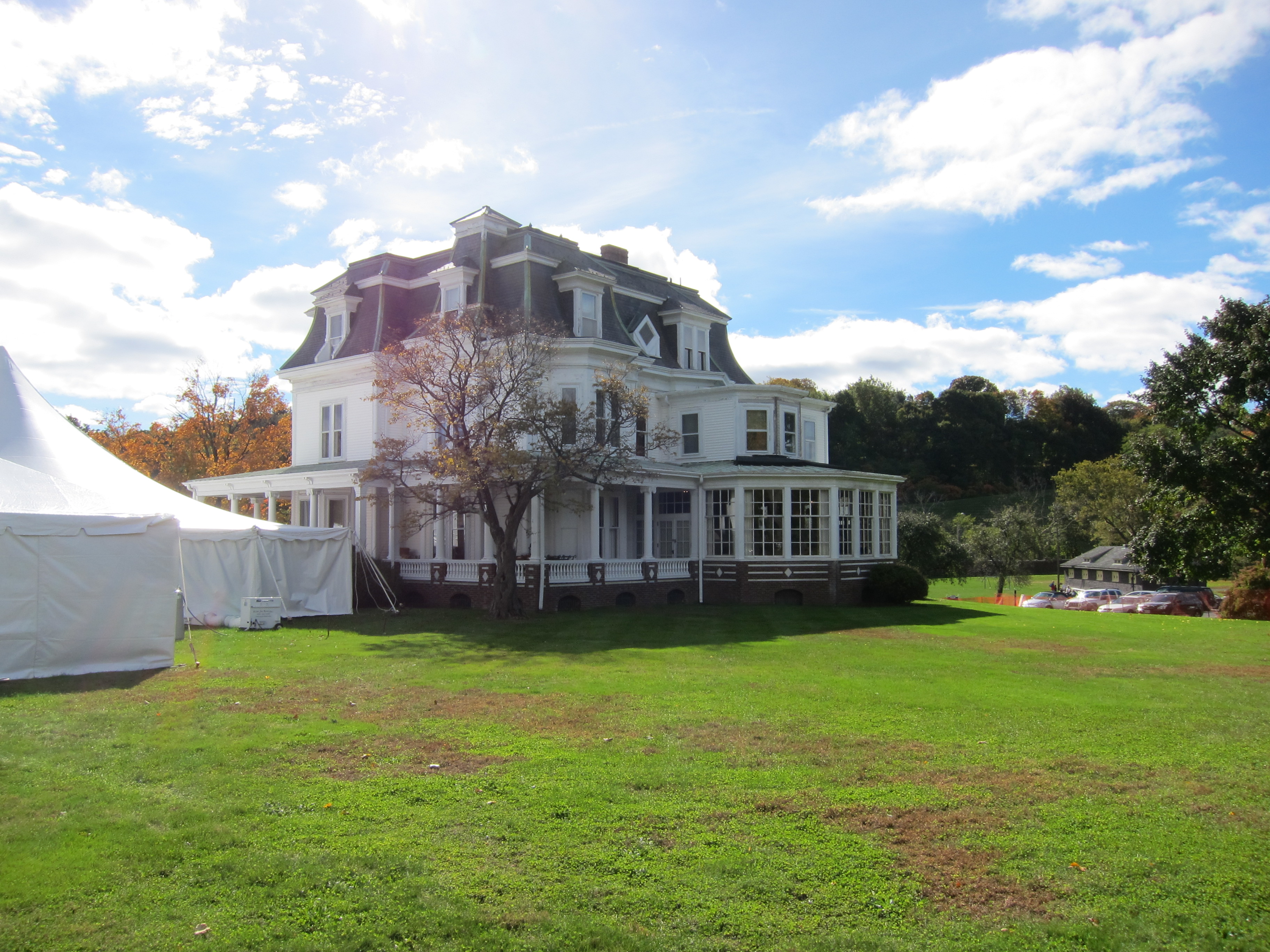
Today, I’ll give you the first taste – my very favorite rooms in the house (so hard to choose), The Potter Estate, an historically significant Second Empire manse dating back to 1862. It also happens to be right here in my hometown of Newton, Massachusetts. This is just my highlight reel, folks…
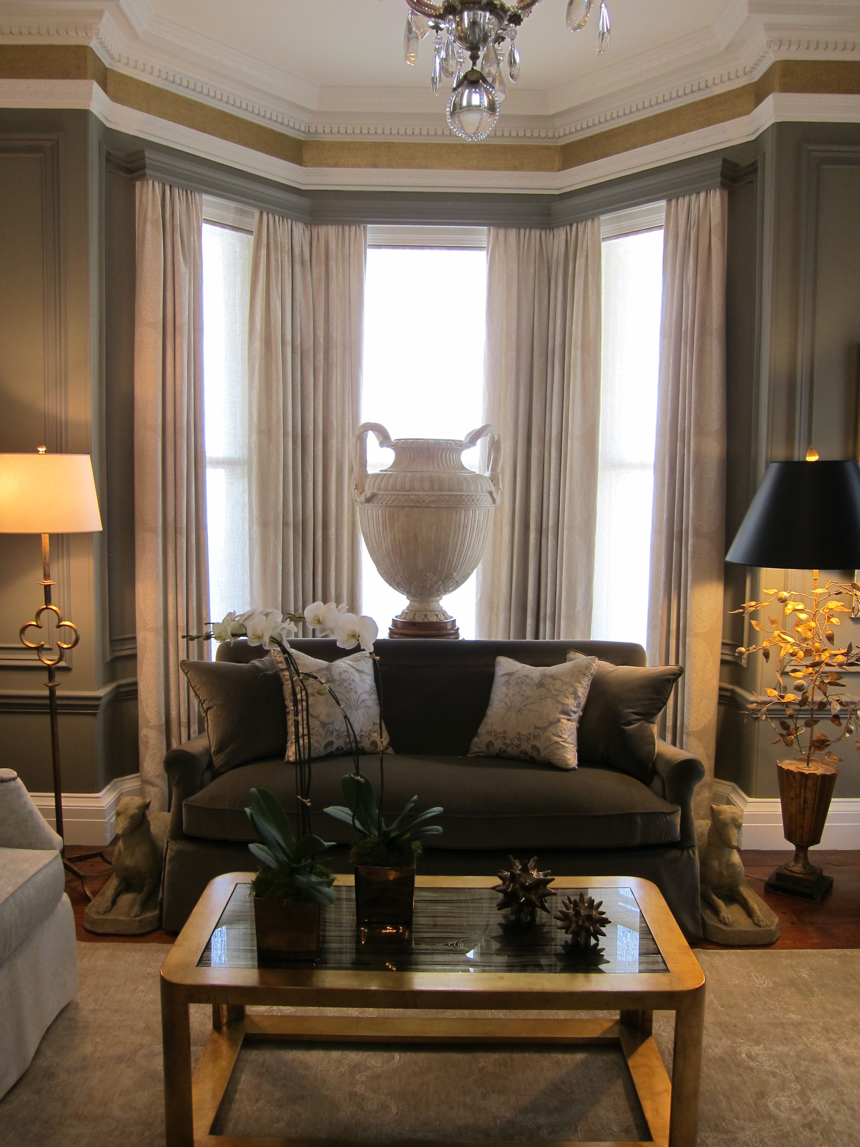 Above, the Sitting Room, designed by Michael Carter. I loved how he combined silver and gold finishes in a not-at-all shiny or glitzy way. It’s a perfect balance for a serene, classically elegant setting.
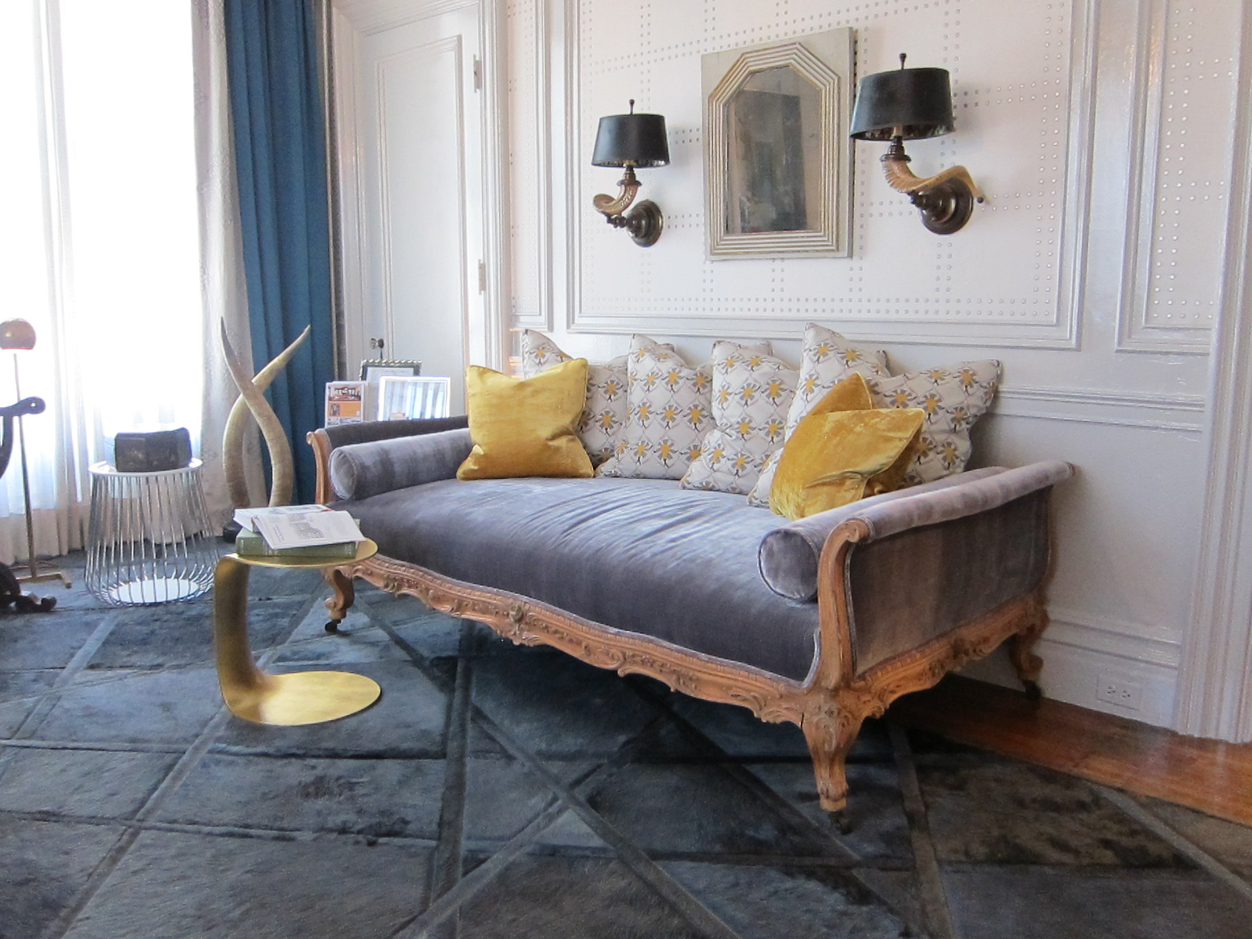 A sitting area in the French/Moroccan-inspired master bedroom, designed by Kristen Rivoli. There were so many gorgeous details in this room, including an amazing lantern hanging under a billowing fabric canopy over the bed (of course, my picture of this did not come out), patterned nailhead trim on upholstered panels on the walls, and the most sumptuous fabrics and rugs.
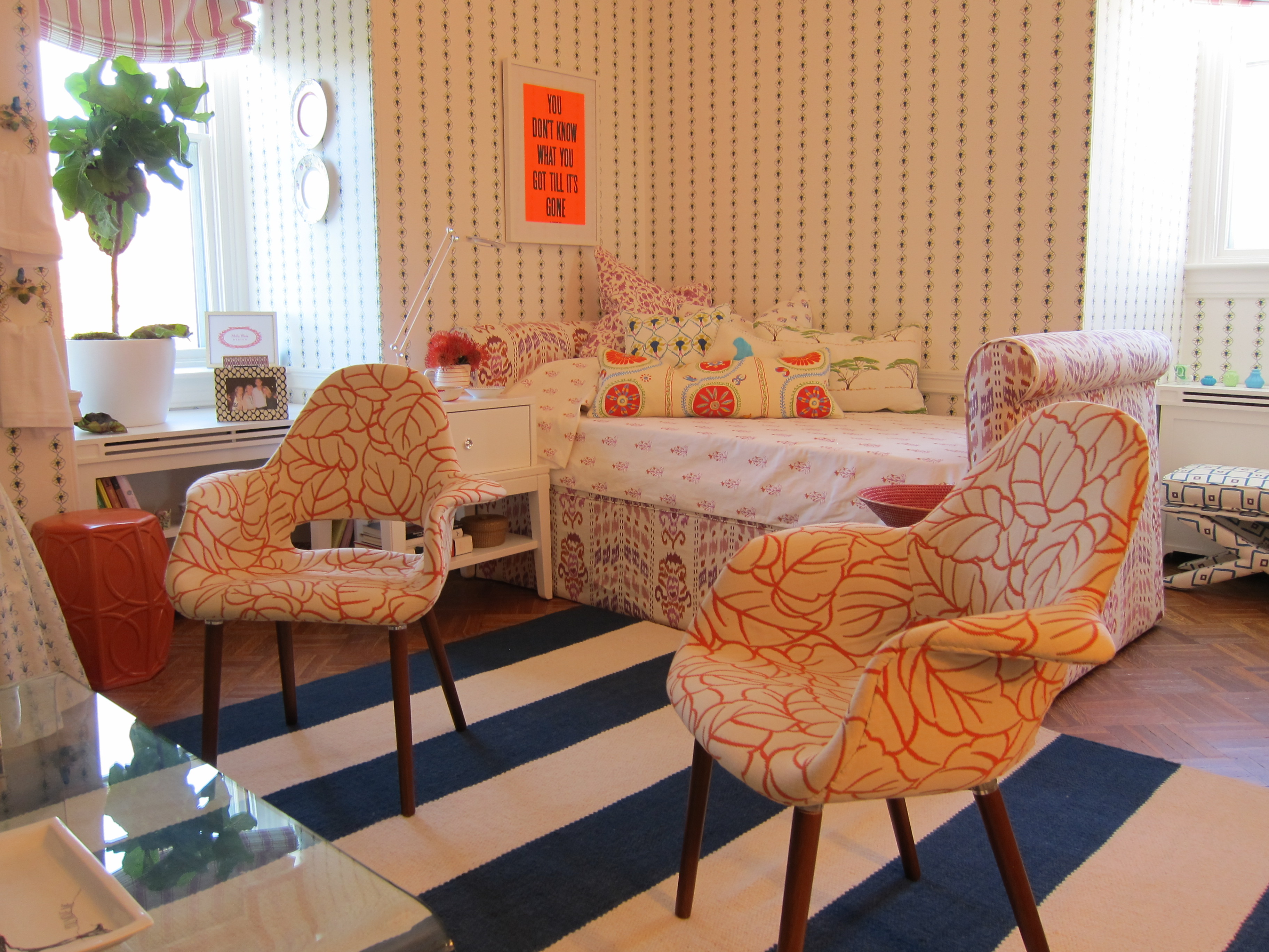 Interior and textile designer Mally Skok created “A Young Woman’s Bedroom,” featuring many of her own fabrics. What a fun room for a tween! The bolster pillow in the foreground on the bed is made from her new collection, “Suzani Luv,” which is slated to debut later this year.
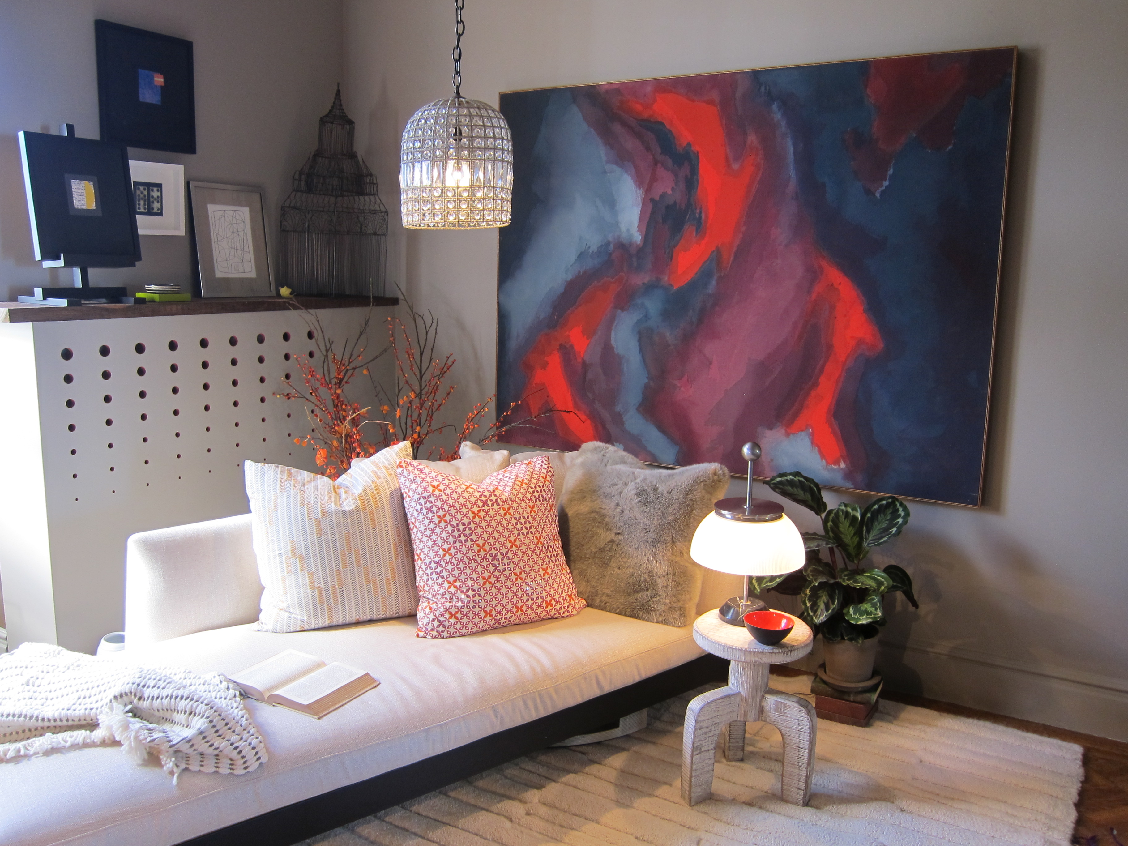 Wellesley, MA based designer Andra Birkerts designed The Hideaway, a room she envisioned being used by an artist for her creative endeavors. The low-slung white furnishings create a feeling of calm, while the bright contemporary painting (possibly the inspiration for the room’s color palette) injects a jolt of energy into the space.
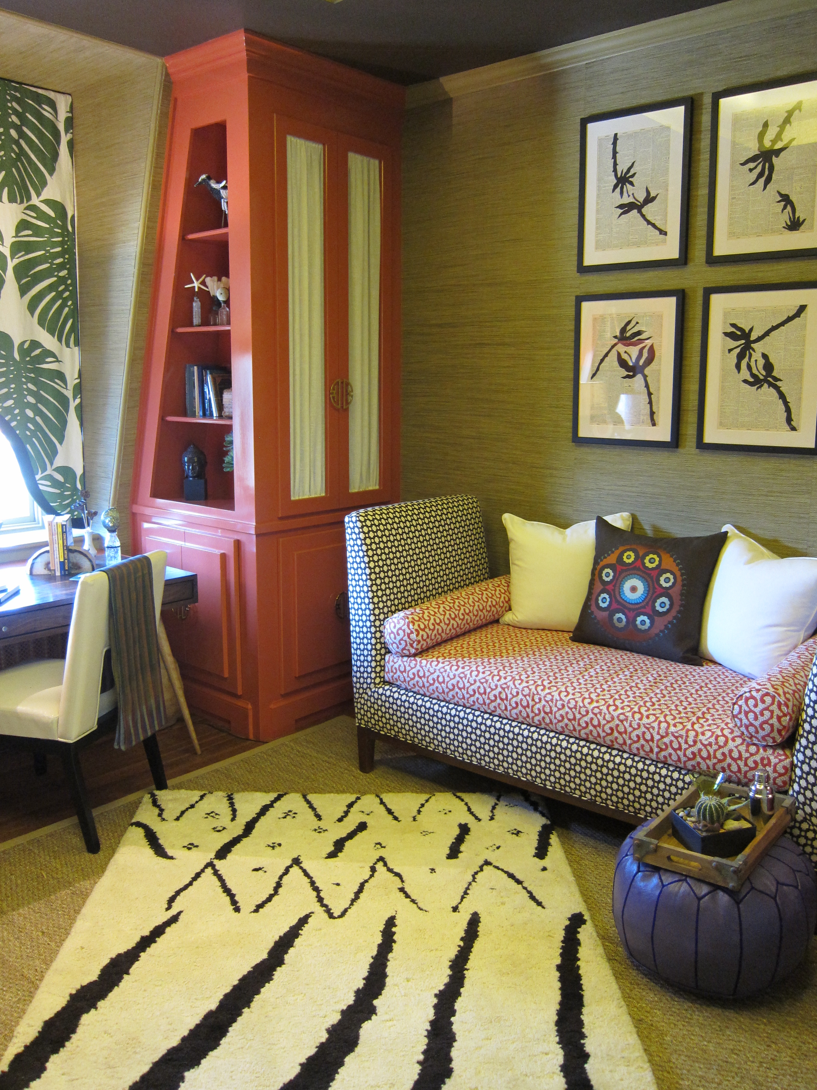 OK, I wish I could go back and take about 17 more pictures of The Inner Sanctum, my absolute favorite space in the house, and creation of Laurie Gorelick. The cabinetry built-in to the sloping mansard roof is brilliant in so many ways – in how it conceals the odd angle of the exterior wall, is an incredible glossy tomato/salmon red, and has the coolest brass Asian-inspired hardware. I could go on and on…
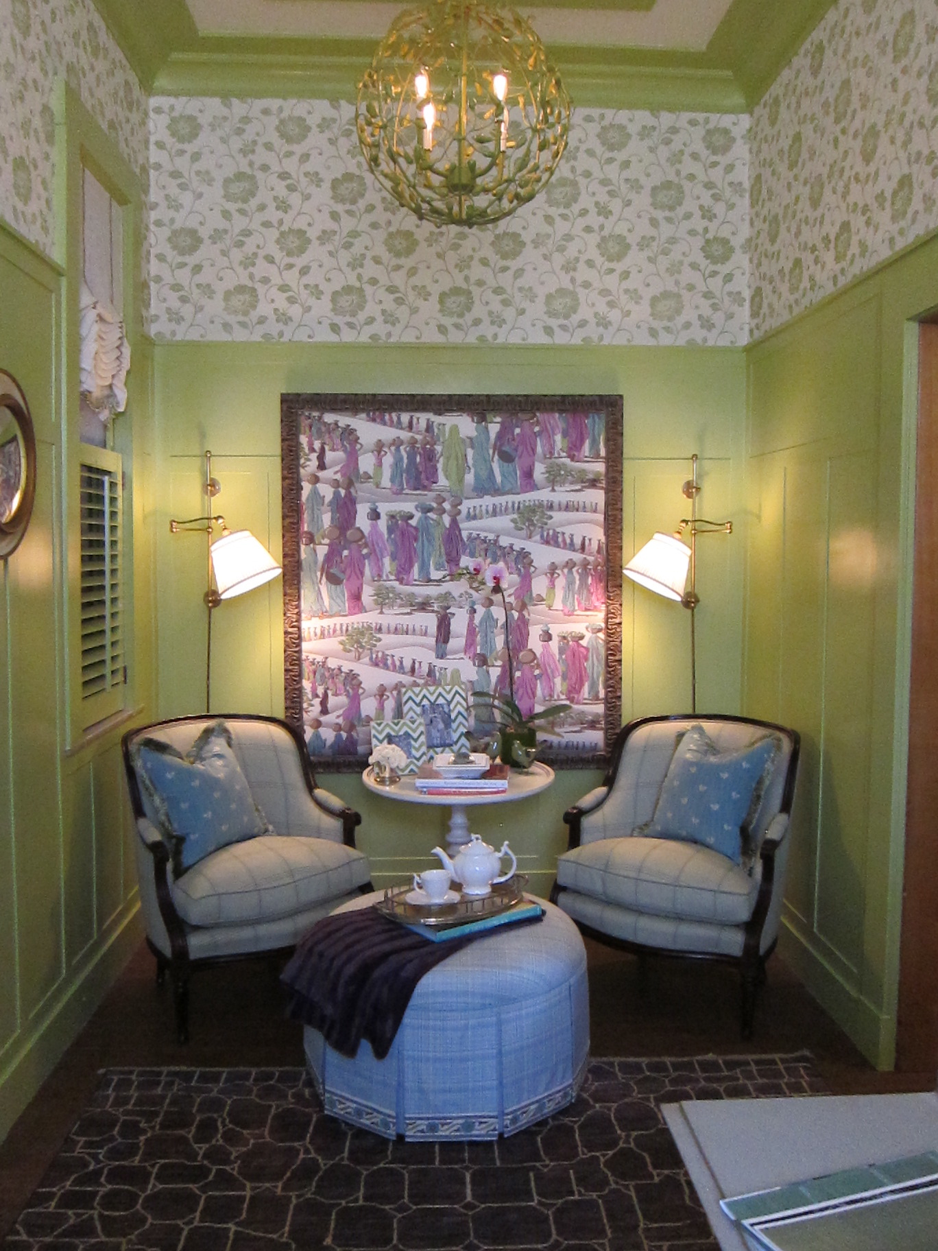 This long and skinny room adjacent to the kitchen is aptly named “The Green Room,” and was designed by Elizabeth Benedict. I love how she let the color really do the talking in this space, and that it has a clear relationship to the kitchen (with its chartreuse cabinetry and periwinkle blue accents) – something you don’t always see in a show house setting.
I’m planning a few more posts spotlighting vignettes, details, window treatments, and, of course, “interiors for families.”
A big thanks to the wonderful ladies at the Junior League of Boston for allowing me to photograph these beautiful spaces, so I could share them with you all! If you are in the Boston area, or will be in the next month, you should definitely buy tickets and support this great organization.

Thanks for the great recap, Kelly. I’m so glad you “got” what my design is all about. I’m looking forward to reading more of your posts on the Show House. Tell your classmates to come too. It’s a good lesson on residential design.
What an honor to have you stop by, Laurie – thank you so much for your kind comment! It’s so clear how much creativity and hard work went into the development and installation of these spaces, and as you know I am especially fond of yours :).
Thanks so much for the mention in your post about the Show House – I used the green to balance the height of the room and appreciate that you took notice!
Hi Elizabeth – you are most welcome! And the green – it totally works. It happens to be my favorite color, too :). Thank you for reading and commenting – hope the good Show House vibes keep rolling in for you!
These are all of my favorite rooms as well (along with a few others)! It’s an amazing group of talent! So glad you enjoyed it and were able to find a sitter! My mom has been my stand-in sitter for a week now, and it’s so nice to get a break…let alone a nice treat, to visit the show house! Thank you for coming and supporting the Junior League!
Thanks, Cecilia! It most certainly is an amazing group of designers, you among them. Your back entrance and hallway was stunning, and I can’t wait to share a pic of that in one of my next posts.