As we prepare to move into our new home this fall, I’ve begun to think about how we will stage our condo when we put it on the market in a couple of months. I’m actually kind of excited about that – it’s a bit of a mind shift from designing a space for how we want to live, to arranging a look that other people can see themselves customizing for themselves. I’ve never done any staging work before, and I’m not sure I am looking to incorporate these services into my future offerings, but I thought it would be a good exercise to do some quick styling and snap shots in our master bedroom today. I thought I’d share the results here!
I rearranged some of our accessories, and tried to create a focal point with our bed.
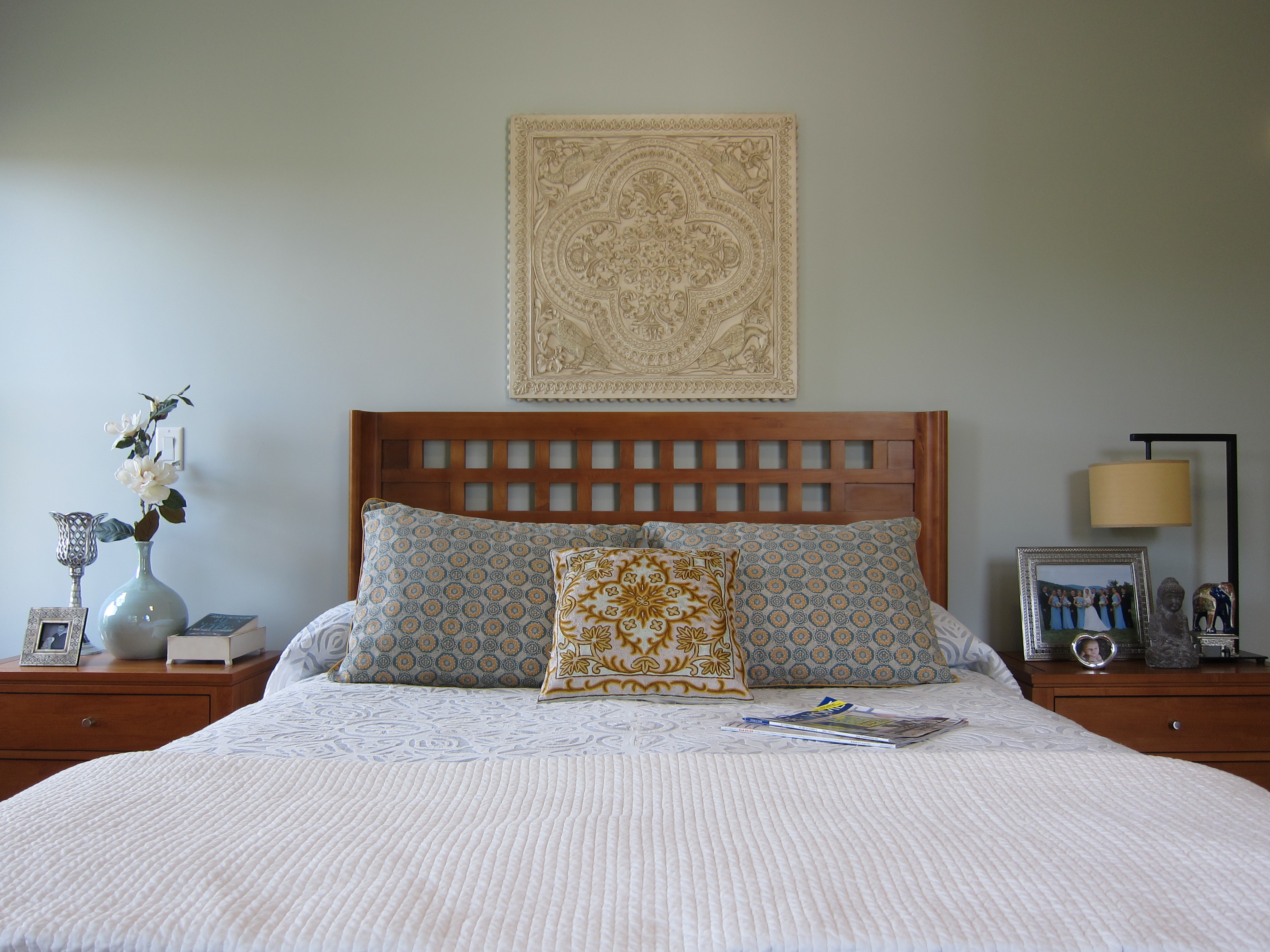 The concept for our bedroom was “Indian spa,” inspired by the cut-out suzani bedspread we bought in Delhi back in 2007. The square throw pillow was another Delhi purchase, but the pillow shams are Anthropologie (circa 2006). Above the bed, a whitewashed quatrefoil plaque from Ballard Designs (again, several years old). A thousand apologies for the matching furniture set – I was young and foolish, and won’t let it happen again! 🙂
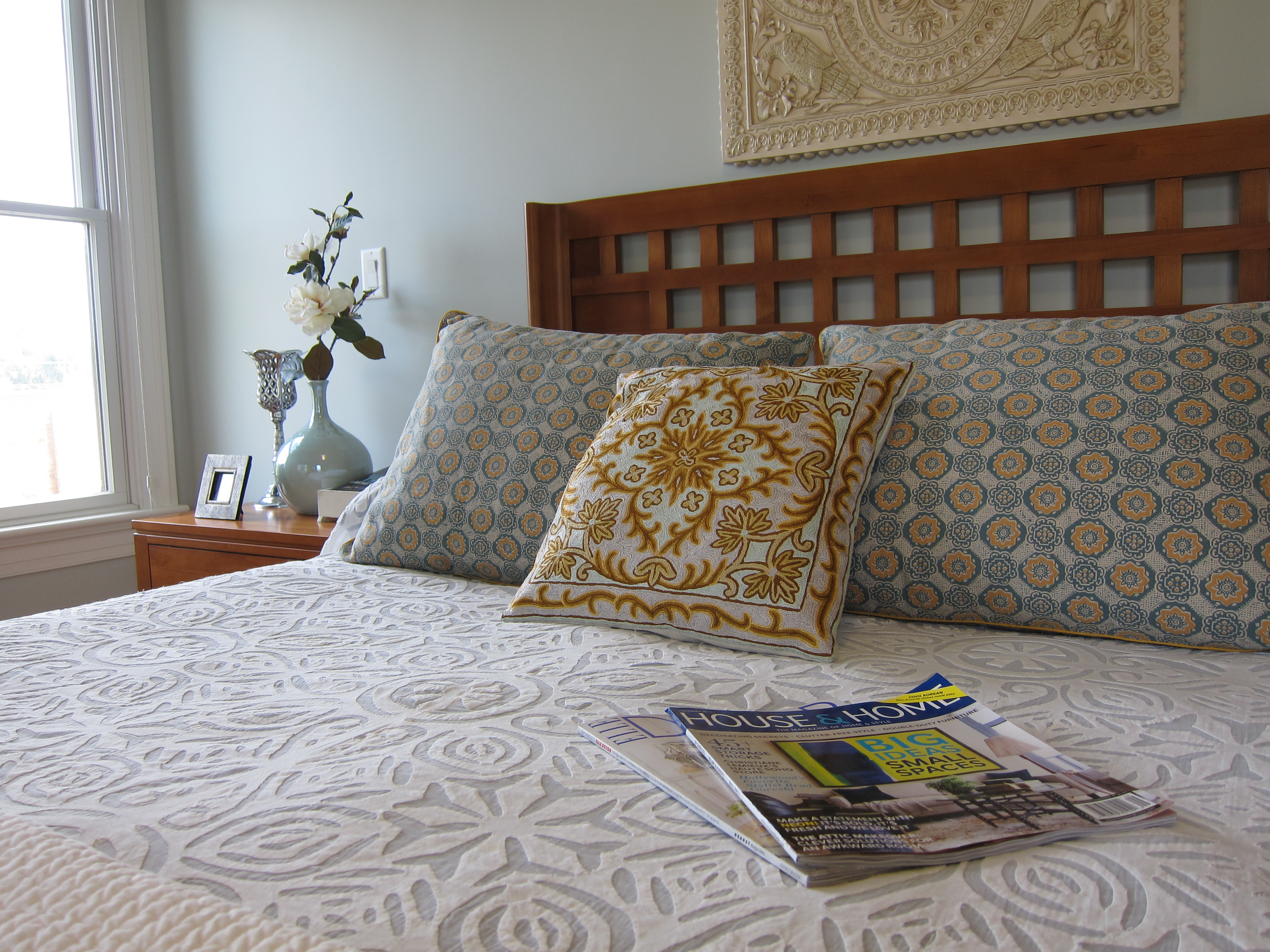 I like the variety of textures on and around our bed, and would like to go even further in our new home. When we ultimately put the house on the market, we will do some work to depersonalize, but for now I must have my family photos on display. By the way, are you guys familiar with House & Home, a Canadian shelter magazine? It is AMAZING! But I definitely need to do a tray vignette of some sort, I know…
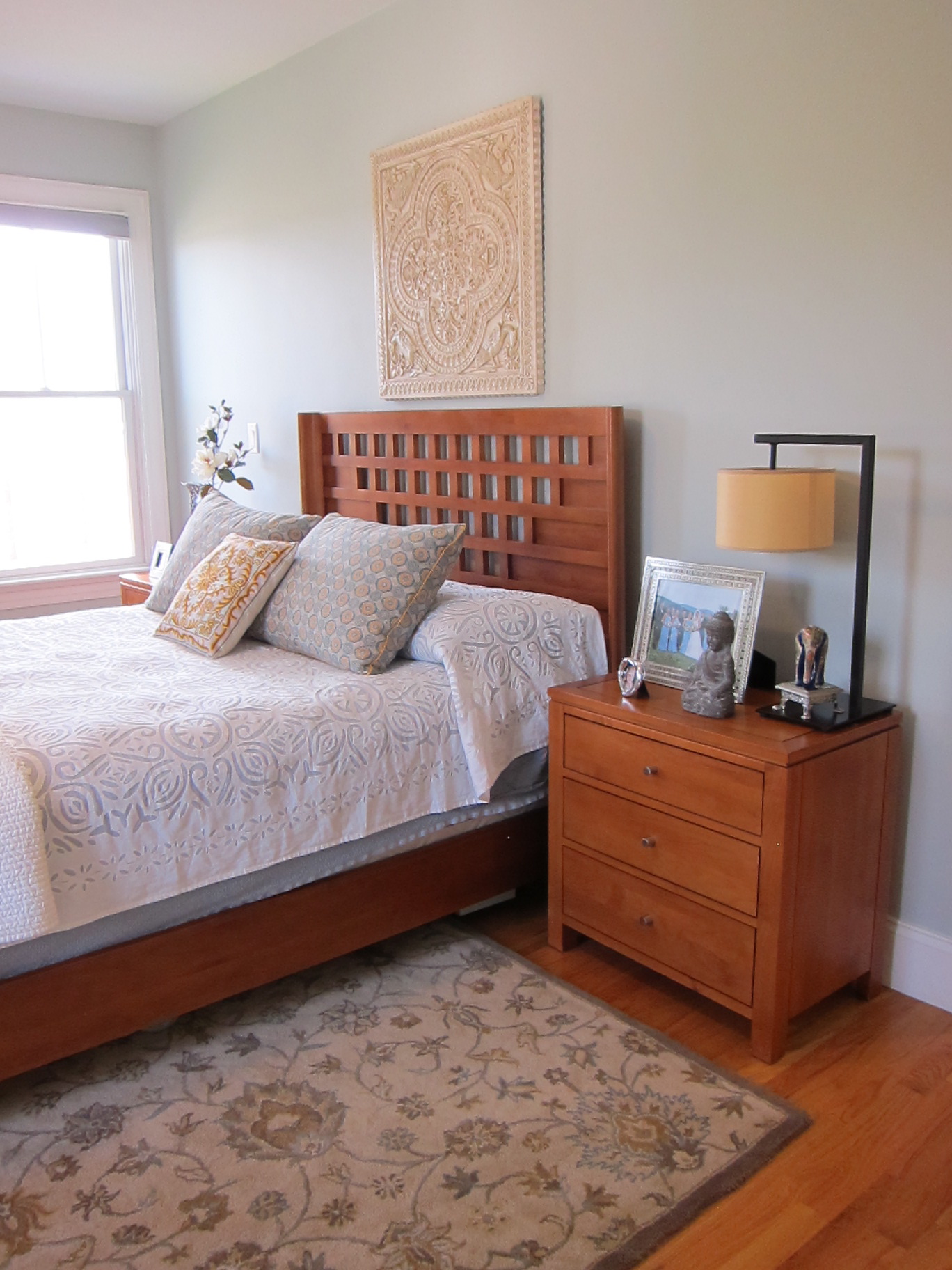 I’ve been pretty happy with the rug, which is Pottery Barn. The paint color, in case you are wondering is Benjamin Moore Gray Cashmere 2138-60. We did not choose it, but we liked it well enough not to spend the money and hassle to change it. I have seen it described as a nuanced gray/blue/green color, and it’s on a Color Preview card with definite green undertones, but honestly, it pretty much looks blue in our space. We get a lot of natural light, and have both northern and western exposure – but it’s a definite pale blue even under strictly incandescent light. Window treatments are super-basic Hunter Douglas Duette room-darkening shades. We opted to forgo fabric Roman shades (which is what I really wanted) in our condo for purposes of resale, but will be stepping it up in our new home (can’t wait!).
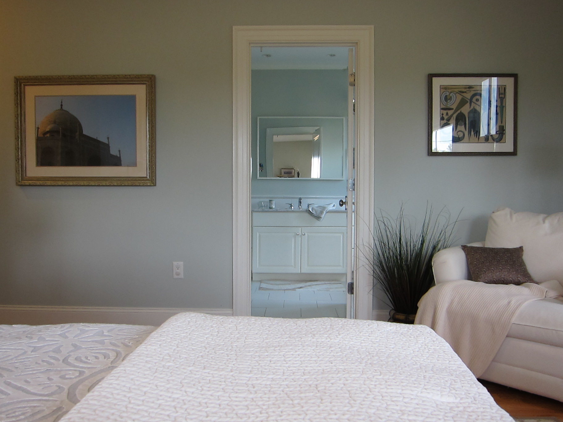 A view into our bathroom. I didn’t stage that room fully, but there is a definite spa-like vibe in there. The light quality (and quantity) in there is incredible. I’m going to miss that.
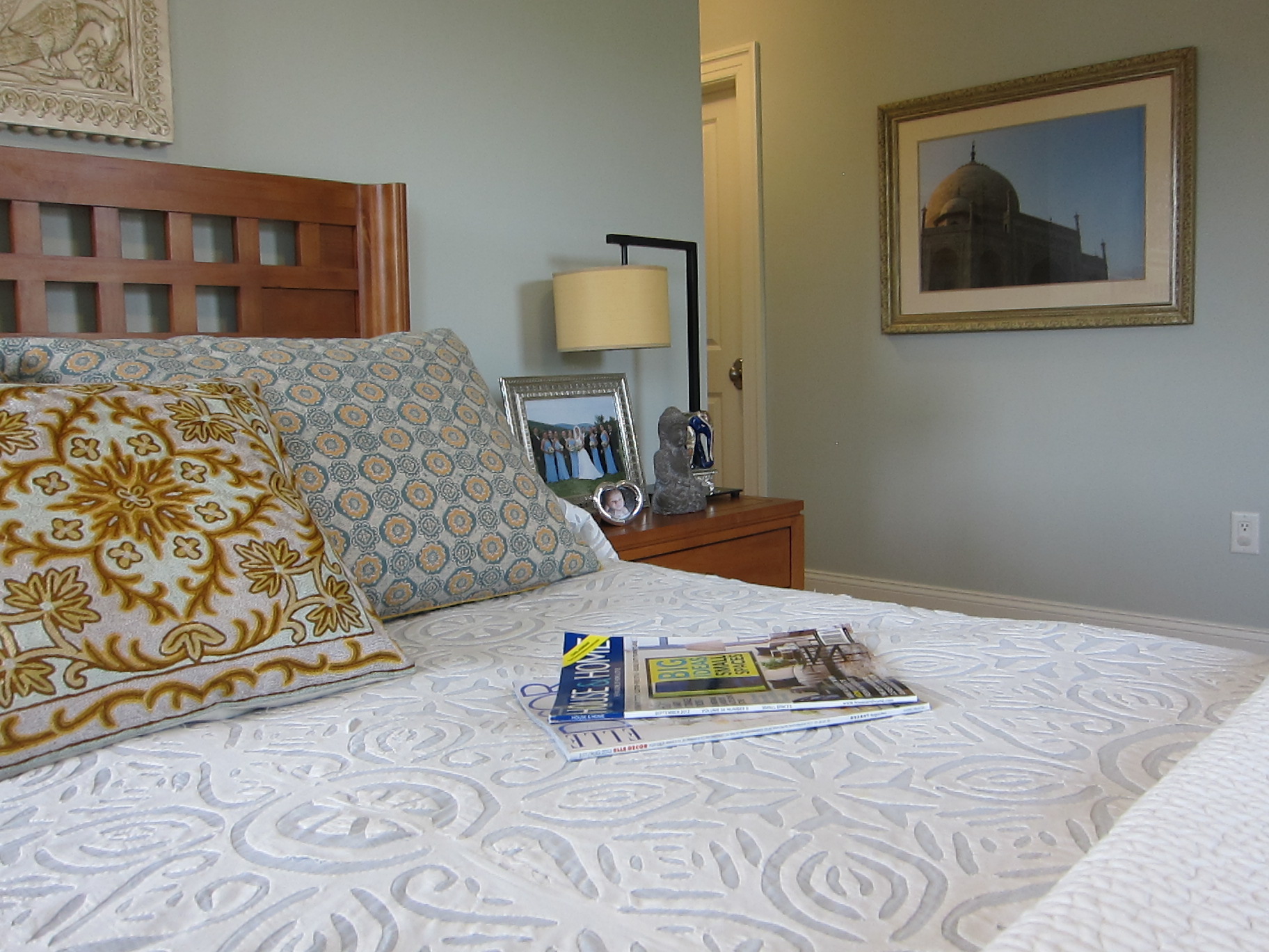 The framed photograph on the wall is one I took on our trip to India – an extreme late-afternoon close-up of the Taj Mahal. I wrote about using your own photography to decorate your home previously, in case you missed it and are interested!
I hope you enjoyed this little peek into our boudoir, and my trial run for staging the room to sell!

I’m cool with spas…this works for me. Ahhhhh!
Kristina
Nook & Sea
Thanks so much, Kristina. I still like our bedroom, even though I decorated it several years ago, but I’m so ready to start fresh with our new house (darker, warmer gray on the walls this time!).