While vacationing in Newport, RI last month, we rented a lovely house in the Kay-Catherine neighborhood. The homeowners had the most impressive collection of coffee table books I had ever seen. Name a topic, they had a great big book (or several) about it – art, architecture, sailing, lighthouses, geography, food, wine, etc. The ones that caught my attention were related to residential interior design and decorating (shocker).
As I scoped out the titles, I noticed that they had evidently purchased a home design book in each of the last three decades of the twentieth century. I had hit the Interior Design Time Warp jackpot! I immediately knew I had to blog about this find, and set about taking way too many pictures of these volumes to share with you all. Finally, I have some truly novel content to share with you – there’s no way these books are in print anymore. And trust me, you haven’t seen ANY of this on Pinterest!
Without further ado, let us bask in the glow of the first installment of Interior Design Time Warp…1970’s Edition!
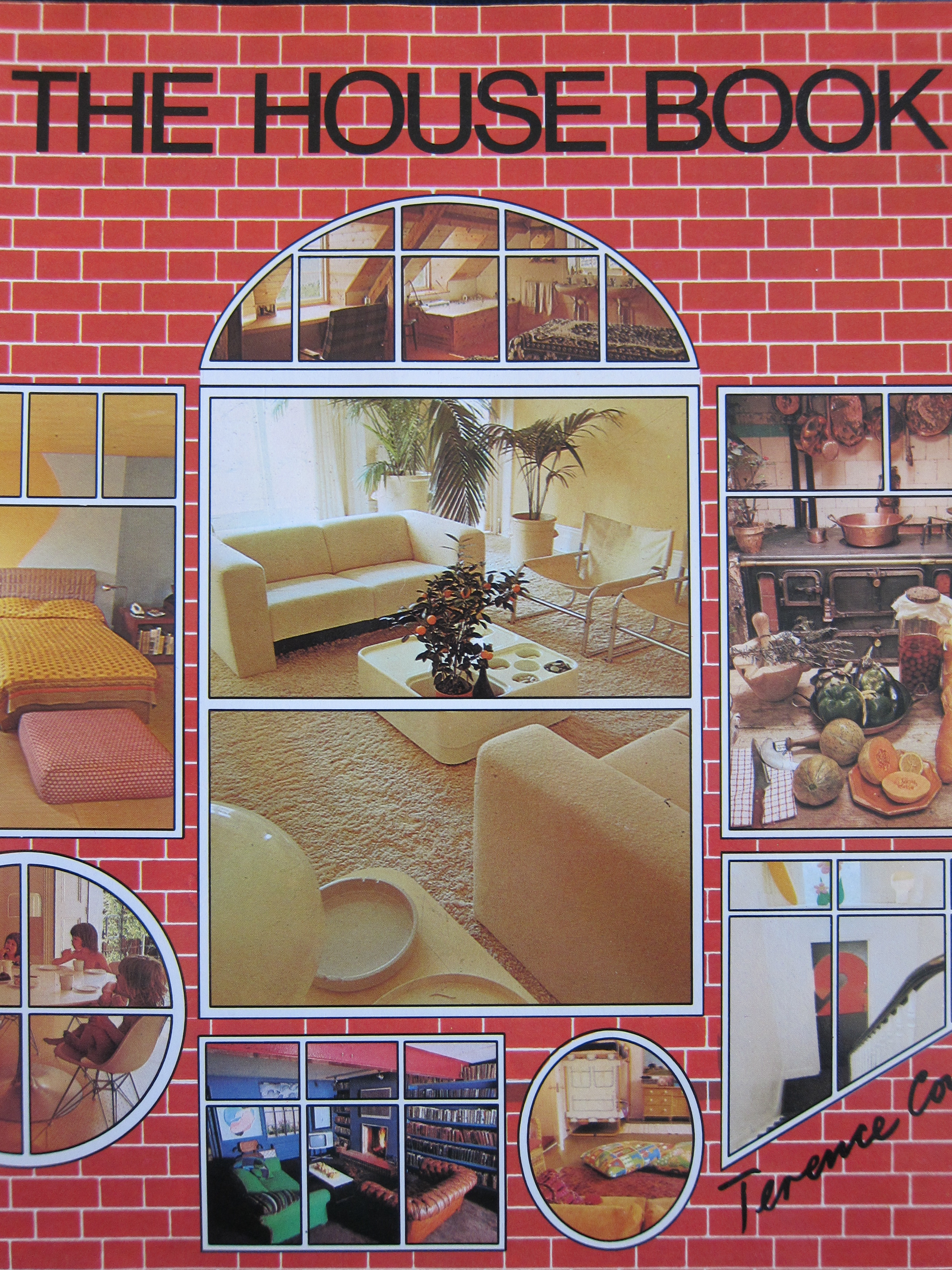
The House Book, by British Designer “Sir” Terence Conran, was published in 1974.
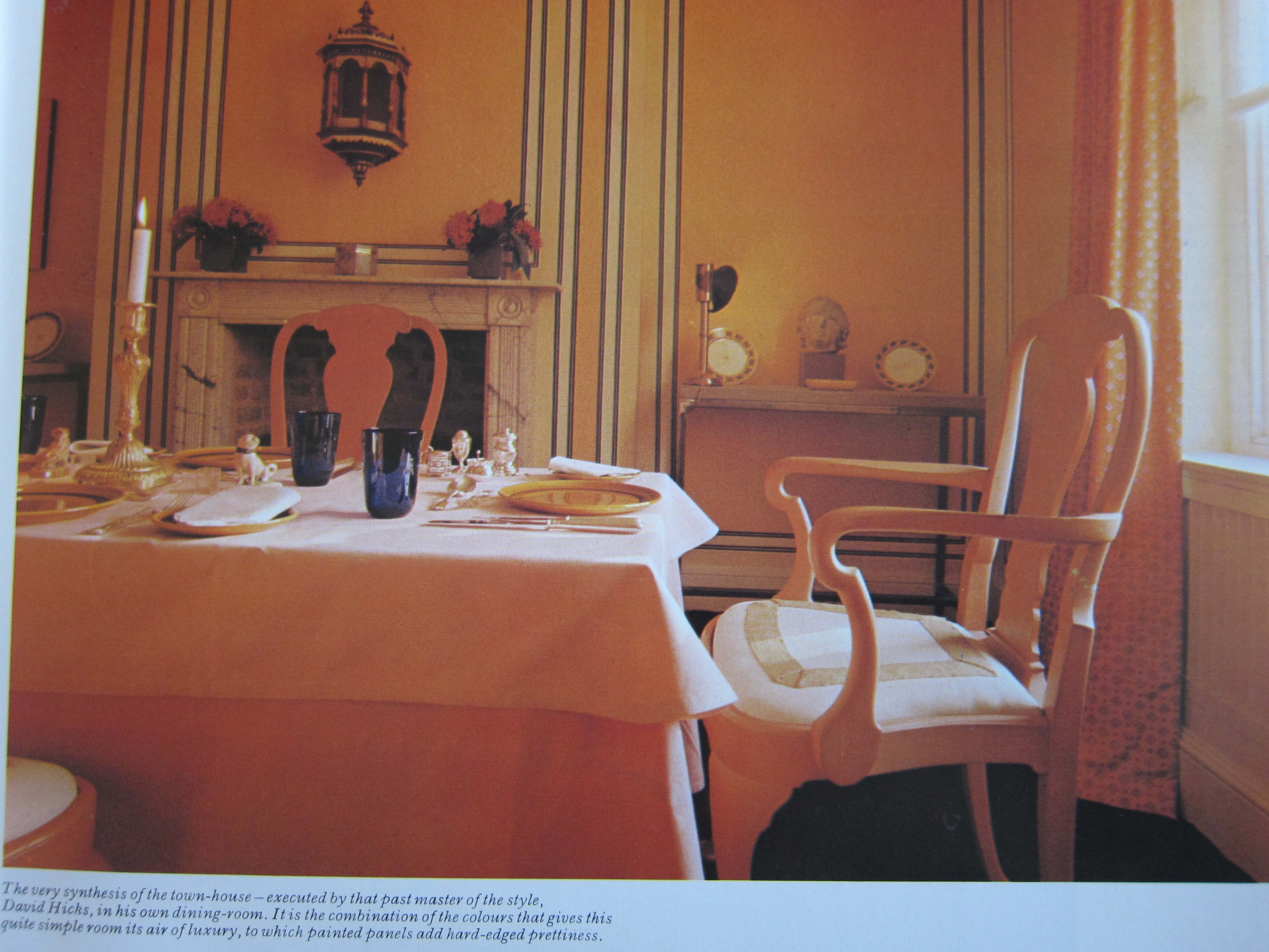
Let’s start with a familiar name – David Hicks. Pretty impressive how most of the elements in this traditional dining room really are timeless. But don’t worry, this is going to be a wild ride…
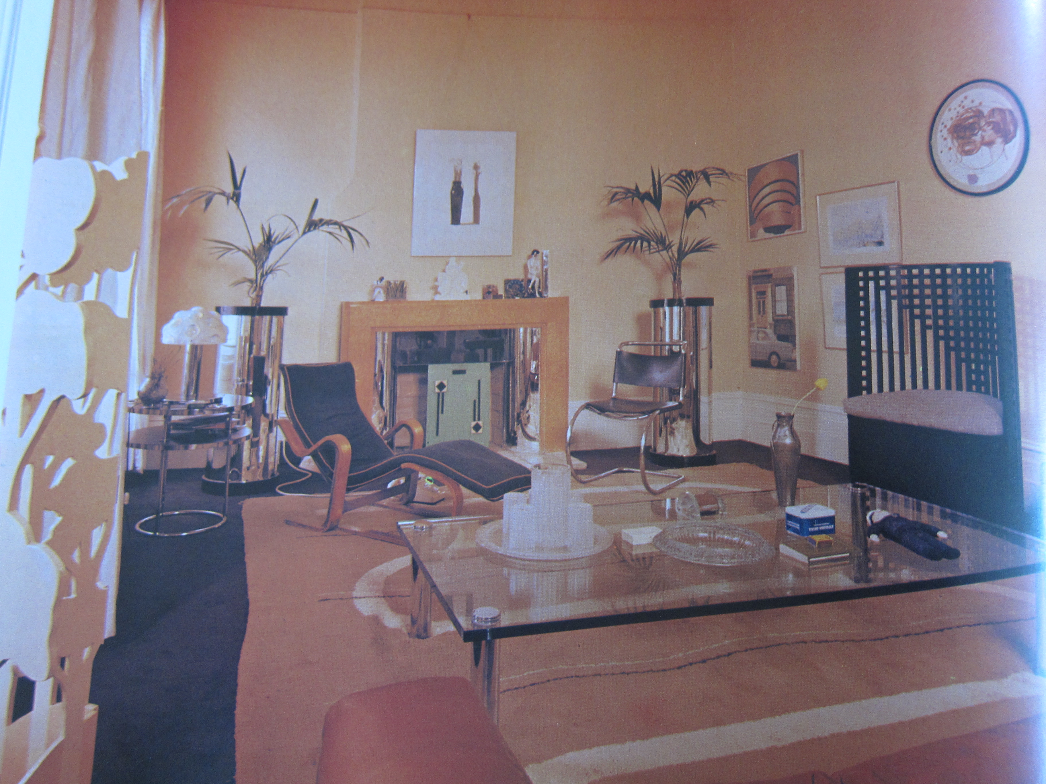
Another David you may have heard of – this is pop artist David Hockney’s self-designed living room, circa the early 70s. What I find most peculiar is how amateurish the “art” displays and accessories in the room appear (in terms of material, scale, variety, etc.). The rose and gold color palette is right at home in its time.
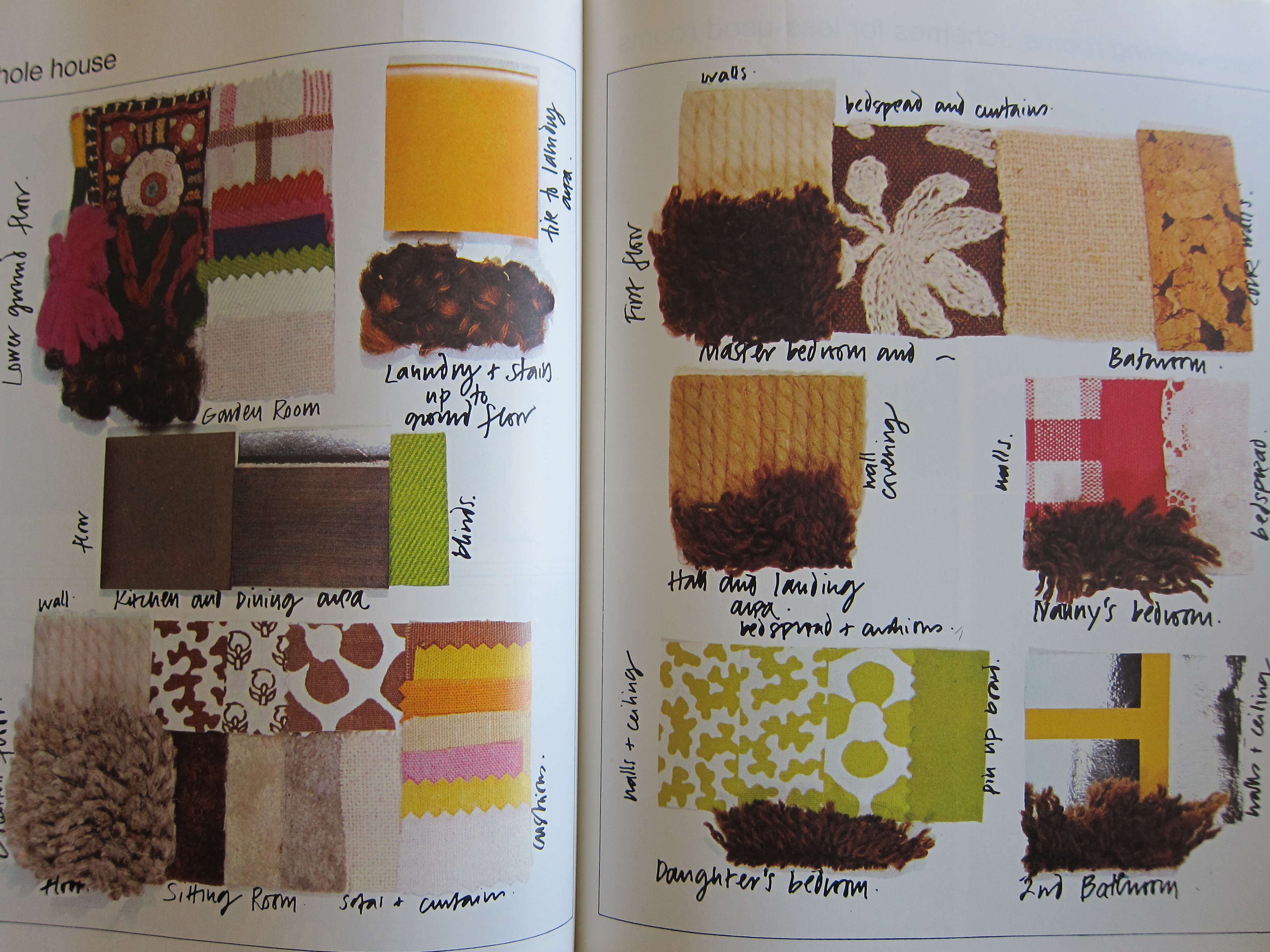
Well, this helps explain all of the brown deep-pile carpet in my childhood home, while I was growing up there. I think all of the greatest hits of 70s color are represented here – from avocado green and tree-bark brown to deep russet red and super-saturated yellow-gold.
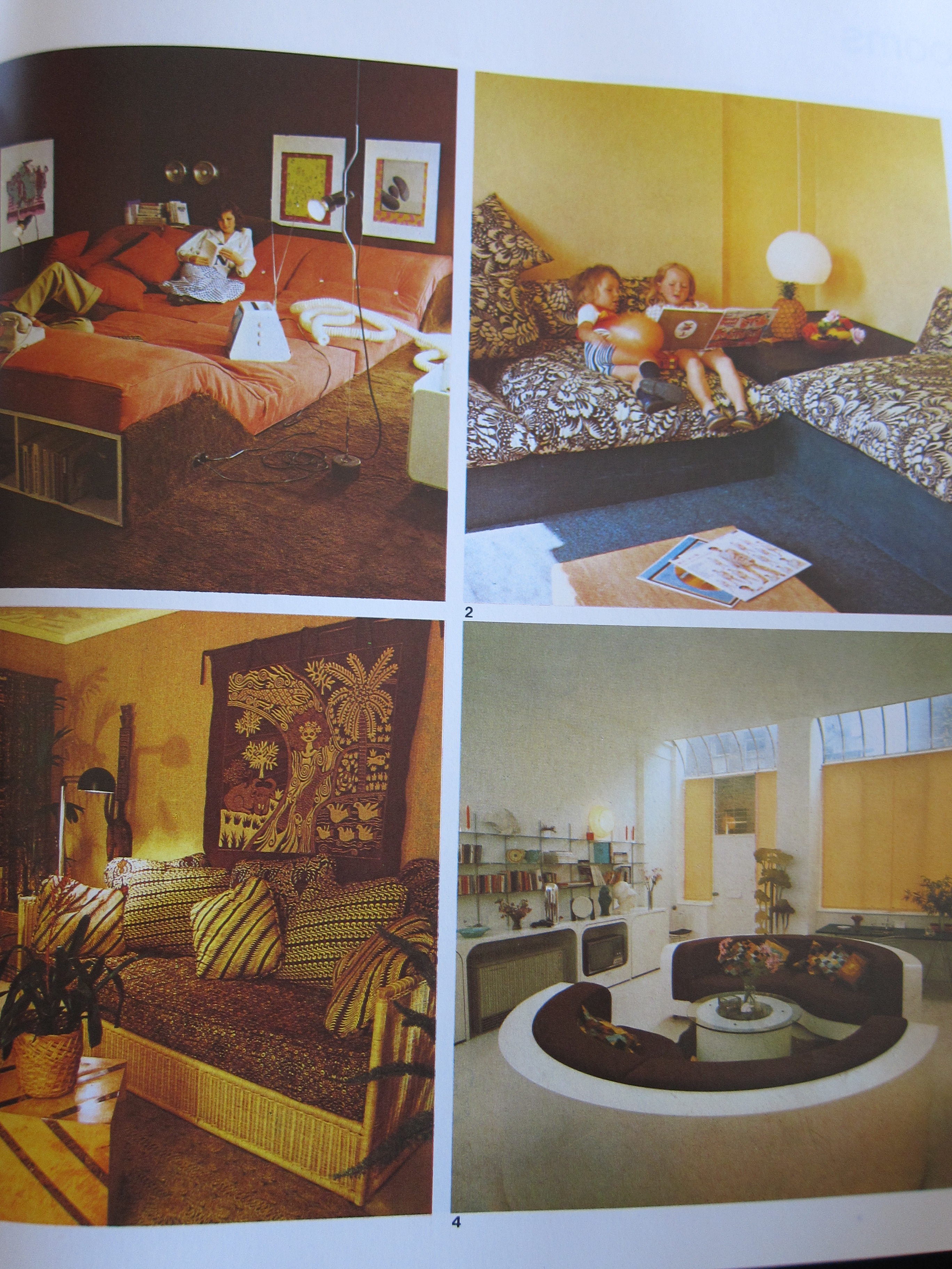
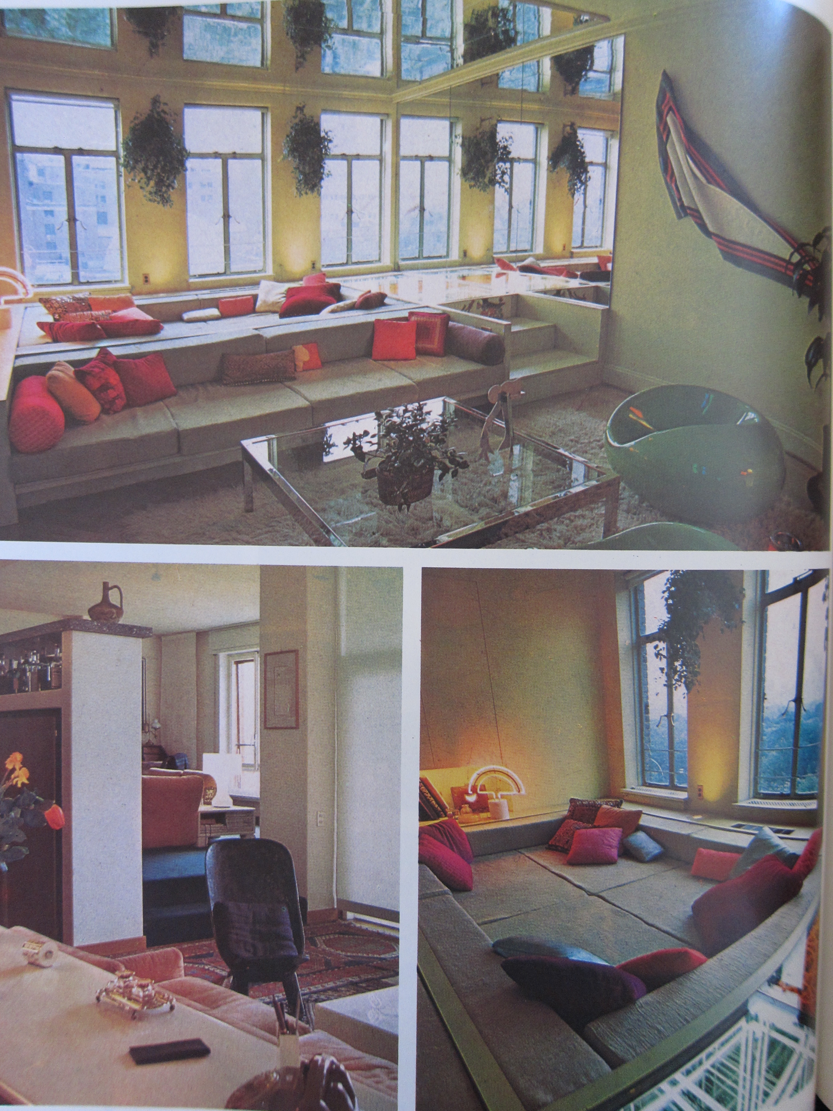
Apparently, we liked to live on (or in!) the floor. Did you know conversation pits are making a comeback. That’s according to Apartment Therapy – though I’m not so sure I’m buying it…
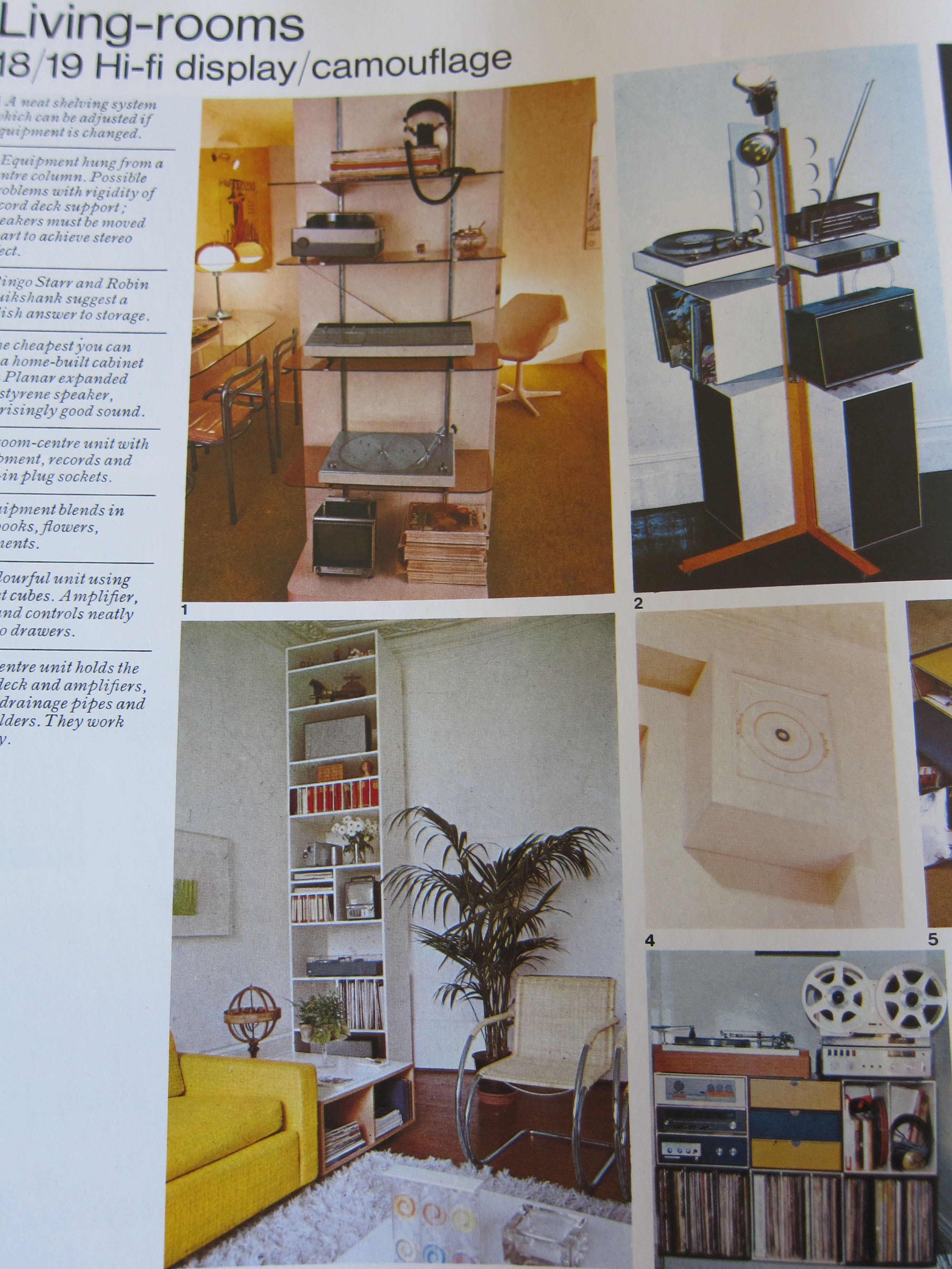
And you thought it was challenging in 2012 to figure out how to store your electronic equipment? I loved this section on “Hi-Fi Display/Camouflage.”
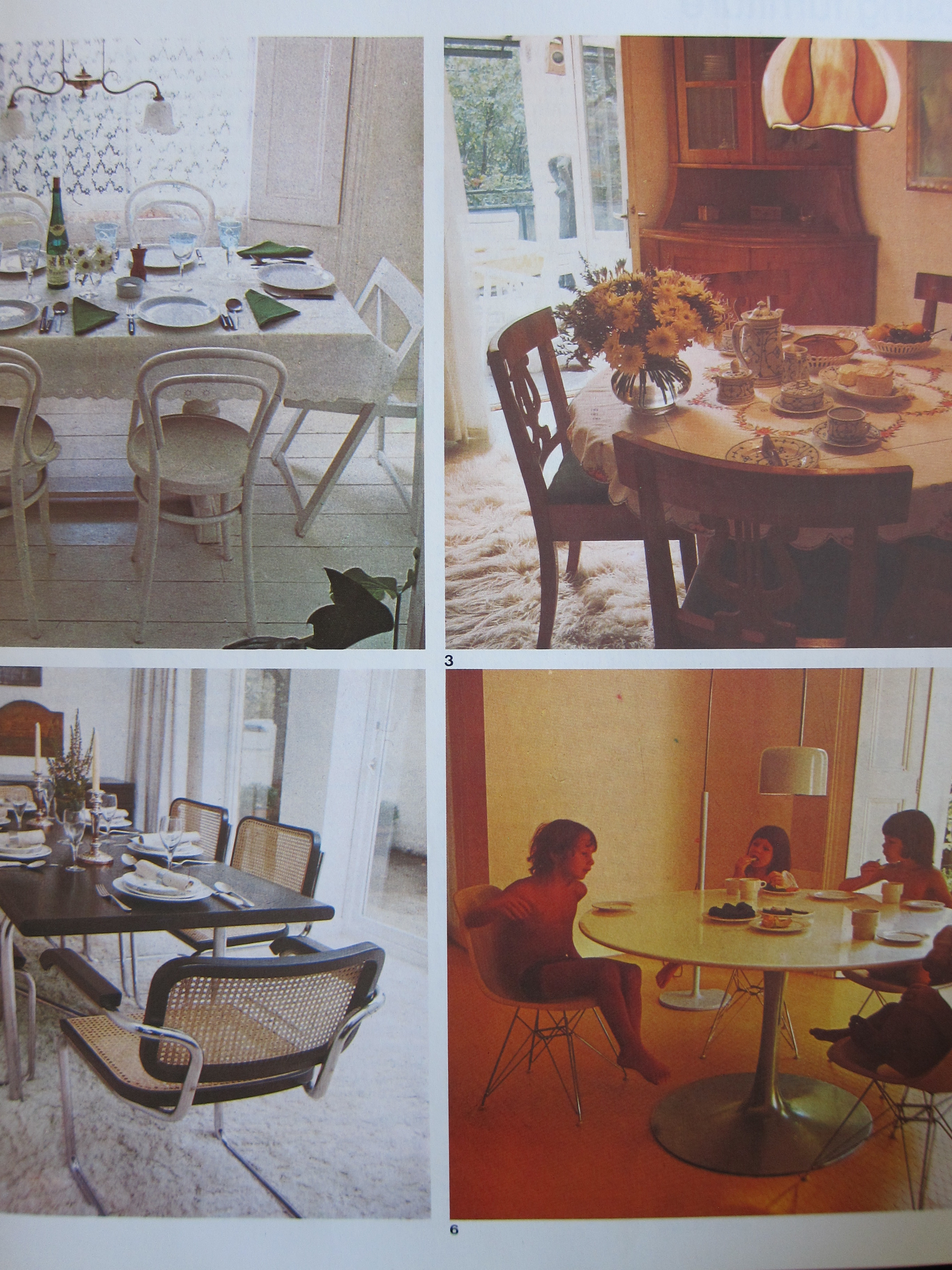
These dining spaces are actually not so dated looking (for the most part). Many people would kill for the Eames set on the lower right. And I remember those caned chairs being everywhere into the early 80s – aside from being uncomfortable, they actually look pretty cool on a fluffy white rug (my opinion, of course!).
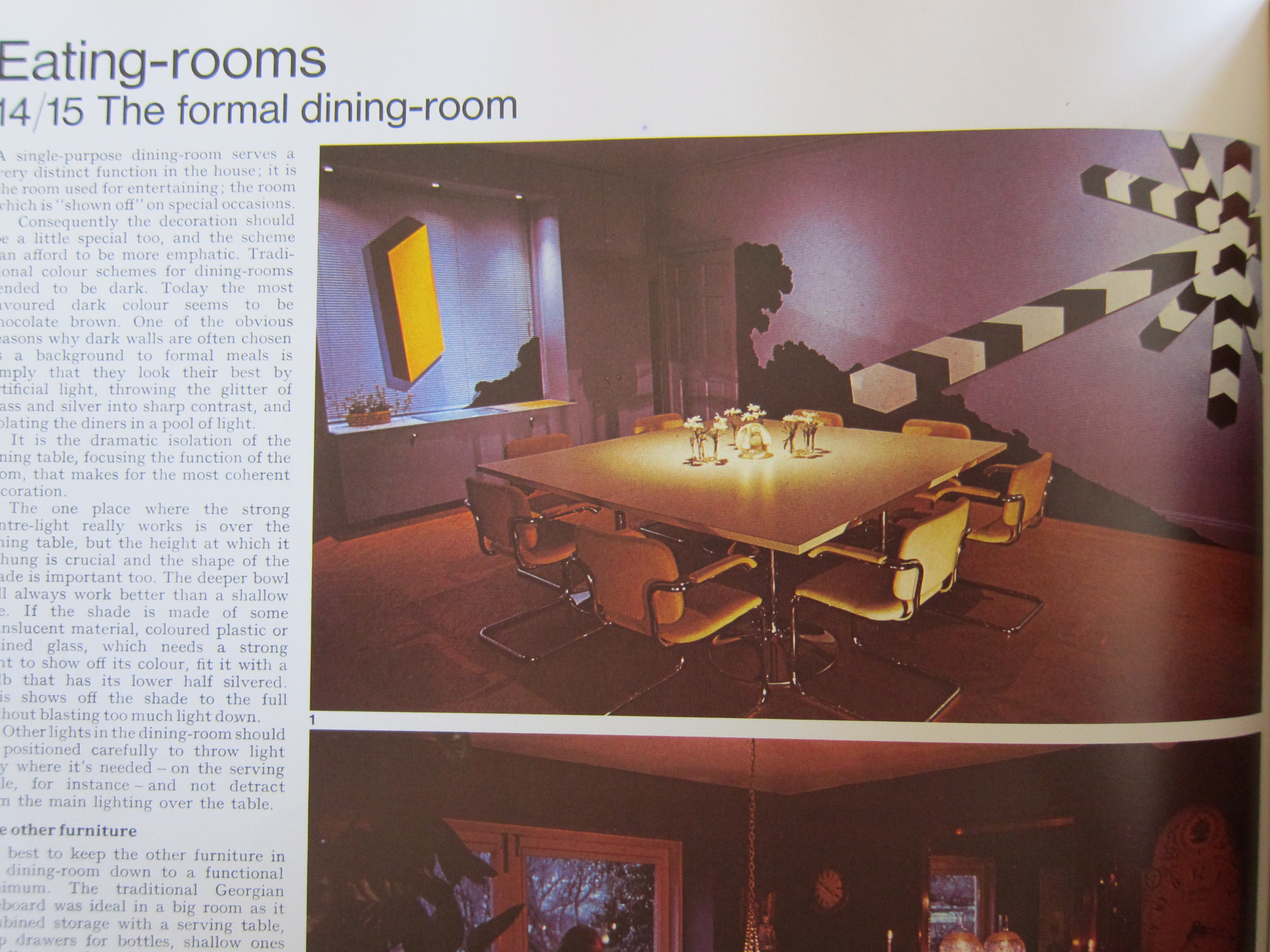 Yeah, baby! How would you like to have a giant black and white whoozie-whatsit on the wall of your “formal” dining room. There is so much to chuckle about here.
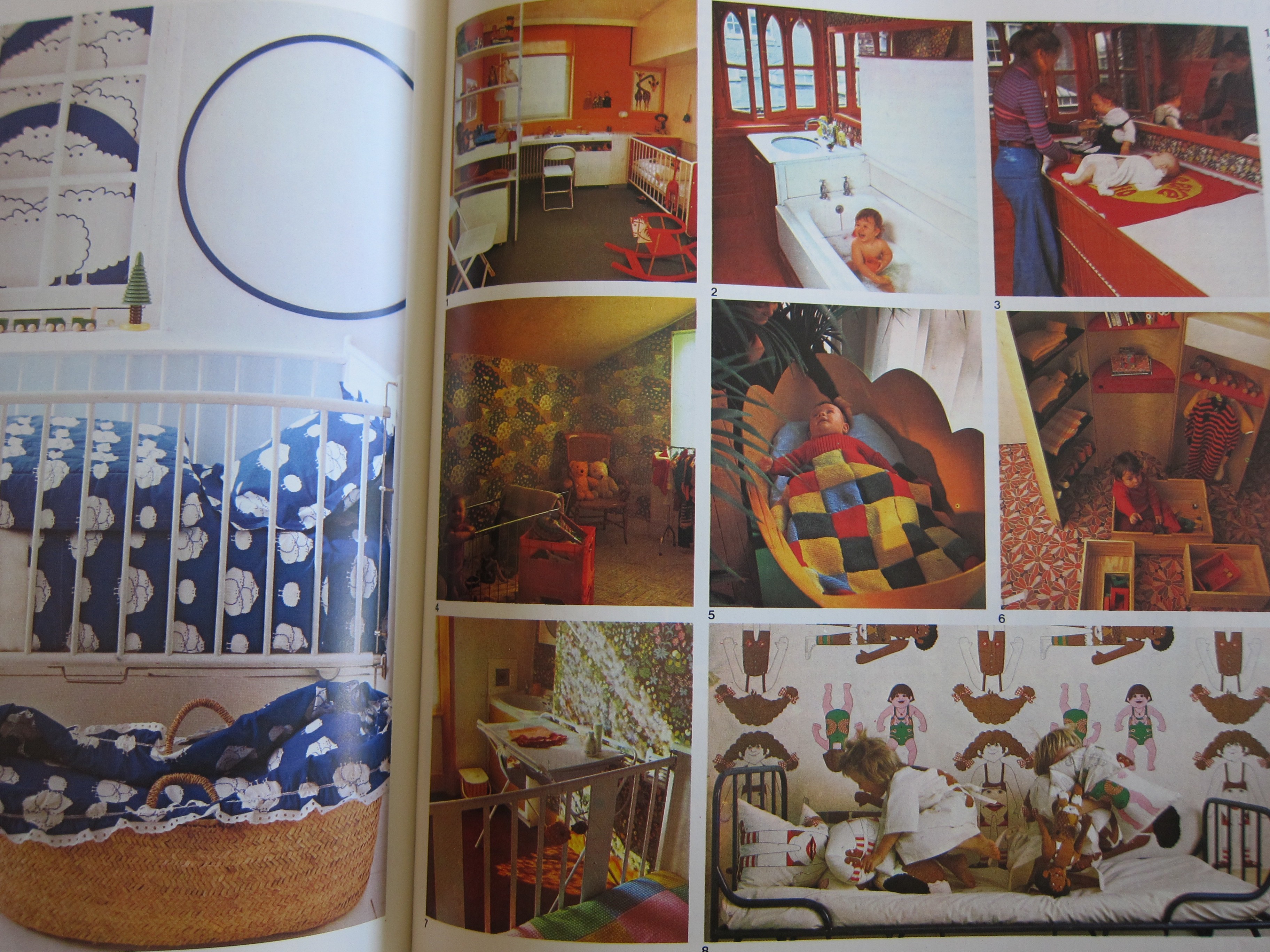 Some stylin’ 70’s kids rooms for you. The mom with two kids on the changing table is making me nervous…
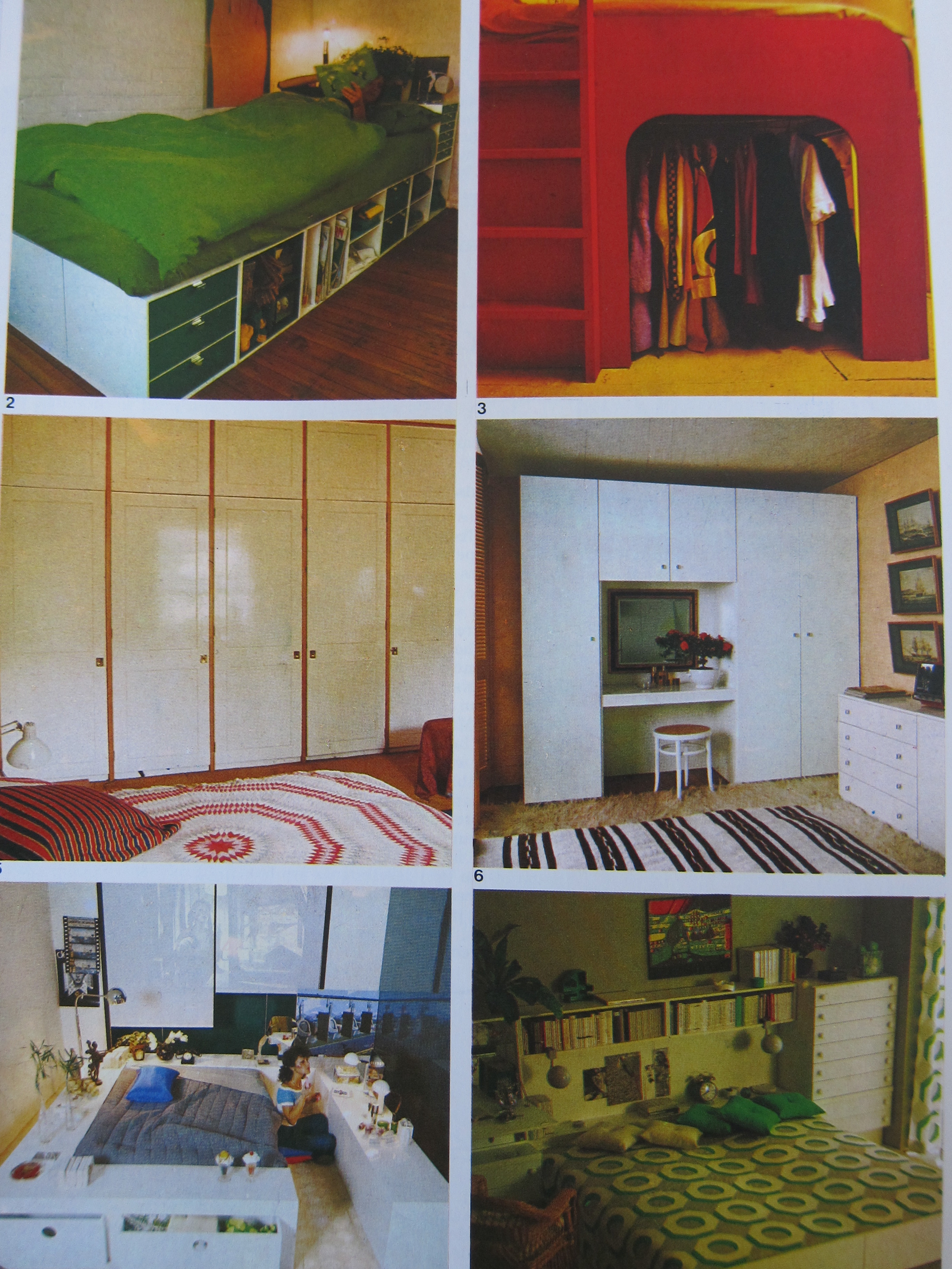 Some elegant – and some not-so-elegant – storage solutions from 40 years ago.
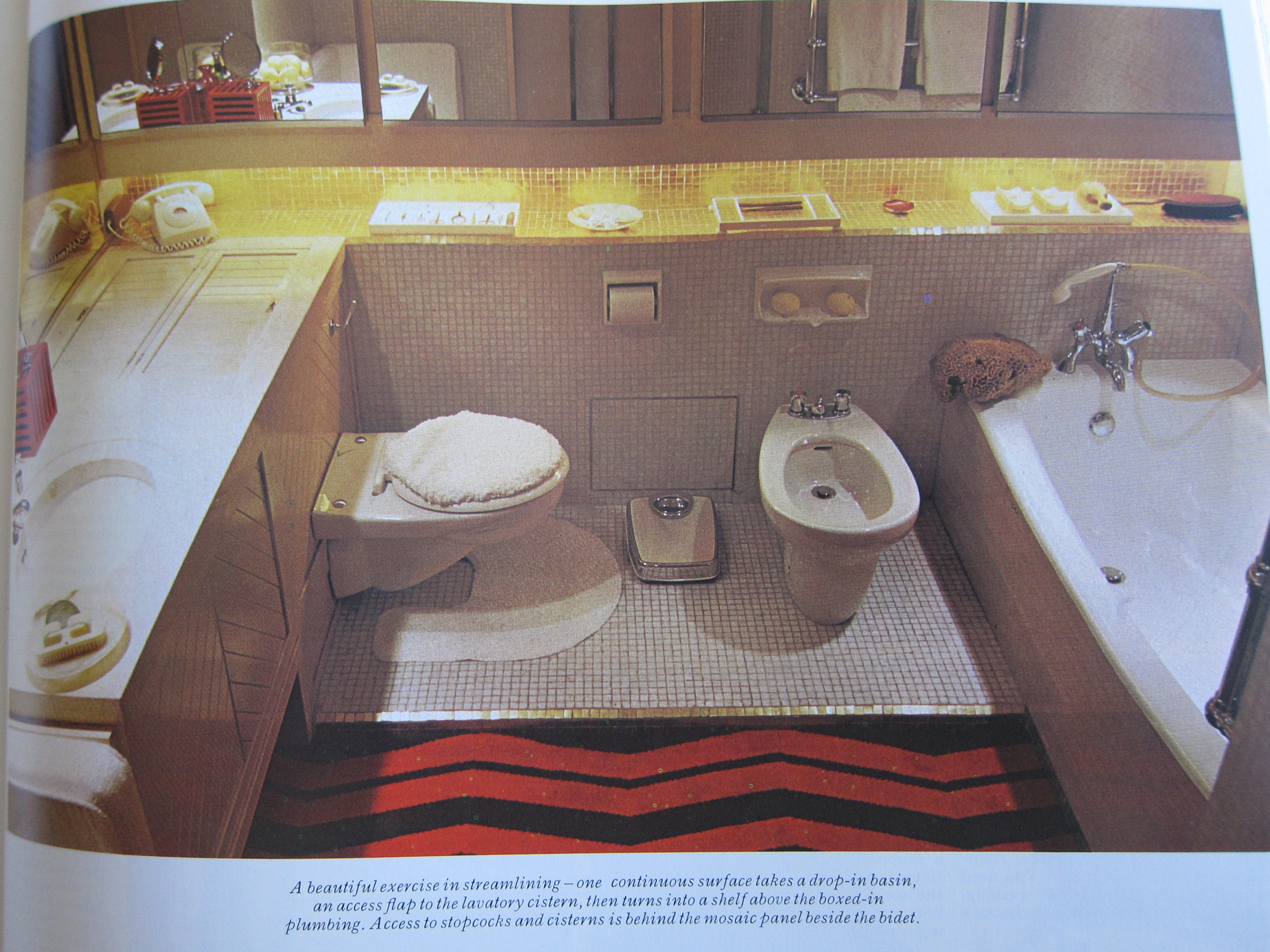 Great description – I love that this bathroom was an example of “a beautiful exercise in streamlining” in its time. I’d need someone to come in and streamline every bit of grout on the floor, walls and counters on just about a daily basis – yowza.
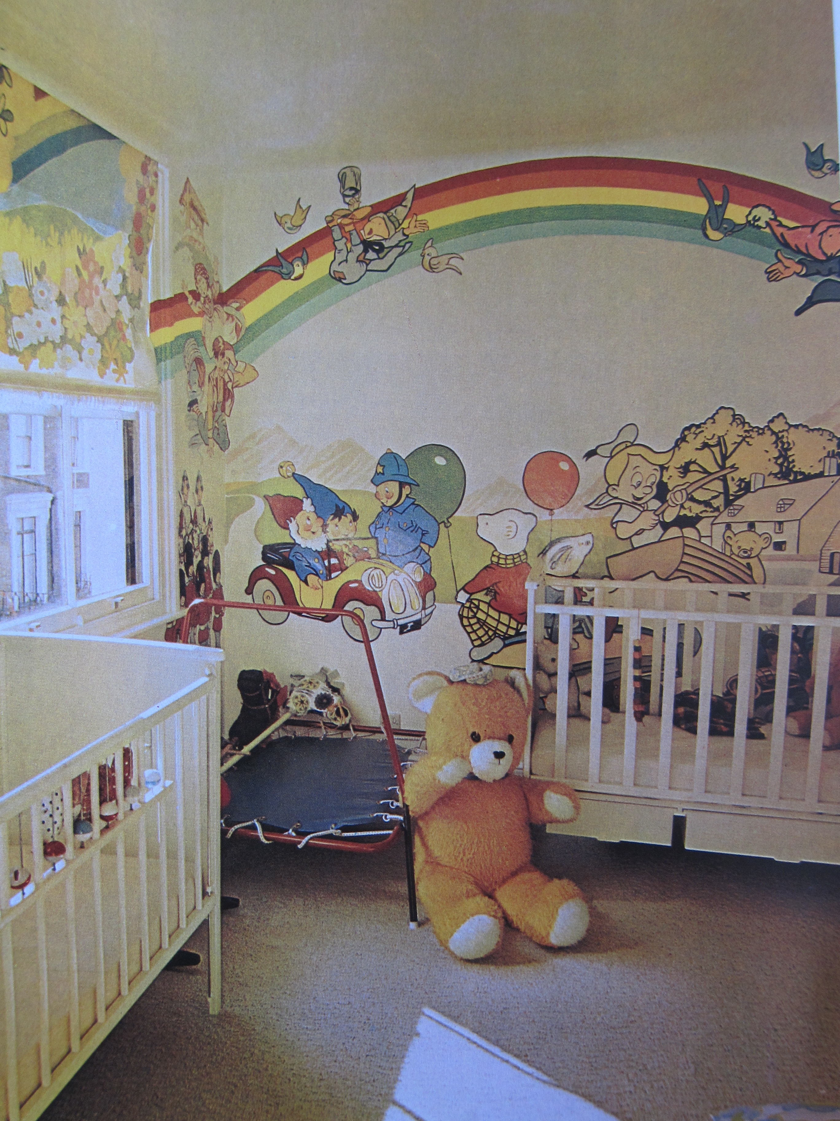 They just don’t do nurseries like this anymore. Thank goodness. No joke, I could literally just taste flavored liquid medicine (the kind I chugged down as a sick kid) as I added this photo to the post. This room must have transported me back, calling forth an equally disturbing taste memory.
Do you have a favorite memory from your home, circa the 1970s? Hopefully it doesn’t make you remember the taste of chalky cherry antibiotics, too :).

This was so fun to look through! I have to just go ahead and admit that SOME of it still appeals to me. Well… if it’s done right and mixed in with “todays” design.
For some reason the shag carpets and the light fixtures are what always stand out in my mind. We had a couple of houses that had that “sunken” living room. Eeeeek! Oh and my parents chose this hideous orange and green linoleum for the kitchen once. It was AWFUL! Even as I kid I had enough sense to know that “they were wrong for that”! Ha Ha!
Oh I agree completely! We had one of those avocado green refrigerators for way too long, though ;).
I love sunken living rooms and avocado green 😉 Think I am in the minority!