Well, thanks for your patience as I’ve attended to some personal matters (you know, family, school, the usual stuff!). I proudly bring you the second installment of Interior Design Time Warp – my favorite decade (so far) – the 80s, baby! If you’ve forgotten how families lived during the decade of decadence, or if you missed it completely due to young age (lucky you!), this post is for you. I’ve got some good stuff to share – and again, I challenge you to find any of this on Pinterest! Until I pin it, of course – muahahaha!
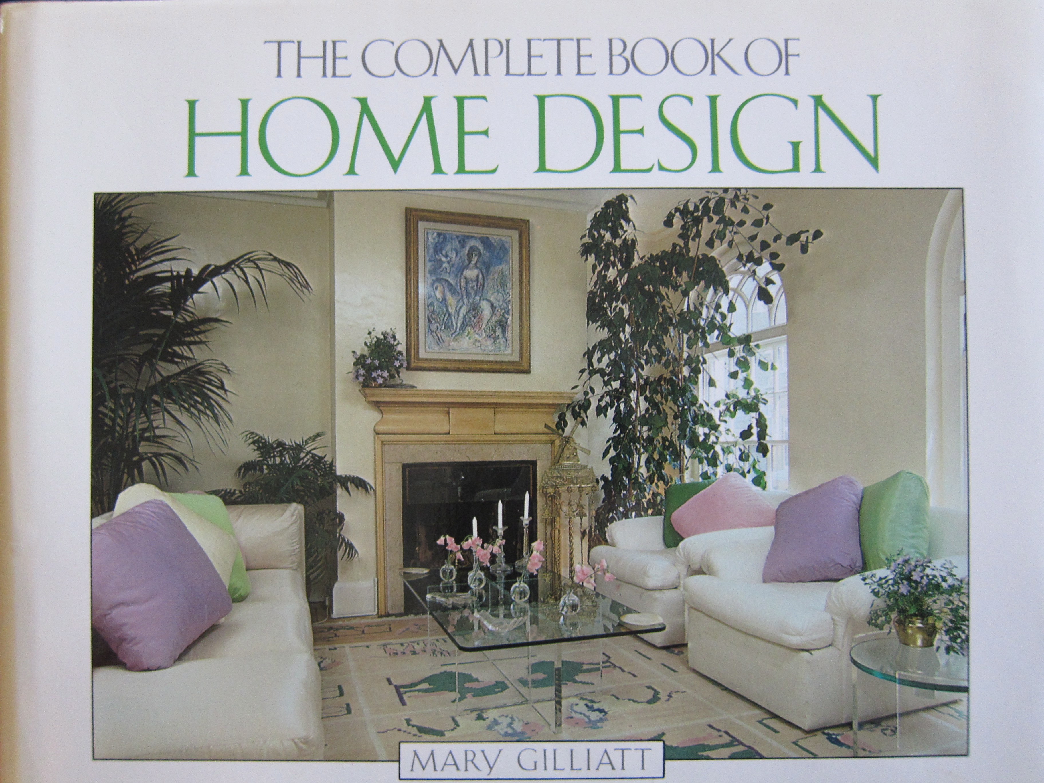 All photos featured in this post were snapped from The Complete Book of Home Design, by Mary Gilliatt circa 1985. A revised edition of the book from 1989 is still available via Amazon and others. Before we even open the book, we can already see what’s in store for us. Mauves and other “dusty” pastels, gold, and lots of plants. Apparently we were especially fond of palms in the 80s??
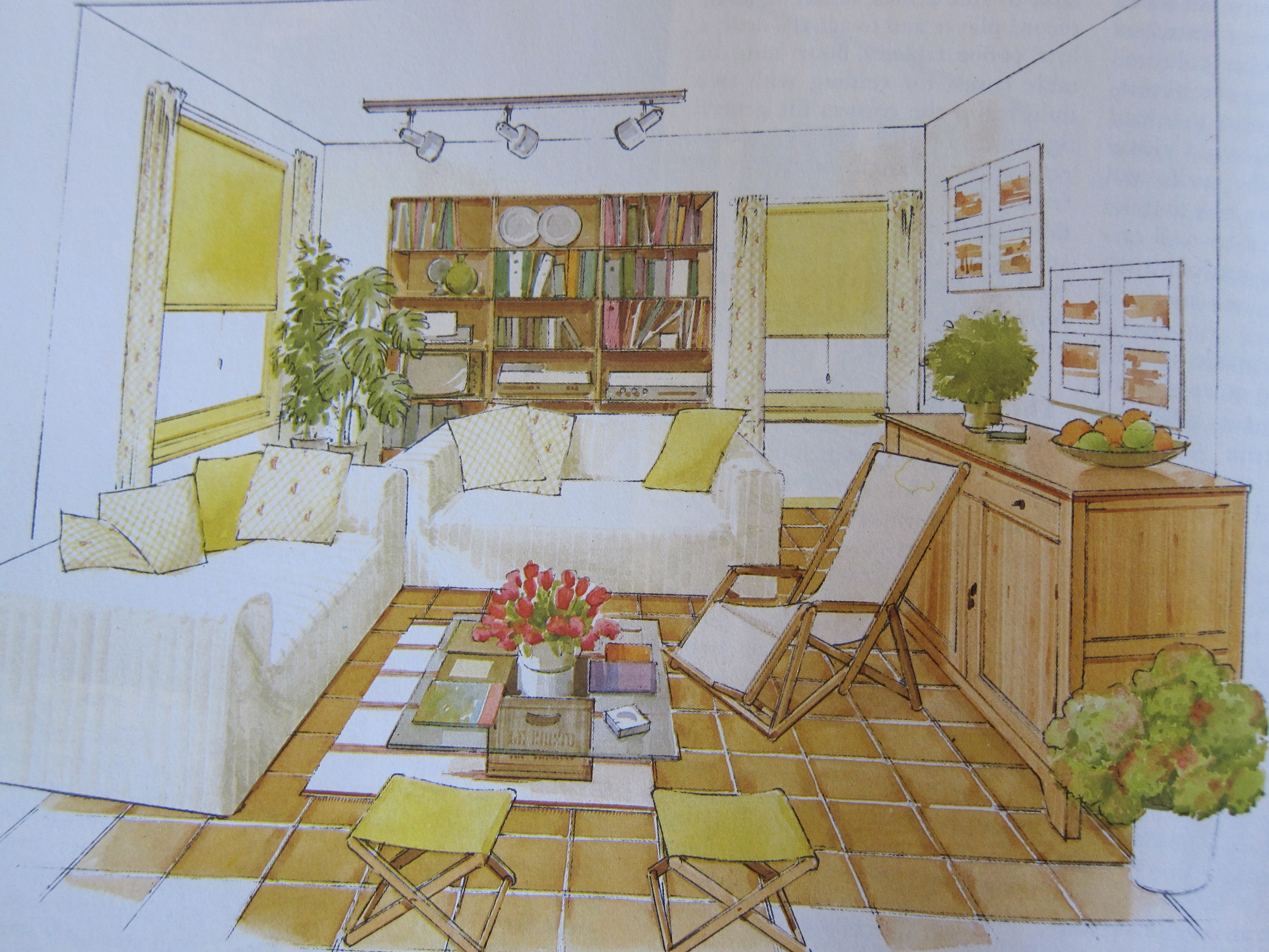 Palm plant…check. Track lighting…yep. Blocky furniture…heck yes. Patio chairs used indoors: priceless.
Ahh, the good old mirrored wall. To me, this was a trend that happened in the past, but I’ve actually seen contemporary examples from designers like Mike Clifford and Miles Redd. If you think about it, the current trend of glossy lacquered walls and/or ceilings is more or less the same thing. There’s no debating the fact that it does make a room appear larger, and you can do very cool things with mirrors, like “creating” a window where one doesn’t exist.
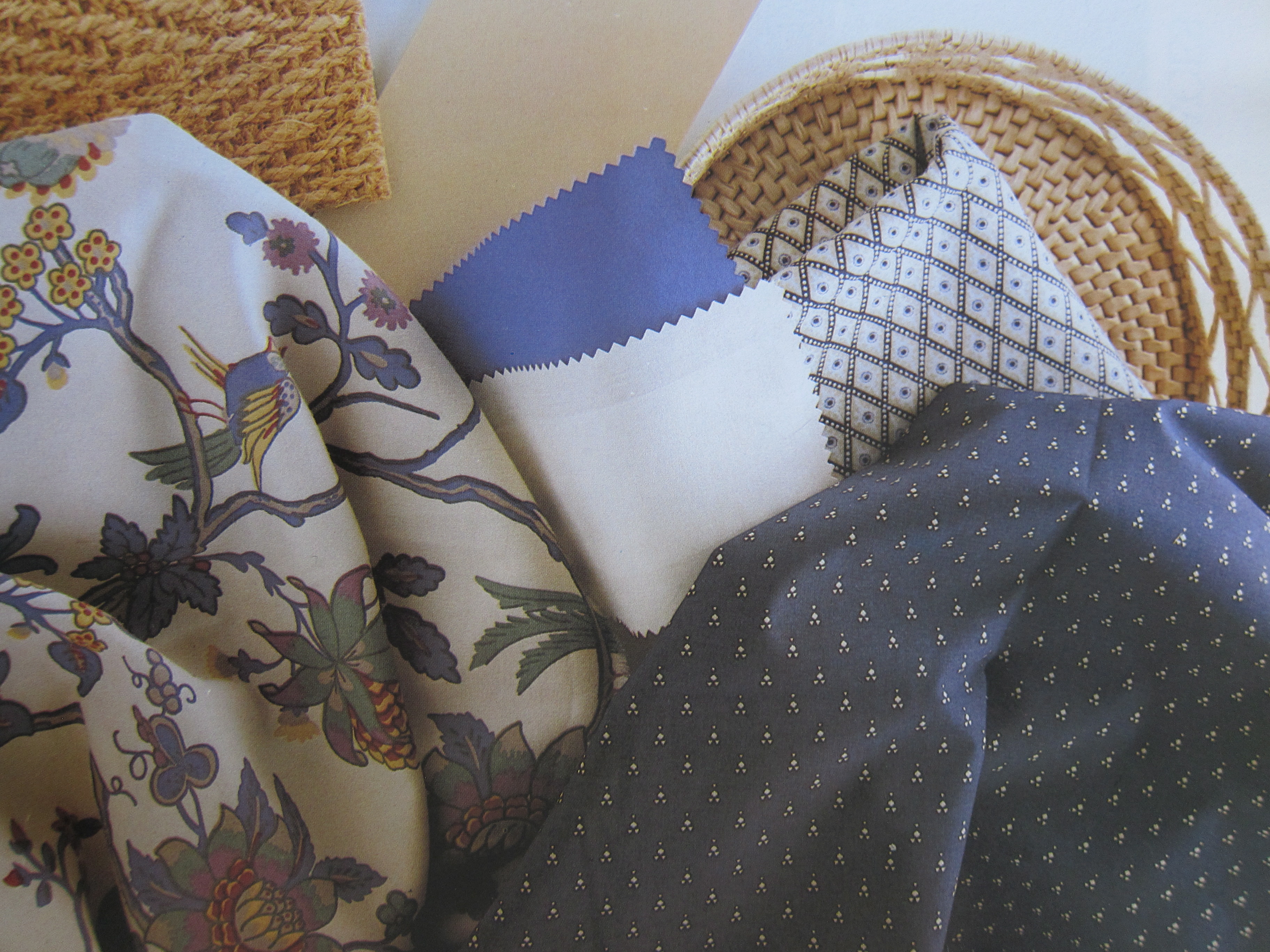
I happen to think this is a lovely chintz, actually! Not so much on the super small scale companion fabrics, though. Chintz is definitely associated with the 80s, and though it fell out of favor for a spell, it’s in the process of making a comeback. I don’t know that we’ll see a lot of sofas decked out in these large scale florals, but chintz is on its way.
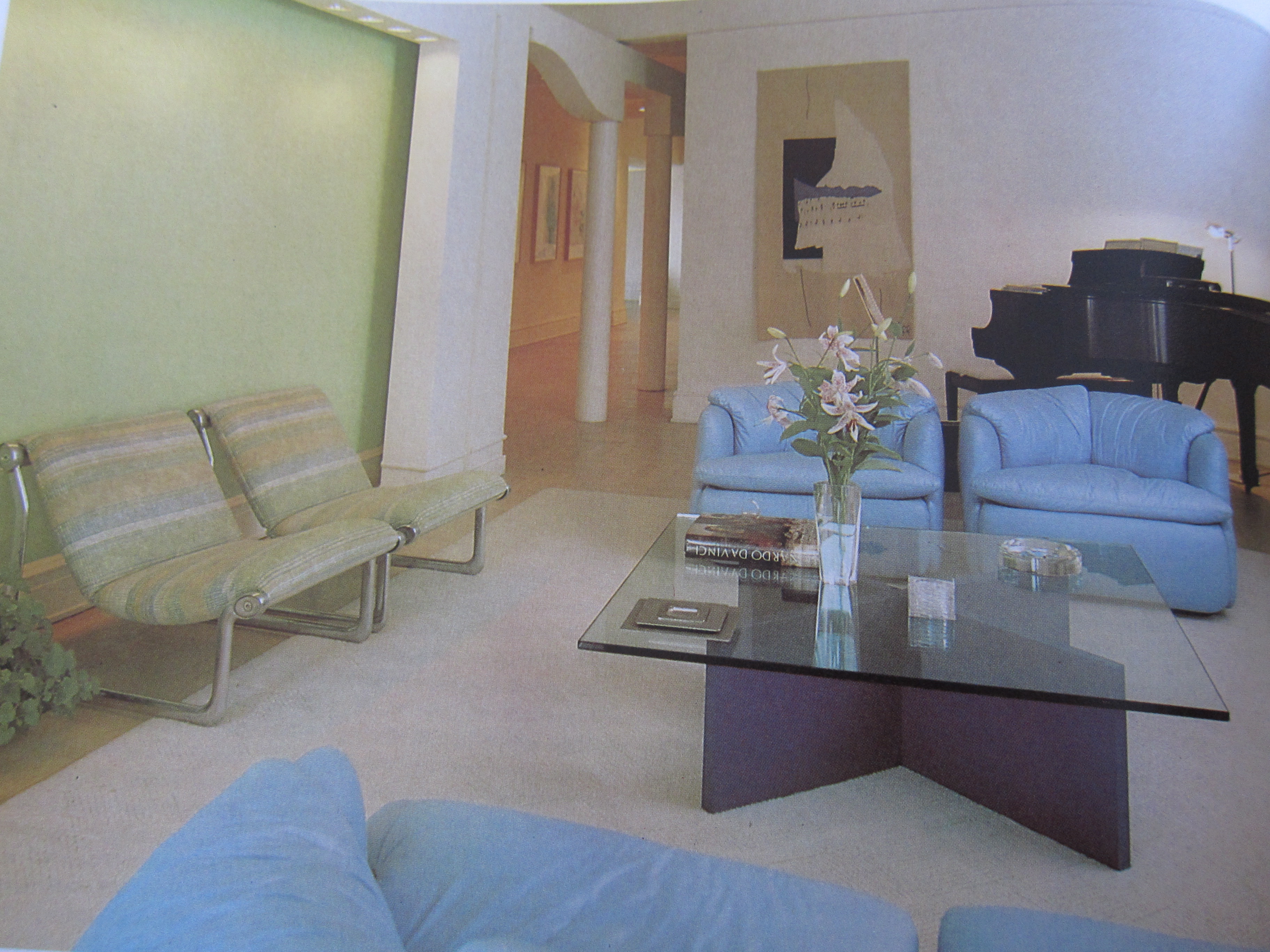 We sure liked our upholstery nice and foam-y in the 80s, didn’t we? Other than that, I’m not entirely sure what to say about this photo. It looks like they forgot to finish the room before they did the shoot. Even the book on the table is upside down – today’s photo stylists would NEVER let this happen! Color scheme = weird.
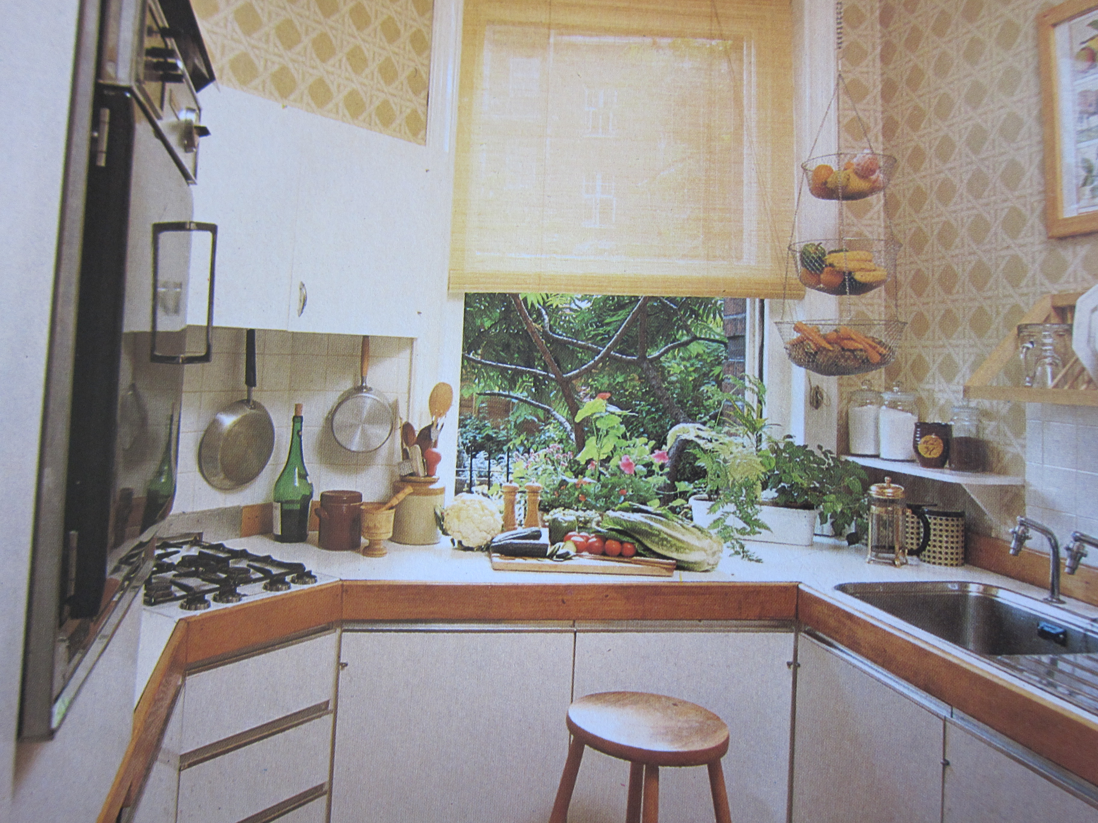
Many of us still have the quintessentially 80s cabinetry in our kitchens today – with good reason. Those white cabinets with blonde oak trim are awfully sturdy. However, I’m willing to bet the yellow lattice wallpaper has long since been replaced by a tile backsplash, or good old paint.
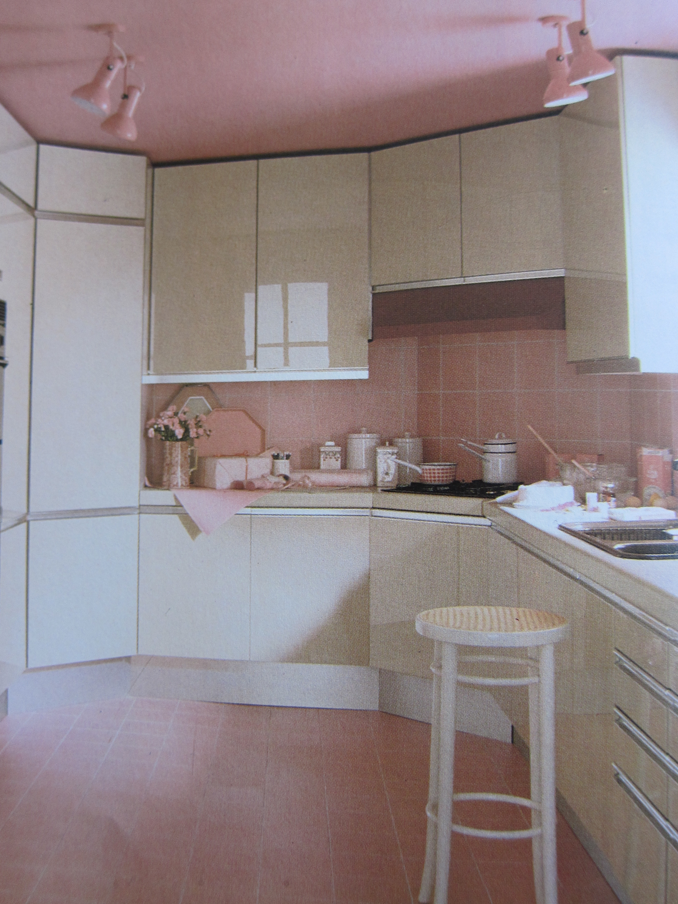
Perhaps the theory here was that if you felt nauseous upon entering this pink kitchen, the Pepto-Bismol like qualities of the room would simultaneously ease your turbulent tummy?
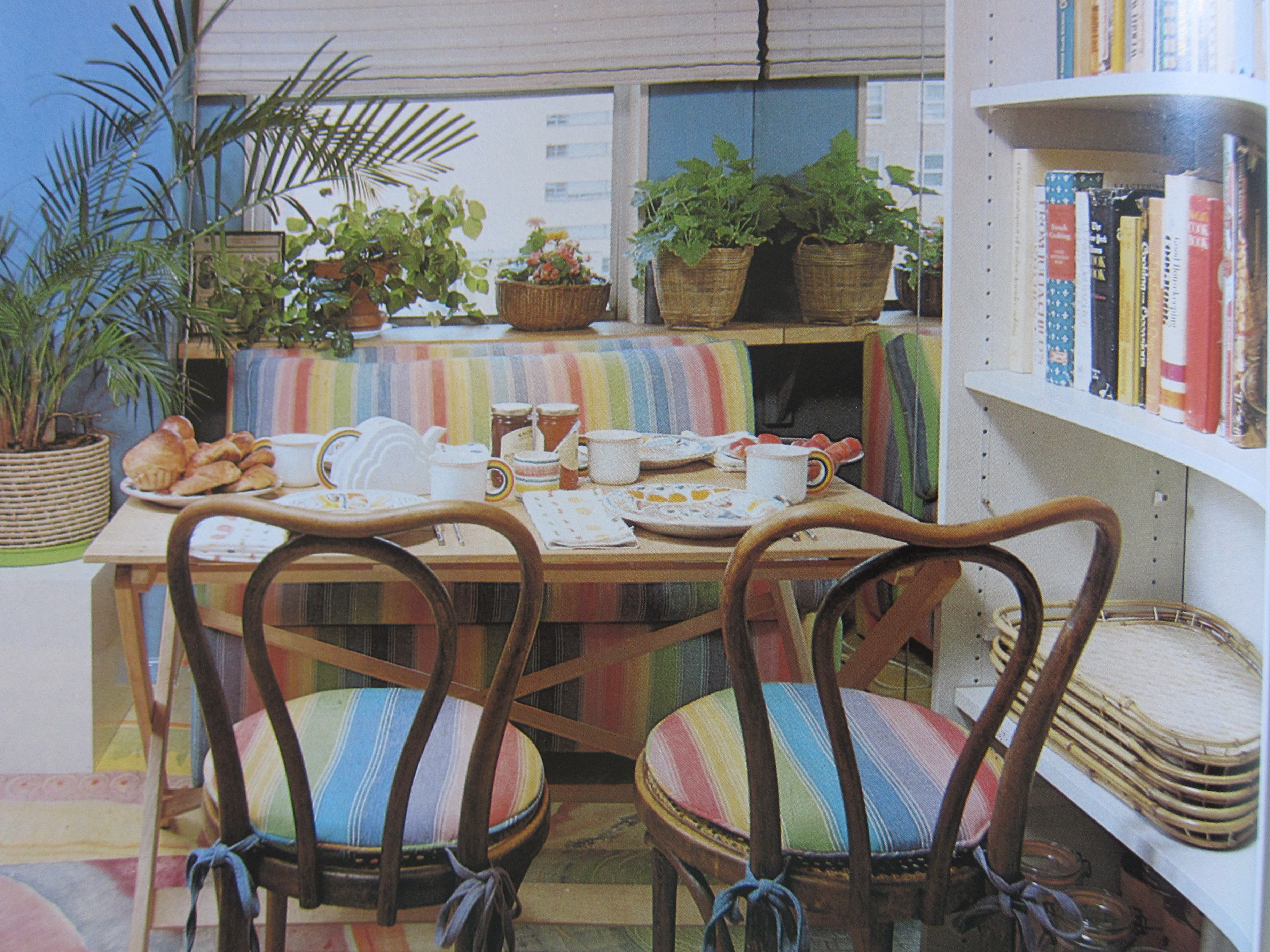 This breakfast room is the interior design equivalent of Skittles – it’s a rainbow of fruit flavors. The cerulean blue painted walls are not going to cast a lovely light on any food that is consumed in this room, and it certainly won’t do anything to stimulate the appetite. Perhaps designers didn’t know as much about color and its effects as they (generally) do today.
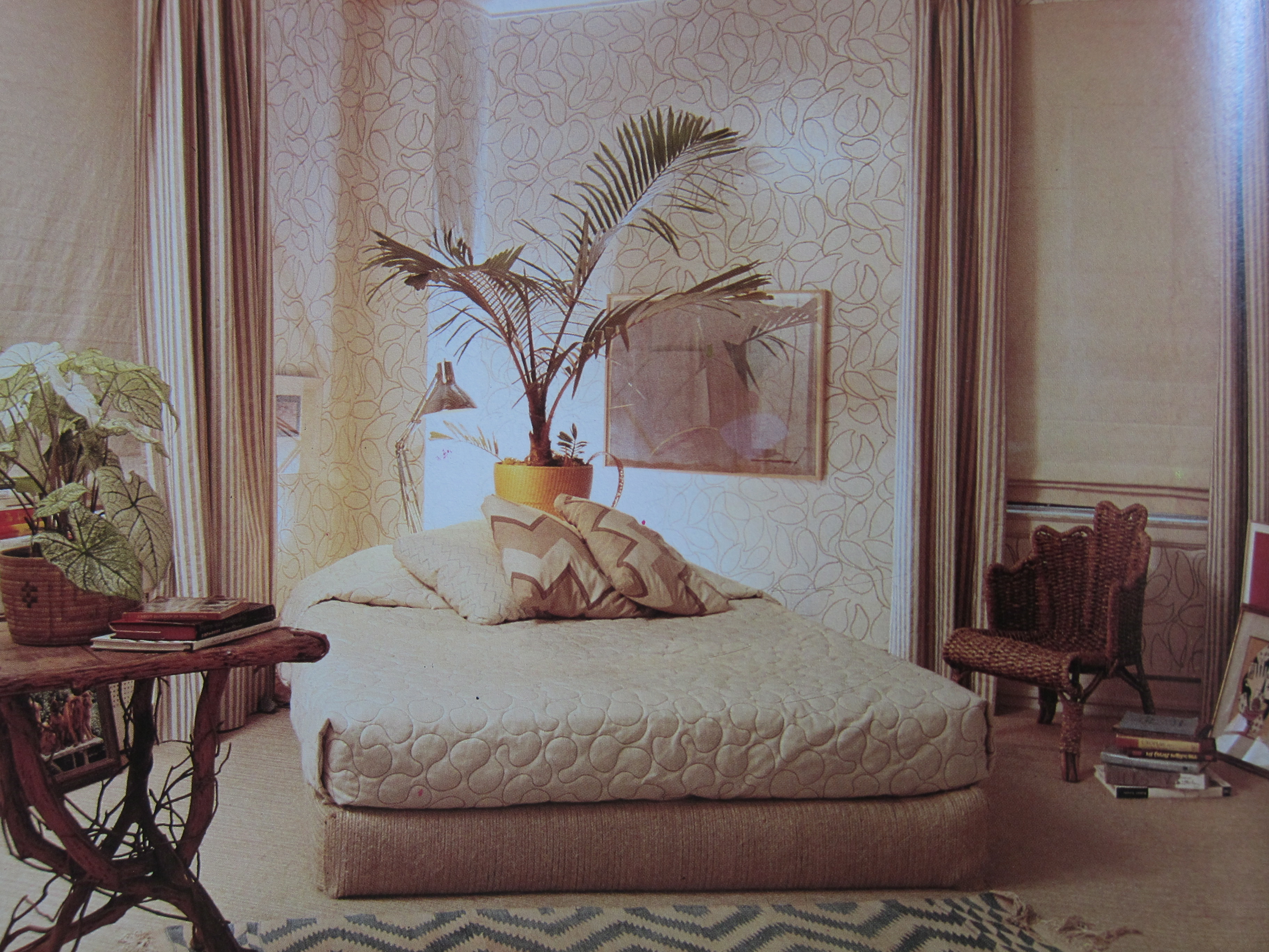 There’s our friend the potted palm, again! In a pretty weird spot. There’s a lot that’s weird to the contemporary eye in this room. But I spotted two things you could seamlessly transport to a room in 2012 – well, almost. Note the chevron pillows and dhurrie rug with a similar (diamond) motif! Also, the wallpaper pattern would be current in other colorways.
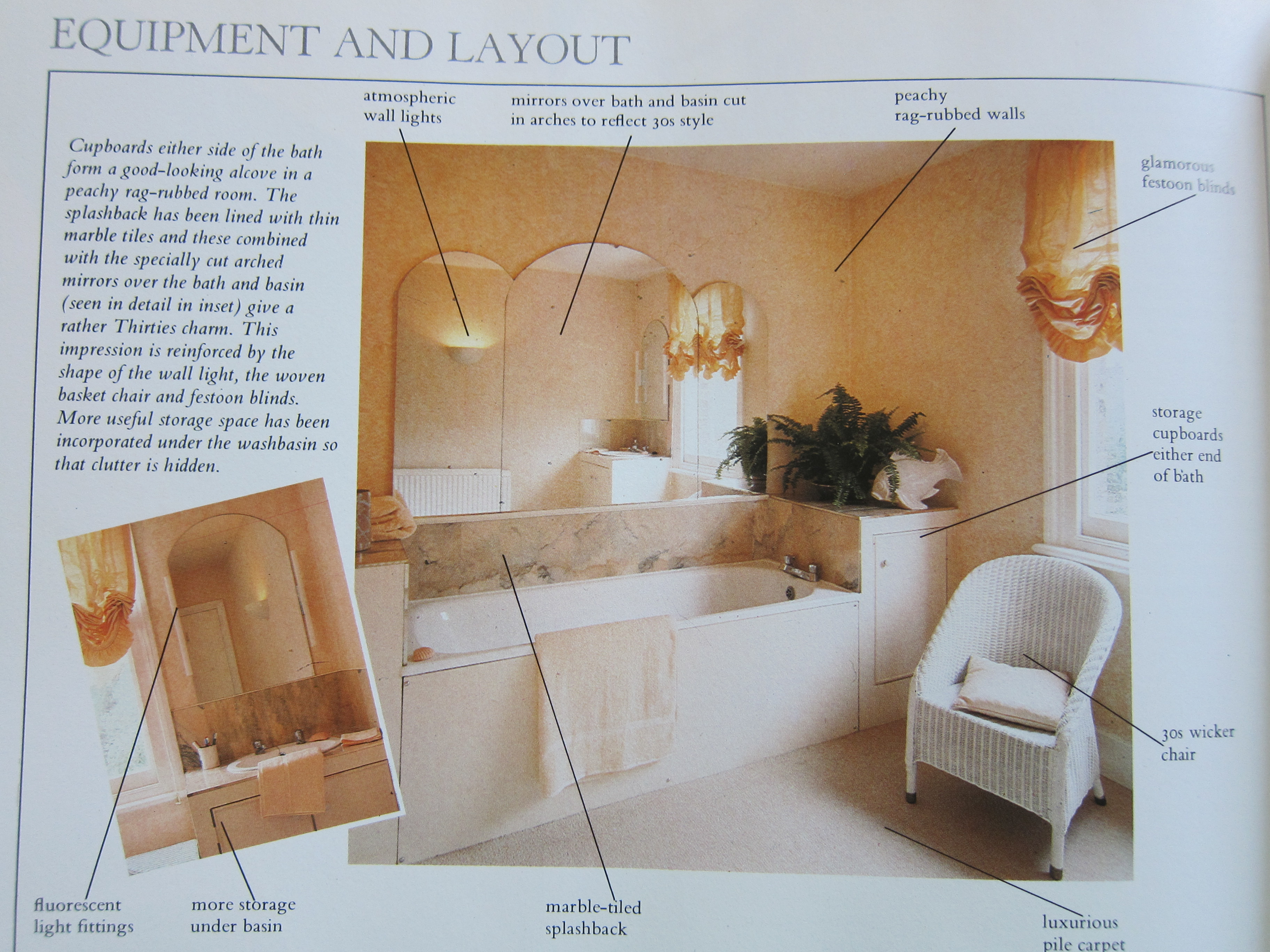
A how-to for designing an authentically 80s bathroom, inspired by the 1930s. Complete with practical wall-to-wall carpeting, oh-so-flattering fluorescent vanity lighting, and an elegant stone “splashback” behind the tub.
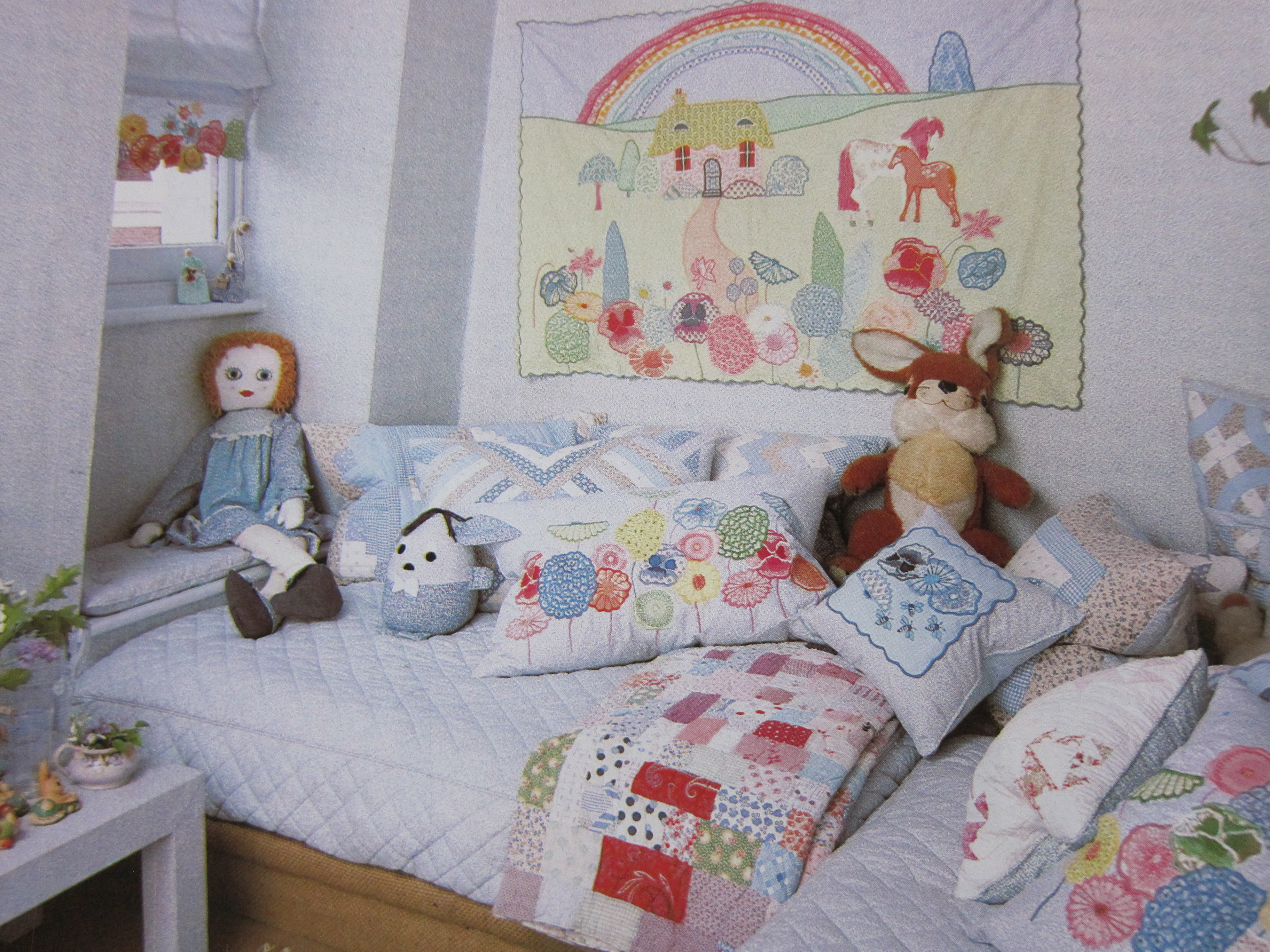 I had to include a kids room, though there weren’t too many examples in this particular book. This one stood out and rang true to this child of the 80s. It’s one big crazy quilt, but everything is also very “coordinated.” My late aunt lovingly created a Rainbow Brite wall hanging for me not unlike the one pictured.
I hope you’ve enjoyed this blast from interior design’s past! If you are pining for a more distant decade, you can check out Interior Design Time Warp #1 – The 1970s. Coming soon…the third and final installment, featuring the 1990s! As you will see, it’s further away than it sounds…
What sort of interior design elements remind you of the 1980s? Do you have any relics of 80s decor in your home?


I love your Interior Design Time Warp installations. They bring back so many memories. I don’t know if I could ever go back to the mirrored walls. Talk about self-consciousness. I always hated walking into a room and having my entire reflection staring back at me. Suddenly I’m thinking, “Oh. Were these the right shoes?” “Do my legs really look like that?” Haha. Great post.
Haha, I never thought of it that way, but yeah, I don’t usually relish those opportunities to see myself from head to toe either (except when getting ready in the morning). I do, however, like the trend of mirrored furniture, which can help prevent a case piece from pulling too much visual weight in a space. Thanks, as always, for reading and for your comment, Iris!
Love the pep to-bismol pink kitchen–your comments on it are hilarious!! So spot on! Wow, the 80’s were perhaps almost as bad as the 70’s?
I think it actually gets progressively worse as we move forward in time, which doesn’t make sense intuitively, but it might be telling of the life cycle of design trends!
Loved this post! Currently working on a film that takes place in the 80s. This was very helpful!!