We all have them. Pet peeves. Pre-conceived notions. Things we passionately hate about “bad” design. It’s different for everyone. Some people loathe wallpaper, in general. Others can’t stand the sight of shiny brass hardware, or an overstuffed recliner. Everyone is entitled to their opinion – and we all have the right to love where we live (whether or not everyone else loves it equally).
If I had to define my personal decorating “style” I would probably say I am New Traditional – for my own home. But I am totally style-agnostic when it comes to other people’s spaces. The house, the family, and functional requirements should dictate interior design and decoration. But I digress…what I’m interested in right now is opening my mind to even more possibilities. To doing away with those things I don’t like on principle (by the way, wallpaper is NOT one of them!), by indoctrinating myself with examples of successful design that contains those very things in some way, shape or form.
1. “Matchy Matchy”
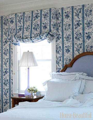
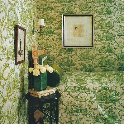
This guest bedroom, designed by Allison Caccoma (via House Beautiful), has what the designer calls a “cocoon” effect, achieved by the use of the same fabric on the upholstered walls and the London shades. I am digging it. This one too – a bedroom in Kate Spade’s new home (via Habitually Chic).
It’s toile-rrific! If you’re going to do matchy-matchy, you’ve got to really go for it. And skip the bedroom furniture sets (I, too, have done this in the past – so tempting, yet a little boring 🙁 ).
2. Colorful Kitchens
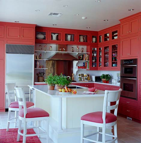
When it comes to kitchens, I tend to favor a neutral to near-neutral palette, with splashes of color in appropriate places (note: green is totally a neutral). This kitchen (via Traditional Home) flips that on its head, and goes bold with tomato-red cabinetry and seat upholstery, leaving just about everything else white. Many upper cabinet doors have glass to keep the red from becoming too overbearing. And all of the places where food will be are white, which will increase appetite appeal and make everything look delicious. I’m not sure I could live with this in my home (for very long), but I like this, and I can see how others would like it too. My favorite part is the gleaming white island that draws you to it, which is exactly the idea.
3. Unadulterated Maximalism
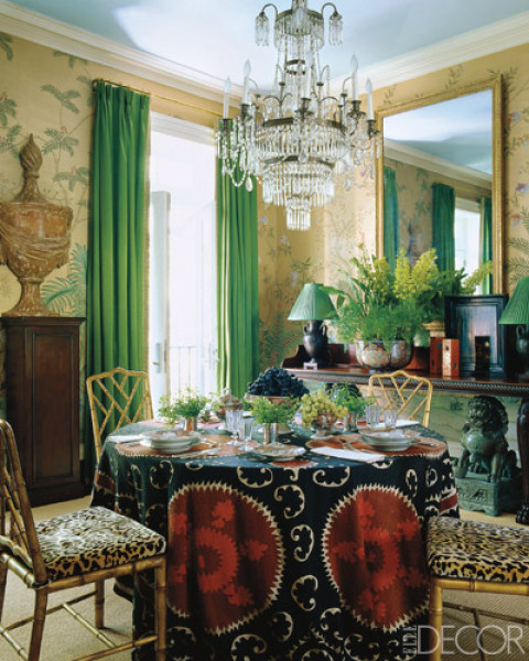
Celebrated designer Miles Redd is known for his audacious, and copious use of color, form and texture. He is certainly a brilliant decorator, but I am generally more in favor of less ostentatious, more harmonious interiors. However, this small dining room (via Elle Decor) is a Redd design I can get behind. Sometimes something just “works,” and it’s hard to identify exactly why that is. I think that’s the case here, but I will attempt to explain why I think it works. Firstly, the complementary color scheme of saturated green and red is perceptually pleasing to the eye (though I’m still trying to figure out how it succeeds in not looking Christmas-y). Secondly, the variety of patterns and scale thereof creates depth and texture in the small space. And lastly, the design is enhanced by light passing through the window, off the mirror, and through the dripping crystal chandelier and Chinese chippendale side chairs. I could have also filed this under “Learning to love animal prints.” 🙂
What are your bugaboos – those decorating cliches or styles that you just can’t get past? Have you ever seen something that has changed your mind or made you think differently about any of them?


