Welcome to Week 1 of the One Room Challenge, where 20 featured designer bloggers (and hundreds of talented guest participants) embark upon a lightning-speed 6-week room transformation!
I wanted to do a mini introduction before getting into it, as I suspect many of you are brand-new to me and this blog – thanks so much for visiting!! I am a Boston-area designer and blogger specializing in family-friendly interiors with fabulous style. I started my blog and business in 2012. This is my fifth (!) ORC, and my first as a featured designer.
Even though Week 6 is when we reveal our finished rooms, this week is also a reveal of sorts, as it’s when we each get to spill the beans on what space we’re tackling…and start revealing our plans, hopes and dreams. Week 1 is really exciting!
I am delighted to be working with a long-time client this season – and it’s a room I set my sights on years ago, when I first started working with her and her husband. You see, this client has amazing personal style, and her decorating taste has evolved and become more modern. She favors a clean aesthetic and the ‘light and airy’ look but also likes texture, earth tones, warmer hues (especially orange) and purple, and is an aficionado of interesting textiles and art. She does not like blue. Little by little, her home is beginning to reflect this.
Her master bedroom…well, it does not. Reflect any of this. YET!
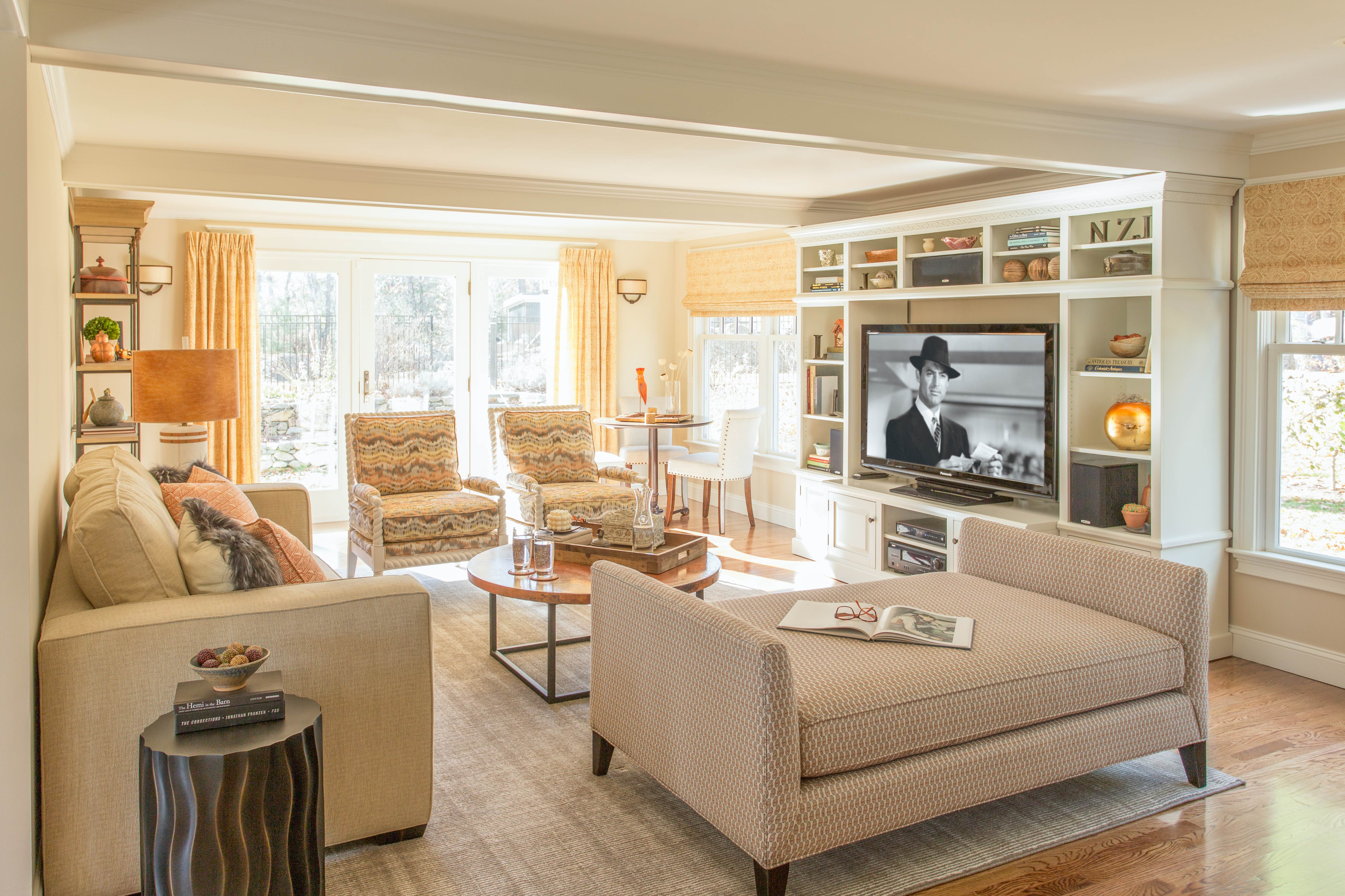
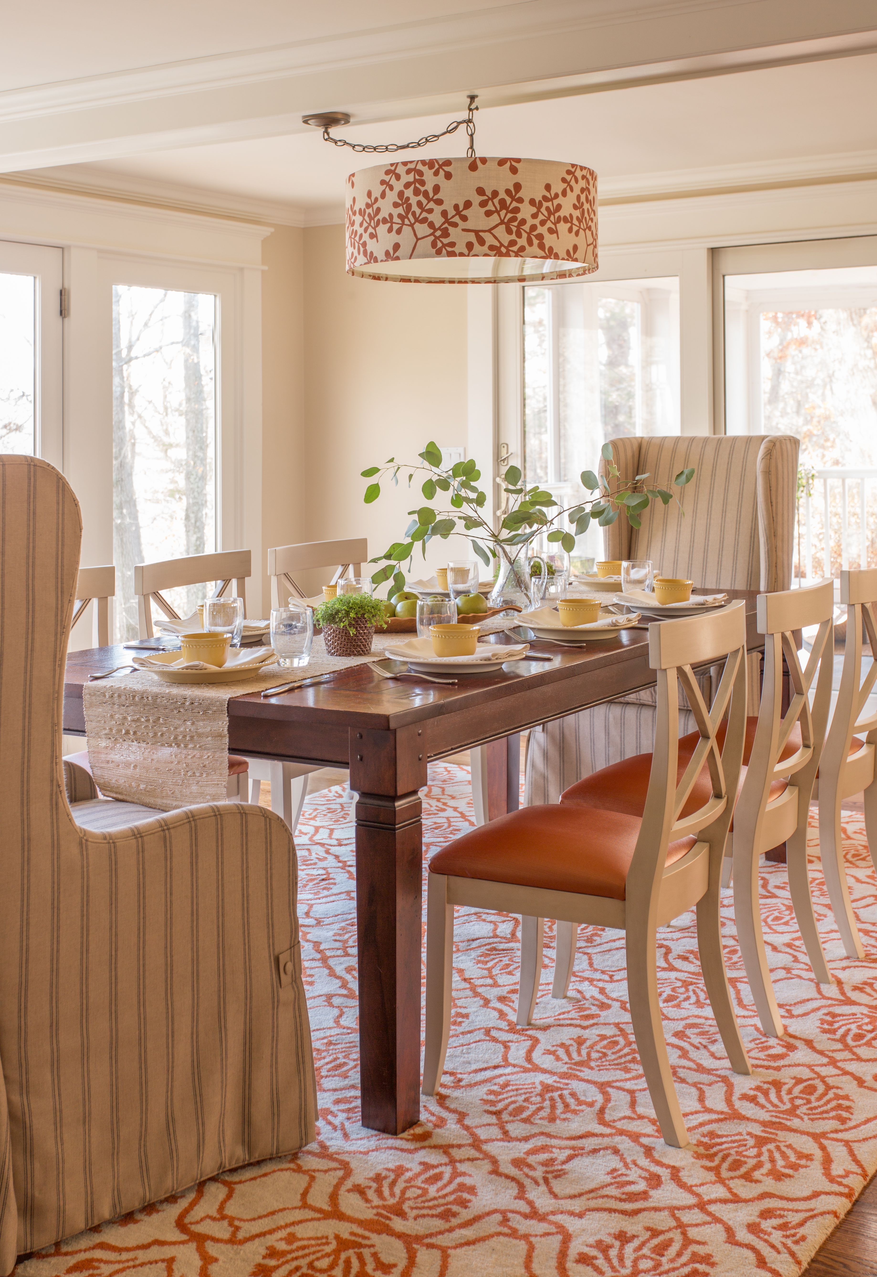
Before I divulge all the ‘before’ pics, I thought I’d share a couple of spaces in her home that we’ve already transformed together – actually, they’re directly below the master bedroom.
Now…you’ll see why their bedroom absolutely needs this major transformation (hang tight – I’ve got the plans to show you, too!).
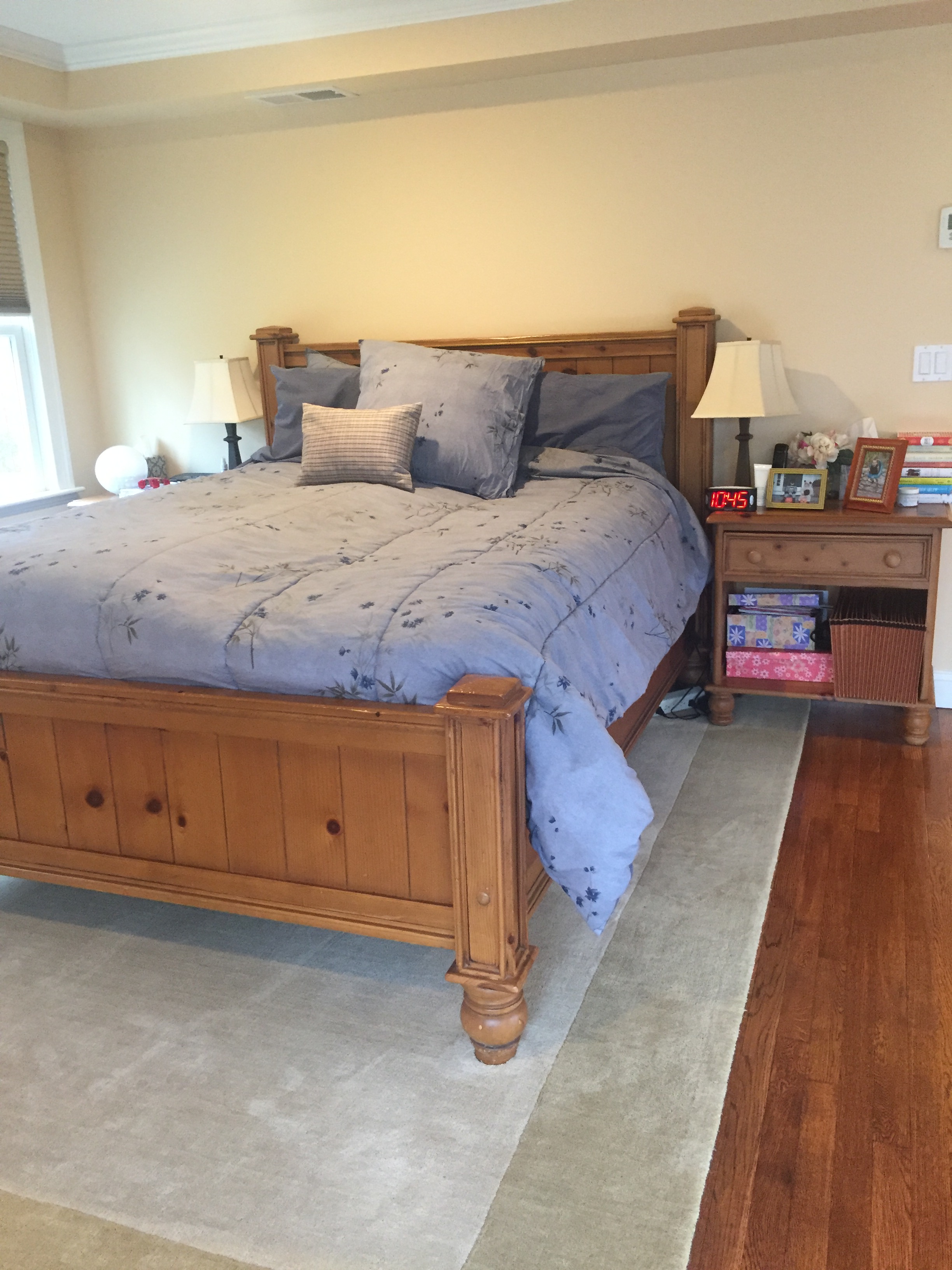
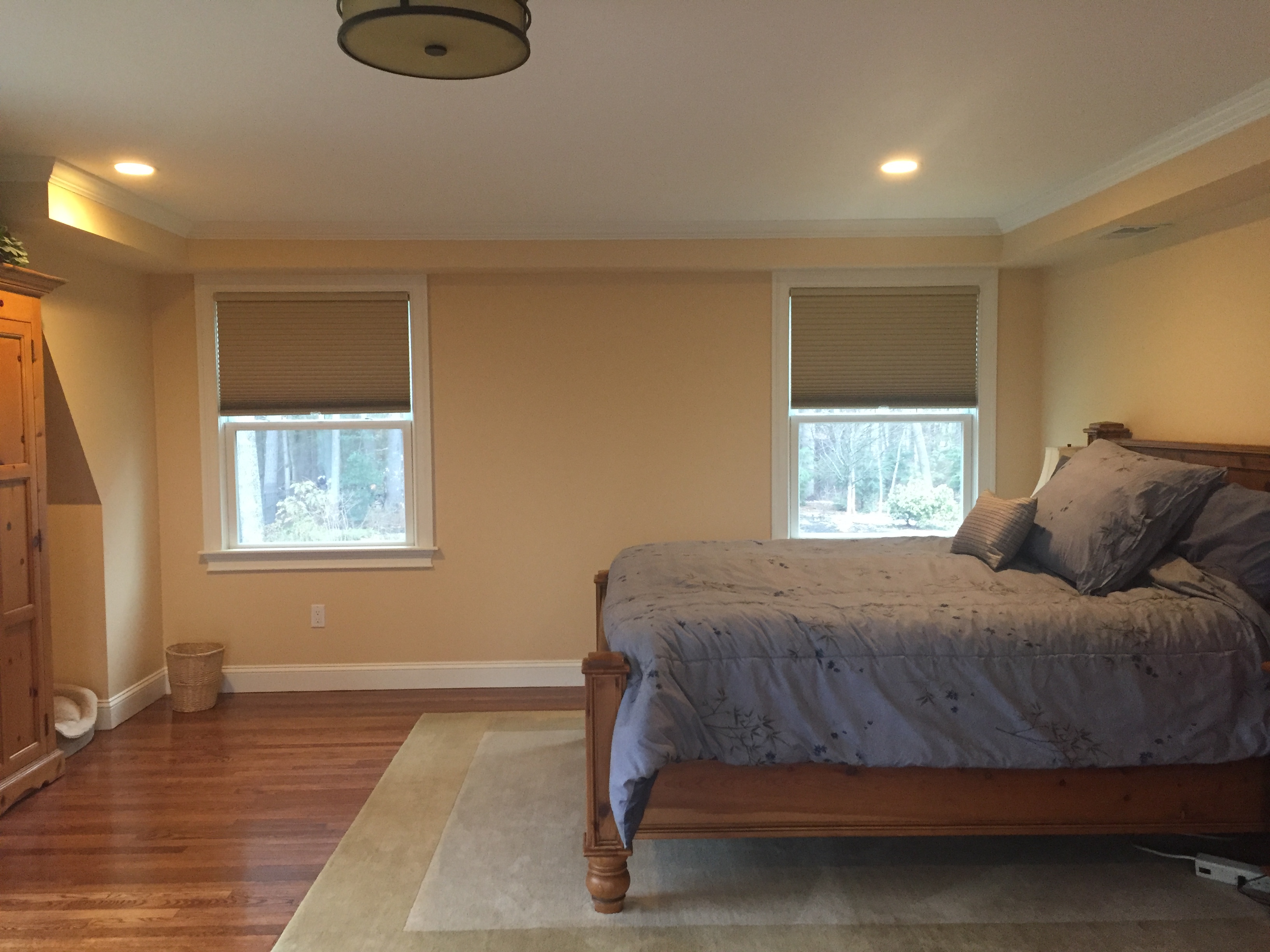
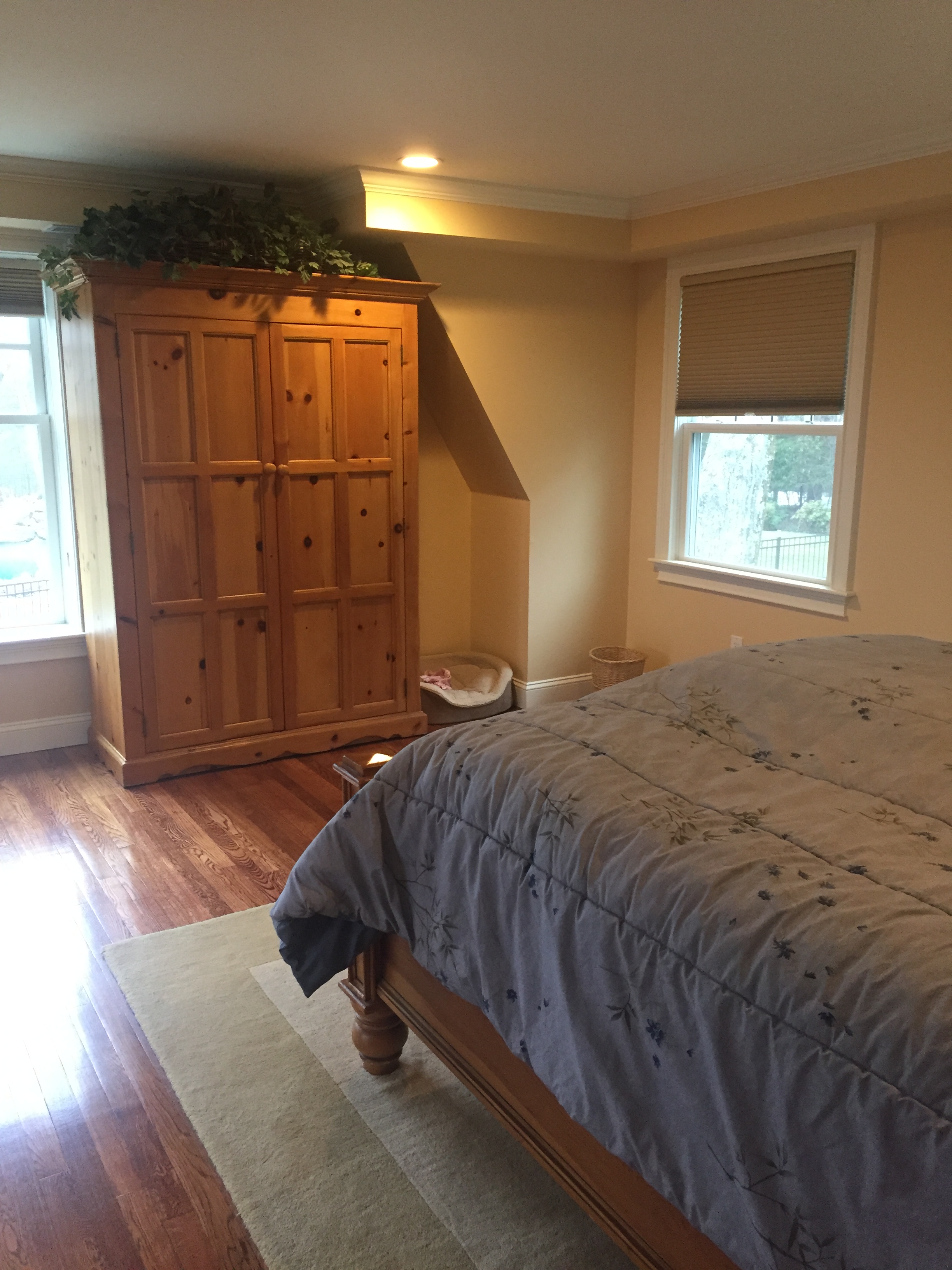
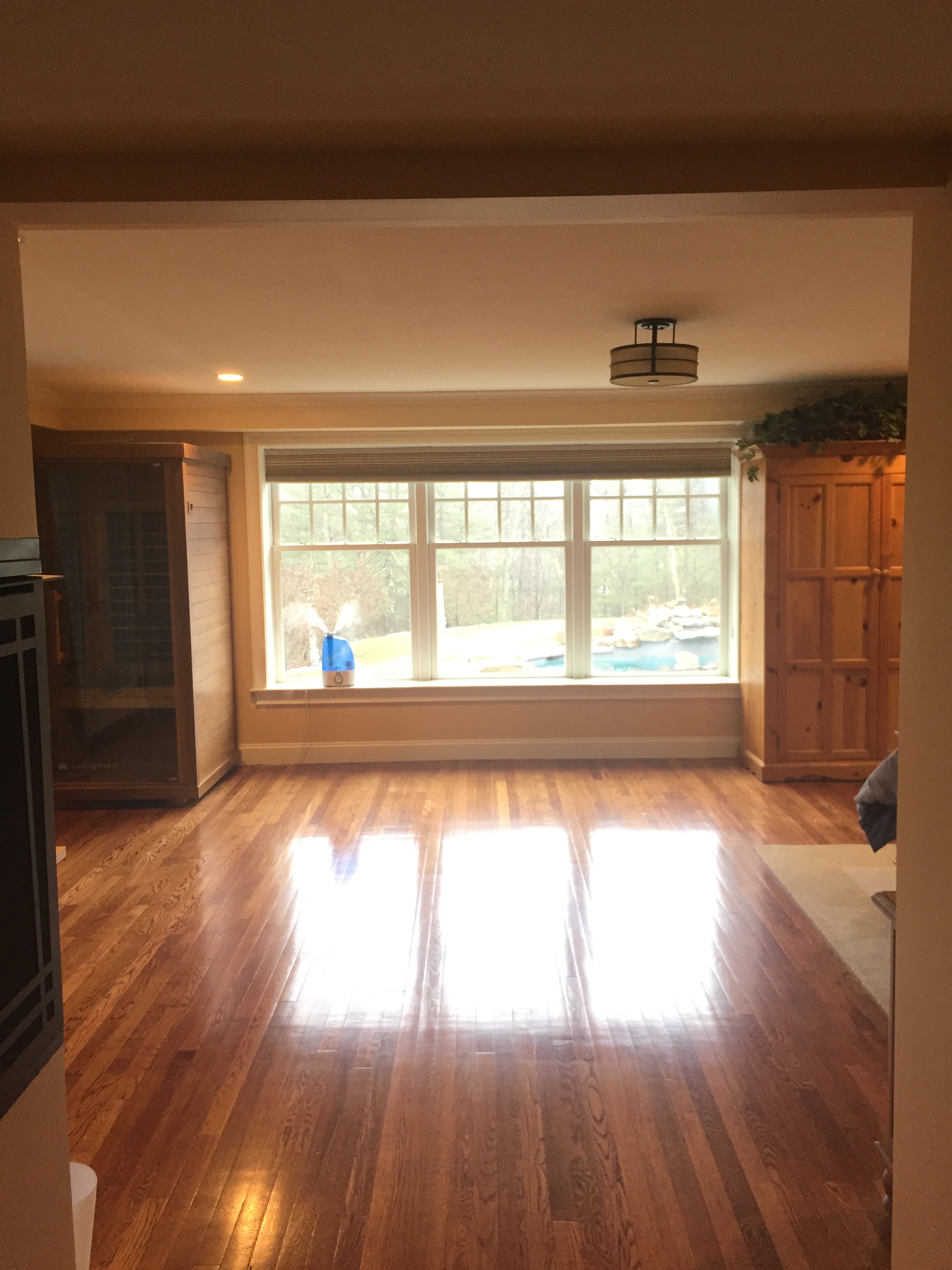
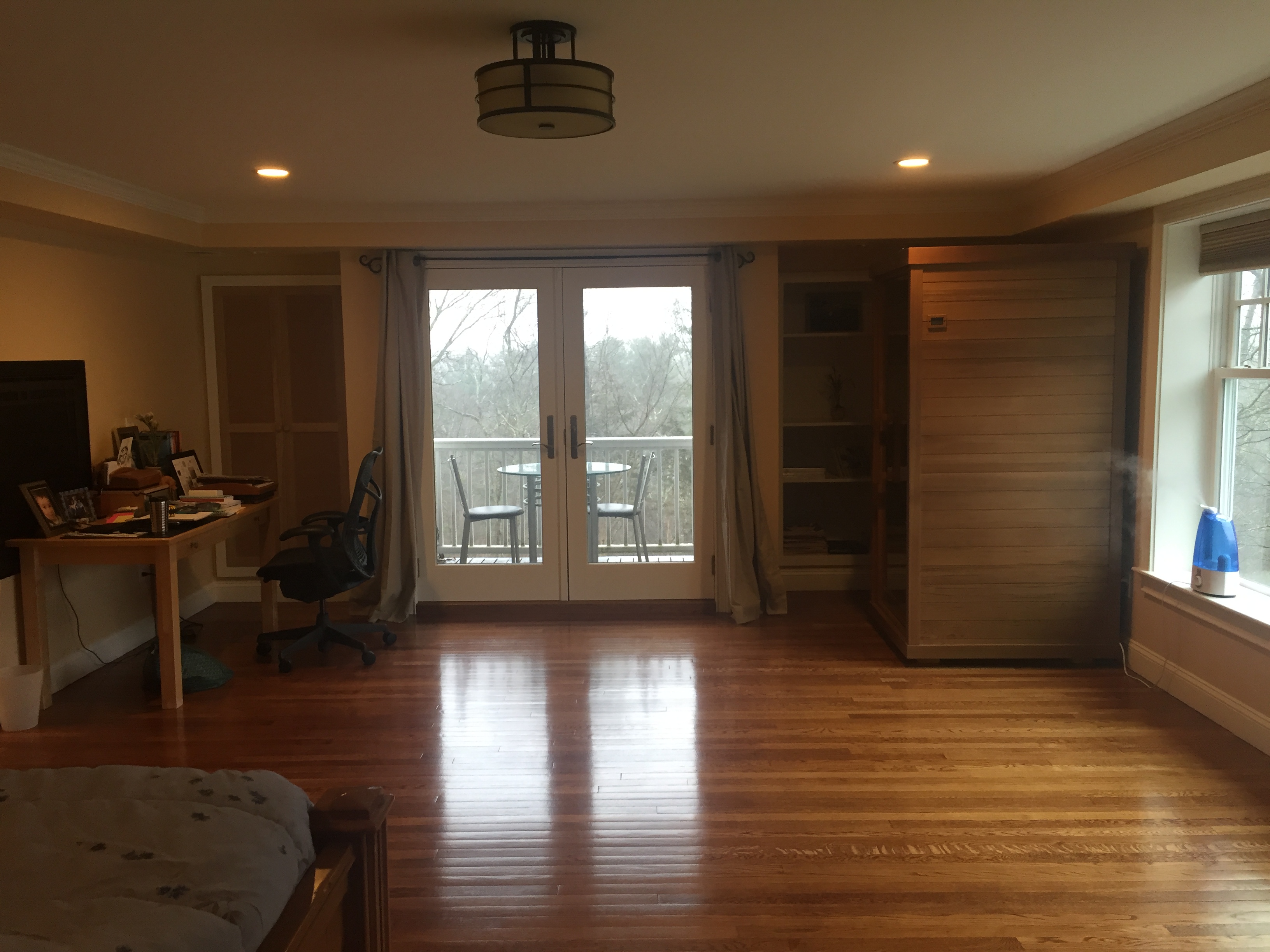
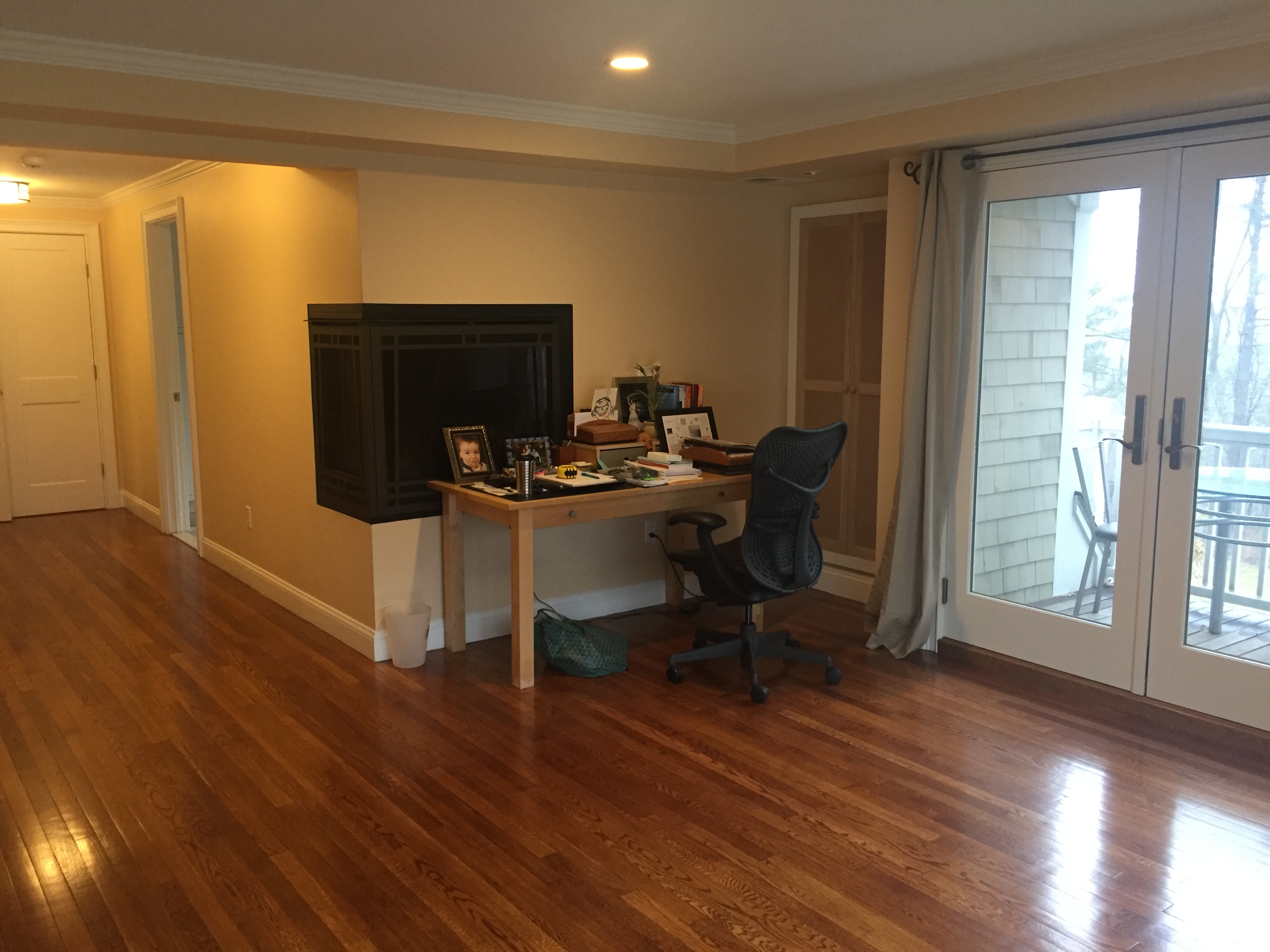
BEFORES:
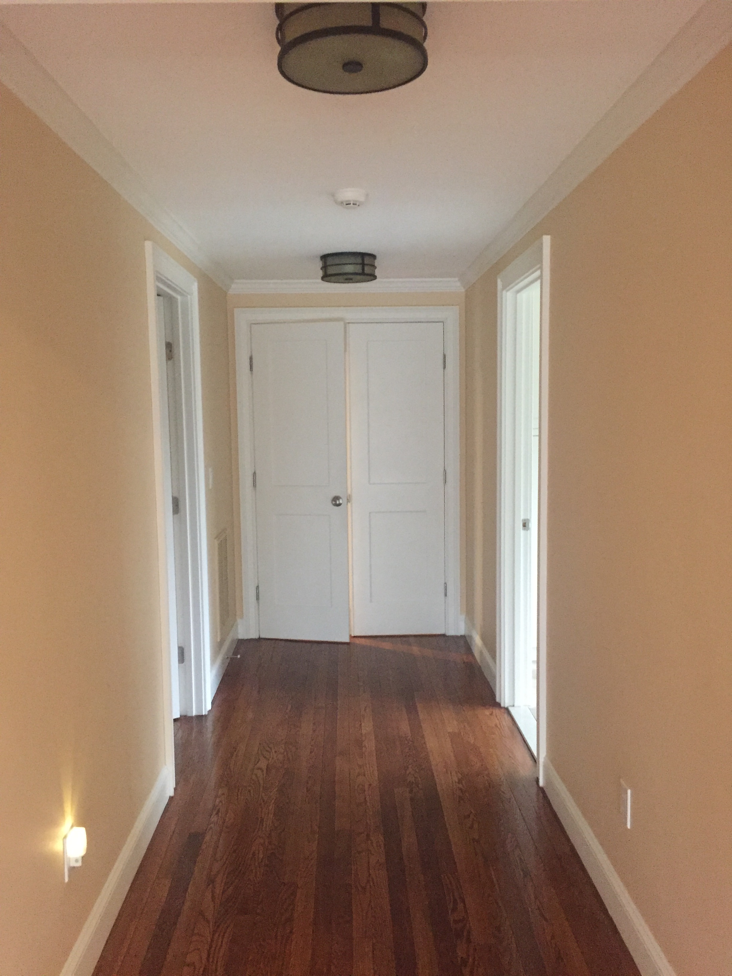
Still with me? I’m not sure if it comes across in these photos, but this room is huge – around 24 feet long, plus a long hallway. It’s almost like 1 3/4 rooms worth of ‘stuff.’ My client had no idea how to approach furnishing it, so it remained a mostly empty, little used (but for sleeping) space containing an assortment of craftsman/mission design elements, and country-cottage-clunky Crate & Barrel furniture dating back to the early 90’s. Does that count as vintage? 😉 In any case, it has been a source of frustration and avoidance for years. But no longer! We have a plan – and that plan will result in a 115% finished master bedroom in six-weeks’ time. It’s a blank slate; we’re scrapping it all and starting from scratch.
I’m calling it…
Project Bold Serene Bedroom (aka #KRIProjectBSB)
Bold Serene…an oxymoron? Nope. It’s actually the best I’ve been able to do at encapsulating and defining my ‘style.’ I enjoy using bold elements – such as color, pattern, form, etc. – while creating a balanced overall composition that ultimately and intentionally results in a very calm, peaceful feeling. Bold Serenity. (I have a hashtag for that too – #boldserenity).
Without any further ado, I would like to present to you the design plans for the Bold Serene Bedroom!
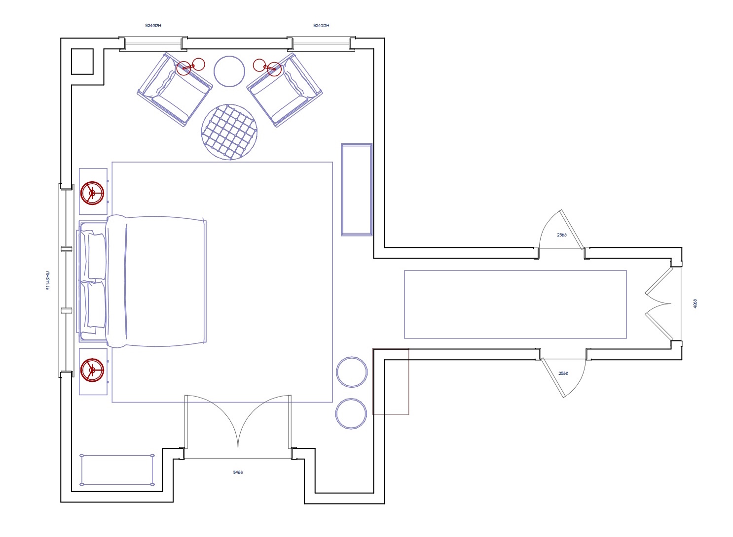
I created three different layouts, and this was the one the client liked best. To some, it may be a cardinal sin to place a bed in front of a window. But you have to love the visual of seeing a bed, framed by beautiful draperies, with that sunlight streaming in all around it., as soon as you throw open the doors to the master suite. It will be a lovely focal point for the large space. I designed a simple upholstered bed with a low-ish headboard that my local upholsterer will be making (with maybe an interesting detail or two to be determined!).
We are sprinkling lots of seating around the room, for different purposes – a couple of lounge chairs for reading and relaxation, a bench in a niche for putting on socks or slippers, and a couple of poufs or small ottomans in front of that strange and awkward two-sided fireplace, with the hopes of making it all look a bit more normal (more to come…and more for me to figure out on that design challenge!). Cozy, functional and relaxing is the goal – this room was certainly intended to be an oasis, and we’re going to help it realize its destiny.
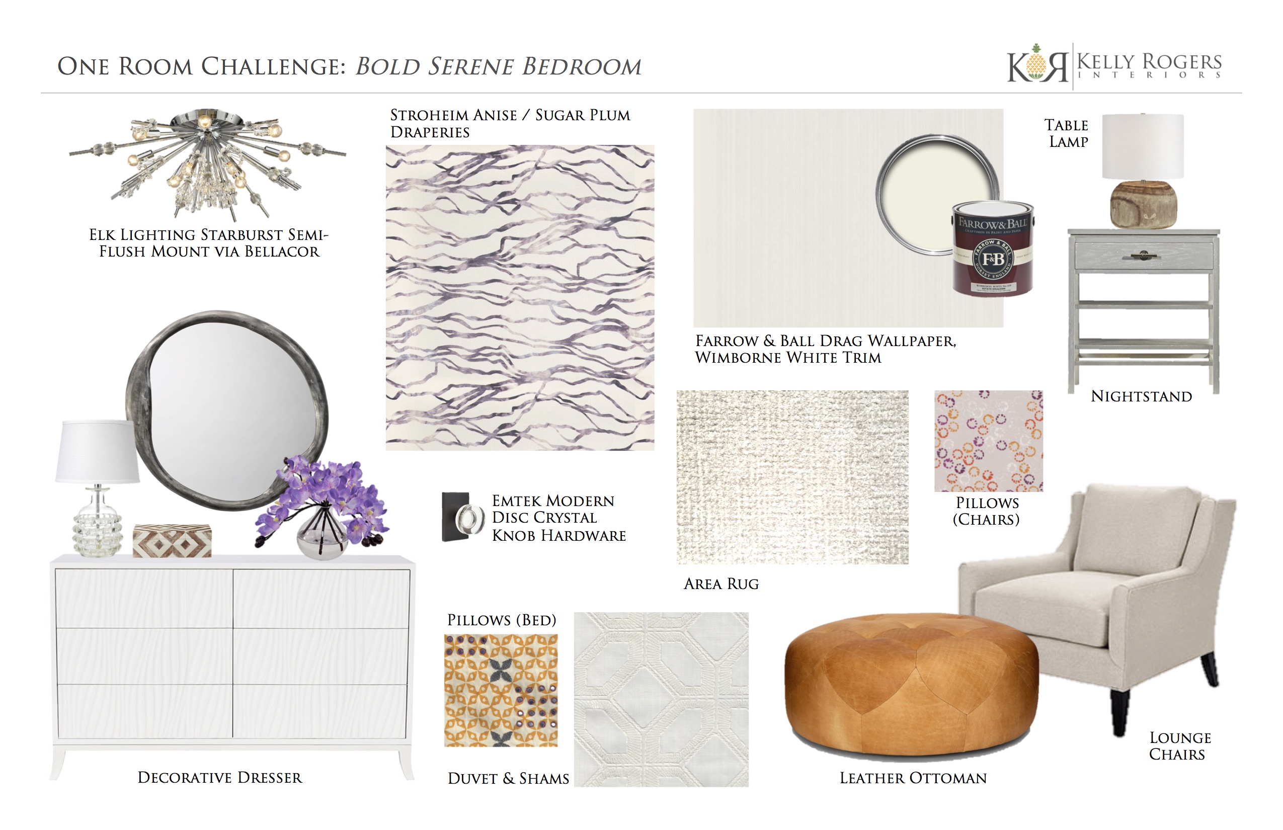
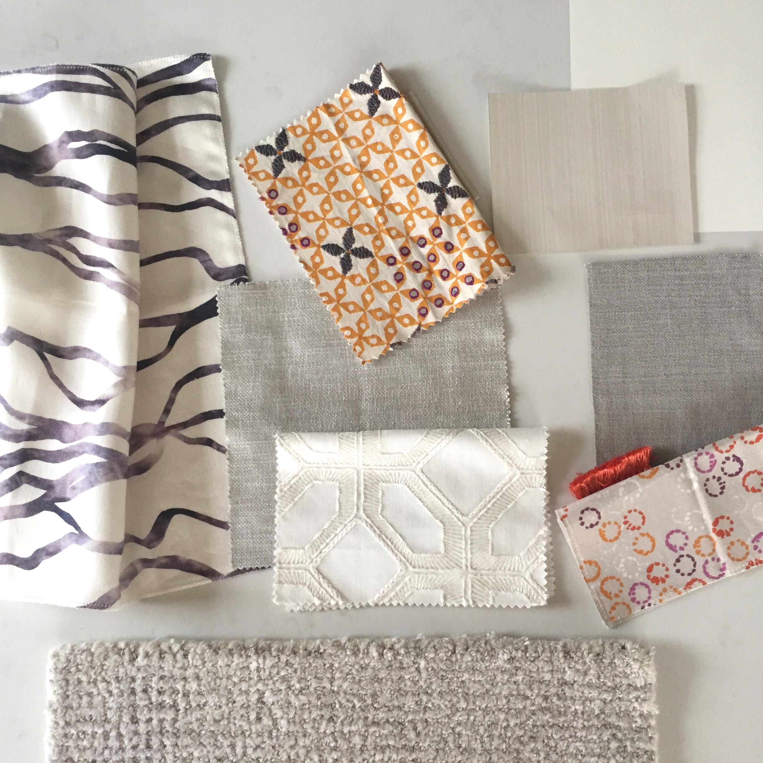
The drapery fabric – Stroheim’s Anise linen print in the Sugar Plum colorway, was the starting point for the entire scheme (I almost always start with fabrics!) – and we have a lot of windows and doors to dress. I absolutely love both the color and the abstract pattern, which is reminiscent of both waves and topography. The linen ground cloth is uniquely smooth, and is going to drape amazingly. Within the drapery folds, the pattern will soften even further, providing ‘just enough’ color and movement. That large triple window behind where the bed will be? It overlooks a beautiful new pool and pool house (that’s the unphotographed project, by the way) – I think it will be a marvelous harmony between inside and out.
Another really neat thing about this fabric is that it was designed by a team of talented students from Savannah College of Art & Design as part of a Design Incubation competition. The resulting capsule collection, which launched late in 2017, and of which Anise is part, sits at the intersection of art, innovation, design, and commerce.
Here’s how the scheme is shaping up (what do you think??)…
Speaking of subtle impact, I am SO excited to be using Farrow & Ball’s Drag wallpaper throughout this entire space – every wall, including the entire hallway. To achieve the light, clean look the client was after, I knew a big pattern on the walls was not in the cards – but just flat paint would have been, well, a little flat in this case.
Drag is a strie paper, printed with actual Farrow & Ball paint so it has both visual and tactile appeal. I’ve used it in another client’s foyer in the past (different color), and it has a wonderful, almost luminous effect on the walls.
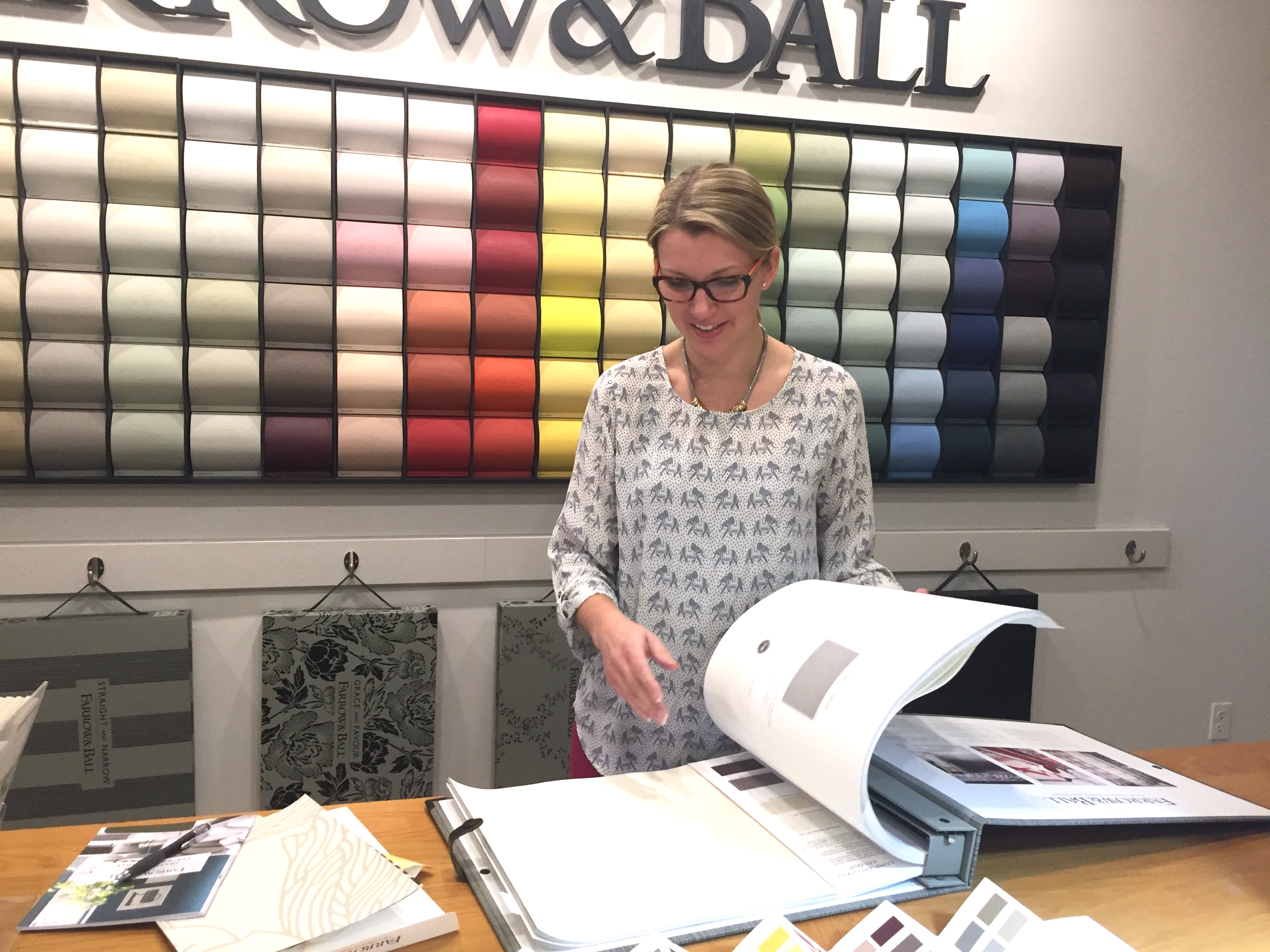
When I went to look at all the Drag colorways at the Farrow & Ball showroom at the Boston Design Center (thanks, as always, to showroom manager Tammy Couture for her assistance!), I was amazed by the selection, but I initially didn’t see quite what I was looking for (I am very particular!). Thankfully, they also offer many ‘archived’ colorways – in other wallpapers and paint, too! These archived colorways are not considered custom, and don’t require as long of a lead time. Which, of course, was also music to my ears, given our crazy ORC timeline!
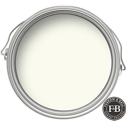
We’ll also be freshening up the trim paint and doors with Farrow & Ball’s always-classic Wimborne White in the Modern Eggshell sheen (a soft gloss finish). It will read as a relatively clean and modern white – but with a touch of warmth.
BUT WAIT…there’s more!
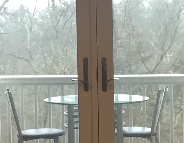
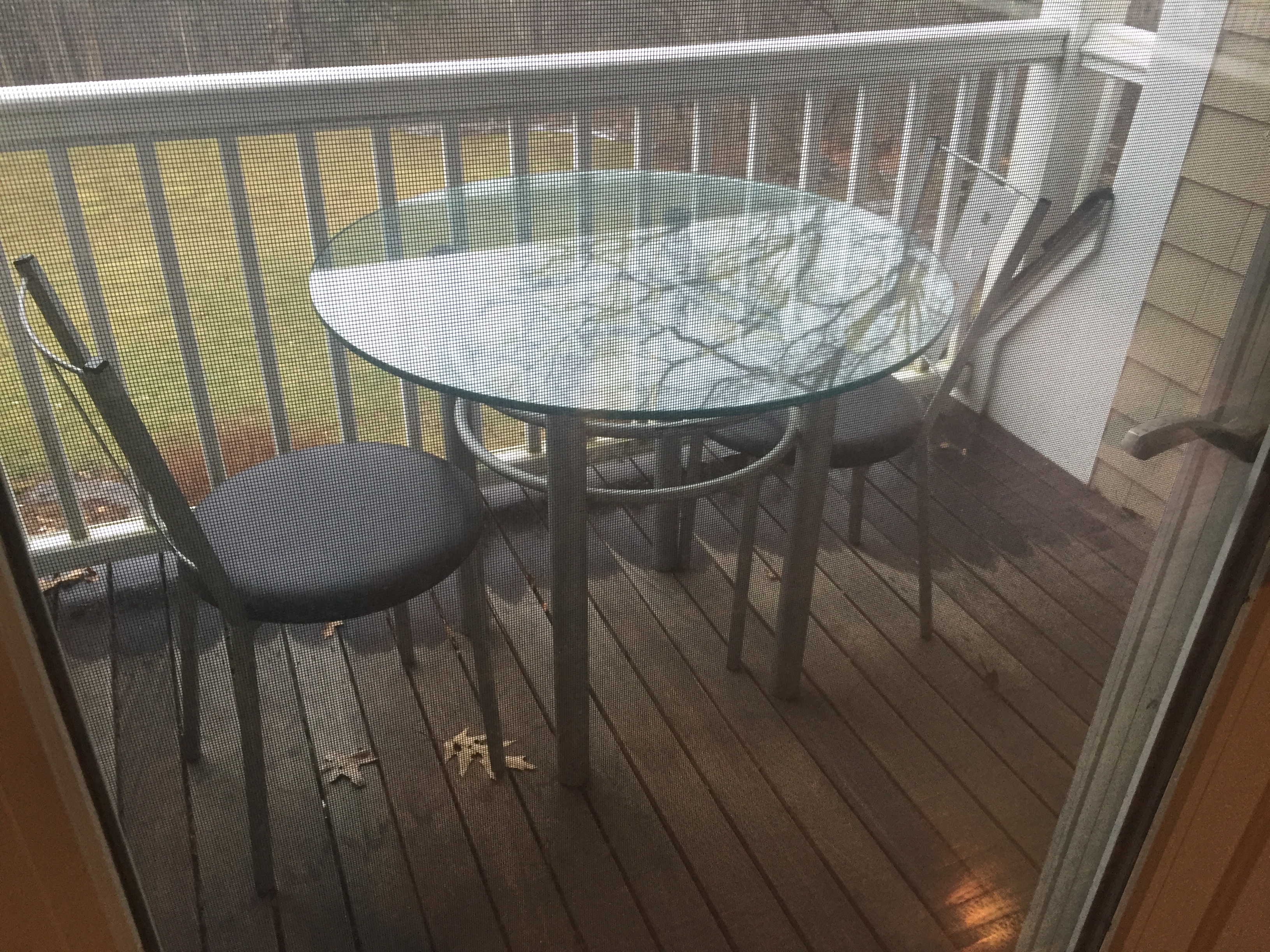
What I mean is that there is even more to this ‘room’…a teeny tiny outdoor space just outside the French doors.
No stone left unturned; this little balcony will receive its makeover, as well!
We are hitting the ground running, and I hope to have lots of progress updates next week. That should give you plenty of time to check out what everyone else has cooking (I know I can’t wait to!). Grab your coffee and dig in.
Apartment 34 | Beginning in the Middle | Coco & Jack | The English Room | The Gold Hive
Gray Malin | Jenna Sue Design | Jojotastic | Linda Holt | Marcus Design
Michelle Gage | Natasha Habermann | The Painted House | Rambling Renovators
Sacramento Street | Shannon Claire | Sketch 42 | Stephanie Kraus | Style Me Pretty Living
Media Partner House Beautiful | TM by ORC
Note: Fabricut / Stroheim and Farrow & Ball are among the generous sponsors we are delighted to collaborate with in the Spring 2018 One Room Challenge!



I CAN NOT WAIT for May 1st! We’re so honored to be your ORC!!! It’s going to be amazing!
It has been a dream working with you!! As always 🙂
Oh wow! What an space. Your plan, as all your designs are, just amazing. I am looking so forward to following this transformation. It will be spectacular!
You are very kind – thank you!
Hi Kelly,
Love this! Look forward to seeing the transformation unfold over the coming weeks!
Tammy & Laura
Thanks so much ladies for all of your help throughout this process! Couldn’t have done it without you!
Kelly, there is something about those fabric selection and combinations that is totally perfect! This is going to be a fantastic looking room and I can already imagine your clients enjoying it so much! Excited to follow along and see it come to life…
Cheers,
Meredith
Thank you, Meredith! We are loving where it is all going; and hoping it all comes together! Fingers crossed
I loved the fabric and now that I know it was from a student designer driven competition, I love it even more! Lucky clients. Can’t wait to see this unfold.
I know – isn’t that cool? Thanks so much, Linda, for being our fearless leader and champion, always!
This is going to be stunning! Can’t wait to follow along as it all comes together. 🙂
Thanks a bunch!
That room is huge! Have fun making over such a grand space. Team beds in front of windows!!
Thanks! It’s not grand…YET! The bed is going to be amazing in front of that window, darn it!
What a gorgeous combo of fabrics! So looking forward to seeing this room “unfold”! Is that a Seema Krish fabric in the mix? I love her work and rarely see the fabrics in a room!
Yes, it is a Seema Krish fabric! I’ve been dying to use it for a long time; I knew this was the perfect opportunity. Thanks so much for your kind words!
You always come up with something so unique — and this scheme is no exception. Eagerly following!
Thanks, Amy! I like to wander off the beaten path a bit, as you know. Excited to see how your studio evolves!
So excited to design alongside you this year for ORC! Can’t wait to see how this space turns out ?
Ditto! This is going to be fun (and stressful, but still fun!)!
I’m really excited to see how this turns out!! Love the moodboard!
Thank you very much!
This is such a large room, I am so excited to watch it come together as you fill it! Good luck!
Yes, it’s definitely big! Thanks for your kind words!