Welcome to week 2 of the One Room Challenge, where design bloggers across the US (and, indeed, around the world!) completely transform a space in just six weeks, documenting the process on their blogs, and revealing a brand new room at the end. I’m Kelly Rogers of Kelly Rogers Interiors, and this is my blog, Interiors for Families, where ‘grown-up’ style meets durability and practicality – welcome!
I am working on a client’s 6-year-old daughter’s bedroom – giving her (and her 8-year-old sister, who also sleeps there) a special room that works now, and will grow with her and be totally age-appropriate for years to come (heck, I’d be delighted to live here, and I am no spring chicken!).
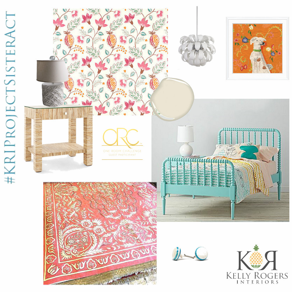
Here is the concept board I posted last week. [And thanks to those who visited and shared your compliments and feedback; I really appreciate them all!]
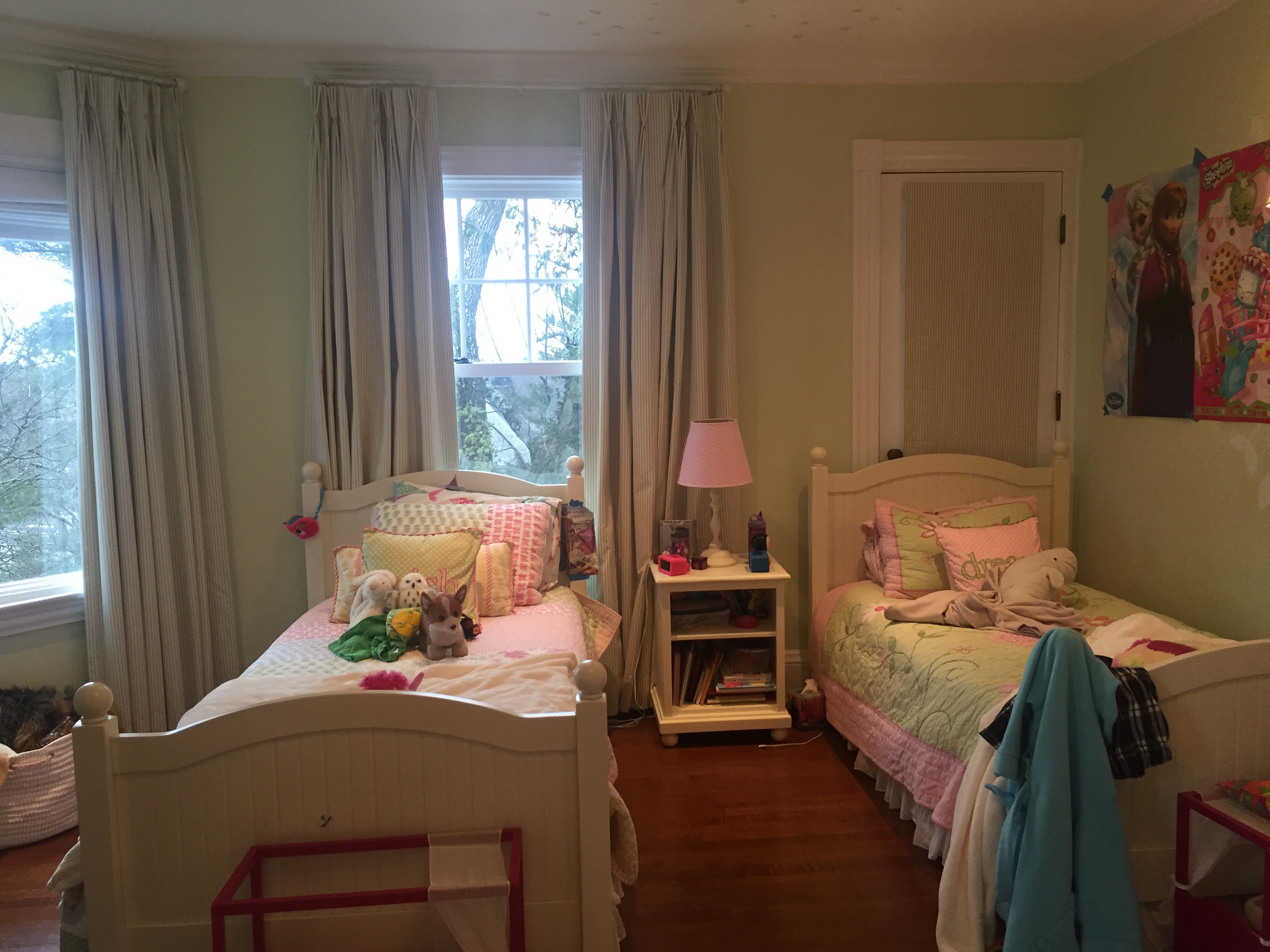
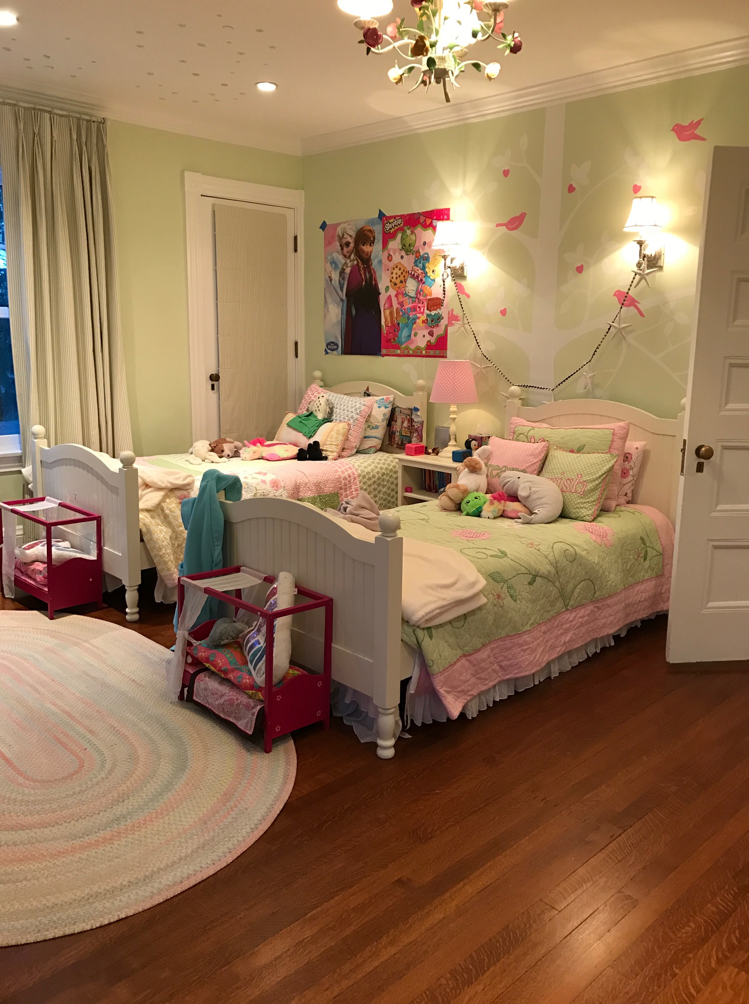
The biggest decision we made this week was to shift the beds to the more natural bed wall.
Here is where the beds were as of Week 1…
And here is where they are now…
I already like it so much better! When practical, it is always a great idea to test-drive a new furniture layout before you make a big commitment (i.e. design and decorate around it). And when kids are involved, it is especially important, as they are often reticent to make a change. Thankfully, the experiment was a success, and the girls are fine with the new arrangement!
Now two critical design decisions fall into place:
- Where to put the wallpaper – ceiling or accent wall?
- Where to put an area rug, and how big should it be?
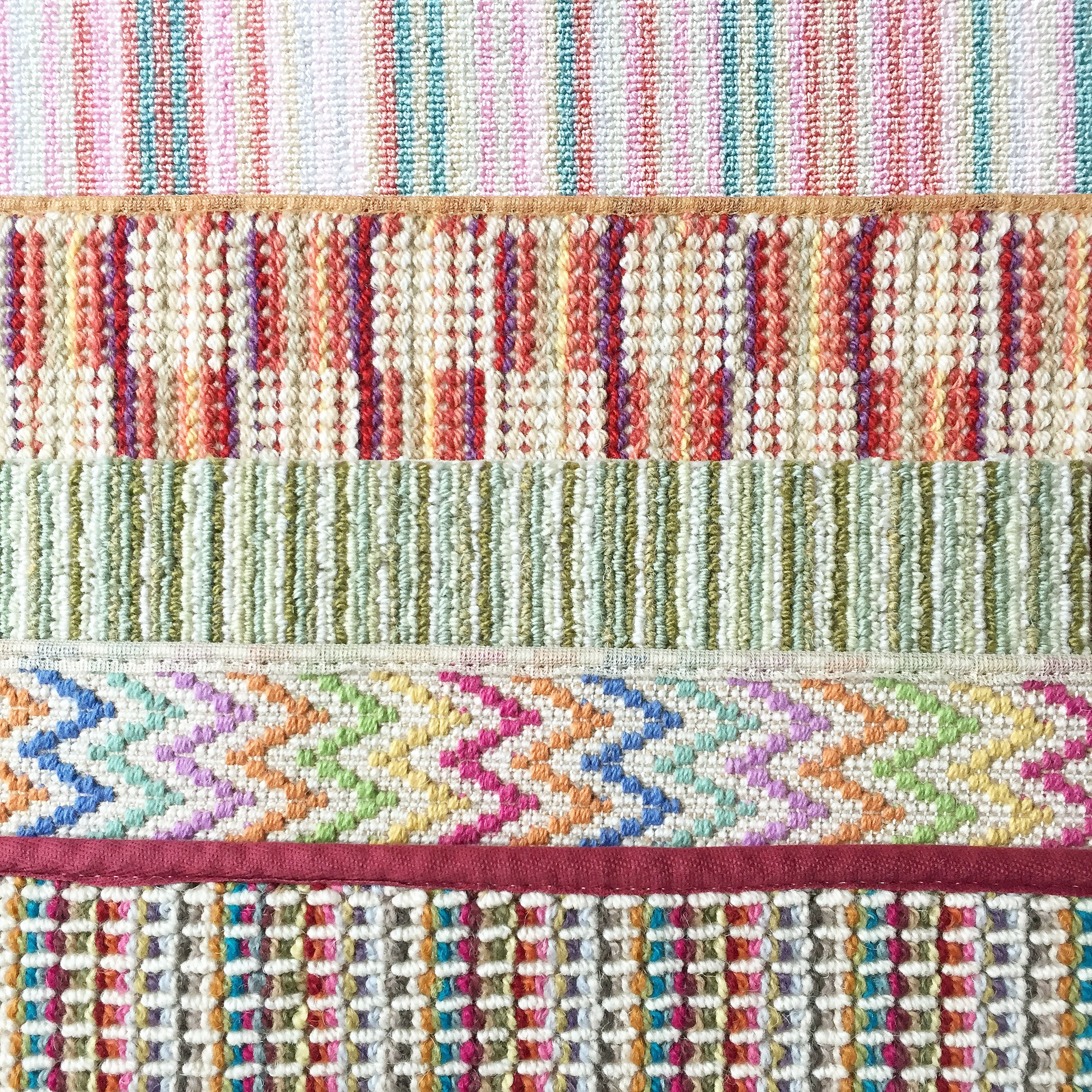
Let’s start with #2. I met with my client yesterday, and we agreed that the amazing pink chain-stitch Kashmiri rug in the concept board, with which we had both fallen in love, was just not going to work with this layout. A rug that covers most of the floor, and allows both girls to step out of bed onto something soft and warm is the goal. The optimal area rug dimensions do not lend themselves to a standard size – we ideally need something in the neighborhood 8′ 6″ x 13′. In this scenario, which I encounter often, I make an area rug out of broadloom carpet.
I had so much fun shopping for these! I picked up these samples the other day, because I had a feeling we’d be needing them. The multi-colored chevron and blue and green stripe are out of contention (I didn’t think they worked as well with the wallpaper), but I’m awaiting the client’s choice from the other three!
Speaking of the wallpaper (Benvarden from Osborne & Little), now that the beds are up against more of a continuous wall, a wallpaper accent wall behind them makes more sense. So we are abandoning the ceiling and going with the wall. The sconces are coming out and we’re not replacing them (there will be a table lamp on the nightstand in-between the beds). I think it’s going to look great! The other three walls will be painted Benjamin Moore Lime White.
It’s sort of a lighter version of the ground color of the wallpaper. I think the turquoise Jenny Lind beds will look even more interesting with a more light, neutral color enveloping the room. We’re keeping the crisp white trim, which will give us latitude to incorporate white accents alongside the off-white!
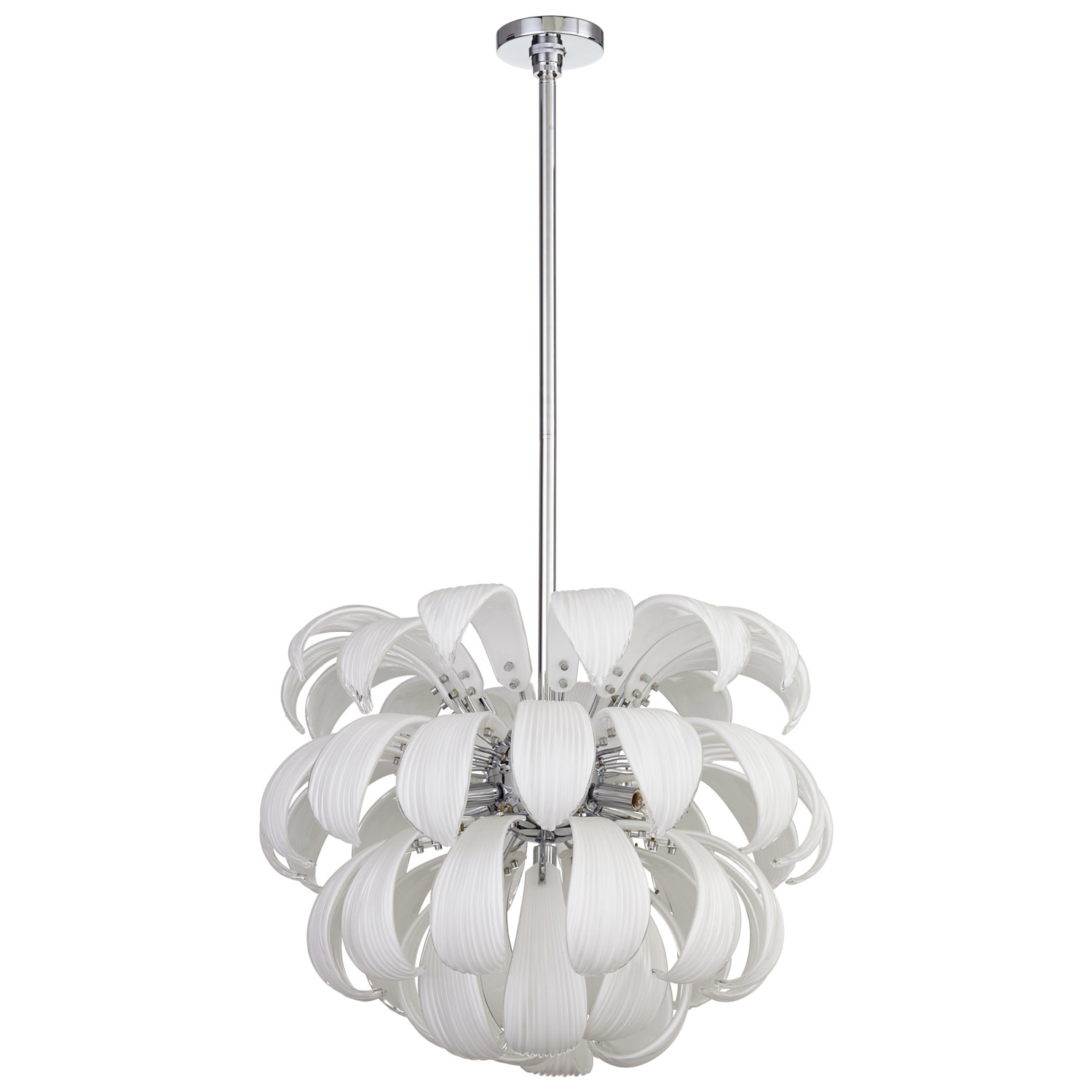
…such as this drop-dead gorgeous ceiling light!
Now that the really big decisions are made (or are close to being made), it’s time to start placing orders and figuring out the small, but important stuff – such as creating storage solutions for a room that lacks free wall space, and adding unique, custom touches without totally breaking the budget – or schedule!
All of the Week 2 guest updates are being populated on the linking page over at Calling it Home (over 250 bloggers linked up last week!), and the featured designers publish their posts on Wednesdays.
Thank you for reading – I hope you’ll come back next week! I’ll be getting ready to head down to High Point Market, and probably in the first stages of “Dear God, what have we done?” on our home renovation :).


Loove the new position of the beds. Can’t wait to see more!
It’s looking great so far! I love the rug choice and that ceiling pendant is amazing! Can’t wait to see the rest of the updates!
Oh Kelly I absolutely love your inspiration for your girls bedroom! I have two girls too, 4 and 5 (18 months apart). Major coral and blue fan, youngest daughter has these colors in her room, and love the sophisticated yet whimsical design plan! What a difference moving the two twin beds make! I also love the bird mural. My oldest has cherry blossom and bird theme room. 🙂 Can’t wait to see how you transform this bedroom; let’s do this! Sarah
i just love the plan- this is going to be such a fun space!
Really cute Kelly! I love the beds and the carpet options (Though I’m sad the chevron won’t work). Can’t wait to see how it progresses!
Finding the pair of beds is just all kinds of “meant to be!!” I think you are going to knock this out of the park and will enjoy following along…
can’t wait to watch your big reno as well….you are going to have a BUSY spring and summer!
Cheers,
Meredith
This is going to be a beautiful room and just a tad bit more sophisticated than before, although that was also adorable. Those rug choices are fantastic, and I love your color selections!
I love shared this girls rooms..I vote for wallpaper on the accent wall – behind the beds!!!!!!!