The day is finally here – it’s time for all the One Room Challenge participants, including myself, to unveil their 6-week room transformations to the world. A little intro is in order, since many of you are probably visiting for the first time (hi there!). I’m Kelly Rogers of Kelly Rogers Interiors, and this is my blog where stylish interiors and family-friendly smarts go hand-in-hand.
If you’d like to get caught up on my ORC fall 2016 journey, you can click here to see the previous five weekly updates. The synopsis: I have transformed a “dead end,” unused, and water-damaged landing area on the second floor of my 1896 Georgian/Colonial Revival-style Victorian into an area for my family of four to read bedtime stories, play games, and enjoy the occasional quiet moment during the day without the distraction of a TV or computer screen. (Spoiler Alert: It’s NOT a playroom! But play is absolutely allowed and encouraged).
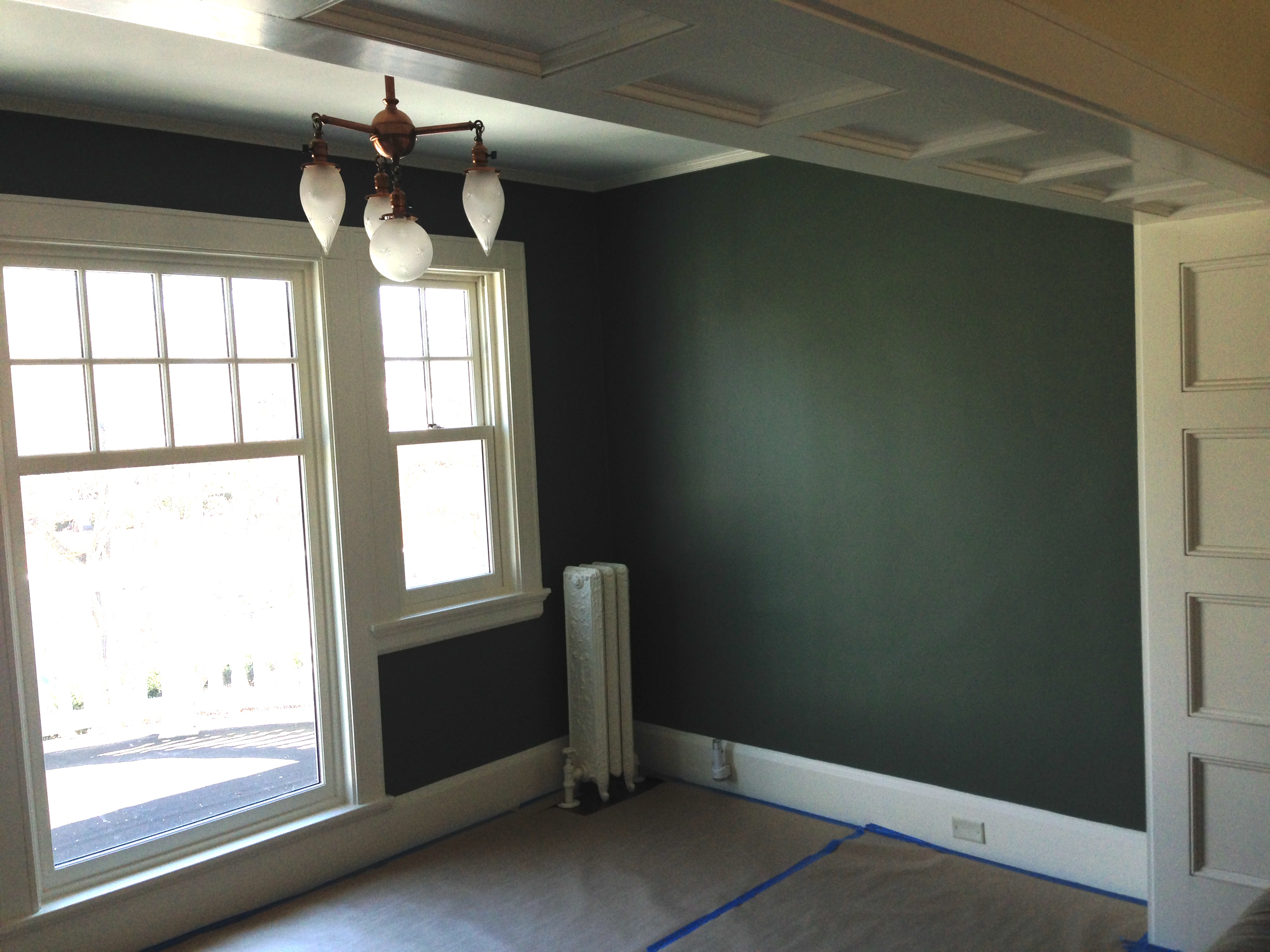
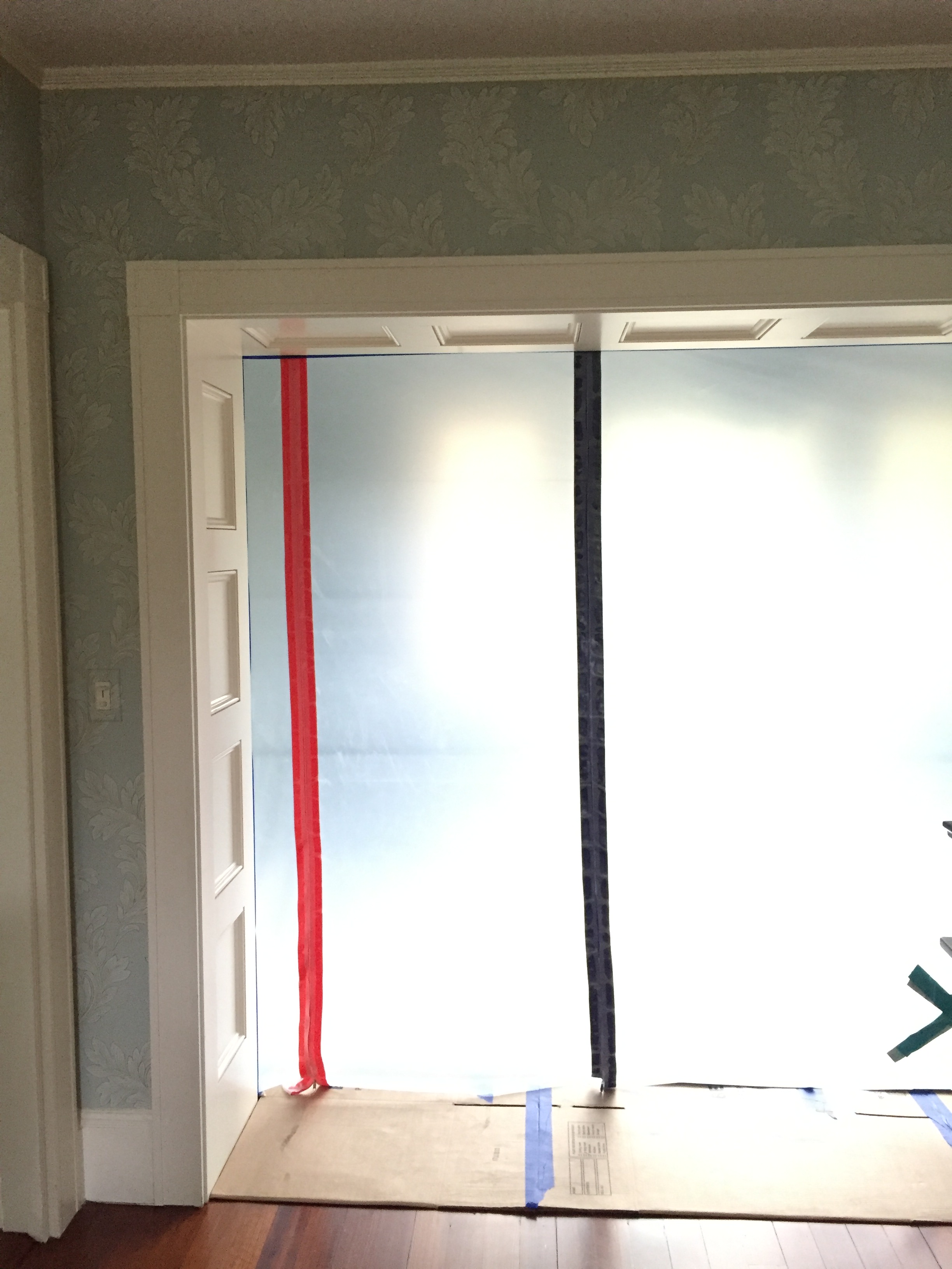
Quick reminder of the ‘BEFORE’ state:
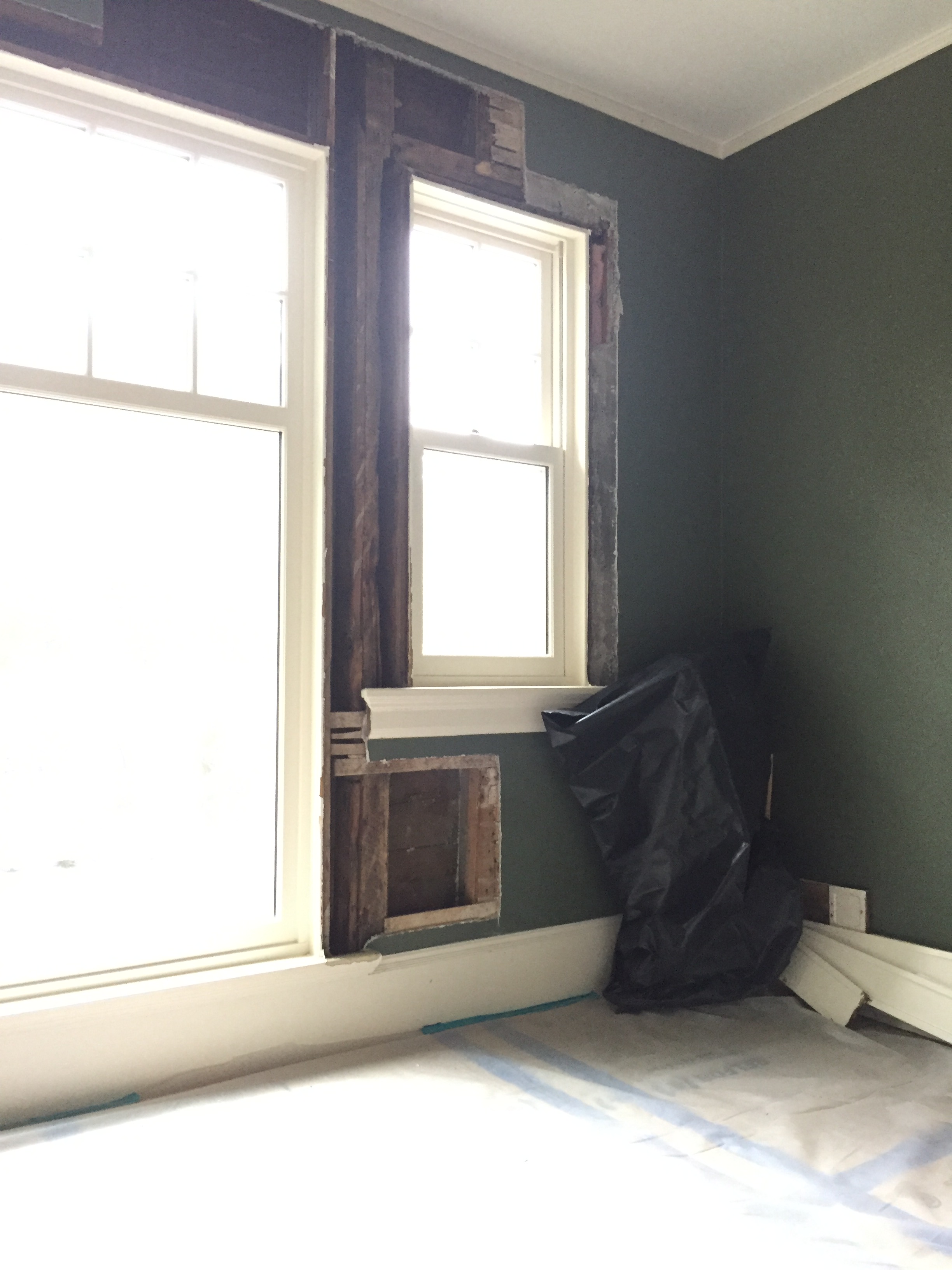
And during the restoration and repair, addressing the damage from our infamous winter of 2015 ice dam extravaganza.
And now, I’m peeling back the curtain on Project Perfect Landing!
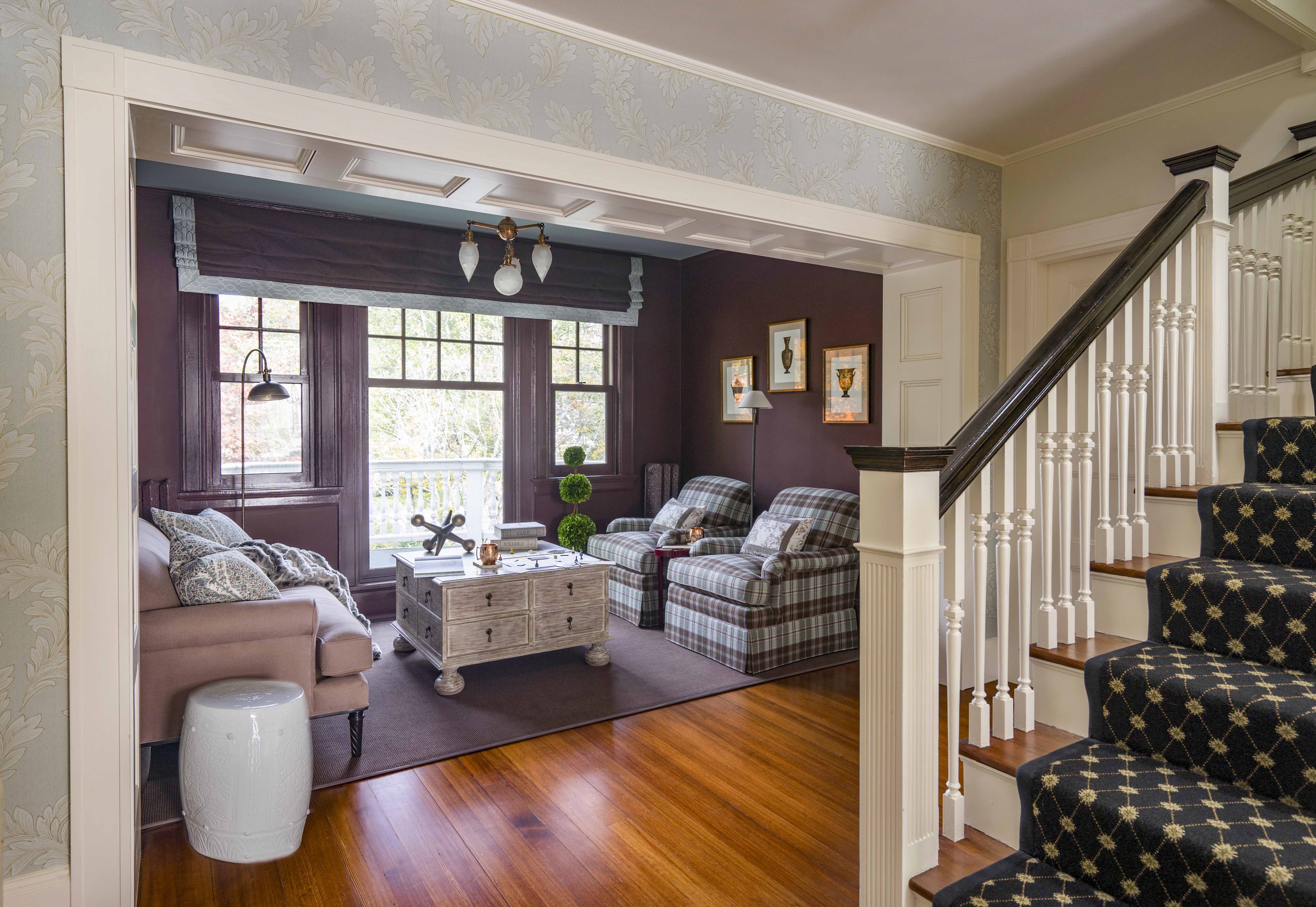
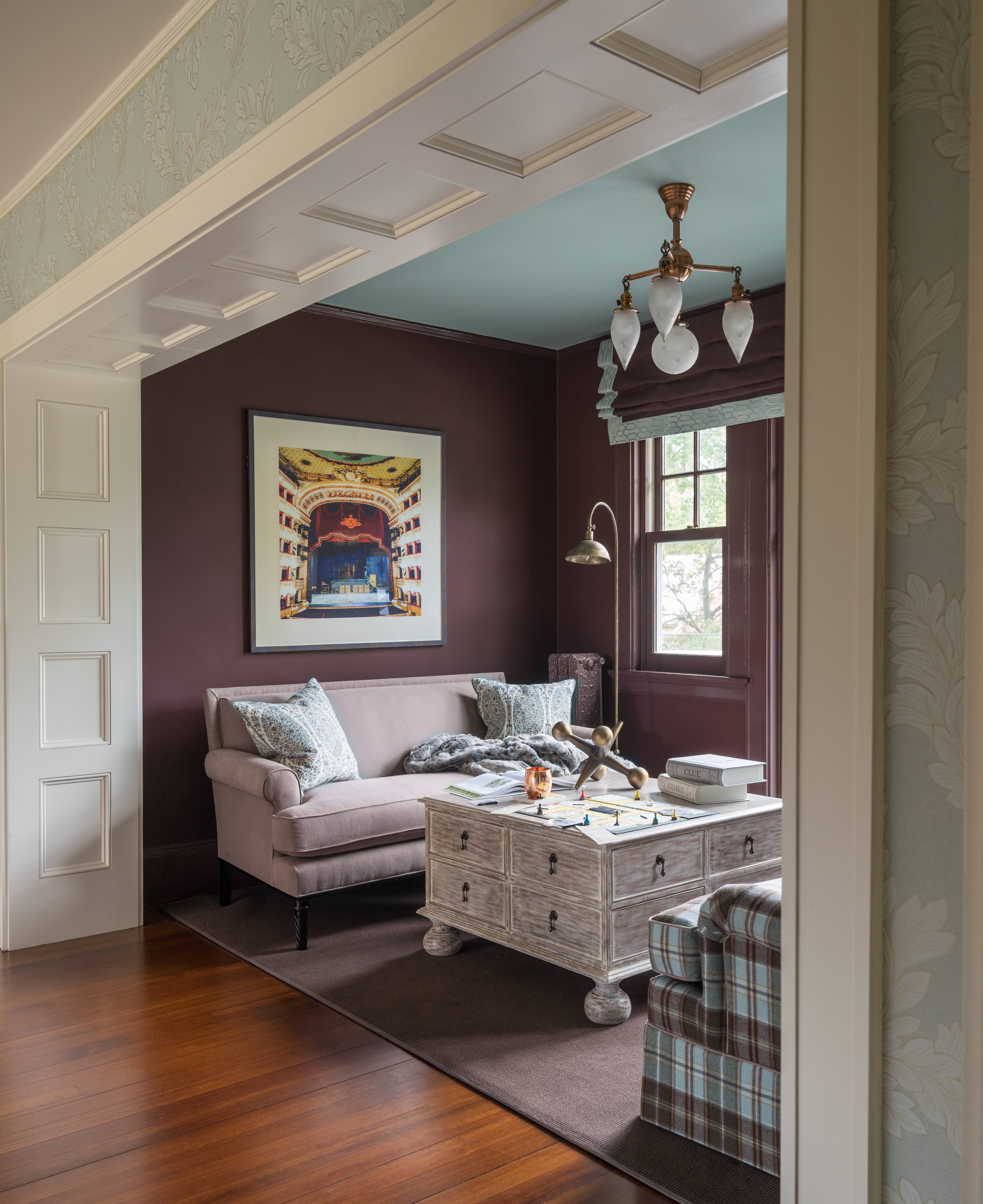
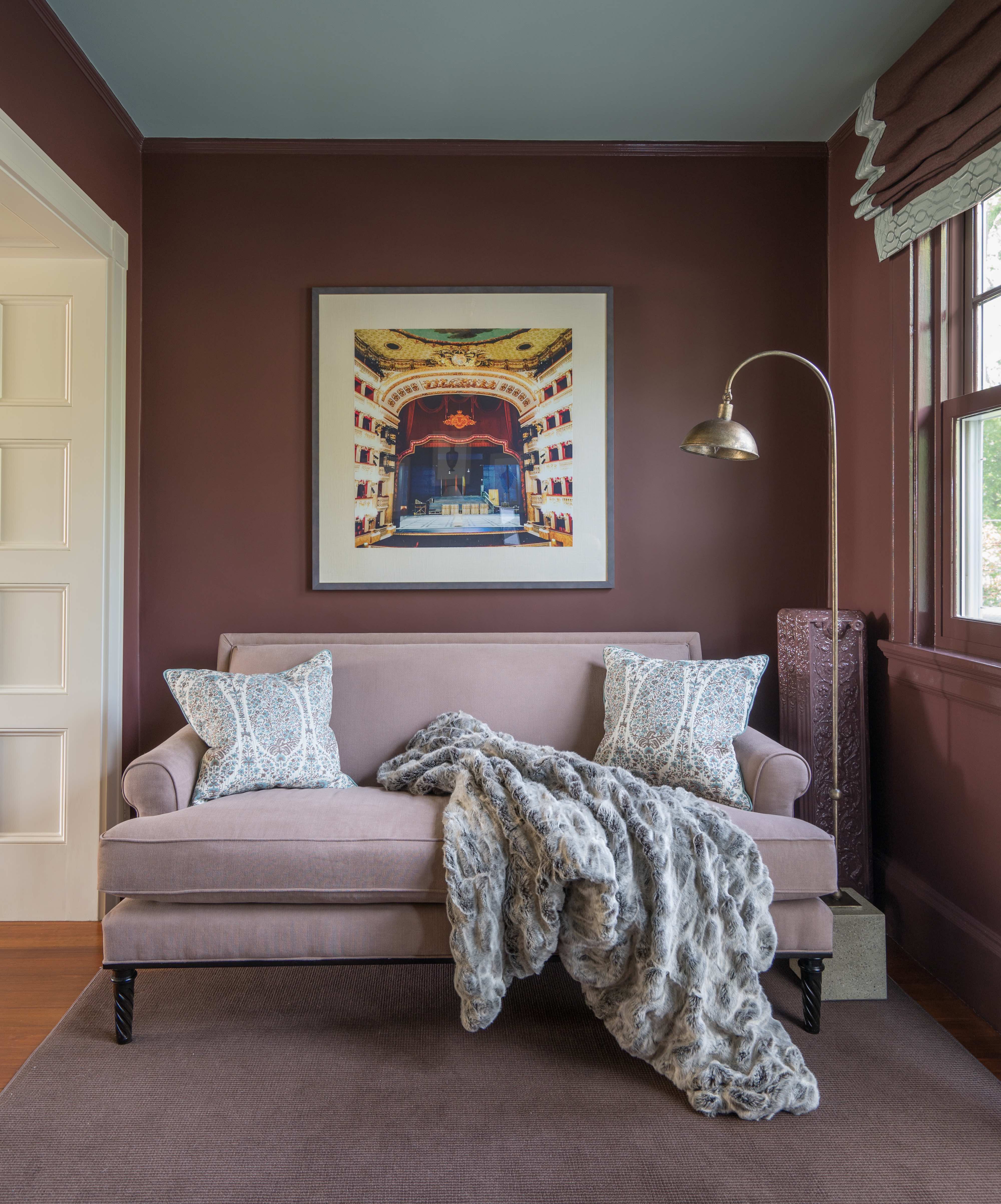
It’s not really a room, per se, but a large (~7′ x 10′) niche – clearly part of the second-floor hall, but a separate, inviting destination in itself.
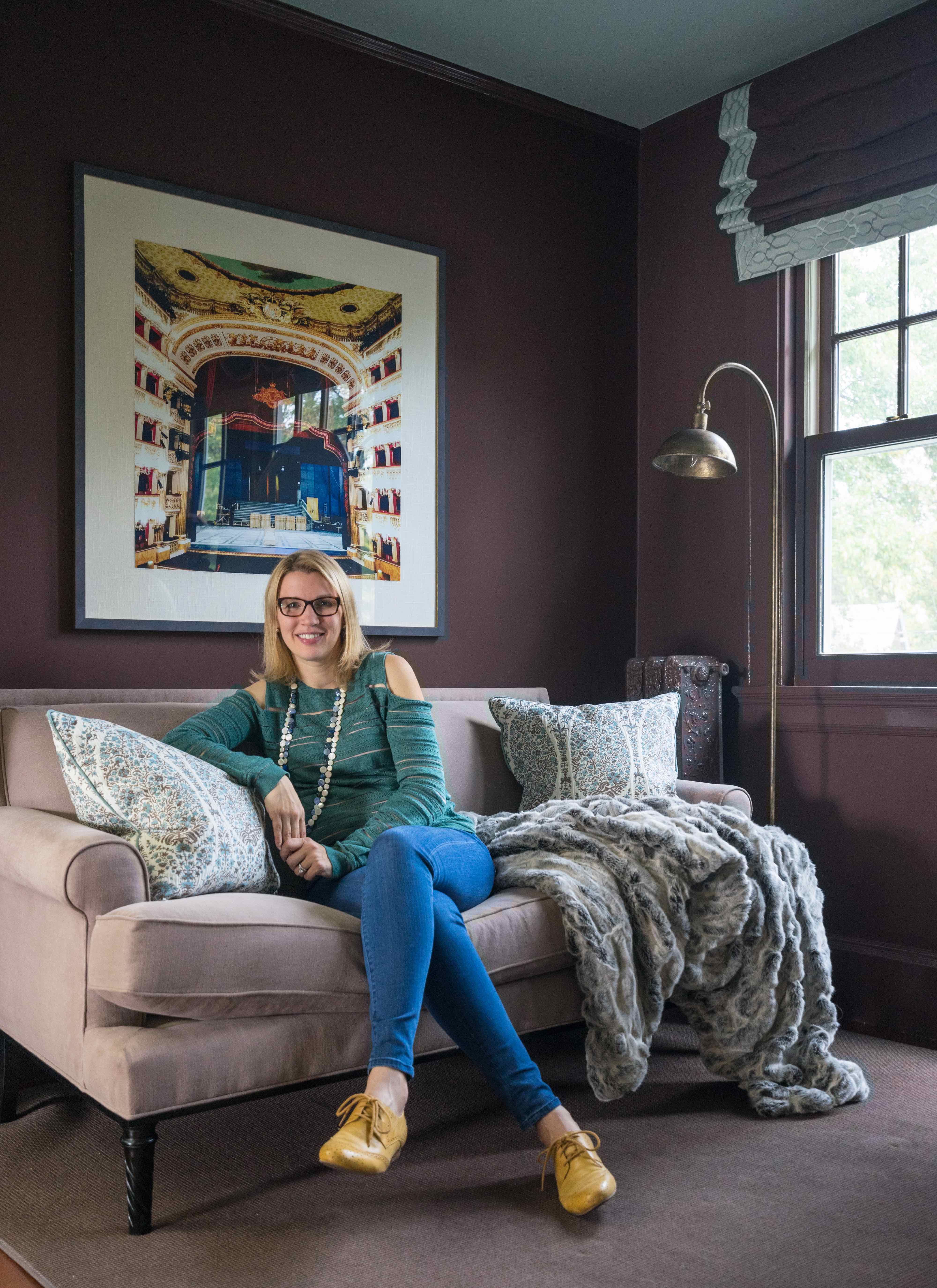
Color is the big story, and creates a cozy space that feels like a warm hug every time we’re in it. You may recall that I went in the direction of brown in part because it’s my eldest son’s favorite color, and the aqua ties it tightly to the hallway and the existing Thibaut wallpaper there. But I also love how the interior architecture comes out – the paneled opening (which absolutely needed to remain white) is so much more visible now. The rectangular shape of the recessed panels is repeated in the artwork, the chair fabric, and of course, the windows. I wish I could say I meant to do that – most of what you see was totally intentional, but that was a very happy accident!
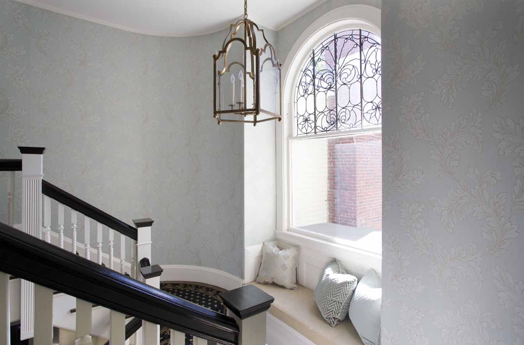
This is the staircase coming up from the first floor, in the rear of the house (while the landing is in the front). The wallpaper was necessary on these curved walls!
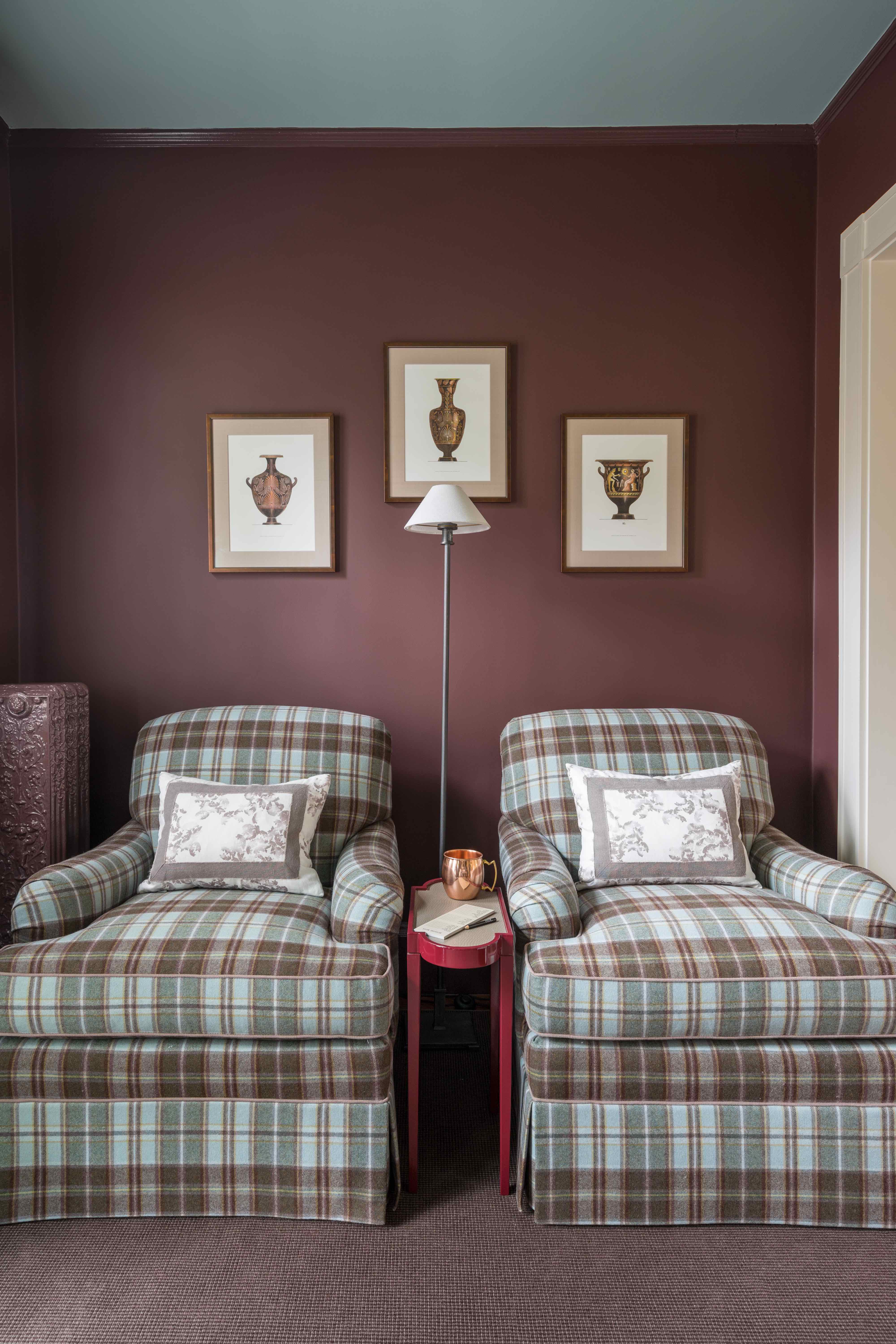
My beloved Rococo Revival radiators received a fresh coat of the trim paint, and look even more gorgeous than before (even while they prevent me from having draperies here 🙁 ).
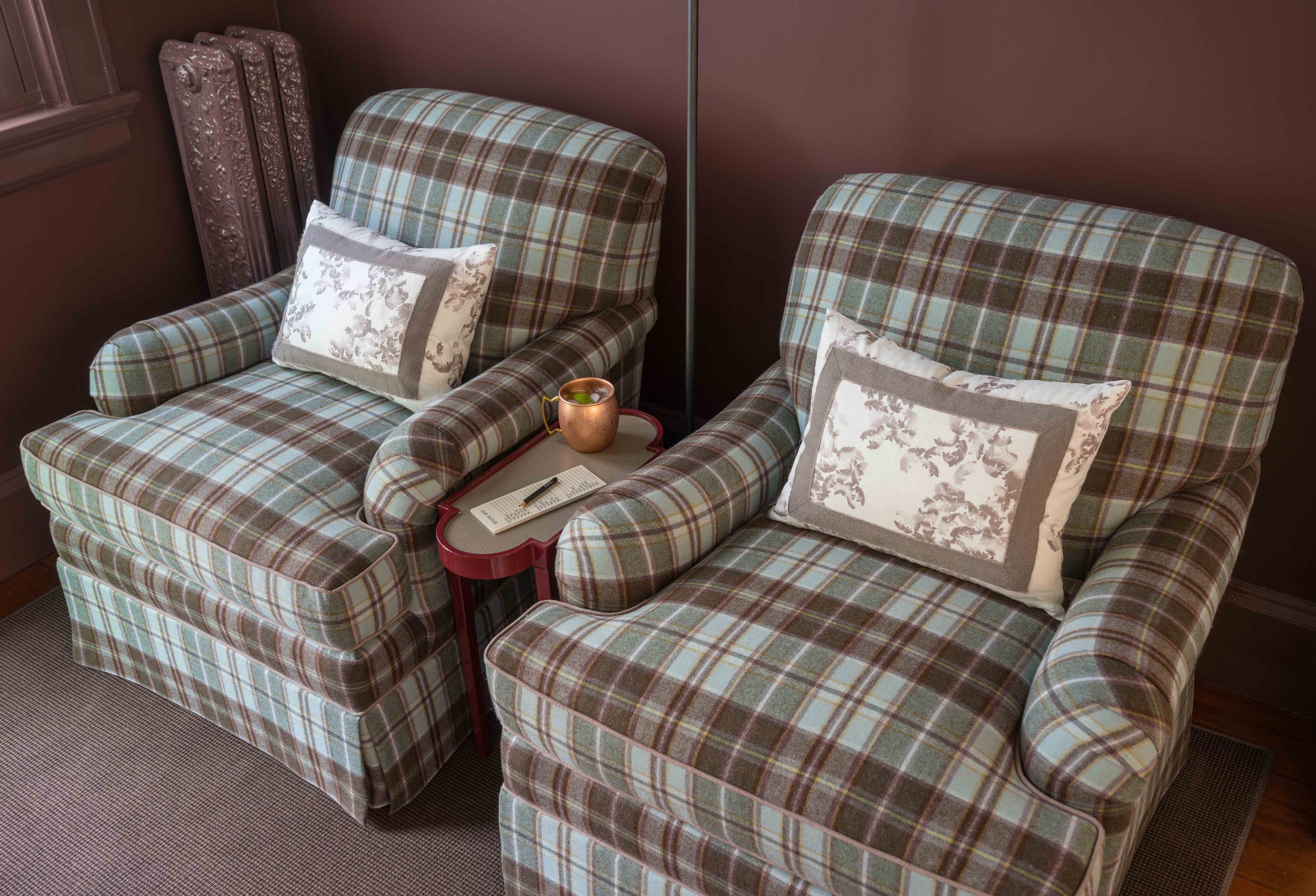
And the English arm chairs are insanely comfortable. Duralee did a phenomenal job with the upholstery and pattern matching. Tight-back seating helps keep things tidy and low-maintenance (and also shaves a little off the depth to help everything fit in this small footprint!)
The sofa is the perfect combination of a refined frame with a slightly more casual, soft (brushed) fabric – helping to strike the right balance of a quasi-formal looking public space, that is also totally livable, family-friendly, and ready to be used daily (by two energetic young boys, I might add!).
I chose the artwork to inject color and energy, but also because I loved its symbolism – an empty opera house stage waiting for its next performers. This is how I want my kids to see the world – like an empty stage, and it’s up to us to grab life by the horns and make things happen.
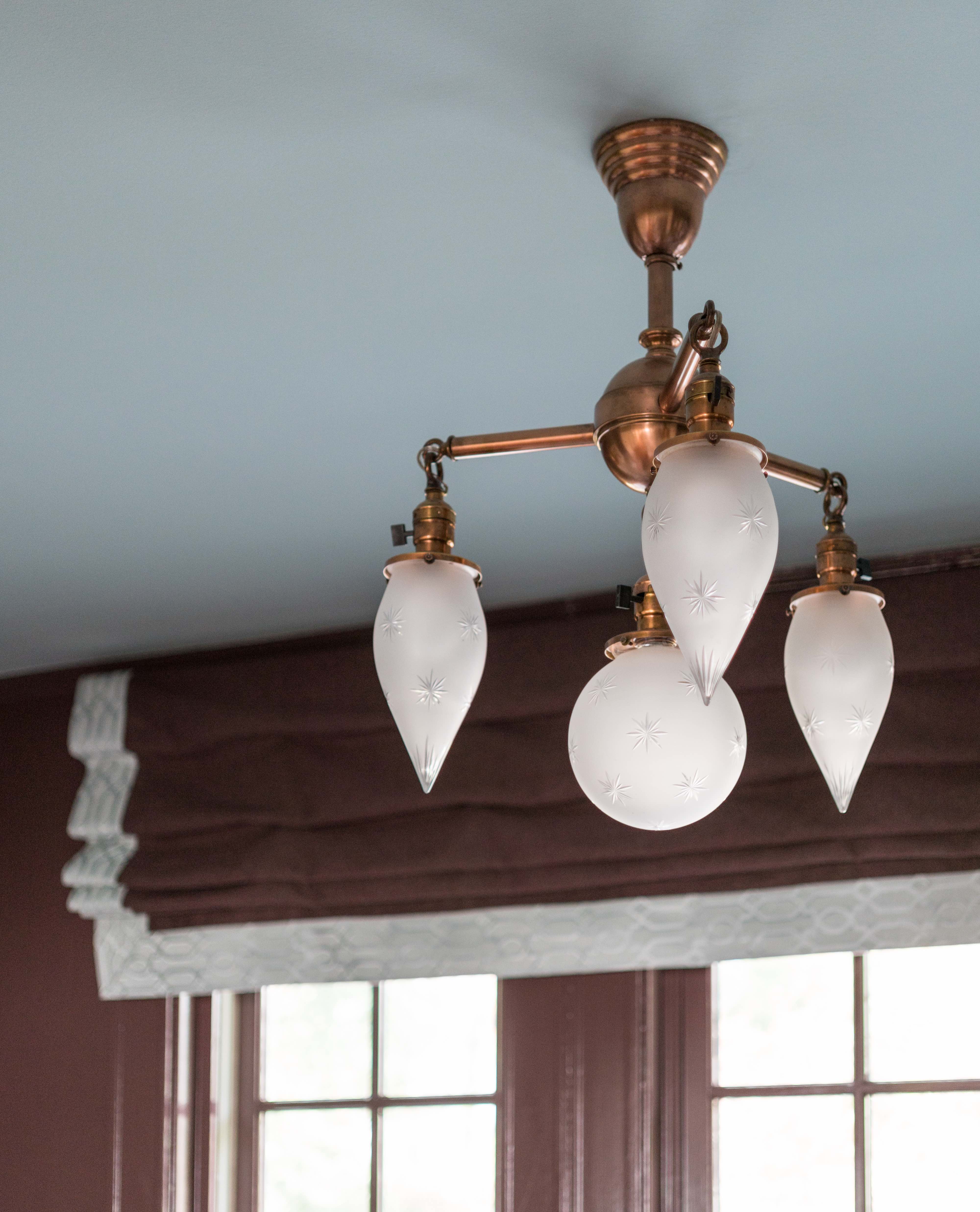
Speaking of opera houses, this fixture, which was left (after some negotiation) by the previous homeowner, once hung in a Paris opera house. In some way, it has come home. A big goal of mine was giving it the prominence and visibility it deserved – mission accomplished, I would say.
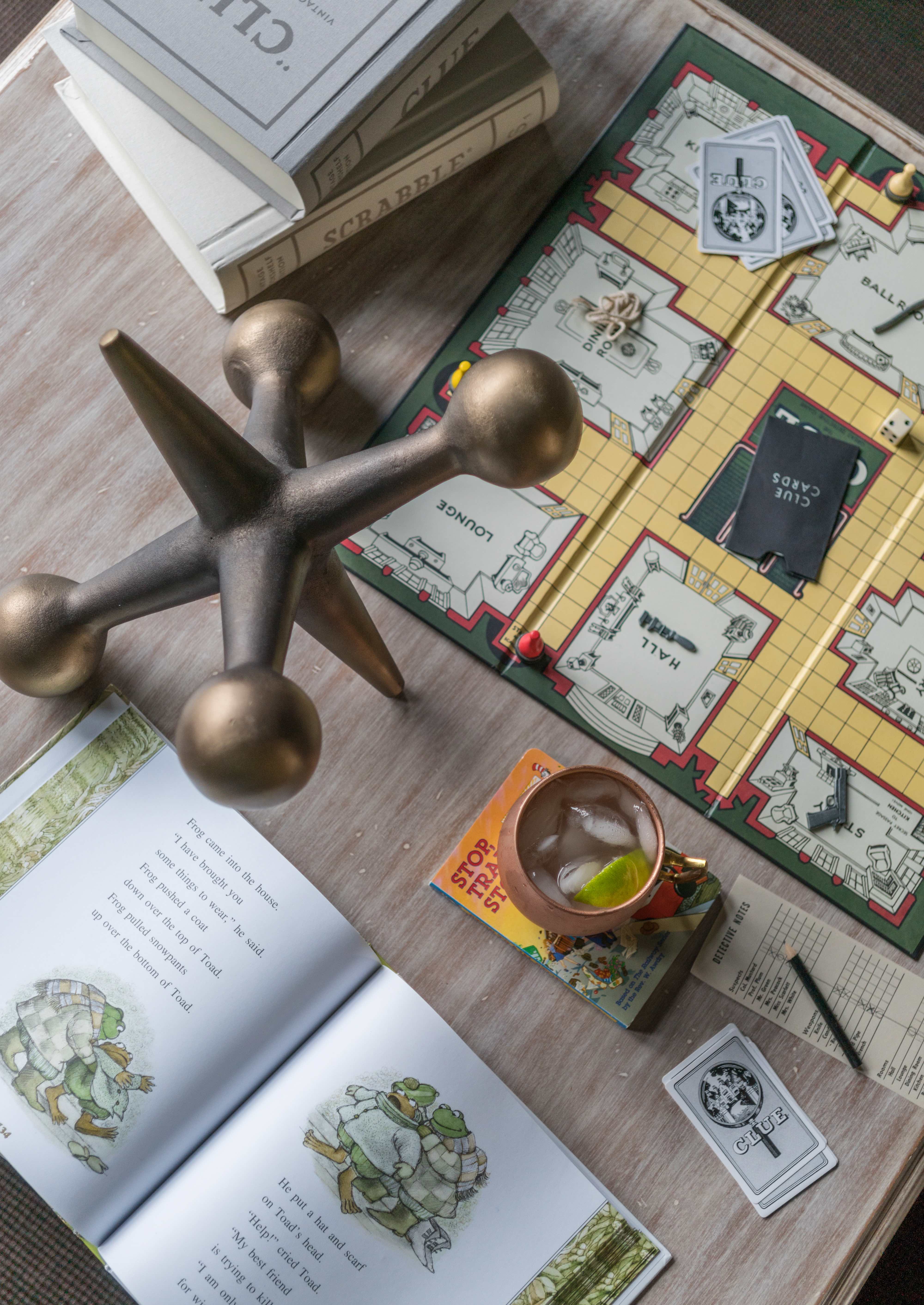
The workhorse coffee table has eight operational drawers for storing the aforementioned games, cards, and Legos, but they were too shallow for conventional game boxes. I found these fantastic vintage versions of Scrabble, Clue, and Monopoly (the latter of which is my 5-year-old’s current obsession) that come in linen-wrapped boxes that look like books. They fit perfectly in the drawers, but also would look fantastic on a bookshelf!
All ‘AFTER’ photography by Eric Roth
I would like to give a big shout-out to all of the partners and suppliers who helped make this space special!
Restoration: Belfor
General Contractor: JW Construction
Paint: Benjamin Moore (Walls/Trim: Townsend Harbor Brown. Ceiling: Wythe Blue)
Chandelier: Antique/existing
Carpet: via Williston Weaves
Sofa: Century Furniture w/ Robert Allen fabric
Lounge Chairs: Duralee Fine Furniture w/ Duralee fabric and Robert Allen welt
Cocktail/Game Table: Somerset Bay Home
Pillows: Makkas Drapery Workroom w/ Highland Court fabric (sofa), Ellisha Alexina fabric (chairs), and both with Fabricut trimmings
Faux Fur Throw: Bloomingdale’s
Floor Lamp by Sofa: Currey & Company
Floor Lamp by Chairs: Restoration Hardware
Side Table: Nina Campbell for Oomph
Window Treatment: Alan Babitts Workroom w/ Pindler fabric and Fabricut fabric border
Opera House Art: Nicole Wadlington for Zoe Bios Creative
Hand-colored Classical Urn Art: via Debbie Bowen Associates, framing by Frame-It Waban Gallery
Special thanks to Amy Mitchell of Home Glow Design for all her help, and for being a sounding board throughout the process (she happens to be participating in her first ORC, as well; give her a click to check out her Artfully Fresh Foyer). And to Linda at Calling it Home for dreaming up this whole concept and taking the One Room Challenge to a new level each fall and spring. I owe her much!
To see lots of other inspirational room transformations, you’ll definitely want to set aside some time with a good cup of coffee (or a stiff drink, depending on how your week has gone so far…) and check out the 200 or so guest participants, as well as the 20 featured bloggers who debuted their spaces yesterday.
And if you would like, you can subscribe to my blog in the right sidebar, or find me elsewhere in the social media world:
- Instagram – @kellymrogers
- Facebook – /InteriorsForFamilies
- Houzz – Kelly Rogers Interiors
I also have a separate business website with information about my services, as well as my full portfolio.
Thank you again for stopping by!

This is so warm and chocolatey smooth and delicious. I love the wools and faux furs — just makes me want to cuddle down with my kids for a Saturday family night. And did you intend to coordinate your outfit with the opera house print? 😉
Thank you for all your expertise and support as well! You are SUCH a talent, and a such a giving mentor.
Thanks so much Amy! Well, regarding the outfit – I guess that makes two things that worked well but were ‘happy accidents.’ As a fashion-challenged decorator, I was just trying to look as cool as possible for this picture – lol! We took some pics without the glasses, but they looked cooler so we kept them ;).
It’s an awesome use of the space! I love your colors and accessories, so different from the norm and quite gorgeous. Well done!
Thank you, Traci! I realize I march to the beat of a different decorating drummer, somewhat, but I’m thrilled what I like and have created resonates with you. Thanks again!
I love this! I’m totally having a frosted plum/blush/taupe moment and this satisfies so many aspects! The art is flawless, the styling is on point.
I’ll be adding this to my ORC favs round-up tomorrow.
Oooh, frosted plum – sounds like a yummy accompaniment to my Moscow Mules. Lol! So interesting, I never thought of this space as having blush elements, but I think you’re right, it kind of does. I was really going for a tonal look to enhance the coziness and intimacy of the space. Thank you for your kind compliments, and I’ll look forward to your round-up!
This is just beautiful! That settee has me swooning! What a gorgeous home you have – congrats on an amazing reveal!
Thank you, Jen, very much!
Gorgeous work Kelly! I love that you let all the architectural features shine here. It’s the perfect cozy nook for many family game nights to come. Congrats!
Thank you, Jana! I just realized that my comment on your room did not go through – perhaps I got distracted before submitting it (would not surprise me in the least). I’ll get back to it, but I loved it!
Your home is beautiful, and your space is incredible! What a wonderful space for your family. Great job!
Thanks so much, Holly! We do love it!
Finally getting around to reading your post and wow. The color scheme, the textures…it’s all beautiful. I LOVE the plaid chairs so much and just want to cozy up on one with a good book. You are incredibly talented my friend!
Aww shucks, thanks, Rachel! The chairs are very cozy, I cannot lie. Thank goodness for the ORC, otherwise nothing in my house would be finished!
It’s so pretty! I love how cozy it looks! The dark walls are amazing!
Thanks a lot, Emy, for your kind words!