I’m so pleased and proud to announce that the Manbrary is now officially open for business. It was a close one, but thanks to more than a few exceptional vendors and partners, I finished on time to reveal it to you today! We made a HUGE leap forward from last week. My husband and I have been enjoying the room since Tuesday (when I revealed it to him!) – that is when he “invites” me to join him for a fireside chat – ha ha :).
If you’re a new visitor, thank you so much for stopping by to check out my ORC reveal! I am a decorator based in Newton, MA, and my specialty and passion is family-centered design. This round, I tackled the library of our 1896 Victorian, which is the first room you see when you open the door into the foyer (after the vestibule, which was my project in the spring!). It was somewhat of an eye sore, and in need of a full revamp (befores here) . The room boasted yellow-toned gum wood trim that matched nothing else in the house, deteriorating ornamental plaster, cracks in the ceiling, under scaled lighting, and a too-busy rug that wasn’t doing any favors for the distinctive antique Empire partners desk, which my husband actually sourced himself a couple of years ago. I wanted to make this a room fitting of our home’s style and scale, while also carving out a space in our house specifically designed for my most favorite client – my husband.
My inspiration statement for the Manbrary (and explanation, for the uninitiated – aka EVERYONE) was as follows…
Move over, man caves, we have evolved. Neanderthals need not apply – the sophisticated, modern man will spend both work and leisure time in his cozy cocoon of wood, leather, brass, wool, books, and sheer masculinity. He can be found in his natural habitat, tapping away at his laptop (hunting and pecking, probably…), dialed into an after-hours conference call, or leafing through the latest non-fiction best seller, fireside, whilst sipping Maker’s Mark. If people still smoked cigars in their homes, that would be happening here, too (but NO). Perhaps a semi-serious board or card game now and then, and lots of football talk when others are present. Women and children are always welcome, of course, but we try to give him his moment of manly zen whenever possible.
It’s an office. It’s a library. It’s a retreat. For a man.
It’s a Manbrary.
[If you would like to get fully up to speed on the Fall 2015 One Room Challenge before proceeding, visit Calling it Home, and/or my Week 1, Week 2, Week 3, Week 4, and Week 5 posts].
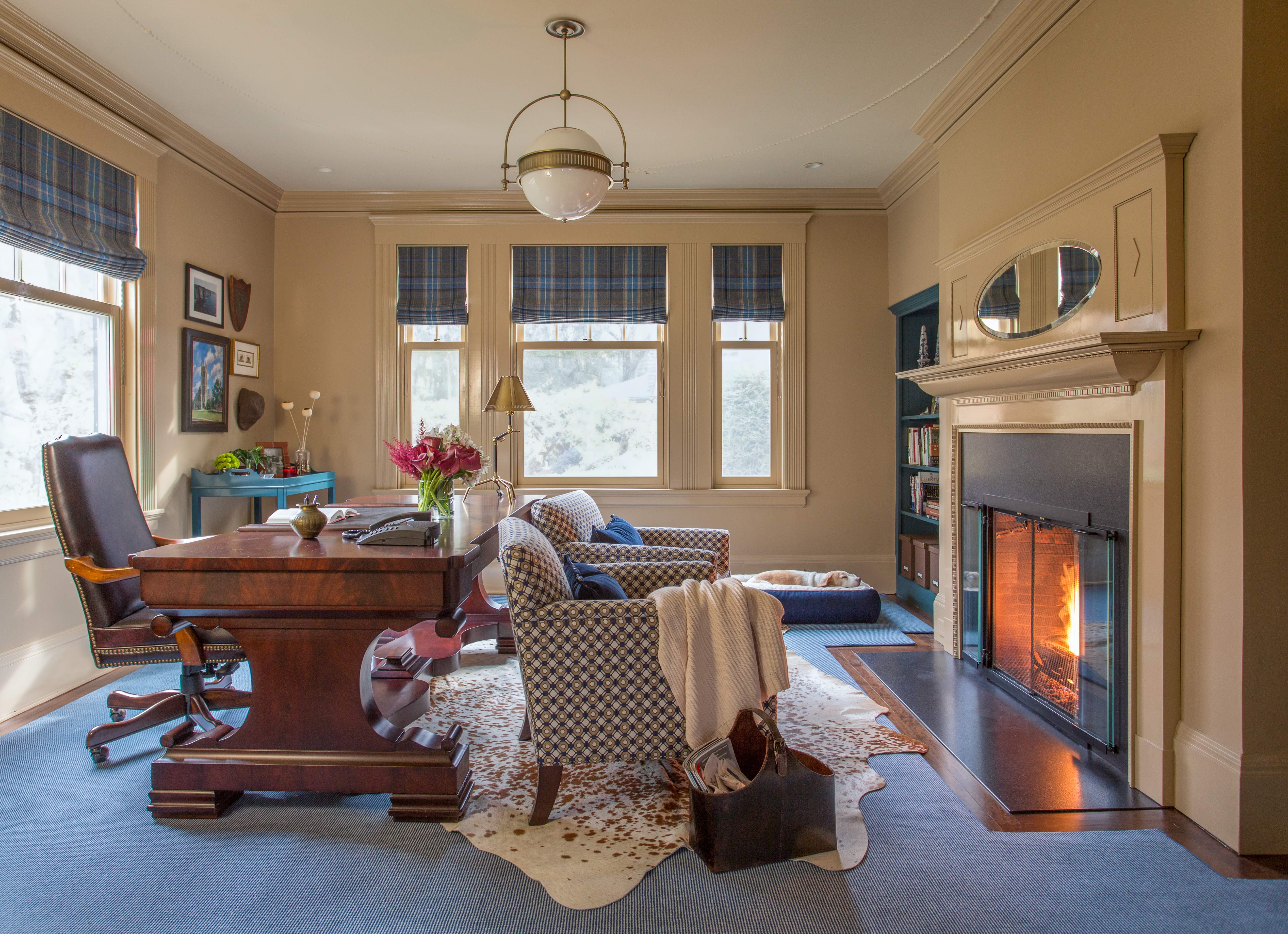
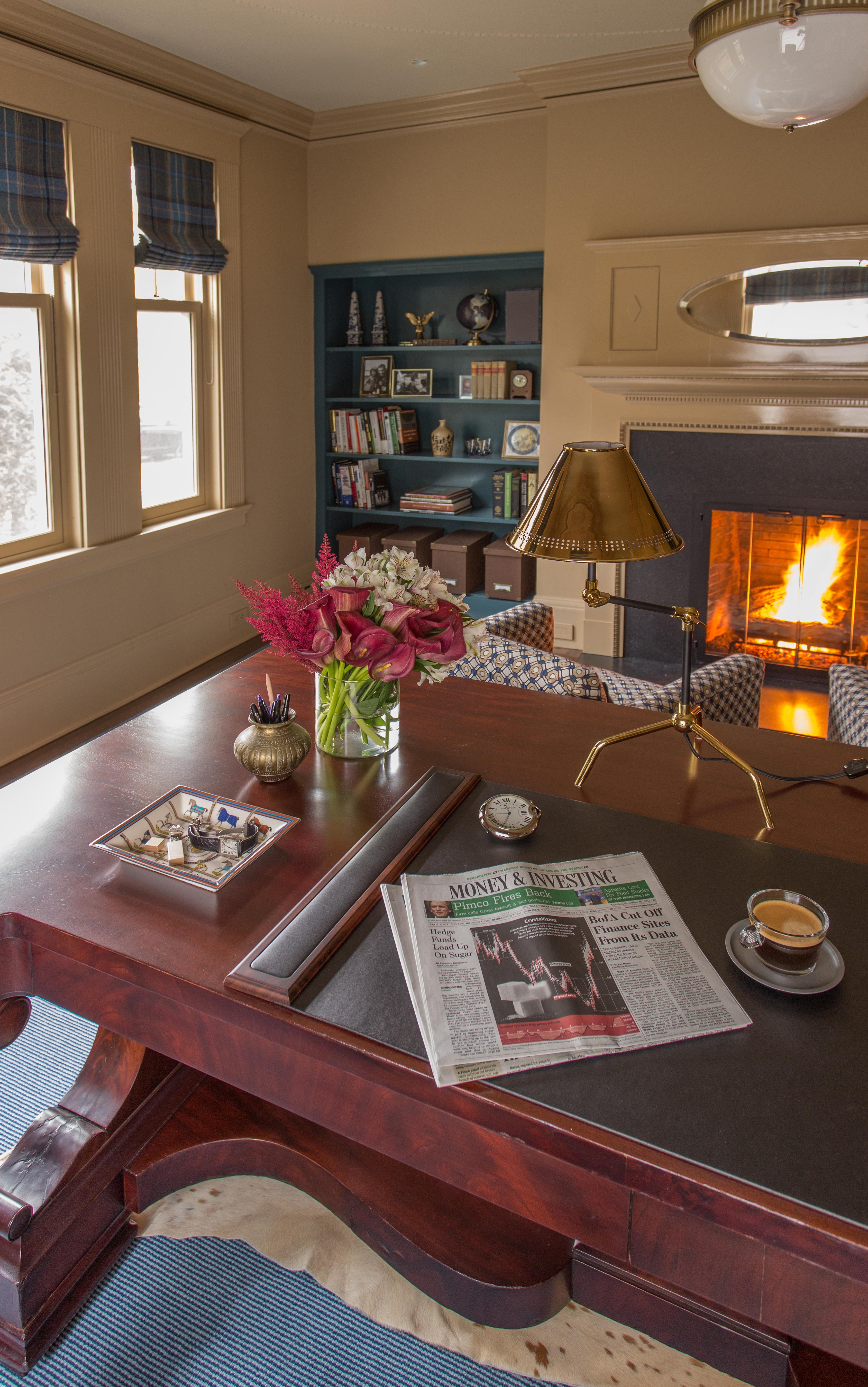
Without further ado, I present to you the original Manbrary. I’m going to let the pictures do most of the talking, for the most part. I’m happy to share sources, which are at the bottom of the post, along with very important credits and acknowledgments.
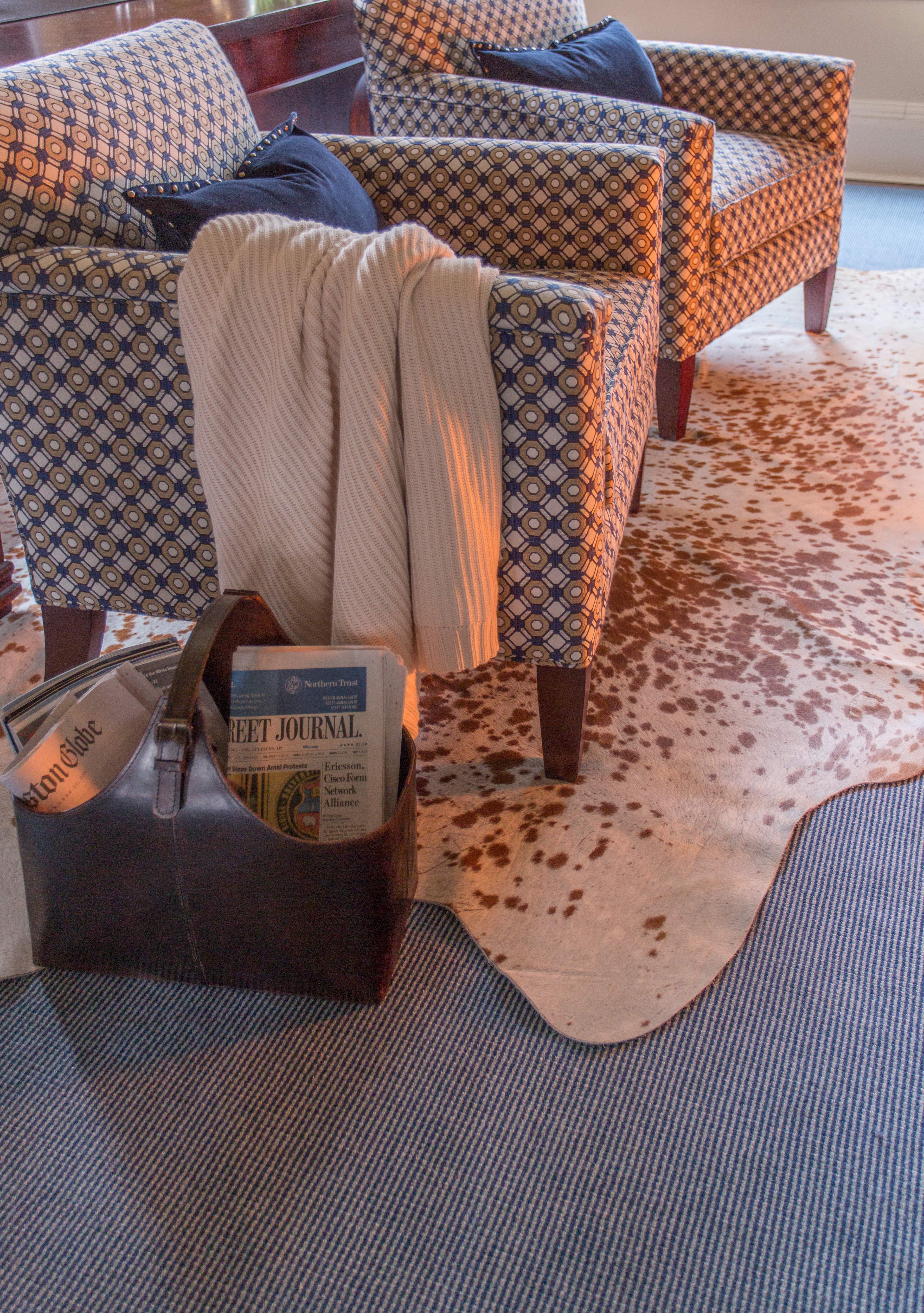
The cut and bound rug following the outline of the room is such a classic, traditional library look, but the cowhide rug gives it personality, warmth, and even a little edge.
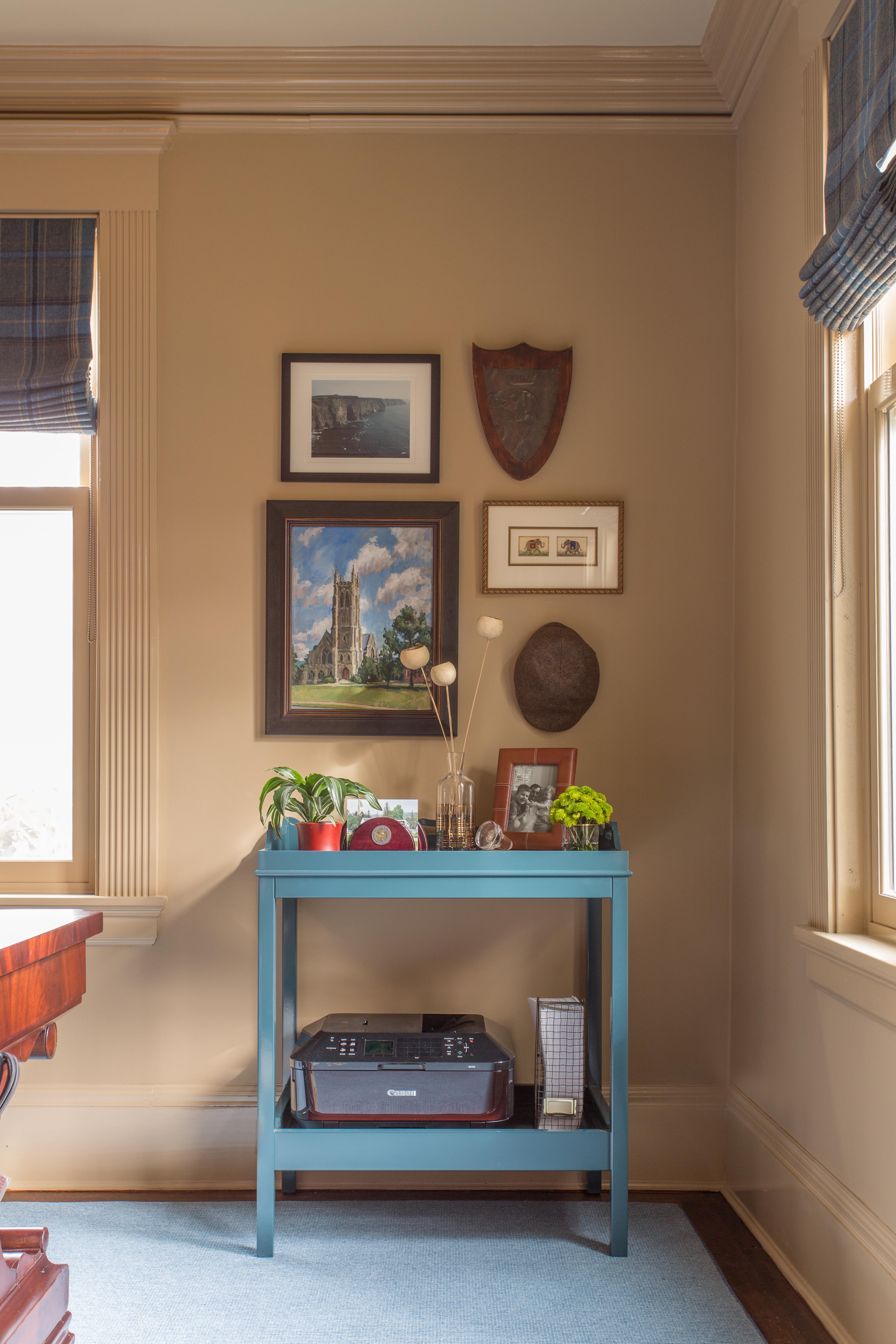
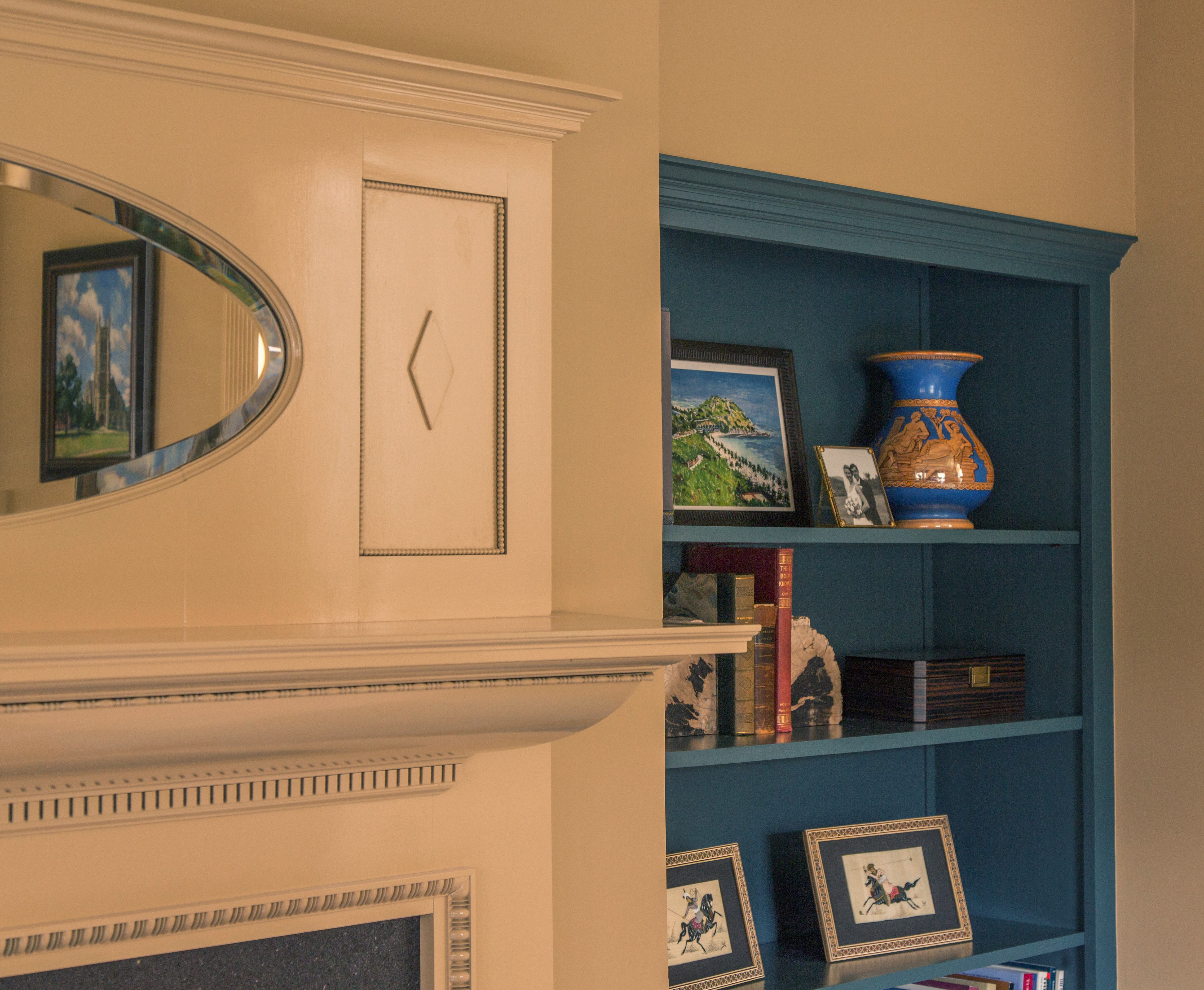
Oomph’s Billy Bar (from the divine Nina Campbell collection) proved to be the perfect “side piece” to accompany the floating desk. It’s a little deeper than a bookcase – better to house a printer – and a little higher to not look like an afterthought shoved into the corner. Not to mention it came in Everard Blue lacquer, like the built-ins (it was meant to be!). Plus, he can tuck away the desk lamp and phone here when not in use, to avoid a tripping hazard. All of the artwork here and throughout the room has a special meaning and significance.
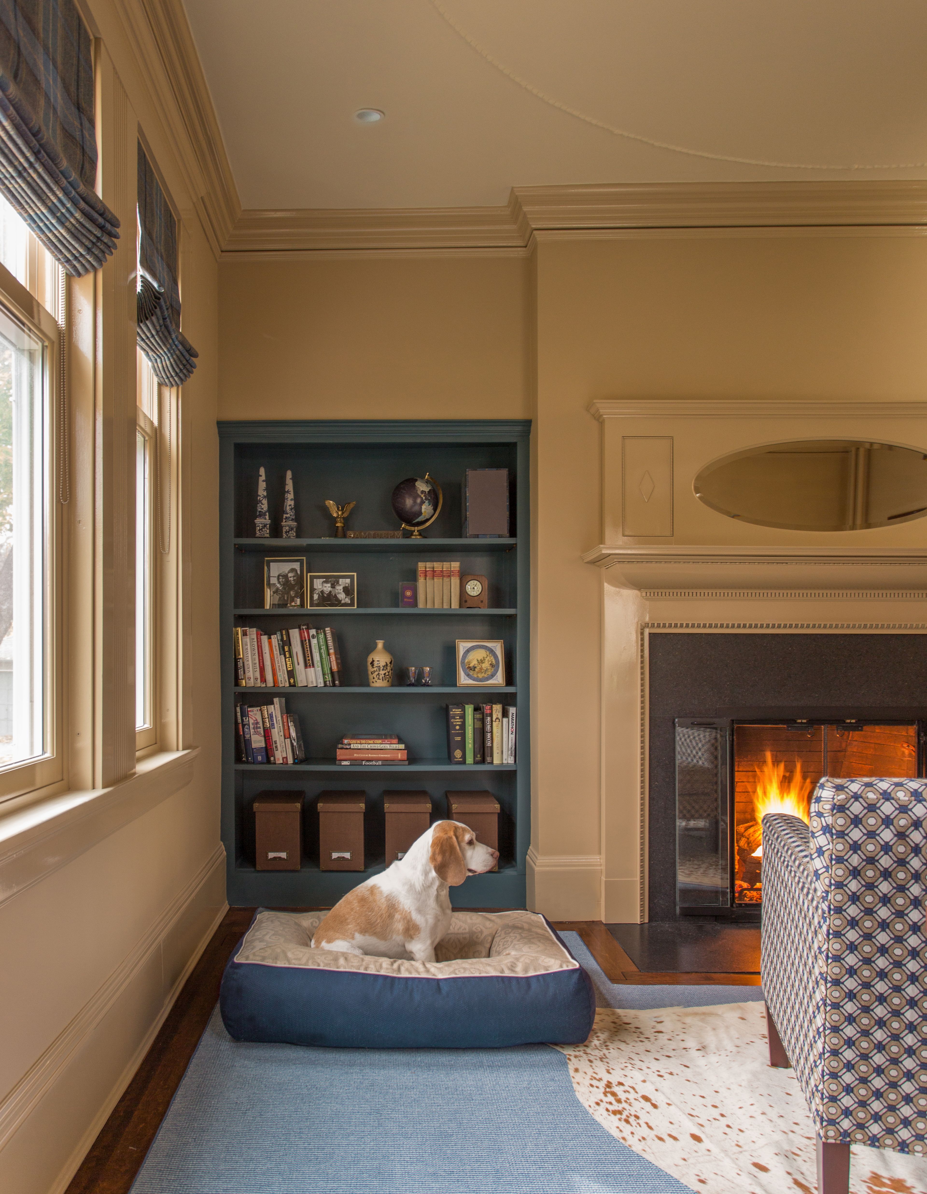
Harrison is really enjoying his new dog bed (and posed quite well for us – bonus!). You know how they say dogs and their owners start to look like each other? I think the same might also be true about their houses…
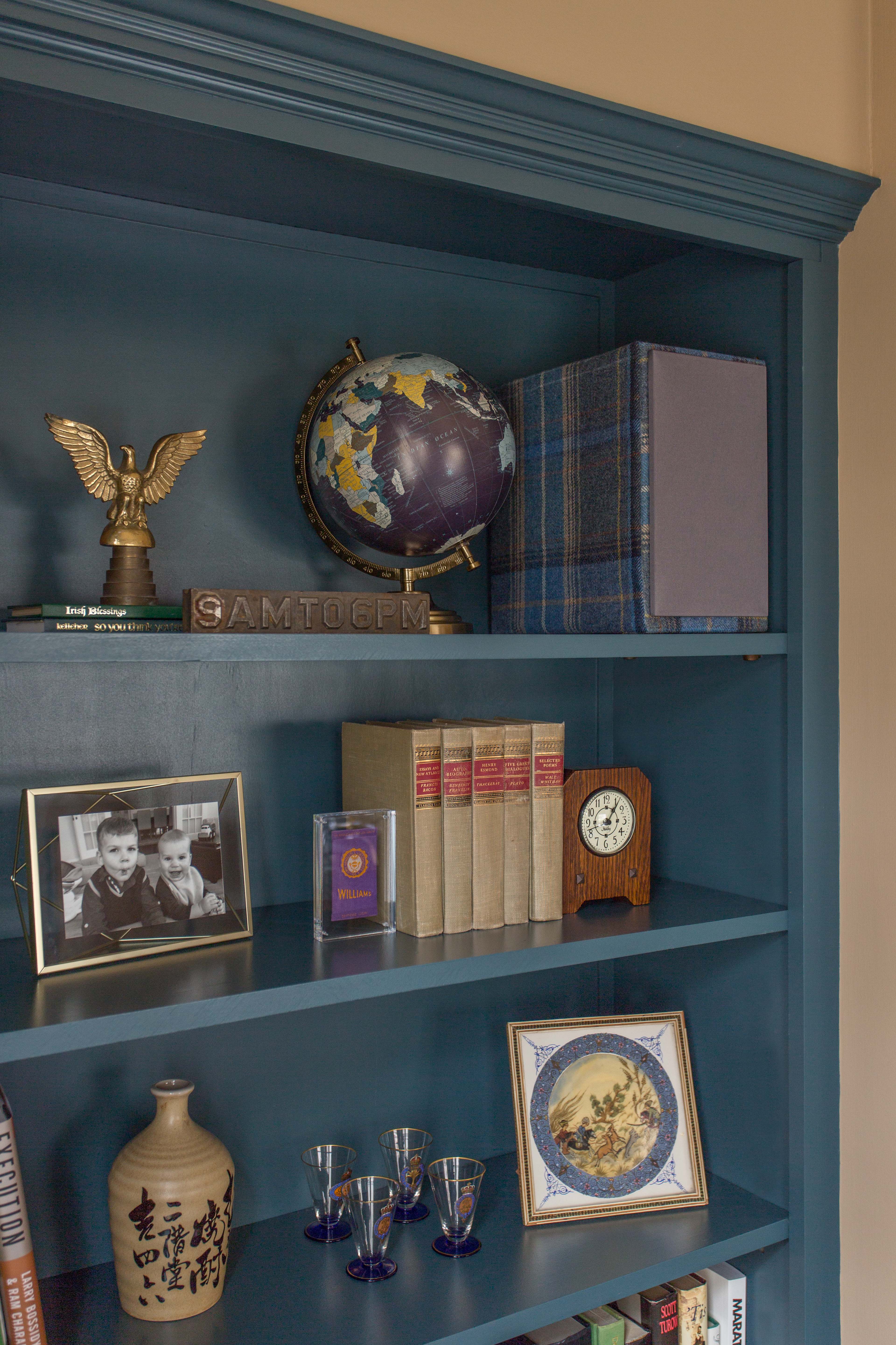
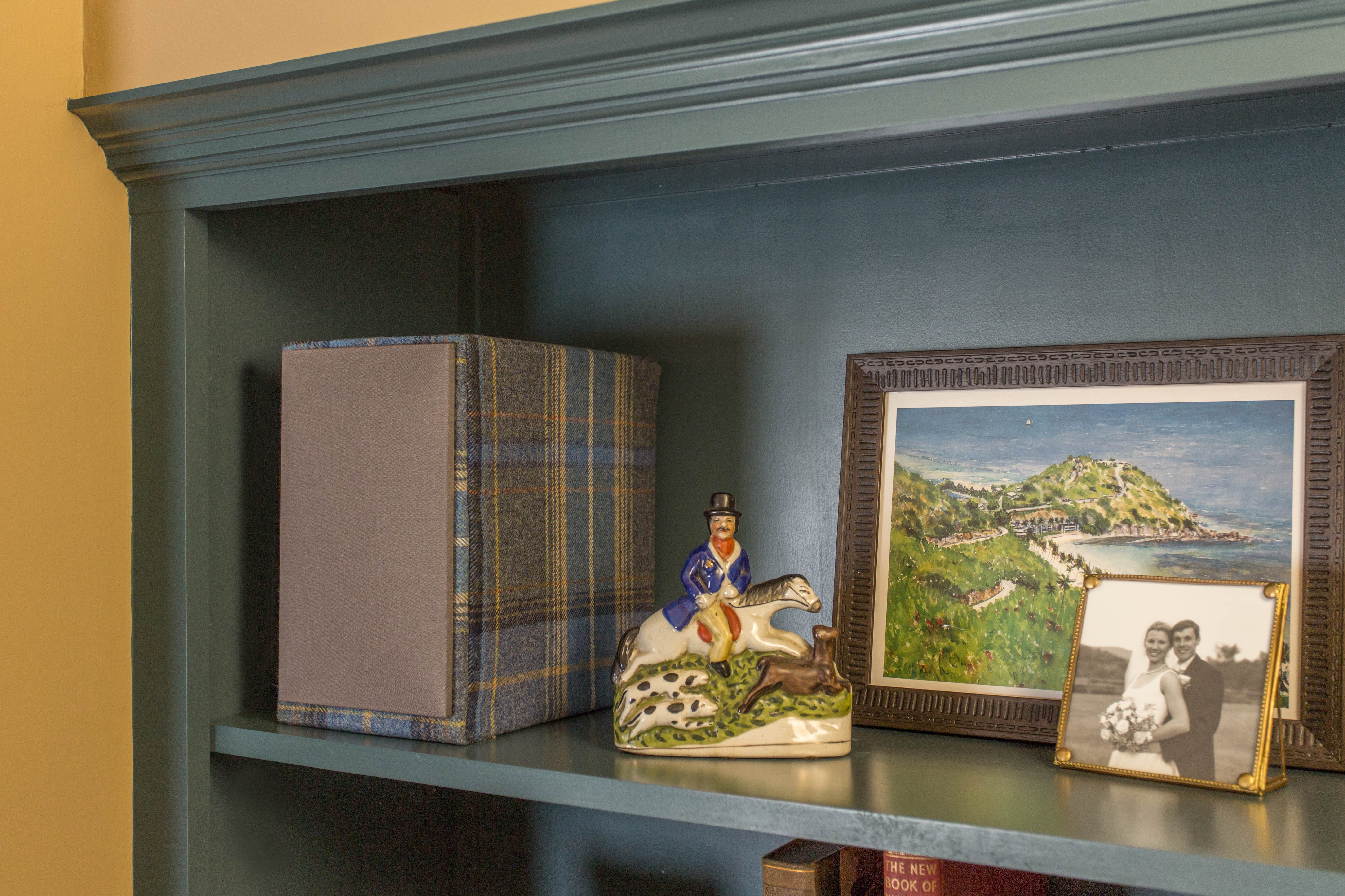
After deciding to paint the built-ins this moody blue, I really did not want to stick our big stark white speakers back on the shelf and kill the vibe I was trying to create. Remembering that I had extra fabric from the window treatments, I came up with the crazy idea to somehow cover and camouflage the speakers with the plaid wool. My workroom helped me figured out the best way to do it, and executed them to perfection. It seems funny to say it, but I think it might be my favorite thing in the whole room!
The other speaker plays nicely with this stately gentleman on horseback, who I thought was just perfect for the Manbrary!
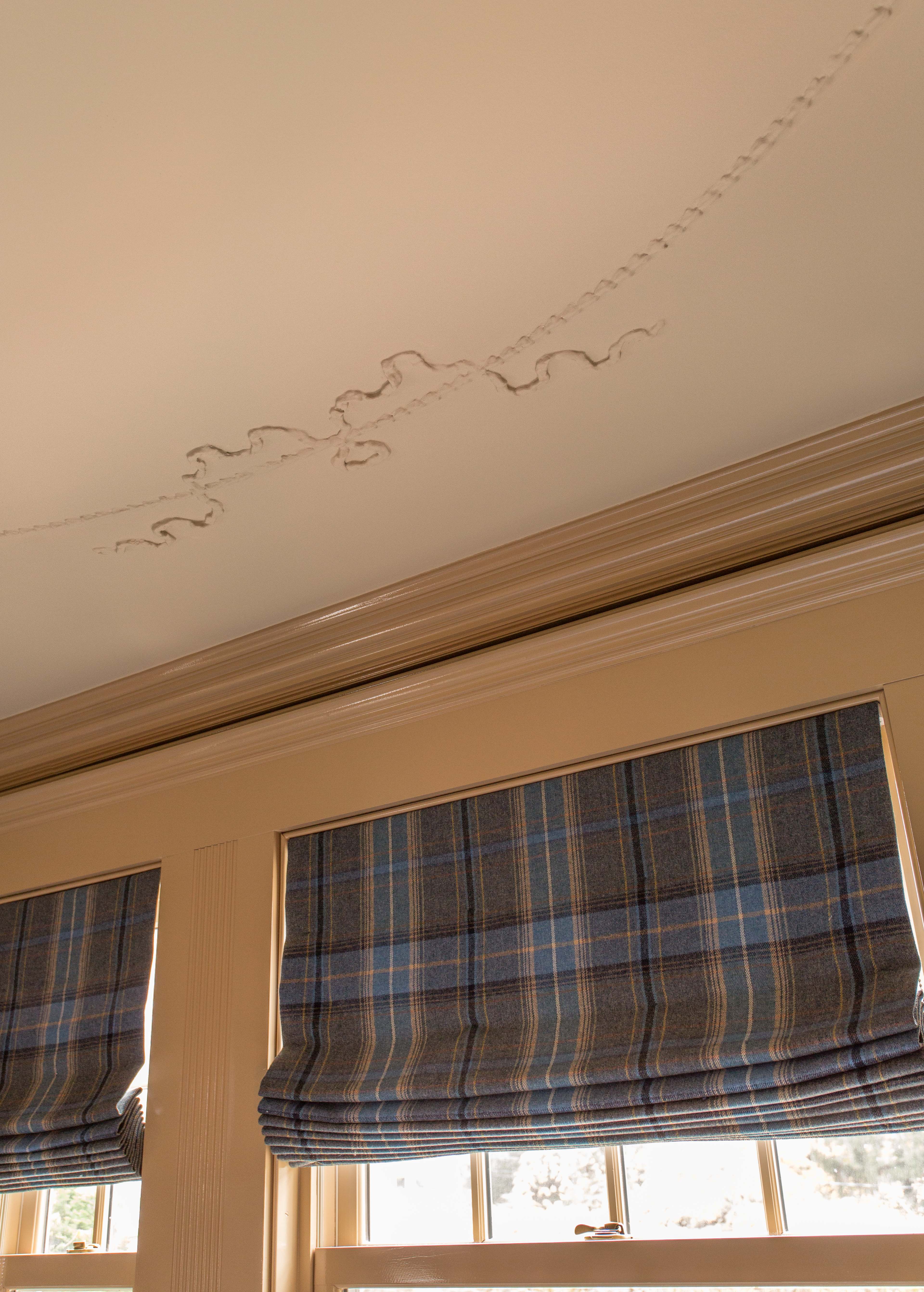
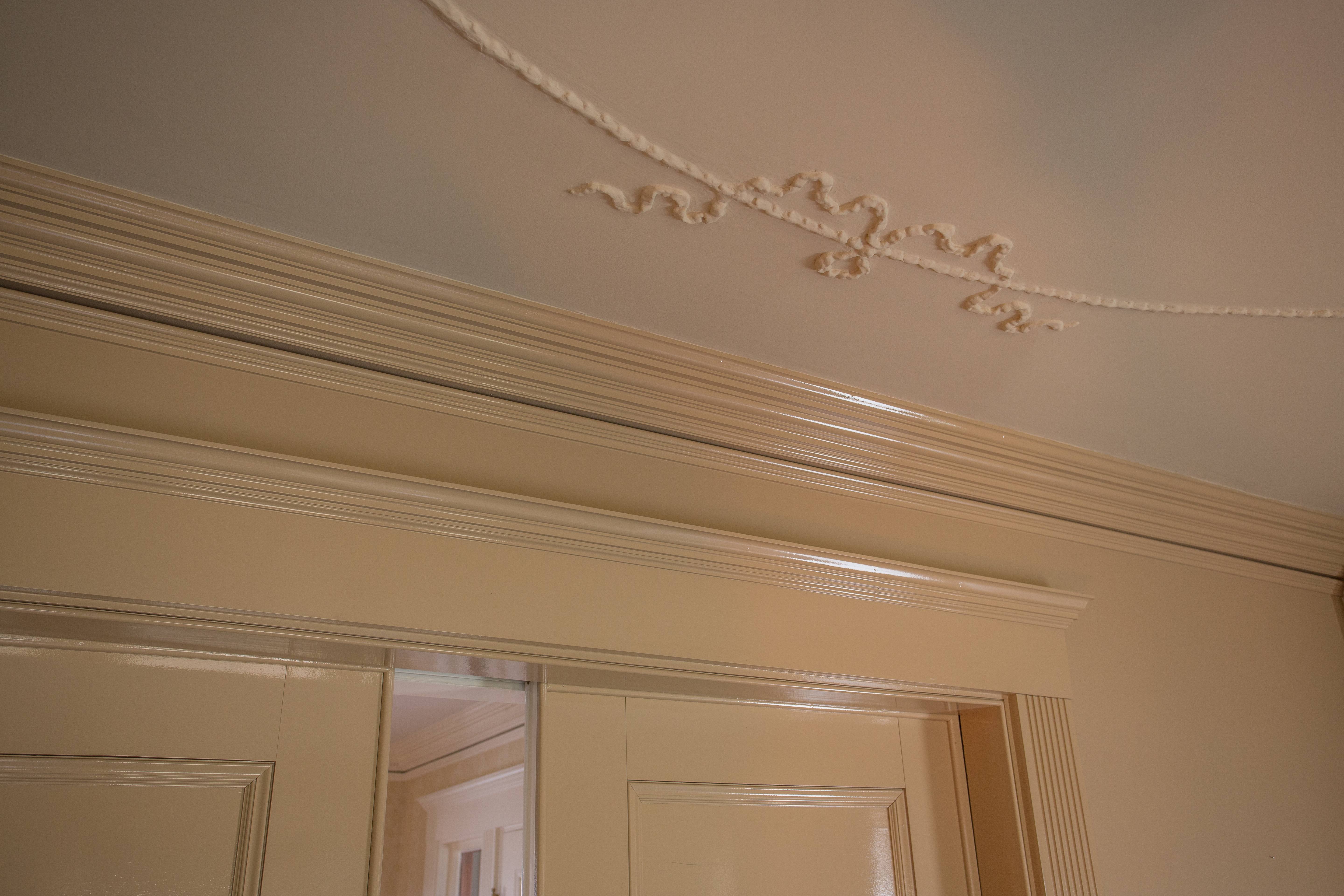
Love the juxtaposition of the chalky ceiling and ornamental plaster with the mega-gloss trim in this shot. That’s my bold beige :).
A pair of extra cozy, yet compact and low-profile seats by the fire easily double as guest chairs for meetings and such.
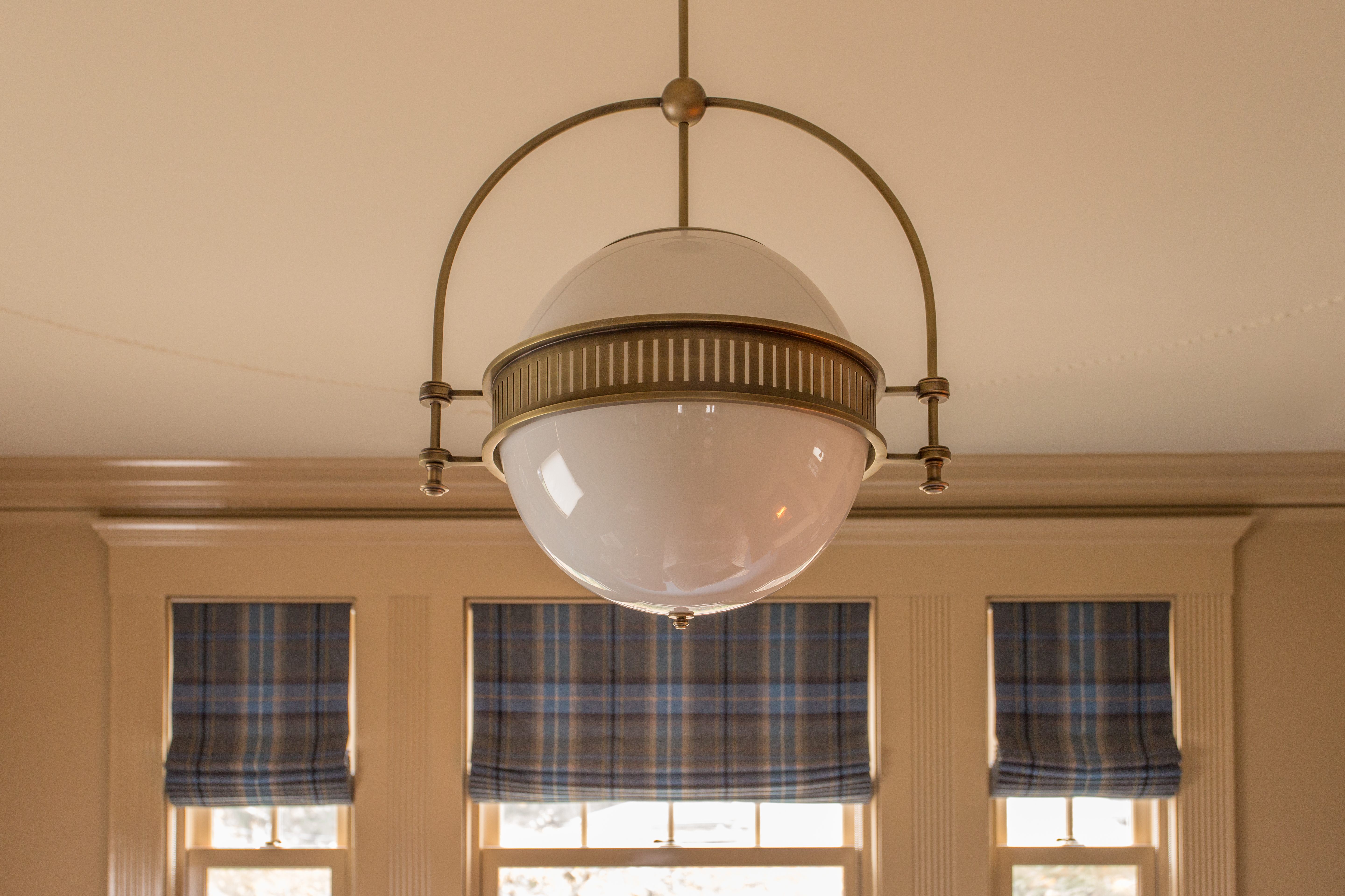
If lighting is the jewelry of a room, then this one, from Urban Electric Co., is the Hope Diamond of light fixtures. I can’t say enough about the craftsmanship, especially the quality of the antique brass finish, and the way it softly illuminates the ceiling detail without any distracting shadows (which is why I went with the opal glass).
Sources
- Desk: Antique, owner’s collection
- Desk chair: Owner’s collection
- Area rug: via Williston Weaves
- Cowhide rug: Saddleman’s via Wayfair
- Club chair fabric: Duralee
- Roman shade fabric: Mulberry Home
- Paint
- Walls: Benjamin Moore Trench Coat (Aura Interior Paint)
- Trim and mantel: Fine Paints of Europe Hollandlac Brilliant, color matched to Benjamin Moore Trench Coat
- Built-ins: Benjamin Moore Everard Blue (Advance Waterborne Alkyd)
- Ceiling: Benjamin Moore Williamsburg Stone (Waterborne Ceiling Paint)
- Office “bar”: Oomph
- Ceiling light fixture: Urban Electric Co.
- Desk lamp: Jonathan Adler
- Dog bed: Joe Ruggiero Collection for The MT Company, customized with fabrics from Joe’s collection for Sunbrella
Key Partners
- Painting: Catchlight Painting (special shout-out to these guys, who are total pros and were extremely flexible and worked hard until the job was completed perfectly – can’t say enough about their skill and precision with a fussy product, and willingness to go above and beyond, including helping me move the ridiculously heavy and awkward desk back into the room)
- Plaster repair and restoration: Austin Ornamental
- Electrical: Bob McNeill
- Shade fabrication/installation: Alan Babitts Workroom
- Audio speaker slipcovers: Partners in Design
Massive thanks to our One Room Challenge originator and hostess extraordinaire, Linda at Calling it Home, without whom, I can confidently say, none of this would exist.
And last, but most certainly not least – thank you to Eric Roth for the beautiful images (as always), which I’m thrilled to add to my portfolio of work.
I’ve been so blessed to share in the ups and downs of this experience with a few local (Boston area) friends, whose ORC transformations you should go check out right now!
I owe Linda an extra special thank you for tolerating my daily flood of panicked texts and progress photos (or lack thereof!). I may, in fact, also owe her an apology for convincing her to throw her hat into the ring in the first place – this is a stressful process, and it made all of the difference to me to be able to go through it with her. Linda, if you’ve made it this far in the post, I can’t wait to see that fabulous family room of yours and raise a glass to your success!

I’ve been so excited to see your room, and it does not disappoint!! The Hollandlac is gorgeous!! What a cool and cozy and totally masculine room. You nailed it!
Thank you so much, Laura! Your new doors look amazing – so glad you were able to find a way to execute your curb appeal vision (with such great results)!
Seeing all the bits and pieces doesn’t begin to show how great it all looks together! Especially put there by your great eye- it all looks stellar! Your husband must be so thrilled to have a space like this- don’t good surroundings elevate everything? Thanks for cheering me along on the process, it made it a lot more fun to share the journey…..now, for that glass of champagne!?!?!!
Cheers!
Can’t believe I’m just now replying to your comment (and all of the others!). Thanks so much for your kind words – we are truly enjoying the library, and it almost feels as though our house is larger now, since we are using and enjoying more of it. So much better than an “office” only used for work! I’ll look forward to our ORC tour – maybe a good excuse for a holiday get-together (as if we should need one??). 🙂
Nice. I really dig the ceiling light and the plaid Roman shades.
Does your husband love it?
Thank you, Zoe! Yes, he loves it – really takes the sting out of having to work during off hours, and thankfully we’re all able to enjoy it as a cozy place to sit by the fire.
I love the colors, I love the styling, and I love the light. I thought it would be hard to top the entryway from the last challenge but you may just have. Spectacular Kelly…bravo my friend.
Wow, Linda, thanks so much for your very kind words. I need to have you down here before the end of the year to have a glass of wine by the fireplace with me. Long overdue. Your ORC was/is inspired, and I’m so pleased that you’ve gotten so much recognition for it – so well deserved!!
Gorgeous! love the little fire nook with the chairs. What a beautiful place to work! Congrats!
Thank you! The chairs were key – keeps it from being “just” an office. A library is so much better! 🙂
Omigosh at the beginning of the article you call it the “original Manbrary” so the whole time I scrolled through I thought they were the “before” pictures! Wondered why you were going to change all that! Looks great. Congrats.
Oops – I didn’t even realize I had used a word that could be construed in two different ways. As you figured out, by “original” I meant the first of its kind. Jokingly :). Thanks so much for your comment and for checking out the Manbrary!
I honestly didn’t think you’d convince me to love beige and holy balls…was I wrong! This is absolutely incredible!!!! I adore the finish on the walls and the mix with the blue built ins. The cut rug/hide combo is divine and those romans make my knees week. You have ton a truly beautiful, beautiful job!!!!
Thank you so so much, Christine! I have to admit, I may be a beige convert! I am really looking forward to your reveal, and will keep following along. Love your unique style and can’t wait to see how everything comes together!
Fantastic and I am applauding you have shifted the man cave to a more sophisticated life! The colors are fabulous Kelly, well done!
Kelly, this space is really cool! You took some awesome risks that paid off. I love the wall color combined with the blues and plaid, plus that cow hide rug. Your husband is a lucky dude. I’d be chillin in front of that fireplace. All. Day.
What a beautiful space. I’m in awe. I bet the magazines come knocking at your door soon!
I’m with Christine. I didn’t know if I could go there with the beige walls but I’m a convert!! You did it! So well done. Love the shades, the wall color the chairs…everything!!
Looks great! I love how you embraced the traditional aspects of the space and ran with it. Very, very well done!
Your room looks great almost like it came out of Southern Living Magazine. Very Sophisticated.
What a lovely space. I really like the painted bookcases & the roman blind fabric.
Looks great–wow, that light fixture! Love the chairs, too, and the whole vibe. Nice work!
What a beautiful transformation! I love what you did with the room! Gorgeous!
What a gorgeous ( is that manly?? IDK?) room and I love that light fixture!!
You have done, yet, another amazing room! Gorgeous!!! I love how you covered those speakers to go with the room. Brilliant!
Great transformation, well done! I love the idea of upholstering the speakers.
This is an incredible manbrary! I would stay in this room for hours! Fantastic job!
Ohmywow! Your home is a classic, timeless beauty. The design of this space is stunning.
I love that you swathed the speakers in plaid. The manbrary is gorgeous! In a manly sort of way. And that fixture is the bomb, baby. Congratulations, beautiful work!
This is a beautifully designed room! The attention to detail is stunning….I agree the wrapped speakers are brilliant! I am in awe of how you curated the space with color, fabric and furniture. I am dying to sit in those chairs in front of the fire with a cocktail!
Kelly it turned out beautifully – or manly I guess I should say! So perfect and I think only in the Northeast could you readily find someone to repair ornamental plaster! Congrats!
Hi Kelly, this is fantastic. Did I tell you that my husband is from Boston? Love that area! This is the perfect spot for a cold winter day. Great job.
I’ve been thrilled with my find of this paint color(Trenchcoat Beige) and was searching for “examples” used if anyone shared when I came across this. While I won’t be doing the same ‘take’ as you with the woodwork….I still like the color and found it to be pricey! I remember when Benjamin Moore wasn’t considered so elite or pricey. It was always a good known brand….I was into chalked paint recently with some being quite pricey and was just surprised at the tag of $75 in my area for a gallon which I will need at least two for my space if not 3 of Benjamin Moore Trenchcoat Beige. I like how I originally saw the color compared to the whites on the woodwork making it standout. That really will be my only choice with a staircase in the room if I decide to do this instead of another beige at a better deal without compromising quality. I currently have what could be described as a cream similar to your look before. I saw the color on Curb(which I am NOT a regular reader but was searching for top beiges to use).