I think it’s finally time to start blogging about the renovation my family has been planning for, oh, about 4 years. After a series of postponements and false starts, we are ready to go now. Let’s get this party started!
And by party, I mean 7-8 months living through a major construction project that involves the gutting, opening up, and slight expansion of the back of our house, on the bottom two floors. The rooms being addressed including our family room, mudroom, back hall, powder room, playroom, garage loft (my new studio!) walk-in pantry, and our kitchen.
During that time, our temporary kitchen will be located here:
I will soon be dismantling our living room (just putting everything into storage temporarily) to make way for a makeshift and bare-bones kitchen using a few of our old cabinets while our new one is being built around the corner. Humpty Dumpty will, indeed, be put back together again when all is said and done, and our new kitchen is up and running – just in time for the holidays!
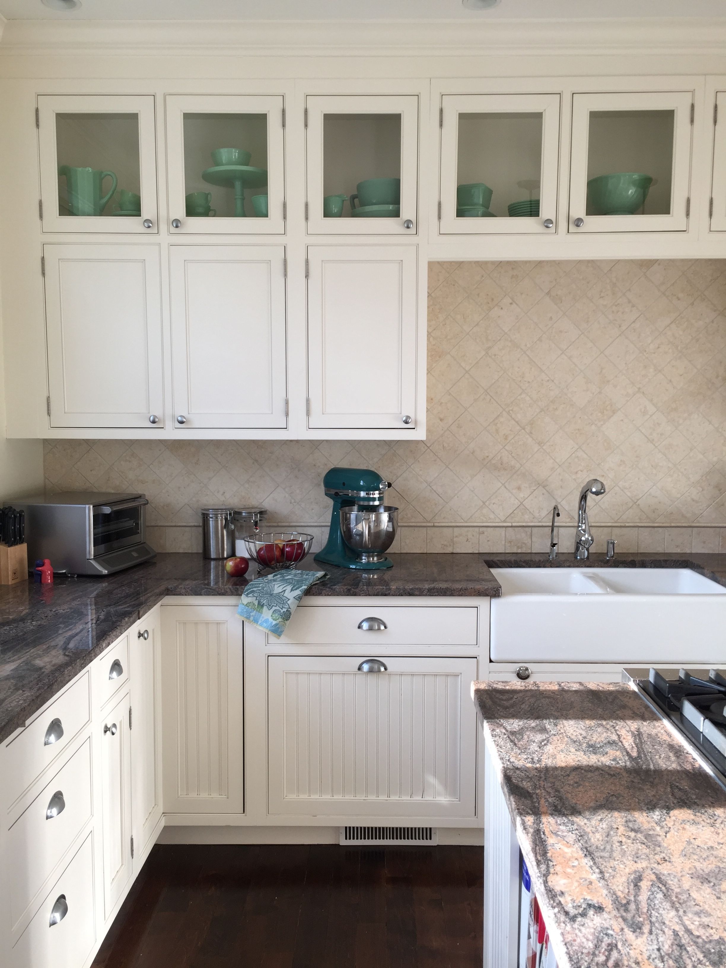
Here is a picture of what our kitchen looks like now. It is actually a scouting shot I semi-styled and took with my iPhone to send to HGTV Magazine, because they wanted to potentially include it in the House Tour last year (I was so happy it didn’t run, since I did not design it!).
I know it is not a horrible kitchen by any stretch of the imagination, but there are a lot of problems with it (I’ll only mention the big ones!). It is still in its ‘service kitchen’ mode, tucked away in the back corner, isolated from the rest of the house, and not terribly big. Renovated last in the late 90s, I’ll bet it was the bomb back then – and I believe the cabinets may have been stained cherry originally, painted white in more recent years. The cottage-y style with beadboard door panels is cute, but has no relationship with the style of my house. When we open up the family room to the kitchen, which was the original impetus for planning to renovate in the first place, the small kitchen tucked into a corner makes absolutely no sense, and was too limiting. So, it became a total gut job – and a blank slate. Yay!
Over the past several months, I’ve been developing the plans for my new and improved kitchen, and I’m excited to share some of the details!
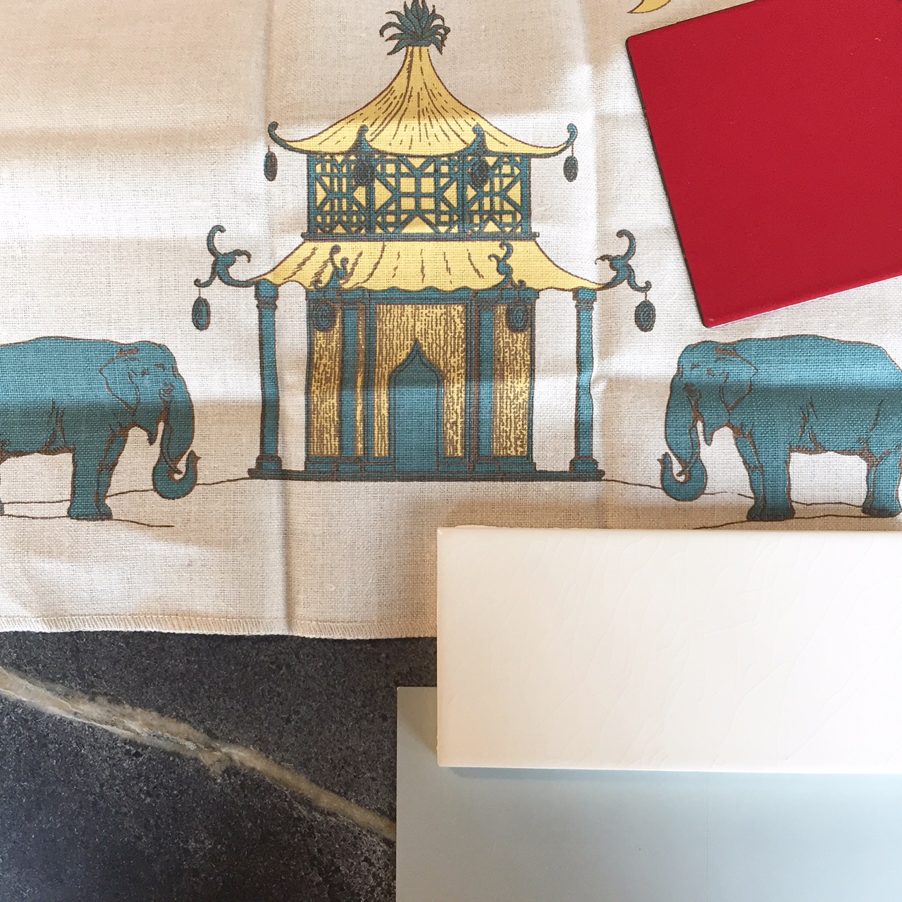
I teased this picture on Instagram a few weeks ago…
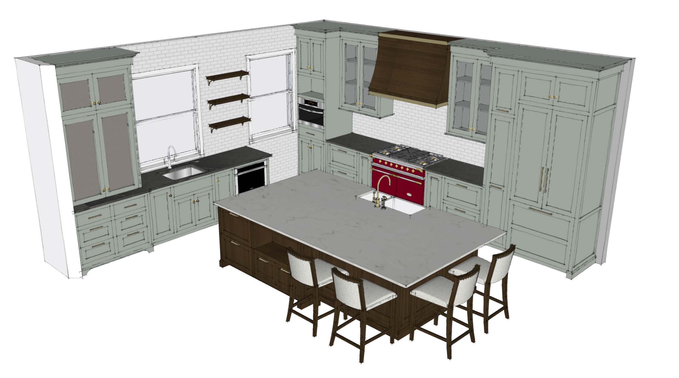
The blue-green-gray paint color at the lower right will be the color of the perimeter cabinets. These base cabinets will be topped with soapstone counters. The backsplash will be a simple 2×6 handmade lightly crackled off-white subway tile (with a fretwork pattern above the range, in the same ceramic tile). The windows (I am 90% sure!) will be dressed in this unique Katie Ridder pagoda pattern. And that fire-engine red color sample in the upper right? That’s an enamel chip for the Lacanche range that will be the focal point of the new kitchen! Ooh la la (it’s French 🙂 ). Not shown is the island finish, which will be a darker stain of quartersawn oak, and the island countertop
I’ve been collaborating with Jewett Farms on the overall kitchen design. It has been a wonderful process, and I couldn’t be happier with the result.
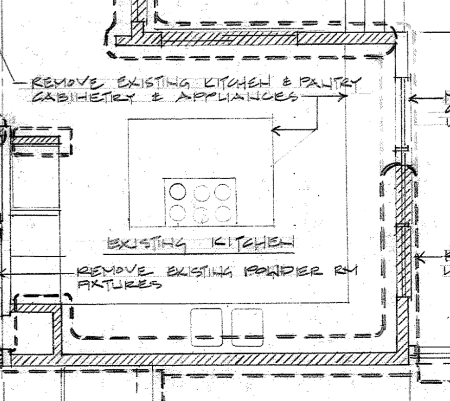
Here is the ‘Before’ layout (from my architect’s ‘vintage’ 2013 demo plan!):
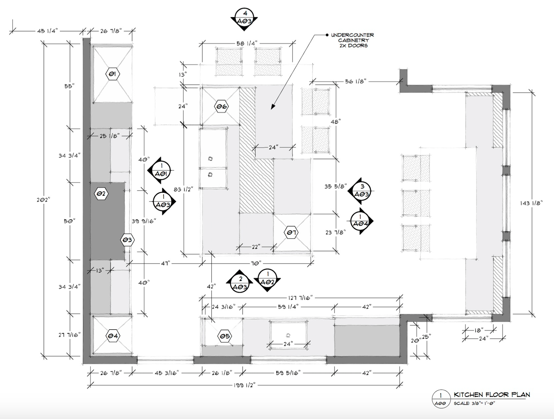
And the ‘After’ layout:
One of my biggest priorities was making the kitchen a place where my boys, as they grow and become more independent, can easily do things independently in the kitchen, like grab a drink or snack, reheat food for dinner, sit and do their homework in a comfortable place, and each have a designated place to store (and charge) their computers and gadgets, schoolbooks, etc.
The bump-out with banquette features two wide drawers for the school stuff (one for each of my sons), and lots of natural light. Nearby in the island (bottom right of the island in the plan) are refrigerator drawers to hold the aforementioned beverages and leftovers. Across the way on short run of cabinets (bottom of plan), nearest the banquette is the ‘snack and coffee zone’ – I wanted a straight shot from the homework place, and from the family room, to get to these things, without having to cut into the main cooking/meal prep area of the kitchen. That, of course, is the cabinet run on the left side of the plan, anchored by the Lacanche range and a custom wood hood for which I’m still ironing out the details!
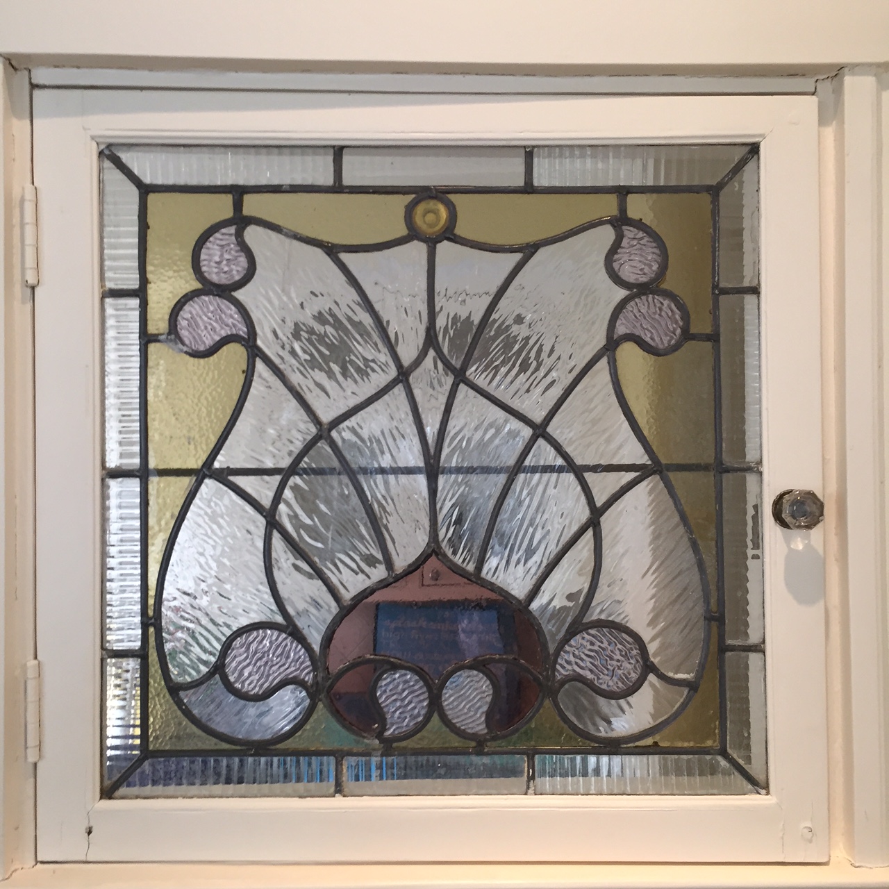
The 3D rendering doesn’t show every detail with 100% accuracy, but it gives a good sense for the layout and overall look and feel. For example, the window to the right of the floating wood shelves is much smaller – because it will be an existing, original leaded glass window from our house (an interior one, if you can believe it) that’s currently on a family room wall slated for demolition. The frame suffered some water damage during the infamous Ice Dam (Damn) Winter of 2015.
There are so many more details and elements that I’ll be sharing over the coming months, here on the blog and on Instagram (look out for #KRIProject1896). Demo begins in March. It’s about to get real up in here!

This is going to be amazing- I love that red range!!! I can’t wait to see the progress and I hope the construction goes smoothly.