I recently surveyed my followers on Instagram, and boy did I learn a lot! One of the major themes was that lots of you are still reading blogs. Well, maybe all of you since you are here – ha! Although it seems like people are spending more time on Instagram, I’m hearing that many still like the level of detail that can be shared in a blog post, and the permanence of it – you can always come back to reference your favorite posts. Something else I heard from many of you is that you want to see more Before & Afters. I’ve actually been pretty good about sharing projects here (less consistent with more topical posts, and regular features like Friday Family-Friendly Finds…sigh…), and I’m going to try to do more mini transformations on Instagram. Thanks so much to those of you who provided feedback.
Since Before & Afters are what you want, that’s just what I’m giving you today! With a little more detail surrounding the process than usual.
I recently completed a master bedroom for a client who lives in a beautiful, very well-preserved Queen Anne Victorian. She and her husband are so in love with their house, and they are very keen on maintaining the historic, traditional look and feel – but recognized the need to freshen things up a bit. I consider freshening Victorians a sub-specialty of mine, so I was excited about the opportunity to work on a couple of spaces in their home, including a full transformation of the master bedroom.
BEFORE:
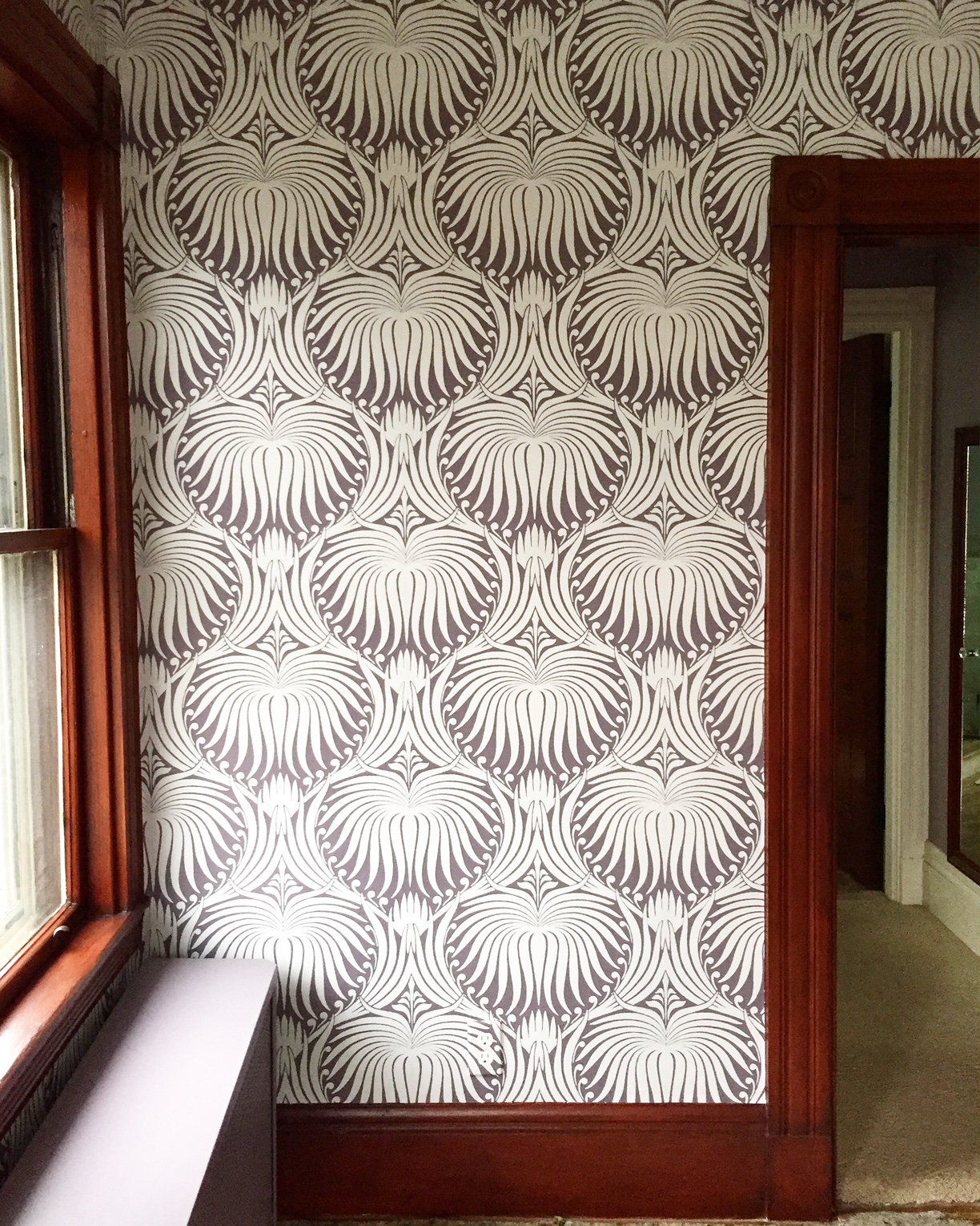
Loved the scale of the wallpaper – but not the wallpaper. Because of the condition of the walls, as well as the client’s wishes, we knew we’d be papering again (no argument here!). The client was more than ready to part with the unremarkable mishmash of bedroom furniture, and I again concurred :).
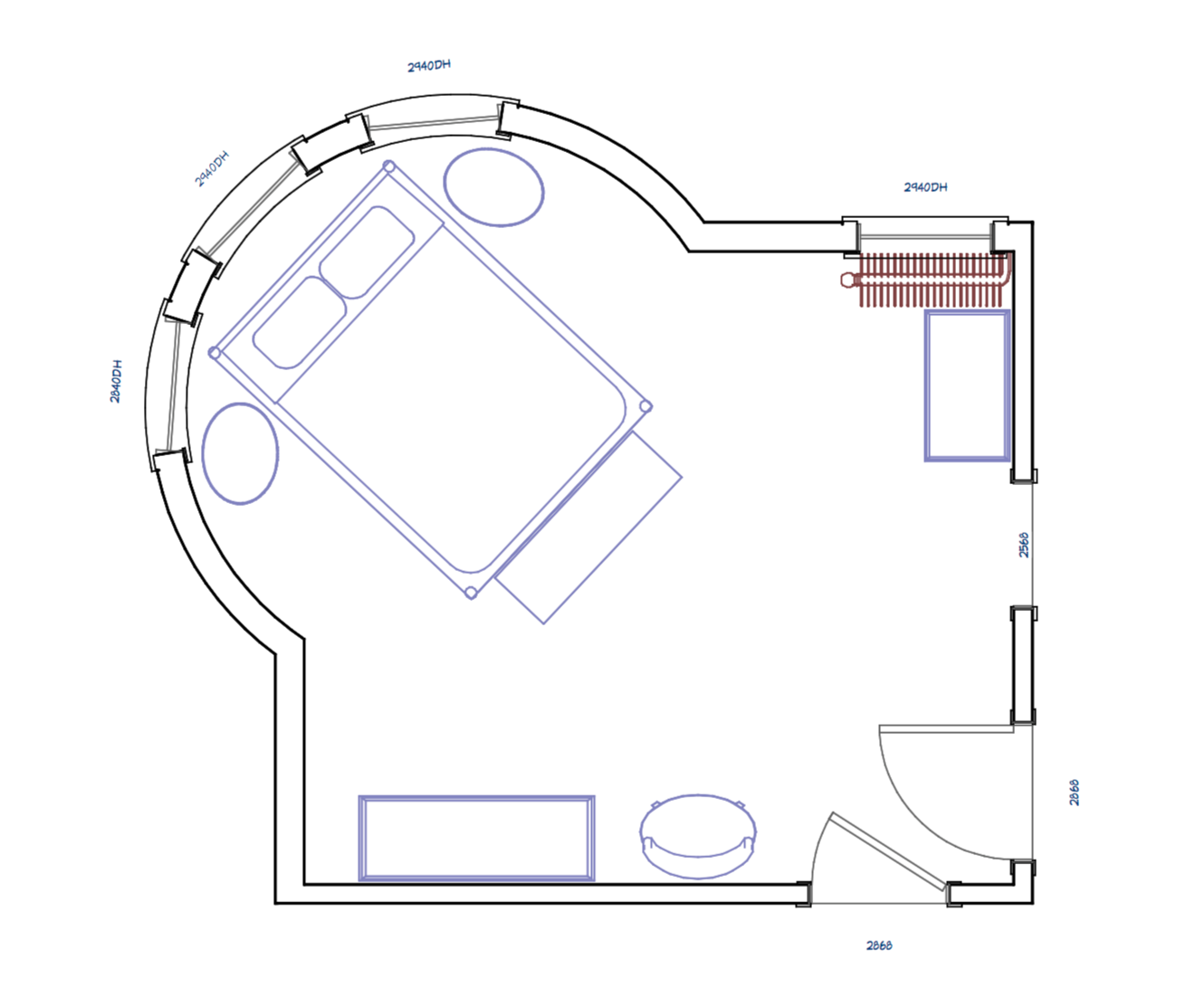
The coolest feature of the room is, hands down, the curved bay, which is part of a turret that continues down to the first floor. The client wasn’t sure where to put furniture or hang art (or draperies). I knew we had to figure out a way to play it up – so much potential here.
Though the turret is quite expansive, the rest of the room is not. We had to make every inch count. And figuring out where to put the bed would be decision number one.
The beautiful original cherry doors were a big check in the ‘asset’ column, and in theory white painted mouldings are a good thing. But together, I was not loving the effect. It was a room that couldn’t make up its mind.
I love a good reupholstery project, and this was no exception! I like the unique lines of this vintage high-back host chair, but felt that the quilting and floral pattern detracted from the intrigue of that sinuous silhouette. Oh, and you can see in this pic that the carpet was definitely on the chopping block, too!
THE PLAN:
The winning layout was putting the bed in the bay window. Here I go putting beds in front of windows again! The symmetry and grandeur of a formal bed framed by a curved wall of draperies – ooh la la! We had to hunt a little for oval nightstands, but it was really the only thing that would work and still be substantial enough to be useful. I wanted a large dresser and the reupholstered chair along the same long wall to maximize circulation around the bed. We decided to search for a tall, narrow antique piece to use as a lingerie chest in the corner near the radiator.
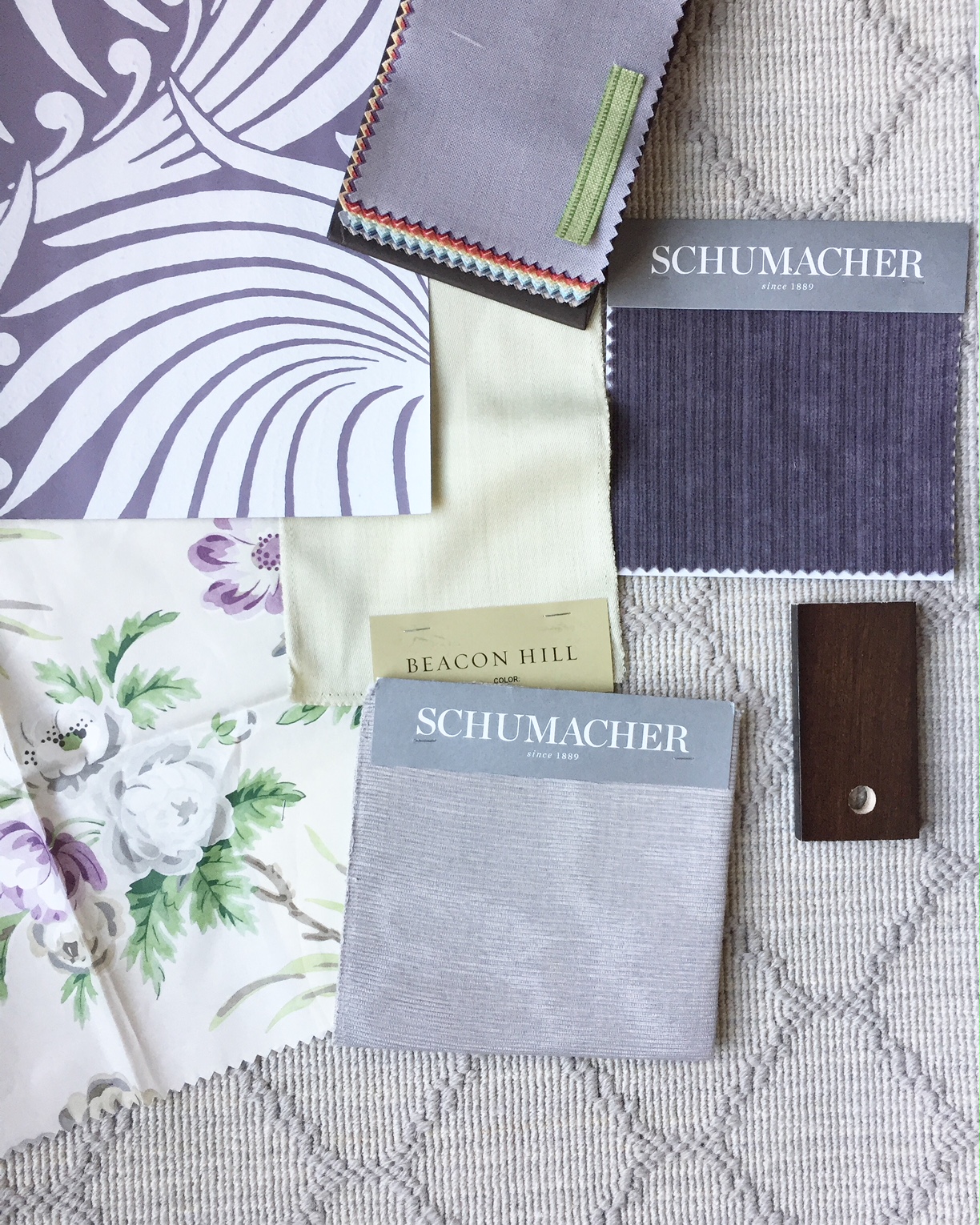
Farrow & Ball’s Lotus wallpaper was the very first thing that popped into my head, and thus inspired the entire plan. It is one of those timeless patterns you could never tire of, no matter how many times you’ve seen or used it (this was my second rodeo). Lotus also has this way of bridging traditional with contemporary. The client loved it, and we were off to the races, devising a decorative scheme in tone-on-tone muted purples, silvery grays, and fresh spring green. There is a definite French influence that creeped in, and I’m not mad at it!
So, clearly, this wallpaper was made for the room! But did you notice anything else? It was also made for stained wood trim! I talked it over with my client, and we both felt strongly that the bedroom wanted to be wood, not painted white. We either had to go with the doors or the trim, and the doors won out. It just adds so much soul and old-house gravitas. But would you believe that a decorative painter made the trim look stained without having to go through a time-consuming and costly process of stripping and staining it? Even up close, I have to say it came out amazing. 10 out of 10 people who see it would be fooled, I guarantee it.
Alright, let’s get to the finished photography, shall we?
AFTER:
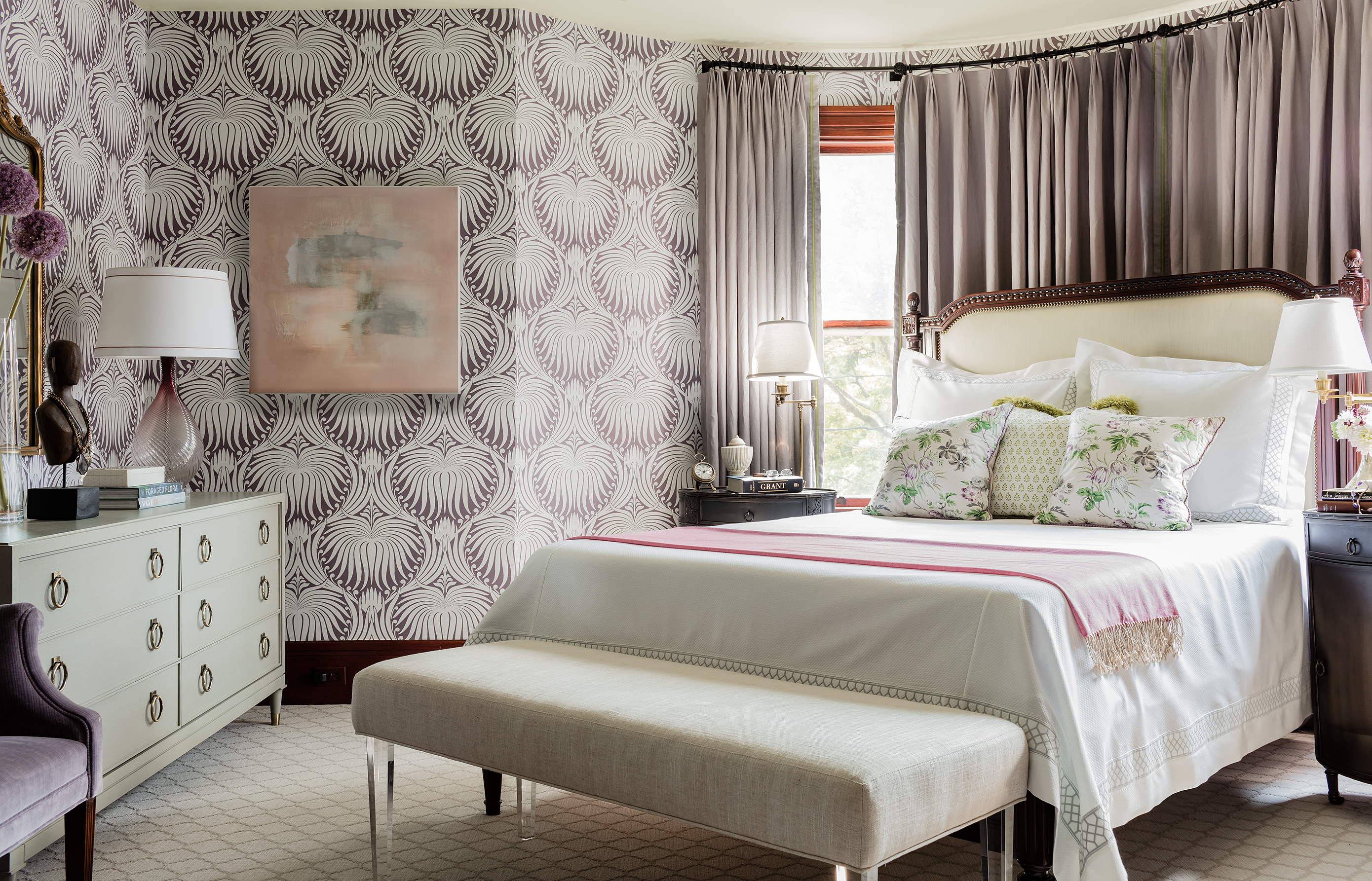
Yes, ma’am – the wallpaper is the star of this room. The Lotus does not disappoint! But there are many notable supporting actors playing a quieter part to ensure an overall serene, balanced look. I wanted a bed that would be comfortable to read in, and looked like it could have been a newly-refurbished family heirloom. Check! And the smoky purple linen draperies hanging on a custom iron rod make the curved bay look properly finished, but not too terribly formal. I used a narrow green tape trim on the leading edges as a subtle detail.
I am very predisposed to white bedding in adult bedrooms, and this one is no exception. The sweetest floral chintz makes the prettiest accent pillows. And did you notice the metal oval nightstands? We even skipped the table lamps and put adjustable-height, swing-arm floor lamps behind the nightstands to keep the feeling of openness, and utilize the ‘dead’ floor space in the back.
And did you notice the ceiling? It’s a light spring green – just like the headboard upholstery.
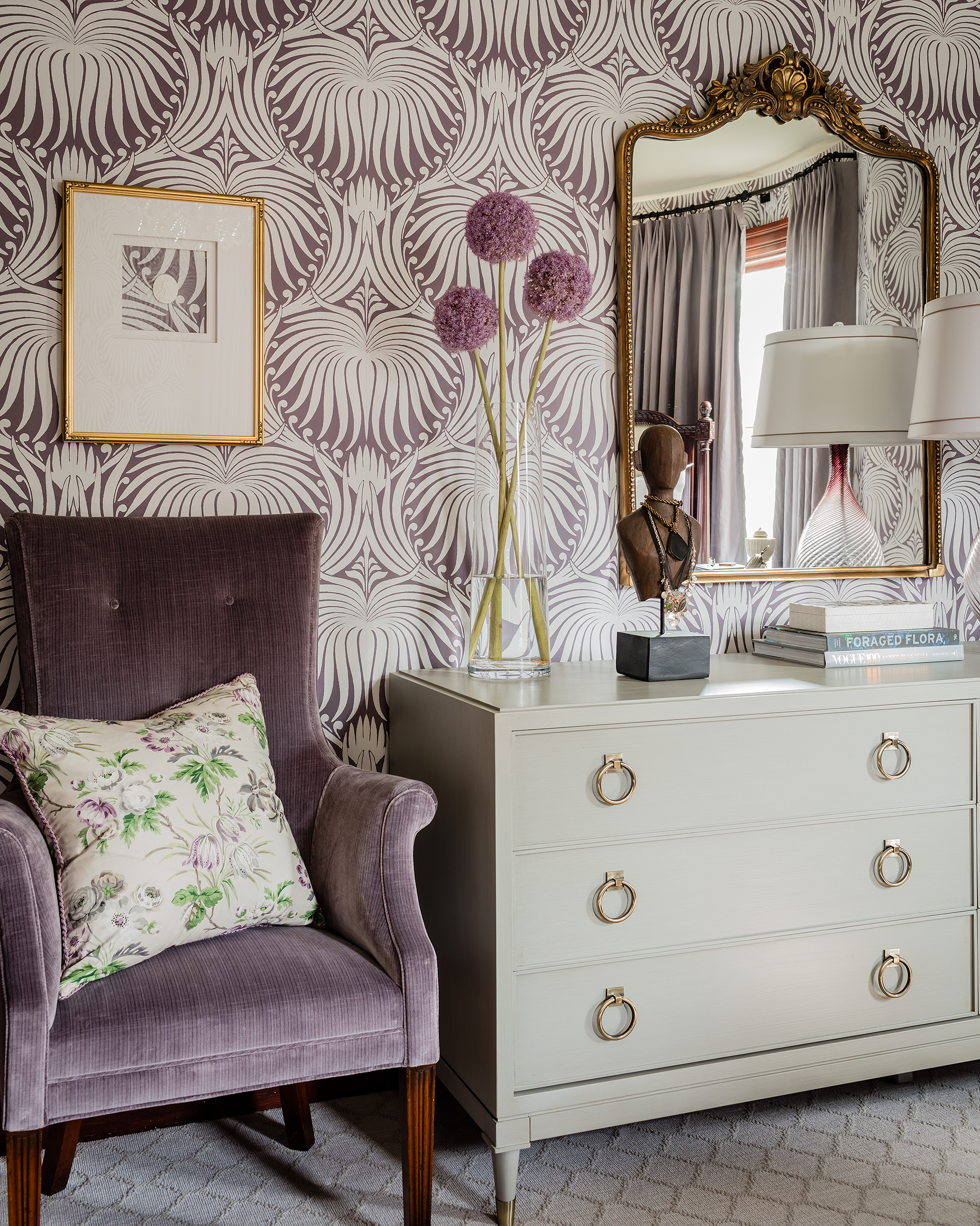
What do you think of the chair? We used an antique strie purple velvet, which I think helps emphasize the unique shape of the chair. Plus, it is so soft and inviting! Speaking of soft, the light lavender-gray arabesque wool Wilton weave carpet is a huge upgrade. As is that grown-up size dresser…those antique brass sabots, though!
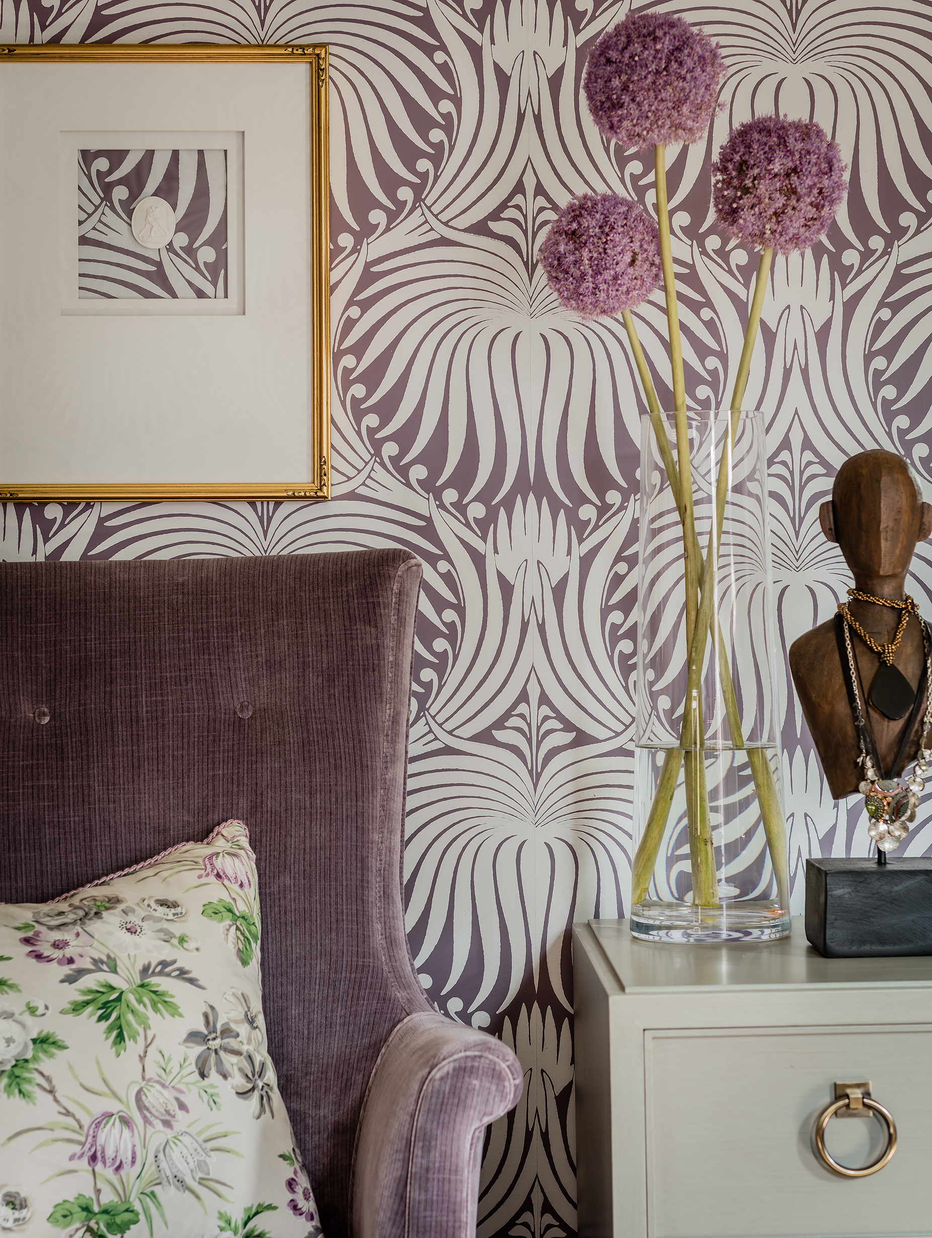
This is one of my favorite art installations so far – and one of the least expensive! An intaglio with a gilded frame, modern white matting, and floating in glass to let the Lotus show through. I wasn’t there when my art installer hung it, so I can’t take any credit for the beautiful placement he chose. I just love it! And I love how this vignette encapsulates the whole vibe of this little project.
If you are smitten with Farrow & Ball’s Lotus paper as I am, I have good news and a deal to share! My client’s paper hanger (not mine) misoverestimated the rolls needed. By a lot. We have eight unopened 11-yard rolls and are offering them for $999. This is a STEAL. Reach out soon if you are interested; I don’t expect them to last long. Local pickup, or will ship outside the area for free!
All finished photography by Michael J. Lee
With lots of appreciation for support from Libby Silvia ArtStyle and Elizabeth Home Decor!

![[BEFORE] Room Reveal: Fresh Victorian Master Bedroom | Kelly Rogers Interiors | Interiors for Families](https://kellyrogersinteriors.com/wp-content/uploads/2018/09/IMG_5010.jpg)
![[BEFORE] Room Reveal: Fresh Victorian Master Bedroom | Kelly Rogers Interiors | Interiors for Families](https://kellyrogersinteriors.com/wp-content/uploads/2018/09/IMG_5012.jpg)
![[BEFORE] Room Reveal: Fresh Victorian Master Bedroom | Kelly Rogers Interiors | Interiors for Families](https://kellyrogersinteriors.com/wp-content/uploads/2018/09/IMG_5011.jpg)
![[BEFORE] Room Reveal: Fresh Victorian Master Bedroom | Kelly Rogers Interiors | Interiors for Families](https://kellyrogersinteriors.com/wp-content/uploads/2018/09/IMG_5015.jpg)
![[BEFORE] Room Reveal: Fresh Victorian Master Bedroom | Kelly Rogers Interiors | Interiors for Families](https://kellyrogersinteriors.com/wp-content/uploads/2018/09/IMG_5018.jpg)
Absolutely stunning — and purple is right on cue for fall weather! The faux wood grain trim is inspired.
Thank you very much, Amy!
I’m a long time reader of blogs and relatively new to Instagram. Have been wondering where all the bloggers were going and imagine my surprise when I found everyone on IG posting like crazy :). I can definitely see how much more instantly gratifying IG can be for the author with all those Likes piling up; whereas I could follow a blog for years and rarely comment. But yes, we are definitely out here! (And I am leaving a reply to prove my point ^^. (LOVE the room btw!)
Beautiful room. Love the layout solution.
The bed in the turret is genius! And the room turned out gorgeous!
Wow! What a beautiful room! The wall paper is fanstastic and I am loving the muted plum color!
Wow, this is just so incredible. I love how you incorporated color and made such a tricky space feel so special. Great job!