If you’ve read other color or color-focused design blogs, you’ve likely seen a fair amount of clamor about a much-maligned, and very commonly used neutral color – beige. But not just any beige, beige with a red undertone. AKA “pink beige.” Even if you have no idea what I’m talking about at this point, you’ve no doubt seen it in action.
OK, now we should all be on the same page! Beiges, and all neutrals, for that matter, come in many different ‘flavors’ due to their undertones. The most commonly seen are yellow beiges (like creams, tans, golds, khakis), and pink-ish ones. One of the most common homeowner mistakes is to assume that neutrals are universal colors with which everything looks good – so they paint the room beige, install beige tile and buy beige furniture. In fact, the opposite is true – neutrals are more likely to obviously clash in an interior space, and are much more volatile than you might think. It all comes back to the undertones.
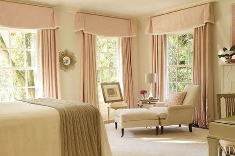
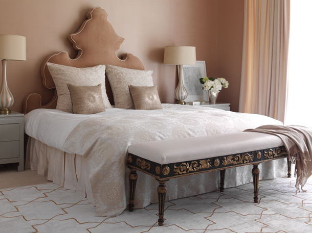
Note the difference between these two bedrooms – both professionally decorated:
See the difference? The second space works much better, don’t you agree? This is because all of the beiges have the same undertone – red. In the first (published in a little magazine called “Architectural Digest,” I might add), yellow and pink beiges are mixed, resulting in a design that is just slightly off kilter.
I know, you’re probably thinking that AD pic doesn’t look so bad. Well, it’s not. There are much worse offenders out there like this kitchen:
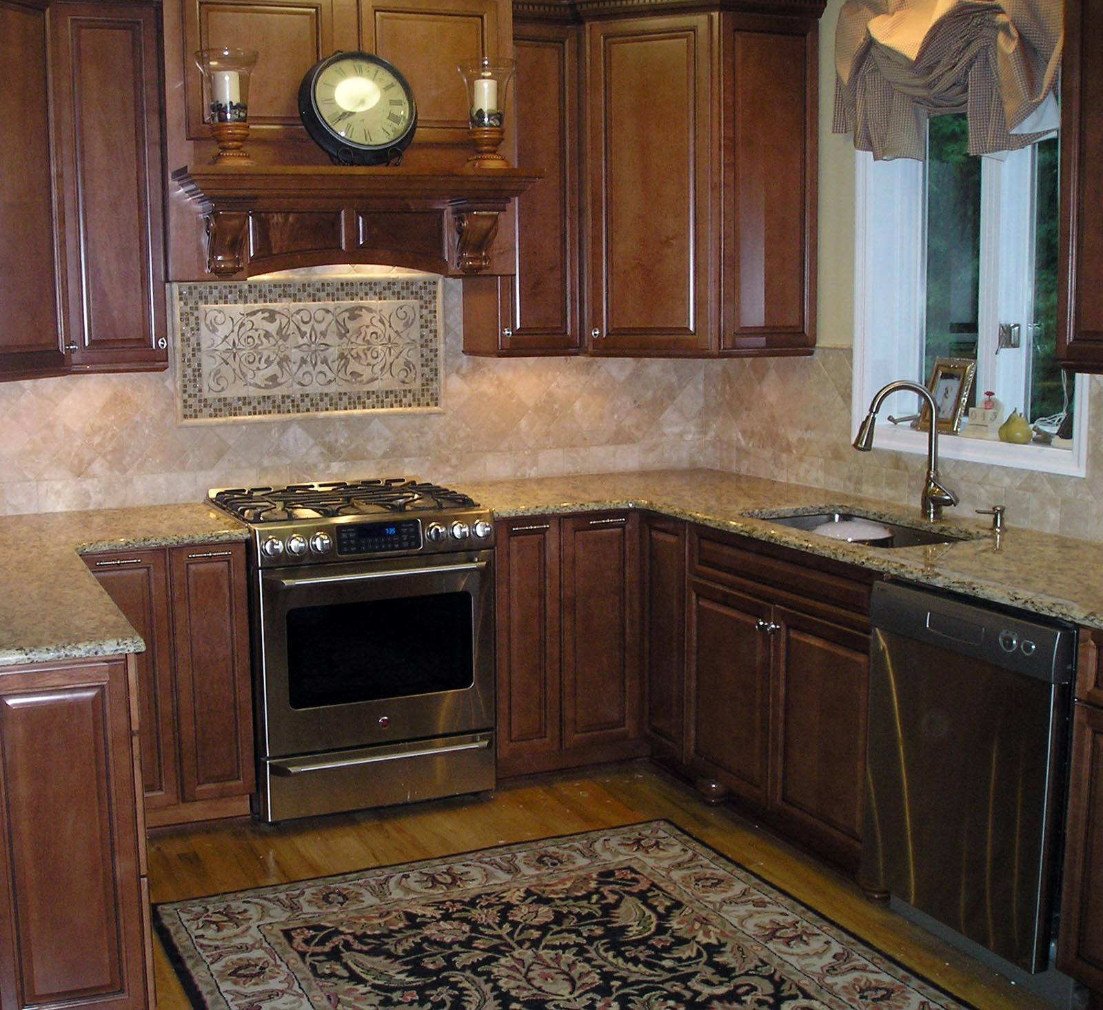 Do you see it? The floors and countertops are yellow, while the cabinets and backsplash are pink/red. This type of kitchen color ‘scheme’ is quite common – especially in spec homes built by developers focused on maximizing profit, not interior design quality. Mismatched undertones in the various materials make for a sticky situation – usually, one that’s difficult for a layperson to articulate. Something just feels “off.” Way off.
This illustrates why many color consultants and other experts say pink beiges should burn in the fifth level of hell for all eternity. I paraphrase, of course :). There really is a passionate negative feeling among some color professionals about pink beige, though. True, as we have seen, in the wrong hands the results can be disastrous. Pink beiges tend not to play nice with others – the same could be said for other hues. But isn’t that where these same professionals can help their clients?? Therefore, I write this with a lonely, yet certain voice in defense of pink beige!
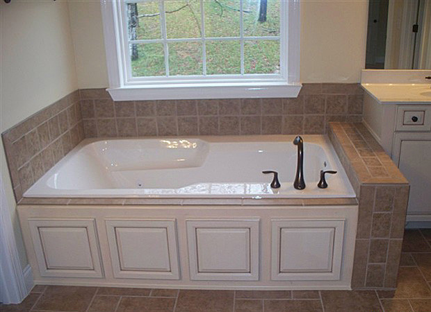
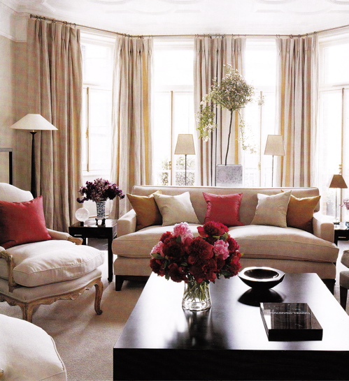
If pink beige didn’t exist, than neither would this:
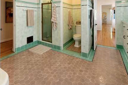
Or did I mention this??…
I, for one, am not afraid of pink beige. It’s actually quite the lifesaver if you are working with hardwood or tile flooring with a red undertone (not so much if you have those natural polyurethaned oak floors). I guess it’s kind of like “going with the grain,” instead of fighting what you have. It is my nature to try and work within constraints of the existing conditions as much as possible and practical. Of course, if you don’t love the look of pink beige and you have some in-your-face floor tile or a countertop in that hue, you may have to make a bigger investment to change your (bad designer joke warning!) color ways.
Believe me, I know how confusing color can be! I have taken multiple courses in architectural color and color theory and there is always more to learn. If you need professional color help, I am pleased to offer my color consulting services. Check out my business website to learn more or to contact me!

I love neutrals! The beige bedroom is very pretty.
Thanks for your comment, Patricia! I know, isn’t it gorgeous? Coincidentally, today House of Turquoise featured a beautiful home with a whole lot of pink beige (paired with turquoise, of course!): http://www.houseofturquoise.com/2012/11/cole-wagner-cabinetry.html
Oh, it’s beautiful! Thanks for the link!
Which tones would go best with the builder’s Timberlake Maple Mocha Glaze cabinets and what looks to me like Baltic Brown granite? The granite seems to have a lot of pink in it in photos. I’m thinking they made a mistake with that granite and those cabinets. The backsplash and tile look pinkish as well. It’s a house we’re purchasing, and I’m planning to repaint before we move in.
I just replied to you via email. I’m not sure exactly what your kitchen or the materials in it look like, but maple, if left with a natural finish, has a definite yellow undertone. Which could clash with pinkish tile and granite. Let me know if you want to discuss further!
Hi Kelly,
I can send photos. The cabinets have a mocha glaze does moderate the yellow, but not enough perhaps. i can send photos.
LHS
OK, great! I’ll look for your email.
I need suggestions. I have bought at least $100 in paint samples and can’t seem to find the right beige for our family room and hallways. My sofa is a dark amber with chocolate pillows that have silvery blue, slight yellow gold, and peachy beige accents. Curtains are chocolate and we have mahogany wood furniture. the wood floors are a light oak. We need a beige that’s on the lighter side, but doesn’t get washed out and look too creamy, but with NO green undertones. The color we found that looks the best is ‘Harmony’ AF90 by BM, which has a slightly pink undertone. However, our kitchen, which is next to the family room will be ‘Powell Buff’ by Ben. Moore. It is a yellow beige. Our dining room is ‘Old Plank Trail’ by Clark Kensington, which is a greenish brown. Can you provide any suggestions of a warm color that may be in the middle of the pinkish beiges and yellow beiges with no green undertones??
Color can be frustrating, can’t it? My two cents: I think you will need to move outside of the beige realm to find your family room color. Or, perhaps the kitchen can be painted a color other than yellow beige? Not sure what your finishes are in there. Without seeing pictures of your family room, it is hard for me to picture what is more dominant – the red undertones of your furniture/accents or the yellow oak floor (which I’m assuming runs through the kitchen?). A natural, earthy green (made of yellow, muted with its complement, red) can sometimes work to help marry these disparate undertones, but a paint color cannot stand alone and needs to be repeated elsewhere in the room. If you would like to continue this conversation and learn about my virtual color consultation services, please contact me directly through my website (kellyrogersinteriors.com). Good luck!
I totally agree that you should just roll with pink beige sometimes rather than fighting it. But I’m having trouble figuring out how to do that! We have one of those builder-flipped houses where they specified surfaces to look nice so it’d sell well, heh. Our entire master bath is all different shapes/sizes of pink beige kinda mottled ceramic tile. The cabinetry is a light wood, slightly darker than maple; the walls are lame yellow-based contractor’s beigey cream, the trim is white, and the accent wall over the sinks is ORANGE.
We actually really love the color orange, but it doesn’t look good with all the hard finishes in the bathroom. The door is often open and there’s also a peek-through gas fireplace, so we can always see the master bath from the master bedroom. (The bedroom also has an orange wall, and since we love the color we decorated the whole bedroom with orangey accents.)
I can’t for the life of me come up with a color for the master bath that is complementary to the pink beige tile, helps tie in the light wood cabinets, yet will still look good when we can see it from our master bedroom which also has that bright orange accent wall. (Everyone seems to say to use blues to go with pink beiges, but a blue would kinda clash with the orange, right?) Our house is so weird, haha. We’re still undoing so much of what the builders did! At least we got a killer deal on it. 🙂
Hi Virginia – Blue is complementary to orange on the color wheel, so that could work (though you would need to watch the undertones there, too). With a situation like this, you’re better off trying to deal with the bathroom separately, rather than worrying about how it looks from another room (because you could close the door if it bothers you). I am available for virtual color consultations if you are stuck; you can contact me via my business website – https://kellyrogersinteriors.com/476613/contact/
Thanks Kelly! Our situation is a little odd in that we can’t just close the door—not only will our cat open it, but we have a peek-through fireplace so you can always see the wall color. (I know, woe is me, haha.) I really appreciate you weighing in! I’m going to be traveling for a few weeks and then it’s crazy holiday time, but I’m bookmarking your site for reference in case I want to track you down and hire you.
And hey, for what it’s worth, have you thought about investigating Google Helpouts? It’s a new program (in beta now but you can join when it launches) that allows you to take payment for a Google Hangout, which might be awesome for getting paid to answer quick little questions from users like this one, especially now that everyone has a tablet with a camera that they can just take to the room in question. I’m using Helpouts for my online dating coaching business and I’m finding it really useful for bite-sized Q&A like this at an affordable price point! Just had to share, from one small biz to another. 🙂 Cheers!
Hi Virginia – I was just checking out Google Helpouts; looks perfect for virtual consultations! Do you happen to have any invitation codes to give out? Let me know, and thanks for the tip!
Hi Kelly! I don’t, but it’s actually public now so you should be able to just sign up on your own! (I wish they’d give me an affiliate link or something.) Send me a link to your listing when it goes live! 🙂 Mine is still on hold; I think they have an ENORMOUS submission queue to get through but we’ll both be out there eventually. Cheers!
Is there any way to find out the wall color specs in the beautiful bedroom posted above?
Hi Sandra – I followed the breadcrumb trail back to the image source, and the Benjamin Moore color ‘Seaside Sand’ is referenced. Though it isn’t clear if that is a visual color match by the blog author, or if the information came from the designer herself. Feel free to check it out for yourself – and don’t forget that this color would most likely look very different in your space! http://www.thelennoxx.com/browse-by-style/classic/interior-designer-tara-seawright-does-beige-well/
Searching the net for info on pinky beige, I am told to avoid it due to the oak in my kitchen but being color blind, well I may as well be … how can you tell a pinky beige. If you look at what they put into each paint color can you decipher it like that? Designer recommended Manchester Tan for my kitchen, living, dining … all open but I don’t like how orangey, yellowy it looks… I want a cleaner, grayer but beige color but don’t know how to avoid the pink undertones. thanks
You are on the right track – an undertone is a tint in the paint; it’s an ingredient, NOT what the paint color looks like. For example, a purple-y gray has a red undertone; it’s the red tint that made it look purple (when mixed with black and white). There is no such thing as a purple undertone, as there is no purple tint in paint formulation. While what you are describing sounds like an appropriate setting for Manchester Tan, that doesn’t necessarily mean you have to love the color. You do have other options. Look for light greenish grays (yellow undertone) if you want a gray or greige to coordinate with yellow wood. And the easiest way to detect undertone is to pull a bunch of beige (or gray) paint chips and put them right next to each other. You’ll see that some look pink or purple (red undertone) while others appear gold, yellow, or green (yellow undertone). I’m available for virtual consultations (kellyrogersinteriors.com) if you are still stuck – good luck!
I wish I read this before painting my entire new house SW Practical Beige! It looked great on the paint chip until they painted the entire house with that pink beige! There is nothing practical about Practical Beige. We had to repaint the entire house before we moved in, there was no way I could live with that!
Ugh, now that is frustrating! If you painted the whole house the same color again, you may notice that it looks different in each room. Unless you are doing white/off-white walls, it can be often very challenging to find one color that works equally well throughout your home (depending on its size, layout, orientation, natural light, existing materials, etc etc). This is just one reason why it is usually advisable to use different colors in different spaces. Hope you are enjoying your new home!
I feel your pain! I just did the same darn thing last week! Painted the whole house with Practical Beige and hate its guts! It is so pink I can’t take it. It looked NOTHING like that on the swatch, and really didn’t even look like that until it dried down all the way. Yuck. What a terrible, expensive lesson. Also, I have oak cabinetry and it’s just a total nightmare. I’m having someone out in a couple of weeks to repaint at least the living room so I can stand sitting in there again. What color did you go with? I’m going all the way in the other direction with something like Benjamin Moore’s Roxbury Caramel so I can make SURE it’s warm and welcoming. Death to pink beige!!
Jana, so sorry to hear that. I have painted A LOT since then (this happened many years prior to posting, still recovering from it.. hahaha).
The most neutral beige (no yellow, no green, no pink undertones) I could find is SW Latte. I’ve painted a lot with that, but these days neutrals are trending towards the grey-beige.
Use Latte to compare colors to, if it’s any pinker than that, stay away 🙂 Buy a sample quart and paint a large section of the wall. I will never paint off a sample again!
I just ran across your blog and LOVe it! Thank you!!
I am having trouble with pinky beige floor tile that is in my kitchen. it is brand new UGH!!!
Since I can’t change the floor, I can change the counters and paint the cabinets and walls. Do you have any suggestions for colors? I am open to any color that will go with this floor.
Thanks for any advice you may offer!!!
Patty
Thank you for reading, and for your question. The key to creating color harmony in your kitchen is to incorporate surfaces and paint color(s) that have the same undertone as your floor. So, a red undertone. When it comes to specific colors or materials, I generally don’t provide recommendations in this forum, especially since I don’t have the full context for your color dilemma. If you are interested, I do offer virtual color consultations – you can inquire at my website, kellyrogersinteriors.com. Thanks, and good luck to you!
We just moved into our new house that is painted all “primer” white, and I’m trying to find a perfect whole-house neutral beige/tan color. We have pinky beige carpet everywhere, and a pinky tan/taupe sofa in Living Room. I just finished painting the first room, our master bath, in Kwal’s Botany Beige, which seems to have yellow undertones and is clashing terribly with the pinky beige carpet. Sadly, I actually like the Botany Beige and we tend to like decorating in warm earth tones throughout our house and not grays, but the pinky carpet/sofa proving difficult! I really don’t want pinky beige walls. Not sure where to go next? We have oak cabinets, doors, and trim thru-out.
I’ve had issues for years with our kitchen, to the point where I’ve done very little in the way of redoing it. When I started reading about undertones, I finally figured it out: the paneling and flooring have a yellow undertone, the counters have a pink undertone, and the cabinet undertone is orange (I think).
Since I’ve never liked the walls or flooring, but I can live with the counters, I’m looking for a beige without any yellow to it. Manchester Tan doesn’t look right so I’m leaning toward Bradstreet Beige.
Hi Kelly, thanks for this post! I have a question for you…
My kitchen and bathroom look quite similar to the kitchen you posted above, very basic-builder, full of the same yellow toned granite everyone and their mothers’ kitchens have, and with a very pink beige travertine backsplash and floor to ceiling in the bathroom. I am having trouble understanding how to neutralize the pink beige of the travertine in both rooms. For example, I really enjoy makeup and understand that green concealer can neutralize red/pink tones in the skin. However I don’t understand how to neutralize a color by filling the room with other colors, vs. layering them as you do with cosmetics. Does color theory in interior decorating work similarly? The bathroom shower has the travertine floor to ceiling, with the other three walls tiled to high chair rail level–so could I paint the wall space I have a white with green undertones? If not, what is the proper way to understand this?
Thank you!
Ok, Im sure I missed it, but when I go to buy the pink beige paint, what is it actually called, or is that the name? Thanks so much, it is very very nice….
Thank you,
Lisa
What a great post! We are updating our home but have to keep the travertine and Brazilian cherry floors. I’m told the travertine has a pink beige undertone. Just trying to understand the concept. We are going for a very fresh, light look with our paint..that works with the floors. Am I correct that I should be looking for a light color that has a red or pink undertone to smoothly coordinate so floors don’t stand out? I’d like the travertine to be very neutral. Thank you.