Color
Using Color to Create Balance & Harmony
**Please also check out the full reveal of this project here!** In my opinion, the most critical of the principles of design is Balance. It is also one of the most subjective, making it tricky for many people to master in their own homes. Balance is when the various items or elements in a…
Read MoreWho’s Afraid of Pink Beige?
If you’ve read other color or color-focused design blogs, you’ve likely seen a fair amount of clamor about a much-maligned, and very commonly used neutral color – beige. But not just any beige, beige with a red undertone. AKA “pink beige.” Even if you have no idea what I’m talking about at this point, you’ve…
Read MoreColor 101: Optical Mixing & Seeing The Forest (Not The Trees)
During my color training, I learned about the various phenomena of color interaction and color perception. Among these is optical mixing – the phenomenon of seeing two or more colors one way up close, and very differently from further away. Specifically, two or more distinct colors in a pattern seen from a distance will begin…
Read MoreHow to Make a Color Statement with Collections
When people want to make a quick hit, big impact change in a room, usually the number one solution is paint. Really, this means that color, and changes thereof has a dramatic effect on the overall look of an interior space. However, there are, of course, many other ways to breathe new life into a…
Read MoreA Warm Welcome
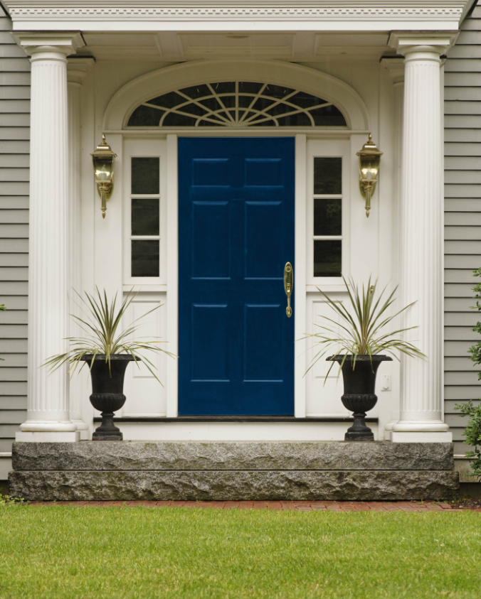
A beautiful public entry – more specifically, your front door, is really the first impression your home makes on visitors, passers-by, and of course the nosy Nellies who like to scope out everyone else’s digs (but I wouldn’t know anything about that…). All apologies to apartment dwellers and other renters! Now that I’ve got that…
Read MoreArchitectural Color in Newport
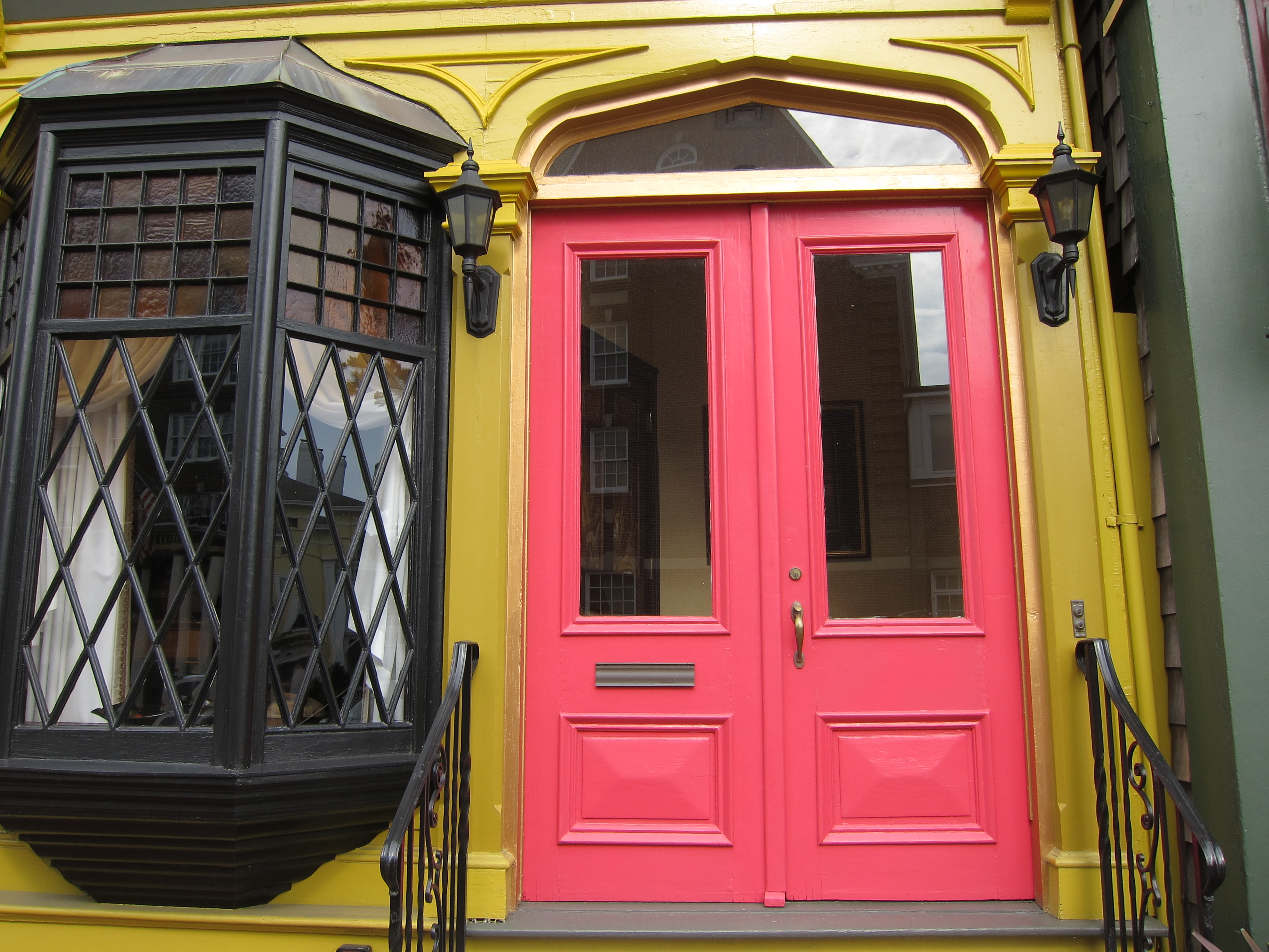
I am currently in Newport, Rhode Island on a quasi “stay-cation” – I call it that because my husband is still commuting to Boston for work this week, and I have to drive up to the city a few times next week for various commitments. I don’t think it can be a true vacation if…
Read MoreGoing Gray: A Cautionary Tale
Yesterday, I finalized the paint colors for our entire house (the new one under construction), after weeks of agonizing over fan decks, large color chips, fabric swatches, and actual paint on the walls. I won’t bore you with the laundry list of all thirteen colors (fifteen if you count trim and ceiling), all Benjamin Moore, but…
Read MoreColor in the Kitchen
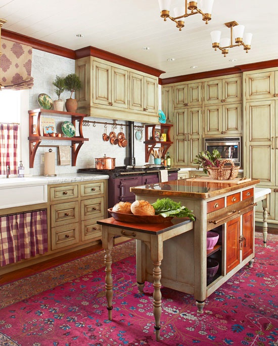
Yesterday, while (finally) flipping through the July/August issue of Traditional Home, I came across a kitchen that really caught my eye… Not only is it drop-dead gorgeous, but it also happens to be in the very same town in which I reside (Newton, Massachusetts), and the brainchild of a local designer I can’t seem to…
Read More(Color) Scheming In Our New Home
If you’ve read some of my older posts, you know I (with my husband) am knee deep in building a new house. I’ve spent so much time picking all of the fixtures, materials and finishes to ensure that our home will have “good bones.” I’m only now starting to eke out into the world of…
Read More
