In spite of its title, this is not a post about coastal decor. While I have a deep abiding love for the homes of Martha’s Vineyard, Nantucket, Bermuda, the BVI’s and beyond – not to mention the Florida Keys, where I spent last week – today I wanted to take a closer look at how nearly-ubiquitous kitchen island has evolved over time, and when it took its present form(s).
While the first kitchen islands were probably simple tables or work surfaces in late 19th century Victorian unfitted kitchens. By the 195os, they were beginning to be built-in along with perimeter cabinetry, taking advantage of the open home planning that was coming into vogue. But the 70s and 80s saw islands really take off as a de facto design element in kitchens with sufficient space (and those that were smaller had peninsulas).
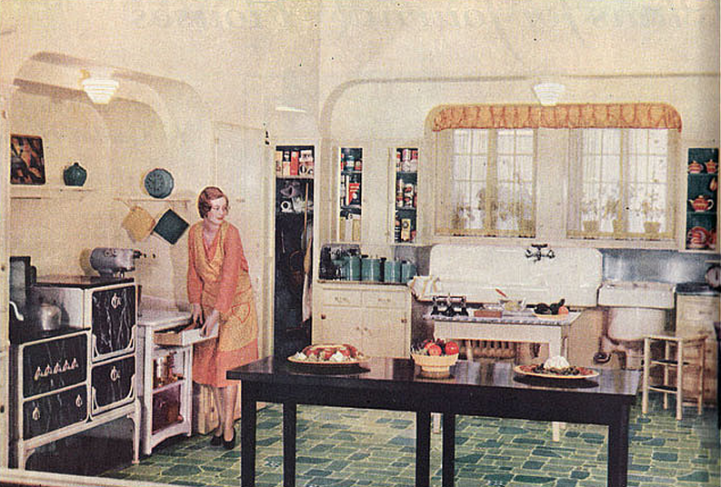
This image from the 1930s shows a freestanding counter-height island table in a partially unfitted kitchen with a linoleum floor and modern appliances. Perhaps the floating island was necessary for work and serving space because of all the large modern appliances that needed to be plumbed or electrified in retrofit fashion on the perimeter. The innovation of tucking appliances along and under a continuous countertop was about 10-20 years away.
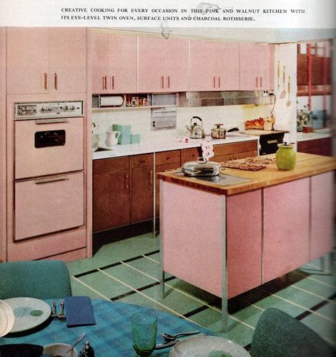
Fast forward to 1960…if you can get past the migraine-inducing pink and mint-green color scheme, this kitchen is actually pretty cool. Intentional mixed materials, clean-ish lines, and appliances that blend in with the cabinetry. The custom island is built-in but has the look of a freestanding cabinet (perhaps a transitional style?), sports a built-in hotplate and a butcher-block top, and matches the pink cabinets on the perimeter – clearly a central design and functional element in this kitchen.
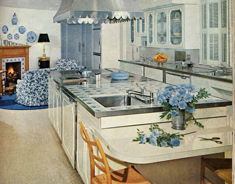
This kitchen, published in House Beautiful in 1961, actually holds up relatively well! It’s a familiar white kitchen with blue accents, and the very large island holds a cooktop, prep sink, and dishwasher. Clearly, this is not a ‘typical’ kitchen of the day, but a designer kitchen that was probably a bit ahead of its time. Side note: The scalloped hood is good!
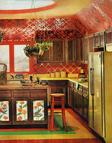
And then there’s this, circa 1970! Whoa. I always find it fascinating that the 50s and 60s look more current and relevant than the 70s. The decade is such a bizarre and abrupt blip in the history of interior design and the decorative arts. At times, an assault on the senses. (Side note: I also find the 80s more palatable than the 90s…). This kitchen’s island features some floral panels inset into the cabinet doors (wallpaper or hand-painted?) – while clearly functional, the island is also serving as a decorative element in and of itself. It’s a statement piece. (One of far too many in this particular kitchen).
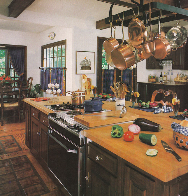
A real mac-daddy island from the 80s truly signals the evolution of the island into the absolute workhorse and heart-center of the kitchen. Cooking, cleaning, storage, prep and now, sitting and eating, too. The kitchen table has moved further away to a ‘breakfast nook’ or disappeared altogether. But this island…I’d take it! Almost 🙂
[And we are skipping the 90s…because I can’t even 🙂 ]
Here are a few modern-day kitchen islands I absolutely love!
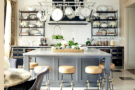
A classic built-in island with a contrasting finish is a superb look in this lively, yet neutral chef’s kitchen.
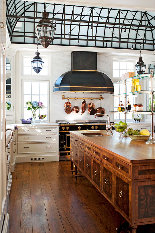
I love an island that either looks like, or actually is furniture. This very long island is by all appearances a custom creation, modeled after a traditional sideboard or commode. The detailing and figuring of the veneers on the door panels and framing is beyond!
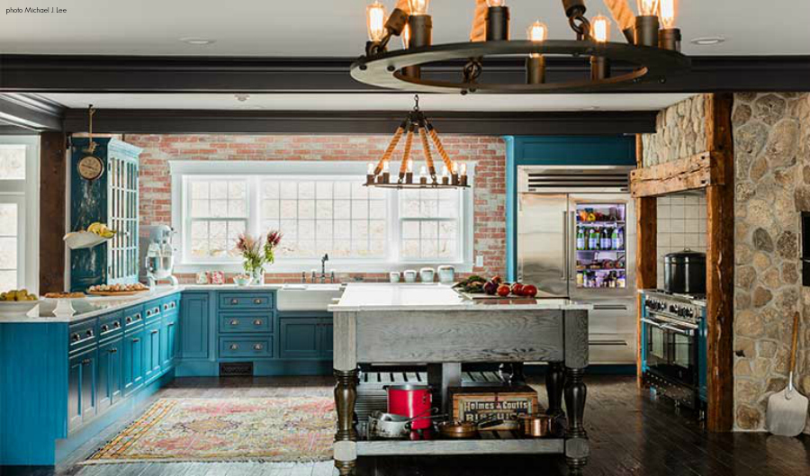
This one, from local design firm Color Theory, and photographed by Michael Lee, was featured in Design New England recently and stopped me in my tracks. It looks like a piece from some sort of giant old bakery in the French countryside. But it was actually custom-made for this fabulous kitchen. The island adds so much character and soul to the space.
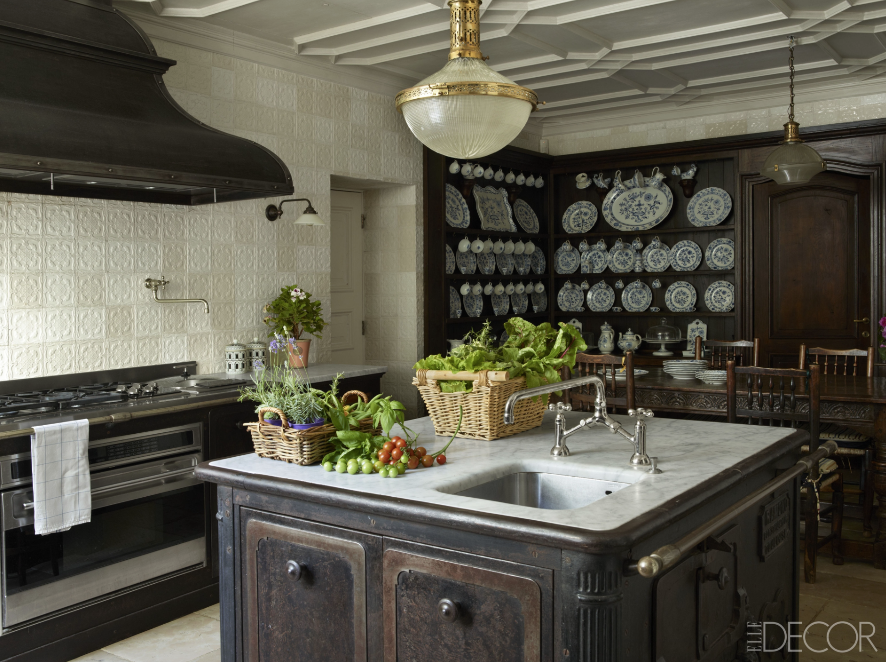
And then there is this smaller, yet useful island, which is made out of a big old cast iron stove. What a fantastic upcycle!! (I pretty much love everything else going on in this kitchen too – which says a lot, considering there is not a stitch of color in it!).
So, what’s your island style?

