I don’t often chime in on the various color trend conversations that pop up every year. Mostly because I find that they are often somewhat disconnected from the reality of my day-to-day work. I don’t really follow or use trends as much as I try to be aware of them and watch how they evolve (and decline) over time. I find it problematic that the paint companies and color forecasters are often miles apart from one another in their predictions. And, I’m often just flat-out puzzled by the choices (e.g. 2015’s Marsala from Pantone – I have to say I’ve definitely seen it more in fashion than in interiors…it seems to me a very seasonal color, not one you’d want to live with all year round, and a little too wishy-washy overall for my taste neither bold and exciting, nor soft and pretty).
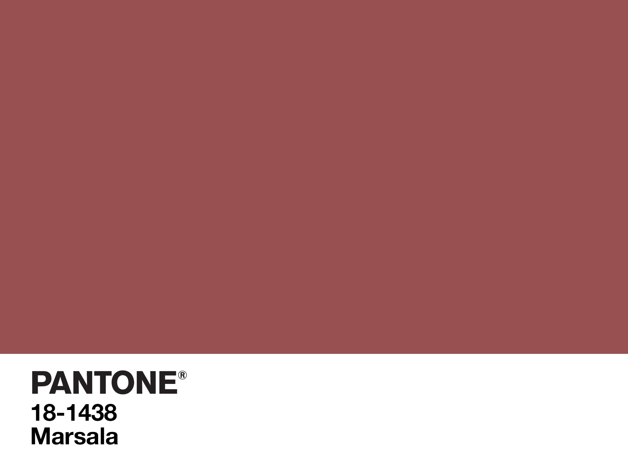
Pantone’s 2015 Color of the Year
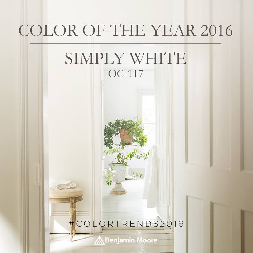
Benjamin Moore’s Color of the Year for 2016 was Simply White. It surprised everyone, and delighted many. And it was, I thought, completely in line with interior color trends (but certainly not ahead of them), and very much usable within a more clean, contemporary aesthetic (I like to call it the “bathed in white” look). And if you weren’t into the white-walled idea, Simply White was and is a fresh choice for painted millwork in a more modern setting.
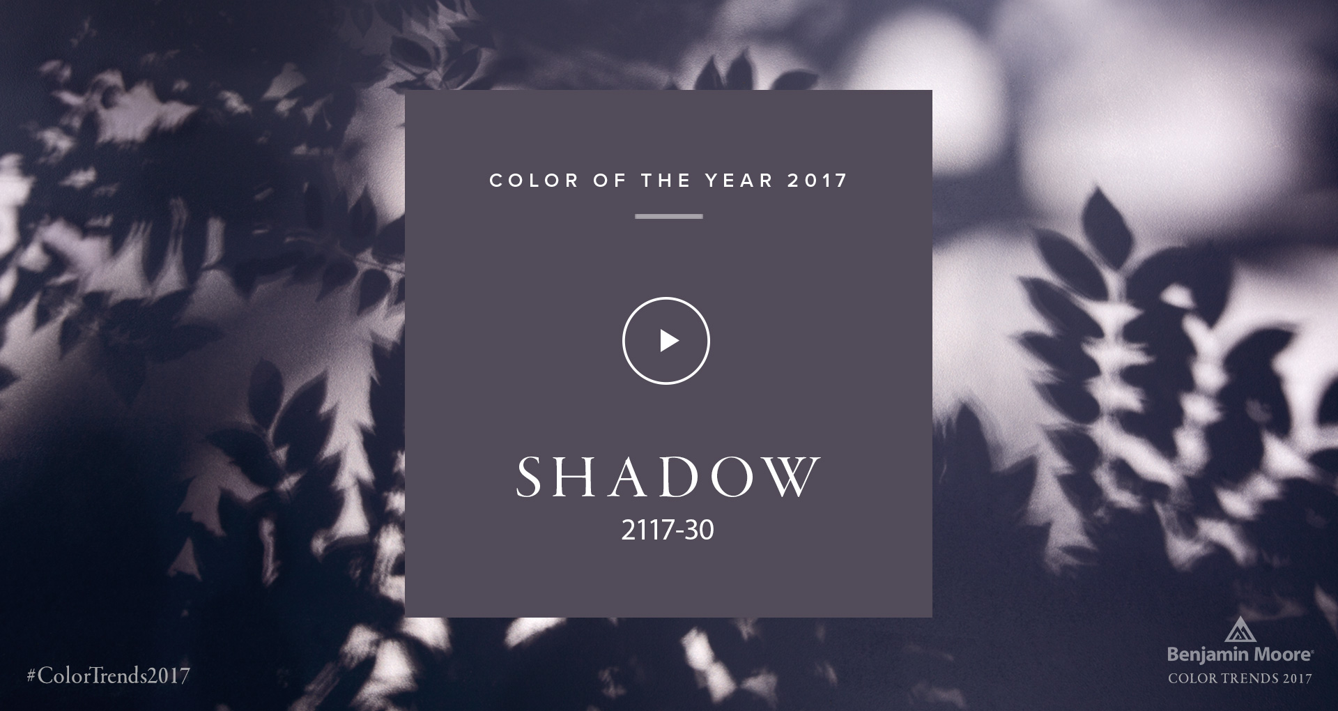
Last week, Benjamin Moore announced its Color of the Year for 2017. Going in the complete opposite direction, they chose a deep amethyst violet hue from its Color Preview collection – “Shadow.”
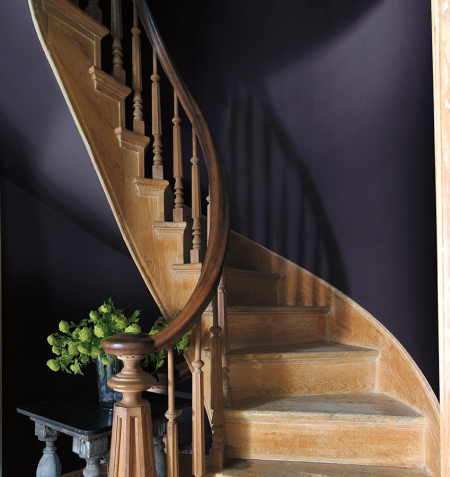
I have to say, I was surprised, but generally in a good way, by this choice. Not surprised because I don’t think it is mostly on target with color trends (I will explain why…), but because Benjamin Moore went with a color that is darker, somewhat more nuanced, and better highlights natural and stained wood finishes (as in the above picture) than they have in recent history.
Just a couple of weeks ago, I wrote a blog post about how these darker, more moody paint colors seem to be trending as an antidote to the ‘bathed in white’ idea. It’s also a bit easier to pull off for most of us, as achieving a great look with white walls really requires certain architectural and (natural) lighting conditions. I do like how it could go traditional or contemporary, and has that undeniable royal connotation.
For me, Shadow is almost, but not quite nuanced or muted enough for me to consider using as a wall color in a decorating project or interior color consultation. But I’ve been using purples as an accent color in projects all year, unable to explain exactly why, and my clients (even the husbands!) have often found themselves surprised to be loving them. The violet hues I’ve been incorporating are more in the plum, raisin, and aubergine family – including my One Room Challenge project, to be fully revealed on November 10th.
The key difference is with the color undertone. Shadow skews toward blue, while the purples I’ve been using have a red undertone. The latter hues will pair better with the neutrals that are most prevalent and most popular right now.
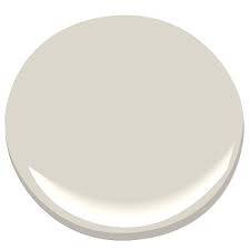
Paint colors like Balboa Mist (OC-27).
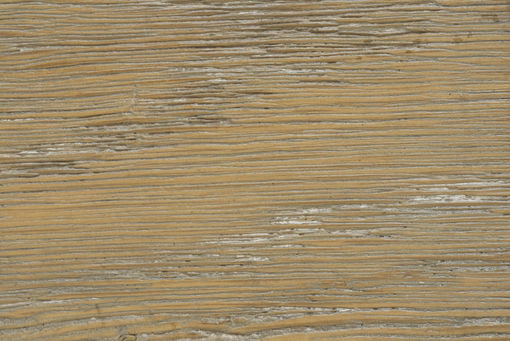
Wood finishes like “Thames Wash” from Fauld.
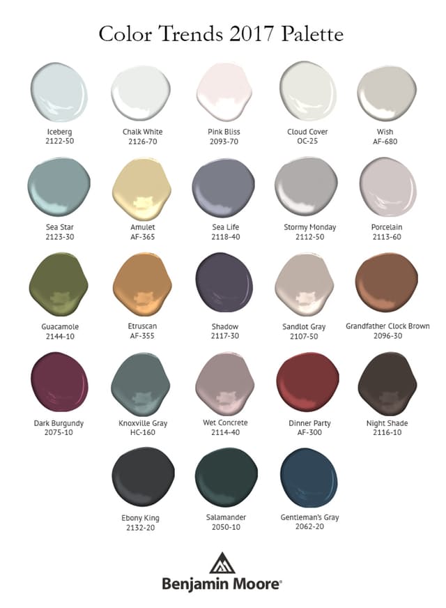
This is the full 2017 palette Benjamin Moore put out along with Shadow. You can see, overall, that this is a much more muted, deeper, richer palette. Personally, I would have plucked out something like nearly-black Night Shade (bottom of the right column).
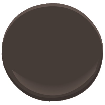
Benjamin Moore Night Shade (2116-10)
I have to say, I wish Benjamin Moore would have included in its trend palette colors from its newest collections: The Williamsburg collection of historic colors, and Color Stories, which is a stunning collection of full-spectrum colors I actually use far more than any other.
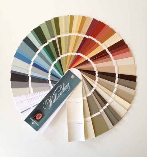
Image via Linda Holt Interiors
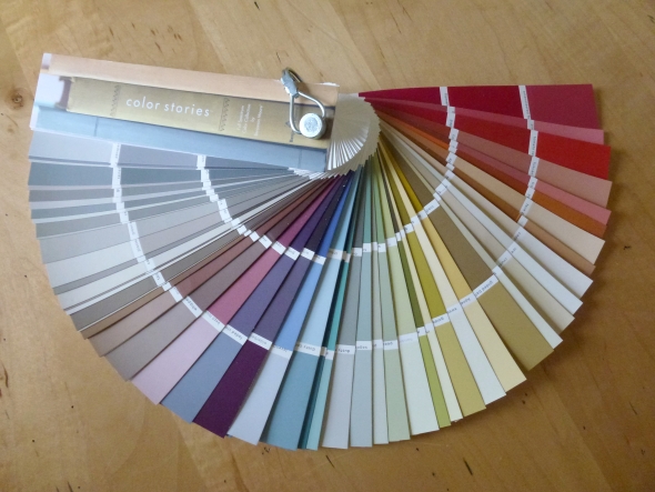
Image via Linda Holt Interiors
What do you think about Shadow? What would your choice for 2017 Color of the Year have been?
I like Shadow as a pick as well. It is refreshingly different as I think many expected some hue of dark blue or green. I especially love it as an accent color and have been drawn to it recently in fabrics. I can also imagine it in a powder room or a small library…it would be warm and cozy.
I like “Shadow” but I think it would need the right lighting. Without sufficient light, I think it will look more like a deep, cool gray.
I agree entirely with you. Shadow is a very nice pick that goes along with the current trend as the Simply White did. And I also agree that I am usually left perplexed over the color of the year choices. Your example of Marsala was a great one. That color never really even took off.