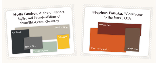
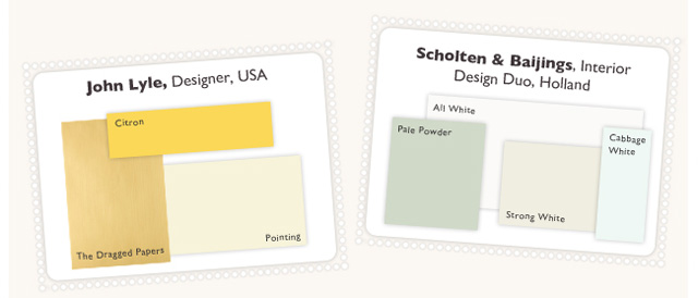
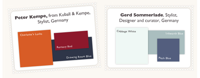
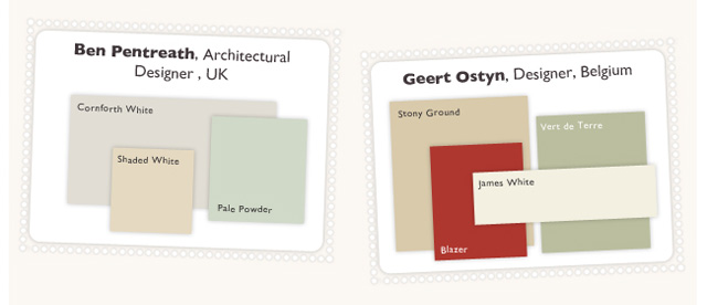
A couple of days ago, I received an email from Farrow & Ball, the fine British paint and wallcovering company, featuring six different interpretations of a color scheme for its home country. Check out the results when they asked eight designers, seven of them non-British, for their take on this assignment.
How interesting! And how telling. Proof positive that there is truly no one “right” solution to a color-related design problem. I just love that of the eight color schemes, only one included Union Jack-inspired red and blue hues. Some of them look downright sunny. Is Great Britain known for sunshine?
I’ve been thinking a lot about culturally and geographically-inspired palettes, but I have to admit I was thinking more about colorful destinations like India, Spain, Italy, Greece, New Mexico – but England? Not so much. Just goes to show you that inspiration really can come from anywhere! Especially when you step away from the cliches and the expected.
To learn more about the inspirations and color schemes from the designers themselves, check out Best of British Colour Schemes on the Farrow & Ball website.
Have you ever been inspired by the colors of a place you love in this world? Enough to create a space in your own home using these colors? Which of the Farrow & Ball British color schemes do you like best?
P.S. I think Cabbage White is just about the best paint color name EVER.


