There’s only one day I like better than install day and that’s REVEAL DAY! Welcome to the unveiling of my Spring 2017 One Room Challenge. Whether you are new here or a regular reader, I would like to welcome and thank you for stopping by! I’m Kelly Rogers of Kelly Rogers Interiors. This blog is where my passions for fabulous interior style, practicality and durability meet (and are not mutually exclusive – I promise!).
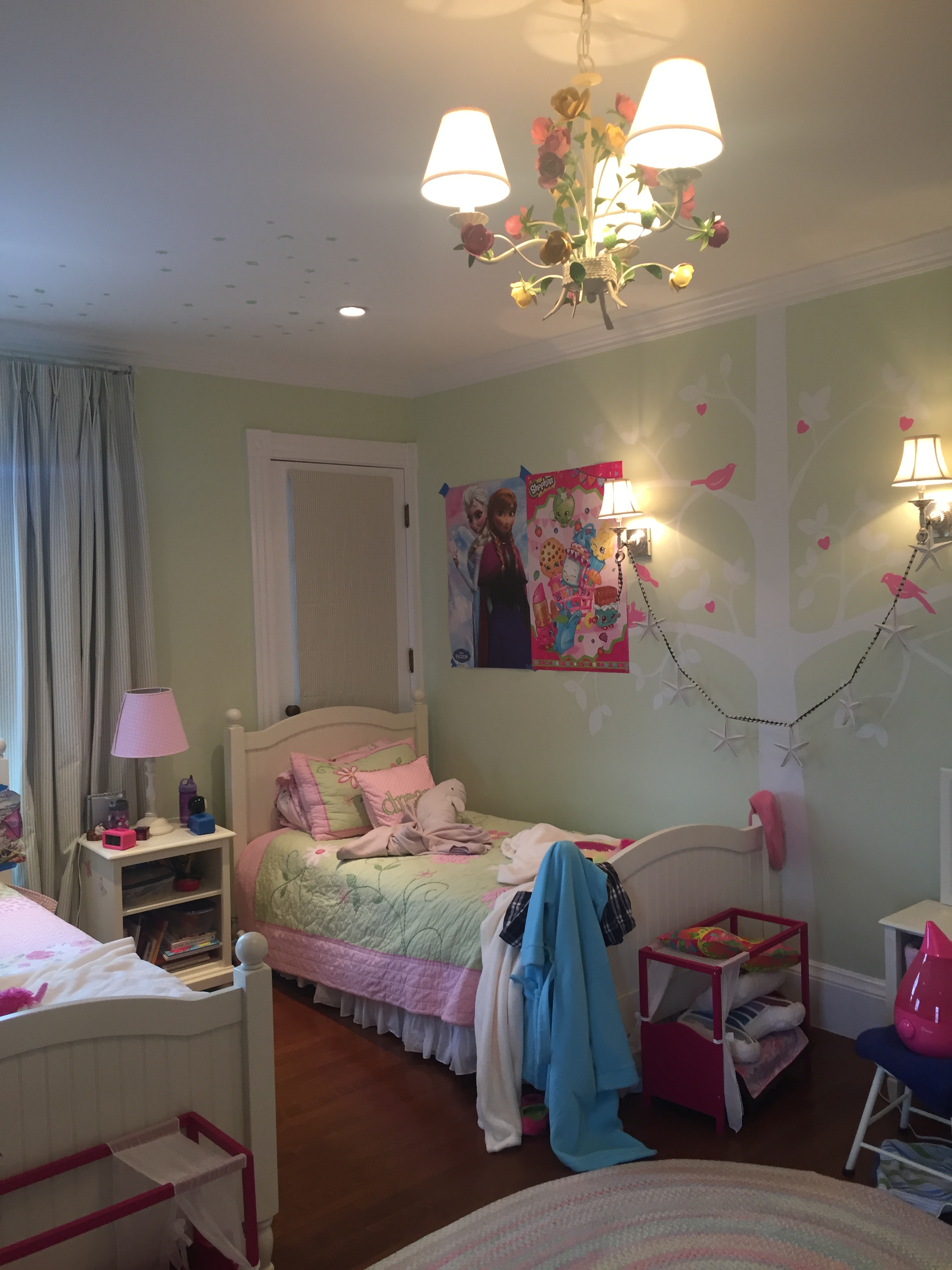
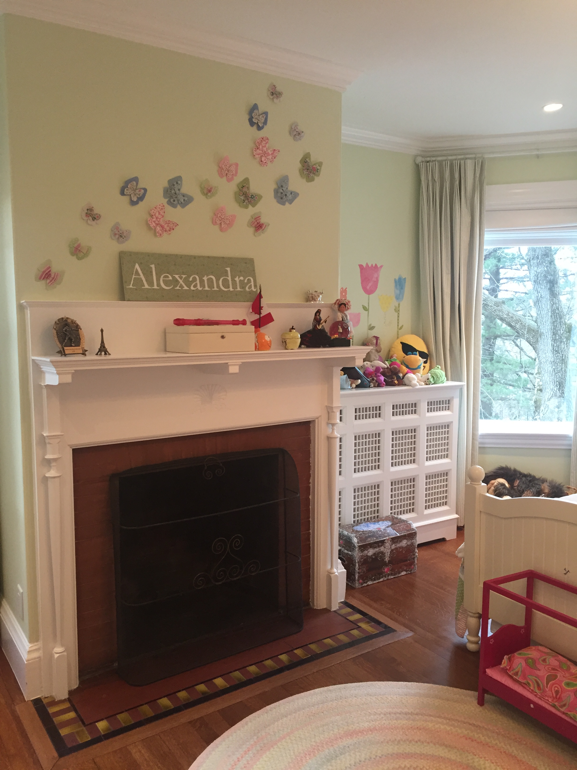
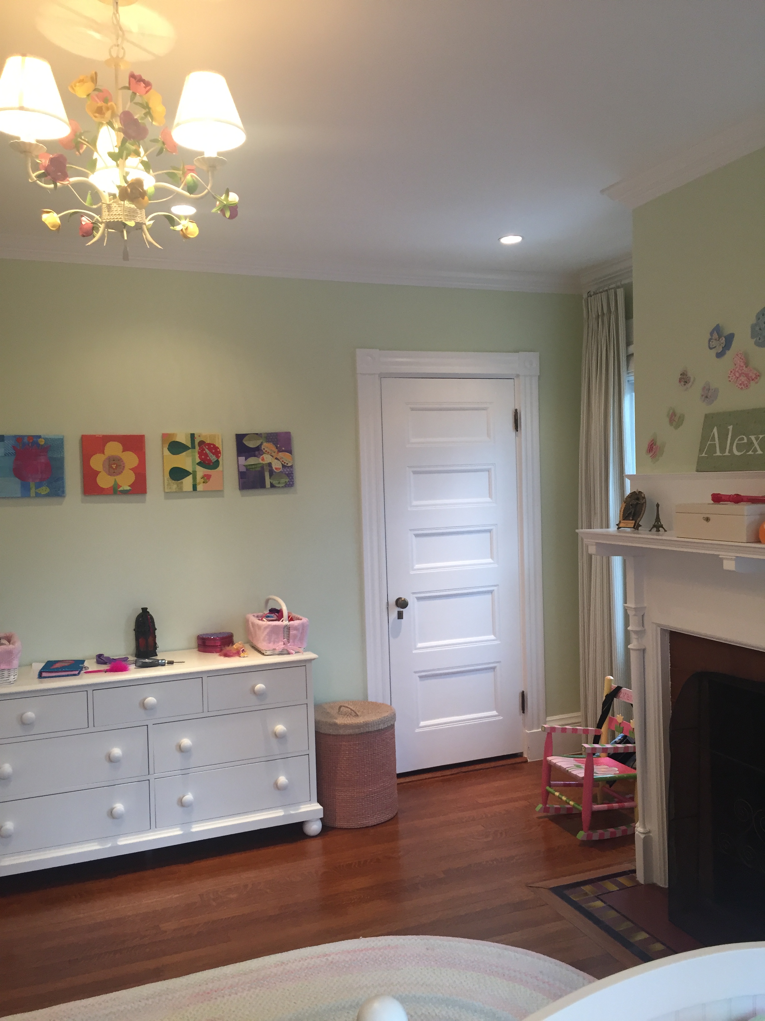
This is my fourth season participating in the ORC, and my first doing the challenge with a client project. My job (and privilege) was to transform the bedroom of a lively and sweet 6-year-old girl from nursery-land to a space that is totally age-appropriate, but can grow with her (and her older sister, who also sleeps here!) well into early adulthood. It’s definitely the fastest I’ve ever completed a client project – just five weeks from concept to completion. Whew! No wonder why I’m so tired. I’ve been blogging the updates in real time – all of the posts are here (and a shortcut to Week 1 if you want to see all the befores) if you are interested in seeing the progress leading up to the finished space.
I know you are probably just scrolling down right now anyway, so I will just show a couple of the before pictures upfront, and then go straight to the afters! I can’t wait to show them to you, either!
BEFORE
BEFORE
BEFORE
[Drum roll please]
AFTER….
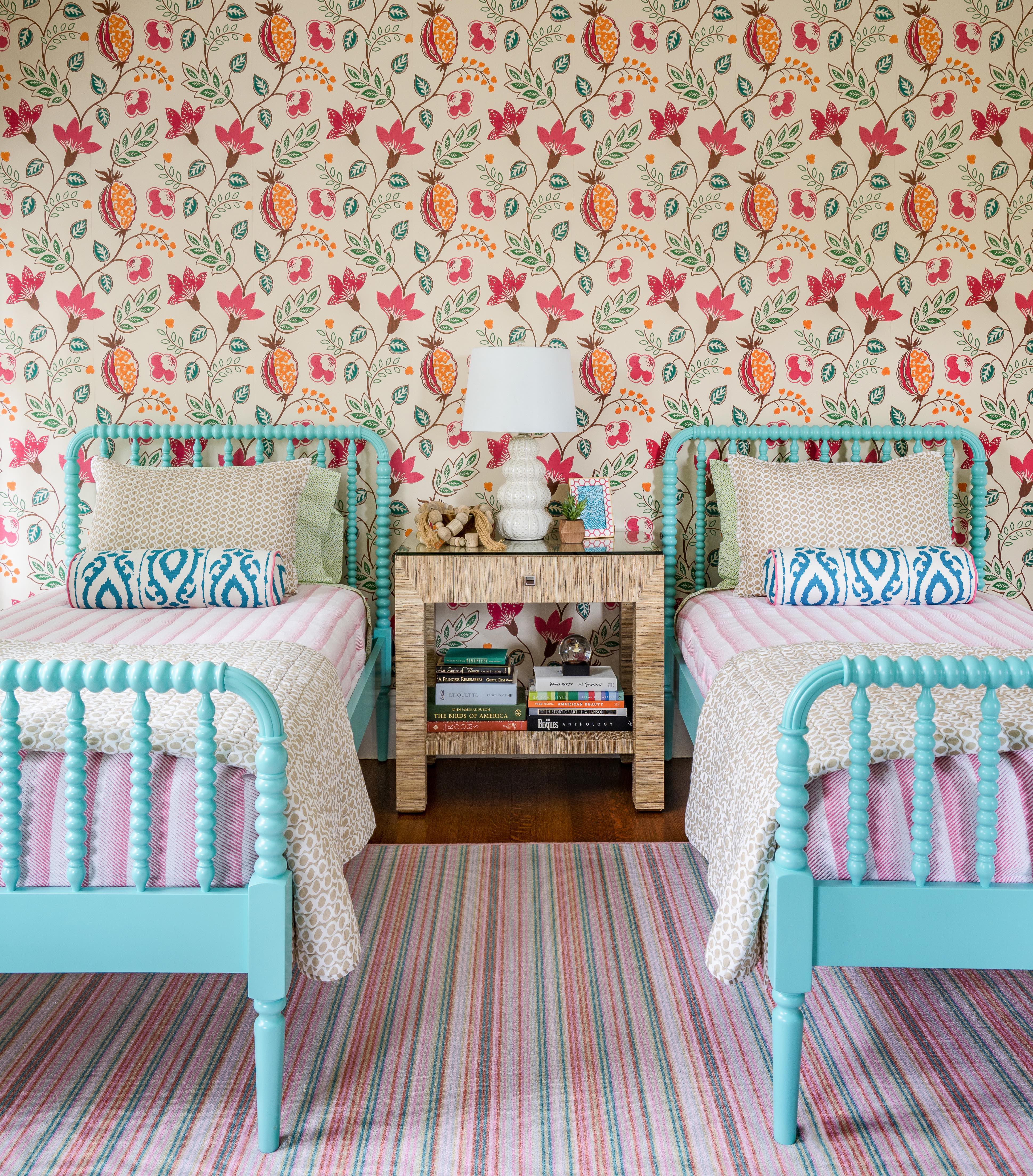
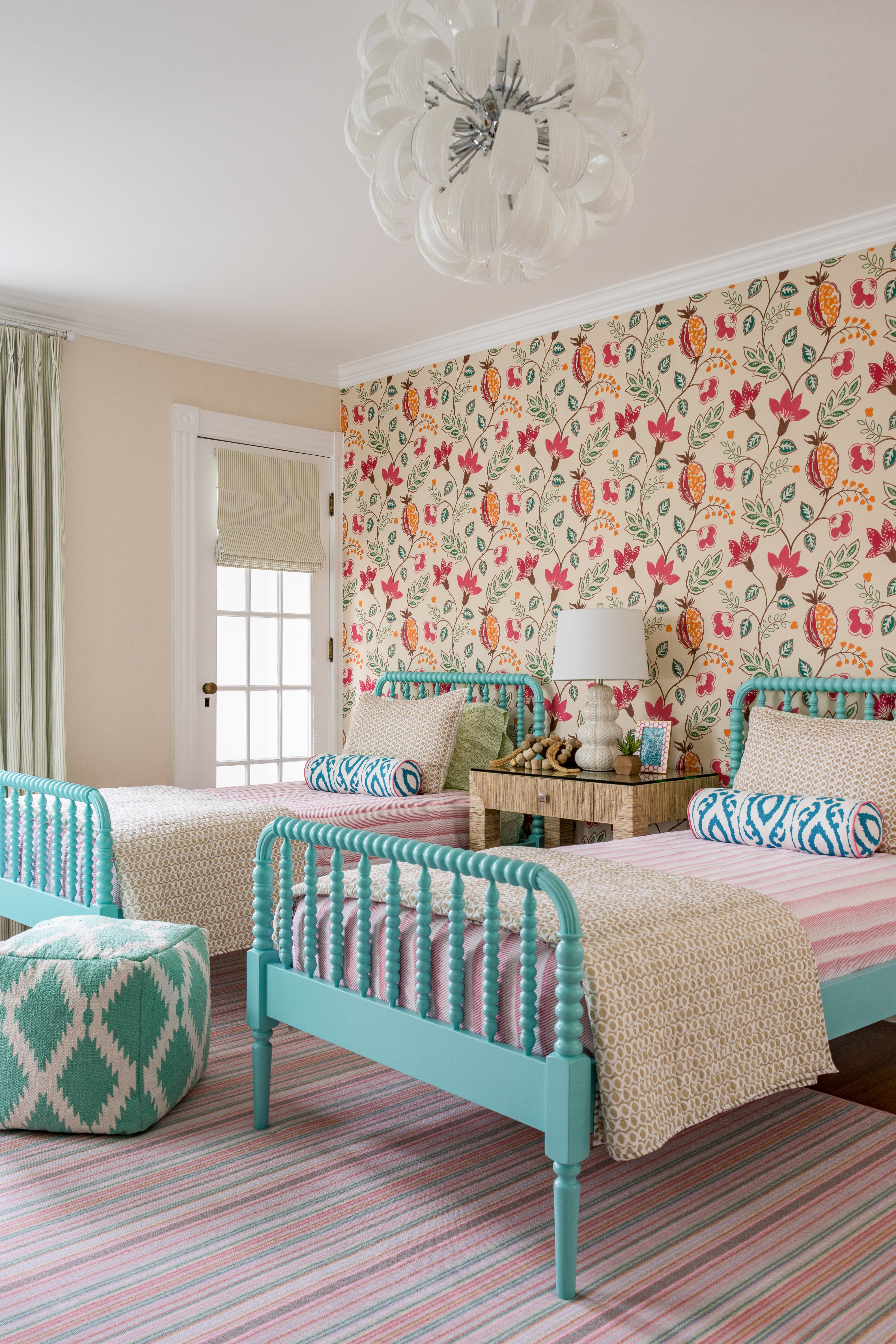
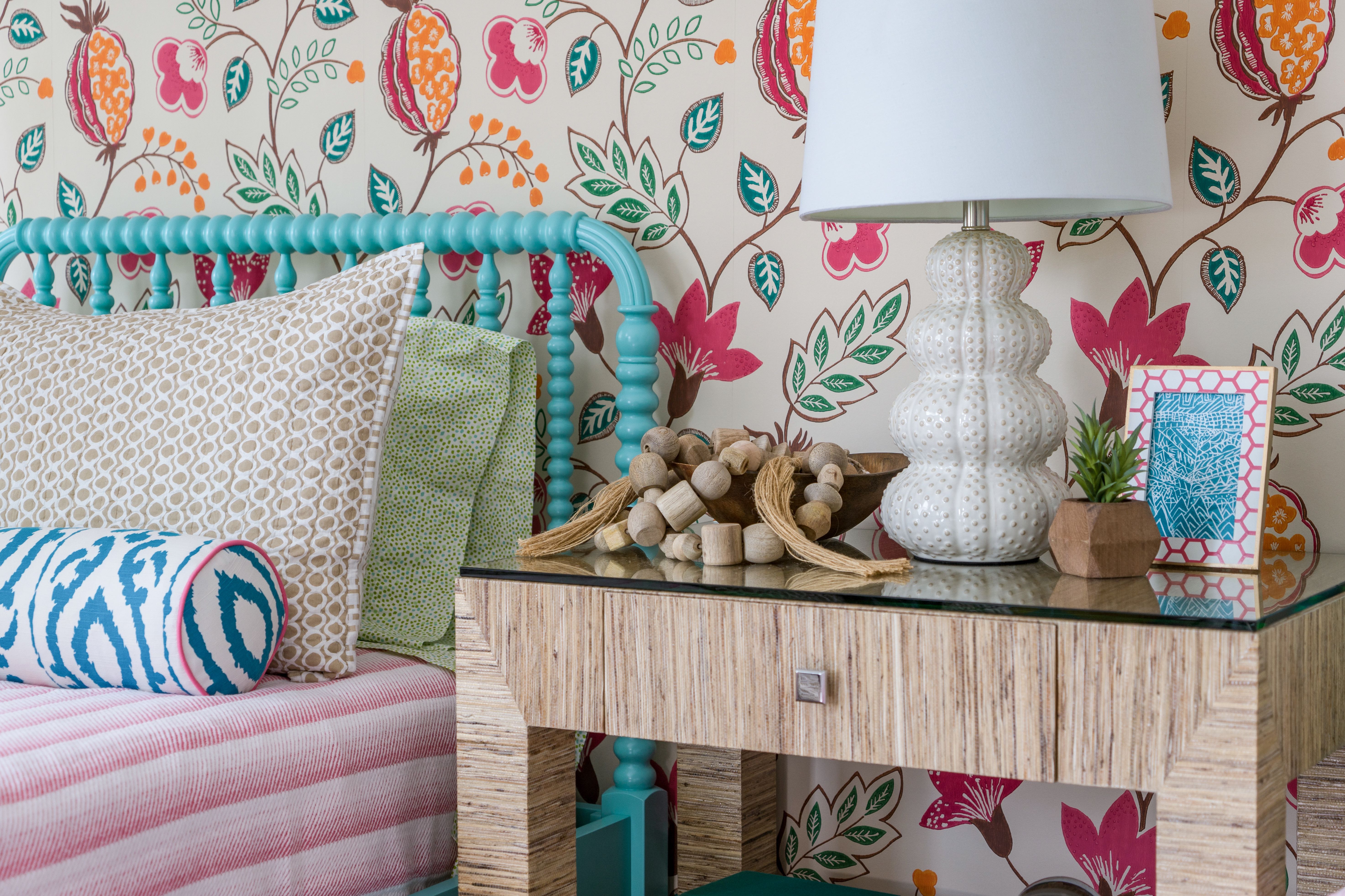
I found one of these turquoise Jenny Lind beds upstairs in the sister’s room; we brought it down and added another as the starting point for the room. I absolutely love them! The next thing we decided on for the room is the wallpaper from Osborne & Little. I love the scale and the vibrant colors of this pattern – it’s a little bit traditional, a little bit tropical, and a whole lot of fun. Moving the beds to this wall allowed us to use the wallpaper as a dramatic accent – no art required! We upsized the nightstand for sharing, and broke up the ‘matchy’ furniture set with this lacquered grasscloth number from Bungalow 5. My lamp unfortunately did not make it in time for the reveal – this one is on loan and stood in very respectably, I think!
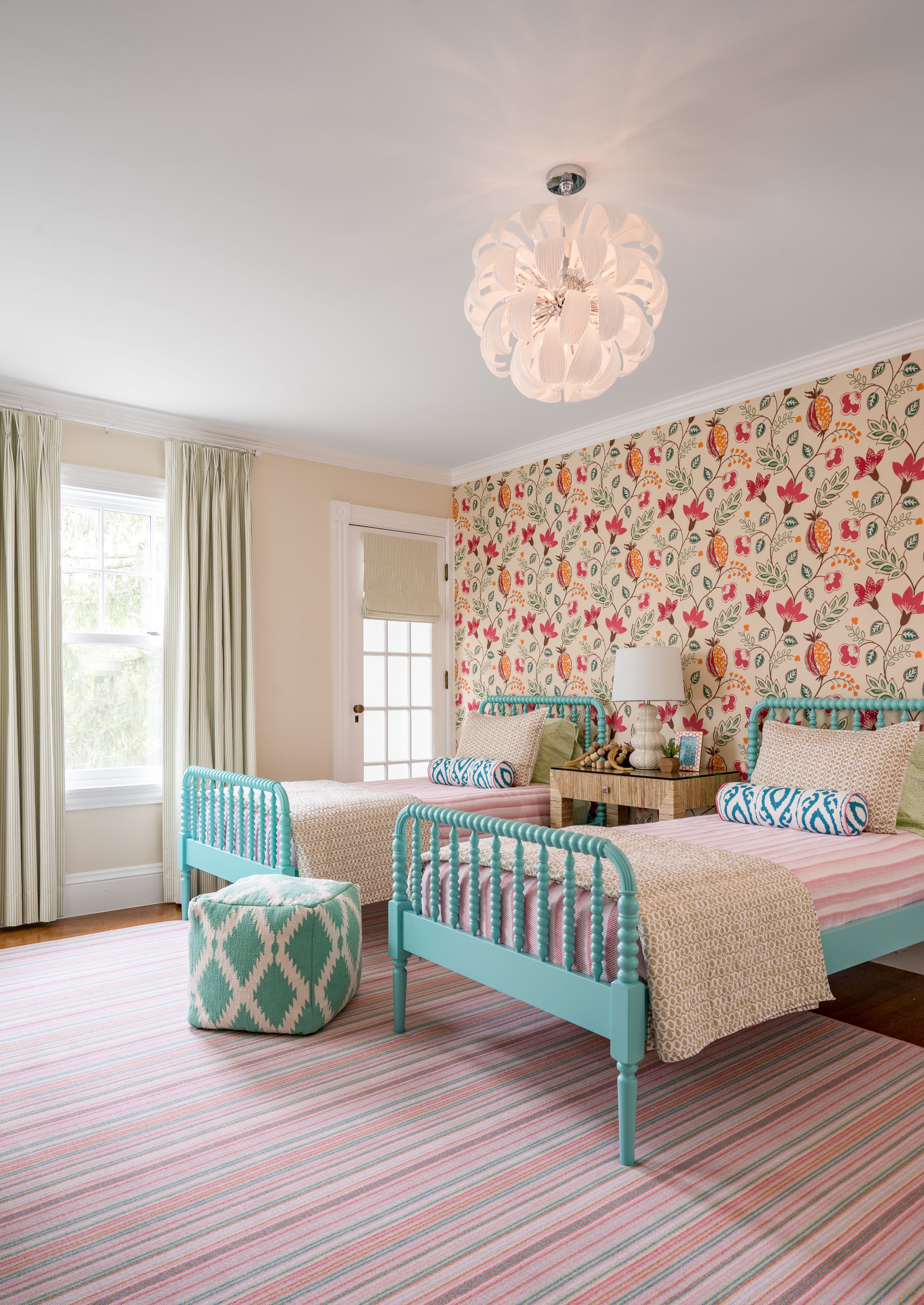
We painted the walls Benjamin Moore Lime White (from the Williamsburg collection, which I use all the time); it blends really well with the ground color in the wallpaper, and provides a light backdrop for all of the punchy accents – it’s all about the balance! I also like the mix of a more traditional off-white and crisp, modern whites in the room. The ceiling got a fresh coat of white (which I don’t always do, but it made sense in this case), and, of course, this stunning light fixture from Cyan Design. It adds a whimsical, modern touch, and a little dash of glamour to the room. Let’s see it illuminated…
It’s just so pretty! I was originally planning to add storage pieces to the end of the beds, but after installing the beds, I liked how it felt airy, and there is plenty of floor space for the girls to spread out with books, games, dolls, or homework – and that’s so critical in any kids’ space! The rug did not disappoint, either – I love how it brings the whole color palette together in a somewhat softer way than the wallpaper. I had it cut and bound from broadloom carpet, which allowed us to make a non-standard size (which I do all the time, because I often need funny sizes…).
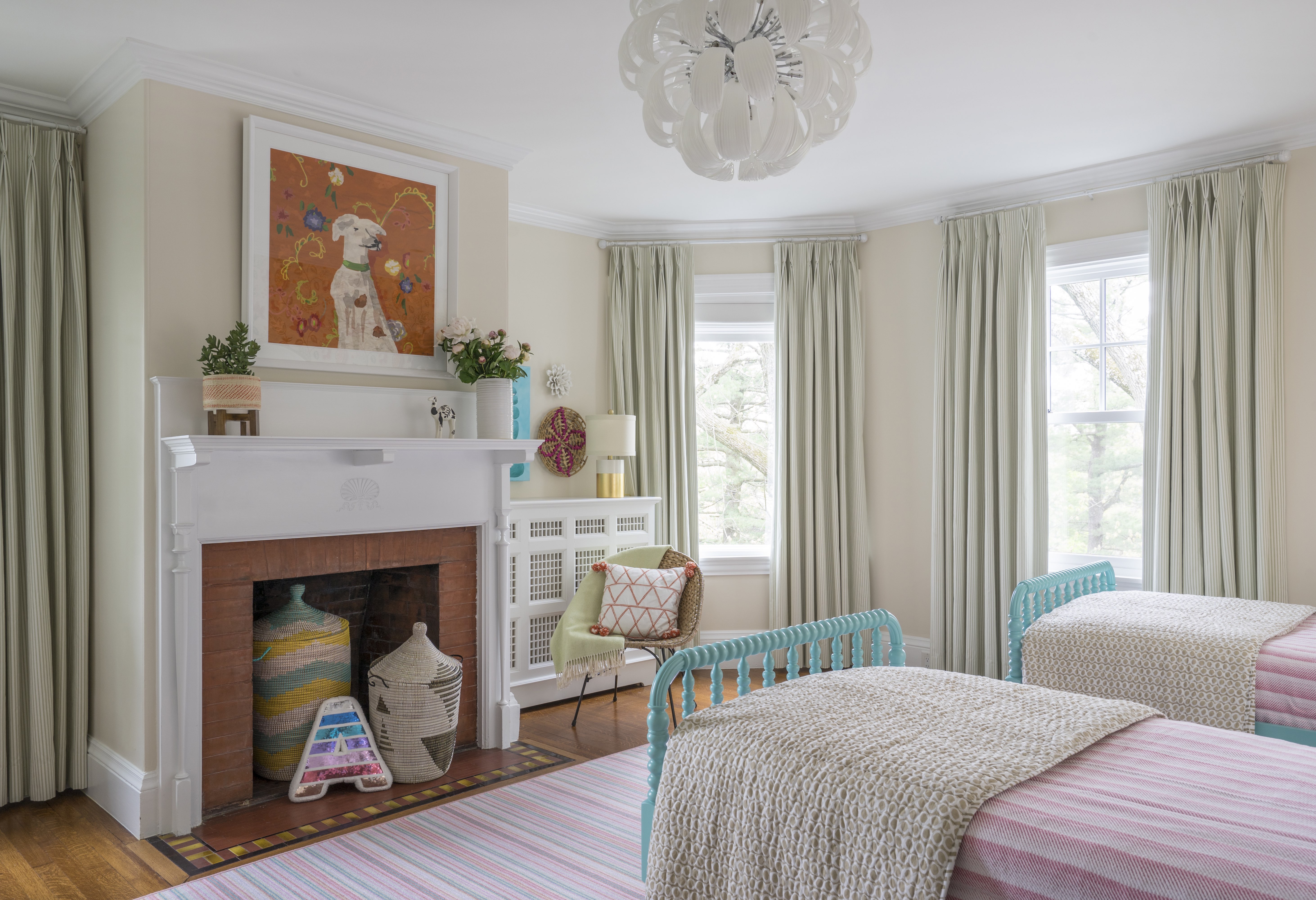
Surprise! The ‘Arlo’ dog portrait (from Dana Gibson’s collection for Soicher-Marin), which I had thought was weeks from arriving, surprisingly showed up nearly a week before my photo shoot! I could not believe it. And he does not disappoint – I love this puppy portrait! The orange color helps the circa 1896 brick fireplace surround and tiled hearth blend nicely with the new decor – I wasn’t about to change those original details! The inside of an unused woodburning fireplace provides a great place to stash extra blankets, stuffed animals, and toys in cool lidded baskets. The ticking-stripe draperies are gorgeous, but I can take no credit for them – they’re one of two things in the room that stayed, and I think they look even more marvelous with all the new stuff.
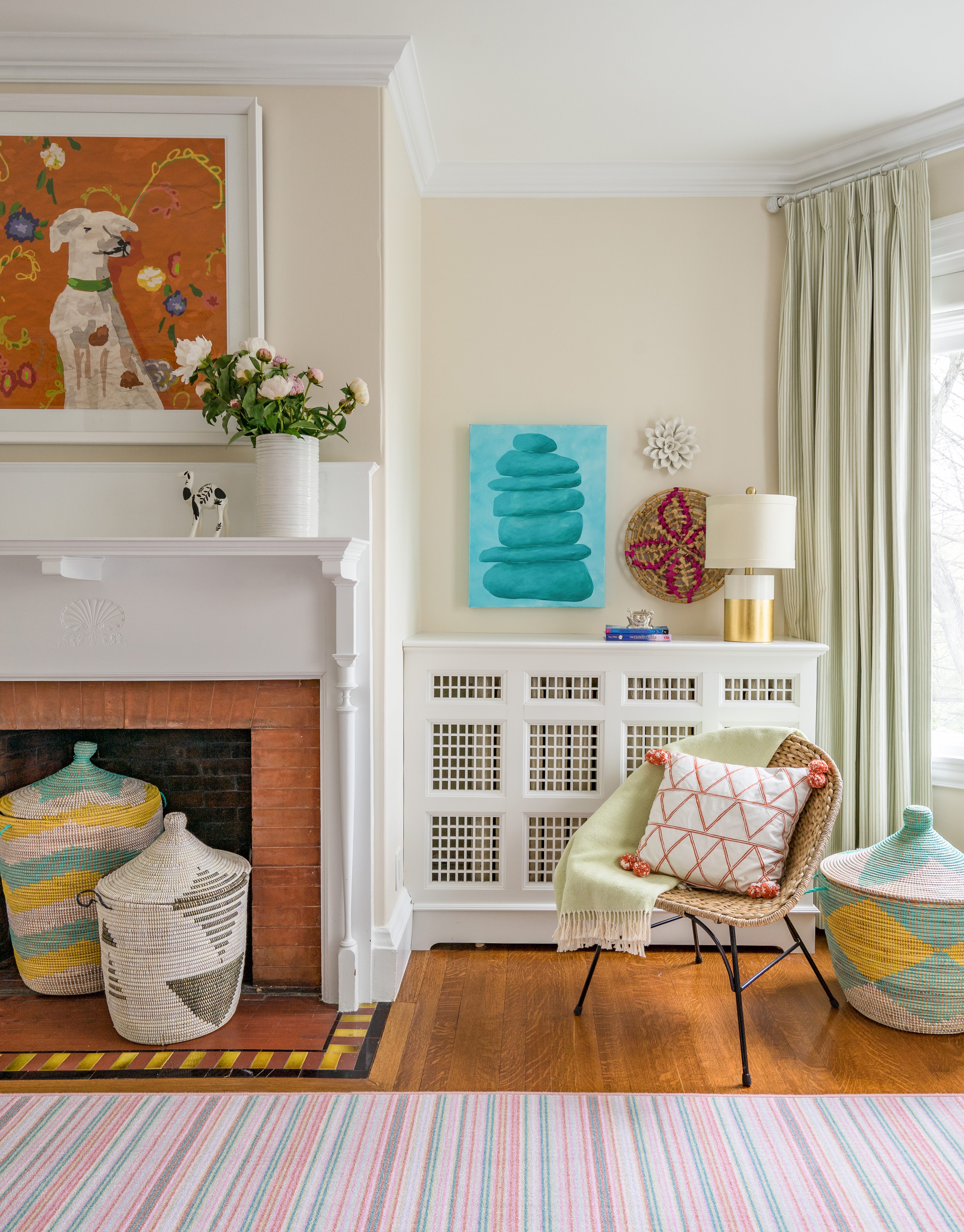
Rotating the beds freed up space on this side of the room to create a little reading corner. And I had fun dressing up the radiator cover. Target was also a surprisingly fruitful source for me this ORC – I couldn’t believe some of the great stuff I scored there! [Including five things in this picture alone]. The turquoise Cairns painting by Stephanie Henderson is both vibrant and meditative. I could stare at it for hours…perfect for a bedroom.
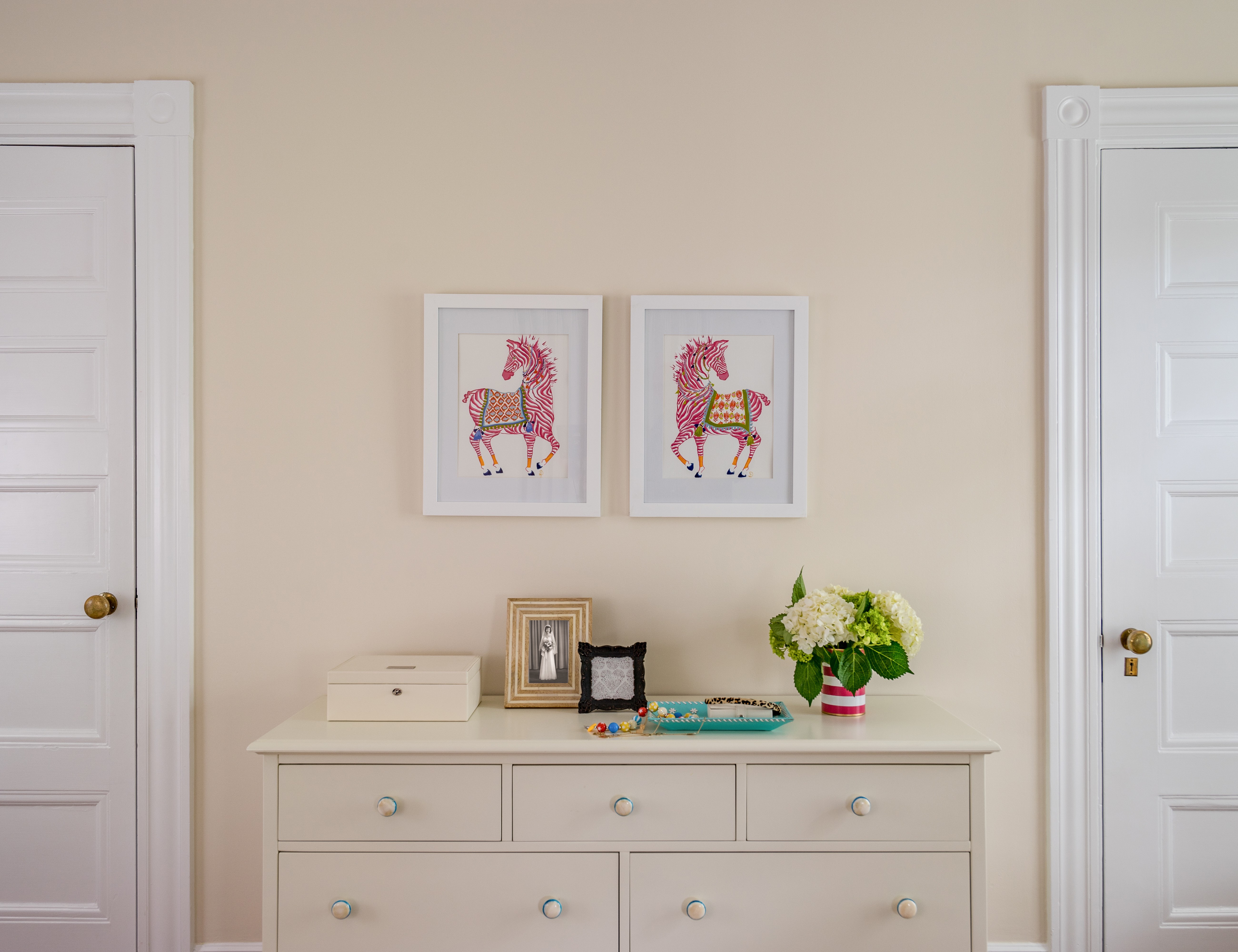
The other piece that stayed in the room was the dresser (which matched the original beds, and the original nightstand). We made just one update – removing the chunky painted wood drawer hardware and replacing it with resin knobs that look like bone inlay, with just a subtle stripe of turquoise around the outer edge. The zebras were found at Elizabeth Home Decor, one of my favorite local sources for art and accessories (owned by one of my good designer friends, Elizabeth Benedict).
I knew I wanted to mix it up with the bedding, and my client’s only request was that it be machine washable. I concurred, and obliged! The blanket, quilt, sham, and sheets are all from Pine Cone Hill – great quality, fun designs, and I get to support a Massachusetts-based business (Annie Selke)! They were kind enough to provide the shams gratis (which I had forgotten about in my first order…oops). The bolster pillows made with a favorite Dana Gibson print are the icing on the cake.
The real reveal actually happened last week, when the girls got to see the bedroom for the first time. My client sent me a video, and I loved seeing their reaction. They were rolling around on the rug and didn’t want to leave! As the mother of two boys, I kind of didn’t want to leave either. But alas, I shall have to live vicariously through my visits to the client (with whom I’m also working on some other things), as well as the wonderful photos taken by Eric Roth, who squeezed me into his very busy schedule.
So many folks have worked tirelessly over the past six weeks to bring you some pretty incredible transformations. Please give them some love – both the sponsored bloggers and guest participants.
Sources
- Beds: Land of Nod
- Nightstand: Bungalow 5
- Light Fixture: Cyan Design
- Wallpaper: Osborne & Little
- Paint: Benjamin Moore Lime White
- Bedding: Pine Cone Hill
- Bolster Pillows: The MT Company; Dana Gibson fabric
- Rug: Williston Weaves
- Dog Portrait: Dana Gibson for Soicher-Marin
- Cairns Painting: Stephanie Henderson via Libby Silvia ArtStyle / Elizabeth Home & Decor
- Storage Baskets: West Elm
- Water Hyacinth Chair & Pillow: Threshold for Target
- Framed Pink Zebras: Elizabeth Home Decor
- Drawer Knobs: MJ Hooks (Etsy)
Acknowlegements
- Thank you to Osborne & Little for extending a generous discount on their beautiful Benvarden wallpaper.
- Thanks to Annie Selke / Pine Cone Hill for providing the shams.
- To Elizabeth Home & Decor – thank you for letting me borrow the table lamp!
- Much gratitude to Linda at Calling it Home for creating this venue for hard work and creativity, and allowing us all to play. Can’t wait until next season!
- Lastly, I could not have done this without the partnership and enthusiasm of my client and her daughter. The ORC is no cakewalk, but they were on board from day one, providing quick feedback/approvals, being flexible at every turn, and showing extreme patience during the two days when I basically took over the room for the install and photo shoot. In a way, it was even smoother than doing a room in my own house – they were much more decisive than I ever would have been, and that is so important in the ORC!

Kelly! What lucky little girls!! This is young lady perfection!! xokim
This is gorgeous, Kelly! I love the mixed prints and all of the color and textures. These sisters are very lucky to have such a beautiful space.
OH, I love it! What a sweet room. That nightstand, art, and bedding just elevate it yet it is so perfect for a kids room without feeling too stuffy. Well done, such a vibrant and fun space! xo
Nailed it! Love it. Great job.
Absolutely fabulous, Kelly. So happy. You never fail to disappoint! Imaginative, colorful, and patternful — but never overwhelms the eyes. Congrats!
Kelly! This is stunning! Just love your work. The color mix is to die. Your should have been in the 20, this should seal your spot! Love it all
So beautiful Kelly (as usual with your designs!) Love it! Congrats
Perfection! That wallpaper! Congrats!
Those are two lucky little girls. What a fun room!
Kelly, this is straight up gorgeous. I love the color and texture. There’s so much for the eye to gobble up. Amazing room! Well done, girl.
what a difference! it’s amazing and looks like something out of domino!
Kelly, this is absolutely beautiful! You had me at the color from the beginning (major blue and coral crush)! Those beds with the colorful wallpaper make this room! I know my girls would love this room and I’m sure your clients do too! How fun is the dog art piece?! Bravo on a job well done! XOXO, Sarah
Wow, this room is gorgeous! It’s going to be the perfect place for growing up. It’s both sophisticated and fun, and the colors are really pretty. Love the wallpaper and beds!
This is so pretty! Those spindle beds are just so perfect. Love it all!
Oh how I love this room. You had me with those aqua beds, but the wallpaper and rug totally sealed the deal. It’s just perfect. Congrats! Susie from The Chelsea Project
Featured on Home Glow’s Saturday Blog today as one of my favs for this ORC season. Love it! http://homeglowdesign.com/2017/05/13/winner-2017-spring-one-room-challenge/
The patterns and colors are perfection! It’s such an amazing transformation. I love it!
What a cute girl’s bedroom! Love those beds and the way the rug mixes with the wallpaper too!
I must say you have very interesting posts here.
Your content can go viral. You need initial boost only.
How to get massive traffic? Search for: Murgrabia’s tools go viral