It’s finally here! The day all One Room Challenge-ers I have been waiting for. Week 6. For me, the big reveal of Project Vestibule. Big. HUGE. I blogged about the photo shoot that produced these pictures last week, and since then I’ve been practically jumping out of my skin fighting the urge to just put them out there already! Now that the day has arrived, I’m feeling a little gun-shy. I get really excited to have beautiful pictures of my work, but then that doubt creeps in. What if it’s a bit of a let-down after all of this build-up? What if they just don’t like it? Putting myself out there like this is at once exhilarating and completely terrifying. I suspect many other ORC folks feel the same way.
[Newcomers may get caught up, if so inclined…Week 1 | Week 2 | Week 3 | Week 4 | Week 5]
Deep breath…
OK, here goes. (Complete source list at the bottom of the post, FYI!)
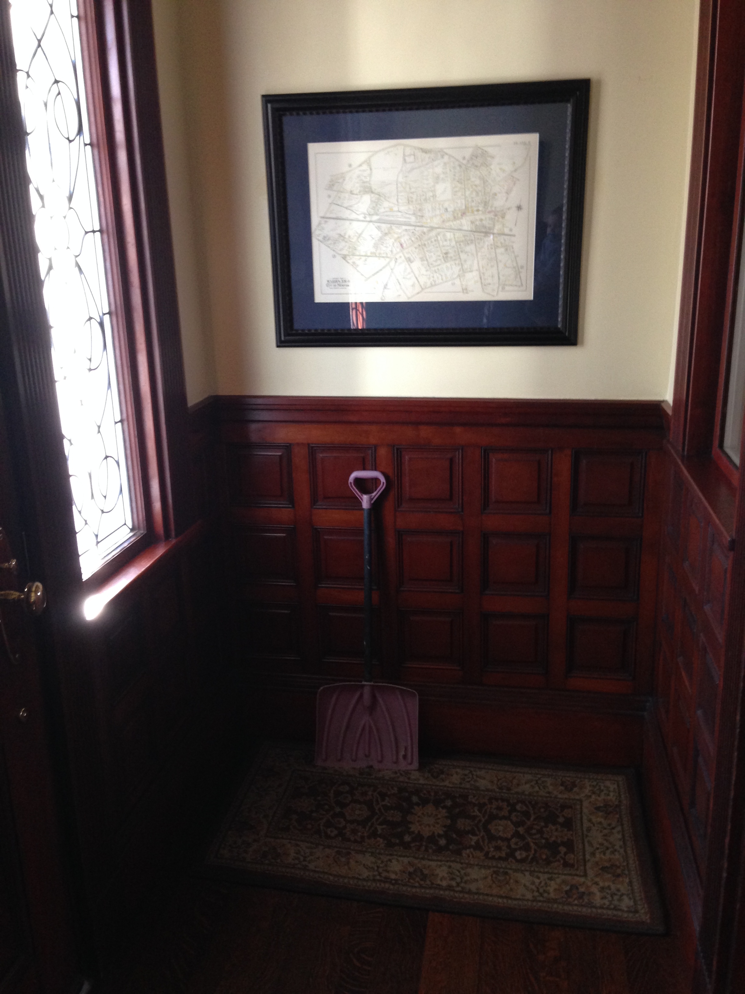
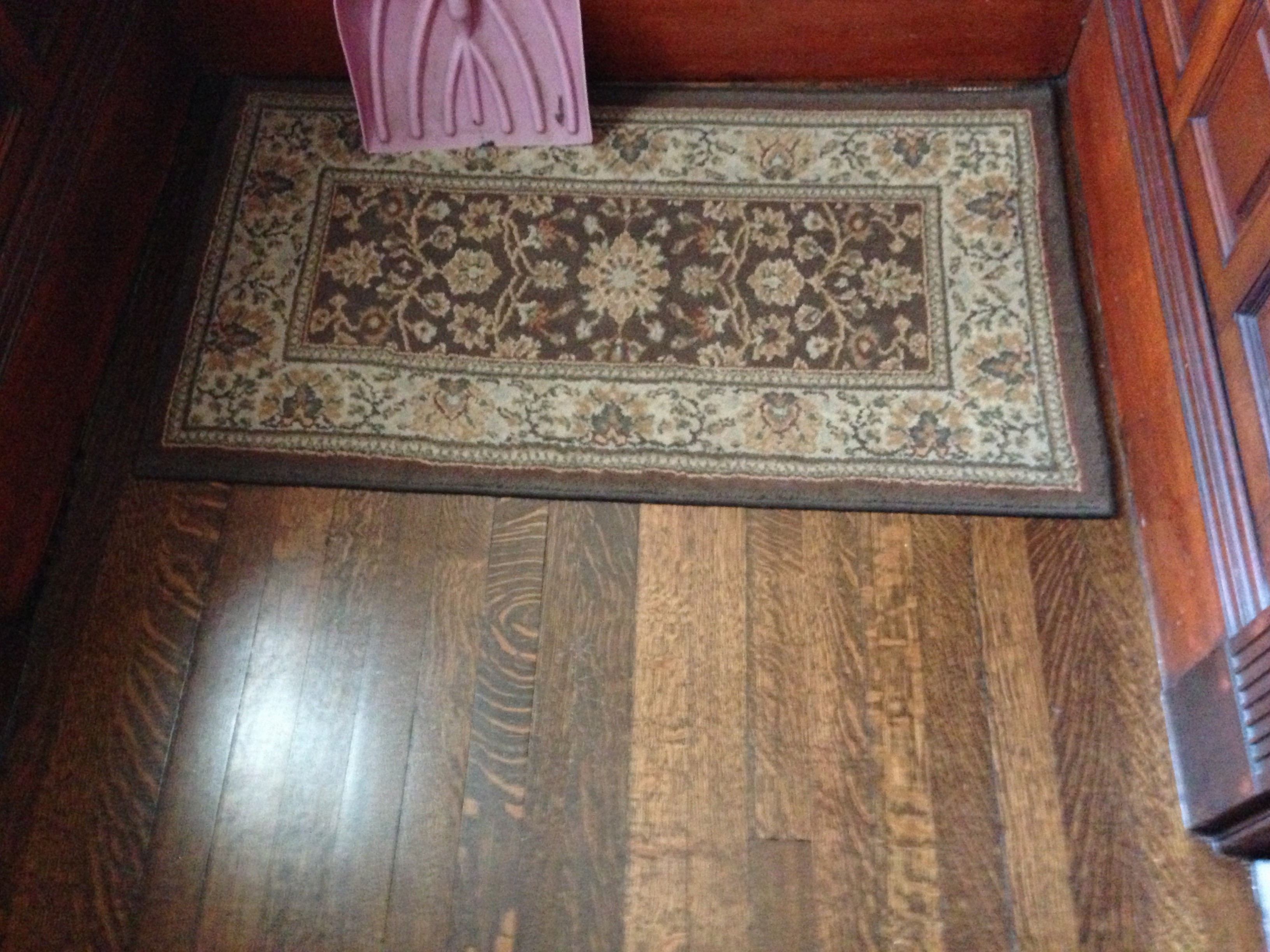
Before…an area I simply hadn’t addressed, functionally or decoratively, in the two years we’ve lived in this house.
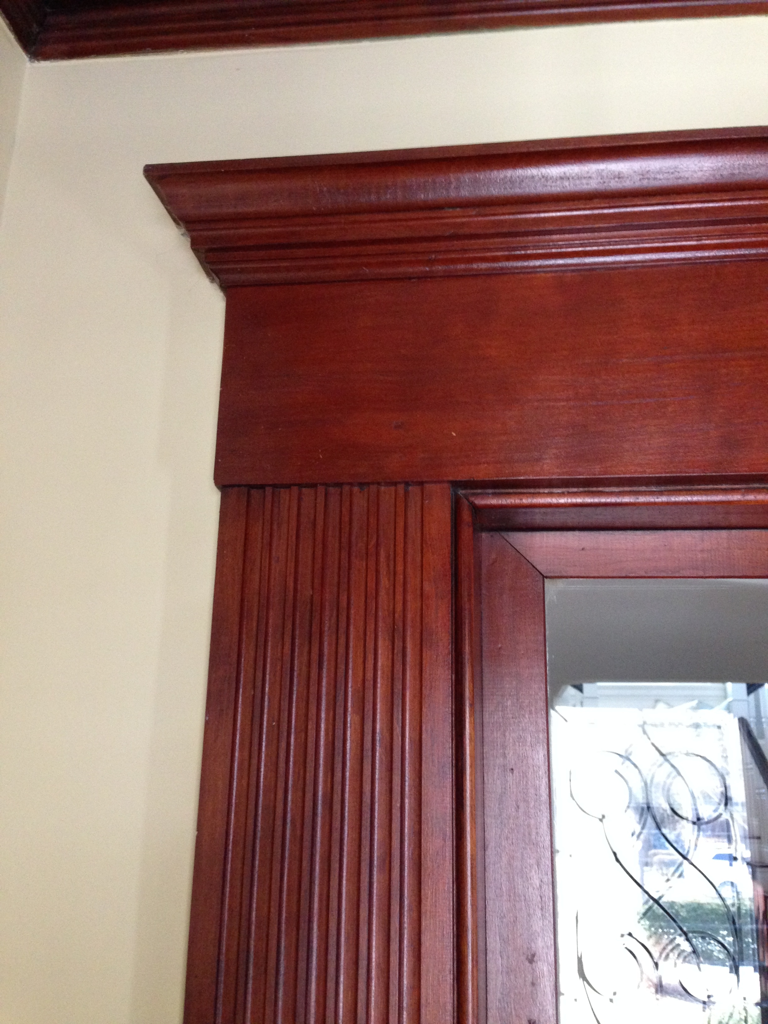
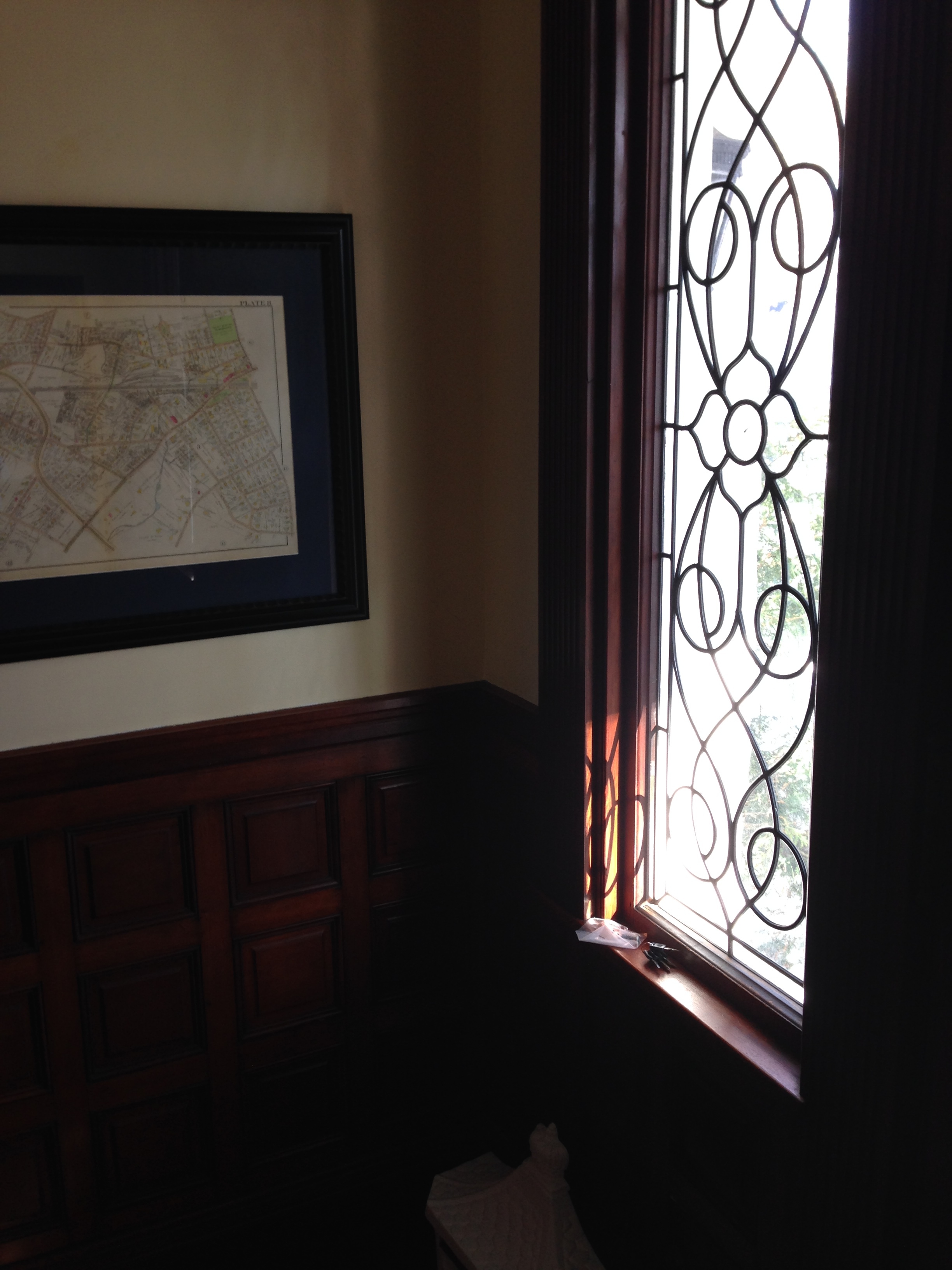
And this is the all-important “first impression” space – the first thing visitors see when they arrive. I mean, I didn’t even have a darn rug on the floor to step on when you walked in the door. Even my husband was starting to bug with me to do something about it already! And all of those beautiful features – the original leaded glass side kites and woodwork – just sat there calling to me…”For the love of God…DO something already!”
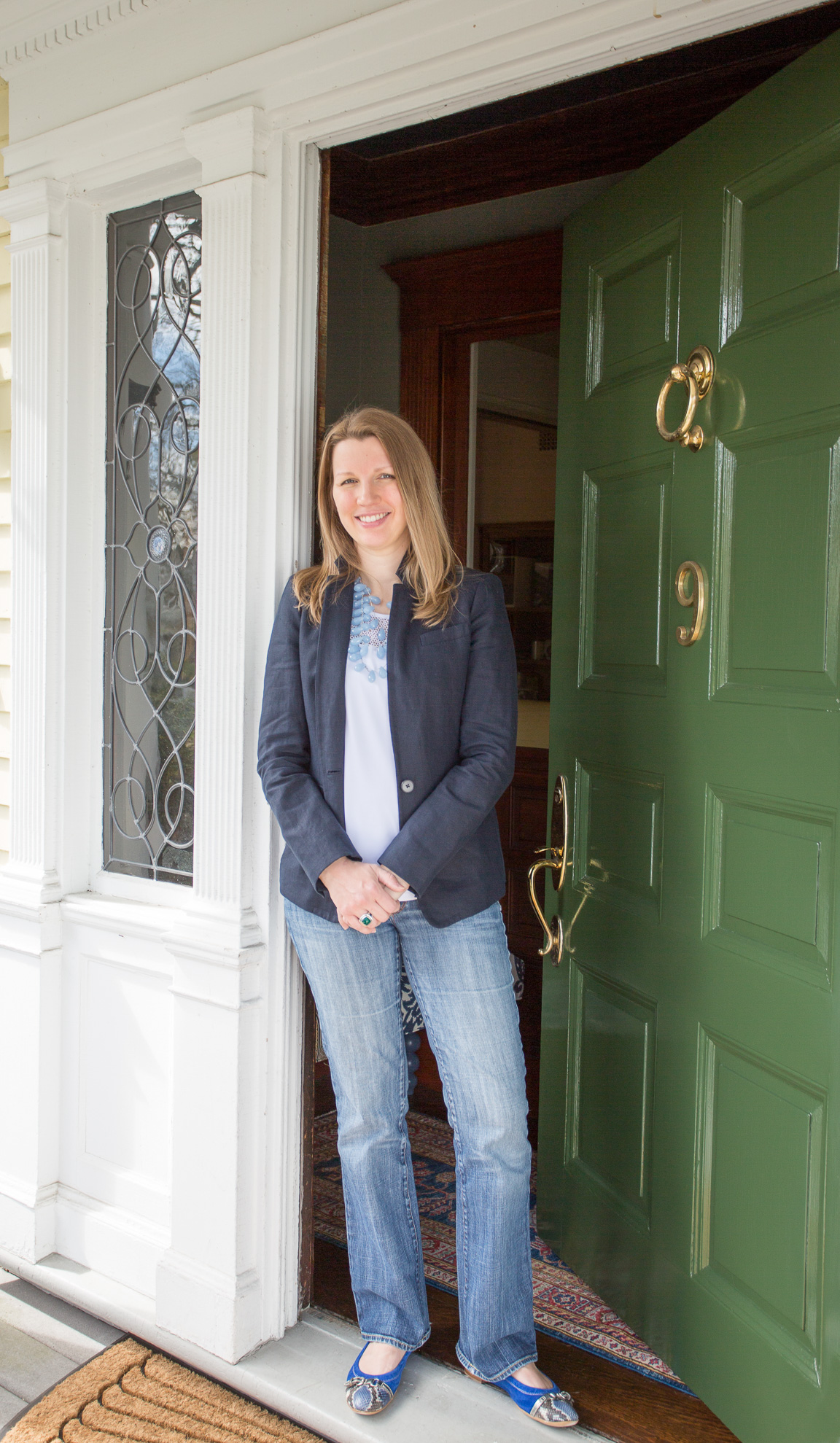
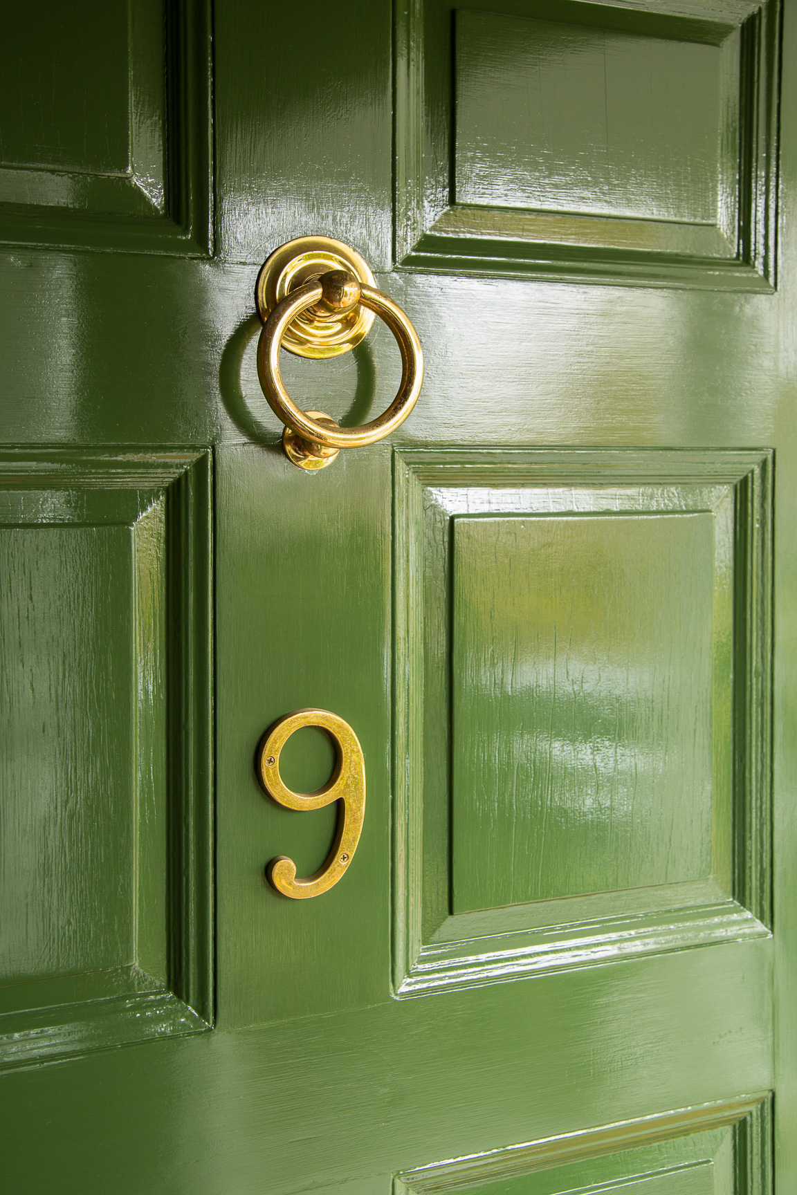
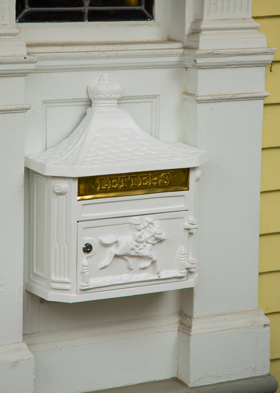
And AFTER! First, a peek outside…
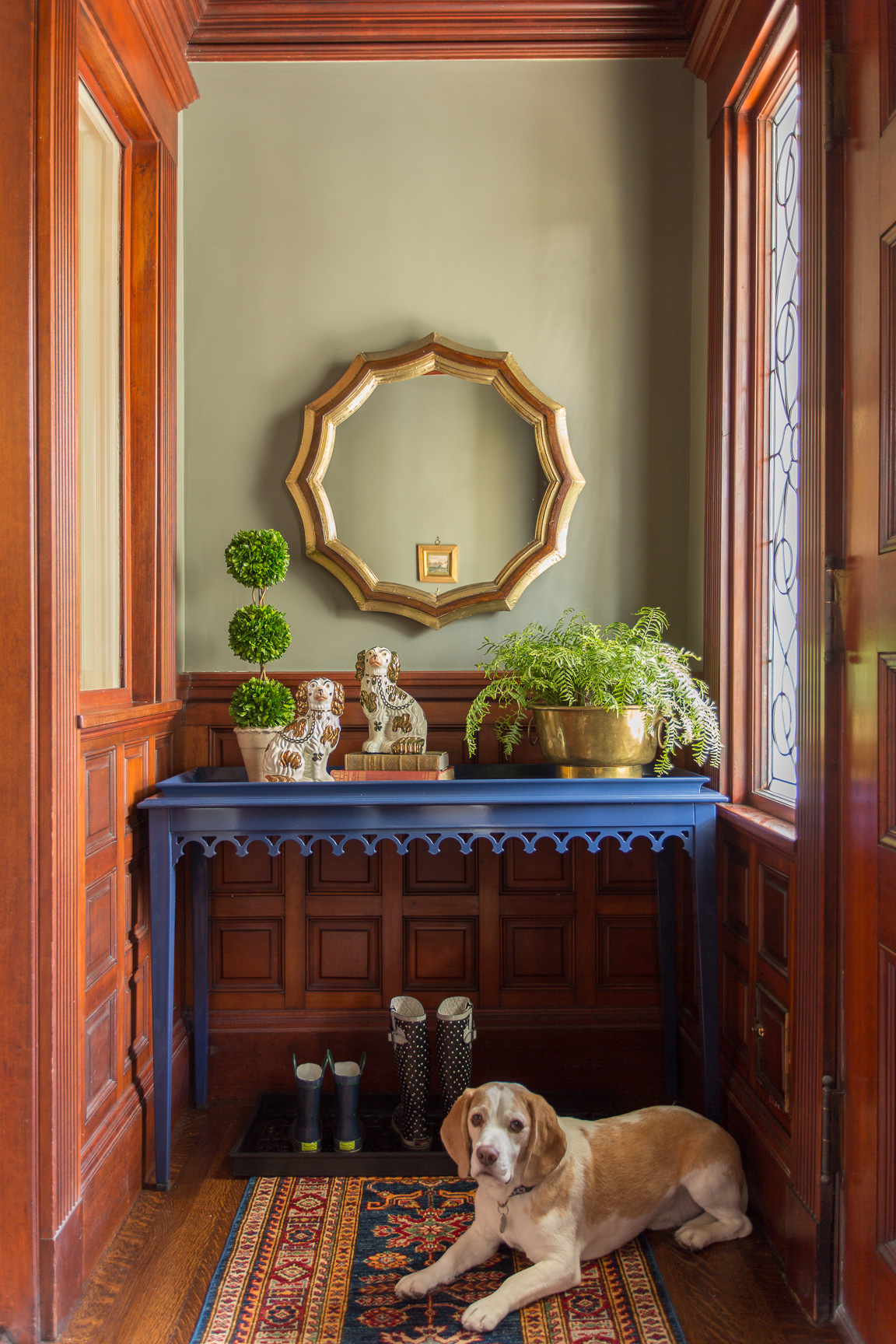
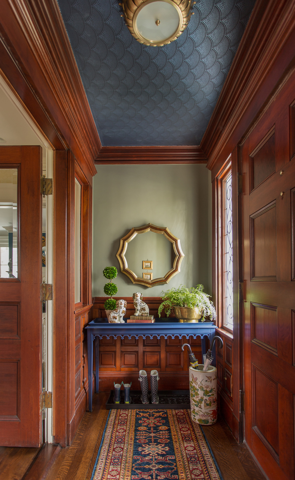
Now come on in (and please do step on the rug!)!
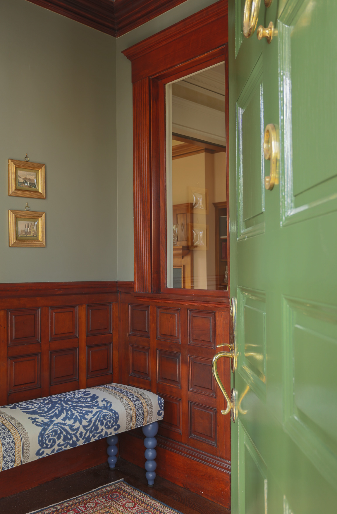
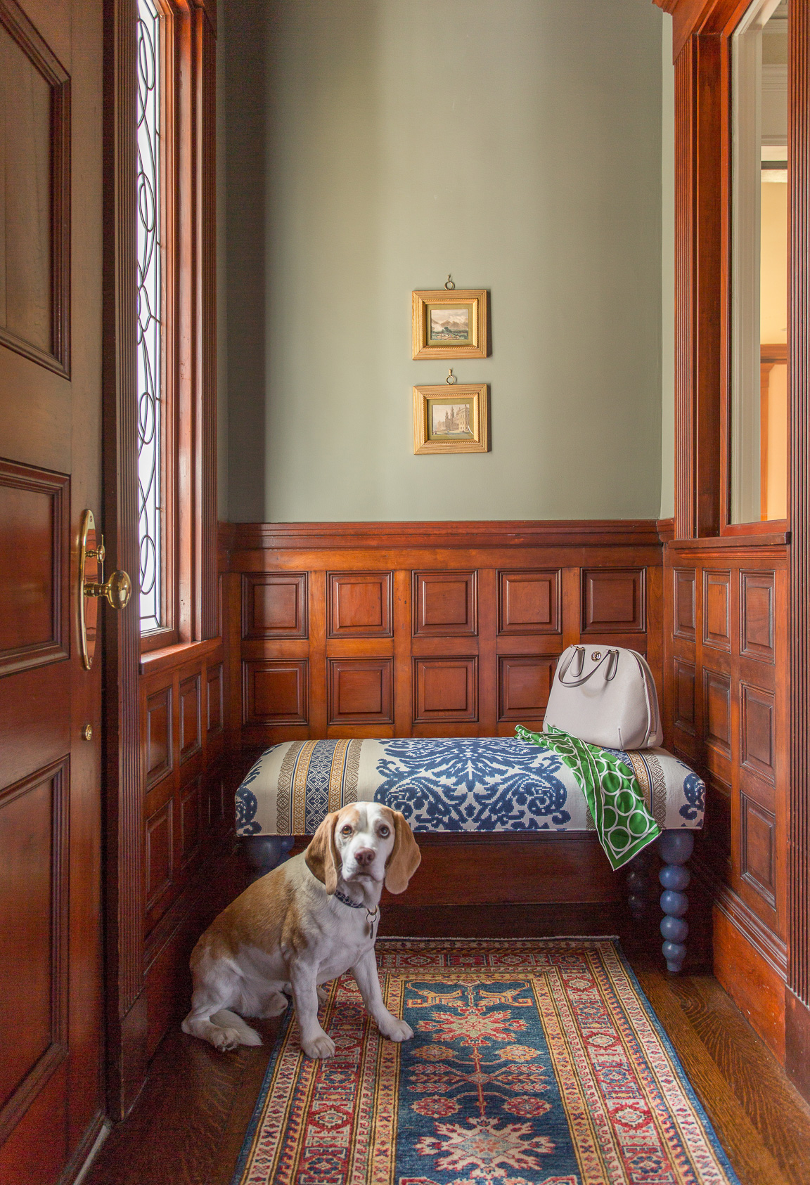
I know…my dog is totally a scene-stealer.
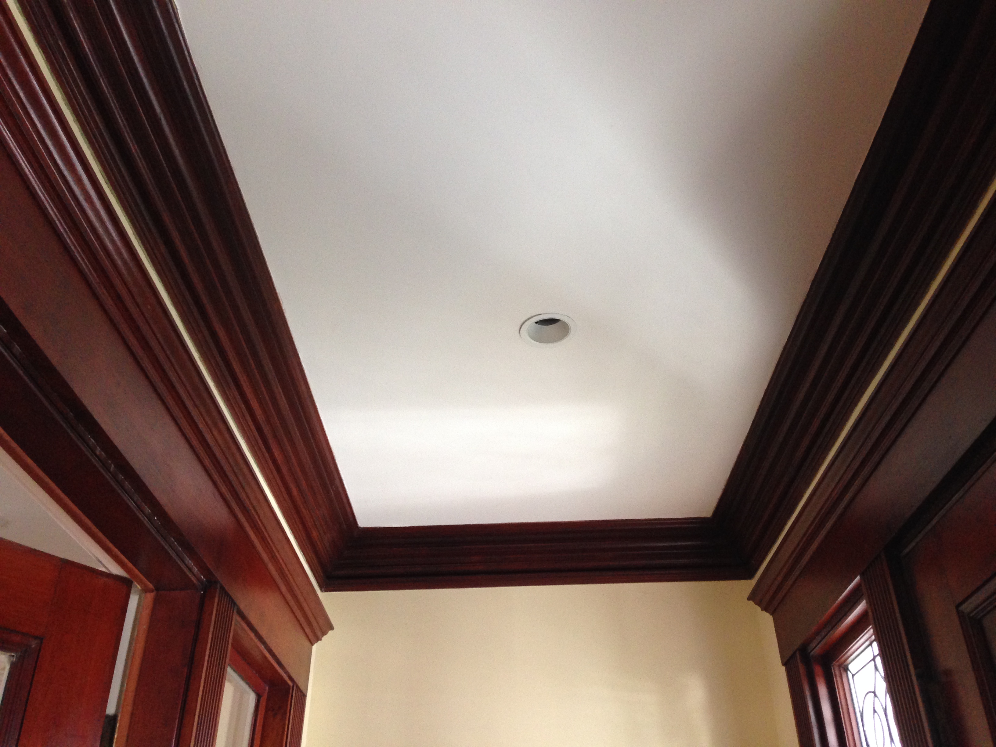
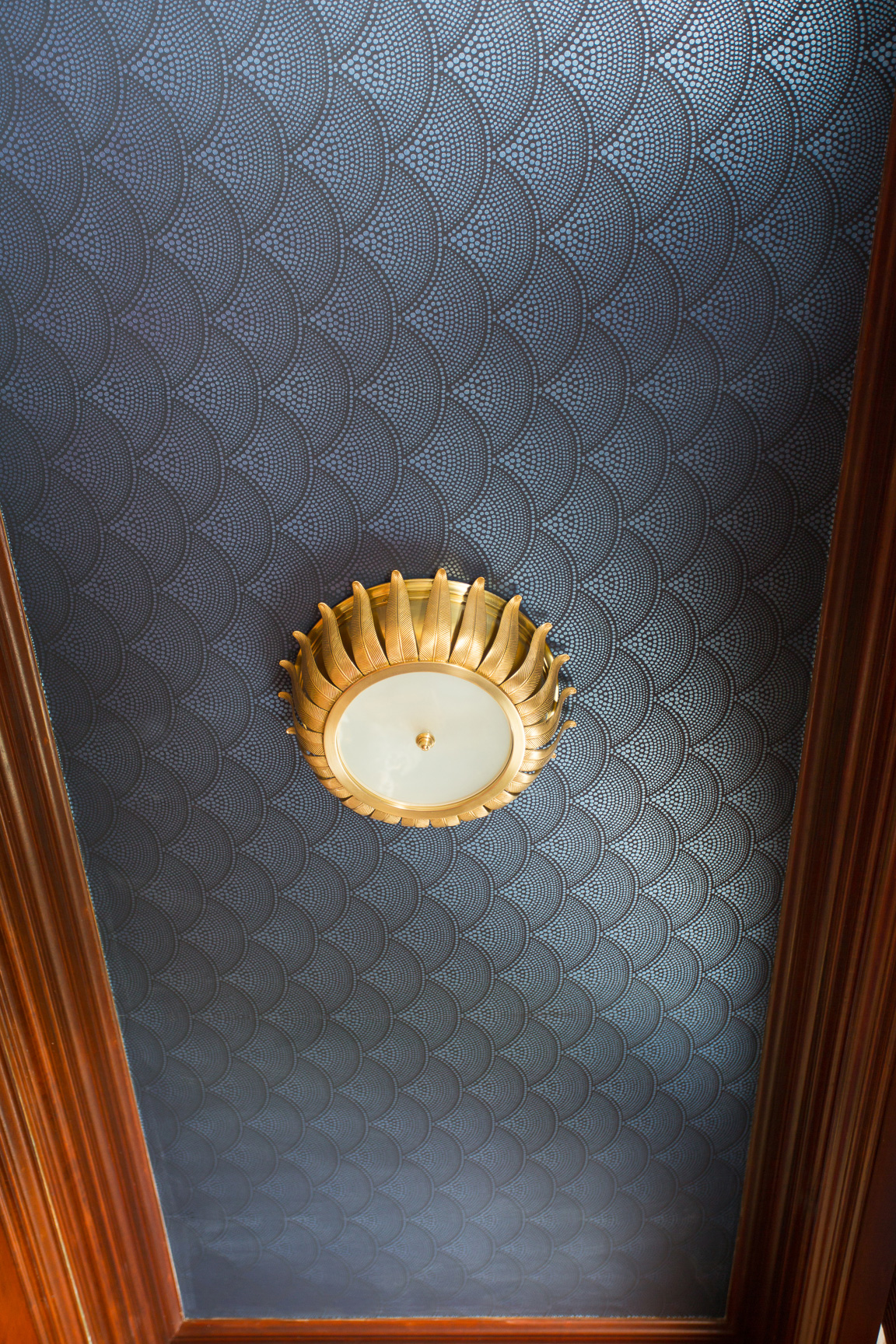
Don’t forget to look UP for the big surprise!
Here are some quick superlatives for you, summarizing the past month-and-a-half’s work on Project Vestibule…
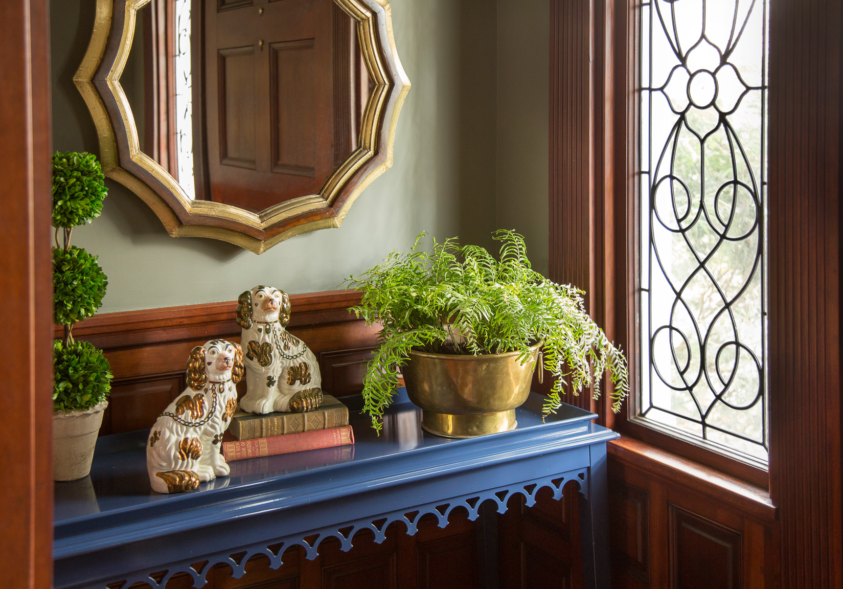
- Biggest risk: Ordering made-to-order Oomph Newport Console less than three weeks before the photo shoot. With a 6-8 week lead time. It arrived with two and a half days to spare (and, as expected, fits like a glove)
- Sweetest reward: The ceiling. No doubt. I walk in here nearly every day just to look up at it. The cool, indirect light comes through the leaded glass and rakes across the metallic “Feather Fan” wallpaper from Cole & Son. It makes me happy. (the light fixture, too!)
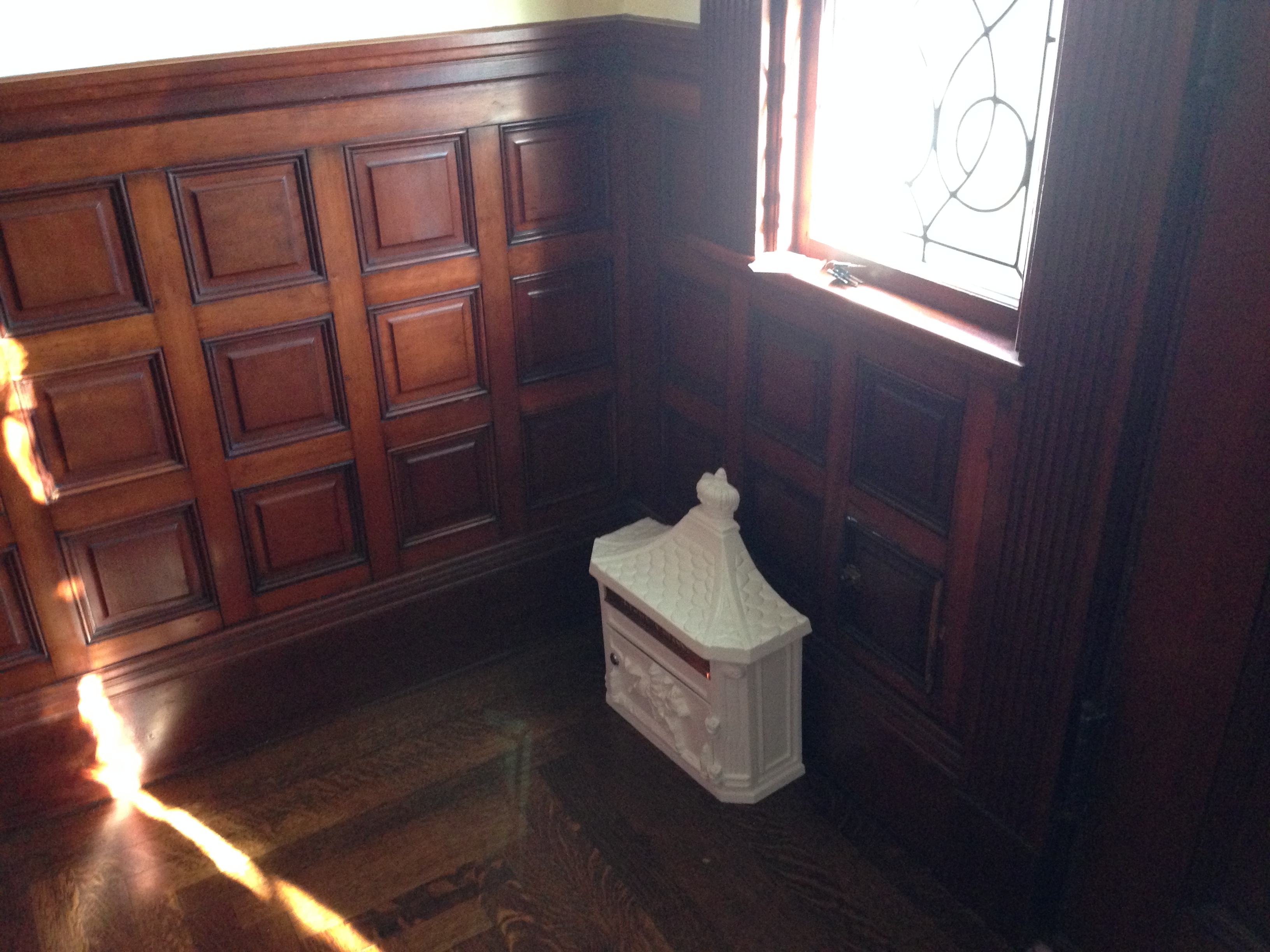
- Biggest regret: Not dealing fully with the exterior component – my front porch. My whole house exterior needs to be repainted, and we have plans to rebuild the porch in stone (it needs some love). Painting the front door, mounting the mailbox, and replacing our doormat helped tide me over
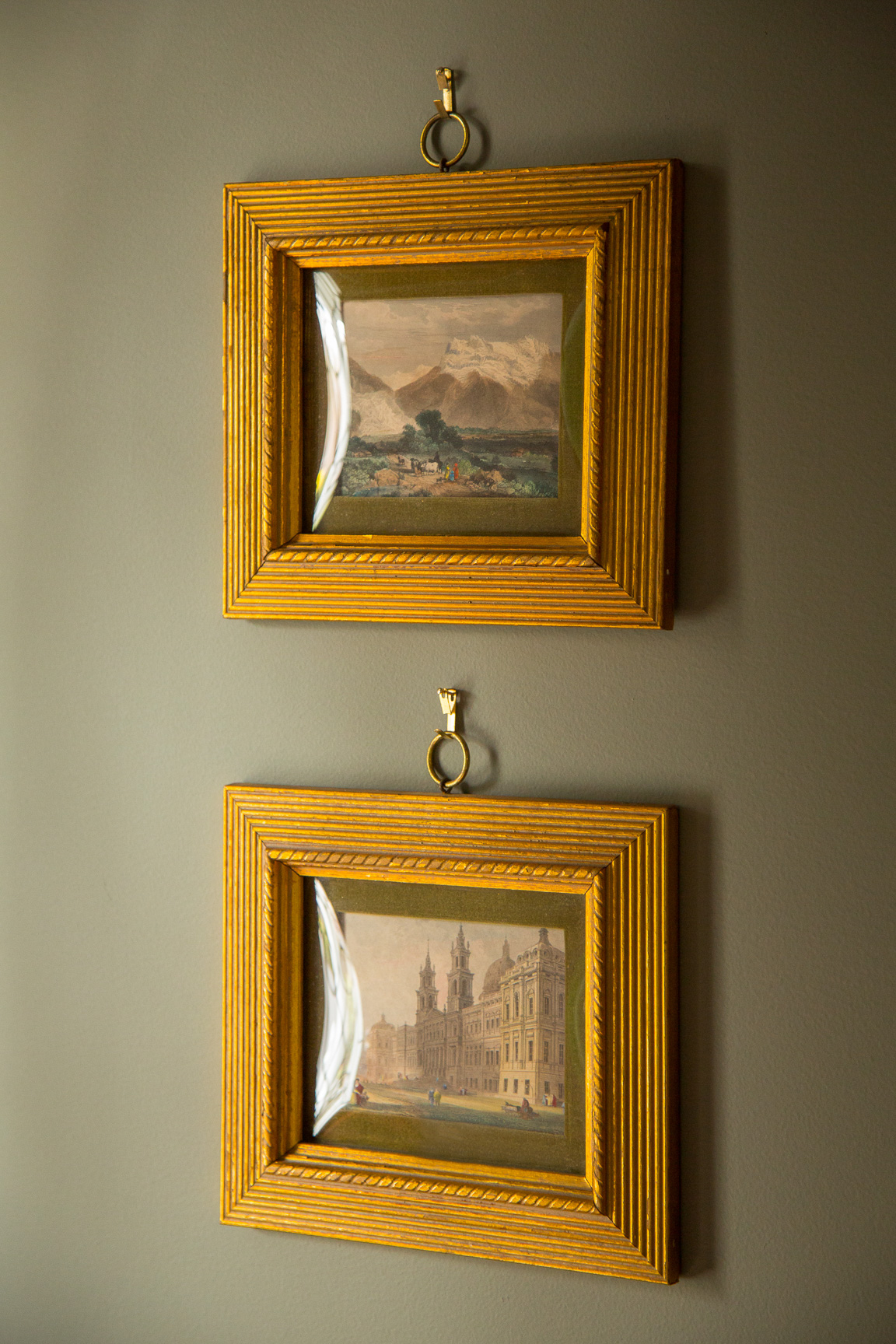
- Best bargain: Those adorable antique bubble-glass miniatures (with velvet matting and gilded frames) on the wall over the bench were only $20 total! I love how they echo the paneling below
- Biggest splurge: Bench fabric from Lee Jofa. Worth. Every. Penny.
- Cutest canine: Duh
Major THANK YOUs are owed to all of the partners and vendors who scrambled to finish and/or deliver my orders in record time (about FOUR weeks, actually!). I still can’t believe it all arrived in time. And Eric Roth Photography for conquering the difficult lighting conditions and space constraints, and making my room look beautiful (as always).
I would also like to profusely thank Linda at Calling it Home for hosting the One Room Challenge link-up so folks like me could participate. Honestly, if it weren’t for the ORC, my vestibule would still look exactly like the ‘before’ images. Not joking. People – this is the way to get things DONE at home, let me tell you! I’m already deciding what room I’m going to tackle next, in the fall!
I’d encourage each and every one of you to grab a cup of coffee, a glass of wine, a snifter of brandy, a bottle of water, or whatever your drink of choice may be, sit down, relax, and check out the other One Room Challenge reveals! The “official” group of design bloggers unveiled theirs yesterday here, while the linking participants, like myself (so many talented, hardworking folks, including my Boston-area friend Kim Macumber, whose gorgeous master bedroom you just have to see), can all be found here. Prepare to be awed and inspired.
And lastly, thank YOU for stopping by – whether you are a regular reader, my mom (hi, Mom!), a neighbor, or you just found me through the Calling it Home link-up page, I’m so glad you popped in to check out Project Vestibule – thanks!!
Sources:
Custom bench: Partners in Design (Newton, MA)
Bench fabric: Suzanne Kasler for Lee Jofa
Ceiling wallpaper: Cole & Son
Flushmount light: Alexa Hampton for Visual Comfort
Console table: Oomph
Mirror: Arteriors Home via Wayfair
Umbrella stand: eBay
Boot tray: Ballard Designs
Wall paint: Benjamin Moore Rooftop Garden
Front door paint: Benjamin Moore Colonial Verdigris
Staffordshire dogs: The Barn at 17 Antiques (Somerville, MA)
Antique books, bubble glass miniatures in gilded frames: Ramble Market (Waltham, MA)
Brass planter: Marcia & Bea Antiques (Newton Highlands, MA)
Mailbox: Salsbury Industries via Amazon
Doormat: Frontgate
Kelly, elsewhere:

I am amazed about how many beautiful details you managed to put in this space. I love each of them with a special mention for the ceilings! Wow! The ceilings!
Thank you so much! Yeah, I think when you have a tiny space like this, everything you put in it has to count and be impactful. No fillers!
Wonderful. The repeated scallop shape really is effective.
Thanks for picking up on that, Casey! And thank you for stopping by to comment – I really appreciate it, and hope to see you soon!
KELLY!!! This is gorgeous … I’m so happy to see you with that Green Door … and your ceiling! OMG that is perfection! And thank you my sweet friend, for the shout out! Thank Goodness we have a challenge to kick us into gear in our own homes!
Thanks, Kim! I still can’t believe how amazing your room was. I am a total convert to the ORC! Do you have any rooms left to transform? I am totally in for next time. Although I might have a client this time…my husband (gulp!).
I love how you infused the space with some colour. Looks amazing! Way to go!!
Thank you, Sabrina! It was a bit of a challenge to come up with a color scheme that played up the wood tones, while also incorporating some happy hues. I’m so glad you liked it – thanks again for stopping by!
Gorgeous. I love that ceiling, how fabulous is that. You have created such a beautiful entry. Love your choice of console and accessories. Great makeover.
Well thank you so much for all of the kind compliments!
I’m loving the scalloped ceiling and light fixture! Very elegant – beautiful job!
Thank you, Natasha! The wallpaper kind of has a night sky quality to it – I thought it made sense on the ceiling, and I love the way it looks with the wood trim.
great job Kelly, I love it all. The ceiling is gorgeous and love your colors ( and your pup!)
xo Nancy
Thank you so much, Nancy! I really appreciate your comment!
So elegant…I’m obsessed with your vestibule!!
Lol – maybe you wouldn’t be as obsessed with it if you knew that it lacked insulation, and the front door sticks something awful. Ha. But it does look prettier now! Seriously, though – thanks a lot for the kind compliment!
It looks amazing, Kelly!!! Gorgeous greens and every single detail is spot on! Way to go! 🙂
Thank you so much! I’ve had quite a week, and am still making the rounds to look at everyone’s transformations. I may be late, but I’ll be by soon!
What a breath of fresh air! While I love and appreciate so many of the ORC rooms, so many of them look the same. Yours was unique and stunning. The woodwork in the foyer is amazing, and I was SO happy that you didn’t paint it! This was my first visit to your blog, and I’ll be a follower now. Congrats on a job well done!
Beth – This was a compliment to end all compliments. Thank you so much, I’m truly touched, and also encouraged to keep doing what I’m doing, rather than trying to emulate others. I’m fortunate to own a home with such distinctive features; I’m glad I was able to play them up – especially the wood; that was really important to me. Thanks again!
So gorgeous! It’s so rich with texture and tone! Honestly, this should be in a magazine! Great work, and know you most certainly were not alone in your anticipation of today. I’ve been going back and forth with self doubt about how my room would be received, and thankfully once it was done I was so happy with it myself, that I knew it would be okay no matter what happend today.
Thanks so much! It’s great that we can all breathe now and just enjoy our new rooms, isn’t it? 🙂
Love your vestibule. It looks fabulous.
Many thanks!
Beautiful as your work always is.
Thank you, Miss Irma! 😉
This is drop dead gorgeous!
Hey – thanks so much! I’m equally delighted by how functional it is now. And how I feel more confident when I open my front door to a guest, now. 🙂
That ceiling was a secret worth keeping until the end. It is stunning! Everything looks wonderful. Great job!
Haha – thanks! I debated whether or not I should divulge the ceiling treatment (and it was HARD not to tell!). But the room was so small, each element seemed like a big deal, so I decided it made sense to hold that back till the reveal. Nice meeting you through this process – and thanks again!
Kim, totally beautiful…I loved every element! When that gorgeous ceiling light fixture is not even the star of this show, you know that you have a winner!! those little pictures are beyond sweet, and I especially loved that all your choices were totally distinctive and unexpected, from the paint color to the bench fabric, to that wonderful papered ceiling…Cheers to you!
Meredith
Okay, this is why I love the ORC! I love meeting other designers with fresh ideas!
Now onto this vestibule! Holy cow you have hit a homerun! This is gorgeous and I now want a vestibule! I absolutely LOVE how you mixed old with new. Your space is traditional and fresh all at the same time…which is my absolute favorite design. Well done and it is so good meeting you! Now I want to do a road trip to the Barn at 17! 😉
I was waiting for this reveal as I liked your space before and I like it now even more! So elegant and classic. I love the ceiling and the bench and the table, everything! Definitely my style:)
Oh my word, the character is this space is over the top! A true classic beauty. Great work!
What an amazing transformation! A true job well done. I adore the color palette you selected. It feels fresh yet classic. The six weeks went by so fast. I completed our entry, living and dining areas in a new to us 30 year old house. So, cheers to us! Have a wonderful weekend.
so gorgeous and now that woodwork really stands out- it’s stunning!
Your vestibule looks so inviting. I love all of your choices but the wallpaper on the ceiling is genius. It has come together beautifully and I’m glad that you’re looking forward to the next ORC because I can’t wait to see what you do next. How many times have you left the house just so you could walk in through your fabulous vestibule again?
Hi Kelly, this is one amazing entry! I would look up all day long. That dog is adorable and coordinates perfectly :). I am in love with the table, rug, bench and light. Oh, and the color green on the door. It’s just stunning. It’s always nice to meet one of Kim’s friends. She is the best. Bravo!
Thanks so much, Linda. It was so much fun, and an honor to participate. Kim helped convince me to throw my hat into the ring, and I’m so glad she did! Already looking forward to October, which should be interesting because I’ll have a client next time: my husband!
Kelly….whoa! You did a great job turning this into a welcoming entry! I love the wallpaper and light fixture! I bet you are thinking….why did I wait so long right? Well it was worth it!!!
Haha, yes, I always think that. About almost everything. Thank you!
This is jaw-droppingly gorgeous! You did a beautiful, beautiful job incorporating the dark wood. This is one of the best before-and-afters I’ve seen in ages.
What a generous compliment – thanks so much for that!
Oh my goodness, couldn’t this vestibule been more perfect? I think not! Just fabulous, so hard to pick a favorite corner! Absolutely one of my faves for this challenge Kelly!
Wow! It looks absolutely amazing! I love every single detail and…holy cow — that ceiling!!
Thank you! I do have a little more pep in my step when I open my front door now :). Now if I can only get everyone to look up already!
That ceiling is amazing! So many great details and your house has such character. I’m swooning!
Thank you, Jennifer! I know I am very lucky to have such a special home. I just put a little lipstick on it, really :).
Love the traditional feel with the modern bold color mixed in. Fabulous! Gorgeous ceiling!!
Gotta freshen up that old wood somehow, right? I love it so much more now. Thank you, and thanks also for the mention on your ORC blog post today!!
Oh my goodness this is wonderful! I love the colors, the wallpaper on the ceiling, the rug, in fact, I love everything about it!
I’m so glad you liked it. Thanks for stopping by and reading about my vestibule transformation!
I just wanted you to know I picked your room as one of my ORC faves! Thank you again for the inspiration!
http://buhayatbahay.blogspot.com/2015/05/my-orc-faves-part-1-kitchen-dining.html
Thank you so much!
That looks absolutely fabulous Kelly! I love it!