Of course, I had to pick the only rainy day in July for my visit to coastal Maine. But the soggy weather and my directly-related bad hair didn’t put a damper on my day – I was there to see the “Secret Cove” Decorator Show House in Kittery Point.
Presented by, and supporting Museums of Old York, it has been running for 24 straight years. Quite remarkable for any fundraising event, and especially a show house, which can tend to go on indefinite hiatus, only to pop up again a few years later. This year’s show house is being held at a quirky, sprawling privately owned home, situated on Lawrence Cove – just a stone’s throw from New Hampshire (if your stone is really aerodynamic…and you once played right field for the Yankees). As with most well-designed coastal homes, Secret Cove is very much oriented to the water, and aspires to make the most of indoor-outdoor living. I was especially interested to see different takes on “coastal” color and decor, and how designers dealt with challenging spaces, which always seem to be in excellent supply at show houses.
My tour began with a rain-soaked walk to the pool house, formerly in service as a utilitarian potting shed.
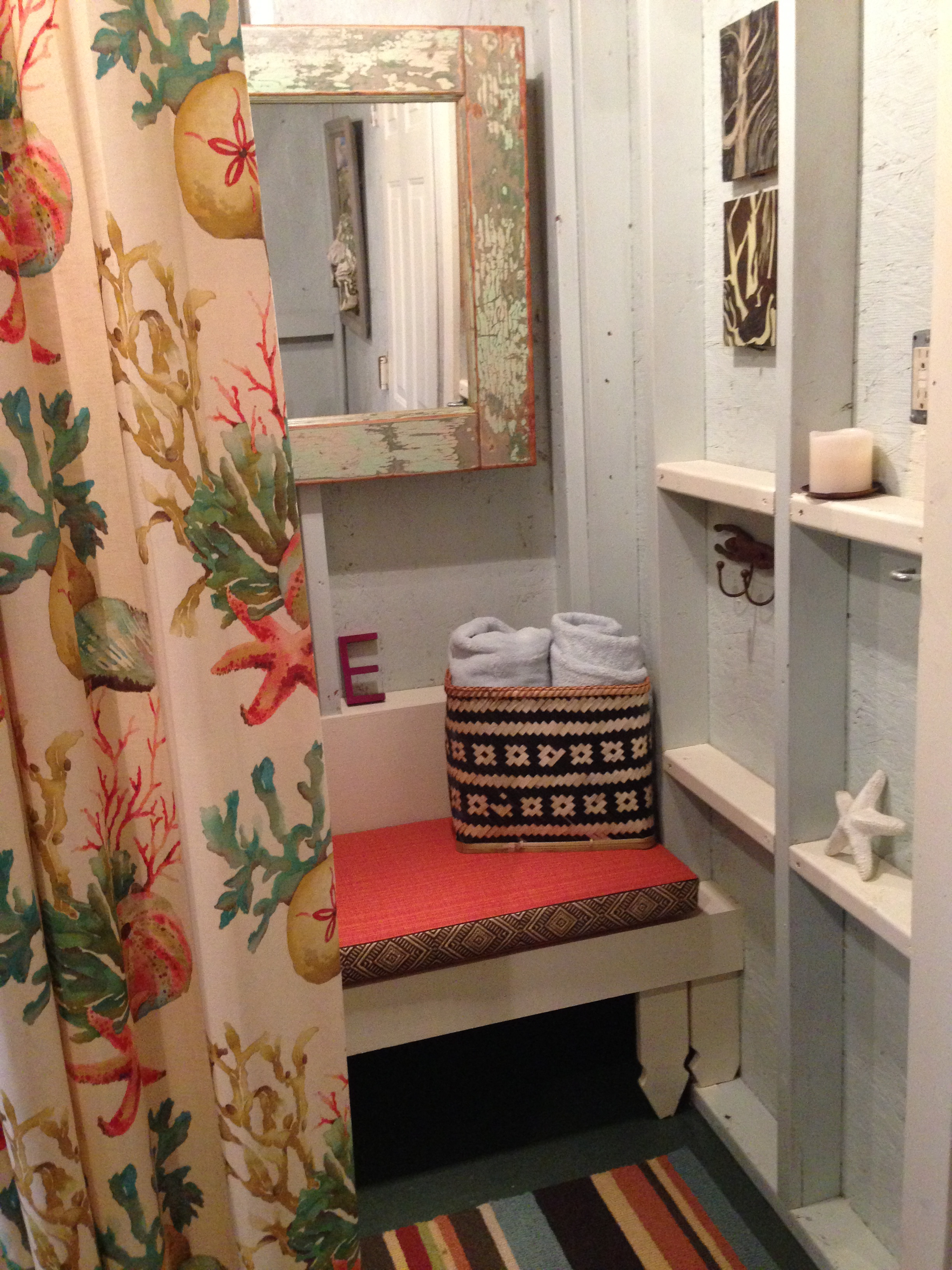
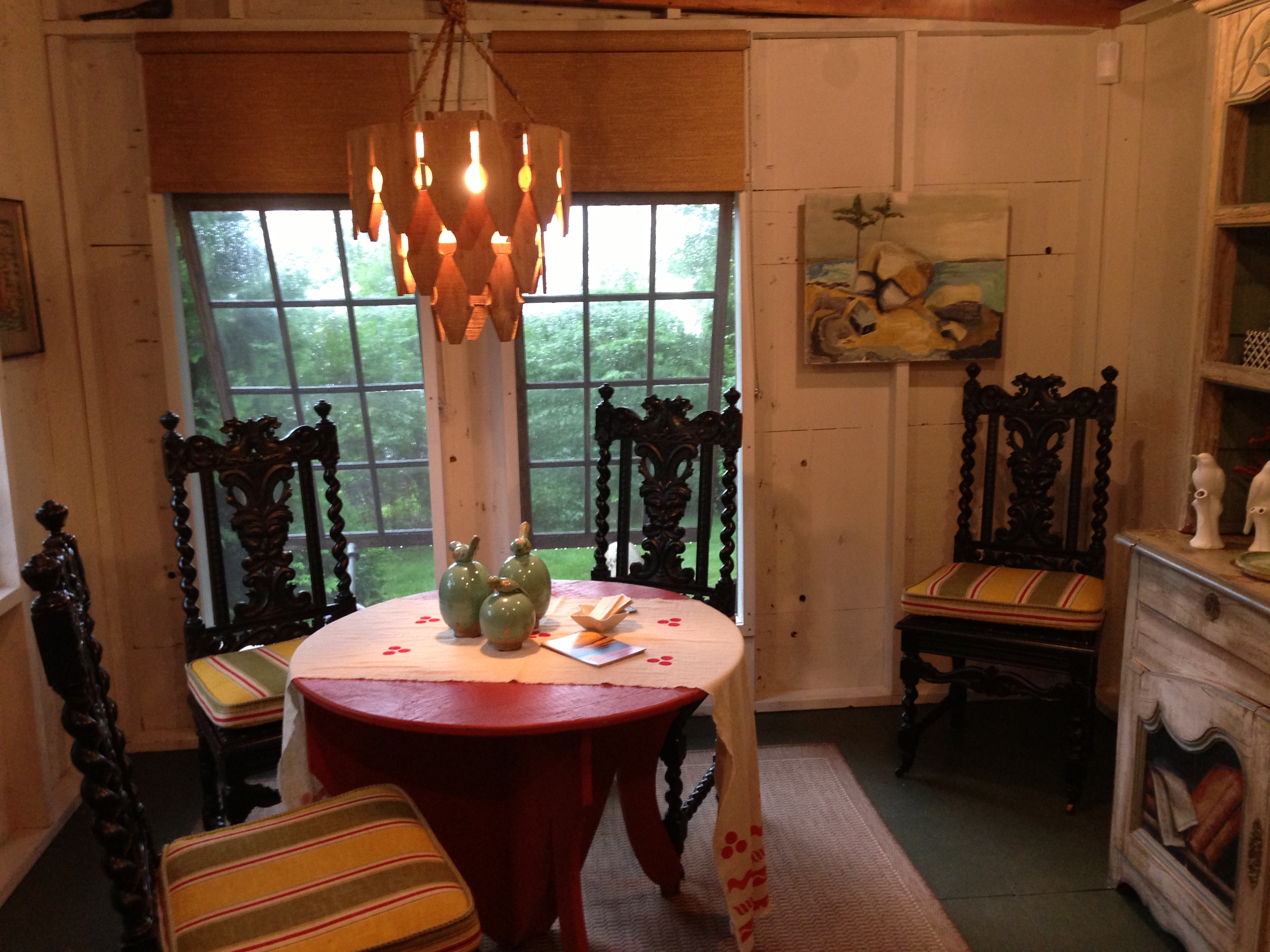
Wells, ME-based designer Valerie Jorgensen created a colorful space with just enough patina to look like it had been evolving into this for many years. Sometimes decorators go overboard with too many weathered surfaces in coastal rooms – but Jorgensen got the balance just right. My wet feet were no problem here, with indoor-outdoor rugs adorning the floor.
More than just a changing room, Jorgensen also imagined the Pool House as a place to eat an informal meal with family or friends, in-between dips in the adjacent salt water pool. The picket fence chandelier was custom made by the designer’s firm, and repeats the motif also seen in the changing nook bench’s legs, and elsewhere. I loved this detail; it really drove home the “cottage couture” feel of this space.
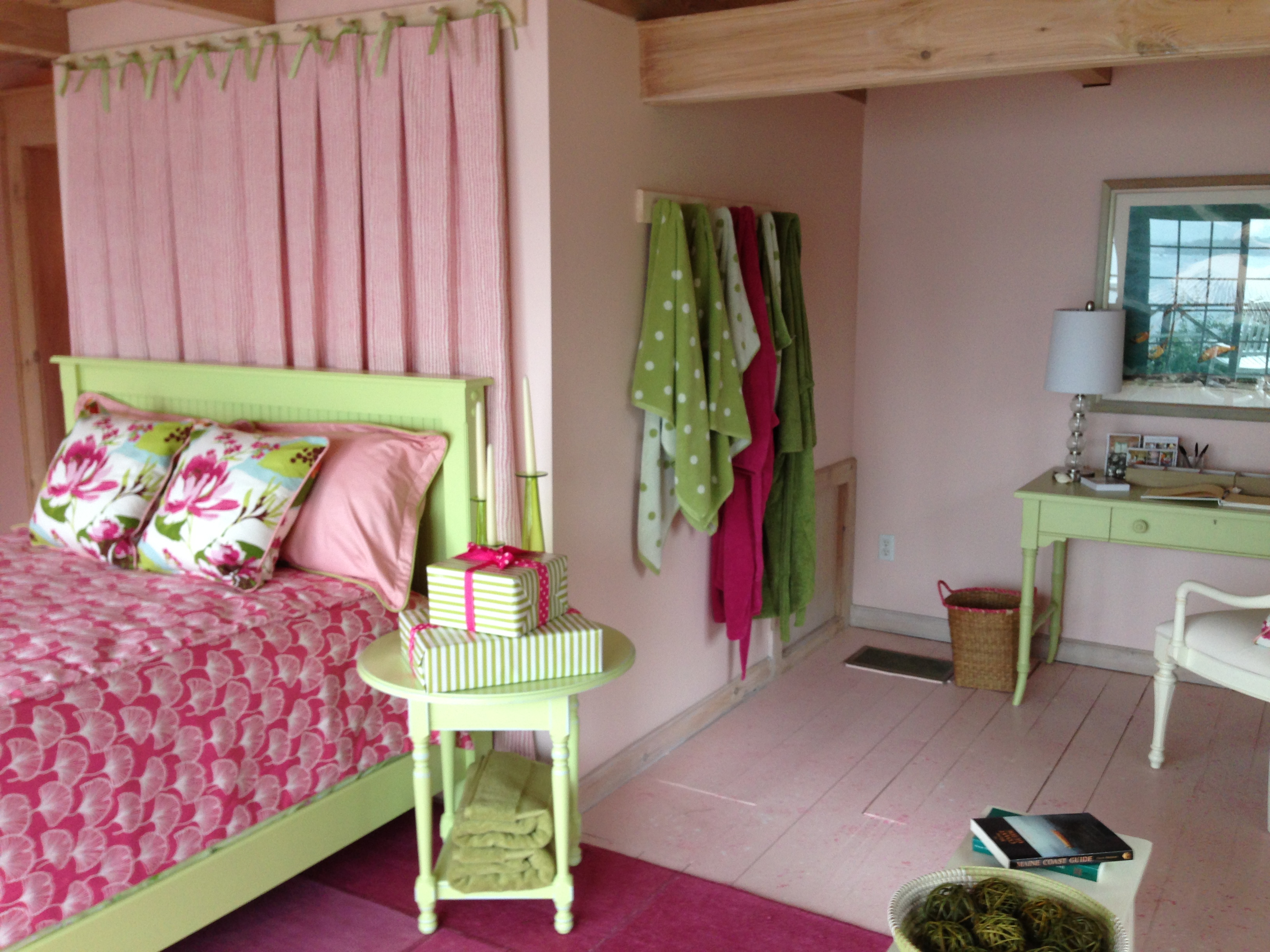
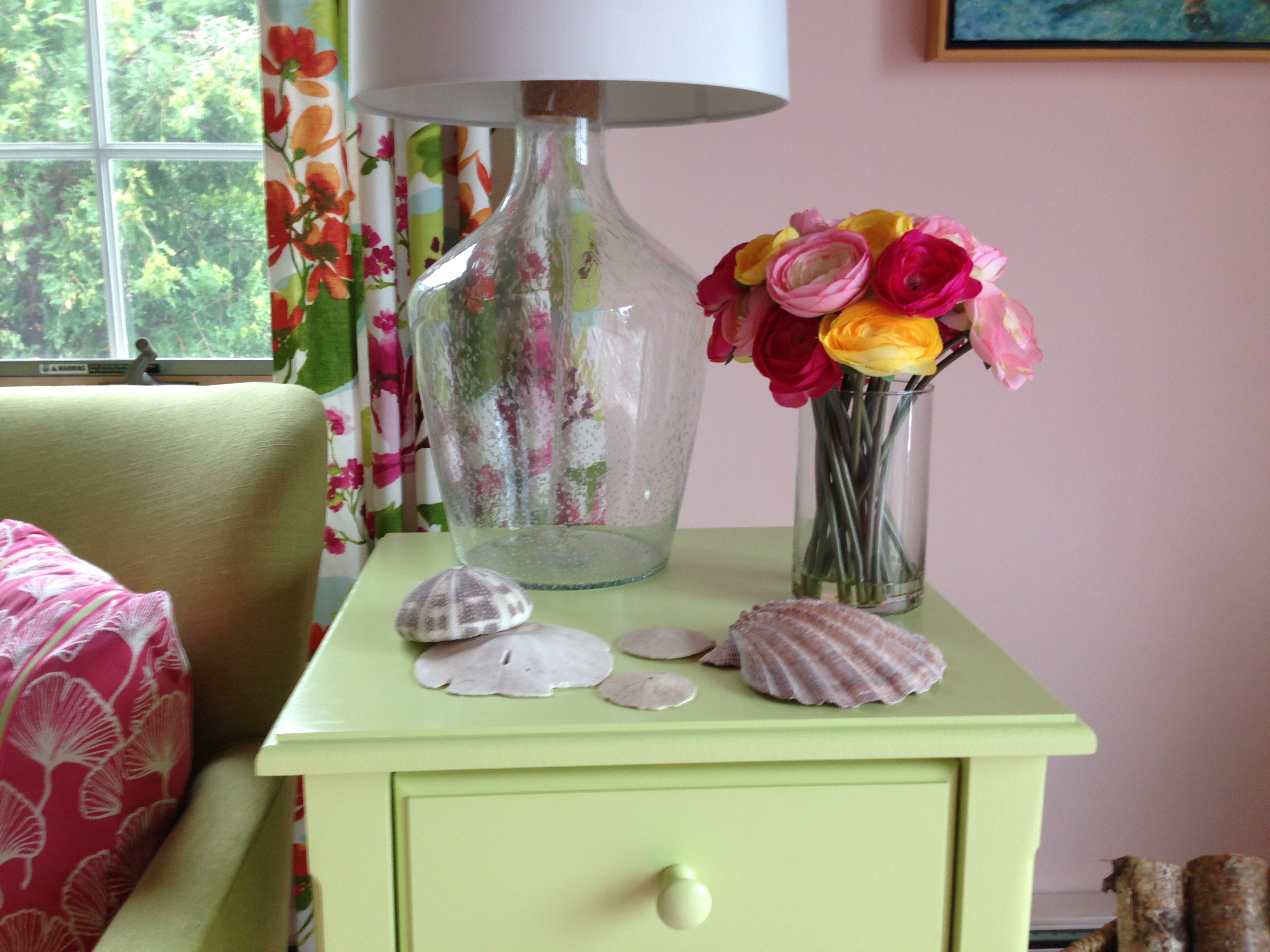
Next up was another drenching dash to another outbuilding known as the Guest Cottage, which is quite literally on the water. Though you’ll just have to take my word for it, since I could not get a picture looking in the direction of the harbor without the inside looking like a big black hole. Ah, the perils of amateur iPhone photography. In any case, I found these guest quarters, designed by Anne Cowenhoven, completely enchanting, and appreciated her use of a less expected coastal color palette of raspberry pink and melon green. Can you tell I was hungry when I wrote this? The bed faces the water, and sports a coverlet in a charming embroidered Robert Allen fabric.
The bed pillows and window treatment fabric was the inspiration for the color scheme. I just loved how everything in the room tied back to that. The designer even brought the floor into the color scheme, and not just with the very cool overdyed patchwork rug from Stark – the entire wide-plank wood floor was painted pink to match the walls, and then given a whimsical tone-on-tone spatter paint treatment.
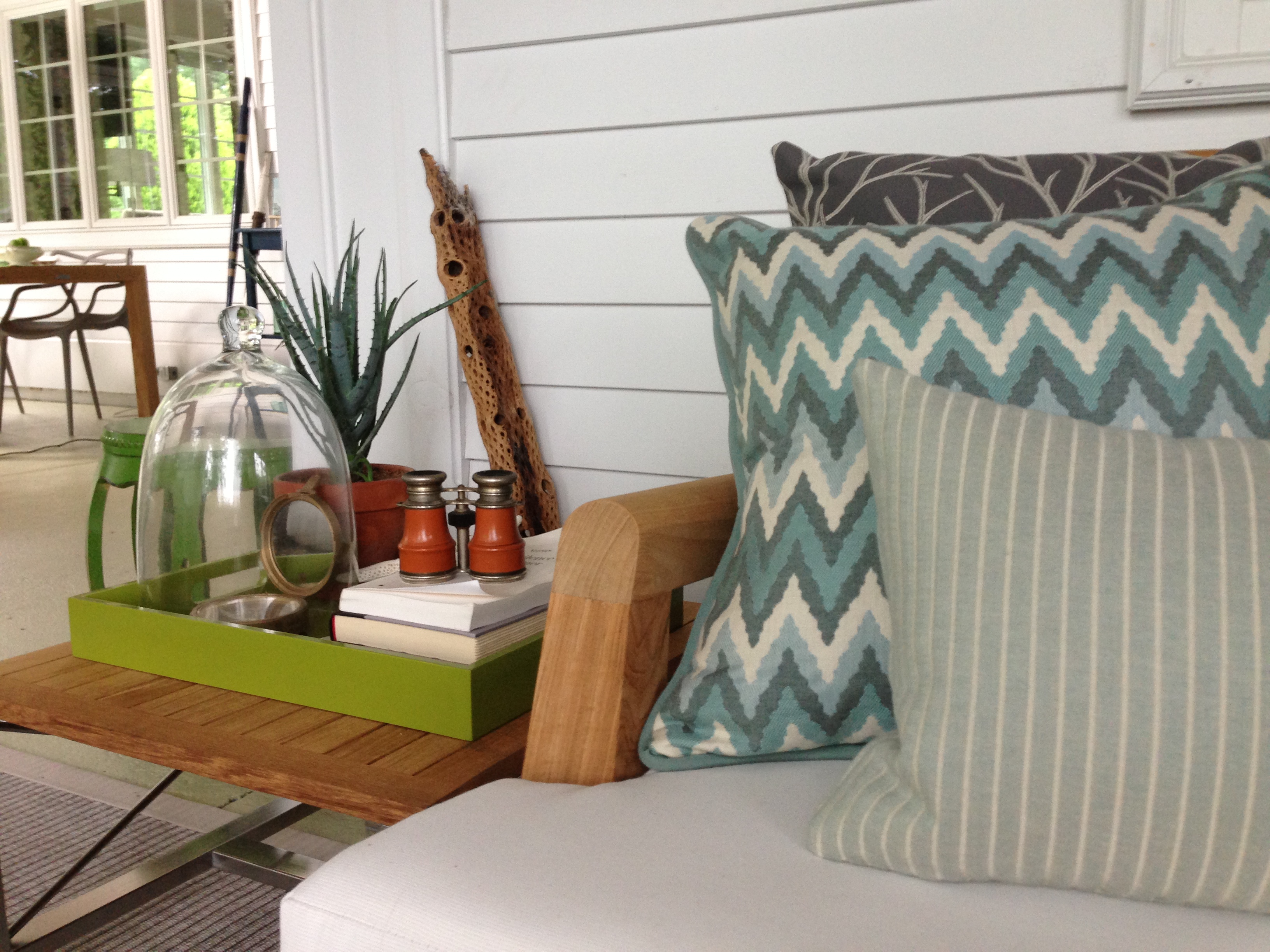
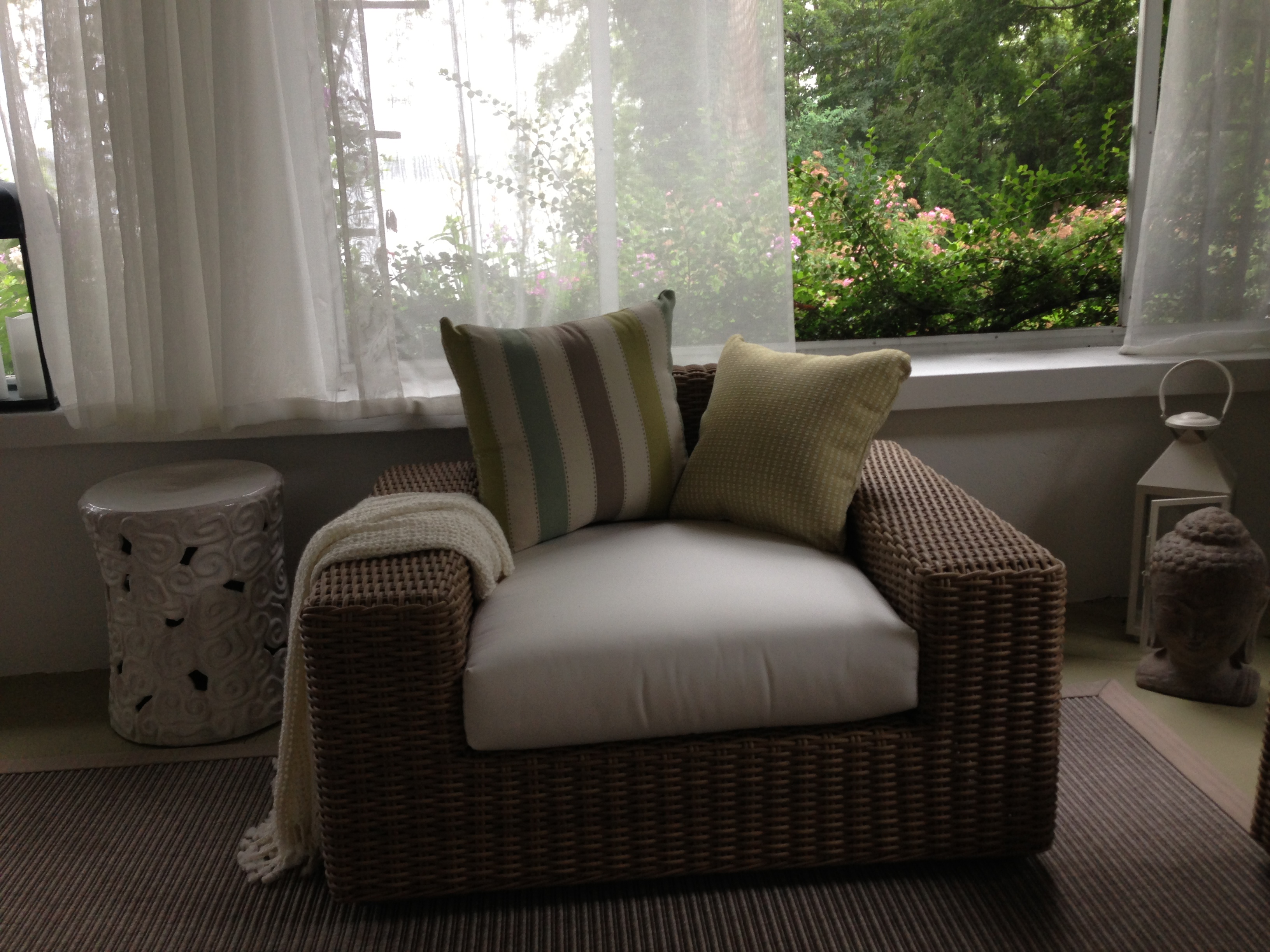
In the main house, Barbara Elza Hirsch of Elza B. Design (Acton, MA) conquered the double-L-shaped screened porch with aplomb. Even on this dismal day, the space was breezy, bright and instantly relaxing. Hirsch mixed warm teak with polished metals, molded plastic, all-weather wicker, and a variety of coastal-leaning textiles to create an all-purpose space you could practically live in exclusively – during the summer, of course. It has it all – comfy daybed seating facing the water, areas for mingling and conversation, and a small dining area fully protected from those pesky mosquitos (aka the “State Bird” of Maine). And all of the furniture Hirsch selected was low-slung, so as not to impede the expansive water views.
I like to call screened porches in New England “one-season porches.” I can say that because I live here, too. I kid, I kid.
One of the main attractions for me at the show house was the opportunity to see the spaces designed by one of my new friends in the Boston-area design community, Yvonne Blacker. She teamed up with fellow designers Rosanne Palazola and Katherine Hawkins to form Trio Design, which tackled several of the more challenging spaces at the show house.
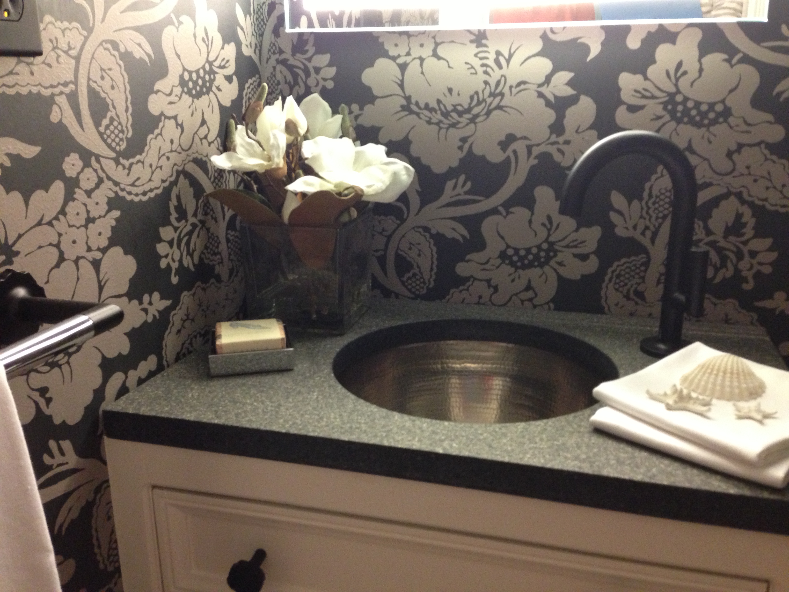
One such space was this tiny, dark powder room, which Blacker elevated to jewel-box status in an homage to fashion designer Jason Wu. The faucet and bath accessories were all designed by Wu for Brizo, and are quite stunning. The Versailles wallpaper from Farrow & Ball, one of the show house’s sponsors, is a favorite pattern of mine, and fits the room perfectly. Blacker helped compensate for the lack of light with a back-lit mirror – it was a sleek work of art in itself, and I thought really made this little half bath sing.
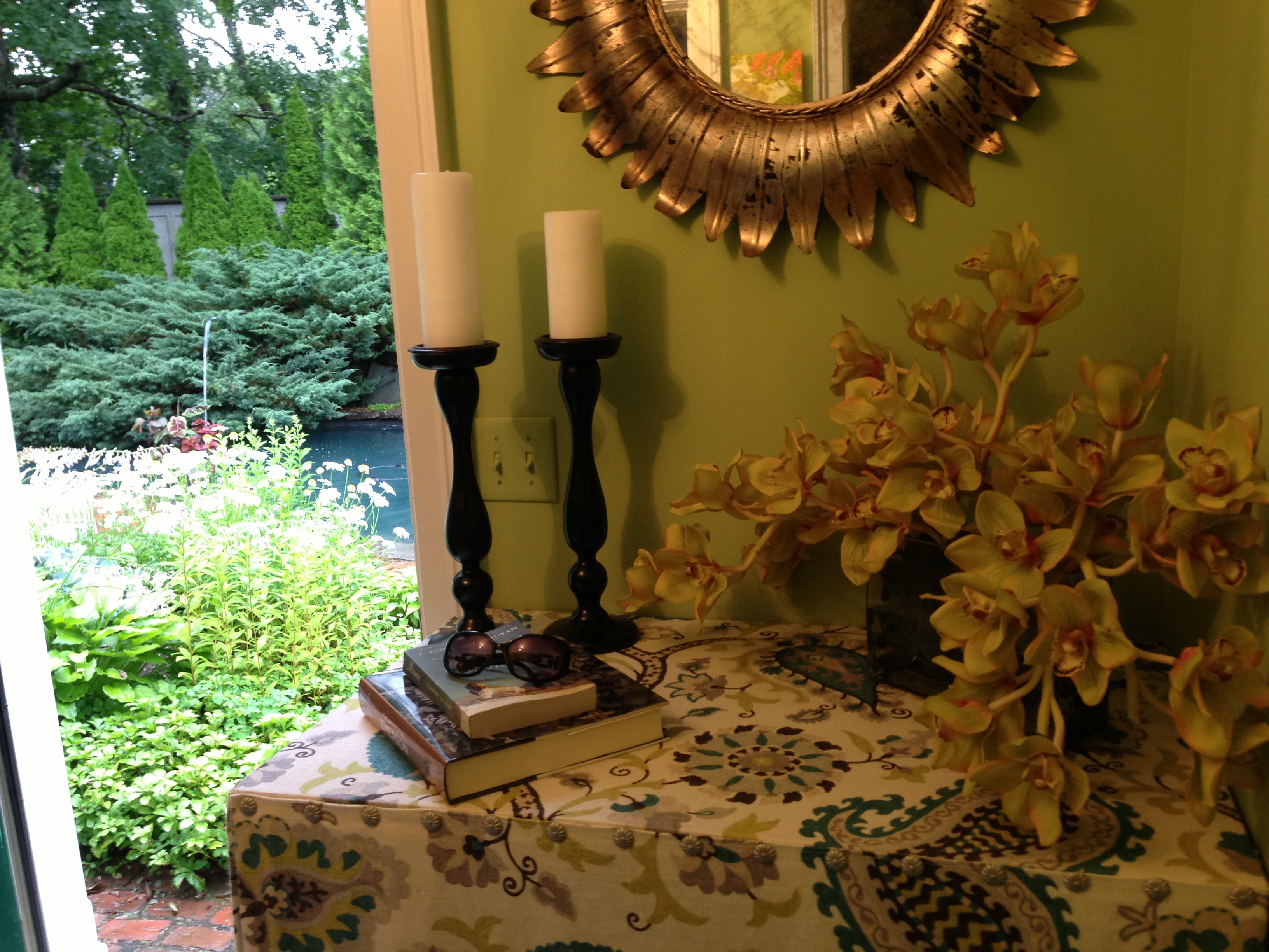
Just outside the powder room is a mudroom designed by Palazola, which she reconceived as a “Poolside Portal.” It really is the gateway to the lovely salt water pool, which you can see on the left side of my photograph above. Again, due to the limitations of my photographic ‘equipment,’ it may be hard to tell but the colors of this space flow so beautifully from inside to out.
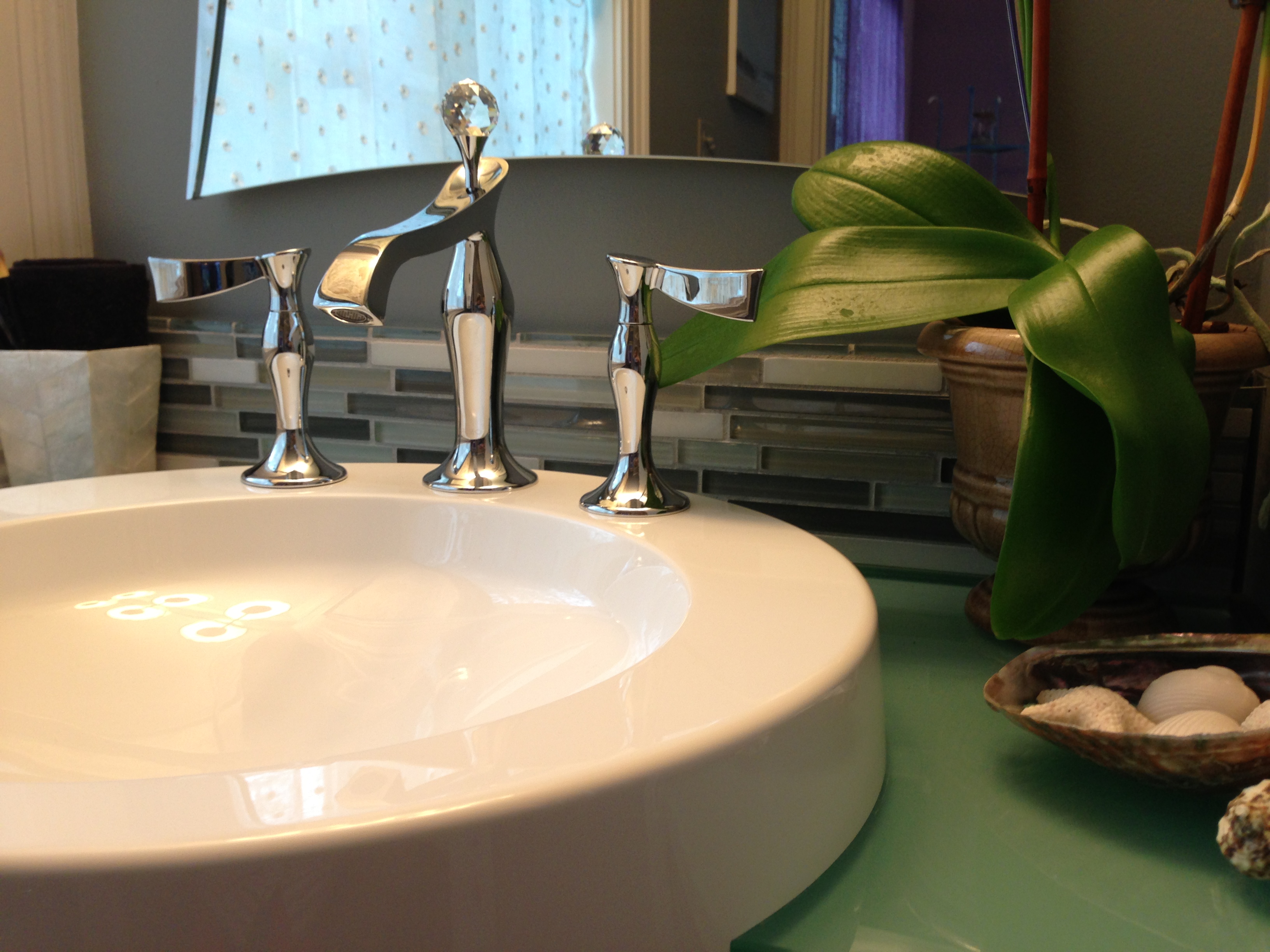
Another of Blacker’s baths featured more saturated blue and green hues, a contemporary glass tile backsplash, and more gorgeous Brizo fixtures. I particularly loved this faucet in this space, especially paired with the orchid. In this context, the sleek, undulating lines of the spout and handles read almost like a marriage of chrome and bamboo. Well done, you, Yvonne :).
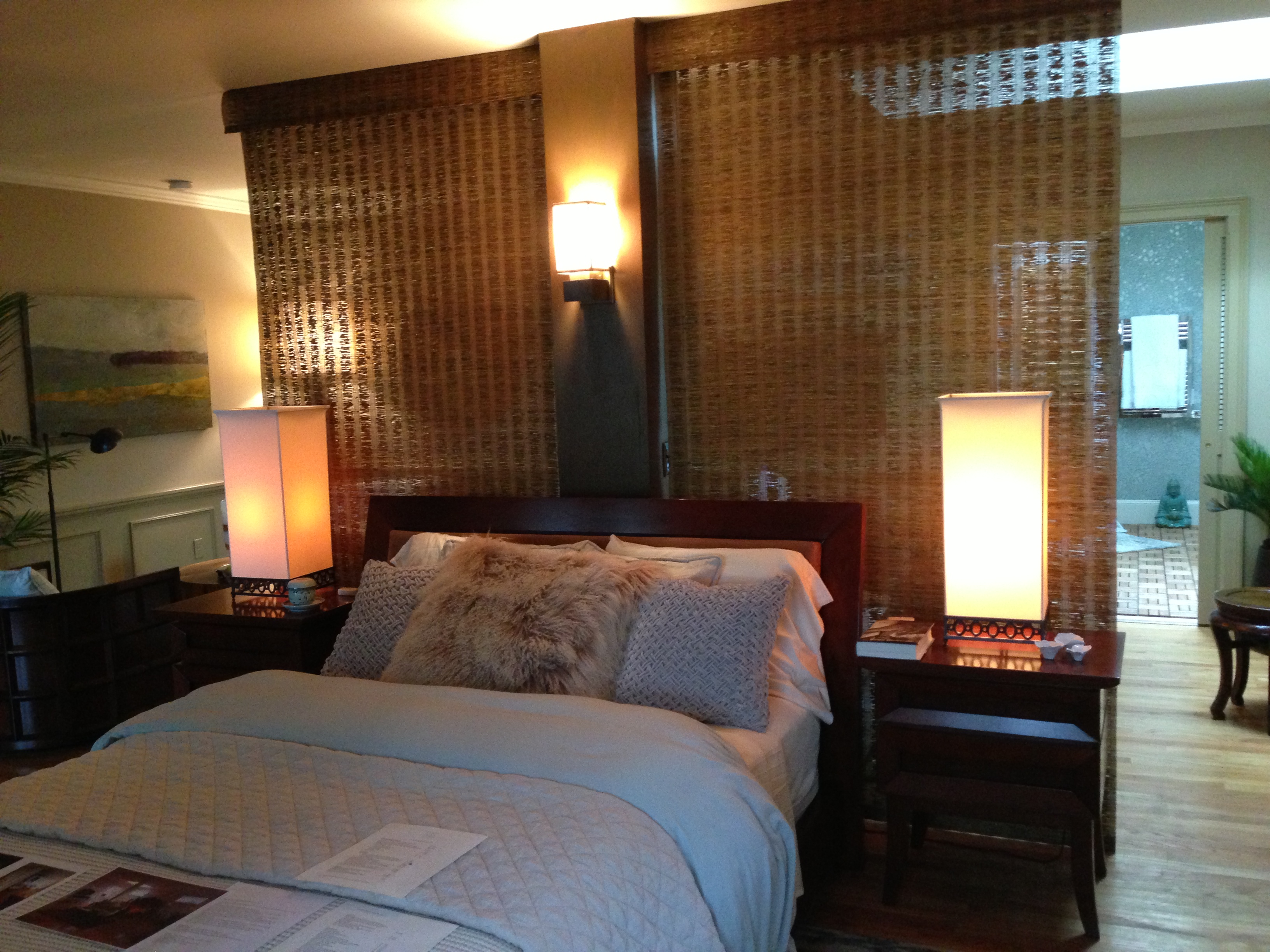 I think if there were an award for “Most Improved Space,” it would have to go to Pat Finn of Finn-Martens Design in Beverly Farms, MA. She transformed the huge master bedroom from an underleveraged, underfurnished, cavernous chamber with a big awkward column right in the middle, to a multi-functional, cozy and comfortable series of distinct zones for sleeping, reading, working, and watching TV. She made light work of the big awkward column by electrifying it, wrapping it in wood veneer, and hanging woven shades from the ceiling to floor, creating a divider screen with texture that still lets light through. Finn, like other Secret Cove designers, orients the bed toward the water. I can say from experience that waking up to a view like that can change your whole perspective on life. Well, at least for the day!
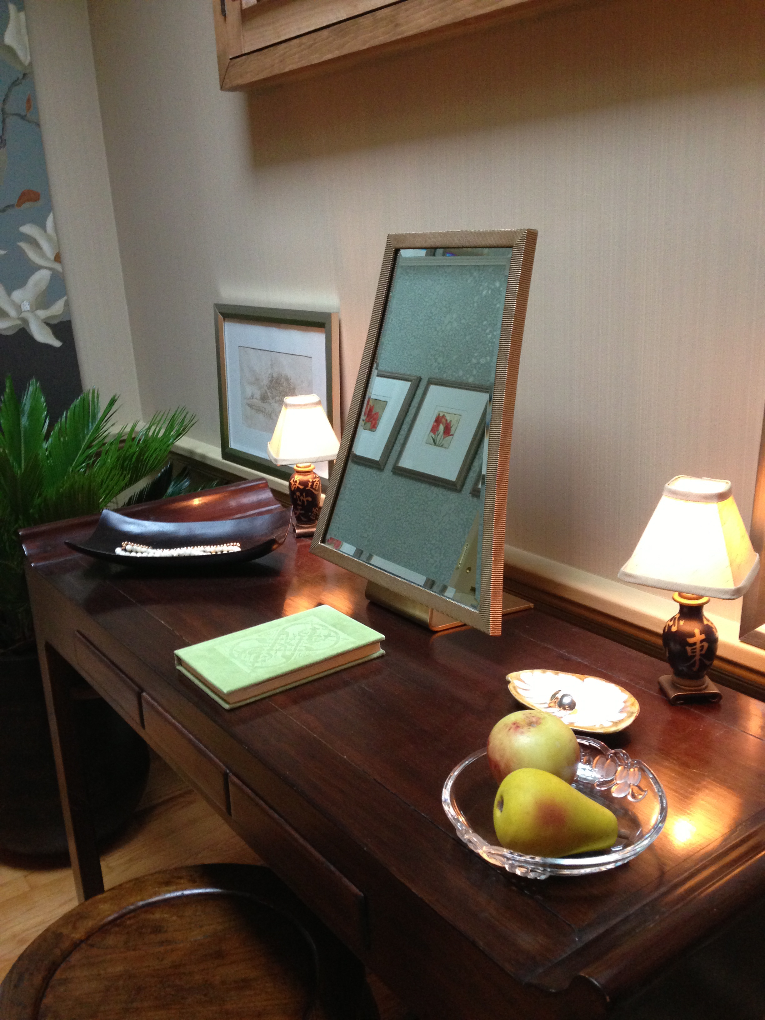 Finn used Farrow & Ball’s Drag wallpaper throughout the bedroom – a subtle strie I have used and absolutely love. It is great for people who are a little apprehensive about wallpaper and committing to a pattern, but feel that more than ‘just paint’ might be beneficial in their space. P.S. LOVED this little desk/vanity mirror!
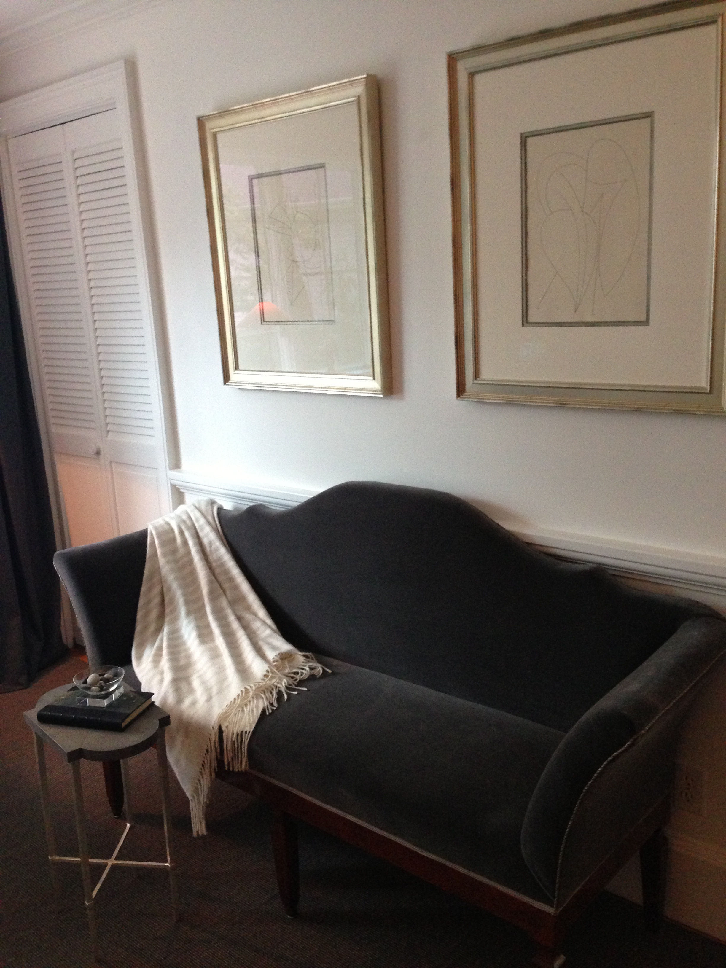
Boston’s Frank Hodge, who decorated a monochrome and masculine study at the Junior League of Boston 2013 Show House, was back at it again in Kittery Point, with another wonderful design for a man’s office. Although this time, I think his room was about a quarter of the size! He nonetheless created a functional and visually beautiful space, deftly managing scale, proportion, and color placement along the way.
I wanted to throw this plush charcoal velvet (or mohair?) upholstered settee into my trunk and skeddaddle out of there. The size and style of this piece was “just right” in it’s current context, though, so I decided to let it stay.
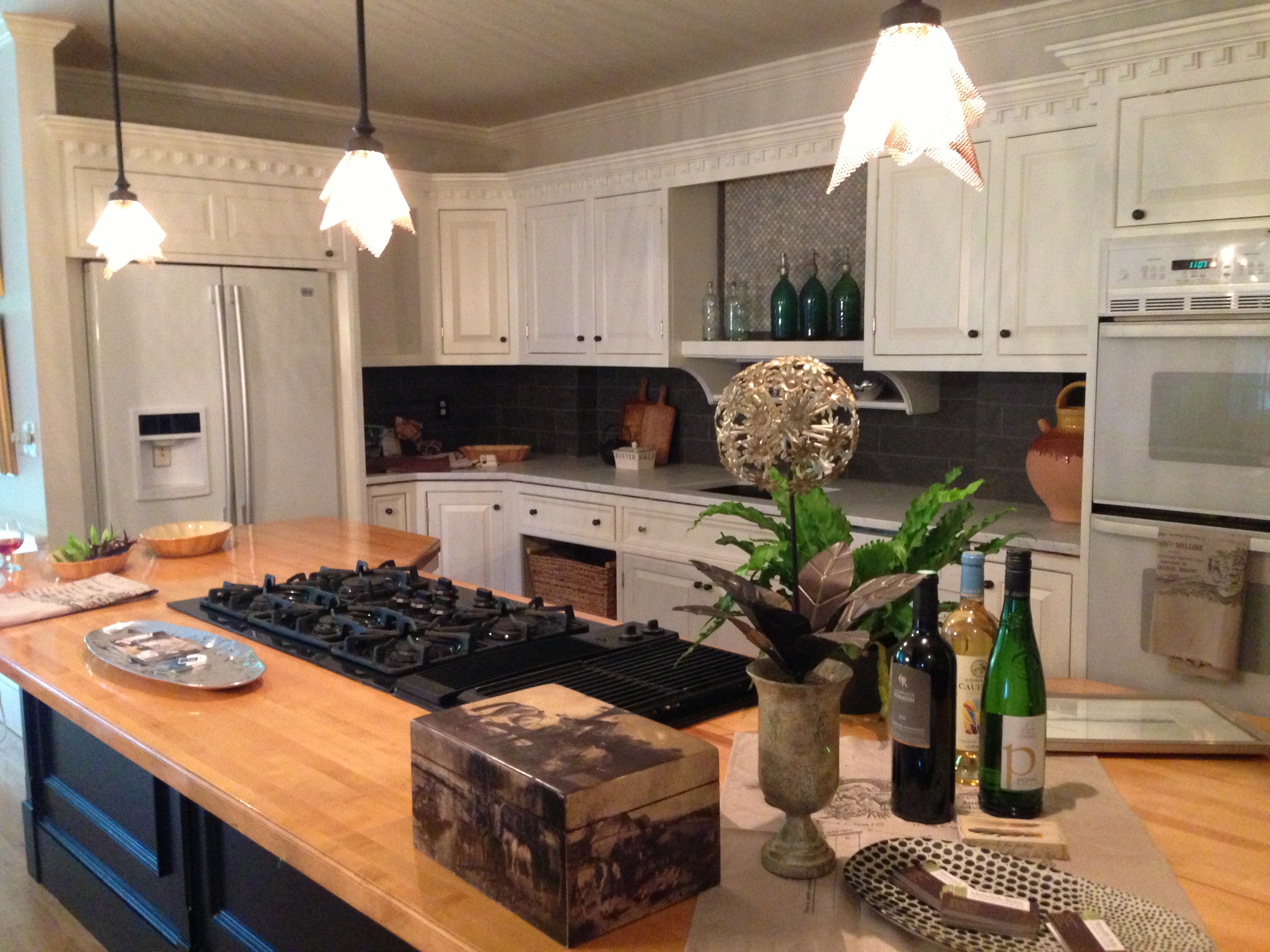
I was thoroughly delighted to meet New Hampshire-based designer Meredith Bohn at Secret Cove, and equally delighted to tour her several spaces there. I only snatched a few quick pictures of her lovely kitchen, which was being photographed by the excruciatingly talented Eric Roth, who I also met for the first time. I tried to stay out of their way as much as possible, and hope I did not disturb the shoot too much!
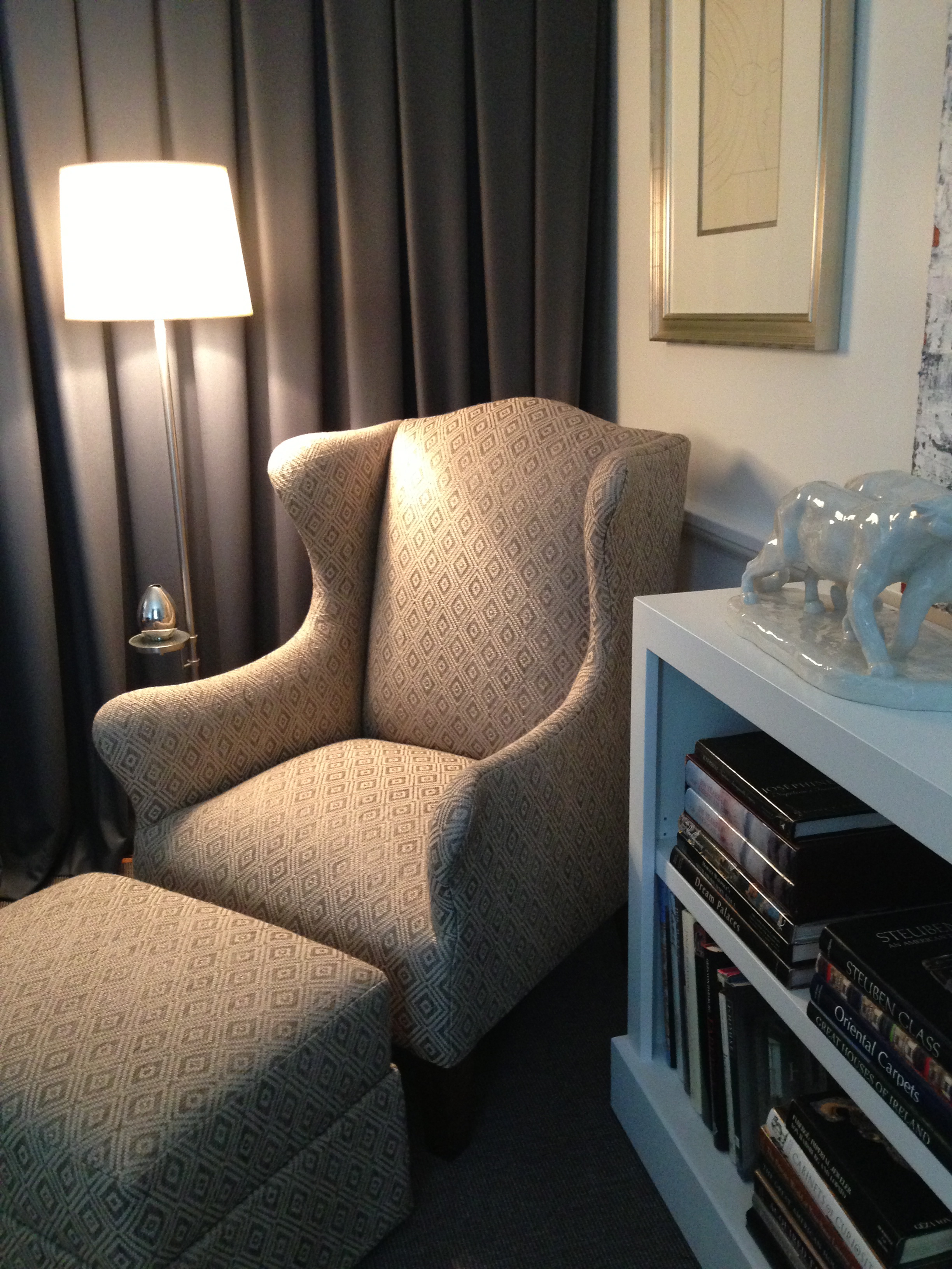
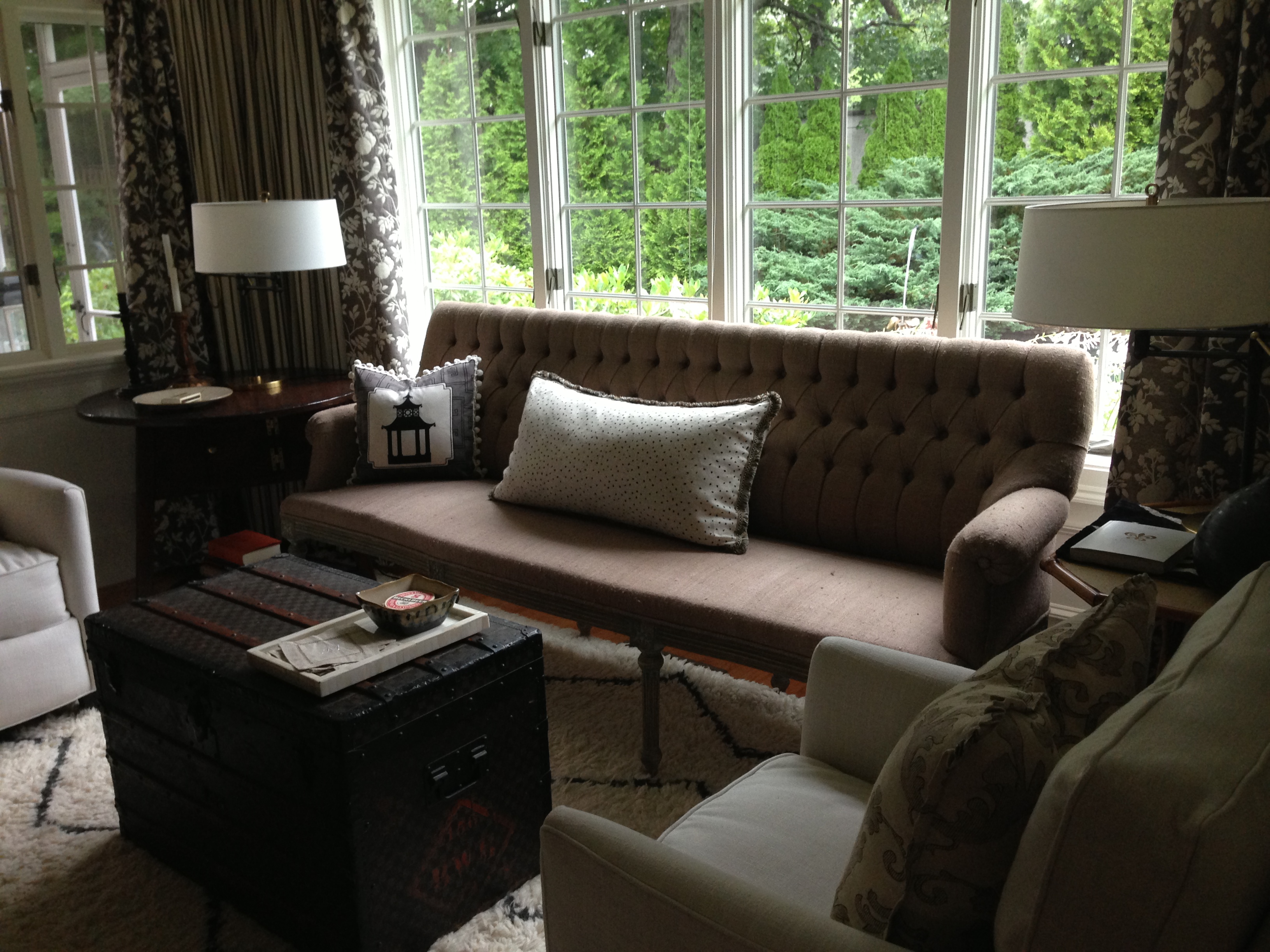
The adjacent sitting room, also designed by Bohn, is a master class in monochrome color design. Shades of gray, white and black can easily look gloomy and boring, but in all of this texture, mixing of styles and materials, and a bit of whimsy thrown in for good measure (love the pagoda pillows!), she found the formula for success.
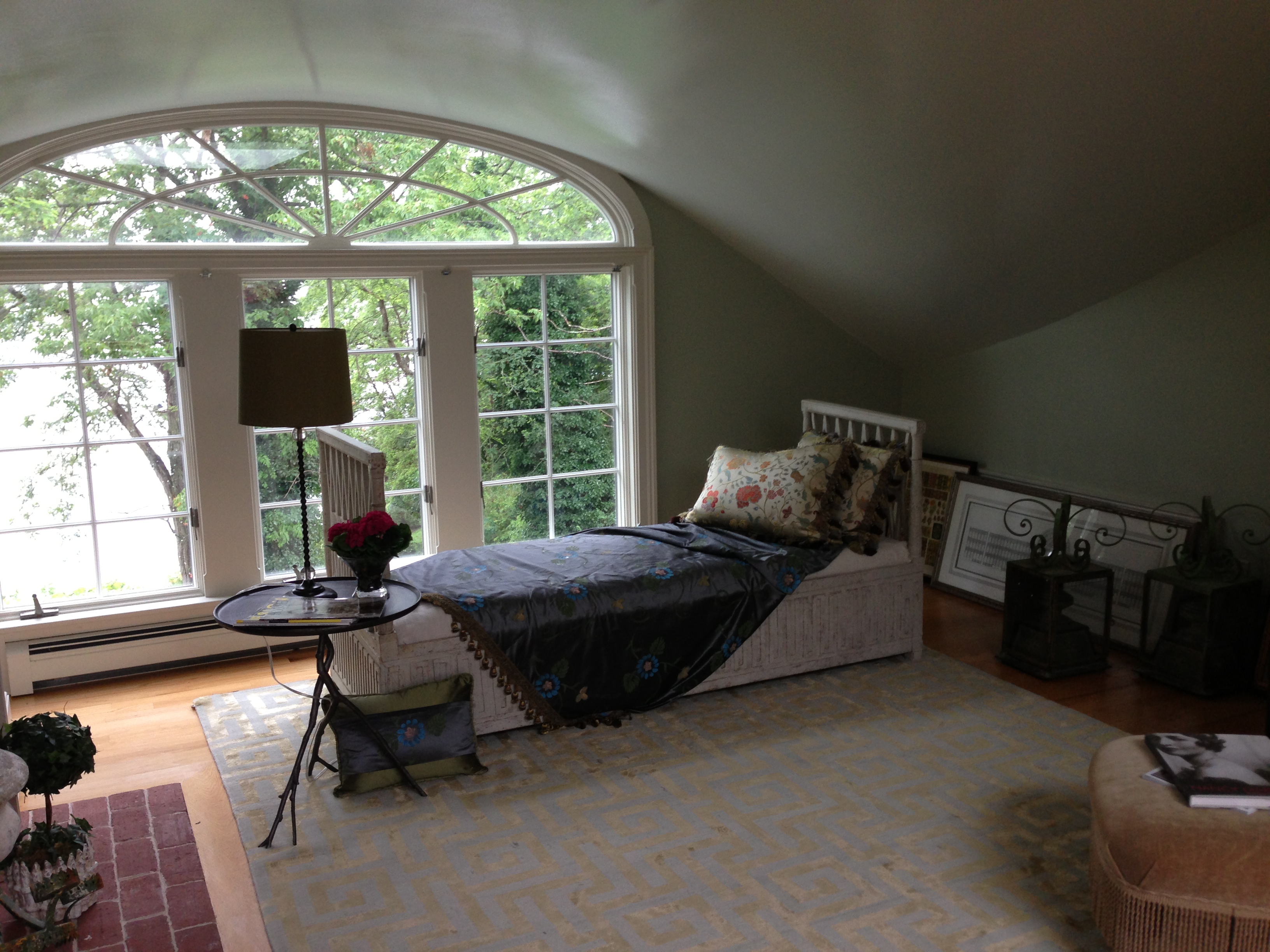
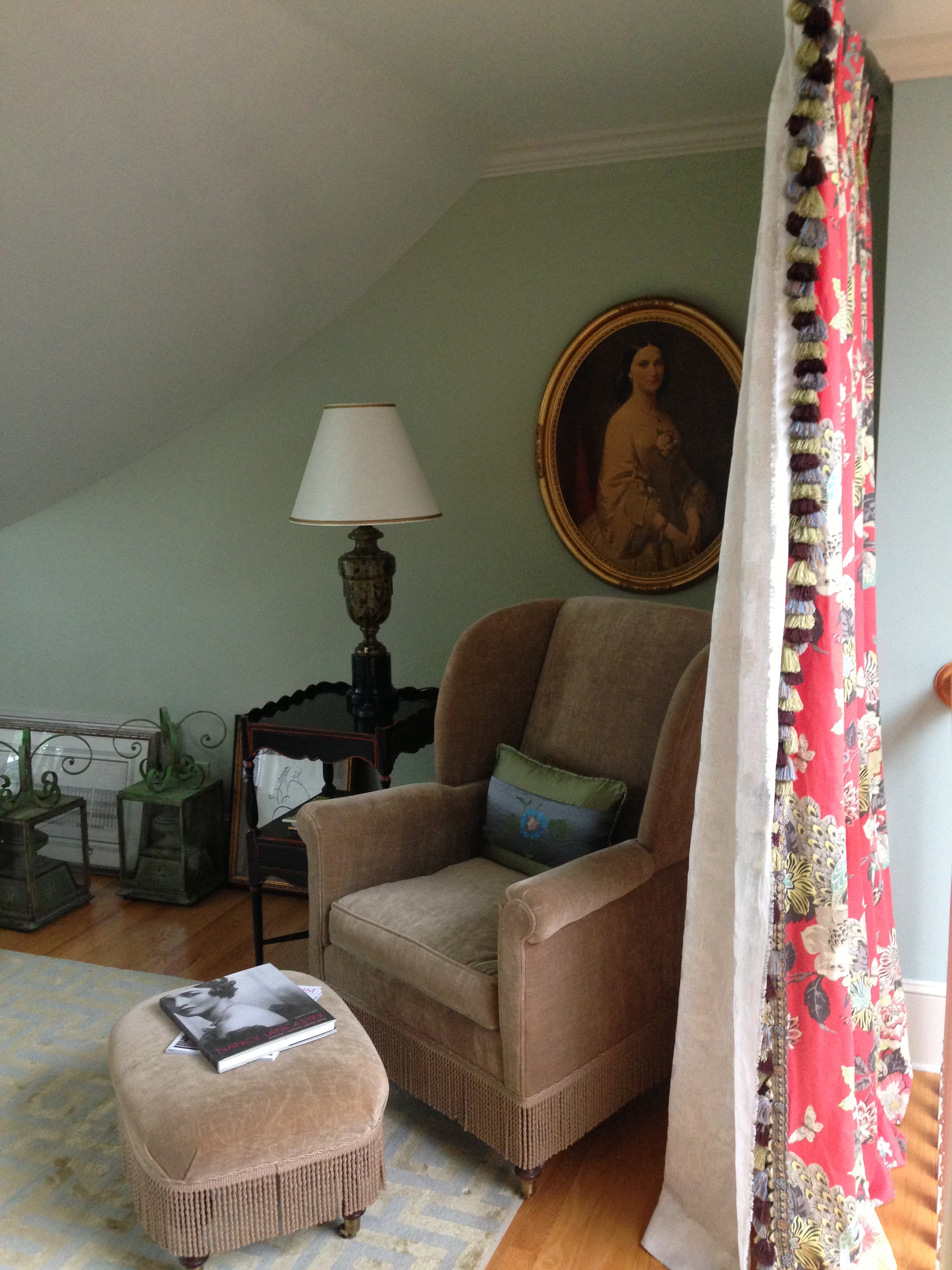
Bohn also decorated the “Ladies Retreat” sitting room on the third floor. She enhanced the drama of the space (that window!) with a high gloss lacquer treatment on the ceiling, but kept it cozy by painting the walls in the same celadon green color (I think) with a more matte finish.
This vignette, in particular, just says “New England” to me. I can just picture the ‘ladies’ gossiping about the goings-on in town, and sipping their tea while gazing out onto Lawrence Cove, from their own little part of the Secret Cove.
The Secret Cove Decorator Show House is located at 2 Lawrence Lane in Kittery Point, Maine, and runs through August 15th, 2013 (rain or shine! Just not on Tuesdays…). It’s well under an hour and a half’s drive from Boston. For tickets and other information, please jump on over to the Museums of Old York website.

Thanks for the lovely comments!! glad you like the house and you are right…it was a thoroughly dismal downpour….glad it did not deter you 😉
Best,
Meredith
You are most welcome, Meredith – thanks to you for shining a light on an otherwise dreary day! Great meeting you; I appreciate your comment and follow!
Kelly, thanks so much for writing this wonderful blog about the Museums of Old York Show House!
All my best,
Frank Hodge
Thanks, Frank! I loved the study. Wish I could have captured the phenomenal desk you designed and placed in front of the window, but my shutterbug skills are sorely lacking.
I loved reading about the show from your point of view, Kelly! Thank you so much for visiting our spaces and sharing your thoughts. Your descriptions and photos really bring it to life. Secret Cove is like our little summer getaway … while it lasts! Just a few more weeks to call it home : )
Yvonne! Congratulations to you and the other Trio ladies on a job well done. It must be exciting to finally just sit back (more or less) and admire the fruits of your labor. Hope to see you soon; take care!
Thank you so much for the wonderful mention in your post! The Poolside Portal is hard to photograph, but you captured it beautifully! And you captured the wall color the best of all the photographs I’ve seen! Looking forward to reading your future posts!
Rosanne
You are most welcome, Rosanne! I loved that fresh green wall color; it was perfect. 🙂
Thanks for calling me excruciatingly talented! Wow!
I’d be honored (and excruciatingly LUCKY) to work with you some day, Eric. Would love to keep in touch as I get my “real” portfolio together over the next few months. It was great meeting you, and thanks once again for allowing me to sneak into the spaces you were shooting!
Hi Kelly,
What a delightful post. I wish I had been able to meet you at Secret Cove. Thank you so much for your enthusiastic review of the show house and for your lovely comments about my Pool House. It was a fun area to work with (despite the crazy hot weather) and I had assistance from a talented young intern, Ryan Bulger, who was responsible for the creation of the picket chandelier you mentioned. Thanks again!
Kindly,
Valerie Jorgensen
I’m sorry to have missed you, too! Thank you for your kind words, as well. And kudos to Ryan!
Hi Kelly,
Such beautiful writing and excellent coverage! I really appreciate you taking the time to visit this beautiful house and sharing your thoughtful impressions of my porch. I came in shortly after you left probably and was sorry to miss you. Hope to meet you some day!
Thank you so much, Barbara! What a bummer that we missed each other. Hopefully we will meet soon – until then, take care and enjoy the rest of the show house run, while it lasts! Crossing my fingers for better weather this weekend…