As a mother and devotee of family-oriented design, I probably look at dozens of photographs of nurseries online every single day – whether I’m shopping for my own child’s room, or just surfing great design sites and blogs. There is so much creativity out there, and it can be very inspiring. Before my child was born, I spent countless hours on these sites trying to pull together the elements of my son’s nursery. At the same time, I was doing tons of research on caring for infants, parenting, etc. – as a first-time mom, I really wanted to get it right and be super prepared when my son arrived.
These are some pictures that are relatively typical of what I found (note: the photos below are a mix of ‘selling’ images, and ‘design’ images).
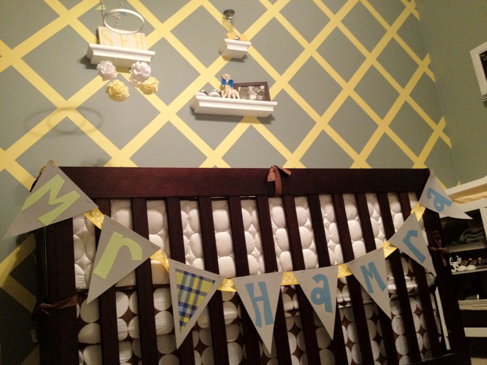
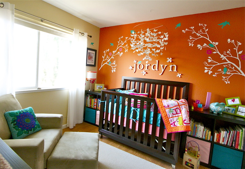
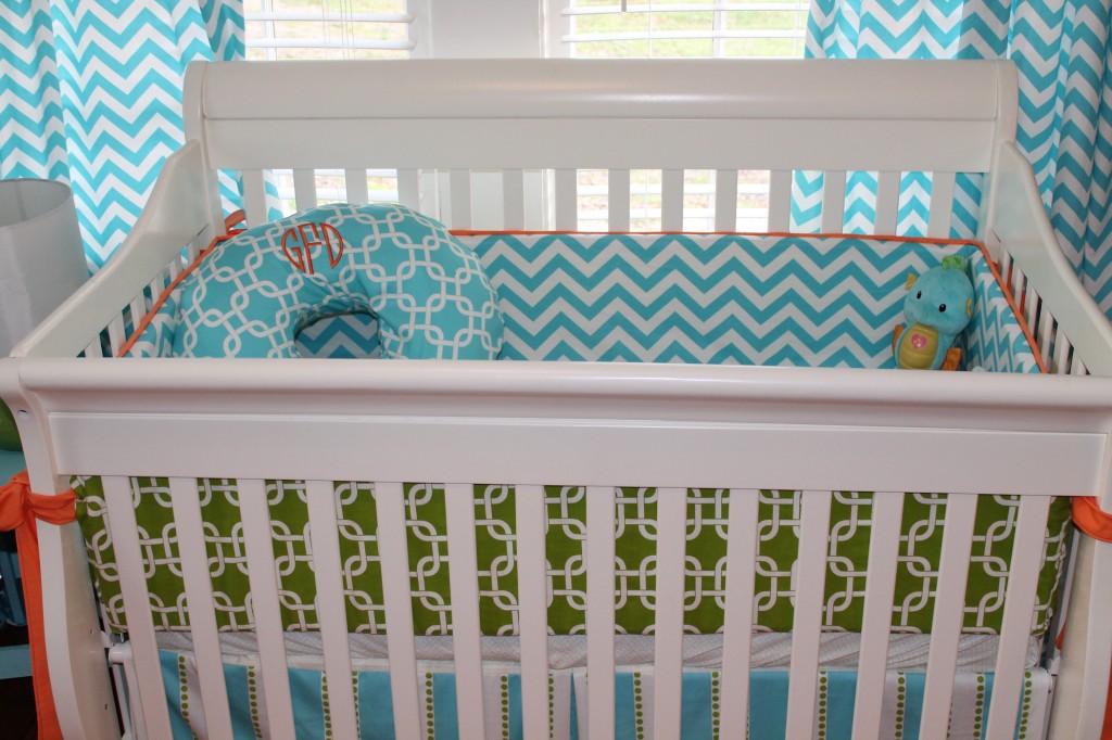
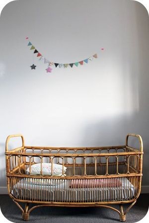
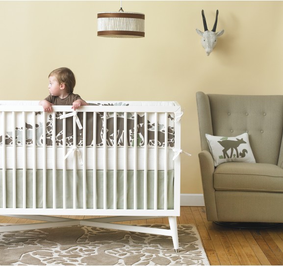
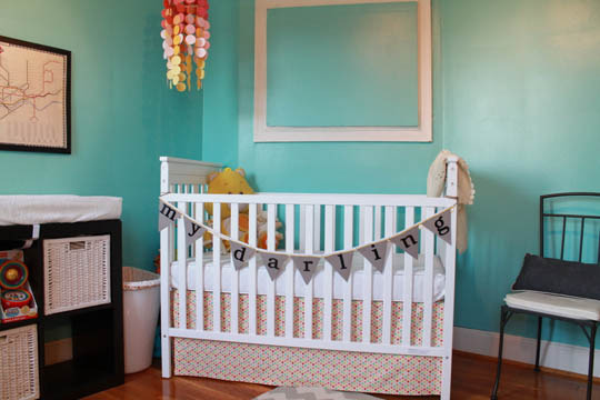
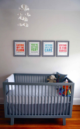
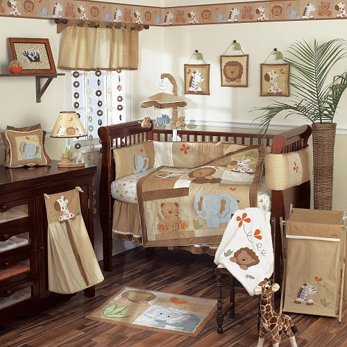
Photo sources: 1, 2, 3. Project Nursery. 4. Pinterest via Justine Blakeney. 5. Dwell Studios. 6, 7. Apartment Therapy, 8. CoCaLo (babiesrus.com).
Just in these 8 pictures (which I did not search too hard for – most were already familiar to me), there are countless safety hazards for young infants. Allow me to enumerate them:
- Quilts, pillows, toys, and other objects inside the crib (SIDS prevention no-no)
- Missing crib front (yikes!)
- Strangulation risk from pennant buntings hung ON the crib. Sadly, babies are actually sleeping in these cribs, these were not staged…
- Potentially dangerous objects placed on display ledges directly above crib (Isn’t there a better place to put these? I hope they do not live in an area prone to earthquakes). Again, this one is a real nursery…
- Crib bumpers everywhere you look (AAP strongly recommends against, another SIDS prevention measure)
- A child sitting up in a crib in which the mattress should be lower (he looks as though he might topple out if he leans forward)
- An appallingly unsafe crib made of some sort of wicker or jute. I have no doubt my little mini me could squirt his way between those ‘slats’ and straight out of the crib, to say nothing of it’s overall construction, which I’m sure is not terribly sturdy. This one is just plain illegal in the U.S.
Granted, most people see these things and realize that they are, in most cases, staged – meaning, someone did these things specifically for the purposes of creating a beautiful photograph. The stuffed animals are there just for show, they don’t really sleep with baby. Or showcasing items for sale, in the case of the commercial images.
I have resisted joining others in making critical comments on these blogs and other sites, because I believe what my mother used to tell me – that if you haven’t anything nice to say, you shouldn’t say anything at all. However, to me, this is different because for that certain percentage of parents-to-be that do not do their homework, or have access to the best information about keeping their babies safe, these photos can be downright dangerous. They don’t come with warning labels, like cigarettes and alcohol – they are just presented.
So here I am, on my own turf, taking a stand against these and other staged nursery photographs. For those blogs and sites with editorial staff charged with screening and publishing user-submitted content, I urge you to educate yourself on current AAP recommendations, crib guidelines, and good old fashioned common sense – and prevent those images that don’t conform from being published on your site. That would really make a big difference – and maybe even save a life. Isn’t it worth it?
And to the government (Consumer Product Safety Commission), which does regulate cribs, why not expand your scope to cover the visual merchandising of things like bedding and other nursery accessories by companies in the United States? Why risk people purchasing or creating something that is “cute” that unwittingly puts their innocent child in peril, or worse?
Lastly, to all of the amateur and professional photographers out there – I challenge you to be creative and devise ways of showcasing a beautiful nursery that also connote safety. Be inventive with lighting and compositions. I personally don’t think anything is lost from a picture by removing a bunch of stuffed animals from a crib.Who will join me? Contrarian opinions are welcome here, too!


wow … they are all lovely and so different, even as a non-mum I like
I’m a little out of my territory here (no children) but I’d like to think I have enough common sense to comment. I agree with all you said here and I honestly think you could easily comment on these websites and say something in a gentle non-threatning way. You bring up VERY valid points that maybe new parents aren’t thinking about… just daydreaming over some photo on the web. I think staged photos are fine.. but I also HATE them. I think they’re misleading. Kind of like “photoshopped” models… you’re looking at something that isn’t real, unattainable, and maybe dangerous.
Okay, I’m not qualified, but clearly you make an excellent point!
Thanks, Stacey – and you raise even more valid points beyond safety (which was my focus) to what is ‘real’ and ‘fake.’ I admit, when I was photographing my son’s nursery for this blog and other purposes, I moved some things around – you won’t see the Diaper Genie, the trash bin, or all of the ‘stuff’ that sits on top of his changing table, but these are an integral part of the room in order to be functional. You’ve certainly given me even more to think about!
Oh no, I totally agree. Nobody wants to see poo-poo diapers in a beautiful well thought out room.. it’s a no-brainer to move those things.
Note: I love your sons room .. you did an amazing job on that. I think you’re definitely qualified to speak up and help others. Some parents don’t know what the heck they’re doing!! (no offense.. we could all use help, ya know)
I hope I didn’t confuse you with my response. I mean to say that I think it’s okay that you moved those things out of your sons photo. They are practical things that you HAVE to have.. but not always so “pretty” for a photo. I don’t think they are a safety hazard… but many other things are.
Oh no, I totally understand what you’re saying, Stacey. It just made me think about staging in a broader context, especially since I’m all about celebrating the way people really live :). Then Lindsay got me thinking maybe the photography angle was just the superficial part – a symptom rather than a cause. Thanks to you both for your thought-provoking comments!
Jeff Rossen recently investigated stores showing crib bumpers in their displays for the Today Show. Even more concerning is that many of the store workers recommended soft crib bumpers for newborns!
http://today.msnbc.msn.com/id/47414692/ns/today-today_rossen_reports/t/rossen-reports-crib-products-may-be-deadly-experts-say/
Thanks for sharing, Lindsay. I hadn’t seen that, but sadly I’m not surprised. I think the real question is – why do all of the bedding manufacturers keep producing padded crib bumpers for sale? Certainly, they’re considered ‘ok’ for toddlers, but they’re completely unnecessary. I covered the photography side of the story, but the commercial side is the source of (part of) the problem.
Wow, I never really looked at nurseries this way (I don’t have children), but it’s interesting to read how many dangers could be potentially lurking in the seemingly-perfect pages of Pinterest. Design-wise they’re beautiful, but guess I have a lot to learn 😉 Wonderfully detailed post.
Kristina
Nook & Sea
Thanks, Kristina! Forgive the delayed reply – I haven’t sat down at a computer for nearly a week, so I am catching up and digging out! Nice to see you here, thanks for stopping by. I am living the West Coast lifestyle vicariously through Nook & Sea, from my New England environs :).
thanks for all these tips! I am decorating my nursery right now and didn’t really think about the stability of framed pictures hung on a wall adjacent to the crib… I am definitely calling my handy man to make sure all wall art is seriously secured!
Sorry I missed this comment earlier! I’m glad my post and experience has helped. Professional hanging is a good idea, for sure – I just wimped out and used decals above the crib and changing table :). I can’t wait to see how your nursery turns out!
Great post! A nursery shouldn’t be “perfect” it should be child-friendly and inviting imagination!
Reblogged this on DesignStaging.