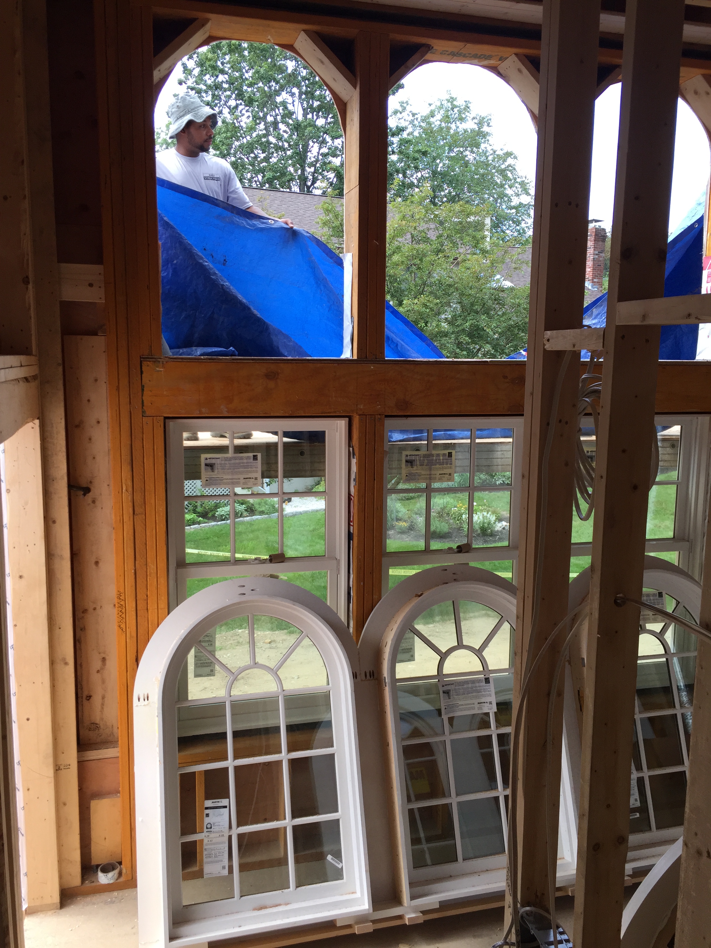
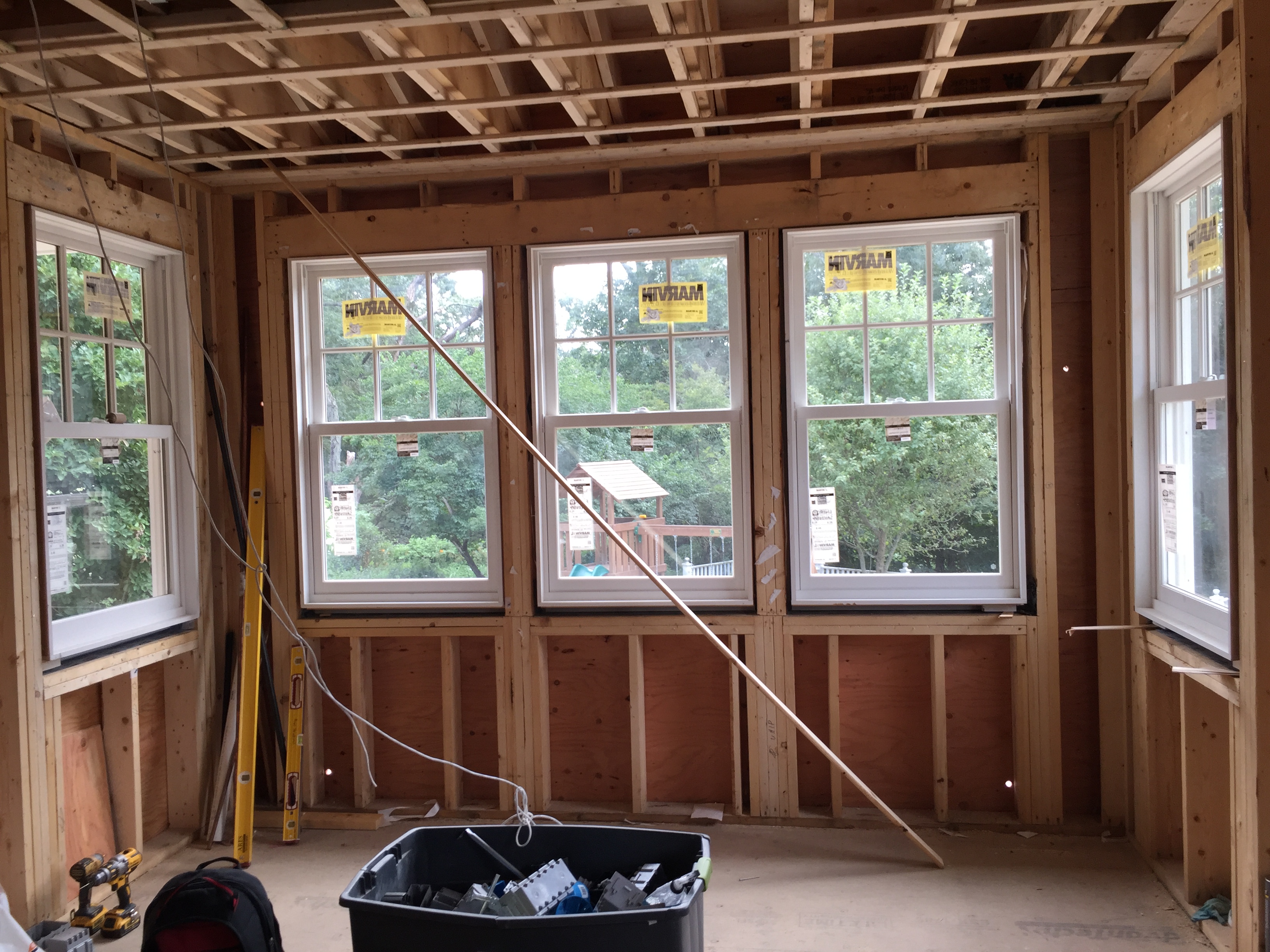
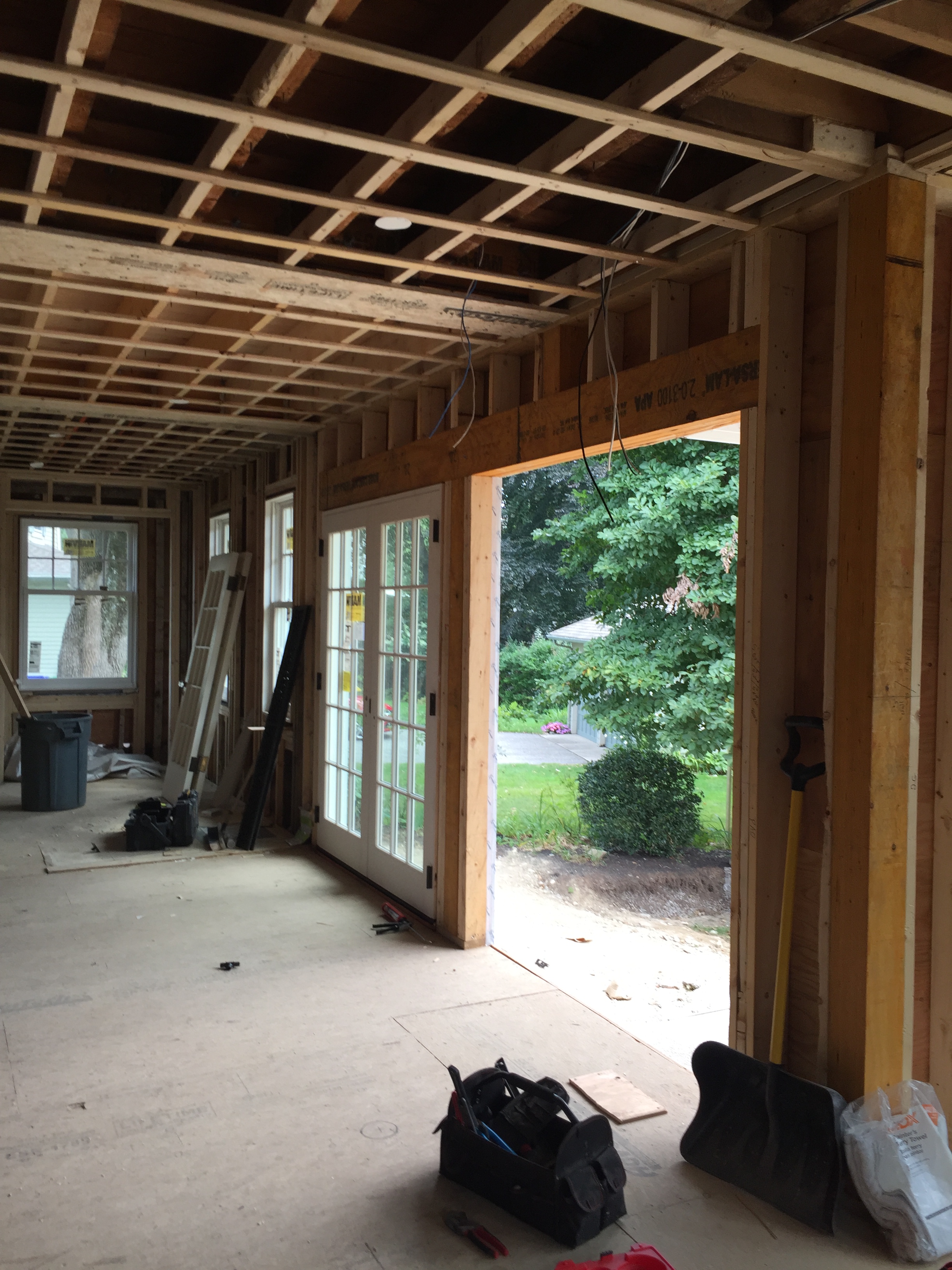
Since I missed Friday Family-Friendly Find last week (did you notice? I did 🙁 ), I wanted to share an extra-special update today to make up for it. Things are really heating up here with our renovation project, and I’m really excited to say that we’re inching ever-closer to weather-tight. All windows and exterior doors are now on site, and many are installed. It’s truly a beautiful thing!
My neighbor was kind enough to lend me (and a couple of folks on our framing crew) her eclipse glasses so we could take a brief peek at the partial eclipse right there on the back ‘porch’ !
Anyway, I’m going to keep this post light on construction pictures, and heavy on design inspiration. Sound good?
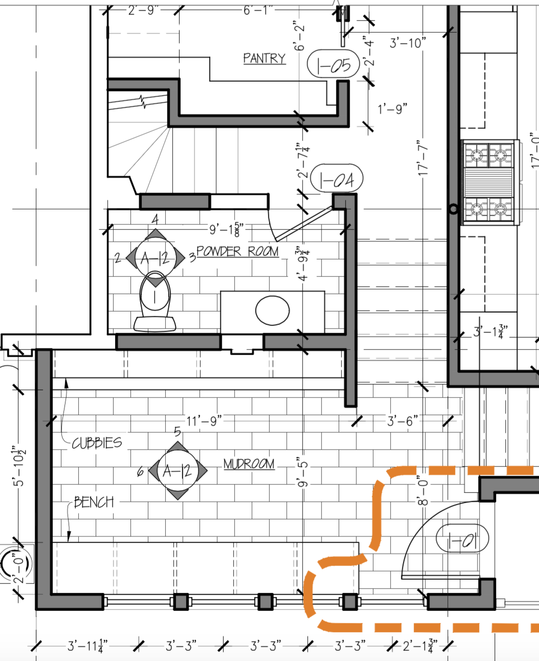
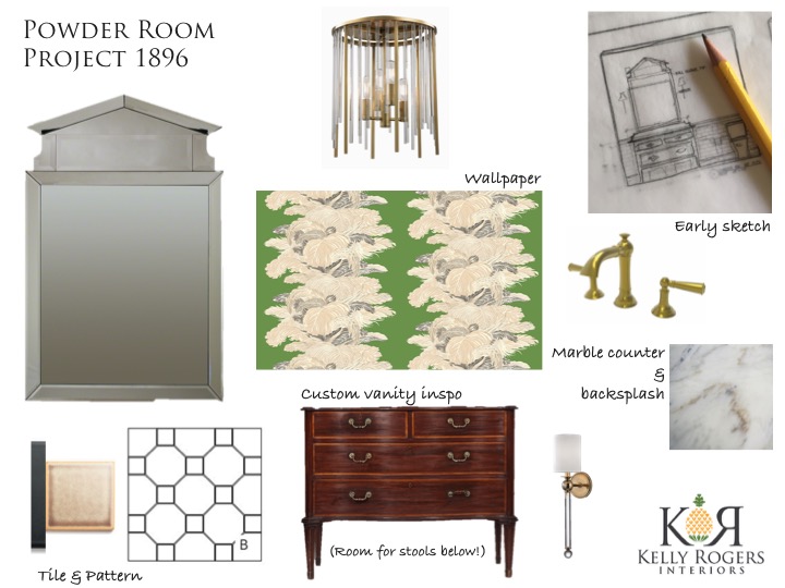
As promised, I wanted to share the design-in-progress for our new powder room. For a half bath, it is abnormally large, but that’s just how the space worked out. I wish we’d had enough room to carve out a pantry, powder room and laundry room in this back hall, but something had to give, and the laundry room was it. But it does leave us with generous spaces for the other two rooms.
You may recall me lamenting recently about ‘losing’ space in our kitchen I thought we were going to have? We also ‘gained’ some completely unnecessary space in the powder room. It is nearly 10 feet long now (contrary to what these drawings show). But this gives you an idea of the context of this space. It is part of the less formal back hall, but I’ve always wanted a ‘fancy’ powder room (especially after what we had before) – and you can totally make a powder room a design specimen unto itself, so that’s exactly what I’m doing! With a strong nod to the Colonial Revival history of our 1896 Victorian, of course.
One thing I knew I wanted to incorporate in the room was a paneled wainscoting similar to what is in our dining room and foyer, which is by all indications original to the house. It’s a visual cue that you are in a more ‘formal’ part of the house. We are likely making the height a bit lower, though – around 3′ or thereabouts. Pro tip: If you want to wallpaper your bathroom (and I definitely do!) and you have little boys, either a wood or tile wainscoting is a must. If you haven’t gotten to this point yet with the potty, you’re just going to have to TRUST ME. 🙂
I have teased an image or two on Instagram as I worked out the powder room scheme, but I’ve changed my mind on the wallpaper. And over the weekend, I also reworked the lighting. I needed this blog post to help me feel like I’m committed and can’t make any changes now. Lol! Here goes…
The first thought of any sort that popped into my brain for this room was to try to source a Hepplewhite or Sheraton-style antique commode and convert it into a vanity. After realizing that I would either need to fork over $15K-$20K for the absolute real deal antique (and then cut a giant hole into it??), or spend the rest of my earthly life looking for a needle in a haystack, I resigned myself to creating a custom vanity inspired by the original antique form (working on the design now!). An important design element is that it sits up on higher legs, so as to allow space beneath to tuck step stools until both of my kids are tall enough to reach the faucet and sink. I like this solution, rather than building a stool into the design, because it’s really only a few more years that I will need this.
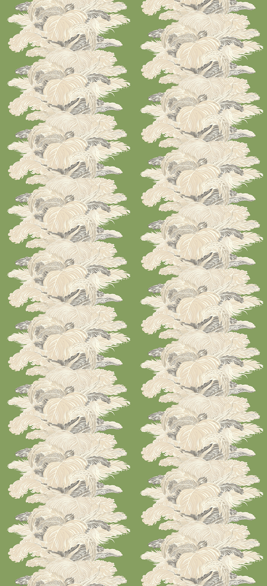
My ‘new’ wallpaper – a Barry Dixon design for Vervain – has a bit more of an edge to it, but still with a very traditional soul – which makes it just perfect in my eyes. That, and the fact that it is green! And with feathers! What you can’t see is that the paper is pearlescent, and that the feathers/stripes are rendered in exquisite detail. Also, the scale is huge – the image above represents a 54″ wide panel. This powder room can handle it for sure.
For the floor, I am opting to go with a classic and traditional octagon and square pattern framed by a thin black liner border. I haven’t decided on the exact tile I’m using, but believe it or not I’ve really limited myself by the shape I chose, to a couple of handmade ceramic manufacturers. Octagons (aside from inexpensive porcelain mosaics) are actually kind of hard to come by these days – everyone wants hexagons, apparently.
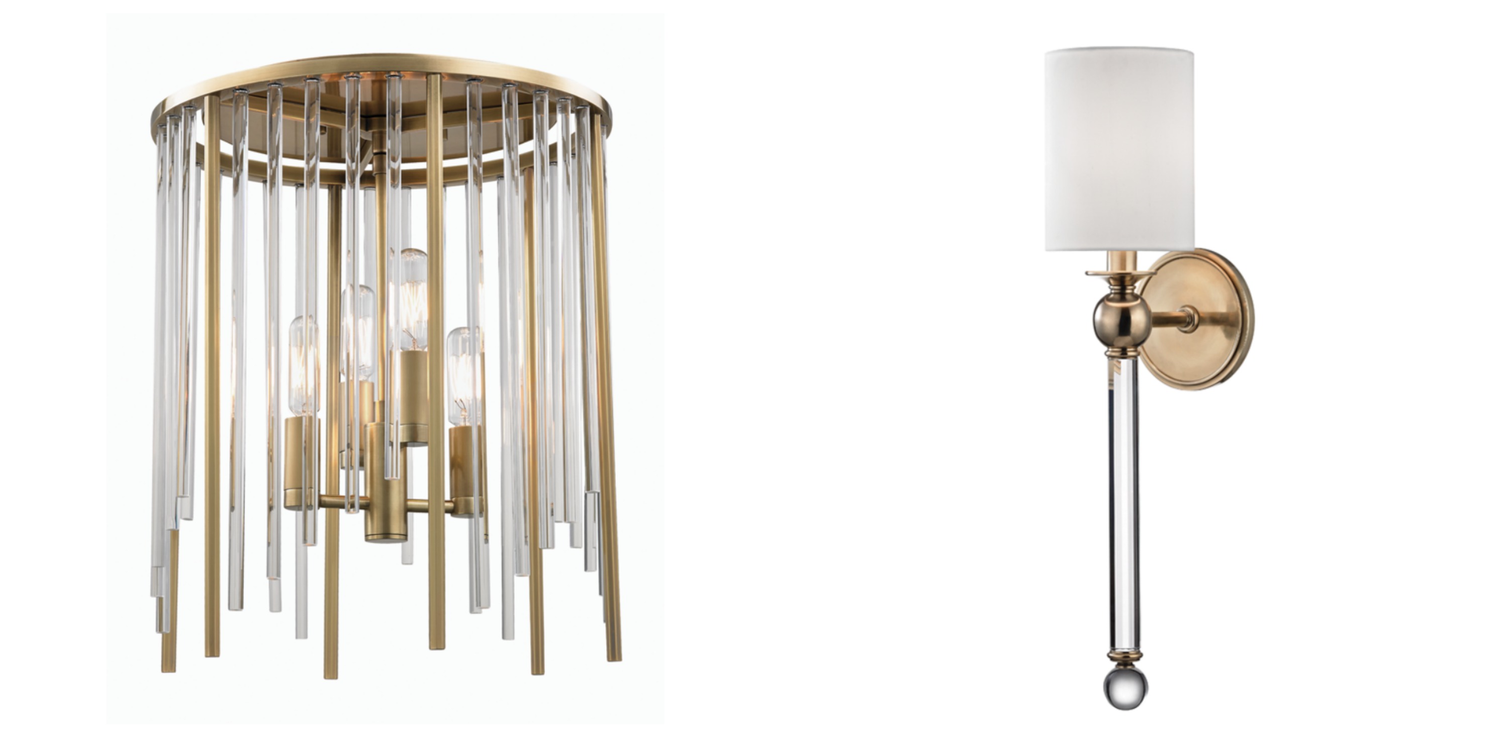
The ceiling light is a funky and very modern (for me) counterpoint to the floor. The sconces have an elongated line, and incorporate glass like the ceiling light, but they also connect back to the traditional thread…and to the faucet I (finally) decided upon.
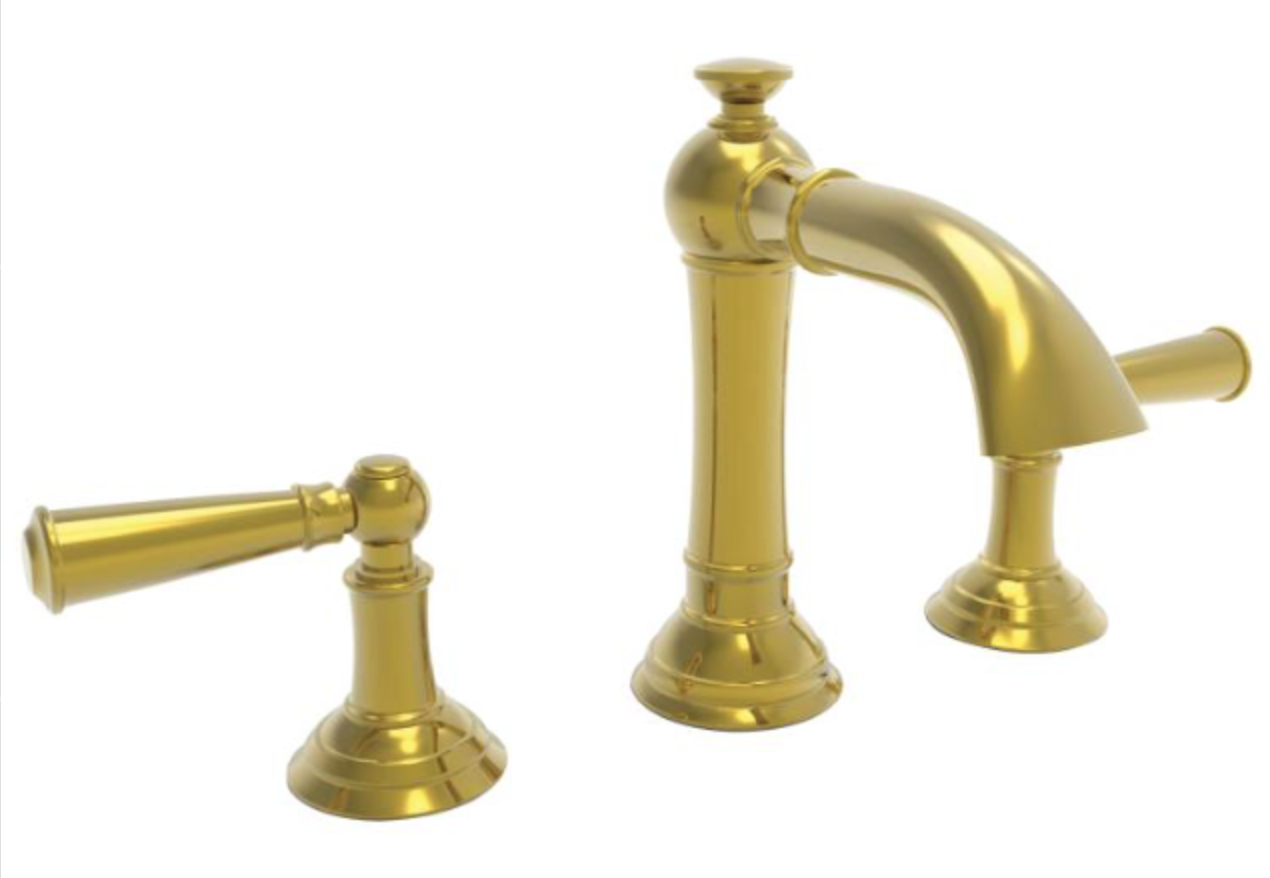
Part of what I love about it is that all of the detail you see on the levers is created out of one piece (rather than having rings and/or deep ridges), so I know it will be much easier to keep clean. I always look for a higher spout reach, as well, when kids will be using the faucet. Even when they can turn the levers, with or without a stool, it can be hard for them to reach down under a low faucet spout. Independence is everything!
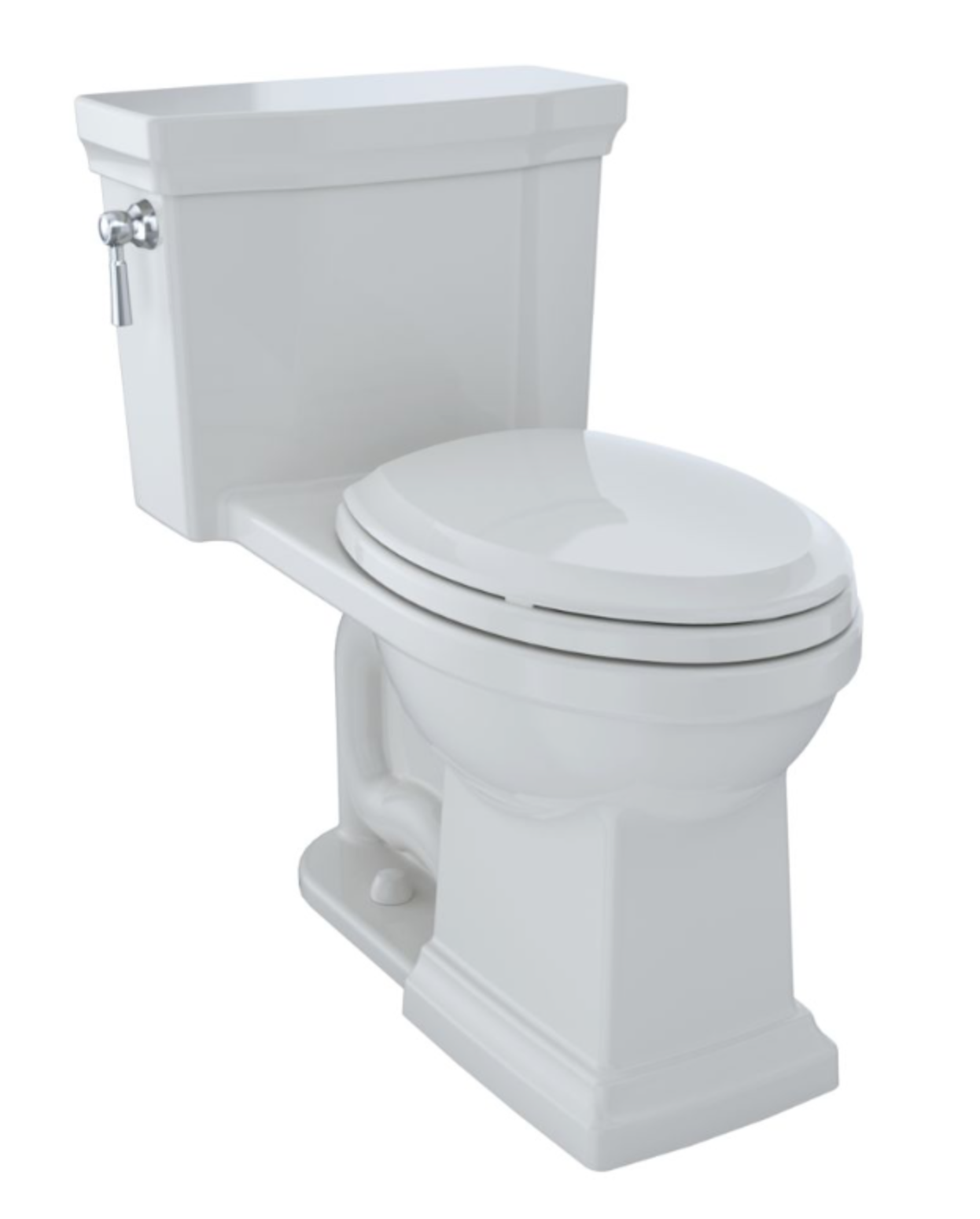
Speaking of one-piece…another vital element to a kid (especially boy) friendly bathroom is a one-piece toilet. Toto’s SanaGloss is also a gift from God, and I’ll probably want to replace all of the toilets in my house after this one is installed. Oh, I’m using a Toto sink in the vanity, too…with SanaGloss, again.
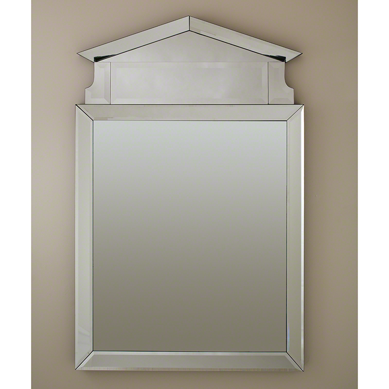
While hand-washing, you can check yourself in the huge frameless mirror (I’ve really been into frameless lately…with the beveled edges, especially). It’s modern in that sense, but with a strong traditional/neo-classical reference.
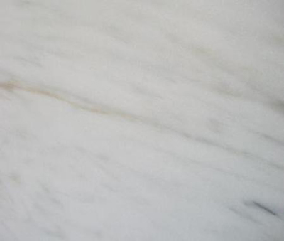
I think the only thing on the board I haven’t yet addressed (elephant in the room!?) is that lovely piece of marble near the lower right corner. I’ll bet you never thought I, the proponent of family-friendly design, would use marble on a counter surface. Well, I would. Here’s the thing – for me, personally, I couldn’t deal with it in my kitchen. It would look like a war zone of stains and etch marks, especially with all of the natural light it receives during the day. However, the powder room is a windowless room, and although I’m sure we’ll have rings where the soap dispenser is, and maybe some minor etching, I honestly don’t care. I’m trying to find the old-timey-est looking piece of honed imperial Danby marble, with the thought that I’m just adding a little patina to something that already looks like it’s been around the block. We’ll seal the heck out of it and enjoy its antique beauty.
Furthermore, if a client really wanted marble countertops in their kitchen, and they knew exactly what they were getting into (and they would, because we discuss the pros and cons of all stone options at length), I would fully support it. I recently did a kitchen where I recommended a highly veined marble-look quartz on the counters and backsplash, and the client ended up selecting a beautiful quartzite (which is susceptible to etching). It looks incredible and they love it! Every family is different…
Anyway…there you have it! I’d love to know what you think about my powder room plans. Do you think I’m crazy to use marble? How about that light fixture – is it just too funky for me, to paraphrase George Michael (everybody wants a fixture like that, though 🙂 )?

