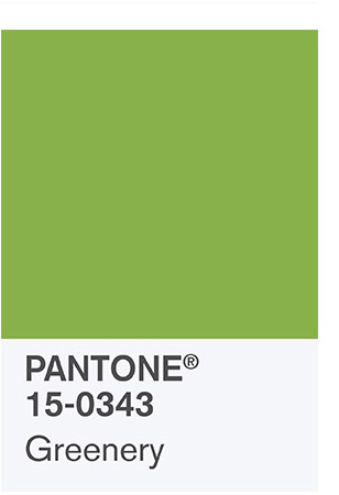
Late last week, Pantone, the cross-industry authority on color (and the standard for color matching in the production of textiles, paint, printing inks, and virtually any consumer product you can imagine) announced its color of the year for 2017.
Those who know me well won’t have to guess how I feel about this color.

[Apologies to Millenial readers who might never have had the pleasure of delighting in the comedic genius of Balki Bartokomous and Cousin Larry. Actually, no apologies…you’re welcome. America or Burst!]
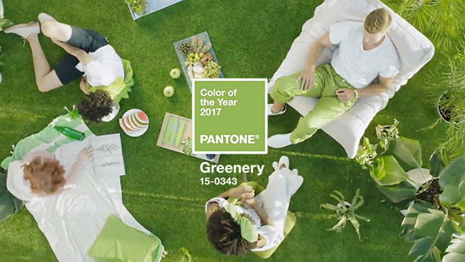
Anyway, suffice it to say, for the first time in awhile I am totally LOVING the Pantone color of the year. It’s called “Greenery,” and it’s as fresh and happy as all get-out.
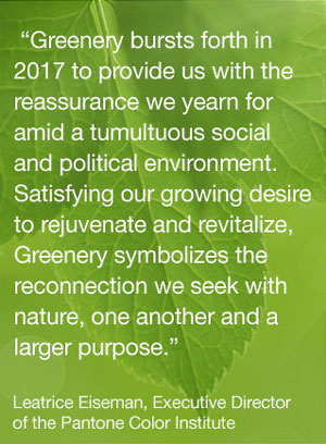
Honestly, I kind of thought we were due for a gloom-and-doom color, for many of the reasons Leatrice Eiseman, color guru extraordinaire, cited in her rationale above. I’ve never been more glad to be wrong. This color is cheerful, optimistic, cheeky, fun, and youthful, yet firmly grounded in the natural world.
So how will I use Greenery? Well that’s easy enough – I’ve used it, and I’ll continue to use it in just about every way imaginable.
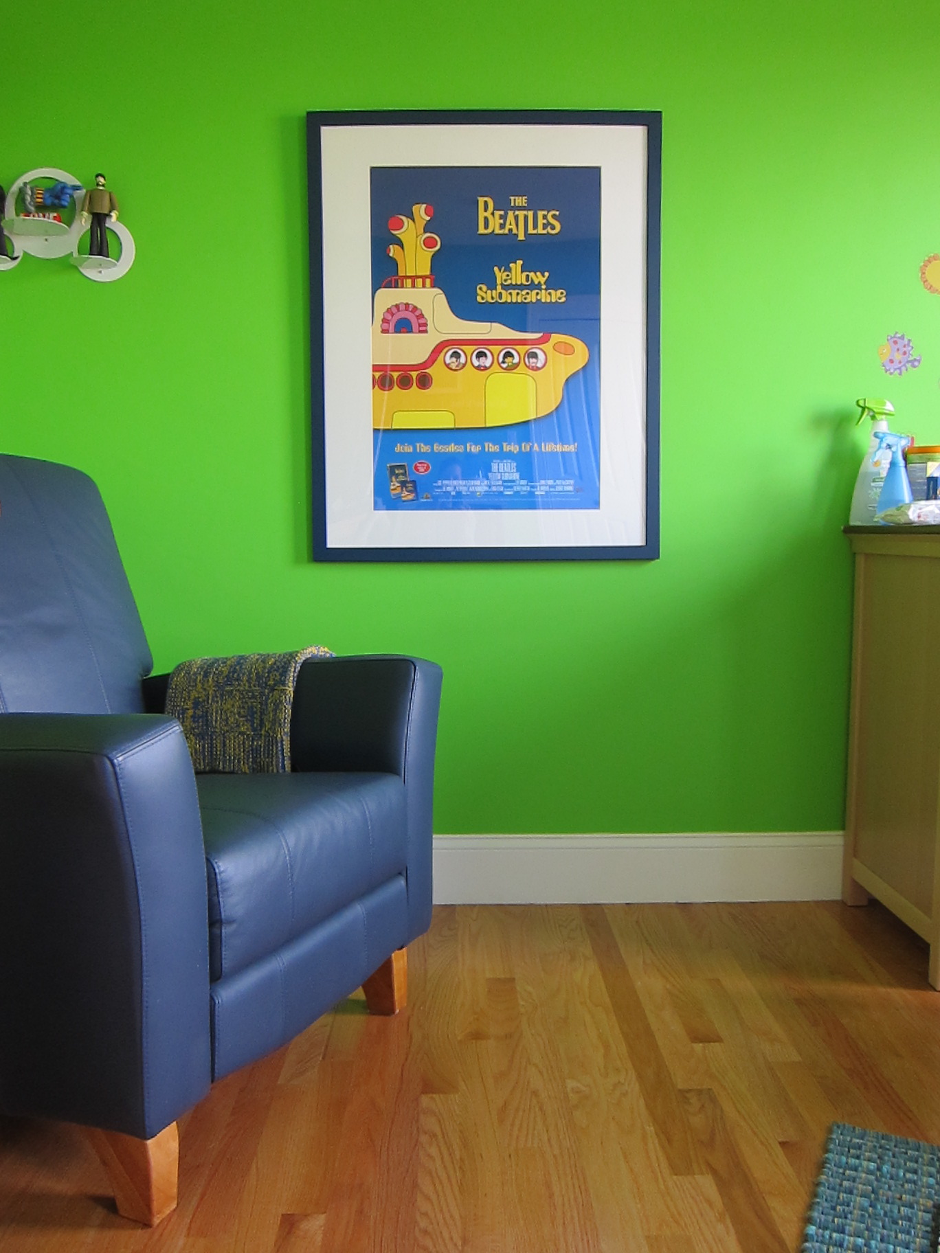
I painted the very first room I really ‘decorated’ – my eldest son’s nursery in our old condo – Benjamin Moore Sweet Pea. Not for everyone, but we loved it!
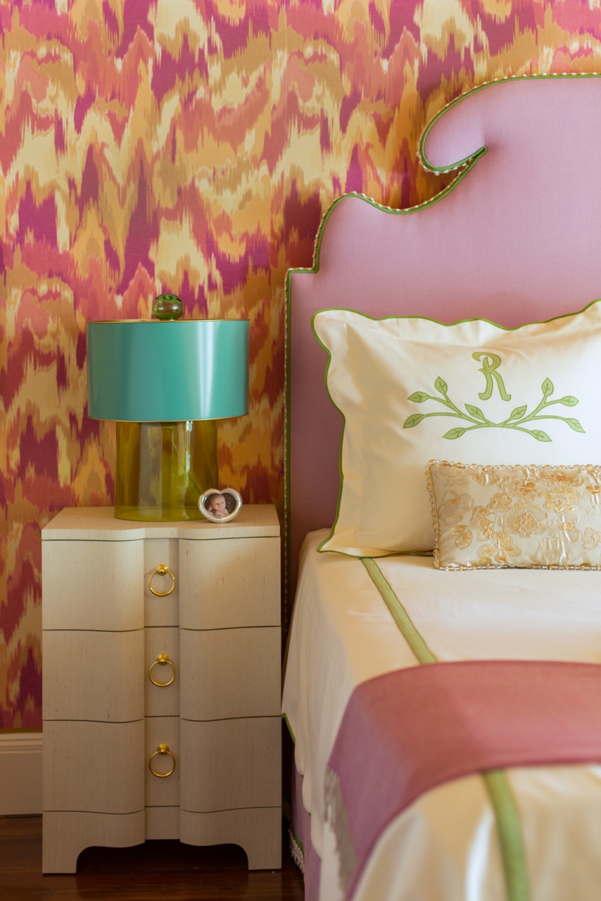
Photo: Eric Roth
My Junior League of Boston 2016 Show House mother-in-law bedroom used Greenery as an accent color alongside turquoise and what I called a “rainbow sherbet” palette of vibrant and energetic hues.
I’ve used it throughout several rooms in my own home, as well…
But my absolute favorite project utilizing this color is still in progress. In fact, we had just finalized all of our orders a couple of days prior to the big color of the year announcement!
This is a close-to-final living room scheme I posted on Instagram awhile back. Did you recognize the other color in my palette?

It’s Emerald! Pantone’s 2013 Color of the Year. Welcome back, old friend :).
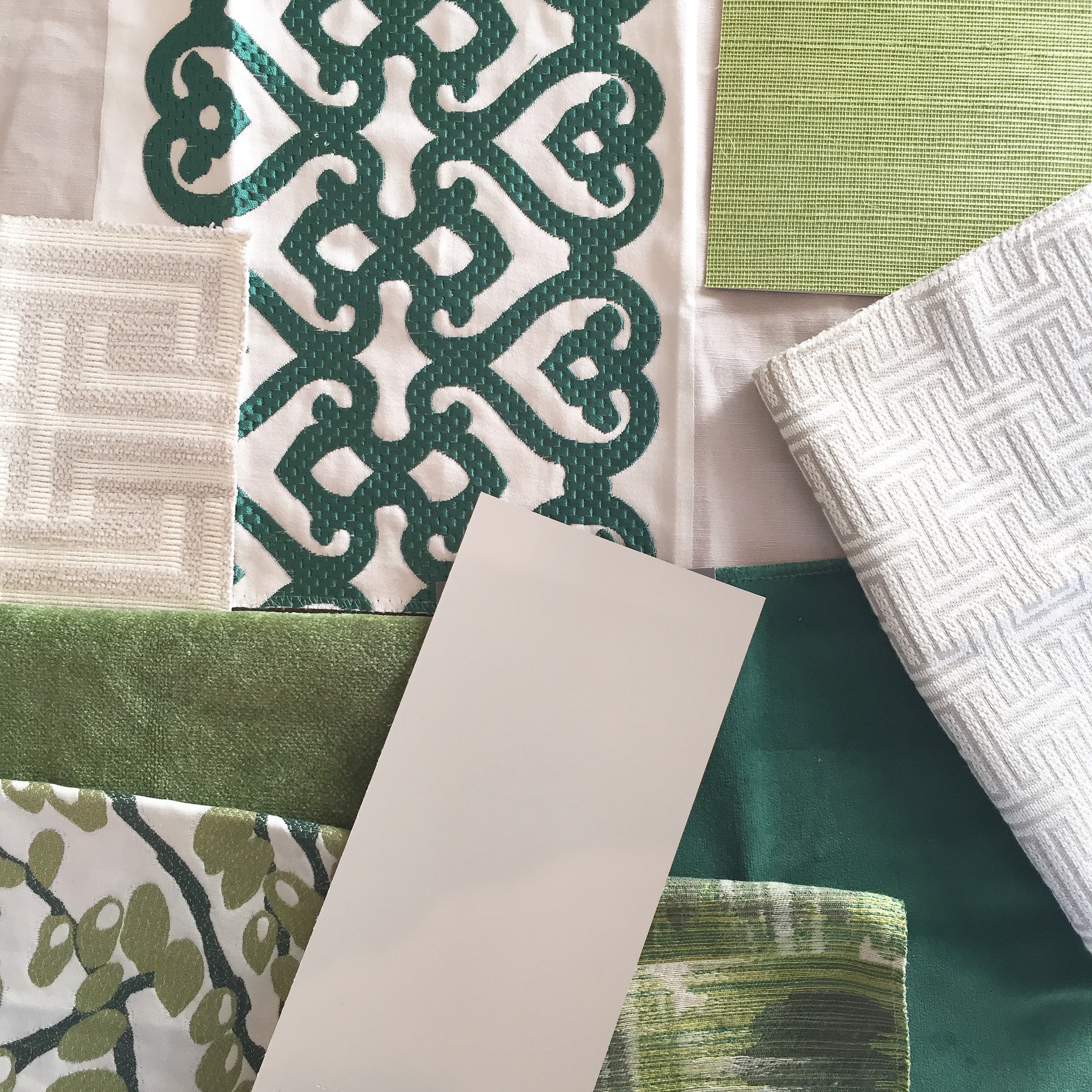
I created this sophisticated and refined, yet young and fun palette for a young family in Lexington looking to liven up their ~10-year-old new construction home. We are focused on the main adult entertaining spaces – the living room and adjacent dining room – as well as the foyer and stairs up to the bedrooms. When I met with them for the first time, I listened carefully to their needs and wishes, but I also learned a lot just by looking around. I noticed that they were not afraid of bold color and pattern, and green was already incorporated in their space. They love both geometric and nature-inspired patterns, and green seemed like a natural vehicle to bring these concepts together.
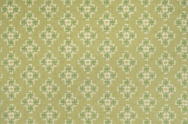
The living room will be repainted a neutral ‘greige’ color, and we will add in liberal accents of Greenery and Emerald – including statement round swivel chairs, custom throw pillows, and a green lacquered drinks table. I always like to include at least one item in a room that contains all of the colors within the palette, and in this case there are two – both pillow fabrics.
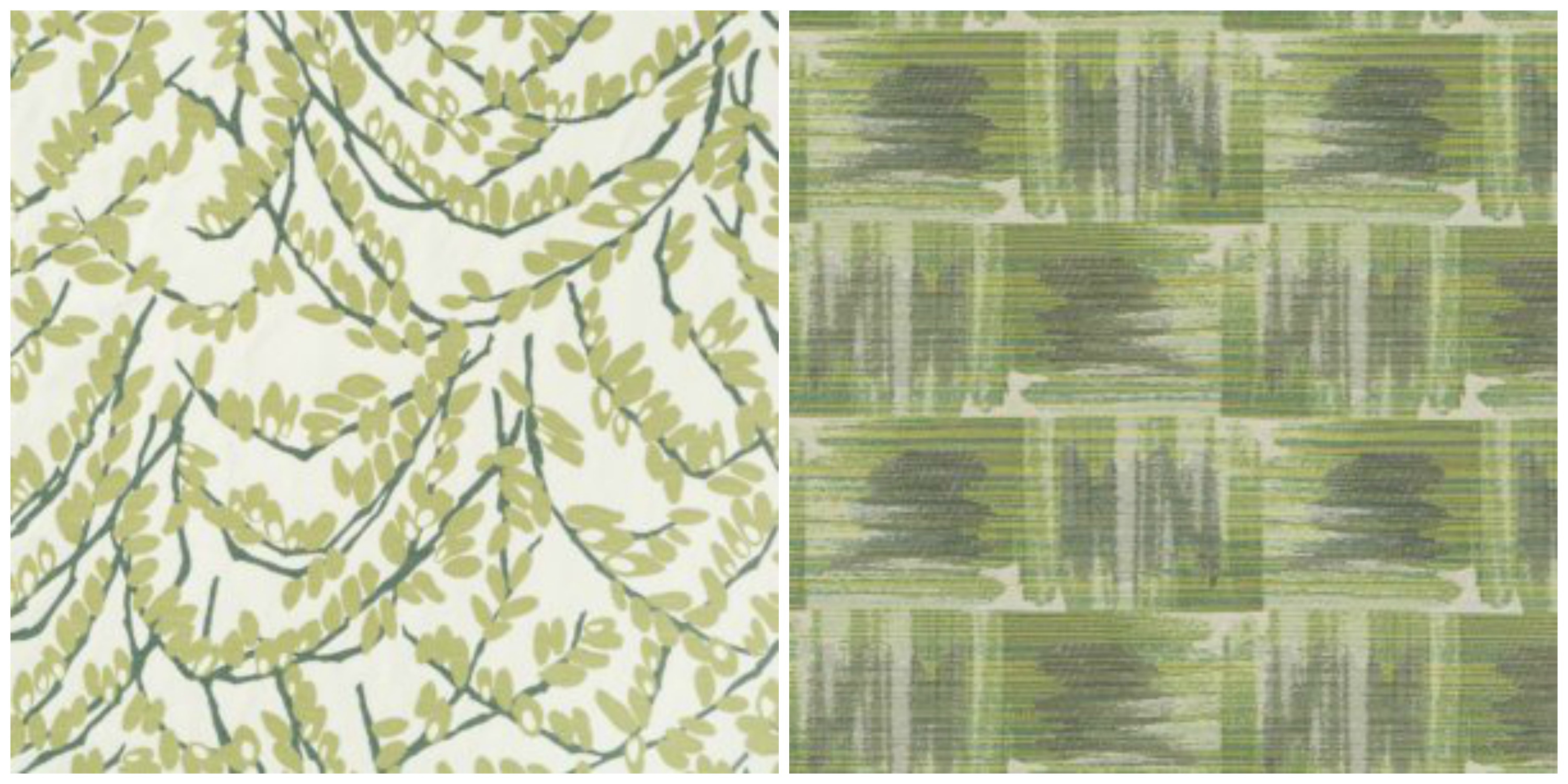
On the left is Robert Allen’s Olive Branch, and on the right, Highland Court’s Ikat Plaid.
The living room’s piece de resistance, however, is a custom 9×12 area rug using our two greens.
The adjacent dining room is keeping its furniture, window treatments and rug, which are all neutral – dark, near-espresso wood and light greige and white textiles.
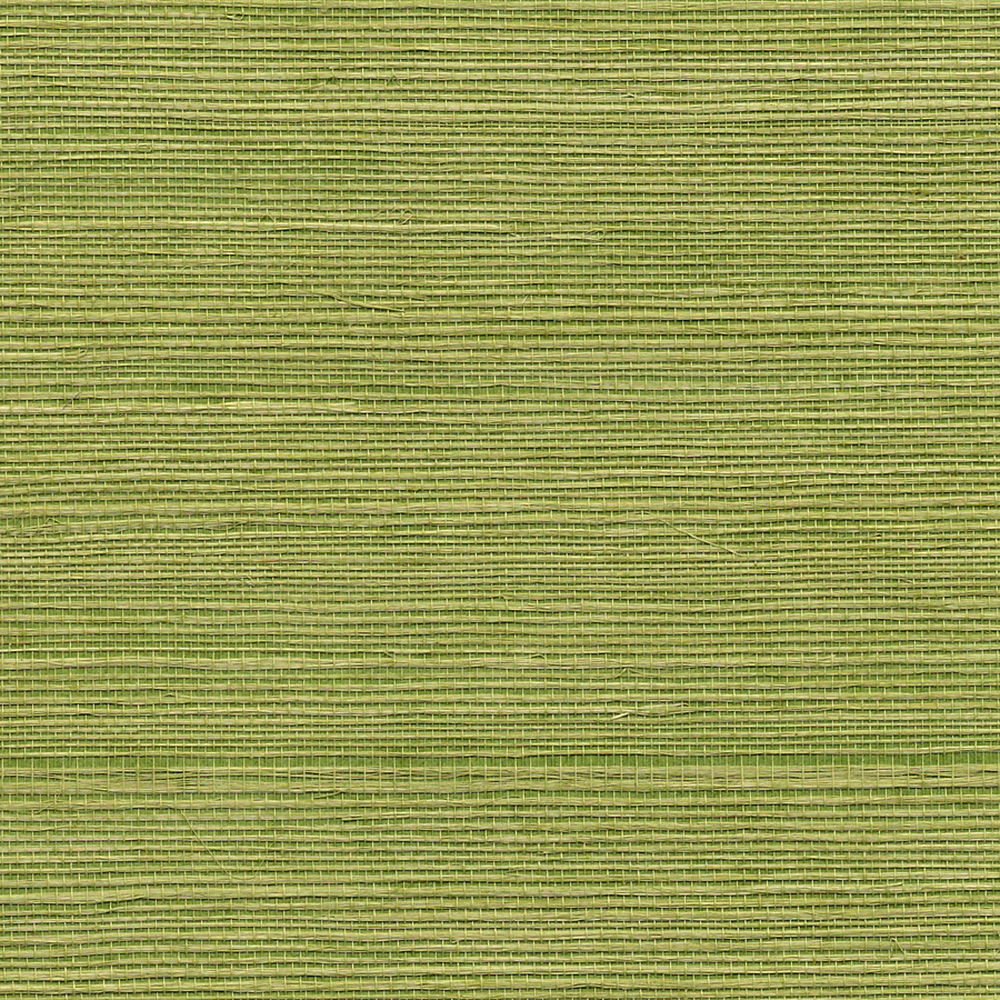
Neutral no more! How about a Greenery grasscloth to jazz up this space? Putting an accent color of one room on the walls of an adjacent room is a time-tested trick for unifying spaces and promoting color flow. The texture takes it over the top. This one is Phillip Jeffries’ Manila Hemp in the Grass Green colorway. I am excited to share the dining room before and after, because it is a testament to how you can truly transform a space changing just one thing!
Moving back to the foyer, we are adding a small area rug and stair runner. I specify a lot of stair runners – they have so many benefits, including safety, improved acoustics, softness/tactility, and, of course, pure aesthetic value.
I’ve had my eye on this one for awhile, and I’m thrilled to be able to use it in this home, for this family!
To keep up with the latest on this project, you can follow #KRIProjectLexingtonGreen on Instagram.
I hope you love Greenery as much as I do. But if you don’t, never fear…trends come and go, so you should always, always use the colors that speak to you in your own home. Greenery is a great ‘trend’ color to try because it is a natural color to bring in as an accent like throw pillows or blankets, which you could always change without spending a lot of money.
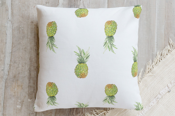
Like this fun throw pillow from Minted, which offers Greenery in a smaller dose (green + pineapples = my idea of heaven 🙂 ).
I’ll be back for a bonus post tomorrow with some inspiration for pulling together your holiday table – and it’s not what you might expect!
I’m so with you on this! Fresh bright green – it’s the new shoots of spring, it’s hope, it’s new life! We’re living in chaotic times no matter which way you look at things and we don’t need dragging down any more! Lovely post – thanks for sharing your gorgeous colours 🙂
Thanks very much! I agree, this is the time we need to have hope, be optimistic, and seek happiness wherever and whenever we can!
I cannot WAIT to see these projects finished. My favorite tone of green. In my dreams I have it in a butler’s pantry where it graces all the cabinetry. And kudos for finding the Bosom Buddies clip. It was one rod the few sitcoms I was allowed to watch growing up, and it was wonderful.
Thank you! I can’t either. The butler’s pantry sounds divine. There was a wonderful library by Parker Kennedy featured in HGTV Magazine recently with all cabinetry and walls in this color you should check out! P.S. It was Perfect Strangers!
Doh! I knew that! That’s what I get for commenting on 3 hours of sleep. 😉 Will check out Parker Kennedy’s library.