Welcome to ORC Week 2! ICYMI – you can check out my Week 1 post here. I’m transforming an unused 2nd floor landing into a cozy nook for the whole family to read, play games, and wind down before bedtime.
Well, let’s see – what’s up with the landing? The walls came tumbling down, thanks to the restoration company.
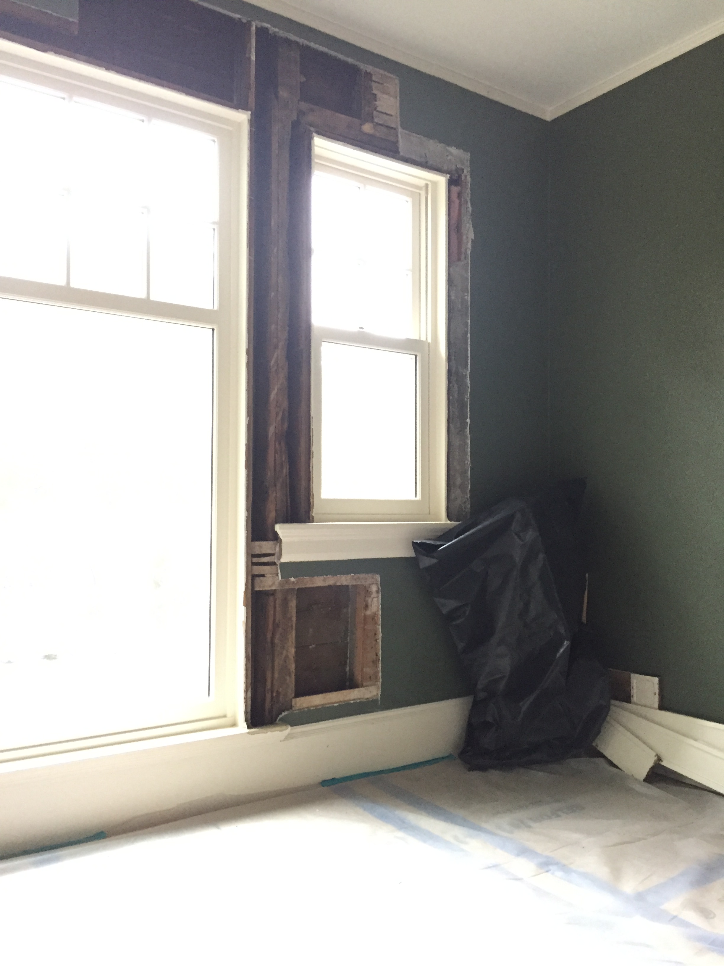
After one white-knuckle day of cutting, sawing, and gutting the small portion around the leak-damaged area (also in my bedroom, incidentally), I had an opportunity to marvel at the enduring solidity of the construction methods of yesteryear.
I never imagined that a 120-year-old house would look so tidy and pristine behind the walls. You always hear horror stories like “you never know what you’ll find when you open up the walls,” but if this is any indication of the condition of the rest of the house, we *should* be in good shape for the large renovation we are planning for next year. Did I ever tell you I don’t believe in jinxes? 🙂
While things get put back together, I’m sharing how I came up with the color scheme for the landing. But first, here is a bit of context and orientation.
My house is very symmetrical along a central axis, and designed in the Georgian Revival style. The foyer and 2nd floor hall are spacious, which is a little unusual for New England – perhaps the architect was from the South? The landing on the 2nd floor overlooks a semi-circular balustrade (which we are also repairing and restoring) on a porch that tops a semi-circular porch on the main level. (Directly below the 2nd floor landing is the vestibule I decorated for my first ORC!).
I suppose this was originally intended to serve as a sitting area, though it is unique in that every other living space has either a door or pocket doors. The windows are replacement windows (really nice ones, I might add, installed by the previous owner), and I think it’s likely that at one point, when building codes allowed for it, the center, full-height window was a door opening up to the porch.
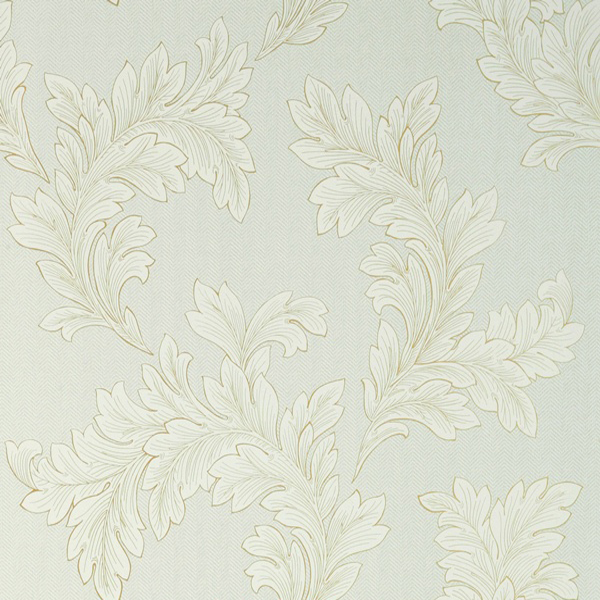
I papered the hallway with this acanthus and herringbone wallpaper from Thibaut a couple of years ago. In developing the scheme for the landing, I knew that the light aqua hue would have to be the accent color. After all, this isn’t a separate room, so I am trying to create a sense of it having a unique, defined character while still feeling very much a part of the 2nd floor hall.
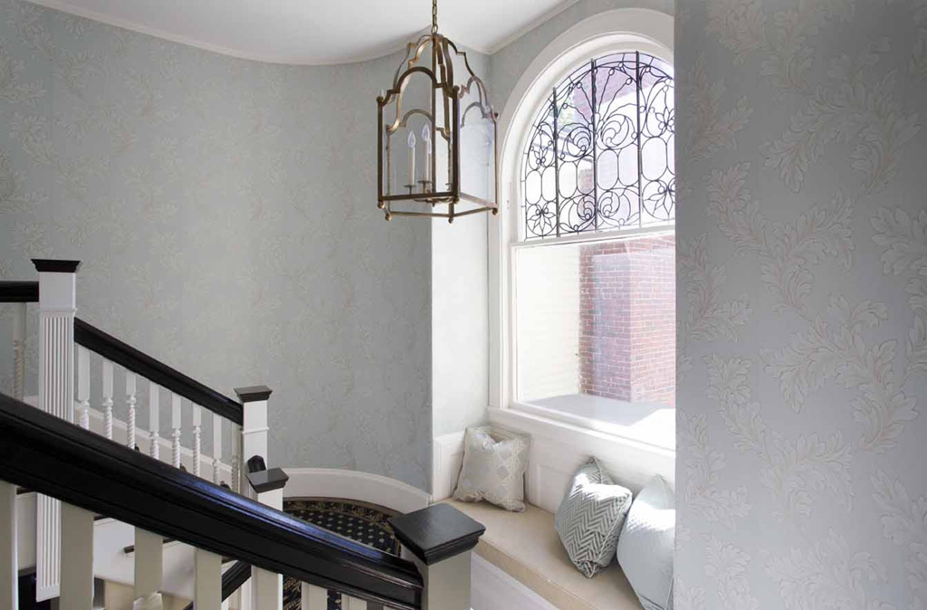
(This is what is looks like in the stairwell, which is in the back of the house, opposite the landing – the arched leaded glass window is my most cherished feature in the whole house. The stairs feature a split landing and curved walls – again, strong symmetry)
I was originally planning on using dark green as the main color for the landing, which is why I had it painted that way a few years ago. As I looked at it sitting empty all this time, I was less and less inspired. Don’t get me wrong, I love a good blue and green color scheme, but there was not enough zing – nothing was popping. The contrast was all wrong. So I decided to start over, and found inspiration in my now 5-year-old son’s two favorite colors. I noted that ‘light blue,’ one of these favorites, was already there – check! The other favorite? ‘Dark brown.’ Hmph. Could I paint a room brown? I surprised myself last fall by going with a tan/beige hue for my ORC “Manbrary,” so why not brown?
After rifling through every fan deck in my studio (that’s a LOT of colors, by the way), I found a highly nuanced brown in Benjamin Moore’s historic color collection that makes the aqua look a little fresher.
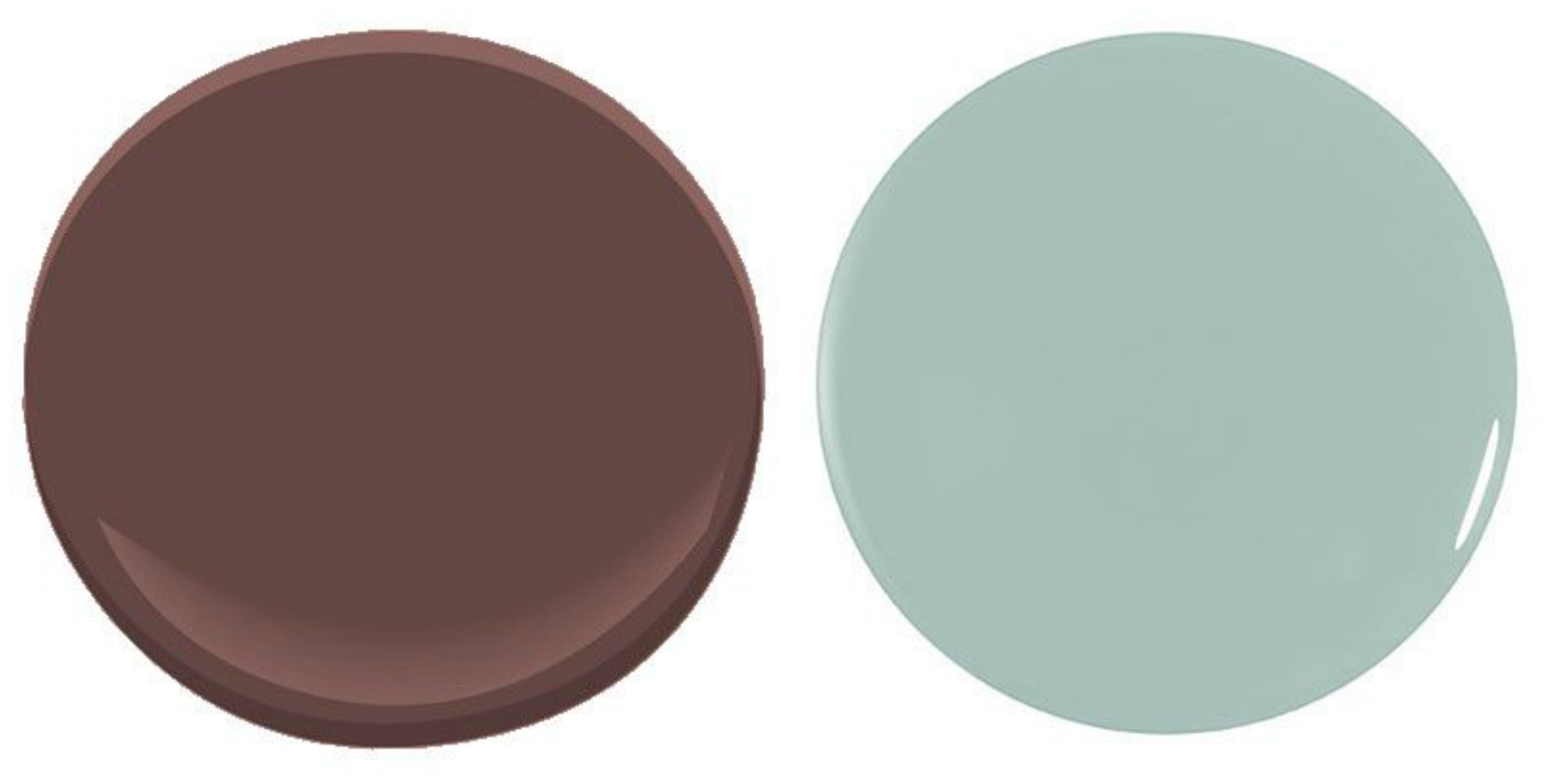
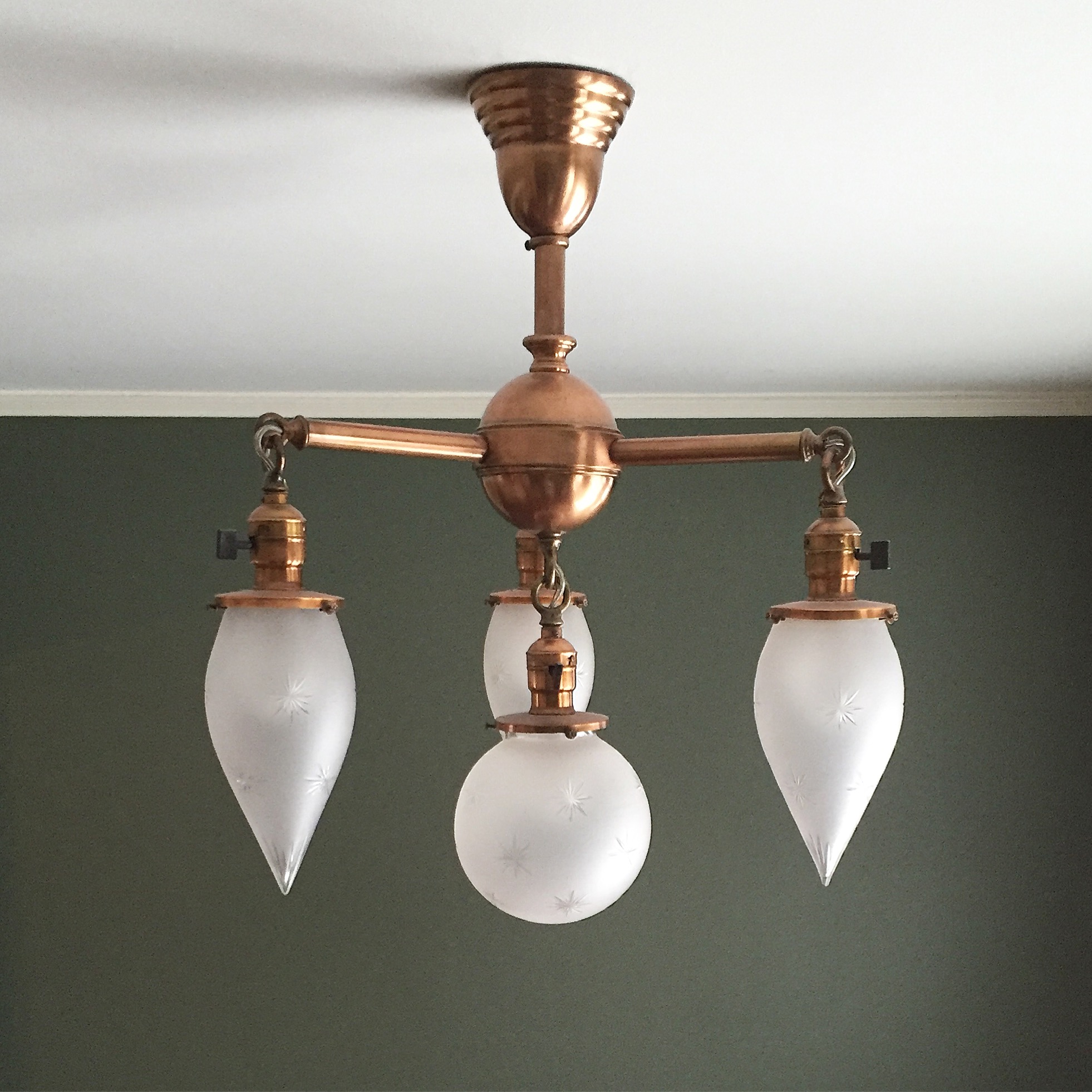
Townsend Harbor Brown is an enigmatic color – sort of reddish, a little plummy…almost an oxblood hue but a little less saturated. This was a brown I could live with, and that met with the approval of my son (whose bedroom is right next to this space). I’m going to paint the walls AND trim this color for an enveloping, cozy and dramatic feel. I am considering using Aura Grand Entrance paint, which I used on my front door, to achieve a very durable and higher gloss finish. It only comes in quarts, so while I wouldn’t specify it for a whole house, it works for 70 square feet :). To play off the wallpaper in the hallway, I’ll be painting the ceiling Wythe Blue. It’s a favorite trick of mine to take the wall color of one space (or something close to it) and put it on the ‘fifth wall’ in the adjacent room. And I think the copper finish of the chandelier will be a beautiful counterpoint to this color!
I’m hoping that, by next week, the landing will be fully put back together, plastered, and maybe even painted. We shall see! I’ll share another progress update next Thursday, as well as the furnishings and artwork I’m using. As a reward for making it this far, in what ended up being a much-longer-than-planned post, here’s a quick peek at one piece that’s sitting in my receiver’s warehouse right now!
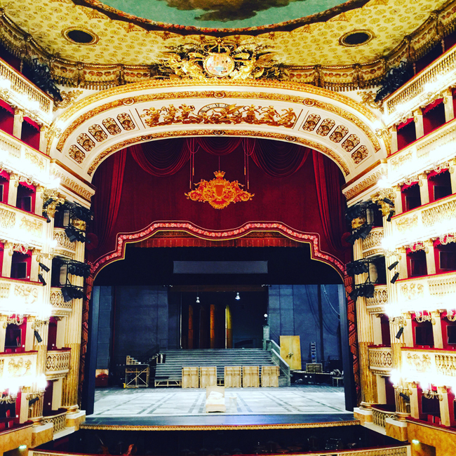
Opera House Stage – Nicole Wadlington (for Zoe Bios Creative)
Please also check out the other transformations underway at Calling it Home! Over 200 guest participants threw their hats into the ring last week, joining the 20 featured bloggers on this crazy One Room Challenge journey.
See you next week, the halfway (but really more than halfway) point!
I can not WAIT for this room. And I you know, being the opera lover than I am, that I think it’s no coincidence you chose that fabulous art. 🙂
Looking forward to seeing what you do with this space, Kelly! I am busy at work transforming our laundry room. Wish me luck!!!