Welcome to ORC Week 3! If you have no idea what I’m talking about, you are welcome to get up to speed by checking out my Week 1 and Week 2 posts.
Well, “real” stuff is finally happening in the Manbrary. We got the room fully cleared out over the weekend, and for one all-too-brief morning, I was the coolest mom in the universe.
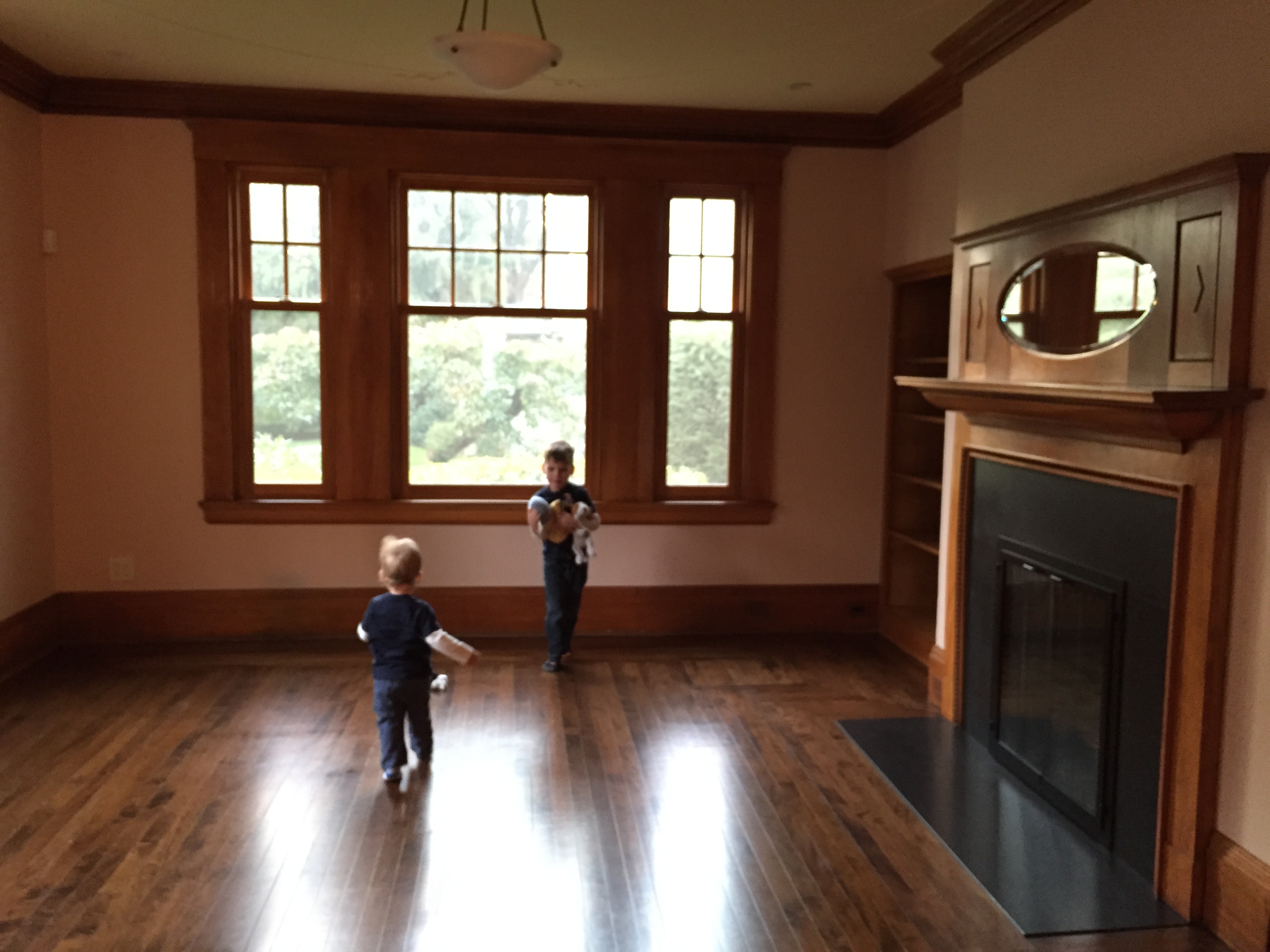
Behold, “The Echo Room.” I didn’t have the heart to tell them the jig would be up as soon as the painting crew arrived. Fortunately, my 4-year-old is really into what the “workers” are doing and, of course, all of their myriad tools and machines, so he’s ok with the “look but don’t touch” imperative…at least, for the time being.
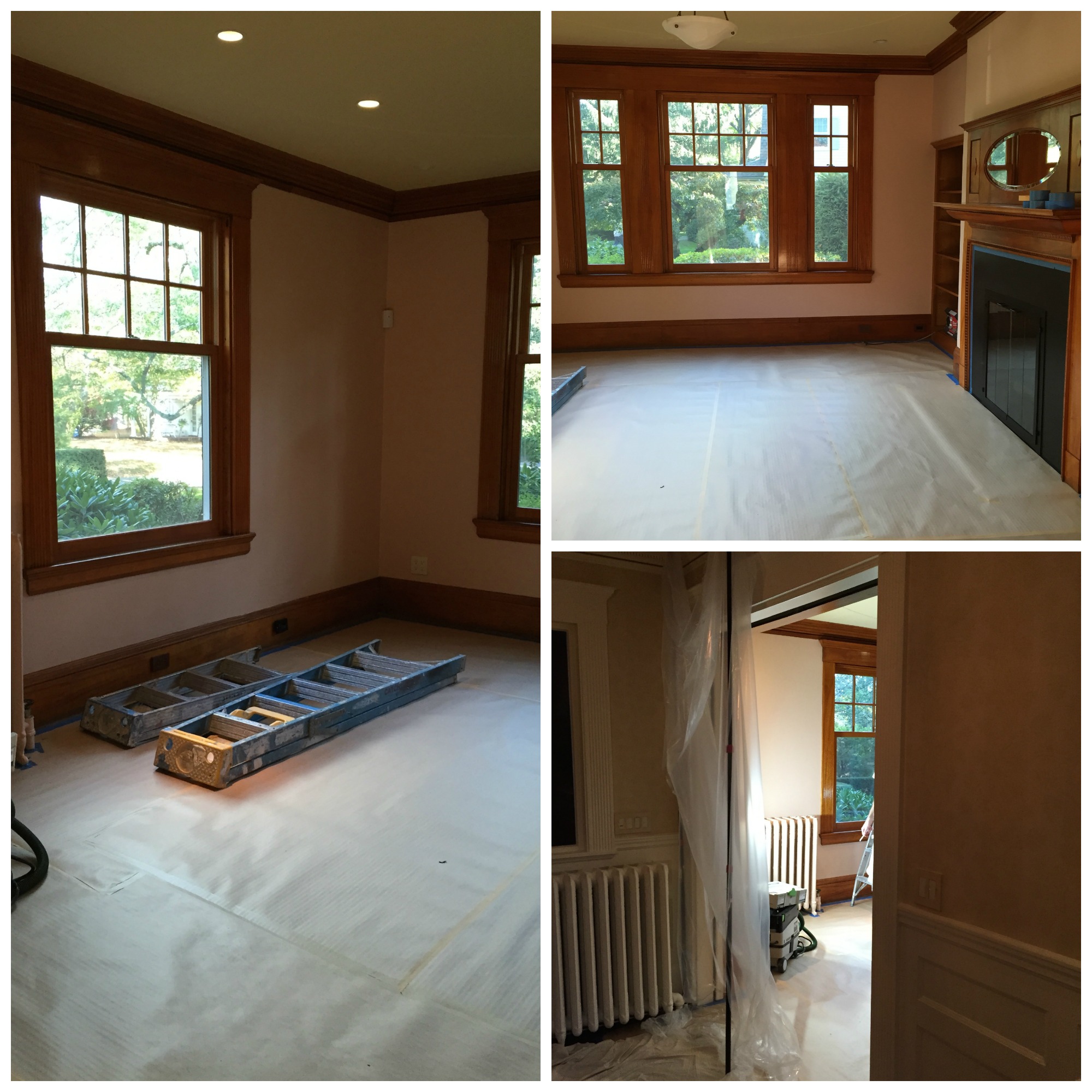
Let me back up for a moment before launching into my color scheme reveal (yay!). My plasterer blew out his bicep last week and is not able to perform work. This work was supposed to be complete before painting got underway, but we had to proceed with the latter to have any hope of making the room reveal deadline. As I write this, I still have no one lined up to repair/restore the decorative plaster design on the ceiling, or the large cracks that have formed in the ceiling in general. The ceiling also needs to be painted a different color, so it’s not an option to not address it. If anyone in the Boston area knows someone, PLEASE send me your referral!
OK…now, if you know me at all, you know color is VERY important in my design work – like, THE most important thing. I like to use bold colors in unexpected ways, yet maintain a balance and a livability in the spaces I create. Which is why you might be surprised by the color I have chosen to bathe this room in…
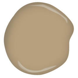
What’s that…you don’t think beige is bold? Allow me to explain. The walls will be painted this leathery, camel-y, manly color, Benjamin Moore Trench Coat, from the brand’s full-spectrum Color Stories line (which I specify for clients most often), with a matte (low sheen) finish. All of the wood trim – baseboards, crown moulding, windows, and even the mantel will be painted in the same color, but in a super high-gloss lacquer paint from Fine Paints of Europe.
If you’ve never seen this paint in real life (and I haven’t yet!!!!), you know it is unmatched in the leveling and sheen department. And if you’ve ever wondered how designers achieve that mirror-like lacquered wall look that frequently graces the pages of shelter magazines, it is FPE’s Hollandlac Brilliant (and sanding…So. Much. Sanding.). And it is dazzling.
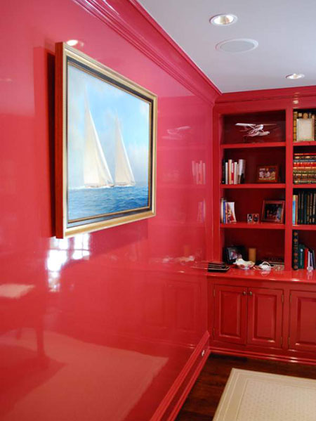
images via Fine Paints of Europe
Now mind you, I’m breaking one of my sacred rules here, which is to never, ever “color match” one brand’s color in another company’s paint. It will never be exact. But a the huge difference in sheen is going to make the surfaces look different, anyway, so I think the small difference will not be apparent. I’ll know for sure when we test after the priming is finished. But do as I say, not at I do, okay?! Do not try this at home! 😉
I really do think that the monochromatic look with the walls AND trim in the same color is a bold stroke for a traditional space such as this (in my 1896 Victorian, by the way), made even bolder with the addition of the lacquered millwork. Yes, even in beige – a color I rarely use on the walls, as a matter of fact! Beige CAN be bold, my friends; I’ll prove it to you.
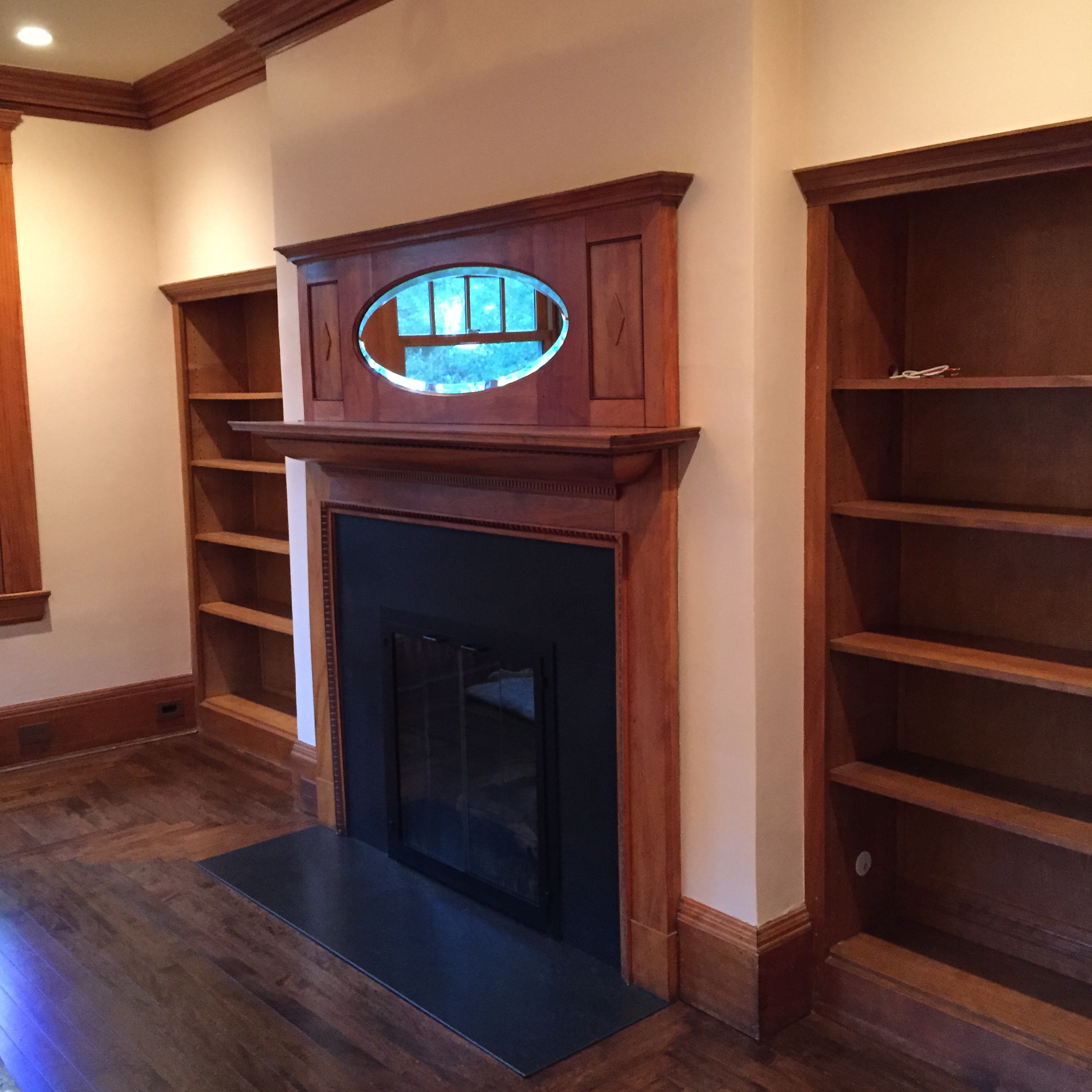
We also have these built-in bookcases with adjustable shelving, which are pretty old, but do not appear to be 100% original. In any case, I decided to treat these differently, to bring the color from the window treatments around the room, to create a dramatic backdrop for books and decorative objects, and to balance out the ‘black hole’ of the fireplace surround, which was, sadly, “updated” with honed Absolute Black granite by a previous owner.
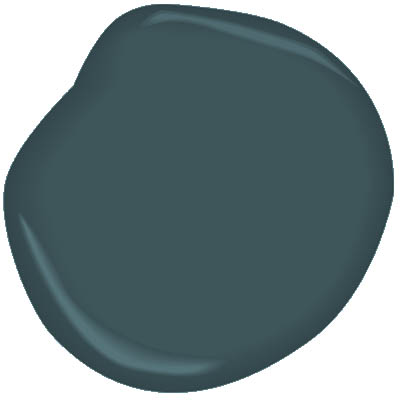
Benjamin Moore Everard Blue is from the company’s newest collection of historic colors: The Williamsburg Collection. To contrast with the high-gloss trim (and color), we’ll mix this color in their amazing Advance waterborne alkyd product, with either a satin or semi-gloss sheen – still deciding on that.
And as much as I hate to think about that ceiling, I do have a color tentatively picked out for that, as well.
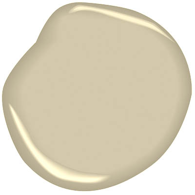
I am going with a color similar to the walls/trim, but quite a bit lighter. But not too light. This is Benjamin Moore Williamsburg Stone, also from the Williamsburg Collection. A white would not be appropriate here – your eye would go right to where the crown moulding meets the ceiling, instead of, well, not really noticing the color of the ceiling much at all. And maybe just noticing the beautiful, original decorative plaster relief.
Other than the aforementioned plaster work that is in limbo, I’m currently stressing about the light fixture (scheduled to ship “week of November 3rd”), and a ‘surprise’ piece of furniture I ordered on a wing and a prayer on Sunday, despite a potentially long lead time, just absolutely crossing my fingers that it will somehow find its way here before my photo shoot on Tuesday, November 10. Here’s hoping! By the end of next week, painting will be complete, and the custom rug will be installed in the Manbrary.
In the meantime, check out both the 20 invited/sponsored participants, and the 160+ guest participants linking up each Thursday at Calling it Home.
Follow Project Manbrary here and on…
1. Facebook (Interiors for Families)
2. Instagram (#KRIProjectManbrary, #oneroomchallenge)
See you next week!
I can’t wait to see this space painted, it’s going to be gorgeous!
Thank you! I’m excited, too – and a little nervous, but I have to trust the vision. Thanks again for your kind comment :).
I’m so so excited to check back and see this happen. I admittedly would be very afraid of beige as a whole so I’m really curious to see how this turns out. I’m dying over the high gloss tone on tone- really so looking forward to seeing this next week. Your room is so so beautiful to start with!
Beige paint is definitely out of my comfort zone (which is kind of funny if you think about it, since it is the definition of ‘comfort’ for most people!), but it just makes sense here for so many reasons. I didn’t even get into the surrounding rooms, but there is a living room with royal/navy blue walls across the foyer, and I did not want to create a ‘sandwich’ effect by doing the same in the Manbrary. Thank you for stopping by, Christine!
Now bold beige I need to see! The high gloss is going to be amazing – can’t wait to see it finished
Thank you – I can’t remember this much anticipation over a paint job, ever! Colors come and colors go, but this seemed like such an important decision and commitment, since we’re painting ‘virgin’ stained wood. Here’s hoping it looks as good as I think it will!
I can’t wait to see how this turns out. And I am in love with the Everard Blue!
Isn’t that color wonderful? I’ve never used it; I’m excited to see it!
This is going to be one fabulous room. I think you chose the perfect color for your historic house and using it in high gloss will keep it from appearing boring. I love the teal color for the book cases too. So excited to see the reveal on this room Kelly. Oh, and about that ceiling..creative camera angles is the temporary solution.
Thanks, Linda! I hope you are right! I’m kind of thinking the glossy beige might look like the reflection off the top of a creamy latte – we shall see. And thank you for the tip on the ceiling. I am really hoping to highlight the ceiling (with its distinctive pattern), but I’m prepared to employ all the time-honored tricks (including Photoshop, if necessary) to be ready for reveal day!
This is going to be great! I love the tone on tone idea and the high gloss. 🙂
Thank you, Carrie! I really appreciate your comment; thank you for stopping by to check it out!
Beige Bold…I can’t wait to see this! Where’s the fast forward button to next week??? I’ll be waiting with bated breath.
No! A fast forward button is the last thing I need! Lol – just kidding; I know what you meant…and I hope I do not disappoint you with the results!
I am VERY intrigued to see this come together! Love how you are thinking both out of the box and respectful of the history…we will have to do a ORC tour when we all finished…a tour with LOTS of wine to reward ourselves for a job well done!
Well that’s the best idea I’ve heard in a long time! I would love to do the ORC tour. We’ll cover a lot of ground, so we’ll either need to enlist the help of Uber (given all of that wine…which I agree is essential), or incorporate a sleepover component to the tour. BYO footed PJs and Ouija board. It’s on!
thumbs up to all of that from me!
I LOVE these colours and am super excited to see it all painted – I’ve never seen a paint with such a high glass before!
Your space is gorgeous! I hope you give us a sneak peek of the walls next week.
Cannot wait to see your Bold Beige! I am a super fan of Fine Paints of Europe!! You go girl!!