Some designers might cringe at the mandate of creating a bedroom around a specific “theme.” Add to that professional sports team decor and the often garish colors that come along with it, and the probability of a visual catastrophe is quite high.
In the past few months I’ve done color consultations for two separate Boston Bruins bedrooms.
![]()
In both cases, the clients were struggling with how to translate the team’s bold yellow and black palette into a nice-looking room for their respective hockey fanatic sons. My most recent assignment was to select paint colors for a Bruins-themed bedroom, and the adjacent bathroom. For the bedroom, I suggested a dark, somewhat complex charcoal gray from Benjamin Moore’s Color Stories collection – Arctic Seal – as a dramatic backdrop for the yellow accents. A lighter, similarly cool-ish gray would be best for the bathroom, and Harbor Gray fit the bill.
This is the kind of Boston Bruins room I envisioned when specifying these paint colors.
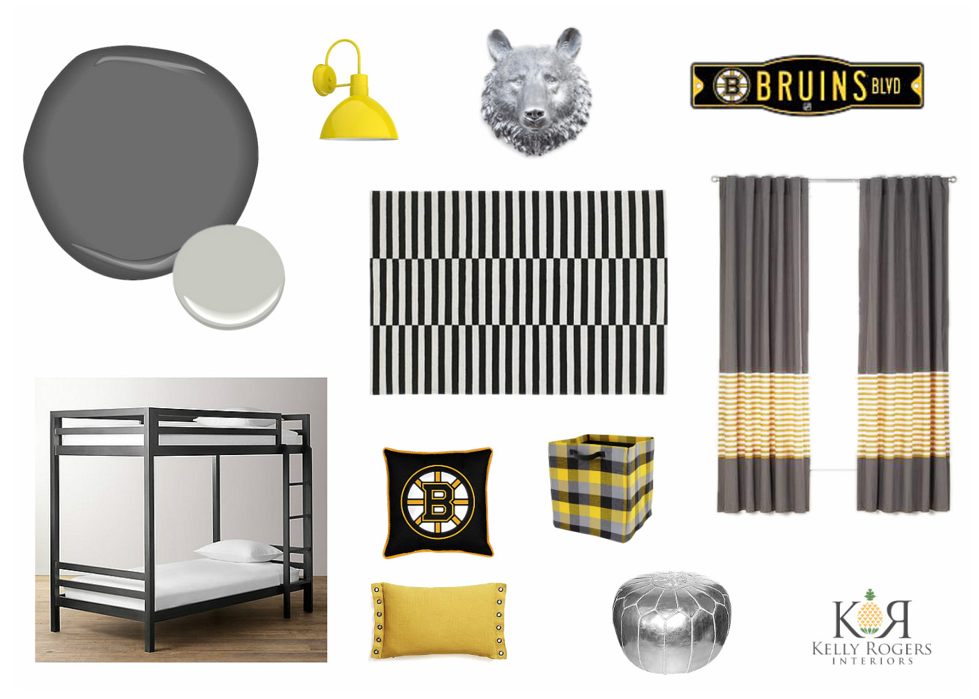
I think the key to a good-looking sports team-inspired kids bedroom is simplicity. Let the color do the talking, and ground it with massive doses of a complementary neutral hue (or hues). A few clever accessories – in this case, a faux taxidermy bear head in chrome resin – reinforce the theme without beating it to death. Graphic and geometric patterns will look great and not conflict with team gear and logos.
Having grown up in Western New York, I am actually a fan of the Buffalo Sabres. But here in Boston, my clients’ kids (and likely, one day, my own) bleed yellow and black. As long as their rooms look like this, I guess I’m OK with that. 🙂