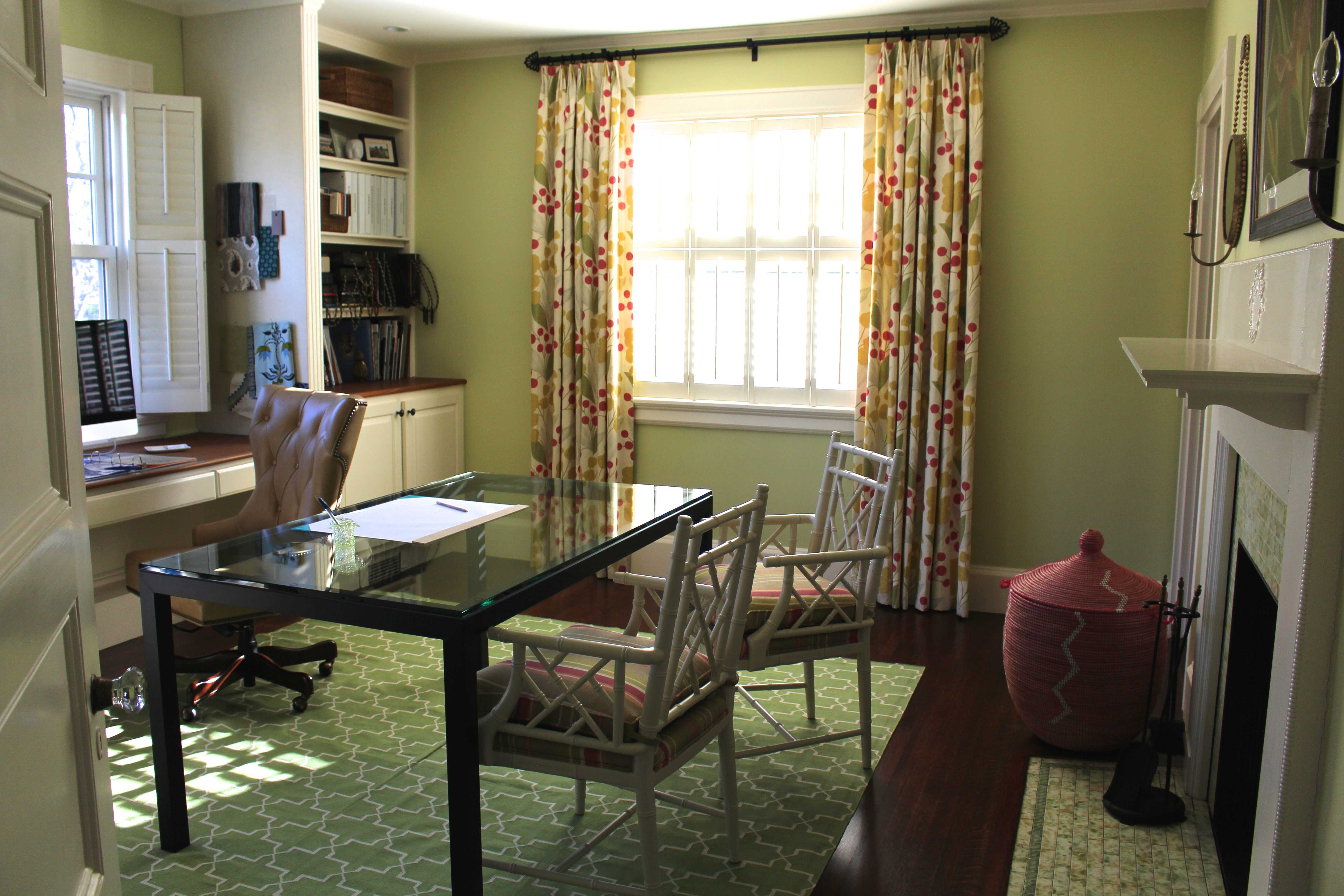
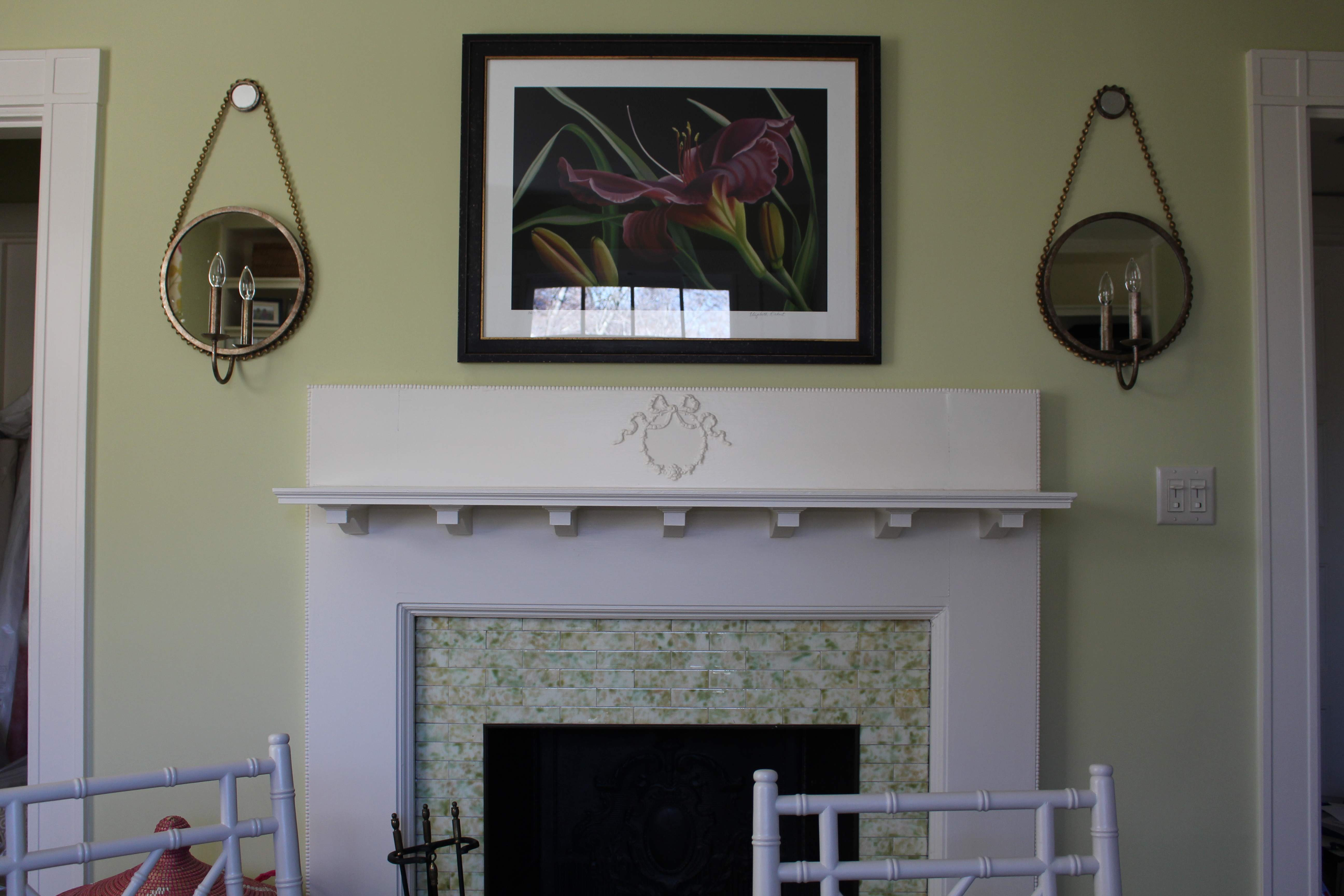
I started Kelly Rogers Interiors in 2012 in the third floor ‘bonus room’ of our then-condo, at a quaint little desk nestled into a dormer, a file drawer, and a small bookshelf. In 2013, when we moved into our current home, I upgraded to a real home office – a whole room to myself (heaven!), already outfitted with a built-in desk and lots of shelf space. I made it as cheerful and bright as I could, and really enjoyed it for awhile.
Over the past couple of years, however, I have begun to feel the pinch a little bit more with each day that passes, due to a whole host of issues…I’ll try to rank them in order of pain quotient…
- Way over capacity on storage storage space. So. Many. Samples. And I want them there – they make my job easier, and make me more efficient. I am spilling out into the rest of the house…not good.
- Lack of good natural light. My office faces north and east. First thing in the morning is totally fine (in the summer, that is!). Any other time of day, I’m basically working in my hallway, unless I’m at my desktop using my design software.
- Disruptions R’ Us. There’s nothing quite like being on the phone with a client and having a screaming/whining/laughing child barge into the room. It’s hard to feel professional when two little boys are constantly coming to call. Don’t get me wrong – I love the snuggles by happenstance and random ‘I love you, Mommy’s, but the distractions are…well, quite distracting.
- Awkward place for meetings. I really don’t want to bring vendors and clients upstairs through my home office for meetings. I have typically met with them in the Manbrary, which is directly off our foyer, so some of my stuff has, unfortunately, migrated into what is supposed to be my husband’s dedicated space. (This is reminding me I really need to make it a priority to get it cleaned out for good!)
- No room to grow. Right now, I don’t have any employees, but I have in the past, even though my space is currently not set up for it. It’s really more of a study – a place for one person to do their thing. I am at the bursting point and desperately need to bring onboard a design assistant and/or junior designer (hiring this summer…please send resumes! And wine! Wine is always welcome 😉 )
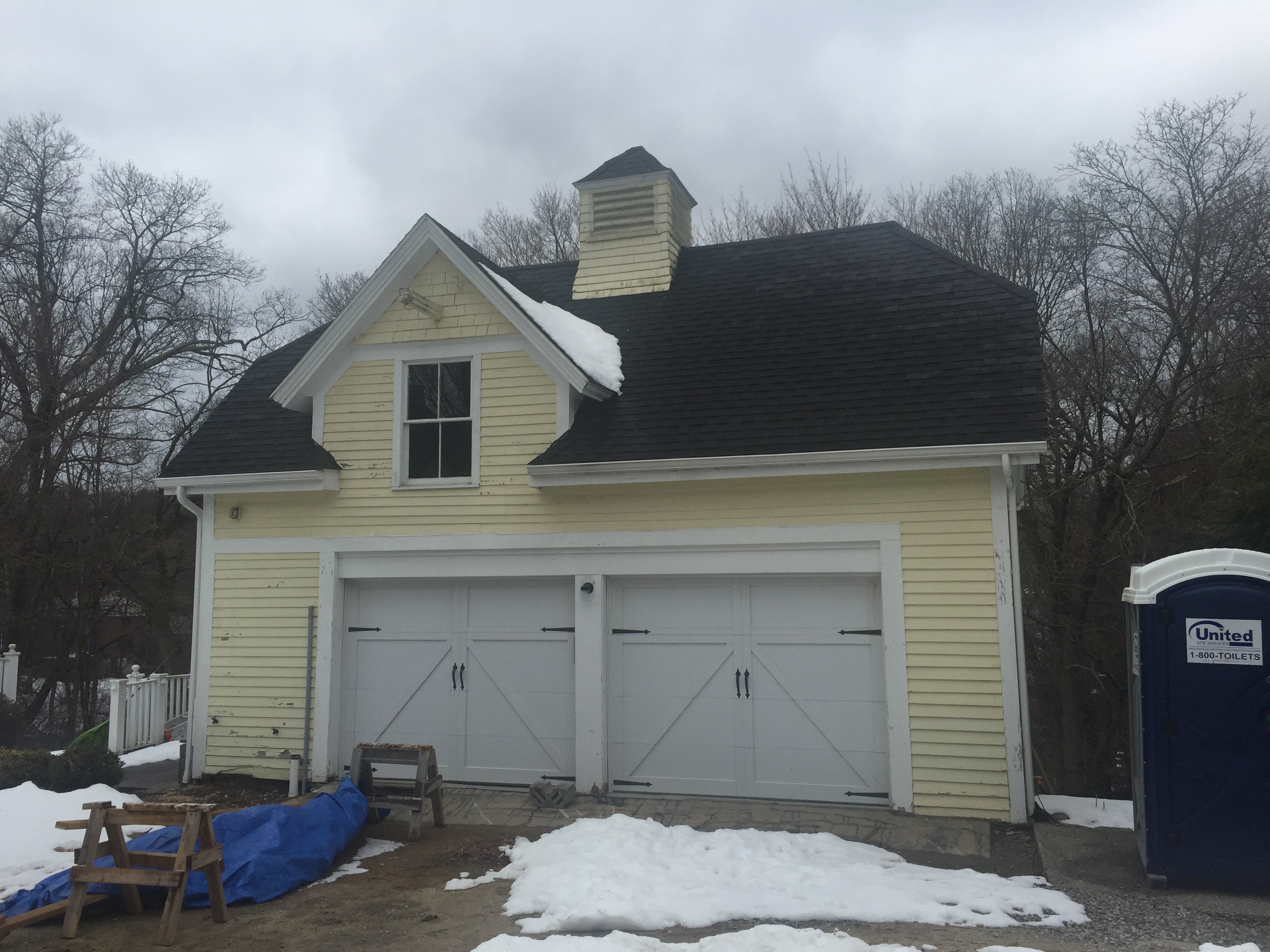
When we were first looking to purchase our current house, I knew that eventually, I’d move out to the garage – which was originally built as a carriage barn with the house in 1896. As with most things I’ve experienced in this, my second career, I just didn’t realize how soon I’d be making that transition. We fast-tracked this game plan when we finally pulled the trigger on our home renovation, originally planning to tackle everything simultaneously to sort of ‘rip off the Band-Aid,’ so to speak.
Unfortunately, the garage required a special permit, and the city put a moratorium on hearing special permits for the better part of last year. So we waited until January, and fortunately it was more or less a slam dunk with the Land Use Committee. I did have to review the plans with my neighbors and ensure everyone was comfortable in advance of the hearing, but it wasn’t too onerous.
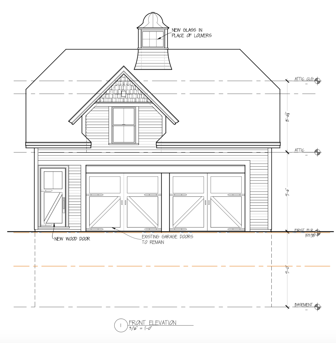
Without further ado, here’s what is *finally* going down – the architectural plans, where we are currently at in the process, and what’s going to come to fruition over the next few months.
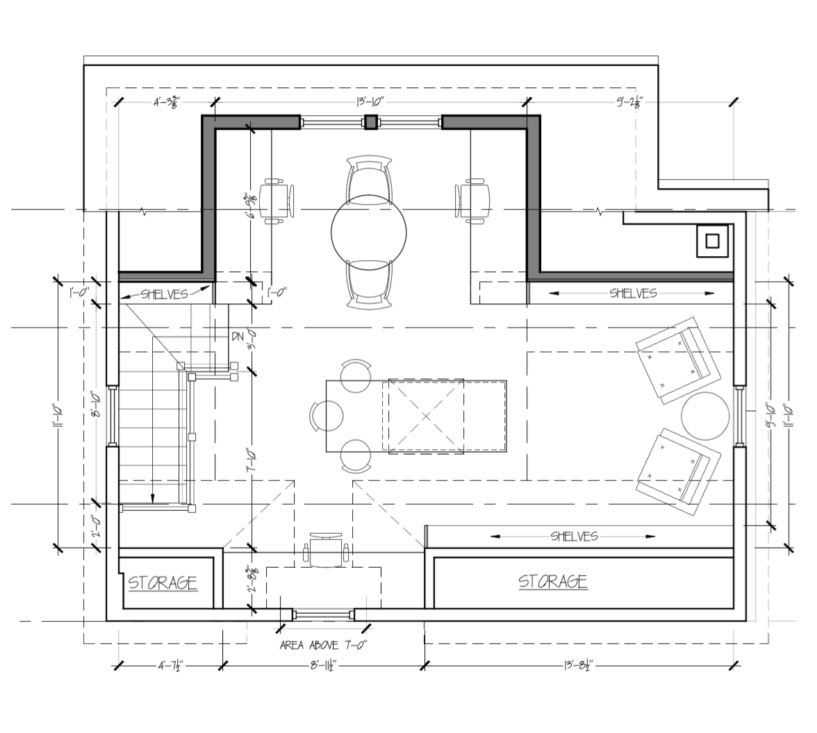
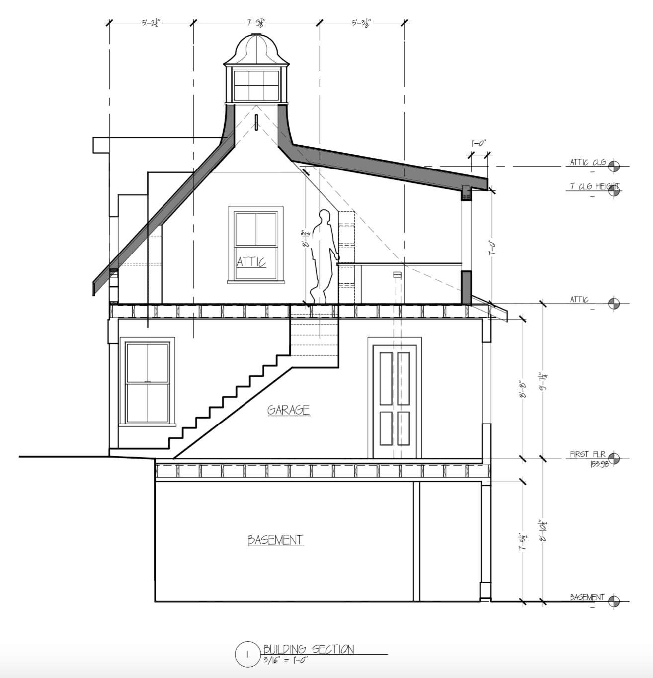
The space in question is on the upper level, above what is now the garage. Right now, there is a staircase only accessible from inside the garage, on the right side, and it’s approximately 8″ wide. Well, that’s what it feels like. Obviously not to code. We will demo that and fill in the floor above, relocating the staircase to the left side, with a new door (maybe even a barn door! lol); it leads directly up to the studio. Pay no attention to the cupola design in the drawing – it is really a placeholder; I intend on keeping the existing shingled roof style, but we will definitely be adding windows on all sides – effectively, a beautiful skylight! Other than these changes, the facade will remain unchanged.
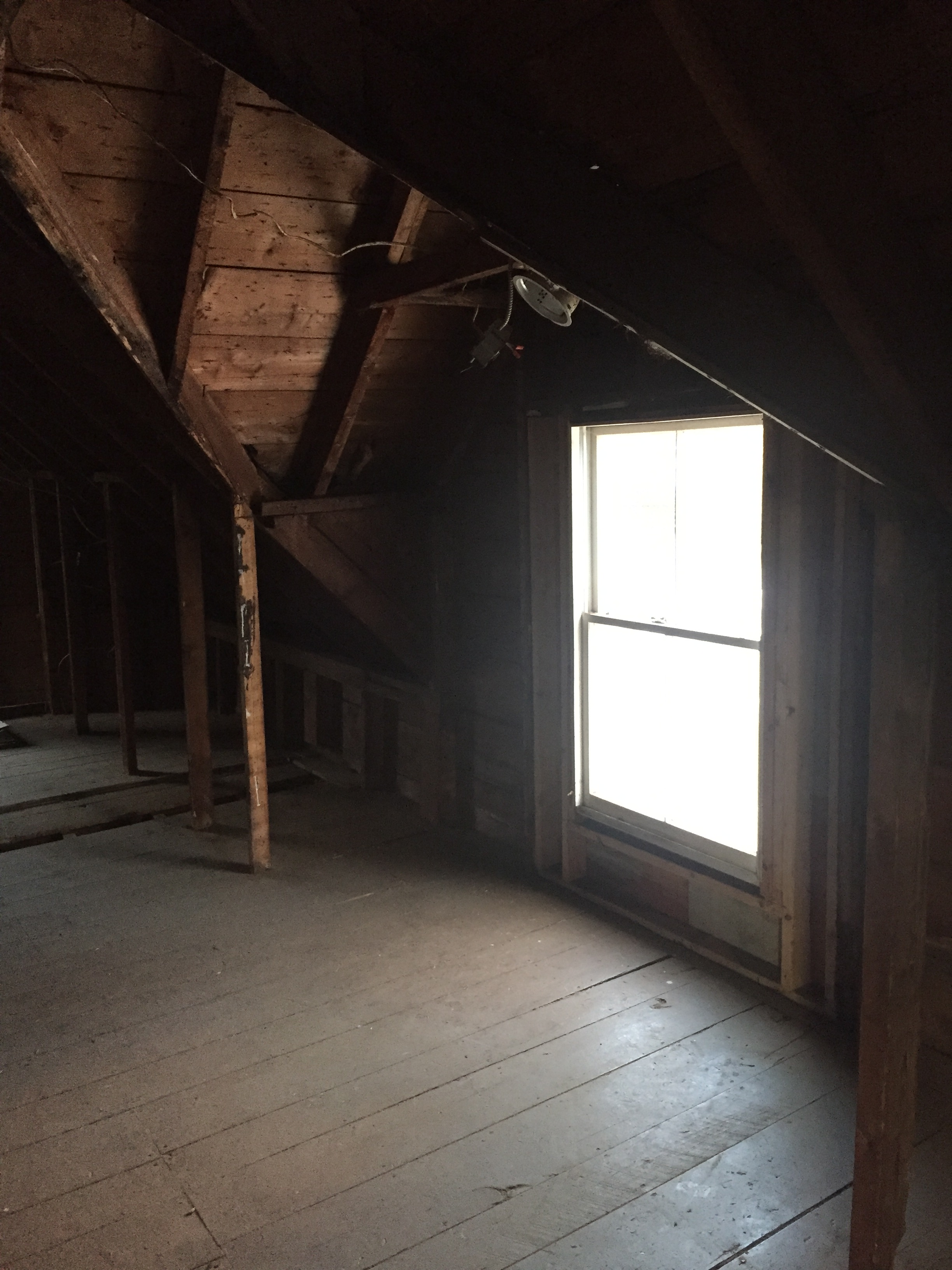
We are capturing a bit more square footage and a lot more light with a south-facing shed dormer in the rear of the structure. The stairs you see to the lower level are existing, and the door leads to an area that we will use for storage. It used to be a cabana for a now-filled-in pool that lies beneath our backyard. I suspect the excavators may happen upon it when they start digging for our new patio – any day now!
Here is the space! We are working on a few tweaks (most notably, to the shelving/storage space – need that extra depth for my wallpaper and fabric books!), but the layout is as it will be. The desk in the front dormer, at the bottom of the plan – that’s mine! There will be an island which is where I will likely do most of my work (who needs a standing desk!?). I am planning to store my client baskets there, so I can just pull one out and dump it right on the counter when its time to develop or edit a scheme.
There will be two other desks, and a little seating vignette on the far wall that I want to be a bit more decorative (to show our style and a few of our favorite things), and to be a place where clients can test out the seat cushions from a North Carolina line we sell, but is not in any local showrooms.
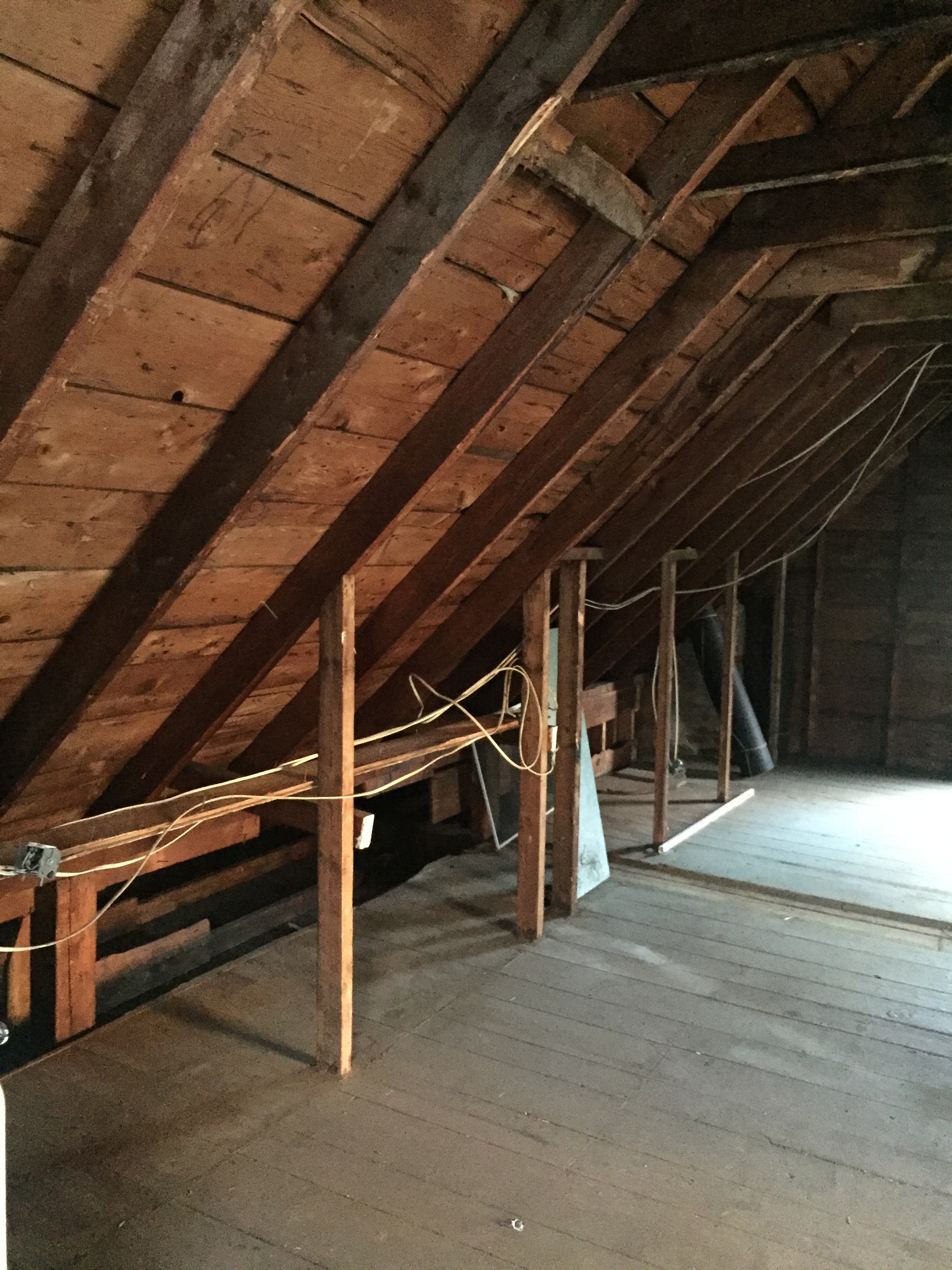
The cross-section shows best how it’s kind of a skinny space, but the eaves are tailor-made for built-in storage, with the ability to go deeper on the lower shelves, which is exactly what I need. With the addition of the shed dormer, we will have windows on all sides, plus the cupola.
So…what will it look like? Well, it is important to me to honor the original purpose and intent of the building, so this design studio will be a little more rustic, a bit more raw, and even a smidge barn-like. It will also be a lot more white than most of my projects – inside and out! (I’m planning to repaint the exterior White Dove, which is the new trim color on our house). The white space will work with the quantity and quality of natural light, and will provide a neutral, non-distracting backdrop for all of the color and texture I work with on a daily basis.
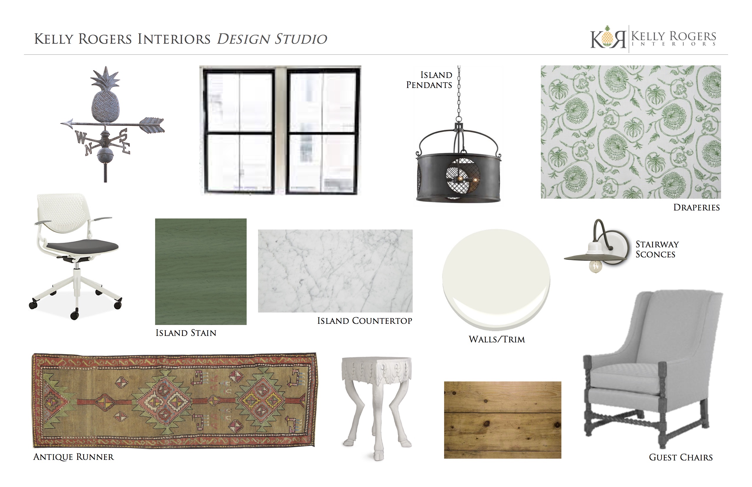
I decided to treat myself like a client and create a design concept board to firm up my vision for the space.
I will be using my beloved White Dove on the interior, as well, possibly with black-painted window sashes. And because this is my design studio, I need to incorporate some green. It’s part of our branding, as well! The reclaimed wood (chestnut?) island will be stained a semi-transparent green – yep, stained not painted – I want to see the wood grain, knots, cracks, etc.
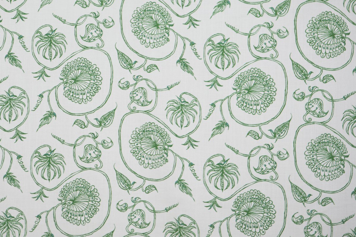
I’m planning to use Mally Skok’s ‘Jessie’ fabric in white and emerald on the window treatments. To me, it is the perfect manifestation of my style, combined with a little of the rough and perfectly-imperfect look I am trying to embrace. It’s also just enough color (I need some!) on a clean white background. I am not sure exactly what type of window treatments I will use, but I’m currently thinking draperies behind the seating vignette, and for the other windows, possibly Roman valances (like a Roman shade that is not operable) with solar shades underneath.
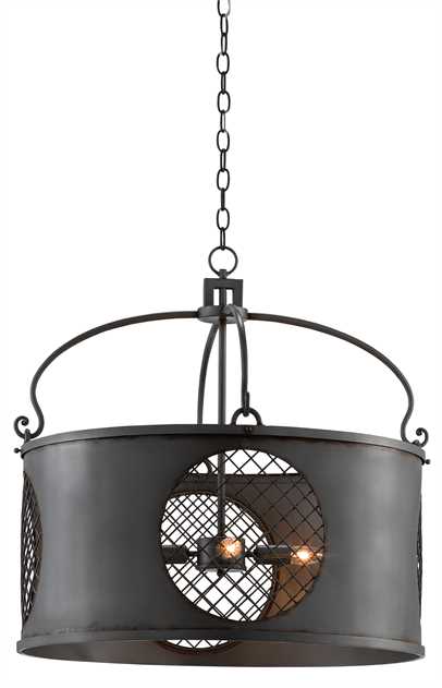
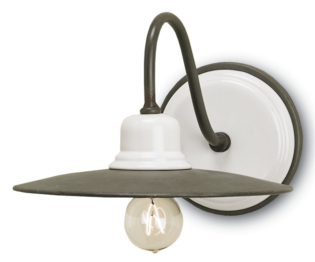
I think the decorative lighting (as usual) will play a big role in establishing the vibe, and its really a mix of semi-rustic, all-American barn style with the unique global influences I try to incorporate into my work.
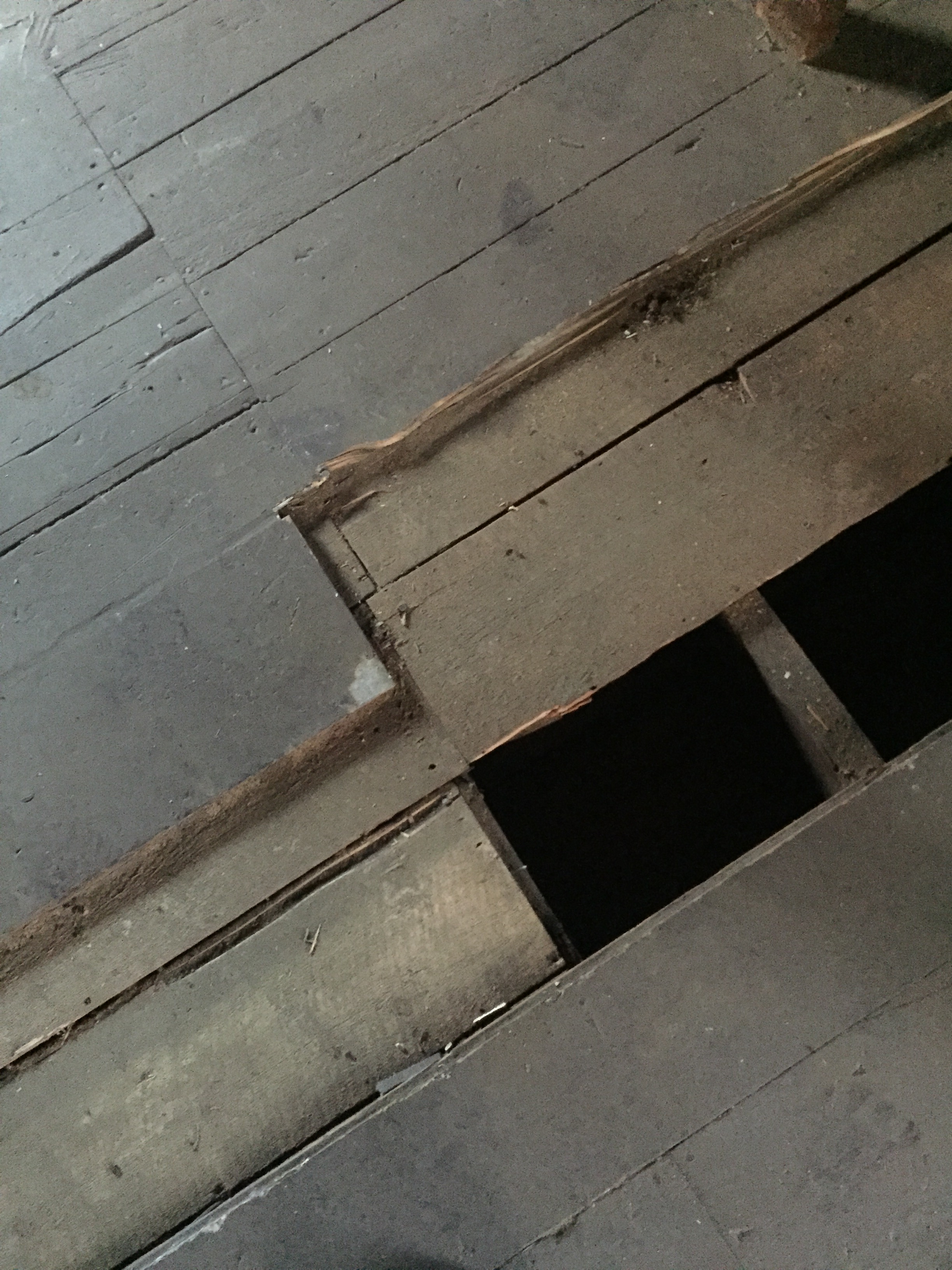
I’m planning to strip the existing pine plank floors (they’re painted brown – ugh!), and simply give them a clear coat of poly, or perhaps even bleach them a bit – depending on how they look once they are ‘naked’ again.
In the ‘new’ areas (staircase, dormer, etc.), we’ll give the new wood the same treatment as the old to help them blend. It seems odd to paint, strip and refinish brand new wood, but I think it is totally necessary!
 To provide some additional warmth and softness to the floor, as well as improve acoustics, I will layer on a couple of runners – like this antique Persian beauty (circa 1890) I am dying to get my hands on! With a little luck, it will be mine before the end of the week.
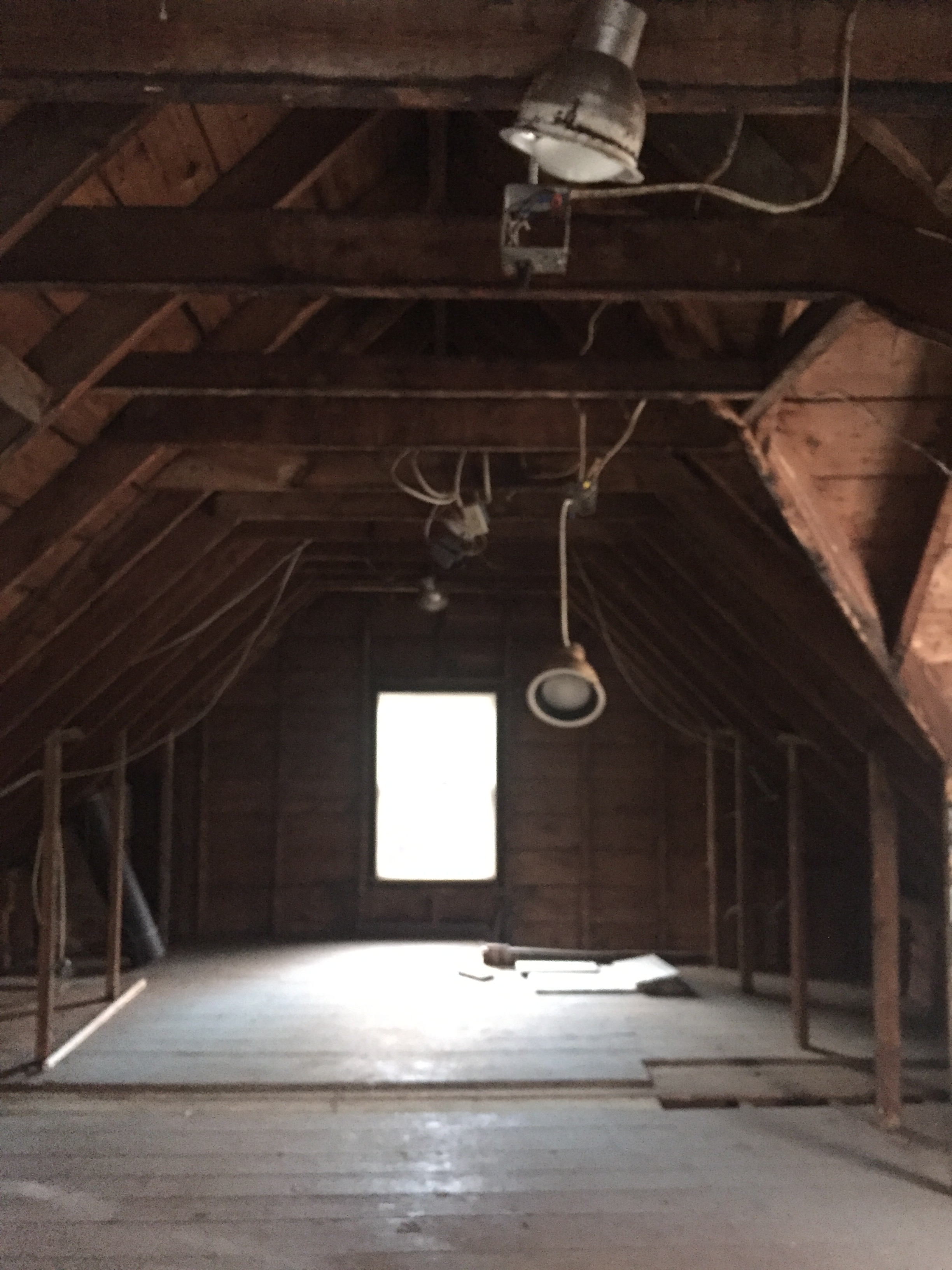
Here’s what the space looks like now, post-demo…
Work has been a little slow to get started, due to some structural hiccups and additional permitting requirements, but it looks like we’ll be moving ahead in the next week or two. And not a moment too soon! I can’t wait to start using this space, and reclaiming some semblance of organization and sanity. What do you think of the design plan?
Stay tuned for a mid-week post with an exciting announcement!


So happy for you Kelly! Can’t wait to see this space!
Thanks so much! I, too, cannot wait to see it. 😉
Love!