**Please also check out the full reveal of this project here!**
In my opinion, the most critical of the principles of design is Balance. It is also one of the most subjective, making it tricky for many people to master in their own homes. Balance is when the various items or elements in a room carry equal visual weight. Harmony is closely related to Balance – it is a state whereby all of the “parts” of a room relate to one another, and combine to form a pleasing and complete whole. With both Balance and Harmony, we know it when we see it – but how can we consciously create it without ripping down our houses and starting from scratch (which is perhaps even more daunting!)?
I thought I would share some snapshots from a client project in progress that illustrate this well. Picture this: you move into a new house. The prior owner has made some updates, but the materials they picked aren’t your favorite. And the cost of replacing them is a bit daunting – especially when you’re not sure what else to do. This happens all the time. Maybe it’s even happened to you. If you’re committed to the bones of your house – whatever the reason – you need to embrace them and work with them, rather than fighting against them.
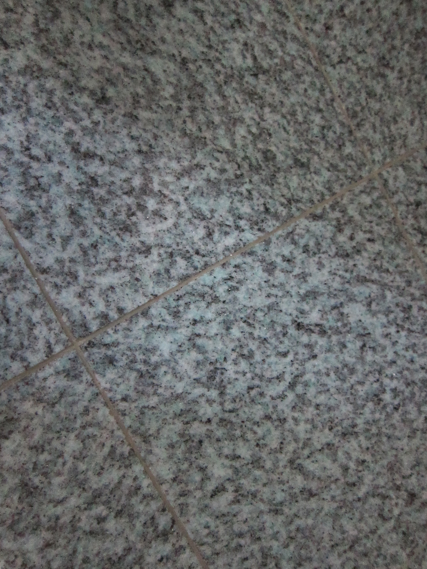
This is the granite tile in my client’s powder room. It’s a bit busy, like most granite, and has lots of black, blue, but the really “bossy” component of this stone is seafoamy blue-green. In color design this is called the “mass tone” – or, the main color you see (forgetting about undertones, etc.). The photos don’t do it justice; it’s pretty colorful.
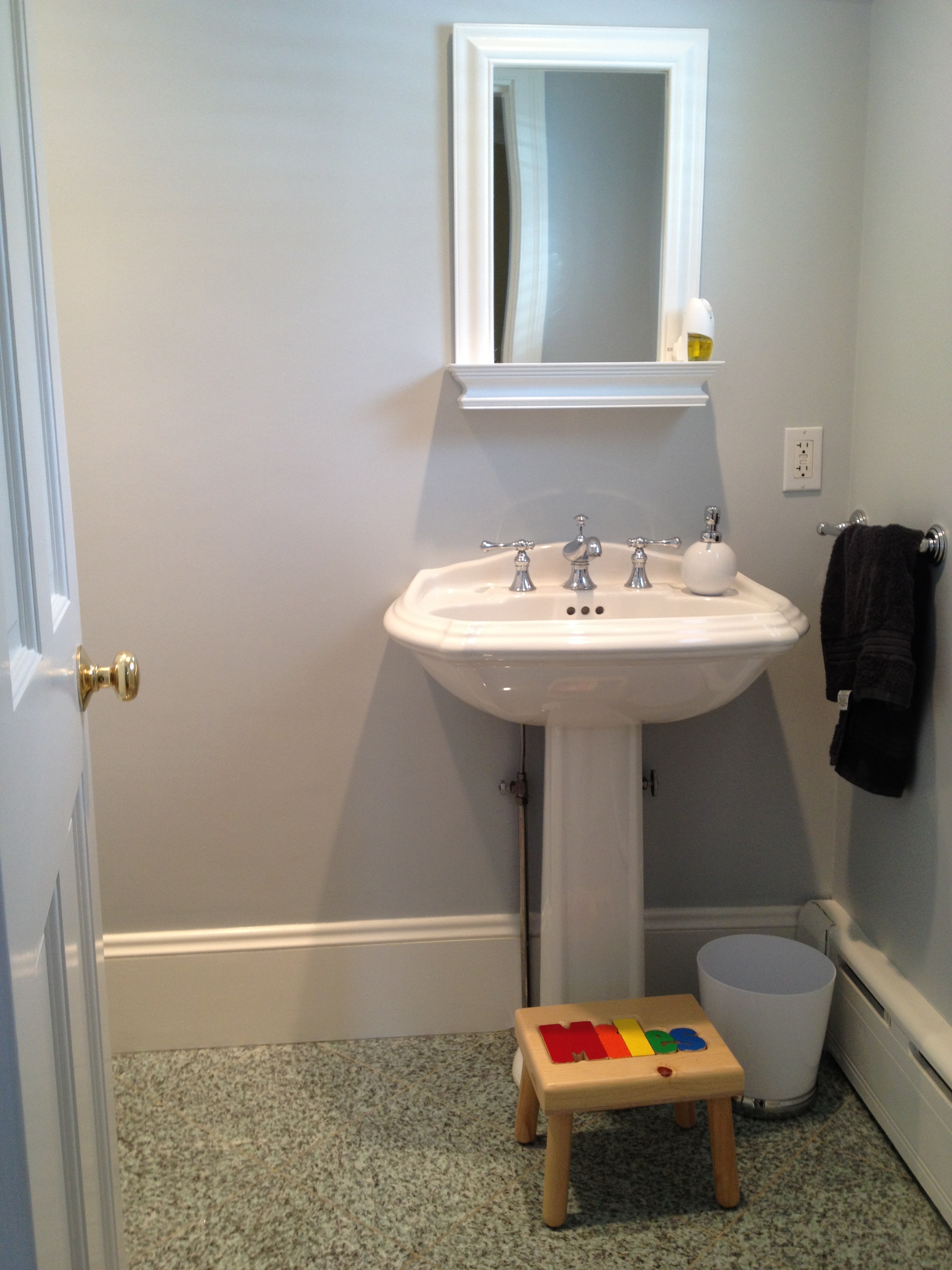
And this is what the powder room looked like last week. The walls are painted in a cool gray which has a blue undertone – lovely in itself, but it unfortunately has no relationship to the tile on the floor. My clients never really liked the room (or the tile), but weren’t sure what to do. They weren’t enthusiastic about the prospect of ripping out the tile, especially with other projects that are a higher priority. I knew that changing just one thing in this room would change the way they felt about this space.
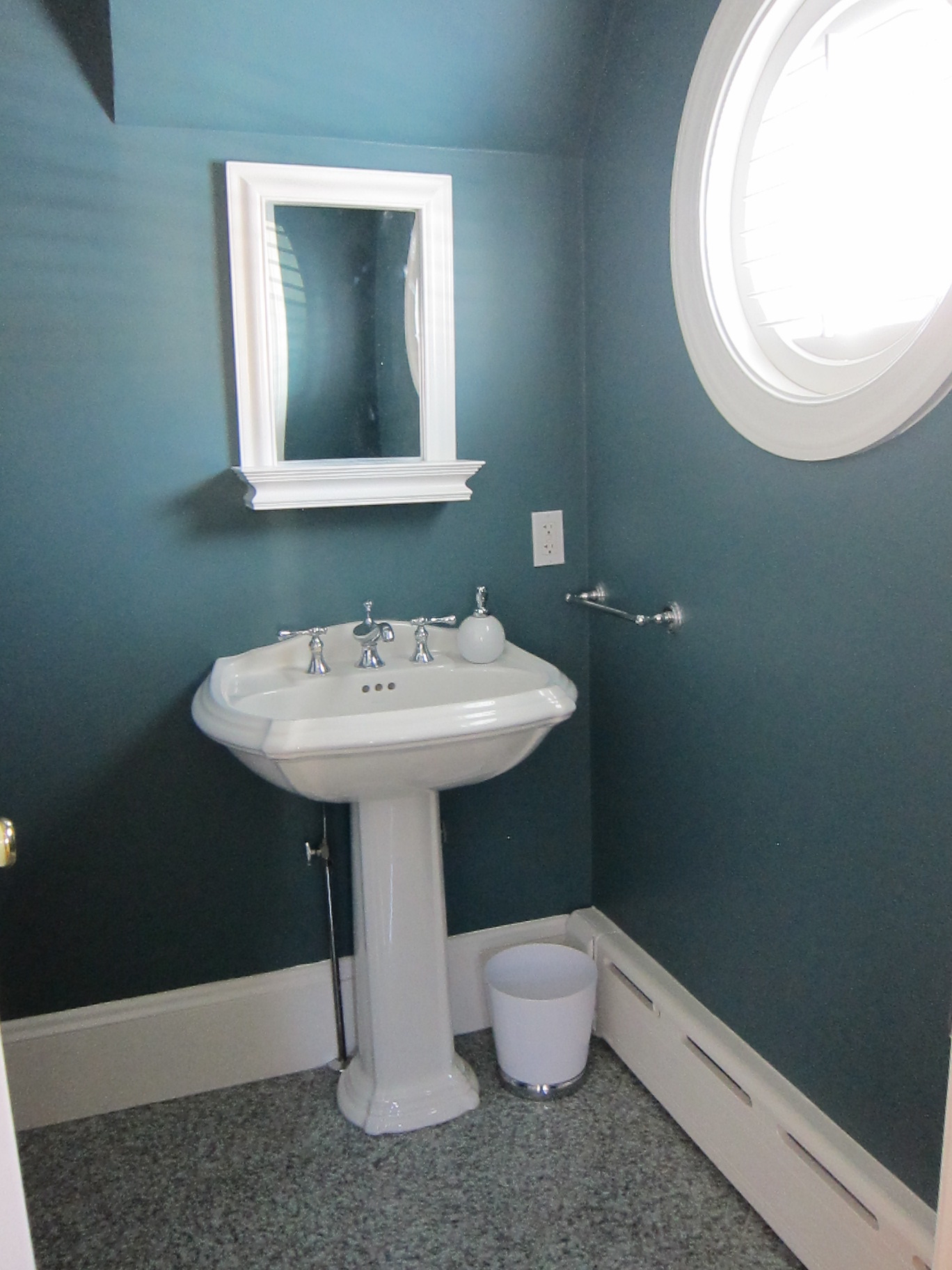
You probably guessed, that one thing we did was PAINT! We EMBRACED the tile, and balanced it significantly by putting a darker, more saturated color on the walls. But not just any bold color – it’s a color with the same undertone as the granite on the floor, creating a sense of harmony in this powder room. Now the tile doesn’t stick out like a sore thumb, it looks like it was supposed to be there all along. Incidentally, we also embraced a bit of the nautical flavor of this room (created by the round porthole-like shuttered window) by choosing this color, and will likely push that vibe a bit further as we complete the finishing touches. The paint color is Benjamin Moore Fair Isle Blue, from the Color Stories collection.
Balance and Harmony do not live in just one room in our homes, though – we have to always remember how spaces flow into one another and relate to each other. Although we can take some creative license with powder rooms and the like, I favored the idea of creating a strong connection between this bath and the adjacent room – the foyer.
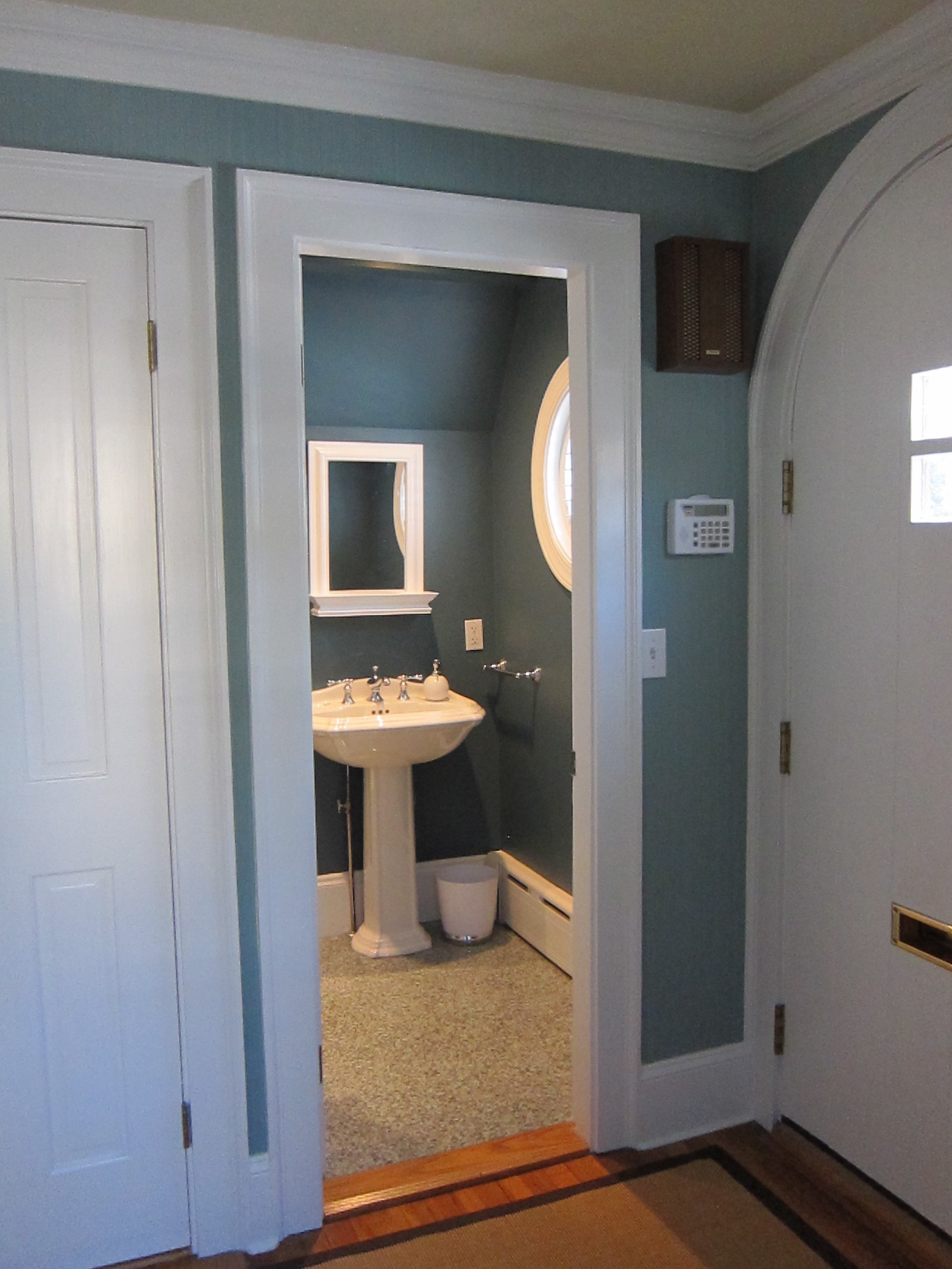

The foyer is also a work in progress, but has just been wallpapered in a mid-tone blue strie paper that relates well to the deeper blue color in the powder room. And the blue of the foyer will become an accent color in the adjacent living room. But I’ve already said too much about the foyer – the big reveal is yet to come!
Bottom line: If you want or just need to live with certain existing conditions in your home, be they tile, walls, cabinetry, hardwood floors, appliances, etc., go with them, not against them. Fight the urge to pick a pretty color, or your favorite color, and you’ll be much happier with the results, even if it’s not something you would have chosen, had you the luxury of a blank slate from which to start.
Sometimes, this gets complicated, even paralyzing. You naturally want to avoid costly mistakes. If you need advice on color in your home, or have a decorating project to tackle, I would love to help – please visit my business website and contact me!
It looks beautiful! Pretty amazing what the right color can do 🙂
Thanks, Donna! I know, right? Feel free to snag the photo for your Color Stories page (though it’s not a 100% finished space).
That would be great if I can do that! It’s extremely rare that I get any AFTER pictures let alone a Color Stories shot. I’ll take it! Thank you!
Here’s the link to my Color Stories page with your Fair Blue Isle power room. Thanks again Kelly!
http://decoratingbydonna.com/color-stories/
Beautiful colour, it strikes the right balance between richness but not overpowering. Excellent choice!! 🙂
Exactly – and thank you for using the word “balance” too! That was the idea and I’m glad that’s apparent.
wow what a difference. Love the color with tile. Great job!
Thanks, Linda! I am really happy with how it turned out, and the client loves it, which is really the most important thing. It’s so great when you can spend a little to save a lot!
Totally agree about using paint to “make it work”. You chose a beautiful color. Thanks for linking up!
Thank you Emily for stopping by, and for your comment! I’m really enjoying seeing all of the projects on the link up – it’s a great variety, and very inspiring. Thanks for hosting it!
Your means of explaining everything in this paragraph is really nice, every one can simply be aware of it, Thanks a lot.
Great beat ! I would like to apprentice while you amend your website,
how can i subscribe for a blog site? The account aided me a applicable deal.
I had been a little bit familiar of this your broadcast offered
vibrant transparent concept
Snowy Night
Your style is really unique in comparison to other people I’ve
read stuff from. Thank you for posting when you have the opportunity, Guess I’ll
just book mark this site.
lucky this home had beautiful substantial trim. the greens really look wonderful, the CSP color is wonderful, small bathrooms need this intimacy.
Thanks for your comment, Lynne! I agree – love to go big and bold on the walls in a powder room.
Very shortly this website will be famous among
all blogging users, due to it’s pleasant articles
or reviews
Excellent article! We are linking to this particularly great
content on our site. Keep up the great writing.