Color
5 Reasons You Should Never Choose a Paint Color from a Picture
It’s so great to live in a time when virtually any information or answer we seek is at our fingertips, wherever and whenever we need it. Websites like Houzz, Pinterest, and the like have become vital resources for homeowners planning to renovate or decorate their homes (renters, too!) – as well as design professionals looking for inspiration, sourcing furnishings…
Read MoreMy Take: Benjamin Moore 2017 Color of the Year “Shadow”
I don’t often chime in on the various color trend conversations that pop up every year. Mostly because I find that they are often somewhat disconnected from the reality of my day-to-day work. I don’t really follow or use trends as much as I try to be aware of them and watch how they evolve (and…
Read MoreOne Room Challenge Week 3: Minor Crises and Progress Updates
Welcome to ORC Week 3! Otherwise known as the fake half-way point. Because, let’s face it, you don’t really have until November 10th to finish your room – the zhushing, styling and photography (and then waiting for said images to come back from the photographer), and the reveal blog post all need to be locked and loaded by…
Read MoreOne Room Challenge Week 2: Little Landing, Big Color
Welcome to ORC Week 2! ICYMI – you can check out my Week 1 post here. I’m transforming an unused 2nd floor landing into a cozy nook for the whole family to read, play games, and wind down before bedtime. Well, let’s see – what’s up with the landing? The walls came tumbling down, thanks…
Read MoreMoody Hues
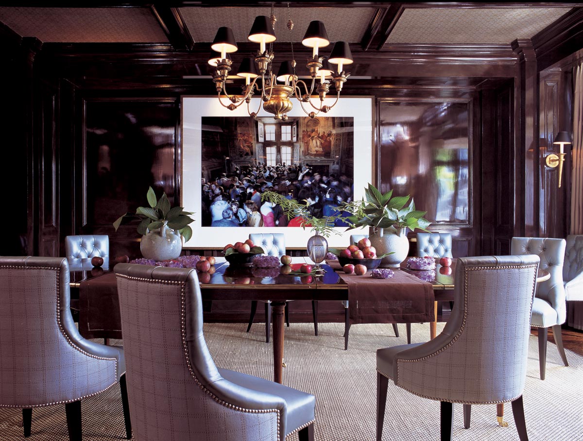
Although the “bathed in white” aesthetic (as I like to call it) is still going strong, I have also noticed an emerging trend in quite the opposite direction. Rooms that envelop you with strong, deep, dark colors are providing a visual antidote to all the white-walled light-and-brightness. Yes, even black! I can almost hear painters across…
Read MoreRoom Reveal: My Colorful, Light + Airy Guest Suite
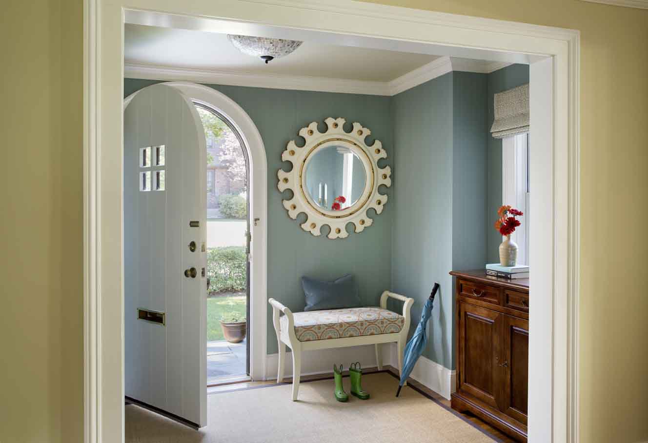
It has been quite a month! Aside from being busy with many great client projects, I managed to polish off a few things in my own home that had languished in an unfinished state for a long time. May kicked off with the reveal of my One Room Challenge Vestibule – AND a feature on a…
Read MoreInsta-Highlights from High Point Spring 2015
I returned yesterday from the Spring 2015 High Point Market – the world’s largest home furnishings and accessories show. Every year it attracts around 75K people, and I am delighted to count about 15 of them among my newest friends! This is my third market, and my first leaving two kids at home with daddy (though…
Read MoreBlue + Brass
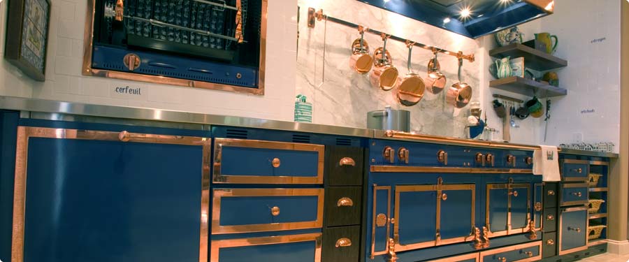
Thank you for all of your kind comments on my One Room Challenge plans last week! It’s always nice to hear words of encouragement from so many folks, many of whom are taking on the challenge themselves! I look forward to providing another update on Thursday – I’ve actually made quite a bit of progress…
Read MoreHouse of Turquoise Guest Post
I’m so excited to be a guest blogger today on one of my favorite (and only) daily reads, House of Turquoise! My post features a new spin on the “Lightened-Up Tudor” project I wrote about previously here. Head over to House of Turquoise to check it out! Thank you so much to Erin for the opportunity…
Read MoreThe Color of Sport
Some designers might cringe at the mandate of creating a bedroom around a specific “theme.” Add to that professional sports team decor and the often garish colors that come along with it, and the probability of a visual catastrophe is quite high. In the past few months I’ve done color consultations for two separate Boston Bruins…
Read More


