It’s been awhile since I’ve written anything about our new house. From a construction perspective, it’s about 99% complete, but there are a couple of things (which I won’t bore you with) that are currently standing in our way of being able to close and move in already.
Despite the lack of progress in making the move, there are still a few things that are *almost* (visually) ready for primetime that I haven’t yet blogged about. One of them is our master bathroom, which is one of my favorite rooms in the house.
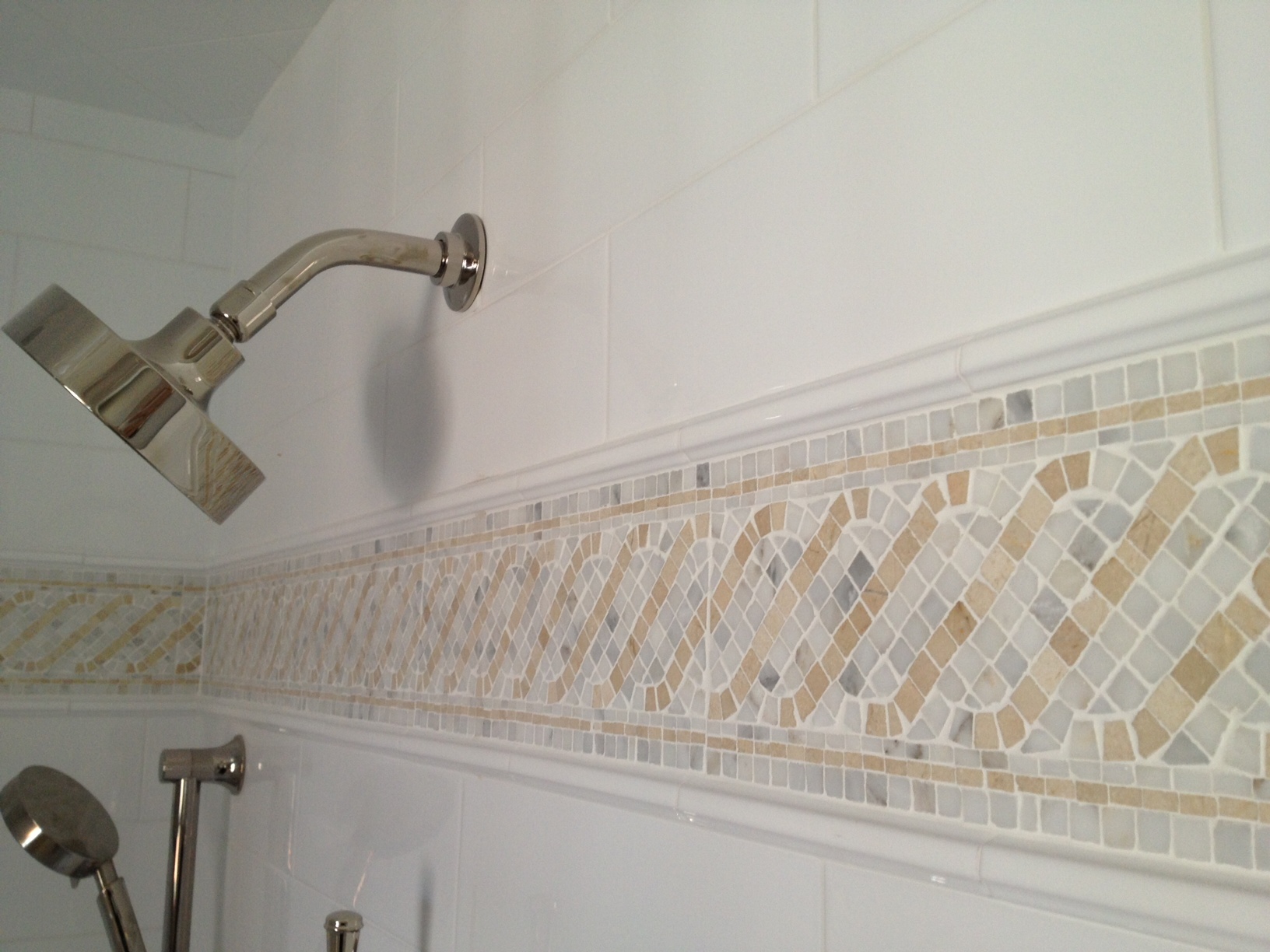
Though our home is filled with color (yes, including a few bold ones on the walls), I had a vision for our master bath, which was very light, airy, neutral, and almost reminiscent of an ancient Roman bath (except a little more contemporary, and a little more neutral). I love to incorporate classical motifs and designs to reference historical styles, without trying to replicate them per se. So when I stumbled across this border mosaic tile with a guilloche motif while selecting materials for the house, I knew it would be the perfect jumping off point for the entire bathroom…
The tiny tesserae in the mosaic are statuary (gray) and crema marfil (beige) marble. Very Roman. I studied in Rome for a semester during college, so feeling a tangible connection with the Eternal City as I shower each morning (or, more likely, while my son naps in the afternoon!) is going to be marvelous.
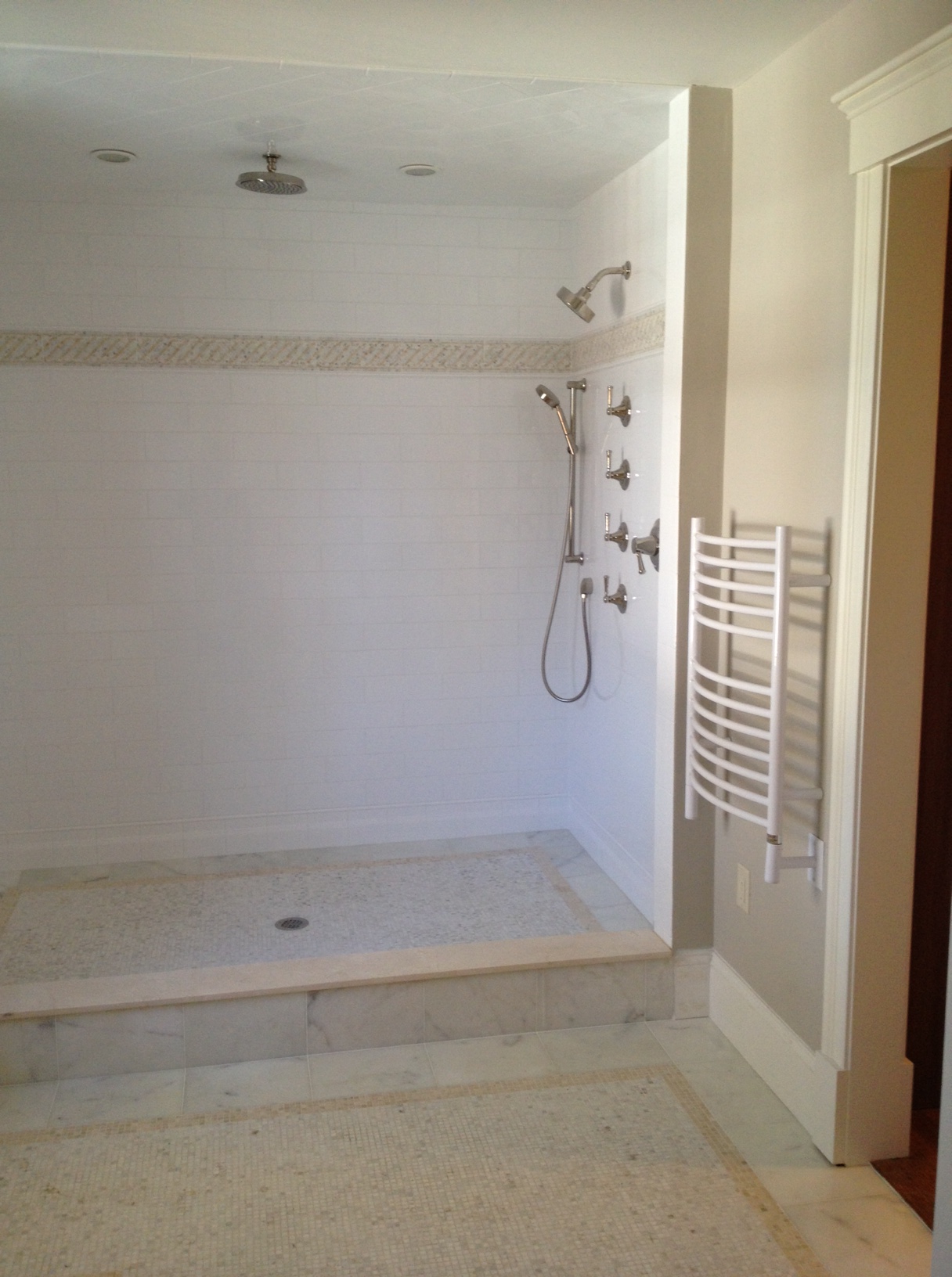
The person I worked with at the tile store had the great idea of mixing these two marbles in a rug pattern on the floor, using larger tiles of statuary as an outer border, a narrow band of small crema marfil mosaic as an inner border, and filling the inside with small statuary mosaic. I decided to use crema marfil for the countertops and tub decking to ensure a ‘warm/cool’ balance in the room.
But this ‘warm/cool’ thing also presented a challenge for choosing a paint color to work harmoniously with both types of marble. I knew I didn’t want white, but I was seeking a light color to help pull together the cooler gray and warmer beige. So I started my search with colors that quite literally looked as though they had resulted from the mixing of colors in crema marfil and statuary marble. This landed me in warm gray land; and a red undertone was critical to meshing with the subtle pink-ness of the crema marfil.
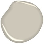
Revere Pewter is one of Benjamin Moore’s most popular colors. But I picked it for our master bath not because it is popular, but because it was the right paint color for this space. I truly don’t believe in ‘good’ and ‘bad’ colors – only ‘right’ and ‘wrong’ colors, relative to the context in which they are being used.
This view actually illustrates the principle of optical mixing I wrote about recently. Look again at the tile border in the shower. From a distance, it looks almost identical to the walls! The eye mixes together the beige and gray hues, with the result being something close to Revere Pewter. Being gray, the paint color relates to the statuary, and having a red undertone, it is harmonious with the crema marfil. Which (I think) means I picked the “right” color :).
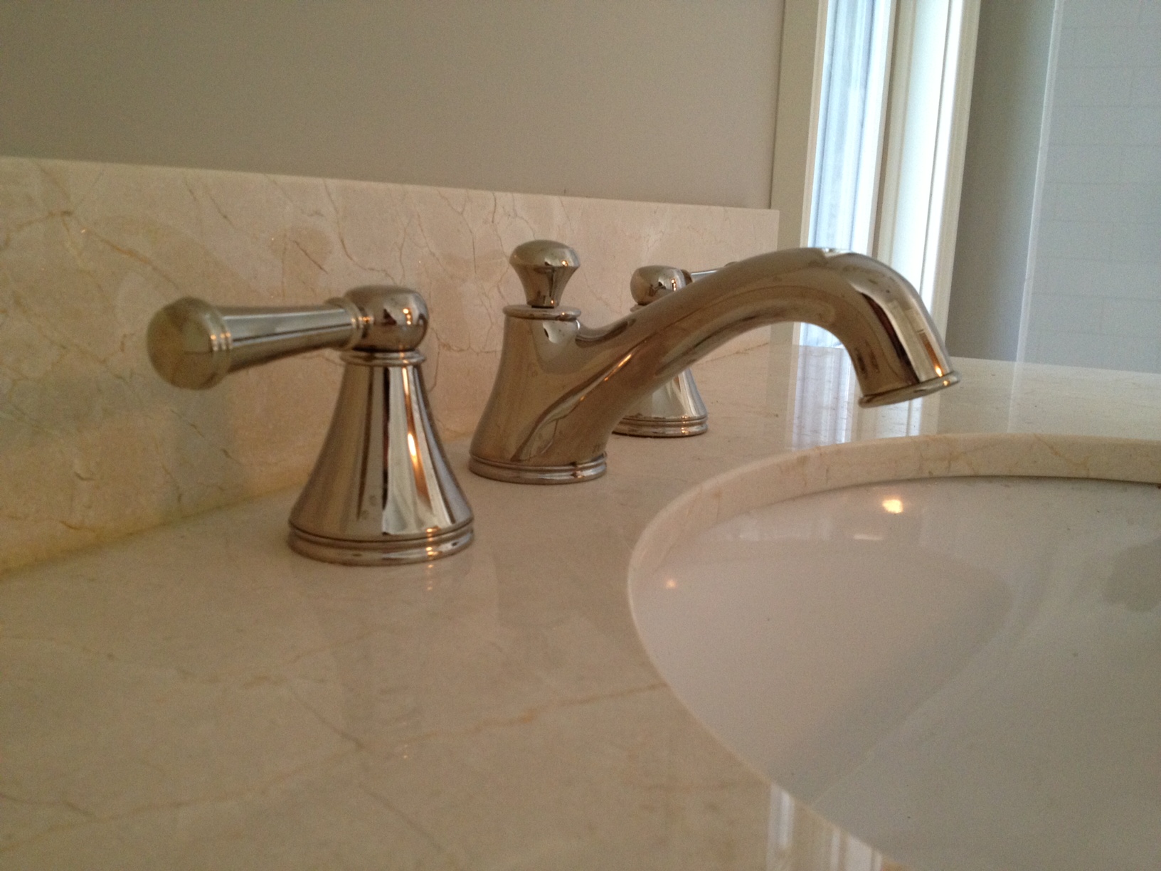
The warmer tone of polished nickel fittings and fixtures also works well in this room, and is even picking up a bit of the subtle rosiness of the crema marfil countertops.
I’m really happy with the way our master bath is shaping up, and can’t wait until we’re actually using it. Although it is no Baths of Caracalla, it will no doubt be my little sanctuary for those naptime showers that are a little bit longer than they need to be (especially on extra cold winter days like the ones we’ve been having in New England).


YES! Great job – I believe you did choose the RIGHT color for your space 🙂
Thanks so much, Kristie. That means a lot coming from you!
WOW! You did good, girl! This is absolutely beautiful. I think I would live in this bathroom. They’d have to tear the door down to get me out. HA HA!
Tell me about the shower opening…. will it have glasss?…. just open? ….or what are you plans? It’s incredible.
Haha, thanks, Stacey! That is quite a visual ;). The shower will have a frameless glass enclosure with a single door. My original plan was to have it be totally open (as I had seen and loved in a hotel we stayed at years ago), but it wasn’t practical so we have a threshold and a door.
Beautiful color, I’ve used it many times. One of Ben’s best 🙂
Agreed, Donna! It seems to work well in a variety of situations.
Lovely! Can you tell me the name and manufacturer of the border mosaic tile in the shower?
Thanks, Karen. I am not 100% sure on the manufacturer; it was ordered through Tile Showcase at the Boston Design Center. I did find this link online which looks like it but I can’t confirm it is the same product/manufacturer: http://onyxfrance.com/Cream_Marfil_Picture_Product_Guide.pdf
Thank you, Kelly
Awesome! Its actually remarkable post, I have got much clear idea concerning from this
post.
It lets you change color, brightness and font on the screen easily.
Also arrange to meet with the contractor prior to setting up a contract;
you don. It’s usually best to consult with a professional
lighting designer and have them work together with you to create a satisfying lighting design that will suit your needs
and desires.